TRANSCRIBER’S NOTES
Unicode symbols have been used to represent the handwritten marks that were used to indicate corrections:
δ (Greek small letter delta, U+03B4) for delete
‿ (Undertie, U+203F) to connect two parts of a word
⁐ (Close up, U+2050) to indicate two parts should be closed up
੭ (Gurmukhi digit seven, U+0A6D) to indicate inverted letter
LONDON:
THE VICTORIA PRESS, PRAED STREET, W.
OFFICE FOR THE EMPLOYMENT OF WOMEN,
UNDER THE PATRONAGE OF HER MAJESTY.
WOMEN COMPOSITORS:
A GUIDE
TO THE
COMPOSING ROOM.
By H. G. B.
LONDON:
THE VICTORIA PRESS, 117, PRAED STREET, W.
OFFICE FOR THE EMPLOYMENT OF WOMEN,
UNDER THE PATRONAGE OF HER MAJESTY.
Numerals—relative sizes of type—leads required to
equal a line of any given body of type—table showing
what number of ems of any other fount will correspond
in depth of body with any given number of pica ems,
from 10 ems pica to 30—the number of lines containing
a thousand ens—accents—signs—points, &c.—metal
rules—braces.
Diagrams of Imposition:—sheet of folio, or quarter
sheet of octavo—sheet of quarto, or half sheet of octavo—sheet
of octavo—sheet of twelves—sheet of sixteens.
The composition of this work was done byfemalesat
an average of20/- per week. The machining was done bymenat40/- per week.
RESULT:—Thehigherthe pay, theworsethe work.
INTRODUCTION.
Among the many and varied employments
which have of late years been opened
up for women, there are few which promise
to be so remunerative and permanent as that
of Printing (composing department). It is
an employment which gives scope for the
exercise of the highest faculties as well as
the nimblest fingers; it requires but very
little physical strength; it is not in any
way injurious to health; it can be performed
either sitting or standing; and is, at the
same time, one in which there is always a
demand for employés.
This latter is a great consideration, as
it is well known that many very suitable
employments for women are rendered almost
unprofitable because there is so little demand
for labour in them, and so many applicants
for each situation. We have no hesitation
in saying that if women will only take up
this employment with a determination to surmount
any difficulties which may appear at
the outset, they will find themselves in a
few years in a position to demand such
remuneration as few other employments can
offer.
It may be objected by some that women of
education will not care to be placed on the
same level as journeymen compositors. This
we admit, but only in a qualified sense. They
need not object to being on the same level as
regards remuneration (if they prove to be
equally skilful), and there is no fear of their
being so in any other respects.
The following pages are written for the
information of such as are desirous of learning
the Art of Printing. Of course they are quite
elementary, but they will give a good general
idea of the modus operandi.
OUTLINES OF COMPOSITORS’ WORK.
Dear reader,
If you desire to know something
about the Art of Printing, suppose you go
with me on an imaginary tour of inspection
round a printing office with which I am
acquainted. We will suppose that you are
quite ignorant of even the least fact connected
with the business, and that you will
not mind asking me questions as we go
along.
Well, here we are, in a composing-room,
which contains a great many things you have
never seen before, and so, perhaps, I had better
begin to tell you their names and uses.
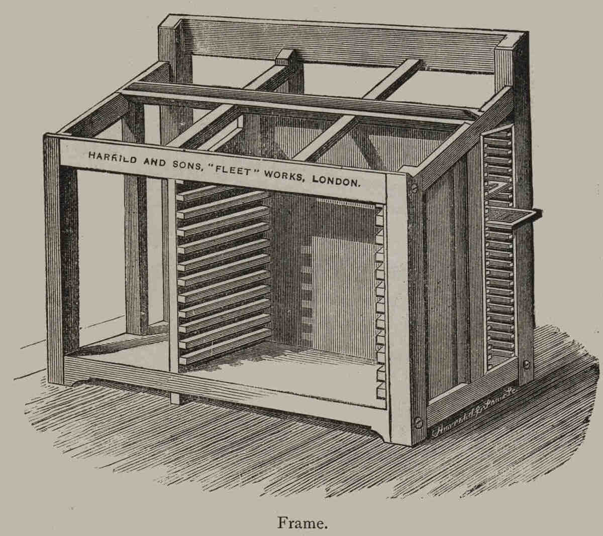
First we notice the frames (see p. 35).
These are wooden structures on the tops of
which the cases lie in a slanting position,
something like a desk. The lower part of
the frame you will notice is fitted with a rack,
in which cases are kept when not in use.
These allow of the cases sliding in and out
like drawers.
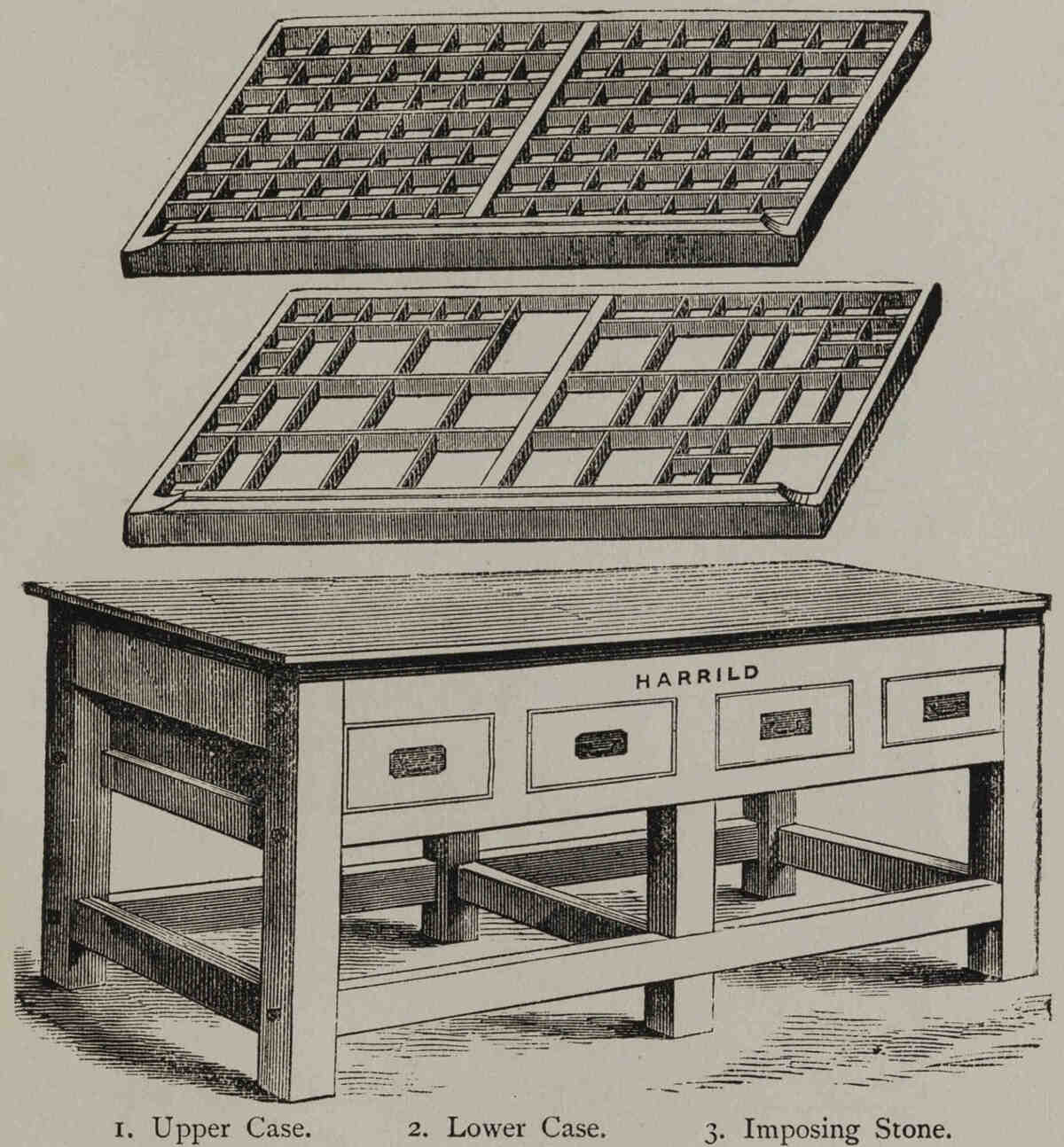
Next we notice the cases (see p. 33). These
are wooden trays, with cross pieces forming a
number of boxes or compartments, in which
the types are placed. There is an upper and
a lower case. The upper has ninety-eight
compartments, and contains the capitals,
small capitals, figures, and accents. The
lower case has fifty-three compartments, and
contains the smaller or “lower case” letters,
points, spaces, and quadrats.
The types in these cases are arranged so
as to afford the greatest facility in composing
the letters into words. On looking at them
you will observe this—more particularly in
the lower case. You will notice that the
letters required for the words most frequently
recurring, such as and, the, this, that, there,
them, then, are placed nearest the centre of
the case, so that they are the more easily
“set up.” We will explain this process
further on.
Now let us examine the types. These are
small pieces of metal, on the ends of which
the letter is cast, and are all of a uniform
height. On the front of the stem nicks are
cut, so that it is easy to see the position
of the letters as they lie in their respective
boxes.
The compositor takes her place in front
of the case, and works standing or sitting,
holding in one hand an instrument made
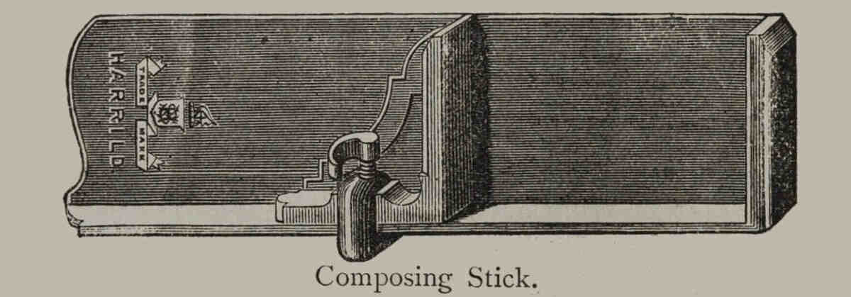
of iron, called a composing-stick (see p. 34).
With the other hand she takes the types as
she requires them out of the boxes; ranges
them on a slip of brass, called a rule, in her
composing-stick, and putting a space to make
a blank between each two words, forms one
line after another, till the stick is full, when
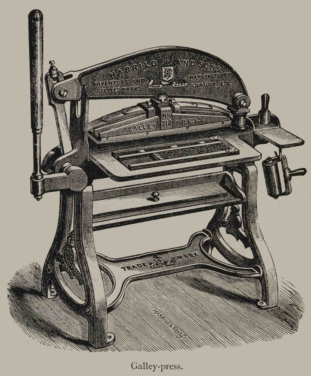
she empties it out upon the galley (see p. 35).
A certain number of these lines are measured
off into pages, several of which being ranged
and wedged tight in an iron frame, called a
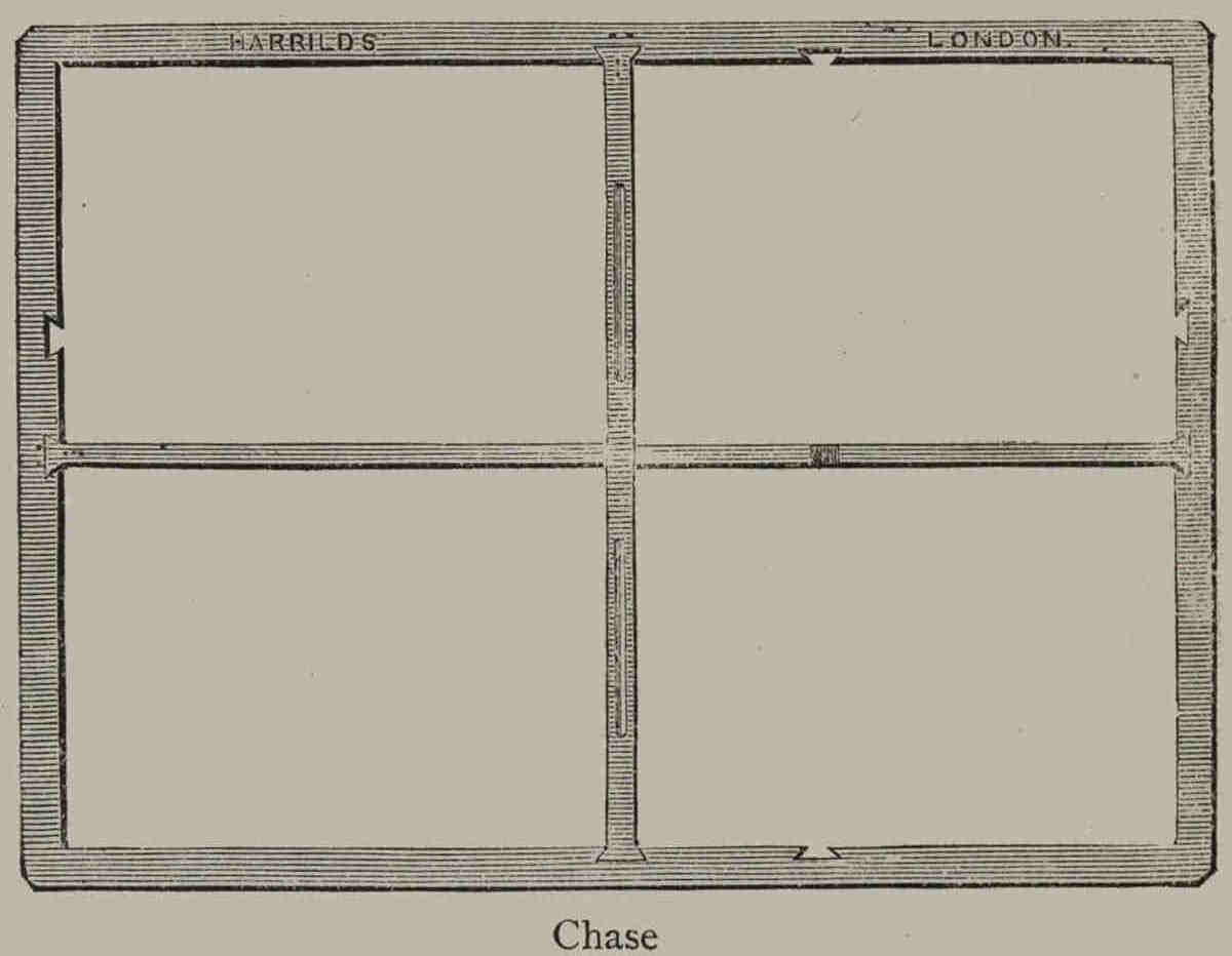
chase (see p. 34), are ready for the press.
The composing-stick consists of a plate of
iron about six inches long and two inches
wide. On the right side of this plate is a
ledge, about half an inch high, running the
whole length of the plate, and serving to
sustain the letters, the backs of which are to
rest against it; on the same plate are placed
two other lesser pieces, one of which is
contrived to slide along it, so that the two
pieces may be either approached or withdrawn
at pleasure, to adjust the line to the measure
intended.
Before the compositor proceeds to compose,
a rule, or thin slip of brass plate, cut to the
length of the line, and of the same height as
the letter, is placed against the ledge of the
composing-stick for the letter to bear immediately
against.
Being thus prepared, the compositor, with
the copy lying before her, and the stick in
her left hand, picks up with the right the
letters, spaces, &c., and places them against
the rule; with the thumb of the left hand
she presses them close to the slide, and thus
keeps them tight and steady while the other
hand is employed in setting in more letters;
the whole being performed with a degree of
expedition not easily imagined.
A line being thus composed, if it end with
a word or syllable and fill the measure, needs
no further care; otherwise more spaces are to
be put between the several words to justify
the lines, i.e., make the measure quite full so
that every line may end evenly; and thus she
proceeds to another line.
The spaces here used are a sort of blank,
of the like dimension as the letters, but not
so high, whose faces, therefore, when set,
do not appear nor give any impression. They
are of several kinds, according to the dimensions
of the whites or intervals to be made by
them, viz., quadrats, to fill up a break at the
end of a paragraph, or the like; em quadrats,
which are square and of the thickness of an
m, serving to make the distance after a period,
or between sentence and sentence; en quadrats,
of the thickness of an n, to be placed
after colons, semicolons, exclamations, and
interrogations; and thick or thin spaces, to
be used between the words in justifying, as
above.
The first line being completely justified,
the compositor advances to the next. In
order to do this, she moves the brass rule
from behind the line and places it in front,
and composes another line against it, after
the same manner as the former: and thus
she goes on till her stick is full, when she
empties it into the galley in the following
manner:
Taking the rule from behind the last line,
she places it before it; with her two middle
fingers she squeezes the lines in the stick
close, her two fore-fingers at the same time
being applied on the outside of the rule: she
then lifts them out of the stick, and placing
her thumbs behind the first line, lifts them
into the galley; taking care to disengage her
thumbs without breaking the lines.
The compositor, having set the proper
number of lines in the stick, and emptied
them out into the galley, again fills and
empties, as before. When a sufficient
number of lines have been composed to fill
the galley she secures it with side-stick
and quoins, and having pulled a proof on the
galley-press (see p. 36), hands it to the forewoman
with copy for reading.
The corrections are written on the margin
of the proof, right against the line where
the faults are found. There are different
characters to express different corrections, as
D or δ, dele, for anything to be effaced, or left
out. When anything is to be inserted, the
place is marked in the line with a caret, ^,
and the insertion added in the margin. When
a word, syllable, &c., is to be altered, it is
erased from the proof, and that to be put in
its place written in the margin; always observing,
that if there be several mistakes in
the same line the corrections in the margin
must be separated by bars, or strokes, /. If
a space be omitted, its place is marked with a
caret, and the margin with #. If a space be
wrongly placed, as in the middle of a word,
the two parts are connected with a cu‿rve,
and this mark ⁐ put in the margin. If
a letter be inverted, it is expressed on the
margin with ੭. If anything be transposed, it
is marked thus: The shortest |are the|follies
best; for the shortest follies are the best; and in
the margin is added trs. in a circle. If Roman
characters are to be changed for italic, or vice
versa, a line is drawn under them thus, and
Roman or italic added in the margin; if to
capitals, a treble line. If a word or sentence
is entirely omitted, the place is marked with a
caret, and the missing words written in the
margin. If the letters of a word stand too
far asunder, a curve is drawn under them,
and in the margin is put this mark ⁐.
Where the alterations are considerable, and
particularly where insertions or omissions are
to be made, there usually arises a necessity
for over-running. In order to do this, they
must decompose, or return the lines back from
the galley into the composing-stick, to be
rectified accordingly.
If one or more words to be inserted in
a line cannot be “got in” by changing the
spaces of the line for lesser ones, part of the
line must be put back into the close of the
preceding one, or forward into the beginning
of the subsequent one, or both, till room is
obtained. If the insertion be large, several
lines will need to be over-run, either backward
or forward, till a break is arrived at; when, if
it will not come in, a line is to be driven out.
When an omission is to be made, the contrary
course must be taken. If it be but little,
the compositor takes it out, and drives out the
remaining matter, either by enlarging her
spaces, or bestowing the beginning of the
following, or the close of the preceding line
therein. If it be considerable, she may be
obliged to over-run several lines before it
can be driven out.
As to the faults which escape the reader
and compositor, they are usually noted in
what is called the errata.
The type, then, being composed and corrected
in the galley, she measures off enough
for a page, ties it up with a cord, and proceeds
to the next, till all the pages required for
the sheet are completed; this being done,
she carries them to the imposing or correcting
stone (see p. 33), there to range them in
order in a chase. This is called imposing.
The chase is a rectangular iron frame of
dimensions which vary according to the size
of the paper to be printed on. It has two
cross pieces of the same metal, called a long
and short cross, mortised at each end into the
frame so that they may be moved if necessary.
By the different situations of these crosses,
the chase is fitted for different volumes; for
quartos and octavos, one traverses the middle
lengthwise, the other breadthwise, so as to
intersect in the centre, which is the most
customary situation; for twelves and twenty-fours,
the short cross is shifted nearer to one
end of the chase. For folios, the long cross
is left entirely out, and the short one placed
in the middle; and for broadsides, or sheets
printed on one side only, both crosses are set
aside.
To dress the chase, or range and fix the
pages in it, a set of furniture is made use of,
consisting of reglets or slips of wood of
different dimensions, which are only about
half an inch high, so as to be lower than
the letters. Some of these are placed at the
top of the pages, and are called heads;
others between them to form the inner
margin, called gutters; others at the sides,
called side-sticks; and others at the bottom,
called foot-sticks.
The pages then being placed in order on
the stone, the chase is put over them, the
furniture applied between the pages and the
chase in the positions above mentioned; and
the whole is locked up by means of small pieces
of wood, cut in wedge form, called quoins,
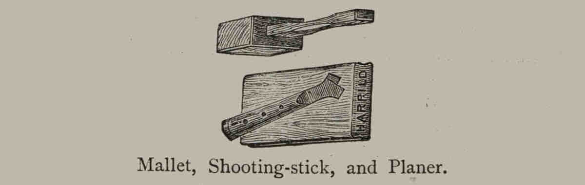
which are driven with a mallet and shooting-stick
to a sufficient tightness. In this condition,
the work is called a forme, containing
more or less pages according to the size of
the volume.
Before the forme is quite locked up, it is
pressed down by passing a smooth piece of
wood, called the planer, over the letters, to
make their surfaces stand flat and even; and,
when locked up, it is tested, to see that
nothing is loose.
As there are two formes required to every
sheet, when both sides are to be printed, it is
necessary that they should be of exactly the
same length and breadth; i.e., the corresponding
heads, gutters, &c., are to be equal
in both formes, that the pages may fall
exactly on the back of each other. This is
called register.
Here, then, properly ends the compositor’s
work; the forme, thus finished, being ready to
be committed to the pressman.
Besides the several kinds of letters and
characters above mentioned, used in printing,
there are likewise rules for division lines,
borders, and head and tail-pieces, accommodated
to the several kinds of letters.
The rules for division lines are of brass, and
are made exactly the same height as the letter;
otherwise they would hinder the neighbouring
letters from printing, or would themselves be
hindered. These the compositor occasionally
cuts into proper lengths, as her work requires.
The borders, or flowers, are a kind of ornament,
in various forms, serving for the division
of books, chapters, &c. Their depth
is proportioned to the letter, and their length
adjusted to the page; for being composed of
several moveable pieces, it is easy to lengthen
or shorten them.
The head and tail-pieces, either cut in wood,
or cast in type metal, are used at the beginnings
and endings of chapters or books.
The initial letters are sometimes cut in
wood, and figured; sometimes cast like the
other characters.
For the convenience of binding, printers
have recourse to signatures, i.e., letters of
the alphabet placed at the bottom of the first
page of each sheet, which show the order
in which the sheets are to be bound, as well
as whether the quires are complete.
And now, perhaps, you may be inclined to
ask, “How long does it take a person to
learn to set up type sufficiently well to obtain
employment?”
To this we would reply, that very much
depends upon the age and ability of the
learner. Girls who begin young, say at the
age of fifteen, generally learn to set up fairly
well in about twelve months, and then begin
to acquire speed, so that they can set from
25,000 to 30,000 letters per week.
Those who begin later, say at about twenty
years of age, should be able to do the same
amount at the end of six months, for which
they would receive from twelve to fifteen
shillings per week, according to the conditions
on which they enter as learners.
We have known some to earn twenty
shillings per week after twelve months’
learning, and afterwards increase to between
twenty-five and thirty shillings.
We do not mean to say that every learner
would make the same progress, as we have
known many who have not; but, generally
speaking, the deficiency arises either from a
want of proper education, or a lack of anything
like aptitude for business.
However, we are quite sure that persons of
fair education, who make up their minds to
learn, can do so with even better results
than those we have before mentioned. It is
not to be expected that a business of this
description can be learned without some
amount of perseverance, and those who take
it up must be prepared to meet with difficulties
and overcome them.
For persons of more mature age there are
special posts to occupy, one of which is that
of forewoman. This post requires not less
than six months’ training, in order to learn the
general routine of the work. But those who
fill it must have a natural aptitude for
business, and possess those qualities which
are essential in governing a number of hands
in any business. The remuneration would
be higher in this case, though much would
depend upon the ability of the individual.
The post of reader is also an important
one, and requires about the same amount
of training. It is essential that a reader
should have a practical knowledge of at least
the rudiments of printing. Moreover, a person
filling this post must necessarily possess a
large amount of general knowledge; must be
able to read a great variety of manuscripts,
and have a quick eye to detect errors. A
good reader can always obtain a high rate of
remuneration.
We have now gone over the whole ground,
though, perhaps, very superficially. Our
object, however, is not so much to give an
exhaustive treatise on the Art of Printing,
as a general idea of one branch of it
to those who desire to learn; and only by
entering a printing office for a given time as
a learner, is it possible to acquire any useful
knowledge of the business.
APPENDIX I.
NUMERALS.
Numbers expressed by letters; either Roman or italic caps or
lower case are used, thus—Vol. I. chap. xvii. The numerals
are—
I
i
1
V
v
5
X
x
10
L
l
50
C
c
100
D
d
500
M
m
1000
The manner of expressing numbers by numerals, is by either
taking from a higher or adding to a lower numeral thus—
IV
iv
4
VI
vi
6
IX
ix
9
XI
xi
11
XIV
xiv
14
XVI
xvi
16
XX
xx
20
XL
xl
40
LX
lx
60
XC
xc
90
CX
cx
110
CD
cd
400
DC
dc
600
CM
cm
900
MC
mc
1100
MD
md
1500
LEADS REQUIRED TO EQUAL A LINE OF ANY
GIVEN BODY OF TYPE.
Pearl
One four and one eight-to-pica.
Ruby
One four and one six-to-pica.
Nonpareil
Two fours; three sixes; or four eights.
Emerald
One four, one six, and one eight.
Minion
One four and two sixes.
Brevier
Two fours and one six.
Bourgeois
Three eights and two sixes.
Long Primer
Three fours; or six eights.
Small Pica
Two fours and two sixes.
Pica
Four fours; or six sixes.
English
Three fours and two sixes.
ACCENTS.
The accented letters are—
Acute
á é í ó ú
Grave
à è ì ò ù
Circumflex
â ê î ô û
Diæresis
ä ë ï ö ü
Long
ā ē ī ō ū
Short
ă ĕ ĭ ŏ ŭ
French ç, Spanish ñ.
SIGNS.
The following are a few of the most common signs—
℔,
Pound weight.
⅌,
Per.
@,
at.
£,
pound sterling, pound l.
/,
Solidus, shilling mark.
%,
Per cent.
+
Plus, or more.
-
Minus, or less.
=
Equal.
×
Multiple.
÷
Sign of division.
°
Degree.
′
Minute.
″
Seconds.
POINTS, ETC.
,
Comma
;
Semicolon
:
Colon
.
Full point
’
Apostrophe
-
Hyphen
!
Admiration
?
Interrogation
&
Short “and”
()
Parentheses
[]
Brackets
☞
Fist.
METAL RULES.
En - em — 2-em —— 3-em ——— 4-em ————
BRACES.
2-em ⏞⏞ 3-em ⏞⏞⏞ 4-em ⏞⏞⏞⏞ Superior ⏞⏞⏞⏞⏞
RELATIVE SIZES OF TYPE.
Dble Pica
=
2-line
Small Pica.
Paragon
=
”
L. Primer.
Gt. Primer
=
”
Bourgeois.
English
=
”
Minion.
Pica
=
”
Nonpareil.
Small Pica
=
2-line
Ruby.
L. Primer
=
”
Pearl.
Bourgeois
=
”
Diamond.
Brevier
=
”
Minikin.
4⅓
ems of
Gt. Primer
=
1 inch.
5½
”
English
=
”
6
”
Pica
=
”
7
”
Small Pica
=
”
8⅔
ems of
L. Primer
=
1 inch.
9½
”
Brevier
=
”
12
”
Nonpareil
=
”
17⅓
”
Diamond
=
”
TABLE showing what number of ems of any other fount will
correspond in depth of body with any given number of Pica
ems, from 10 ems Pica to 30.
Pica.
Small Pica.
Long Primr.
Bourg.
Brev.
Min.
Nonp.
Ruby.
Pearl.
Pica.
10
11½
12½
14
15½
17
20
23
25
10
11
12½
14
15½
17
18½
22
25½
28
11
12
14
15
17
18½
20½
24
27½
30
12
13
15
16½
18½
20
22
26
30
33
13
14
16
17½
20
21½
23½
28
32½
35
14
15
17½
19
21½
23
25½
30
34½
38
15
16
18½
20
23
25
27
32
37
40
16
17
19½
21½
24
26½
28½
34
39½
43
17
18
21
22½
25½
28
30½
36
41½
45
18
19
22
24
27
29½
32
38
44
48
19
20
23
25
28½
31
34
40
46
50
20
21
24
26½
30
32½
35½
42
48½
53
21
22
25½
27½
31½
34
37
44
51
55
22
23
26½
29
32½
35½
39
46
53
58
23
24
27½
30
34
37
40½
48
55½
60
24
25
29
31½
35½
38½
42
50
58
63
25
26
30
32½
37
40
44
52
60
65
26
27
31
34
38½
42
45½
54
62½
68
27
28
32½
35
40
43½
47½
56
65
70
28
29
33½
36½
41
45
49
58
67
73
29
30
34½
38
42½
46½
50½
60
69½
75
30
THE NUMBER OF LINES CONTAINING A
THOUSAND ENS
In any body of type from Pica to Nonpareil, and from
10 to 40 Pica ems in width.
Pica. ems in width.
NUMBER OF LINES CONTAINING A THOUSAND LETTERS.
Pica.
Small Pica.
Long Primer.
Bourg.
Brevier.
Minion.
Nonp.
10
50
43
40
36
32
29
25
11
45
40
36
32
29
27
23
12
42
36
32
29
27
24
21
13
38
33
30
27
25
23
19
14
36
31
29
25
23
21
18
15
33
29
29
23
23
20
17
16
31
27
25
22
20
19
16
17
29
26
23
21
19
17
15
18
28
24
22
20
18
16
14
19
26
23
21
19
17
15
13
20
25
22
20
18
16
15
13
21
24
21
19
17
15
14
12
22
23
20
18
16
15
13
12
23
22
19
17
15
14
13
11
24
21
18
17
15
13
12
10
25
20
17
16
14
13
12
10
26
19
17
15
14
12
11
10
27
19
16
15
13
12
11
9
28
18
15
14
12
12
11
9
29
17
15
14
12
11
10
9
30
17
14
13
12
11
10
8
31
16
14
13
11
10
10
8
32
16
14
12
11
10
9
8
33
15
13
12
11
10
9
8
34
15
13
12
10
9
9
7
35
14
12
11
10
9
8
7
36
14
12
11
10
9
8
7
37
14
12
11
10
9
8
7
38
13
11
10
9
9
8
7
39
13
11
10
9
8
8
6
40
12
11
10
9
8
7
6
APPENDIX II.
DIAGRAMS OF IMPOSITION.
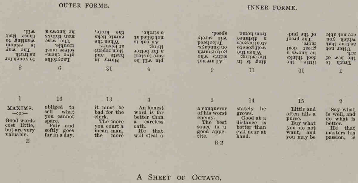
Sheet of Folio, or Quarter Sheet of Octavo.
Sheet of Quarto, or Half Sheet of Octavo.
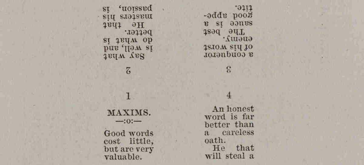
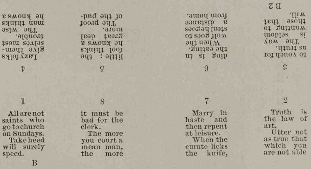
OUTER FORME. INNER FORME. A Sheet of Octavo.
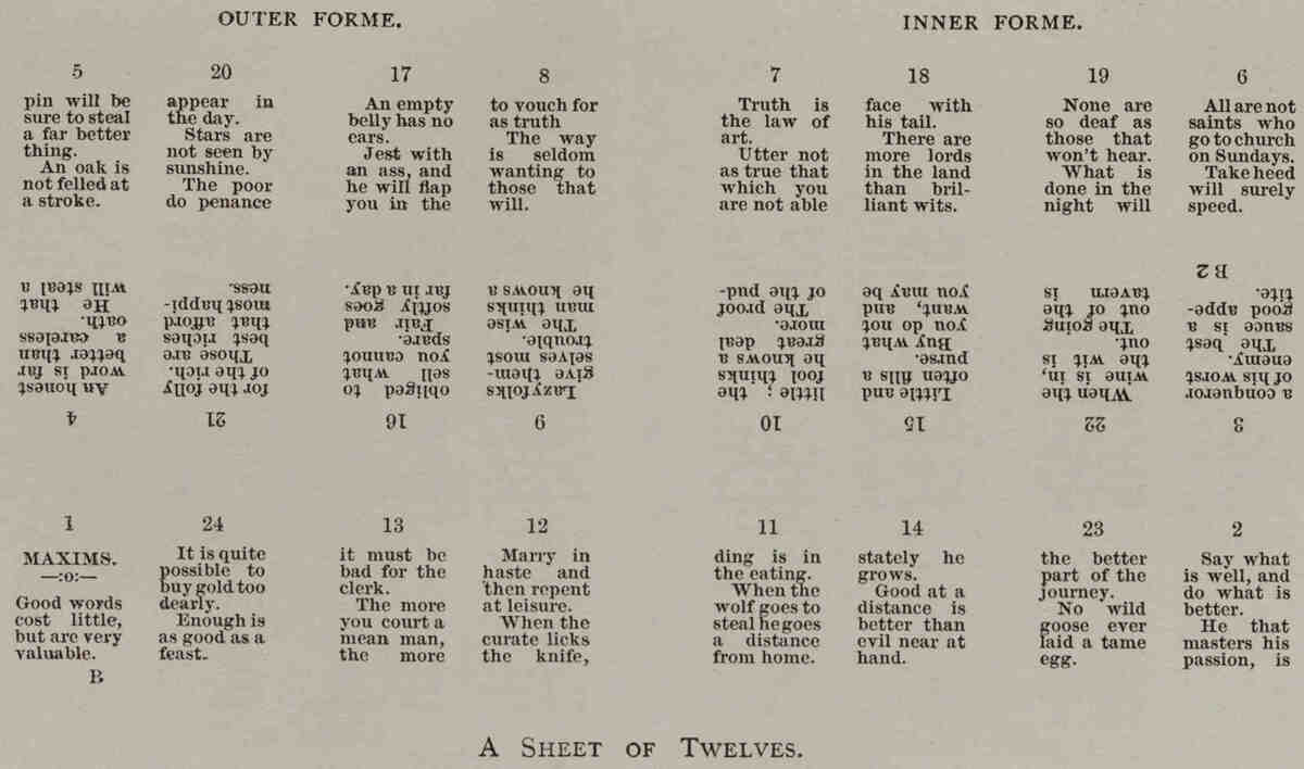
OUTER FORME. INNER FORME. A Sheet of Twelves.
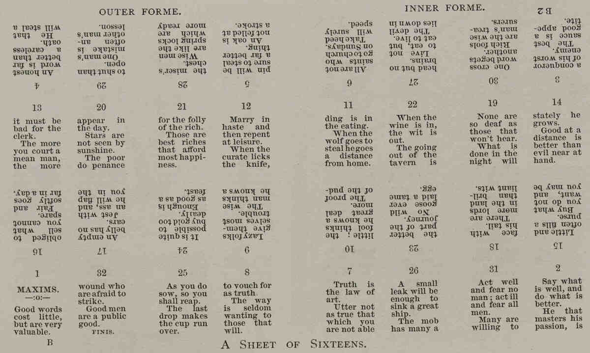
OUTER FORME. INNER FORME. A Sheet of Sixteens.
APPENDIX III.
ILLUSTRATIONS.
1. Upper Case. 2. Lower Case. 3. Imposing Stone.
Composing Stick.
Mallet, Shooting-stick, and Planer.
Chase.
Galley.
Frame.
Galley-press.
APPENDIX IV.
TERMS USED IN A COMPOSING-ROOM.
Author’s proof.—The clean proof sent to an
author after the compositors’ errors have
been corrected.
Bastard title.—A short title preceding the
general title of a work.
Bastard type.—Type with a face larger or
smaller than its appropriate body: as
Nonpareil on Minion body, or Minion on
Nonpareil body.
Batter.—Types accidentally injured in a forme.
Beard of a letter.—The outer angle supporting
the face of a type and extending to the
shoulder.
Blank page.—A page on which no matter
appears.
Body.—The shank of the letter.
Boxes.—The compartments of a case in which
the types are placed.
Break.—The last line of any paragraph.
Casting off.—Estimating how many pages a
certain quantity of copy will make in type.
Chapel.—The meetings held by compositors
for the purpose of redressing grievances,
collecting fines, and disposing of their
funds.
Clean proof.—When a proof has but few faults
in it, it is called a clean proof; and when a
proof is to be sent to the author, the compositor
is ordered to pull a clean proof.
Clearing away.—Properly disposing of materials
after a work has been completed.
Close matter.—Solid matter with few break-lines.
Companionship.—All the hands on a work.
Composing.—Setting type.
Correct.—When the reader reads the proof,
or the compositor corrects the mistakes
marked in the proof, they are both said to
correct; the reader the proof, the compositor
the type.
Corrections.—The alterations or errors marked
in a proof.
Cut-in letter.—A type of large size adjusted
at the beginning of a line at the commencement
of chapters.
Cut-in note.—A note justified into the side of
a page.
Distributing.—Returning types to their various
boxes after having been printed from.
Double.—A repetition of words.
Dressing a chase or forme.—Fitting the pages
and chase with furniture and quoins.
Even lines.—When a piece of printing has to
be executed in great haste, a number of
compositors are employed on it, and the
copy is cut into small pieces for each, to
facilitate the making-up, imposing, and the
general furthering of the work; if the copy
should be in long paragraphs, the compositors
have each to begin a line and to make
their copy end a line, frequently with great
irregularity of spacing. This is termed
making even. In newspapers it is of constant
occurrence.
Fat.—Poetry and leaded matter.
Folio.—The figure or figures which stand at
the head of the page; also a sheet of paper
once doubled.
Forme.—The pages when imposed in a chase.
Foul proof.—A proof with many faults marked
in it.
Fount.—An assortment of type in definite
proportions.
Furniture.—Strips of wood or metal, placed
around and between pages when imposed.
Gauge.—A strip of reglet with a notch in it,
passed with the making up, to denote the
length of the pages.
Get in.—To set close.
Gutter-sticks.—Furniture used in imposition to
separate the pages.
Half-title.—The title of a book inserted in the
upper portion of the first page of matter.
Head-line.—The top line of a page containing
the running title and folio. When there is
no running title the folio is styled the head-line.
Chapter lines are head-lines, as are
also the titles of articles in periodicals and
newspapers.
Imposing.—Arranging and locking up a forme
of type in a chase.
Imprint.—The name of the printer or of the
publisher appended to jobs or title-pages.
Inferior letters.—Small letters cast near the
bottom of the type.
Justifying.—Spacing out lines accurately.
Keep in.—To crowd in by thin spacing.
Keep out.—To drive out or expand matter by
wide spacing.
Kerned letter.—Type of which a part of the
face hangs over the body.
Laying cases.—Filling cases with a fount of
new type.
Laying pages.—Placing pages on the stone in
the proper order for imposition.
Lean.—Close and solid matter.
Lean face.—Light, thin type.
Letter hangs.—When the page is out of square.
Locking up.—Tightening up a forme by means
of quoins.
Longcross.—The bar that divides a chase the
longest way.
Low case.—When the compositor has set
almost all the letters out of her case.
Making up.—To arrange the lines of matter
into pages.
Making margin.—In imposition, arranging the
space between the pages of a forme so that
the margin will be properly proportioned.
Measure.—The width of a page.
Open matter.—Matter widely leaded or containing
numerous break-lines.
Off its feet.—When matter does not stand
upright.
Out.—An omission marked in a proof by the
reader.
Over-running.—Carrying words backward or
forward in correcting.
Passing the making-up.—Passing to the next
hand in order the lines remaining (if
any) after a compositor has made up her
matter, together with the gauge and proper
folio.
Pie.—Type promiscuously intermingled.
Planing down.—To bring down types evenly
on their feet, by laying a planer on the page
and striking it firmly with a mallet.
Revise.—The last proof of a forme before
working it off.
Riding.—Type at the end of a line catching
against a lead, or the ends of leads over-lapping
each other.
Runs on sorts.—Requiring an inordinate proportion
of particular letters.
Shank.—The square metal upon which the
face of a letter stands.
Signature.—A letter or a figure used at the
bottom of the first page of a sheet, to direct
the binder in placing the sheets in a volume.
Sorts.—The letters in the several case-boxes
are separately called sorts, in printers’ and
founders’ language.
Squabble.—A page or forme is squabbled when
the letters are twisted out of a square
position.
Shoulder.—The upper surface of the shank of
a type not covered by the letter.
Stet.—Written opposite to a word, to signify
that the word erroneously struck out in a
proof shall remain.
Superior letters.—Letters of a small face, cast
by the founder near the top of the type.
Table work.—Matter consisting partly of rules
and figures.
Take, or Taking.—A given portion of copy.
Turn for a letter.—When a sort runs short, a
letter of the same thickness is substituted,
placed bottom upward.
Wayz-goose.—A term given to the annual
dinner customary among printers during
the summer months.
White line.—A line of quadrats.
White page.—A blank page.
Working in pocket.—When the hands share
equally their earnings on a work.
APPENDIX V.
Miss Emily Faithfull wrote as
follows in 1874:
In the end of 1859 our attention was directed
to the printing trade as offering a field for the
employment of women, and early in the
following year the Victoria Press was opened
in the face of a great and powerful opposition,[A]
and we commenced what was then
considered a rash experiment, and perhaps
might have proved so, but for the liberal
support accorded by friends who appreciated
the difficulties we had to encounter from those
who tried to check the movement by fair
means or foul.
[A] Mr. Gladstone in speaking on monopolies (about the date to
which we allude) observed;—“Then we come to the printer’s
monopoly—a powerful combination, which has for its first
principle that no woman shall be employed, for reasons obvious
enough—viz., because women are admirably suited for that trade,
having a niceness of finger which would enable them to handle
type better than men; they are, however, excluded by the
printers’ combination.”
The opposition was not only directed
against the employer, but the female apprentices
were subjected to all kinds of petty
insults. Unmanly tricks were played upon
them; their frames and stools were covered
with ink so as to soil their dresses unawares,
the letters were mixed in their boxes, and
their cases were emptied of “sorts.”
Nevertheless, after some years of work,
in spite of foes without and traitors within,
property purposely injured, machinery wantonly
broken, &c., &c., we have steered our
little bark safely through the natural and
artificial perils by which it was surrounded,
and can now point to an office in thorough
working order, producing its own monthly
magazine and weekly paper, together with
the books, reports of societies, chancery bills,
cards, and circulars, with which the friends of
the movement from all parts of the country
kindly favour us.
Nor does the success of our experiment
stop here; we gladly and thankfully recall
the fact that female compositors are now employed
in several other offices; the applications
for “trained hands” are increasing.
During the last month we have received
letters from different correspondents asking us
to send women compositors and proof readers
to country offices. For the women who have
taken up this trade have proved equal to their
work. They “set up type” with expedition
and accuracy. We have no hesitation in
saying, after our long experience, that young
girls learn with greater rapidity than boys of
the same age; they are not only more intelligent,
but they are far more attentive.
They have another vantage ground which
employers will not be slow to recognise—viz.,
habits of sobriety. They do not ask for a few
hours’ leave of absence and remain away a
couple of days “on the spree,” which too
often forms the man’s excuse for placing the
master printer in a position of more or less
awkwardness, according to the size of the
office.
And in one direction the introduction
of women into printing offices may prove
beneficial to others as well as to themselves.
This has been tested to a great extent in
America. Not only did we find women at
work in Harper’s splendid office in New York,
but during a visit to Harvard, Mr. Houghton,
the proprietor of the Riverside Press, kindly
took us over his immense establishment,
where we found men and women at work, side
by side, setting up type. He spoke not so
much of the work executed by the nimble
fingers of the women, but of the moral effects
of their presence there. The men had been
shamed out of the use of bad words and
habits, and he declared that it was impossible
to over rate the good achieved, adducing that
in the interests of his business nothing would
induce him to have a room in which men
worked alone. And this is justly regarded
as a model Press in America. It reminds you
of the good old days when the printer was a
scholar. The heads of departments are all
college men. When we had concluded our
tour of inspection, and Mr. Houghton had
assured us that his idea of introducing women
compositors was due to a visit he had paid to
our own Victoria Press, we indeed felt amply
rewarded for any anxiety experienced in the
establishment of an office which had not only
helped English women, but actually influenced
the fate of their sisters on the other side of
the Atlantic Ocean—far beyond its own immediate
centre.
Female compositors can earn from 10s. to
30s., but a good reader sometimes receives
£2 2s. a week. Before anyone is qualified to
undertake this position they must spend about
twelve months in learning the technicalities
of the business. Quickness of eye and a
thorough knowledge of grammar and punctuation
are indispensable, but they are not
sufficient qualifications. We must be emphatic
on this point, for many ladies come to
us, and think because they can detect an
error in some newspaper or magazine article,
they are capable of filling the very onerous
position of a reader[B] in a printing office.
[B] Several ladies have applied for a readership in a printing
office lately vacant, stating as their qualification a capacity for
reading aloud; another lady stated that “she knew she could
undertake it for her father was a solicitor, and she had often
copied out legal documents.”
Unfortunately, few ladies ever think, or are
allowed to think, of preparing themselves for
work; they never dream of it until driven to
take it up for self support, and then require
immediate payment. Now, charity cannot
find an enduring place in the labour market,
consequently women cannot be placed in
positions of trust and respectability simply
because they need remuneration, and those
who desire to undertake any work in connexion
with printing must be prepared to
train themselves.
In confirmation of the opinions we have expressed
about the position of a proof reader,
we quote the following observation from a
practical printer, who has always been friendly
to the movement, and is a recognised authority
on this point. He writes in answer to our
enquiry:—“There must be a previous acquaintance
with practical printing. A very
few people will do without it, but they are
exceptions. By rights, there ought to be three
or four years’ experience as a compositor first.
Then a few months under careful supervision
may make a reader.”
SIXPENCE MONTHLY, WITH PHOTOGRAPH.
Annual Subscription, 7/-, post free.
NEW SERIES.
THE VICTORIA MAGAZINE,
Conducted by EMILY FAITHFULL.
It discusses the social questions that affect the status of
women with a knowledge and ability altogether its own.—Spectator.
There is not an article in it too dry for a lady’s reading, or too
frivolous to interest a man.—Examiner.
Takes high rank among its contemporaries.—Daily Telegraph.
Altogether the Victoria shows traces of increased freshness
and power.—Guardian.
Every number of the Victoria Magazine perceptibly furthers
the good work.—Oxford Undergraduates’ Journal.
A credit to its conductors.—Liverpool Daily Post.
The Victoria thoroughly sustains its character as the principal
organ in questions relating to women.—Yarmouth Independent.
LONDON:
THE VICTORIA PRESS, PRAED STREET, W.
Simpkin, Marshall & Co., Stationers’ Hall Court,
Sold at Railway Bookstalls.
SECOND EDITION.
Price £1 10s.
Dedicated by permission to Her Majesty.
TE DEUM LAUDAMUS,
ILLUMINATED BY
ESTHER FAITHFULL FLEET.
Could not easily be surpassed in beauty of design,
or in the finish of their execution.—The Times.
Resplendent with gorgeous colouring and gilding,
and the designs have much beauty and variety of
form.—Illustrated London News.
We must not omit to state that the book is also a
triumph of printing in colour.—Pall Mall Gazette.
THE VICTORIA PRESS, PRAED STREET, LONDON, W.
THIRD EDITION.
Price Sixpence.
PRAYERS, TEXTS, & HYMNS
FOR THOSE IN SERVICE.
By the Author of
“Count up your Mercies,”
AND
“Tracts for Railway Men and others.”
THE VICTORIA PRESS, PRAED STREET, LONDON, W.
AMATEUR
AUTHORS
Can have their Works printed and published
AT THE
VICTORIA PRESS
With advantage to themselves, and at the
same time help in the movement for
the Employment of Women.