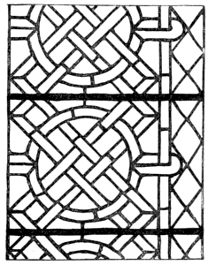
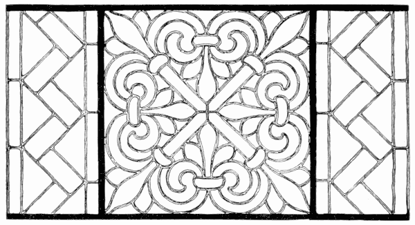
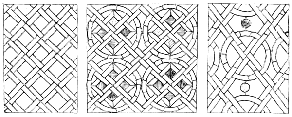
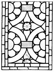
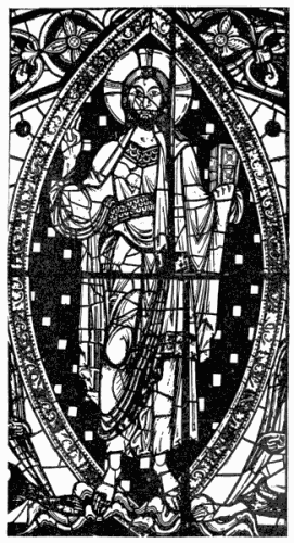
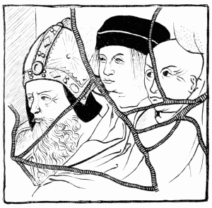
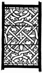
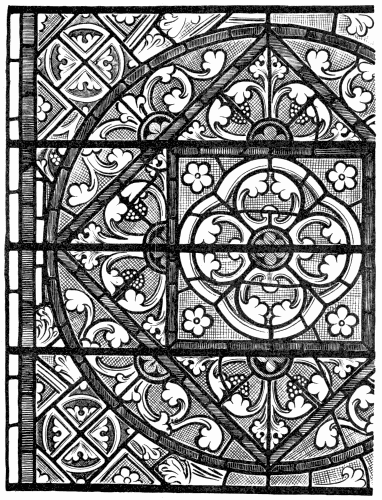
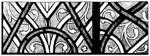
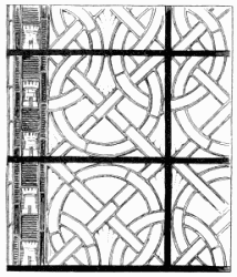
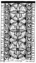
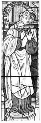
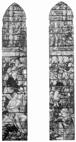
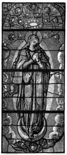
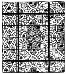
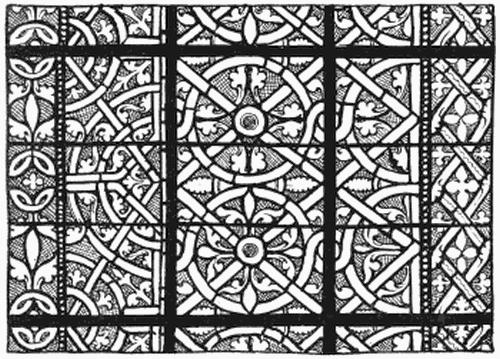
Design in glass developed itself on lines almost parallel to the
progress of technique. Each, of course, affected the other—how
and why it is now proposed to show.
It is not intended at present to say more than is absolutely
necessary about “Style,” in the historic sense—that is reserved
for a chapter by itself—but, as it is convenient to refer to a
period of design by its name, it will be as well at this stage
briefly to enumerate the historic “Periods.”
Glass follows, inevitably, the style of architecture of the
period. Accordingly it is divided broadly into Gothic and
Renaissance. Gothic, in its turn, is divided by Rickman (who
first attempted to discriminate between the styles of architecture
in England) into three periods. Winston, who did
for English glass what Rickman did for English architecture,
adopts his classification as follows:—Early Gothic—to about
1280. Decorated Gothic—to about 1380. Perpendicular
Gothic—to about 1530.
Renaissance art has been classified in Italy according to
the century, and in France has been named after the reigning
sovereign—François Premier, Henri Deux, and so on. In England
also we make use of the terms Tudor, Elizabethan, Jacobean,
and the like. No one, however, has attempted to draw subtle
distinctions between the periods of Renaissance glass, for the
obvious reason that the best of it was done within a comparatively
short period, and the rest is not of much account. It is
enough, therefore, to mark off two divisions of Renaissance glass.
The first (which overlaps the latest Gothic) may be called
Sixteenth Century, or by the Italian name Cinque-Cento, or
simply Renaissance; whilst the second, which includes seventeenth
century and later work, is sufficiently described as
Late glass.
The development of style in other countries was not quite
parallel with its march on this side of the water. The French
were always in advance of us, whether in Gothic or Renaissance;
the Germans lagged behind, at all events in Gothic; but the
pace is equal enough for us to group windows generally into
three Gothic and two Renaissance periods—Early, Middle, and
Late Gothic; Early and Late Renaissance. If we do that it
will concern us less, that Early German work is more
Romanesque than Gothic, that Late French work is not
Perpendicular but Flamboyant, and so on.
The accepted classification is determined mainly by the
character of the architectural or ornamental detail of the
design. Such architectural or other detail—that of costume,
for example—is of the very greatest use as a clue to the date
of glass. That is a question of archæology; but it is not
so much the dates that artists or workmen have to do with as
with the course of craftsmanship, the development of art. It
is convenient for us to mark here and there a point where
art or workmanship has clearly reached a new stage; it gives
us breathing time, a starting-point on some fresh voyage of
discovery; but such points need be few. The less we bother
ourselves by arbitrary subdivisions of style the better; and
Winston himself allows that his divisions are arbitrary.
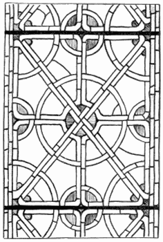
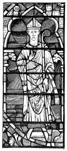
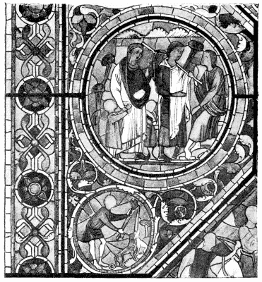
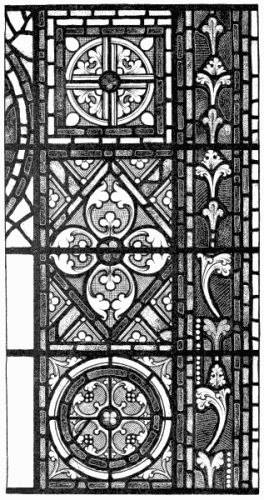
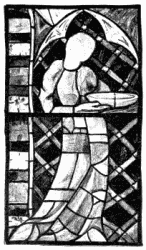
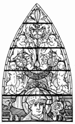
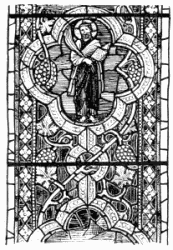
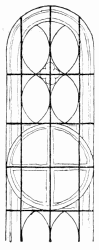 58. Poitiers.
The student need not very seriously concern himself about
dates or names. People are much too anxious to get a term
for everything, and when they can use the term glibly they
fancy they know all about the thing. It is no doubt easier to
commit to memory a few names and a few dates than to know
anything about a craft; but the one accomplishment will not
do in place of the other. A very little real knowledge of art or
practical workmanship will lead you to suspect, what is the
truth, that there is a good deal of fee-fi-fo-fum about the jargon
of styles. It is handy to talk of old work as belonging to
this or that broadly marked historic period; and it is well worth
the while of any one interested in the course of art to master the
characteristics of style. The student should master them as a
matter of course; but he must not take the consideration of
period for more than it is worth. Really we give far too much
attention to these fashions of bygone days—fashions, it must be
allowed, on a more or less colossal scale, compared to ours, but
still only fashions.
It is proposed then to allude here only so far to the styles
as may be necessary to explain the progress of design, and
especially the design of stained glass windows.
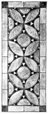
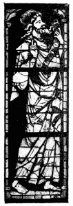
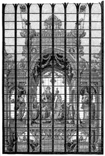
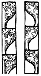
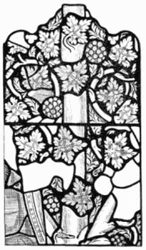
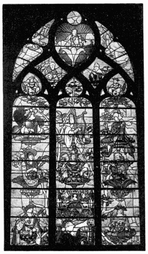
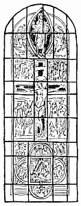 59. Poitiers East Window. (Compare with 24.)
In dividing Gothic into Early, Middle, and Late Gothic, corresponding
roughly with the thirteenth, fourteenth, and fifteenth centuries, it is
not forgotten that there is an earlier Gothic of the twelfth and perhaps
eleventh centuries, more or less reminiscent of the Romanesque period
preceding it; but English glass begins, to all intents and purposes,
with the thirteenth century, and even in France there is not a very
great quantity of characteristically earlier glass. What there is
differs from thirteenth century work mainly in the Romanesque character
of the figure drawing and ornamental detail, in its deliberately simple
composition, and in the spontaneity of its design. The glazier was still
feeling his way. Any composition to be found in a Byzantine
ivory-carving, enamel, illuminated manuscript, or what not, might just
as well occur in glass. The more familiar types of early Gothic window
design had not yet settled down into orthodoxy. The lines on which the
oldest windows extant were set out are in the main those of the
thirteenth century also. They were more or less suggested by the shape
of the window opening, which, it will be seen, had always had a good
deal to say as to the direction glass design should take.
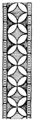
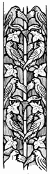
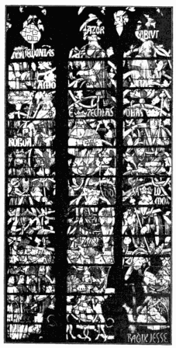
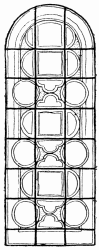 60. Poitiers, North Transept.
The window openings in Romanesque or Norman-French
churches were single lights, round or pointed arched, rather
broad in proportion to their width. Stained glass, it has been
explained, has to be held in its place by copper wires, soldered
to the leadwork, and attached to iron bars let into the masonry
for that purpose. In the case of a very narrow lancet, such bars
would naturally be placed at convenient intervals across the
opening. But for the most part windows were the reverse of
narrow, and the horizontal bars had to be supplemented by
vertical stanchions, so that the window space was divided into
rectangular divisions. As a matter of construction the glass was
made in panels, corresponding to these, and attached to them. It is not
surprising, therefore, that these divisions should often have been
accepted as part of the design, or that the design of the glass should
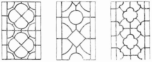
to some extent have followed them. On page 113 is the skeleton of the
upper part of a twelfth century window. The strong black lines in the
diagram show the bars, the finer ones indicate the main divisions of the
design of the glass. It will be seen that the four strips into which the
upright bars divide the window are not equal, but that the outer
divisions are narrower than the inner, so as to accommodate themselves
to the width of the border. Naturally that was determined always by the
proportion of the window; such borders measured often one-sixth part, or
more, of the entire width. The way in which the central circular shape
in the glass breaks across in front of the border is an instance of the
spontaneity and unexpectedness of design characteristic of the earliest
existing work; later one series of forms would repeat themselves without
interruption throughout the length of the window. When, as above, the
centre of a window is occupied by a great crucifix, or, as below, other
such irregularity occurs, it is safe to conclude that the glass, if not
prior to the thirteenth century, belongs to its first years. It is
characteristic of the very early date of the glass that the bars in the
diagrams given do not go out of their way to follow the outline of the
circles, vesicas, quatrefoils, and other shapes, but on occasion cut
relentlessly across them.
The filling out of such a skeleton as those
given would in many respects be much the
same in the eleventh, twelfth, or thirteenth
century; and in each case it would be in direct pursuance of
the traditions of Early Christian design. You may see in
Byzantine ivories and enamels precisely the kind of thing
that was done in glass; and in the Romanesque Michaelis
Kirche at Hildesheim, is a painted roof, the design of
which might have been carried out, just as it is, in a giant
window.
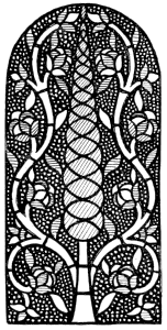
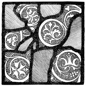
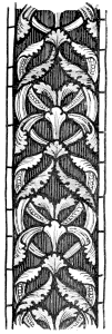
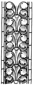
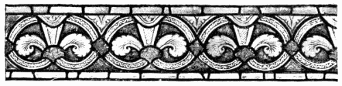
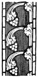
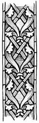
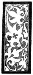
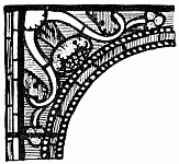
61 and 62. Border, Angers.
The main divisions of the centre part of such a window would
each contain its little “subject” or glass picture; the border
and the interstices between the pictures would be occupied with
foliated ornament; only, the earlier the work, the more pronounced
would be the Romanesque character, alike of the
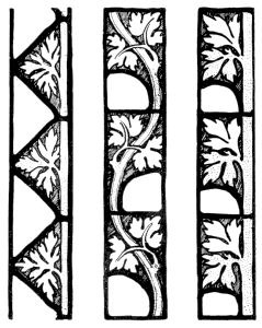
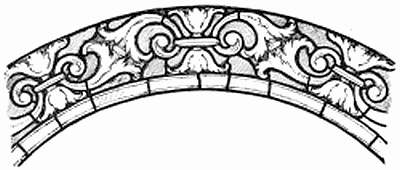
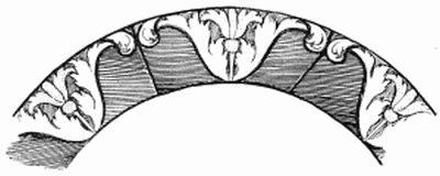
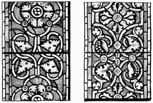
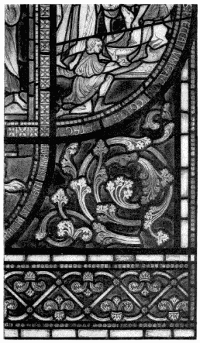
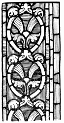
ornament and the figure work. The broad borders from Angers,
above, and the narrower one from Le Mans (page 327) differ
materially from the accepted thirteenth century type (page 117).
Witness how in the Angers glass the stalks of the foliage frame
little panels in the border, and how in the Le Mans work the
stalks take the form of straps, patterned with painted ornament.
This elaboration of the stalks with painted zig-zag, pearlwork,
and so on, is precisely the kind of thing one sees in Byzantine
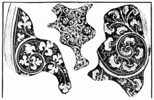
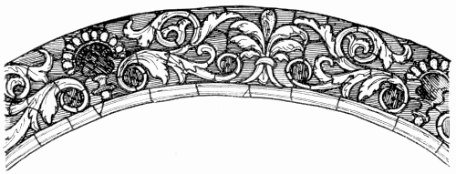
carving and inlay. The very early spandril from Angers, below,
if not markedly Romanesque in character is yet not of the
distinctively Early Gothic type.
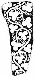
 63. Angers.
The shape of each medallion would be emphasised by a series of coloured
lines or fillets framing it. In quite early work the broader of these
would be broken up into blocks of alternating colour; they would be
patterned probably (which in the thirteenth century they would probably
not be), and altogether the effect of the ornament would be more
jewelled. One of these broken and patterned margins is shown in the
vesica-shaped framing to the figure on page 37—belonging, by the
way, to the window given in skeleton on page 114.
The difference between twelfth and thirteenth century
pictures is in the lingering of Byzantine traditions of design
in the earlier work, and in the strictly simple disposition of the
figures en silhouette against the background, as well as in the way
the drapery is wrapped closely round them, so that the figure
always explains itself. There is an expression and a “go”
about some of the earliest figures for which we look in vain
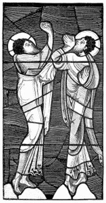
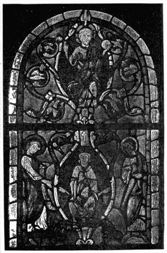
later in the thirteenth century. The figures of the Apostles
from the Ascension at Le Mans on page 33 are altogether more
alive than the thirteenth century bishops, for example, on page
276, who seem by comparison tame and altogether respectable.
A certain exaggeration there is, no doubt, about the action
of these earliest figures, a certain brutality of rendering, as
there is also a certain barbaric quality in the ornament, and,
indeed, in the whole effect; but of its superlative richness
there is no manner of doubt. One is even led to speculate,
when one compares it with later work, whether a
certain barbaric character of design does not go to that
unrivalled brilliancy. In the absolute glory of rich colour
the very earliest glass has never been equalled. The advance
of glass painting was at the cost of this, perhaps barbaric,
quality.
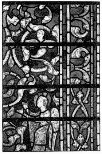
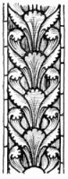
64. EARLY ORNAMENT, SALISBURY.
In the earliest windows the subjects were not invariably
enclosed in medallions; sometimes the square lines of the
bars would be accepted as division enough; these would be
framed with lines of colour, and the design of the portion of
the window within the border would consist (as occasionally
at Chartres) of a series of square subjects, each with its
marginal lines, ranged one above the other. For the most
part, however, the design of the earliest richly coloured windows
extant took the shape of little pictures in panels or
medallions. Another favourite scheme was to delineate the
Tree of Jesse. The upper portion of such a window is given
on page 117; but further consideration of Jesse windows is
reserved for a separate chapter.
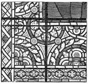 65. S. Remi, Reims.
From the earliest period, no doubt, clerestory or other lights were
often occupied each with a separate figure standing upright; but such of
these as may remain in their places are not readily distinguishable from
thirteenth century work; and the undoubtedly earlier figures—such,
for example, as those in S. Remi at Reims—have been re-set in
framework more or less old, but so as not to tell us anything very
authentic about the setting out of the original windows. Again at
Augsburg, where the figures in the clerestory are said to be the oldest
in Germany (to belong, in fact, to about the year 1000), the windows are
bordered with modern glazing in white. At Reims we have very rudely
drawn figures in rich colour against a deep background, standing with
splayed feet upon little rounds or half rings of colour, representing
the earth, their names inscribed in bold lettering, which forms a band
of yellow behind their heads. At Augsburg the figures, equally rude in
drawing, equally splay-footed, are in white and colour upon a white
ground. They stand upon little hemispheres of Byzantine
ornament, and their names are writ large in black letters upon the white
glass around their heads. Presumably they were framed in a border of
pattern work similar to that surrounding the medallion windows. The
ornamental work in the windows at S. Remi may not always have formed
part of the same window with the figure work—it does not go very
happily with it now—but it is probably of about the same date; and
it illustrates, together with some similar work at S. Denis, near Paris
(so “thoroughly restored” as to have lost its historic value), a kind of
pattern work peculiar to the earliest glass.
As a rule, early glass divides itself naturally into two classes:
work in rich colour, which is what we have hitherto been discussing,
and work in “grisaille,” as it is called; that is to say, in
which the glass is chiefly white, or whitish, relieved only here and
there by a line or a jewel of colour.
Occasionally, as at Auxerre, Reims, and Poitiers, rich figure
work is found set in grisaille or framed by it; and in some
fragments from Châlons, now at the Musée des Arts Décoratifs at
Paris, coloured figures are found on a white ground.
You find also in France rich colour-work surrounded by
white glass—the work of a period when the powers that were
became possessed of the idea that they must lighten the interior
of their churches, and accordingly removed so much of the
coloured glass as seemed good to their ignorance, and replaced
it with plain glazing. But, as a rule, and apart from the
tinkering of the latter-day ecclesiastic, rich colour and grisaille
were kept apart in early mediæval churches; that is to say,
a coloured window has not enough white in it perceptibly to
affect the depth and richness of its colour, nor a grisaille
window enough colour to disturb the general impression of
white light. At Reims and S. Denis, however, you find
ornament in which white and colour are so evenly balanced
that they belong to neither category. The amount of colour
introduced into grisaille was never at any time a fixed quantity;
one has to allow something for the predilection of the artist;
but here the amount of colour makes itself so distinctly felt
that the term grisaille no longer serves to express it.
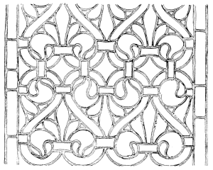
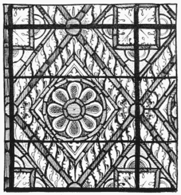
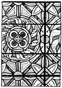
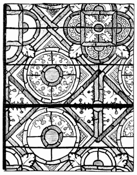
The design of these patterns was of a rather mechanical type
(pages 35, 118, 120) and not in any case very interesting; but it
would have been difficult under any circumstances to produce a
very satisfactory effect by so equally balancing white and colour. The
designer falls between two stools. The well-known gryphon medallions at
S. Denis seem at first to promise something rather amusing in design,
but there is no variety in them:—and no wonder! the greater number
of them prove to be new, and they have all been rearranged by Viollet le
Duc. That is as much as to say, some of the gryphons are of Abbot
Suger’s time, but the design of the window is Viollet le Duc’s. White
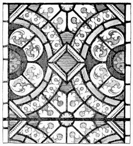
and colour are again too evenly mixed in the heavy-looking English glass
at Lincoln shown on page 121, but that is of the thirteenth century.
It need hardly be said that the earlier the work, the simpler was the
character of the painting, the more deliberately was pigment reserved
for painting out the light, the more strictly was the shading in lines.
But the painted detail was often small; glass was used in small pieces;
subjects themselves were ordinarily small in scale. The largeness of
effect was due first to the actual simplicity of the main lines of the
design, and then to breadth of colour, a breadth of colour all the more
remarkable seeing the small pieces of glass of which the broad surfaces
were of necessity made up.
Of course, too, the earlier the work the more the design was
influenced by the technique of glazing, the more clearly it can
be seen how the glazier designed (as was explained on page 44)
in lead lines, and only made use of paint to fill them out.
 66. S. Remi, Reims.
In twelfth century glass the white was greenish and rather horny in
texture; ruby was sometimes streaky, and often tawny or inclined to
orange; blue varied from deep indigo to pale grey, occasionally it was
of the colour of turquoise; yellow, dark or pale, was usually brassy;
green ranged from bluish to pale apple, and from dull to emerald. These
colours, with a rich brownish-purple, the lighter shades of which served
always as flesh tint, made up the glazier’s palette. Happily there was
considerable inequality of colour in the material. It deepened, for
example, towards the selvage of the sheet where it was thickest; it had
streaks and bubbles in it; no two batches ever came out of the pot quite
alike; and altogether the rudely made pot-metal was chemically most
imperfect and artistically all that glass should be.
 67. Lincoln.
It would be rash in the extreme to formulate any theory as to early
schemes of colour; probably the glazier’s main thought was to get
somehow a deep, rich, solemn effect of colour. He secured this very
often by not confusing his tints, and by allowing a single colour so to
predominate that the window impressed you at once as bluish or greenish
or reddish in tone. He was on the whole happiest when he kept his colour
cool; but he produced also red windows which are never to be forgotten.
In the cathedral at Poitiers, where many of the beautiful
medallion windows belong to the very early part of the thirteenth
century, the scheme is usually to adopt a blue background,
alike for the medallions and for the spaces between, relying
upon a broad band of ruby, edged with white pearling, to mark
the medallion shapes, which it effectively does; but these are
not the most beautiful windows in the church. One recognises
their date rather by the individuality and spontaneity of
the design than by any distinctly Romanesque character in
the detail. It should be mentioned, also, that at Poitiers, even
in windows which seem not so emphatically to belong to the
very beginning of the century, the early practice of using only
straight upright and cross bars is adhered to. There may be
something of local conservatism in that.
68. Bars in Early Medallion Windows.
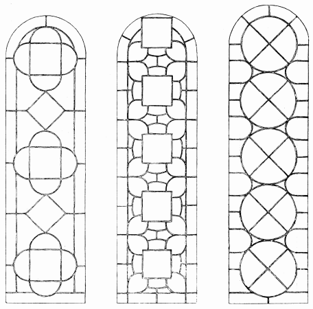
In the thirteenth century the practice of the earlier glaziers
stiffened into something like a tradition, and design took
almost inevitably the form of (1) the Medallion window, (2) the
Single Figure window, (3) Ornamental Grisaille.
The full-blown thirteenth century Medallion window differed
from what had gone before in that it was more orthodox. The
designer begins as before by marking off a broad border to his
glass, defined on the inner side by an iron bar, and proceeds to
fill the space within the border with medallion shapes. But he
now adapts the medallions more regularly to the spaces between
the bars. At most two alternating shapes occur throughout the
length of the light, without break or interruption, such as
occurs in earlier work, and as a rule they keep strictly within
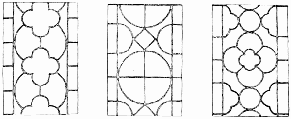
the lines of the border. In all the nine examples here given,
taken at random from Chartres, Bourges, Canterbury, and
elsewhere, only in one case does a medallion cut boldly across
the border in the head of the light. The slight overlapping
of the quatrefoils in one case is not really an overlapping of
the border but only of the marginal lines to it, not shown
in the diagram above, but clearly enough explained on page 132,
which shows the completion of a corner of the window, less its
side border. In the window with large circular medallions
divided into four, there is no upright bar to define the border,
faintly indicated by a dotted line.
69. Bars in Early Medallion Windows.
It will be seen from these diagrams, which illustrate at once
the main divisions of the glass and the position of the ironwork,
what a change came over the construction of windows in
the thirteenth century. The window is no longer ruled off by
upright and horizontal bars into panels into which the design
is fitted; it is the bars which are made to follow the main lines
of the design, and to emphasise the forms of the medallions.
The rare exceptions to this rule (as at Bourges, overleaf) may
generally be taken to betray either the beginning or the end of
the period; but at Poitiers they seem to have passed through
the early period without ever arriving at shaped bars. The
early glazier, it was said, first blocked out his design according
to his leading; here he begins with the bars. The iron framework
forms, itself, in many of these windows, a quite satisfactory
pattern, and one which proudly asserts itself in the finished
window. The designs of the period are not of course all equally
ingenious. Sometimes, in order to strengthen a circle or quatrefoil
of great size, the glazier, instead of breaking up the shape
ornamentally as was the rule, merely supports it by cross bars;
not only that, but he accepts the awkward shapes given by them
as separate picture spaces. Of this comes one of two evils: either
he frames his little pictures with sufficient border lines to keep
them distinct, and so draws attention to the shapes, an attention
they do not deserve; or he has to accept the bars, with perhaps
a fillet of colour, as sufficient frame, which they are not, and
his pictures run together, to the bewilderment of whoever would
decipher them.
70. Spandrils of Medallion Window, Bourges.
It is matter for regret that the French did not accept the
full shape of even the largest medallion, and fill it with
one bold subject; over and over again one feels that the
subjects in medallion windows are not only too small to be
readable, but so small that the figures are out of scale with
the ornamental detail. The scale of the church has, of
course, to be taken into account; but the French churches
are big enough to warrant figures thrice the size of those
which ordinarily occur in medallions. In our narrower
“Early English” lancet windows the medallions naturally
came small.
To divide a window into eccentric divisions (halves or
quarters of circles, quatrefoils, and the like) and then to take
these awkward shapes as separate picture frames, is an archaic
method of design much in need of excuse. The more reasonable
thing to do would have been to make use of such incomplete
forms only in some secondary position, and as framework for
ornament, or at least quite subsidiary figures.
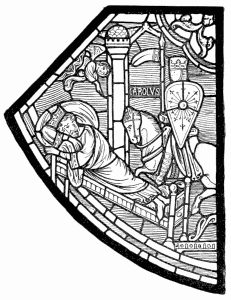 71. The Dream of Charlemagne, Chartres.
Apart from shapes which are really only segments of medallions,
the only awkward medallion shapes occurring in Early
glass are those which are broader than they are high, such
as occur, for example, at Soissons. These have always the
uncomfortable appearance of having been crushed.
How the iron skeleton of a medallion window is filled out
with leaded glass; how the border and the medallion shapes
are strengthened by bands of colour; how the medallions
themselves are occupied with little figure subjects, and how
the interspaces are filled in with ornament, is indicated
opposite and on pages 132, 325.
By way of variation upon the monotony of design, the
designer will sometimes reverse the order of things. At
Bourges, for example, you will find the centre of a light
devoted to insignificant and uninteresting ornament, whilst
the figure subjects are edged out into half quatrefoils at the
sides of the window; and, again, at Chartres and Le Mans
you may occasionally see the pictures similarly ousted from
their natural position by rather mechanical ornament. One
can sympathise with an artist’s impatience with the too,
too regular distribution of the stereotyped medallion window.
There is undoubtedly a monotony about it which the designer
is tempted to get rid of at any price; but consistency is a
heavy price to pay for the slight relief afforded by the treatment
just described.
This striving after strangeness results not only in very ugly picture
shapes—no one would deliberately design such a shape as that which
frames the picture of the Dream of Charlemagne (overleaf)—but it
produces a very uncomfortable impression of perversity. It is quite
conceivable that ornament may be better worth looking at than some
pictures; but a picture refuses to occupy the subordinate position; it
will not do as a frame to ornament. There is no occasion to illustrate
very fully the design of Early figure medallions; they are often of very
great interest, historical, legendary and human, but there is little
variation in the system of design. The picture is of the
simplest, perhaps the baldest, kind. The figures, as before stated, are
clearly defined against a strong background, usually blue or ruby; a
strip or two of coloured glass represents the earth upon which they
stand; a turret or a gable tells you that the scene is in a city; a
foliated sprig or two indicate that it is out of doors, a forest,
perhaps; a waving band of grey ornament upon the blue tells you that the
blue background stands for sky, for this is a cloud upon it. The
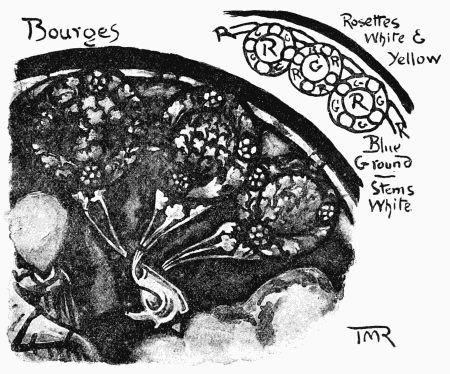
extremely ornamental form which conventional trees may assume is shown
in Mr. T. M. Rooke’s sketch from a medallion at Bourges, opposite. In
the medallions from Chartres (page 325) are instances of simpler and
less interesting tree forms, and in the upper part of the larger of the
two, a bank of conventional cloudwork. Explanatory inscriptions are
sometimes introduced into the background, as in the dream of Charlemagne
(above), or in the margin of the medallions, as in the Canterbury window
on page 132, fulfilling in either case an ornamental as well as an
elucidatory function.
 72. Detail from an Early Medallion.
In the Canterbury glass it will be seen the figures are more
crowded than in the French work illustrated. This is not a
peculiarity of English glass, but a mark of period; as a rule
the clump or compact group of personages proclaims a later
date than figures isolated against the background. There is
no surer sign of very early work than the obvious display
of the figures against the background, light against dark
or dark against light. Another indication of the date of
the Canterbury figures is that their draperies do not cling
quite so closely about them as in figures (page 33) in which the
Byzantine tradition is more plainly to be traced.
 73. Canterbury.
There is no mistaking a medallion window, the type is fixed:
within a border of foliated ornament a series of circles, quatrefoils,
or other medallion shapes, for the most part occupied by
figure subjects on a rather minute scale, and between these
ornament again.
 74. Beverley Minster.
The border might be wider or narrower, according to the
proportion of the window, though a wide border was rather
characteristic of quite early glass. A twelfth century border
(Angers) will sometimes measure more than a quarter of the
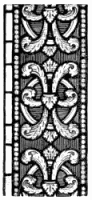
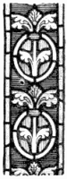
entire width of the window. The borders from Canterbury,
Beverley, Auxerre, and Chartres (overleaf) are of the thirteenth.
A border of sufficient dimensions will sometimes include medallion
shapes as on pages 115, 325, and even occasionally little
subject medallions at intervals, or it may be half-circles, each
containing a little figure; but such interruption of the running
border is rare. In so far as it counts against monotony it is to
the good.
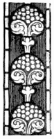 75. Auxerre.
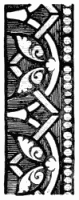 76. Chartres.
In narrower windows, such as more frequently occur in this
country, where, as the Gothic style of architecture supplanted the
Norman, lancet lights took a characteristically tall and slender shape,
the border was reduced to less imposing proportions, as for example at
Beverley;—there was no room for a wide frame to the medallions,
nor any fear, it may be added, that these should be so large as to
require breaking up into segments, as in much French glass, or at
Canterbury: there the window openings, as was to be expected of a French
architect, are more characteristically Norman than English in
proportion. In a very narrow light in the one-time cathedral at
Carcassonne the medallions break in front of a not very wide border; but
then this, though a medallion window, belongs probably by date to the
Second Gothic period.
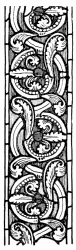 77. S. Kunibert, Cologne.
Medallions themselves may be simple or fantastic in shape.
They may be devoted each to a single picture, or subdivided
into a series of four or five; they may be closely packed, and
supported by segments of other medallions, also devoted to
figure work, or they may be separated by considerable intervals
of ornament. The character of that ornament takes two
distinct forms.
In the examples given (pages 132, 325) it takes the form of foliated
scrollwork, very much of a piece with the ornament in the borders,
except that there is more scope for its growth. In actual detail it
varies, according to its date and whereabouts, from something very much
like Romanesque strapwork to the more or less trefoiled foliage typical
of Early Gothic ornament, whether French or English. Further examples of
the last are shown in the borders from Auxerre and Chartres (page 328).
The one from Chartres illustrates the transition from the Romanesque; it
is intermediate between the two. The borders from S. Kunibert’s,
Cologne, are quite Romanesque in character, though they
are of the thirteenth century; but then it has to be remembered that the
Romanesque style of architecture was flourishing on the Rhine long after
the Gothic style had developed itself in France and England. Many of the
details from Canterbury—which, by-the-bye, are almost identical
with contemporary French ornament—show a lingering influence of
the pre-Gothic period, but the scroll occupying the spandril on page 132
is pronouncedly of Early Gothic type. Of much the same character is the
detail from Salisbury on page 117, which forms no part of a medallion
window, but more likely of a tree of Jesse.
It was in this ornamental kind of design that the thirteenth century
glaziers were most conspicuously successful. One no longer feels here,
as one does with regard to their figure work, that they mean much better
than their powers enable them to do. And it is with scrollery of this
kind, either growing free or springing from the margin of the medallion,
that the Early English designers occupied the intervals between the
medallions in their windows. In France it became the commoner practice
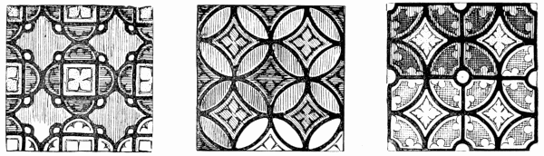
to substitute for it a diaper of geometric pattern. Other expedients
were occasionally adopted. There is a window at S. Denis in which there
is foliated scrollwork on a background of geometric diaper, although
this last is so much “restored” that, for all one can tell, Viollet le
Duc may be entirely responsible for it.
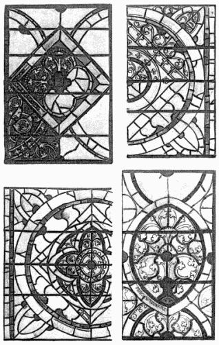
78. French Mosaic Diapers.
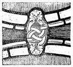 79. Canterbury.
At Soissons is a window in which the interspaces between the medallions
are filled with deep blue, broken only here and there by a spot of ruby;
at Poitiers also the ornament in spandrils is often just a quatrefoil or
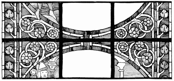
so, barely foliated, if at all; at Bourges there is an instance of
spandrils (page 125) occupied by bare curling stalks and
rosette-like flowers; at Poitiers the bands which frame the medallions
have a way of interlacing, not in the simple fashion shown in the
example from Canterbury below, but so as to form a kind of pattern in
the spandrils in front of the geometric filling; and there are other
variations on the accustomed medallion tunes; but as a rule the ornament
consists either of the usual Early Gothic foliation, closely akin to
that in the borders, such as is shown on pages 129, 130, 328, 330, or of
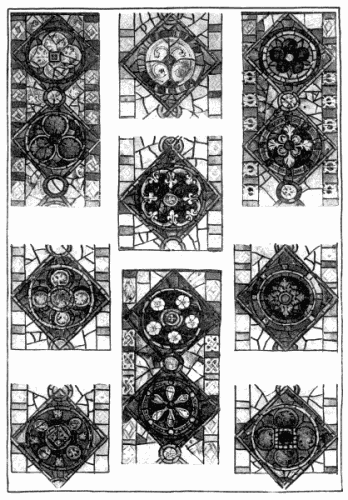
geometric pattern, such as is here given. The rarity of the mosaic
diaper in this country may be gathered from the fact that in the whole
series of Early medallion windows at Canterbury it is found only once,
its frequency in France from the fact that in the choir alone of Bourges
Cathedral it occurs in no less than twenty-two instances; again at
Chartres, out of twenty-seven great windows, not more than four have
scrollwork; at Poitiers, on the other hand, there is little geometric
diaper, but the ornament is of the simplest, and barely foliated. This
device of geometric diaper-filling was possibly inspired by the idea of
utilising the small chips of precious glass, which, with the then method
of working, must have accumulated in great quantity. In any case, it
must have been encouraged by that consideration, if not actually
suggested by it. Apart from economy, which is a condition of
craftsmanlike work, there does seem a sort of artistic logic in the use
of merely geometric design for quite subordinate filling, to act as a
foil to figure work; but there was no occasion to put the mosaic of
fragments quite so regularly, not to say mechanically, together, as was
the custom to do.
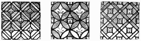
80. French Mosaic Diapers.
That is shown in a rather unusual instance in a window of the Lower
Church at Assisi; there occurs there a diaper of circles with blue
interstices, where the circles, though all alike painted with a star
pattern, vary in colour in a seemingly accidental way, and are red,
yellow, green, brown, just as it took the fancy of the glazier.
81. DETAIL OF MEDALLION WINDOW, CANTERBURY.
It follows inevitably from the small scale on which these
patterns are set out, and from the radiation of the coloured
light, that unless very great discretion is exercised the rays get
mixed, with a result which is often the reverse of pleasing.
And the worst of it was that the French glaziers particularly
affectioned a combination of red and blue most difficult to
manage. A very favourite pattern consisted of cross bands of
ruby (as above), enclosing squares or diamonds of blue, with
dots of white at the intersection of the ruby bands, which
persists always in running to purple.
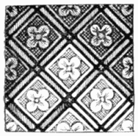 82. French Mosaic Diaper.
Instances of this unpleasant cast of colour are of continual
occurrence, but they are never otherwise than crude and plummy
in effect. The rather unusual combination of red and green
mosaic diaper occurs, however, pretty frequently at Carcassonne.
The diapers illustrated indicate the variety of geometric pattern
to be found at Bourges, Chartres, Le Mans, and Notre Dame
at Paris, and elsewhere. In proportion as there is in them a preponderance
of blue and ruby the effect is that of an aggressive
purple. The safest plan seems to be in associating with the
blue plenty of green, or with the ruby plenty of yellow glass;
or a similar result may be obtained by the choice of a deep
neutral blue and of an orange shade of red, taking care always
that the two contrasting colours shall not be of anything like
equal strength.
At the best these diapers compare very unfavourably with
scrollwork. They are, in the nature of things, more monotonous and less
interesting than a growth of foliage; they are apt also to run to gaudy
colour, which by its mass overpowers the pictures set in it. Compare, in
any French church, the windows in which there is geometric mosaic and
those in which there is scrollwork; and, though they may be all of the
same period, and presumably the work of the same men, you will almost
certainly have to marvel how artists who at one moment hold you
spellbound by the magic of their colour can in the next disturb your
eyesight with a glare of purple produced by the parody of a Scotch
plaid. Many of these diapers are very minute in scale; the smaller the
scale on which they are designed the greater the certainty of the
colours running together.
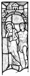 83. S. Peter delivered from Prison, Lyons.
It is to the very small scale of the figures, also, that the
confusion of effect in medallion subjects, in spite of their comparatively
flat treatment, is to be attributed. At Bourges, at
Canterbury, everywhere, the medallion subjects are on far too
minute a scale to be made out by mortals of ordinary patience,
or, to speak accurately, impatience. Often, even in windows
which come close enough to the eye for study, it is only the
more conventionally familiar pictures which explain themselves
readily; and those you recognise almost by anticipation. You
have no difficulty in deciphering the Nativity, the Crucifixion,
the Ascension, and so on, because you expect to find them.
A certain muddle of effect must be accepted as characteristic
of medallion windows.
It is not to be wondered at, that, considering the difficulty
of making out the ordinary medallion subjects in the lower
windows, where they are usually found, some other scheme of
composition should have been adopted for clerestory windows
where those would have been more than ever unintelligible.
Accordingly, in that position, the single figure treatment was
adopted, and carried further than in the preceding century.
The figure was now, not for the first time, but more invariably,
enclosed in something like an architectural niche—a practice
borrowed from the sculptor, who habitually protected the carved
figures enriching the portals of great churches by a projecting
canopy, giving them at the same time a pedestal or base of
some kind to stand upon.
In glass there was clearly no occasion for such architectural shelter or
support; but the pretended niche and base offered a means of occupying
the whole length of the space within the border, which, without some
additional ornament, would often have been too long in proportion to the
figure, the mere band of inscription under its feet not being enough to
fill out the length. These very rudimentary canopies, specimens of which
are given here, are usually very insignificant. It takes sometimes an
expert to realise that the broken colour about the head of the saint
(page 46) stands for architecture. The forms, when you come to look at
them closely, may be ugly as well as childish, but they go for so little
that it seems hardly worth while to take exception to them. It is only
as indication of a practice (later to be carried to absurd excess) of
making shift with sham architecture for the ornamental setting necessary
to bring the figure into relation and into proportion with the window it
is to occupy, that the device of thus enshrining a figure as yet
deserves attention. As the beginning of canopy work in glass it marks a
very eventful departure in design. All that need here be said about the
Early Gothic canopy is that it would have been easy to have devised
decorative forms at once more frankly ornamental, more interesting in
themselves, and more beautiful, not to say less suggestive of a child’s
building with a box of bricks.
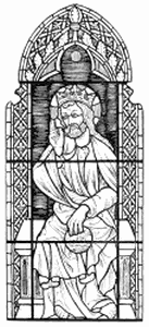 84. Lyons.
Sometimes, as at Chartres and elsewhere, the base of the canopy would
itself take the form of a little subordinate niche enclosing a
figure in small of the Donor, or perhaps only of his shield of arms.
Sometimes it would take the form of a panel of inscription, boldly
leaded in yellow letters upon blue or ruby.
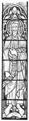
An alternative idea was to represent the Saints, or other holy
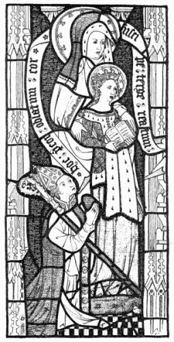
personages, sitting. The figure on page 135 belongs actually to
the beginning of the fourteenth century; but, except for a slightly
more naturalistic character in the drawing of the drapery, it
might almost have belonged to the same period as the standing
figure on page 46. In longer lights two saints are often
figured, sitting one above the other. This may be seen in the
clerestory at Canterbury; but the effect is usually less satisfactory
than that of the single figure on a larger scale. The
standing position is also much better suited to the foreshortened
view which one necessarily gets of clerestory windows. A curious
variation upon the ordinary theme occurs in four of the huge
lancets in the south transept at Chartres, where the Major
Prophets are represented each bearing on his shoulders an
Evangelist. The same idea recurs at Notre Dame, Paris, under
the south rose. That is all very well in idea—iconographically
it is only right that the Old Testament should uphold the New—but
reduced to picture it is absurd, especially as the Evangelists
are drawn to a smaller scale than the Prophets, and irresistibly
suggest boys having a ride upon their fathers’ shoulders.
Dignity of effect there can be none. Not now for the first time,
seemingly, is art sacrificed to what we call the literary idea.
It shakes one’s faith somewhat in the sincerity of the early
mediæval artist to find that in the serried ranks of Kings,
Prophets, Bishops, and other holy men, keeping guard over the
church in the clerestory lights, one figure often does duty for a
variety of personages, the colour only, and perhaps the face,
being changed. At Reims there are as many as six in a
row, all precisely of the same pattern, though the fraud may
not be detected until one examines them from the triforium
gallery. At Lyons, again, it looks as if the same thing
occurred; but one cannot get near enough to them to be quite
certain. None the less they are fine in colour. Thirteenth
century glass was capable of great things in the way of colour;
and the rows of Kings and Prophets looking down upon you
from the clerestory of a great church like Bourges, archaic
though the drawing be, are truly solemn and imposing.
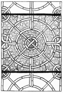 85. S. Serge, Angers.
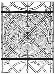 86. S. Serge, Angers.
With grisaille glass begins a new chapter in the history of
glass painting, and a most important one—not only because
of the beautiful work which was done from the first in white,
but also because coloured glass grew, so to speak, always
towards the light.
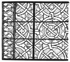 87. S. Jean-aux-Bois.
The first coloured windows were intense in colour, rich, and even heavy.
The note they struck was deep, solemn, suited to the church and to the
times. Neither priest nor parishioner was afraid to sacrifice a certain
amount of light. It was the business of a window to shut in those that
worshipped from the outer world, and wrap them in mysterious and
beautiful gloom. With other days, however, came other ideals. As time
went on, and men emerged from the dark ages, the problem of the glazier
was how more and more to lighten his glass; until at last white glass
predominated, and the question was how to introduce colour into it.
Meanwhile the thirteenth century glaziers resorted, where they wanted
light, to the use of windows in grisaille, in absolute contrast to the
rich picture-glass in the same church.
The model for grisaille design was readily found in the earlier pattern
work in plain glazing.
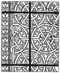 88. S. Jean-aux-Bois.
This last never quite went out of use. But already in the thirteenth
century, and probably in the twelfth, it began to be supplemented, for
the most part, by painting. The exceptionally graceful work at S. Serge,
Angers, for example, on this page and the last, is probably not very
much later than the year 1200. You can see at a glance how this is only
a carrying further of the unpainted work in the same church (page 27)
attributed to the thirteenth century. There may be found indeed amidst
the plain glazing scraps of painted work; but they never happen to fit,
and have pretty certainly found their way into the window in course of
repairs. The unpainted window seems to be of greener and more silvery
glass than the painted, to which perhaps the cross-hatching gives a
rather horny look.
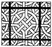 89. Soissons.
The one way of painting grisaille in the thirteenth century was to trace
the design (which of course followed the traditional lines) boldly upon
the white glass, and then to cross-hatch the ground, more or less
delicately according to the scale of the work and its distance from the
eye, as here shown. By this means the pattern was made to stand out
clear and light against the background, which had now the value of a
tint, only a much more brilliant one than could have been got by a film
or wash of colour. Very occasionally a feature, such as the group of
four crowns which form the centre of the circle, above, might be
emphasised by filling in the ground about them in solid pigment; but
that was never done to any large extent. The rule was always to
cross-hatch the ground.
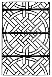
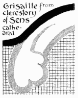 90. Early Detail.
With the introduction of colour into grisaille comes always the question
as to how much or how little of it there shall be. There is a good deal
of Early French work, which, on the face of it, was designed first as a
sort of strapwork of interlacing bands in plain glazing, and then
further enriched with painted work, not growing from it, except by way
of exception. This is seen in the example here given. The painter
indulged in slight modifications of detail as he went on. He had a model
which he copied more or less throughout the window; but he allowed
himself the liberty of playing variations, and he even departed from it
at times. By this means he adapted himself to the glass, which
did not always take just the same lines, and at the same time he amused
himself, and us, more than if he had multiplied one pattern with
monotonous precision. His painting was strong enough to keep the leads
in countenance; that is to say, his main outlines would be as thick (see
opposite) as lead lines.
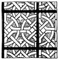 91. Soissons.
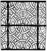 92. Reims.
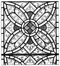 93. Lincoln.
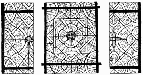
Patterns such as those on pages 138, 139, and below, from Soissons,
Reims, S. Jean-aux-Bois, would make good glazed windows apart from the
painting on them. Indeed, the painting is there comparatively
insignificant in design. In the Soissons work, in particular, it
consists of little more than cross-hatching upon the background, to
throw up the interlacing of the glazed bands; for, with the exception of
just a touch of colour in the one opposite, these designs are executed
entirely in white glass. The geometric glazing shapes so completely
convey the design, that the painted detail might almost be an
after-thought.
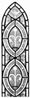 94. Water Perry, Oxon.
In much of the earliest grisaille there is absolutely no colour but the
greenish hue belonging to what we are agreed to call white glass, and
the effect of it is invariably so satisfactory as to show that colour is
by no means indispensable. And, at all events in France, the colour was
at first very
sparingly used, except in those twelfth century patterns (pages 35, 118,
120) which cannot fairly be called grisaille. In the window on page 137
the colour is, practically speaking, enclosed in small spaces
ingeniously contrived between the interlacing bands of white; in that on
page 138 it is introduced in half rings, which form part of the marginal
line, and in spots or jewels; but in either case there is little of it,
and it is most judiciously introduced. The interlacing of bands of plain
white upon a ground of cross-hatching, itself enriched with scrollwork
clear upon it, is characteristically French. Similar bands of white
occur, though not interlacing, in the comparatively clumsy panel from
Lincoln (above), but the more usual English way was to make the bands of
white broader, and to paint a pattern upon them, as in the lancet from
Water Perry, Oxfordshire (opposite), or in the much more satisfactory
light from Lincoln (overleaf), leaving only a margin of clear glass next
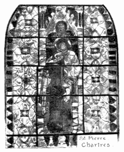
the cross-hatched background. A similar kind of thing occurs in the
church of S. Pierre at Chartres (below). A yet more usual plan
with us was to make the strapwork in colour, as at Salisbury. In the
patterns on this page the straps do not interlace. In that on page 143
they not only interlace one with the other, but the painted ornament,
which now takes the form of more elaborate scrollwork than heretofore,
is intertwined with them. This is an extremely good example of Early
English grisaille. Altogether Salisbury Cathedral is rich in white glass
windows of this period (pages 143, 148, 329, 332).
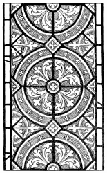 95. Lincoln.
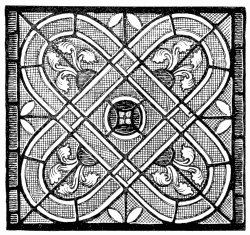 96. S. Pierre, Chartres.
The grisaille in the clerestory at Bourges is similar to the Salisbury
work, but it is not possible to get near enough to it to make careful
comparison. The scrollwork on page 143 may be profitably compared with
the very unusual white window at S. Jean-aux-Bois (overleaf). There the
design consists altogether of scrolls in white upon a cross-hatched
ground. It is as if the designer had set out to glaze up a pattern in
white upon a white ground, cross-hatched. But it is obvious that, as
there is no change of colour, it was no longer necessary always to
cut the ornament out of a separate piece of glass from the ground. We
find consequently that, wherever it is convenient, a painted line is
used to save leading. That, it has been already explained (page 24), was
a practice from the first; and it was resorted to more and more. It came
in very conveniently in the French windows, in which the design
consisted largely of white strapwork. It was adopted in the example from
Châlons here given, though it does not appear in the sketch, any more
than it does in the glass until you examine it very carefully. However,
in the sketches from the great clerestory window from Reims Cathedral
(overleaf), and in the smaller one from S. Jean-aux-Bois (facing it),
the economy of glazing is easy to perceive; whilst in that from
Coutances (page 147) the glazier is already so sparing of his leads that
they no longer always follow or define the main lines of the pattern.
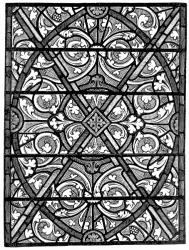
97. GRISAILLE, SALISBURY CATHEDRAL.
J. Akerman, Photo-lith, London.
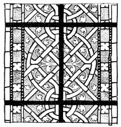 98. Châlons.
In a remarkable window in the choir of Chartres Cathedral (page 150) the
design includes interlacing bands both of white and colour, the coloured
ones flanked with strips of white; but the white bands are not glazed
separately. They are throughout included in the same piece of glass as
the cross-hatching, which defines them. This ingenious and very graceful
pattern window is still of the thirteenth century, though clearly of
much later date than, for example, the windows of S. Jean-aux-Bois,
which might indeed almost belong to the twelfth.
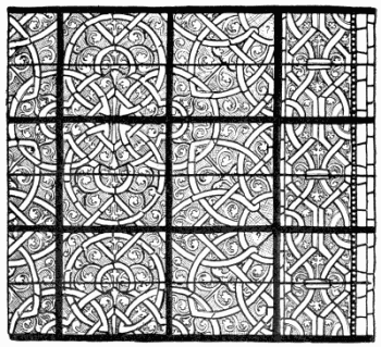 99. Clerestory, Reims.
In several of the Salisbury windows (pages 148, 386) thin
straps of colour are bounded on the outer side by broader bands
of white painted with pattern. And here it should be noticed
the bands no longer interlace at all; on the contrary, the
ornamental forms are superposed one upon the other. This is
very markedly the case on page 148. In the centre of the light
is a series of circular discs, and at the sides of these a row of
zigzags, which, as it were, disappear behind them, whilst at
the edges of the window, again, is an array of segments of
smaller circles losing themselves behind these. In such cases,
it will be seen, the broad white bands fulfil the very useful
purpose of keeping the coloured lines apart, and separating
one series of shapes from the other. In this window, as in the
narrow light on page 386, where the vesica shape is occupied
once more with flowing scrollwork, and as in all but one of
the windows on that page, the background of cross-hatching
is for the first time omitted, and the pencilled pattern is by so
much the less effective. As a rule, patterns traced in mere
outline like this belong to a later date; but these windows are
certainly of the thirteenth century. It is seldom safe to say
that this or that practice belonged exclusively to any one
period. The white glass on page 335, almost entirely without
paint, might have been executed in the twelfth century, but its
border indicates more likely the latter part of the thirteenth.
Quite the simplest form of glazing was to lead the glass together
in squares or diamonds. These “quarries,” as they are called
(from the French carré) are associated sometimes with rosettes
and bands of other pattern work, as at Lincoln (pages 284, 287);
but more ordinarily the ornamental part of the window is made
up entirely of them. “Quarry” is a term to be remembered.
It plays in the next century an important part in the design
of windows.
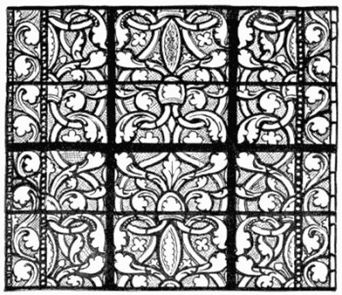
100. S. Jean-aux-Bois.
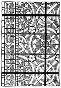 101. Coutances.
The best-known grisaille windows in England are the famous
group of long lancets, ending the north transept of York Minster,
which are known by the name of the Five Sisters.
You remember the legend about them. The “inimitable
Boz” relates it at length in “Nicholas Nickleby”; but it is
nonsense, all the same. The story tells how in the reign of
Henry the Fourth five maiden ladies worked the designs in
embroidery, and sent them abroad to be carried out in glass.
But, as it happens, they belong to the latter part of the
thirteenth century; they are unmistakably English work; and,
what is more, no woman, maiden, wife, or widow, ever had,
or could have had, a hand in their design. Their authorship is written
on the face of them. Every line in their composition shows them to be
the work of a strong man, and a practical glazier, who worked according
to the traditions that had come down to him. A designer recognises in it
a man who knew his trade, and knew it thoroughly. The notion that any
glazier ever worked from an embroidered design is too absurd. As well
might the needlewoman go to the glazier to design her stitchery. But
such is the popular ignorance of workmanship, and of its intimate
connection with design, that no doubt the vergers will go on repeating
their apocryphal tale as long as vergers continue to fill the office of
personal conductors.
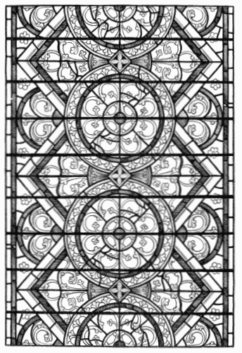
102. GRISAILLE, SALISBURY CATHEDRAL.
J. Akerman, Photo-lith, London.
The Five Sisters are rather looser and freer in design than the
Salisbury glass, and have broad borders of white. In detail they are
certainly not superior to that, nor in general design, so far as one can
make it out at all; but, from their very size and position, they produce
a much more imposing effect. Whoever is not impressed by the Five
Sisters is not likely ever to be moved by grisaille. They form one huge
fivefold screen of silvery glass. The patterns are only with great
difficulty to be deciphered. It is with these as with many others of the
most fascinating windows in grisaille; the glass is corroded on the
surface, black with the dirt and lichen of ages, cracked and crossed
with leads introduced by the repairing glazier, until the design is
about as intelligible as would be a conglomeration of huge spiders’
webs. But, for all that, nay, partly because of it, it is a thing of
absolute beauty, as beautiful as a spider’s
web, beaded with dewdrops, glistening in the sun on a frosty winter’s
morning. It is a dream of silvery light: who cares for details of
design? But it is all this, because it was designed, because it was
planned by a glazier for glazing, and has all that gives glass its
charm.
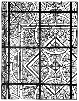
103. Chartres Cathedral.
Stained glass, like the men who design it, has always the
defects of its qualities. It is the first business of those who
work in it to see that it has at least the qualities of its defects.
The merry life of the medallion window was a short one. It
reigned during the Early Gothic period supreme; but after the
end of the thirteenth century it soon went quite out of fashion,
and with it the practice of shaping the bars to suit the pattern
of the window—a practice, it will have been noticed, not followed
in grisaille windows, though it might very well have been.
With the change which came over the spirit of later thirteenth
century architecture some new departure in the design of glass
became inevitable. The windows spoken of till now were all
single lights, broader or narrower, as the case might be, but each
so far off from the other that it had to be complete in itself, and
might just as well be designed with no more than general
reference to its neighbours. But in time it began to be felt in
France that the broad Norman window was too broad, and so
they divided it into two by a central shaft, or mullion as it is
called, of stone. In England equally it began to be felt that
the long narrow lancet lights were too much in the nature of
isolated piercings in the bare wall, and so the builder brought
them closer and closer together, until they also were divided
by narrow mullions.
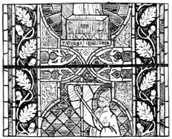 104. Decorated Medallion Window, German.
In this way, and in answer especially to the growing demand
for more light in churches, and consequently for more windows,
it became the custom to group them. Eventually the window
group resolved itself into a single window of several, sometimes
of many, lights, divided only by narrow stone mullions. Or, to
account for it in another way, windows of considerable size
coming into vogue, it became necessary, for constructional no
less than for artistic reasons, to subdivide them by mullions into
two or more lights. The arched window head was broken up
into smaller fancifully shaped “tracery” lights, as they are called;
and so we arrive at the typical “Decorated” Gothic window.
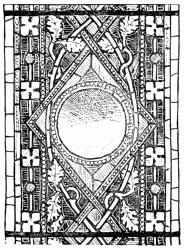 105. Freiburg.
The height of these windows being naturally in proportion to
their width, the separate lights into which they were divided
were apt to be exceedingly long. To have treated them after the Early
medallion manner, each with its broad border, would have been to draw
attention to this, and even to exaggerate their length. The problem now
to be solved in glass was, how best to counteract the effect of
insecurity likely to result from the thinness of the upright lines of
the stone and the narrowness of the openings between them. It is not
meant to say that the medallion window expired without a spasm. For a
while Decorated windows were treated very much after the fashion of the
earlier medallion windows. The medallions were necessarily smaller, and
usually long in proportion to their width, although they extended now to
the edge of the stonework, the narrowish border to the lights passing,
as it were, behind them. This is very amply illustrated in the windows
in the choir clerestory at Tours. Occasionally there is no border but a
line of white and colour, and the whole interval between the elongated
hexagonal or octagonal panels is given up to mosaic diaper. The
medallions naturally range themselves in horizontal order throughout the
three or four lights of the window, giving just the indication of a
horizontal line across them. By way of exception, the subject of the
Last Supper extends through all three lights of the East window, the
tablecloth forming a conspicuous band of light across it. This glass at
Tours is deep and rich throughout, as intense sometimes as in earlier
work, though warmer in colour, owing to the greater amount of yellow
glass employed. That was not to last long.
It lingered longest in Germany. There is a curious two-light
window in Cologne Cathedral, with queer rectangular
medallions, of considerable interest, which is probably not
very early in date. A not very common type of Decorated
medallion window is illustrated above. The cutting across the
border by medallion or other subjects, is a common thing in
fourteenth century glass (below and opposite), just because
such encroachment is obviously a most useful device in dealing
with narrow spaces. It occurs in some medallion windows
(also of the fourteenth century) at the church of Santa Croce,
at Florence.
106. DETAILS OF DEC. GERMAN GLASS.
But this was not enough. The Germans went a step further, and carried
the medallions boldly across two lights, treating them as a single
medallion window with a stone mullion instead of an iron bar up the
centre. There is an instance of this at S. Sebald’s Church, Nuremberg,
and another, more curious than beautiful to see, at Strassburg. They
went further still, and carried the medallions across a three-light
window. There is one such at Augsburg, where the medallions almost fill
the window, extending to the extreme edge of the outer lights. Indeed, a
broad outer border of angels surrounding the great circles is cut short
by the side walls. This is at least a means of getting rid of the
littleness resulting sometimes from the small medallion treatment, and
it is in fact most effective. The broad, sweeping, circular lines also
have the appearance of holding the lights together and strengthening
them.
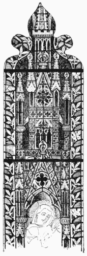 107. Typical Decorated Canopy.
This was a thing most needful to be done in Decorated glass. It was
needed sometimes already in Early work. At Clermont-Ferrand the narrow
lancets at the end of the South transept are filled, except for a thin
white beaded border, with diaper work in rich colour, interrupted at
intervals by big rosettes of white, which form two bands of light across
the series, and make them seem one group.
The deliberate use of horizontal lines (or features giving such lines)
in glass, was clearly the most effective way of counteracting the too
upright tendency of the masonry, or rather of preventing it from
appearing unduly drawn out; and it became the custom. Even in a
comparatively small Decorated window, for example, the figures would
usually form a band across it, distinguished from the ornamental
shrinework above and below it by a marked difference
in colour. In a taller window there would be two, or possibly three,
such bands of figures, in marked contrast to their framing. In Germany
very often one big frame would cross the window, or the figure subjects
would be separated—as at Strassburg, for example—by bands of
arcading, out of which peeped little saints each with a descriptive
label in his hand.
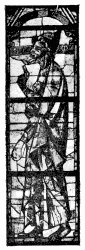 108. S. Urbain, Troyes.
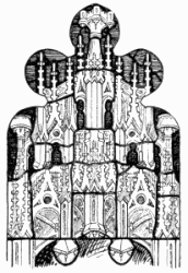
A typical English canopy of the period is given on this page. It was
commonly enclosed, as here shown, within a border, wide enough to be
some sort of acknowledgment of the subdivision of the window, but not
wide enough to prevent the colour of the canopy from forming a distinct
band across the window. The predominance of a powerful, rather brassy,
yellow in the canopy work, and a contrast in colour between its
background and that of the figures, carried the eye without fail across
the window. A notable exception to the usual brassiness of the Decorated
canopy occurs at Toulouse, where a number of high-pitched gables of the
ordinary design, stronger in colour than usual, have crockets and
finials of a fresh bright green.
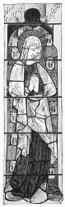 109. New College, Oxford.
The Decorated canopy, with its high-pitched gable and tall
flying buttresses, its hard lines, and its brassy colour was a
characteristic, but never a very beautiful feature in design; and it
grew to quite absurd proportions. It was in Germany that it was carried
to greatest excess, extending to a height three or four times that of
the figure and more; but with us also it was commonly tall enough
altogether to dwarf the poor little figure it pretended to protect. Even
when it was not preposterously tall, its detail was usually out of all
proportion to the figure. Your fourteenth century draughtsman would have
no hesitation in making the finial of his canopy bigger than the head
(nimbus and all) of the saint under it. Clumsiness of this kind is so
much the rule, and disproportion is so characteristic of the middle of
the fourteenth century, that, but for some distinctly good ornamental
glass of the period, one might dismiss it as merely transitional, and
not worthy of a chapter to itself in the history of glass design.
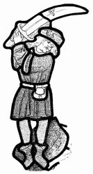 110. Executioner of S. John the
Baptist, 14th Century.
110. Executioner of S. John the
Baptist, 14th Century.
Our distinctions of style, as was said, are at the best arbitrary. We
may devise a classification which shall serve to distinguish one marked
type from another, but it is quite impossible to draw any hard-and-fast
line between the later examples of one kind and the earlier of another
one. We may choose to divide Gothic art into three classes, as we
may subdivide the spectrum into so many positive colours, but
the indeterminate shades by which they gradate each into the other defy
classification or description.
Certainly the best figure work of the middle period is that which might
quite fairly be claimed as belonging, on the one hand, to the end of the
Early, or on the other to the beginning of the Late, Gothic period. In
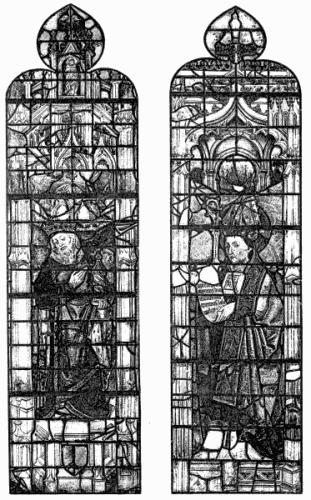
the figures from Troyes, for example (page 47 and opposite), the Early
tradition lingers; in those from New College (also opposite) the
characteristics of Late work begin to appear. In the figure of the
headsman on this page there is certainly no sense of proportion. In all
the wealth of Decorated figure-and-canopy work at York Minster there is
nothing to rank for a moment with the best Early or Perpendicular glass.
Nor in France, though there is Decorated work in most of the great
churches, is there anything conspicuously fine. Even at S. Ouen, at
Rouen, there is nothing particularly worthy of note. It is true that the
period of the English occupation and the troubles which followed it was
not the time when we should expect the arts to flourish there.
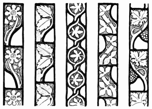
111. Decorated Borders.
A most characteristic thing in glass of this intermediate
period was the way in which colour and grisaille were
associated. It has been already told how, before then, white
and colour had been used together in the same light—at
Auxerre, for example, where, within a broad border of colour,
you find an inner frame of grisaille, enclosing a central figure
panel of colour. Quite at the beginning of the fourteenth century,
if not already at the end of the thirteenth, you find, as at
S. Radegonde, Poitiers, upon a ground of grisaille, coloured
medallion subjects, or more happily still, little figures, as it were,
inlaid, breaking the white surface very pleasantly with patches
of unevenly but judiciously dispersed colour—the whole enclosed
in a coloured border. But in the fourteenth century the more
even combination of white and colour was quite a common
thing. Naturally it was introduced in the form of the
horizontal bands already mentioned. And indeed it is in
windows into which grisaille enters that this band-wise distribution
of design is most apparent, and most typical. The
designer very commonly conceived his window as in grisaille,
crossed by a band or bands of colour, binding the lights together.
That may be seen in the chapter-house at York, where you
have several series of little subjects, more or less in the shape
of medallions, forming so many belts of colour across the
five-light grisaille windows, which belts the eye insensibly
follows right round the building.
That is the theory of design. Its practical construction may
be better described otherwise. The iron horizontal bars, to
the use of which the glaziers had by this time come back,
divide the lights each into a series of panels, which panels are
filled at York alternately with coloured subjects and ornamental
grisaille. Elsewhere perhaps two panels are filled with colour
to one of grisaille, or three to one, or vice versâ. In any case
these alternate panels of white and colour, occurring always
on the same level throughout the lights composing the window
(and often through all the windows along the aisle of a church),
range themselves in pronounced horizontal strips or bands.
112. GRISAILLE AND FIGURE.
This acceptance of the bars as a starting-point in design, and this
deliberate counterchange of light and dark, may appear to indicate a
very rough-and-ready scheme of design. But any brutality there might be
in it is done away with by the introduction of a sufficient amount of
white into the coloured bands and of a certain modicum of colour in the
bands of white. And that was habitually the plan adopted. Into the
subjects it was easy to introduce just as much white as seemed
necessary. A little white might be there already in the flesh, which was
no longer always represented in flesh-coloured glass but more and more
commonly in white. The usual border at the sides of the
grisaille—now reduced to quite modest proportions—perhaps a
simple leaf border, as on pages 44, 158, perhaps a still simpler “block”
border, as above, served to frame the white, at the same time that it
was an acknowledgment once more of the fact that each light forms a
separate division of the window. In most cases the introduction of a
little colour into the grisaille panel, very often in the form of a
rosette, went further to prevent any possible appearance of
disconnection between the figures and their ornamental setting. As a
matter of fact, so little obvious is the plan of such windows in the
actual glass that it often takes one some time to perceive it.
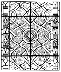 113. Evreux.
In the nave at York Minster the grisaille is crossed by two
bands of coloured figure work. Elsewhere it is crossed by one;
but where the figures have canopies, as they often have, that
makes again a horizontal subdivision in the coloured portion
of the glass. Sometimes the topmost pinnacles of the coloured
canopies will extend into the grisaille above, breaking the
harshness of the dividing line; but it is seldom that it appears
harsh in the glass. The fact seems to be that the upward
tendency of the long lights is so marked, and the mullions
make such a break in any cross line, that there is no fear
of horizontal forms pronouncing themselves too strongly; the
difficulty is rather to make them marked enough. Architects
came eventually to feel the want of some more sternly
horizontal feature than the glazier could contrive, when they
introduced the stone transom, which was a feature of the later
Gothic period.
When it was a question of glazing a broad single light of
earlier construction, the fourteenth century artist designed his
glass accordingly. Not that he then adopted the thirteenth
century manner—it never entered his mind to work in any other
style than that which was current in his day; the affectation of
bygone styles is a comparatively modern heresy—but he adapted
his design equally to help, if not to correct, the shape of the
window opening. Accustomed as he was to narrower lights, the
broad window of an earlier age appeared to him unduly broad,
and his first thought was to make it look narrower. This he did
by dividing it into vertical (instead of horizontal) strips of white
and colour. That is shown in the window from Troyes (page
159), in which the centre strip of the window, occupied by figures
and canopies in colour, is flanked by broad strips of grisaille,
and that again by a coloured border. There, as usual, you find
some white in the figure work and some colour in the grisaille,
always the surest way of making the window look one.
The judicious treatment of a belated lancet window like this
goes to show that it was of set purpose that the tall lights of a
Decorated window were bound together by ties of coloured
glass. So long as windows were built in many lights, that plan
of holding them together was never abandoned. There is a
very notable instance of this at Berne, where the four long lights
of a Late Gothic window are crossed by lines of canopy work,
taking not horizontal but arched lines (a device common enough
in German glass), effectually counteracting the lean and lanky
look of the window. Still markedly horizontal lines of subdivision
in glass design are more characteristic of the second
Gothic period than of any other.
Towards the fourteenth century, it seems, a wave of realism
swept over Gothic art. So much is this so that a relatively
speaking naturalistic form of ornamental detail is the most
marked feature of the Decorated period, giving it its name, and,
indeed, its claim to be a style.
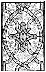 114. Norbury, Derbyshire.
 115. S. Pierre, Chartres.
No great stress has been laid in the foregoing chapters upon this new
departure in naturalism, because it did not so very vitally affect
design. When it is said that glass followed always the fashion of
architecture, that is as much as to say that, as the sculptors took to
natural instead of conventional foliage, so did the glass painters; and
there is not much more to tell. To trace the development of naturalistic
design would lead us far astray. Enough to say that, by the naturalistic
turn of its ornamental foliage you may recognise the period called
“Decorated.” How far that naturalism of Decorated detail may be to the
good is a question there is no need here to dispute. It was a
new departure. The new work lacked something of the simple dignity and
self-restraint which marked the earlier, and it had not yet the style
and character which came in the next century of more consistently
workmanlike treatment. In so far it was a kind of prelude to
Perpendicular work. This is not to deny that excellent work was done in
the Decorated period, especially perhaps in glass, where naturalism, at
its crudest, is less offensive than in wood or stone. But there is no
getting over the fact that the period was intermediate; and Decorated
glass is in a state of transition (1) between the archaism of the early
and the accomplishment of the later Gothic; (2) between the conventional
ornament which merely suggests nature and natural foliage conventionally
treated; (3) between strong rich colour and delicate silvery glass. The
transition of style is nowhere more plainly to be traced than in the
grisaille of the period. At first the character of fourteenth century
grisaille did not greatly differ from earlier work, except in the form
of the painted detail. That from S. Urbain, Troyes, on page 333, is a
typical instance of Early French Transition foliage, in which the scroll
is only less strong and vigorous than before. Precisely the same kind of
detail is shown again in the lower of the two instances, likewise from
Troyes, opposite; but already natural leaves begin to mingle with it;
whilst in the illustration above it, though the mosaic border is
characteristically early, the foliage in grisaille is deliberately
naturalistic. The grisaille at Troyes, by the way, often reminds one of
that at York Minster. It is mainly by the naturalistic character of the
ivy scroll, or perhaps it would be nearer the mark to say of the leaves
upon it, that the design from Norbury, Derbyshire (page 162), betrays
its later date, by that and the absence of cross-hatching on the
background. The glazing of the window is still thoroughly
mosaic.
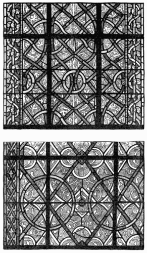
116. DEC. GRISAILLE, S. URBAIN, TROYES.
J. Akerman, Photo-lith, London.
117. Chartres.
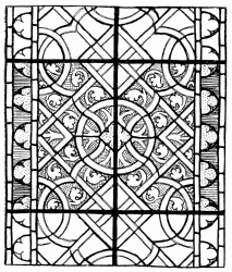 118. Evreux.
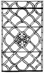 119. Rouen Cathedral.
There is a different indication of transition in the little panel
from S. Pierre at Chartres, almost entirely in white glass, on
page 163. The foliated ornament is here still early in character;
but, it will be seen, there is no longer any pretence of leading
up the bands of clear glass in separate strips. They are only
bounded on one side by a lead line. That is so again in the
three designs from Chartres Cathedral above, where, further,
the background is clear of paint; and in those from Evreux,
on pages 165, 284. There the background is cross-hatched;
but in one case the foliage is naturalistic.
The coloured strapwork in the grisaille from the Lady Chapel of Rouen
Cathedral on page 165 is frankly mosaic; but the foliated ends of the
straps, gathered together into a central quatrefoil in a quite unusual
fashion, indicates the new spirit. The white glass is there painted with
trailing foliage in outline upon a clear ground, not shown in the
sketch, which is merely a diagram of the glazing. The grisaille from
Stanton S. John, Oxford, here given, still hesitates rather between two
opinions. The foliage is naturalistic, but the background is
cross-hatched; the broad diagonal bands, patterned with paint, are
glazed in colour; the rings of white are not separately leaded. That
sort of thing has occurred, as already pointed out, before; but it was
not till the fourteenth century, or thereabouts, that the strapwork of
white lines, forming so characteristic a feature in Decorated grisaille,
are systematically indicated by painted outlines and not glazed in if it
could be helped.
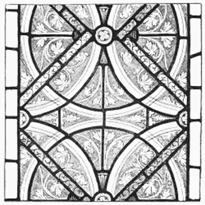 120. Stanton S. John, Oxford.
You have only to examine the crossing of the white lines
in any of these last-mentioned patterns to see that, now that
they are not separately glazed, they do not really interlace
as before. It is out of the question that they should.
It is easy enough to glaze up bands so that they shall interlace; but,
when some of the drawing lines are lead and some paint, it occurs
continually that you want a leaded line to pass behind a line
of clear glass—which, of course, is a physical impossibility. It
follows that the pretended interlacing comes to grief. The pattern is
confused (it is worse when there is no hatched background) by the
occurrence of leads, stronger than the painted lines, which, so far from
playing any part in the design, occur just at the points where they most
interfere with it.
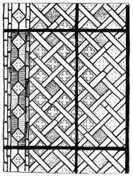 121. Châlons.
That this did not deter them, that they made a shift with interlacing
which does not truly interlace, marks a falling off in what may be
called the conscientiousness of the Gothic designers. French and English
Decorated grisaille, effective as it often is in the window, is
distinctly less satisfactory in design than the common run of earlier
work. Its charm is never in its detail.
The patterns may be ingenious and not without grace, but they are never
altogether admirable, any more than are the figures.
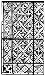 122. Châlons.
What you most enjoy in it is the distribution of white and colour; and
you enjoy it most when you do not too curiously examine into the detail
of the design, when you are satisfied to enjoy the colour, and do not
look for form, which after all is of less account in glass.
So far as effect only is concerned, quarry work, the mere glazing in
squares, answers in many places (such, for example, as the clerestories
of narrow churches, where you could not possibly enjoy any detail of
design that might be there) all the purpose of grisaille; and it was
commonly resorted to. But the painting upon such quarries counts for
very little; it is far too small and fine in detail to have any effect
further than to tone the glass a little, which would have been
unnecessary if the glass employed had been less clear. In fact, delicate
paint on distant clerestory glass is much ado about very little; and one
cannot help thinking that plain glazing would there have answered all
the purpose of the most delicately painted pattern work. The fourteenth
century glaziers seldom complicated their quarry work by the
introduction of bands or straps of colour between the quarries, or by
the introduction of colour other than such as might occur in rosettes or
shields and so on, planted upon them, rather than worked into the
design. Occasionally, however, as at Châlons-sur-Marne, you come upon an
ornamental window (page 167) in which quarries are separated by bands of
clear white, a certain amount of colour being introduced in the form of
yellow quarries substituted at regular intervals for the white. On the
same page is another coloured diaper window designed on quarry lines,
also at Châlons. In that quarries of white and yellow are separated by a
trellis of blue. Something of the sort is to be seen also at S.
Radegonde, Poitiers.
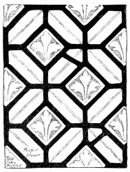 123. Regensburg.
In these cases the painting, as will be seen, is strong enough
to hold its own at a considerable distance from the eye, but the
effect is not very happy. When, by the way, it was said that
delicate painting on distant quarries was lost, it was not meant
to imply that strong painting on quarries would be a happy
solution of the difficulty. As a matter of experience, it is seldom
satisfactory. On the other hand, the common expedient of
leading up the coloured backgrounds to figure work in small
squares of ruby, green, and so on, was generally the means of
securing good broken colour.
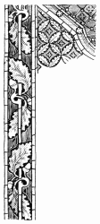 124. Munich Museum.
It can hardly be said that geometric pattern windows in strong
colour are ever very successful. The Germans, who, it should be
remembered, call their second Gothic period the “Geometric,”
often attempted it, but without conspicuous success.
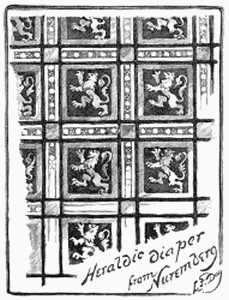 125. 14th Century German.
In Germany it was customary to use geometric diaper work long after it
had gone out of use in France. In fact, it is there more likely a sign
of the second period. The crosslines in the diaper from Regensburg
(opposite) would have been in lead, not paint, if the work had been
executed in the thirteenth century; again, the diaper below it would not
at that period have been painted in the likeness of oak-leaves. Diaper
of this kind was not used merely to fill up between medallions, but as
background, for example, to canopy work. Frequently it was very small in
scale, as well as elaborate in pattern. It can hardly be said
that it was always worth the pains spent upon it—often it was not;
but the Germans avoided, as a rule, the dangerous red and blue
combination, and preferred, as did also the Italians, less stereotyped
arrangements of green and yellow, or of red and green, or of red and
green and yellow; if they ventured upon red and blue, it was with a
difference very much to their credit. For example, they would enclose
diamonds of ruby in bands of purple-brown, with just a point of blue at
the interstices; again, they would make a diaper of purple,
purple-brown, and grey; and in many another way show that they
deliberately aimed at colour in such work—whereas many of the
Early diapers suggest that the glazier was thinking more of pattern. An
instance of heraldic diaper is given on page 169.
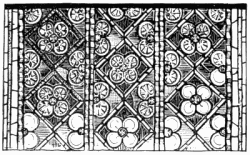 126. Freiburg.
In Italy also you find sometimes, as at Florence and Assisi, medallion
windows with mosaic diaper between, or mosaic diaper used as background
to figures which certainly cannot be described as Early.
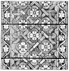 127. Freiburg.
The Germans differed from the rest of us in their frank use of geometric
pattern. We habitually disguised it more or less, clothing it most
likely with foliation; they used it quite nakedly, and were not ashamed.
Instances of this innocent use of geometric form are here given. At
Freiburg are quite a number of windows entirely of geometric
pattern work. There is a good deal of white glass in them, but they
count rather for colour than for grisaille. It would not be quite unfair
to say they fall between the two stools. These designs are much more
pleasing in the glass than in black and white (where they have rather
too much the appearance of floor-cloth), but they are by no means the
happiest work of the Germans of that day. Where they were really most
successful, more successful than their contemporaries, was in foliated
or floral pattern windows, and those of a kind also standing dangerously
near midway between colour and grisaille. The method of execution
employed in them was to a large extent strictly mosaic; but there is
quite a refreshing variety and novelty, as well as very considerable
ingenuity, in their design.
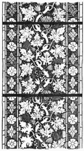 128. From Regensburg, Munich Museum.
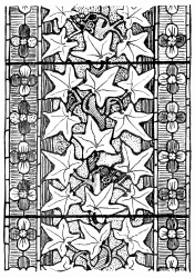 129. Ivy—Munich Museum.
The window from Regensburg on page 389 sets out very much as if it were
going to be a grisaille window; but it has, in the first place, more
colour than is usual in grisaille, and, in the second, it will be seen
that the little triangular ground spaces next the border are filled with
pot-metal. The contrast of the set pattern and the four coloured leaves
crossing each circle with the flowing undergrowth of grisaille is
unusual, and so is the cunning alternation of cross-hatching
and plain white ground. The designs from Munich Museum on pages 171 to
174 have nothing in common with grisaille. The design consists of
natural foliage chiefly in white, growing tree-like upon a coloured
ground up the centre of the light. In the one the stem is waved, in the
other it takes a spiral form, in the third it is more naturalistic. But
nature is not very consistently followed. What appears like a vine on
page 171 has husks or flowers which it is not easy to recognise; and the
ivy here is endowed with tendrils. The border of convolvulus leaves and
the hop scroll, opposite, are unmistakable, though there is some
inconsistency between the naturalness of the leaves and the stiffness of
their growth. The ivy pattern differs from the others inasmuch as the
leaves show light against the yellow ground, whilst the green stem and
stalks tell dark upon it, and there is a band of red within the outer
border which holds the rather spiky leaves together. The most
interesting window of this kind illustrated is that on page 174, in
which the stem is ingeniously twisted into quatrefoil medallion shapes,
so as to allow a change in the colour of the ground, and the leaves are
designed to go beyond the filling and form a pattern upon the border.
The rose is a hackneyed theme enough, but this at least is a new way of
working it out. Fourteenth century German windows are altogether more
varied in design than contemporary French or English work. The glass
is not so much all of one pattern. There are more surprises in it. The
Germans treated grisaille in a way very much their own. At the risk of a
certain coarseness of execution, they would paint out the background to
their natural foliage in solid pigment, or in brown just hatched with
lines scratched through to the clear glass. That is very effectively
done, for example, at the Church of S. Thomas at Strassburg. It is not
contended that this is at all a better plan than that practised in
France or England: it is on the whole less happy; but there are
positions in which it is more to the purpose; and it has at least the
merit of being different; it suggests something better than it
accomplishes, and it is a timely reminder that the best methods we know
of cannot be accepted as final.
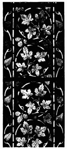
130. GERMAN ORNAMENTAL GLASS.
Again at Regensburg there is some distant ornamental work, so simple in
execution that it is little more than glazing in colours; in fact just
what distant work should be—effective in its place without any
waste of labour.
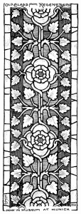 131. 14th Century Glass.
A word or two remains to be said about borders. The narrower decorated
light implied, as was said, a narrower border. It was, as a rule, only
when a wide Early window had to be glazed that there was room for a
broad one. In that case it showed of course the new naturalism, with
perhaps the added interest of animal life, as
here illustrated; but there lingers in German borders such as this and
the one on page 338, something of early tradition. It looks as if it
would not be difficult to accept glazing lines like these and fill them
in with painted detail à la Romanesque. In one of the windows in York
Minster there is a border of alternate leaves and monkeys, both much of
a size, which broadens out at the base, affording space for the
representation of a hunt, men, dogs, grass and all complete.
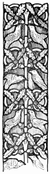 132. 14th Century German.
There was another reason for the adoption of a narrower border. Not only
were windows narrower now, but their arched heads were cusped, which
made it exceedingly difficult to carry any but the narrowest possible
border round them satisfactorily. It will be seen how awkwardly the
border fits (or does not fit) the window head on page 155. Even the
simplest border had to be very much distorted in order to make it follow
the line of the masonry; and, in any case, it gave a very ugly shape
within the border, and one again difficult to fill. Already, at the
beginning of the fourteenth century, the designer found it convenient to
run his border straight up into the cusped head of the light and let the
stonework cut it abruptly short; that occurs at Carcassonne. Sometimes,
as at Tewkesbury, the inconvenient border is allowed to end just above
the springing line of the arch, against a pinnacle of the canopy, beyond
which point there is only a line or two of white or colour, by way of
frame or finish to the background. An unusual but quite satisfactory way
of getting over the difficulty of carrying the border round the window
head is, to accept the springing line of the arch as the end of
the central design, and to make the foliated border spread and fill the
entire window head above. Some quarry lights in the triforium at Evreux
are effectively treated in that manner.
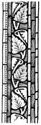 133. 14th Century German.
Types of ordinary Decorated borders, English, French, and German, are
shown in this and the preceding chapter. The leafage springs from one
side or the other or from a central stem, or from either side of a
waving stem, or from two stems intertwined (page 158). Sometimes the
ground on one side is of a different colour from that on the other; in
any case the glazing is usually simple. One of the leaf borders at Rouen
Cathedral includes a series of little green birds; another, an oak
pattern, is inhabited at intervals by squirrels and wild men of the
woods. Rather interesting variations upon the ordinary type of border
are given on this and the preceding pages. The broader one above is of
distinctly unusual character, inasmuch as it has no background except
the painting out, and the colour of the leafage varies
quasi-accidentally.
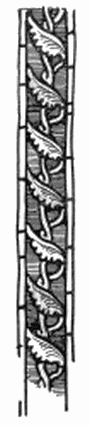 134. Strassburg.
The use of the rosette borders on pages 171, 172 is sufficiently
accounted for by the desire to get contrast to the foliated filling, but
it occurs at all periods more or less. So does the "block border"; but
for all that it is almost as characteristic of Decorated work as the
leaf border. It is seen in its simplest form on page 144. On page 389 it
is associated with foliage and rosettes. A typical form of it is where
the blocks are charged with heraldic devices, which may serve to
indicate the date, or to confuse one. In the design from Evreux on page
160 there occur, for example, the Fleurs-de-Lys of France alternating
with the Castle of Castille. These particular charges occur
frequently in the windows of the S. Chapelle at Paris, and in the lights
from that source now in the South Kensington Museum; and they go perhaps
to show that Blanche of Castille (who married Louis VIII.) gave them to
the chapel, or that they were in her memory. She died in 1252. It is
most improbable that the Evreux glass should belong to so early a date
as that. Were it so, the occurrence of this kind of thing in such early
work would only go to show that heraldic devices are as old as heraldry,
and that when the glazier had a narrow light to fill he treated it as a
narrow light, with a border in proportion to its width: he certainly did
that at the S. Chapelle. The fact remains that this particular form of
“block” border marks, as a rule, the approach of the fourteenth century.
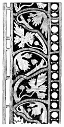 135. 14th Century German.
It may be as well to remind the reader that dates and periods
are only mentioned in order to save circumlocution. When
the thirteenth century is mentioned, it is not meant to convey
the year 1201, nor yet 1299, but the century in its prime. And,
what is more, it is not meant to say that the work ascribed to
that period was quite certainly and indisputably done after the
year 1200 or before the year 1300, but only that it bears the
mark of the century—which, from the present point of view, is
the important thing. The precise and certain year in which this
or that device was by exception for the first time employed, or
until which by chance a practically obsolete practice survived,
is interesting (if it can be ascertained) only as a question of
archæology. Anyway, a workman would rather believe the
evidence of his eyes, which he can trust, than of documents,
which, even if authentic, may not be trustworthy, and which are
perhaps open to misinterpretation.
Typically Decorated glass, apart from the ornamental windows
just referred to, is the least interesting of Gothic. There is in it a
straying from Early tradition without reaching the later freedom
and attainment. In colour it has neither the strength of the
Early work nor the delicacy of the Late. It marks some progress
in technique, but little in design, and none in taste.
The subdivision of art into periods is in reality the veriest
makeshift. To be on quite safe ground we should have, as
a matter of fact, to reduce our periods to not more than half
their supposed duration, and to class all the rest of the time as
belonging to intervals of transition.
The truth is, it is always a period of transition. The stream
moves perpetually on; there are only moments in its course
when it seems to move more slowly, and we have time to fix
its characteristics. It follows that, if we divide our periods
according to time, we have to include within them work of
very various character; and if we divide them according to
style, our dates get hopelessly confused.
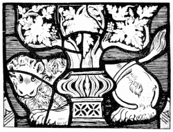 136. Pedestal, Wells.
Some sort of classification is necessary in order to emphasise
changes which actually took place only by degrees, and are perceptible
only to the expert. But no sooner do we begin to classify,
than we find so many exceptions, that we are inclined almost to
wonder if they do not form the rule. All that has been said,
therefore, and may yet be said, about the periods of design,
must be taken with more than a grain of suspicion. For
example, what shall be said about the great East window at
Gloucester Cathedral, which Winston instances as a typical
example of Decorated glass? Doubtless the technique is that
of soon after the middle of the fourteenth century, and the
detail of the canopies, when you come to examine them, is
more nearly Decorated than anything else; but the first impression
of the glass is quite that of Perpendicular work. This
may come partly of the circumstances that the masonry of
the window follows already distinctly Perpendicular lines; but
it comes much more from the colour of the glass and its
distribution. It is not merely that blue and ruby backgrounds
are carried straight up through the long lengths of each alternate
light, or that the blue is lighter and greyer than in
Decorated glass, but that the figures, and especially the canopies,
are for the first time, practically speaking, altogether in white,
only very slightly relieved with yellow stain. The student who
accepted this as typical Decorated work, would be quite at sea
when he came to Perpendicular glass, in which this paler colour,
this preponderance of white, and especially this framing of the
figures in white canopy work, is a most distinctive, if not the
most distinctive, feature. After all, the window is Perpendicular;
and, though the glass in it may have many characteristics of
Decorated work, it cannot well be said that the glass is Decorated,
true though it be that glass did, as a rule, follow rather in
the wake of architectural progress.
Many windows are almost equally difficult to classify. In the Decorated
glass at Wells there are both earlier and later features. The heads
glazed in pinkish glass, with eyes and beards leaded up in white, strike
an Early note, whilst the broadly treated bases or pedestals of certain
canopies in the Lady Chapel, one of which is here shown (the canopies
themselves are strictly Decorated), prelude the coming style.
137. CANOPY, NEW COLLEGE, OXFORD.
These bases remind one of those in the ante-chapel at New College,
Oxford, dating from the last quarter of the fourteenth century, which,
though it is not difficult to trace in them the lingering influence of
Decorated tradition, must undoubtedly be put down as early examples of
the later style. In these fine windows (upon which the tourist turns his
back whilst he admires the poor attempt of Sir Joshua Reynolds in the
West window) there is not yet the accomplishment of full-fledged
Perpendicular work. The figures, though full of fine feeling, are not
well drawn, and the painting is not delicate; but the design of the
glass, its setting out, the balance and arrangement of colour, the tone
of the windows, and the breadth of effect, are admirable; and it is
precisely in these respects that it proclaims itself of the later school
of Gothic. Indeed, we may assume that it was in order
to include such work as this that the line was drawn at the year 1380.
To class it with Decorated glass would have been too absurd. Compare the
New College canopy on page 180 with the Decorated canopy on page 155 and
the more orthodox Perpendicular canopies below and on pages 185, 340,
and there is no possible hesitation as to which it most resembles. The
only thing in which it shows any leaning towards Decorated work is in
the very occasional introduction of pot-metal colour; and the main thing
in which it differs from later Perpendicular design is that its shafts
are round instead of square, and that it is more solidly built up,
larger, more nobly conceived.
A parallel French instance is at the S. Chapelle at Riom, in which
canopies, having at first sight all the appearance of typically Late
Gothic work, prove to have details which one would rather describe as
Decorated. The German canopy work at Shrewsbury (pages 183, 186) is not
very far removed from Decorated. The later Perpendicular canopies run to
finikin pinnacles.
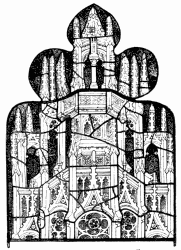 138. Typical Perpendicular Canopy.
The New College canopies have none of the brassy yellow
colour characteristic of Decorated work, but are absolutely
silvery in effect. The gradual dilution, as one may say, of the
deep, rich, Early colour is noticeable throughout the fourteenth
century. Towards its close the glass painter halts no longer
between two opinions, between light and colour. He has quite
made up his mind in favour of white glass. He has come pretty
generally to conceive his window as a field of white, into which
to introduce a certain amount of rich colour, not often a very
large amount. As a rule, perhaps not more than one-fourth
of the area of a fifteenth century window was colour; for, in
addition to the white of the canopy, there was commonly a fair
amount of white in the draperies, and the flesh was now always
represented by white. The typical Perpendicular window, then,
is filled with shrinework in white, enclosing figures, or figure
subjects, into which white enters largely (the flesh and some of
the drapery, often a good deal, is sure to be white), upon a
background of colour. Not much of this coloured background,
most often in blue or ruby, and sometimes deep in colour, was
ordinarily shown, so fully was the space occupied by figure
work. Sometimes there would be represented, behind the
figure, a screen of white, so that only the head and shoulders
would stand revealed against dark colour. Sometimes this
screen would be in colour, contrasting with the background,
richly diapered in imitation of damask (page 342). Sometimes
the background would be white, leaded perhaps in quarries;
but in any case the prevalent scheme of design was to frame up
pictures, more or less in colour, in architectural canopy work of
white and stain. Yellow stain, it should be said, was freely
used in connection with all this white; and its invariable association
therewith is one of the marked characteristics of Later
Gothic glass; but as a rule the yellow was not only delicate in
tint but delicately introduced, so that it did not much disturb
the effect of white. There were significant passages of yellow
in it, but the effect of the mass was cool and silvery.
In canopies yellow stain was used as gold might be in stonework,
which the canopies imitated; crockets and pinnacles
would be tipped with yellow, as with gilding (see opposite),
and the reveal of the arch, shown in false perspective above the
figure, would be similarly stained, so as to soften the transition
from the dark colour of the background to the white of the
canopy mass.
139. FIGURE AND CANOPY, S. MARY’S, SHREWSBURY.
J. Akerman, Photo-lith, London.
One comes upon windows, probably of about the beginning
of the end of the fourteenth century, in which the colour
scheme is practically limited to red, white, and blue, the yellow
being, comparatively speaking, lost in the white. Again, one
finds windows in which the colours are much lighter than in
earlier glass. But as a rule the lighter colours now introduced
(the glazier’s palette was by this time quite extensive) were used
to support, and not to the exclusion of, the richer and deeper
colour, which is the glory of glass, seldom to be dispensed with
even in grisaille. You may do without colour altogether, but
pale colours always have a poor effect.
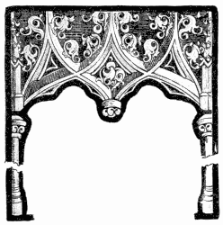 140. German Late Gothic Canopy.
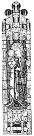 141. All Souls’ College, Oxford.
The typical Perpendicular canopies illustrated and already referred to
are quite favourable specimens of the kind of thing in vogue throughout
the fifteenth century. In France much the same forms were adopted (page
342). Some exceptionally delicate figure-and-canopy windows (or parts of
them) are to be found in the cathedral at Toulouse—the figure in
colour, or in white and colour, against a background of white, richly
diapered with damask pattern, which quite sufficiently distinguishes it
from the architecture only just touched with yellow. An instance of
later German work is given below. The German designer indulged
temperamentally in the interpenetration of shafting and other vagaries
of the kind, which we find in German stone carving. Sometimes in German
work, and occasionally also in French, Late Gothic canopies were all in
yellow, framing the picture, as it were, in gold. As a rule, however,
they were, as with us, silvery in tone, and framed the coloured glass in
a way most absolutely satisfactory, so far as effect is concerned.
In itself, however, this canopy work is rarely of any great
interest; occasionally, as already in the preceding century, the
designer has enniched in the shafts little figures of saints or
angels (there is just the indication of such introduction of little
statuettes in the very simple and restrained example of canopy
work from Cologne, on page 191), redeeming it from dulness;
but as a rule it is trite and commonplace to a degree. The
white, as frame, is perfect. It is none the more so that it
simulates misplaced stonework. What a strange thing it is in
the history of ornament that the natural bias of the designer
seems to be so irresistibly towards imitation! The man’s first
thought seems to be to make the thing he is doing look like something it
is not. Why, having designed openings in the wall of his building, he
should proceed forthwith to fill them up with something in poor
imitation of masonry, is a mystery. Economy had then, perhaps, as now,
more to do with it than art, for it is a very cheap expedient.
Not only in the matter of colour, but in that of proportion, the later
Gothic canopies were a great improvement upon what had gone before. They
were distributed still very much upon the horizontal principle so
noticeable in Decorated work; but by this time the architect had come to
the tardy conclusion that the long lights of his window wanted holding
together, and he tied them together, if they were of any length, by
means of transoms, in which case the glass-worker had to deal with
lights of manageable length. The light from All Souls’ College, here
given, is an example of a very usual Perpendicular arrangement. About
one half its entire length is occupied by a figure enshrined, as it
were, in an architectural niche. The base of the canopy is about equal
in height to the width of the light. The shafts are broad enough to
emphasise the independence of the light. The pinnacles of the canopy
extend into the window head. A point or two of background colour, as
though one could see through, are ingeniously introduced into the canopy
and its base. It would be difficult to better
such an arrangement of white and colour, except that one feels the
urgent want of a margin of white, to separate the coloured background
from the masonry round the window head.
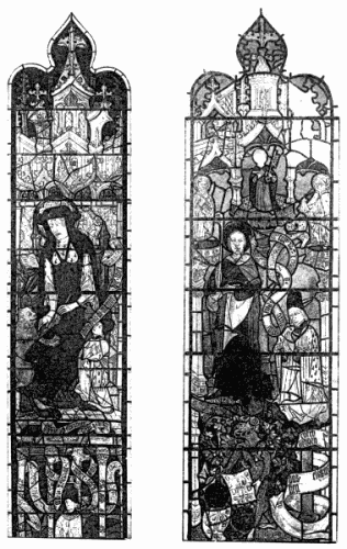
142. TWO WINDOWS, S. MARY’S, SHREWSBURY.
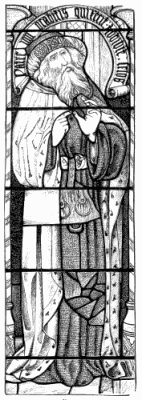 143. Fairford.
The idea is, no doubt, that the shrinework should appear to stand in the
opening, and the figure be sheltered under that. The illusion aimed at,
it is scarcely necessary to say, is not produced, and in any case would
not have been worth producing. On the contrary, the desirable thing to
be done was, to acknowledge the window opening, which, except for this
pretence, the colour of the design effectually does.
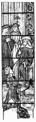 144. The Queen of Sheba before Solomon, Fairford.
A frequent and equally typical arrangement was, where the light was long
enough, to make the base itself take the form of a low canopy over a
more or less square-proportioned subject, possibly a scene in the life
of the Saint pourtrayed above. This gave opportunity of introducing
figures on two different scales, without in any way endangering the
significance of the more important figure, which, by its size and
breadth of colour, asserted itself at a distance from which the smaller
subject appeared only a mass of broken colour. The proportions and
outline of such a subject are indicated by the Nativity on page 54, the
jagged line at the top of the picture marking the inner line of the
canopy work. In German work very commonly the base canopy
encloses, as, for example, at Cologne Cathedral, a panel of heraldic
blazonry.
The height of the canopy was, with us, more or less in accordance with
the length of the window; but sometimes more space was allowed for the
figure than at All Souls’, and the vacant space about the head of the
saint was occupied with a label in white and stain bearing an
inscription. There are some admirable figure-and-canopy windows of this
description on the north side of the choir of York Minster, which seem
to have inspired a great deal of our modern mock-Perpendicular
figure-and-canopy glass. The label occurs, on a background of white
architecture, behind the Prophets from Fairford on pages 187, 391. A
more important example of it occurs round the figure of Edward the
Confessor, from S. Mary’s, Ross (opposite), and again in the group from
the same source on page 339. Extremely clever ornamental use is made of
the label—a typically Perpendicular form of enrichment—in
the German glass on page 186. The extraordinary breadth of the
phylacteries held by the Prophets in the early fifteenth century windows
in the S. Chapelle at Riom, gives them quite a character of their own,
and an admirable one.
At Great Malvern we find the lights above the transom of a window
occupied each by a figure and its canopy, whilst
the lower lights contain each three tiers of small subjects, separated
only by bands of inscription. In the four-light window at Malvern
illustrating the Days of Creation, each light contains three little
subjects, one of which is given on page 252. Sometimes, as in the
windows from Fairford on pages 188, 372, subjects under a canopy are
drawn to a scale as large as the size of the window will allow.
In some shape or another the canopy almost invariably appears in
connection with figure work; it is the rarest thing to find, in place of
the familiar shafting, a border, such as that opposite.
145. KING EDWARD, S. MARY’S, ROSS.
Of the gradual improvement in drawing in the fifteenth century work it
is not necessary to say much. It belongs to the period rather than to
glass painting, and it is shown in the examples illustrated. It is of no
particular country, though our English work was possibly more
constrained than contemporary continental work. Particularly
characteristic of English work was the delicate tracing of the faces,
which were pencilled, in fine lines, the treatment altogether rather
flat, and this at a period when foreign glass was much more solidly
modelled. It is not possible, on the scale of illustration determined by
a book of this size, to illustrate this English peculiarity as clearly
as one would wish, but it will be apparent to the seeing eye even here.
It is within the bounds of possibility that the Fairford glass may have
been executed in England; if so, Flemish or German painters certainly
had a hand in it. To compare it with the neighbouring Perpendicular
glass at Cirencester, with its delicate tracing and fine stain (in which
matter the Fairford glass does not by any means excel), is to see how
very different it is from typical English work. Whether we
look at the detail of the canopies, or the drawing of the drapery, or
the painting of the glass, we see little to connect this with English
work, though it falls at once into its place as excellent Late Gothic
glass. In the windows of the nave of Cologne Cathedral, a figure from
one of which is here given, German Gothic glass reaches its limit. There
is already a trace, if only in the broad shaft of the canopy, of
Renaissance influence in the design. In others of these windows there
are no single figures. Entire lights are filled with biblical or
legendary scenes, one above the other, under dwarf canopies, which do
not very clearly define the horizontal divisions of the window; for all
that, the horizontal divisions are for the most part there. Except where
the
canopies are so insignificant as not to count, a Perpendicular window
presents, as a rule, a screen of silvery-white, on which the pictures
form so many panels of more or less jewelled colour.
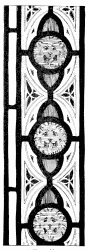 146. York Minster.
The enormous East window at York Minster, which belongs
to the very early years of the fifteenth century, contains, apart
from its tracery, no less than a hundred and seventeen subjects
in its twenty-seven lights; but the canopies dividing them are
so narrow that they scarcely answer the purpose of frames
to the separate subjects. The design is inextricably confused,
and the subjects are very difficult to read; but the effect is still
as of a mass of jewels caught in a network of white. In fact,
the progress towards light is such that, whereas in the last
century the problem was how to get more and more white glass
into a coloured window, it seems now more often to be how to
get colour into a white one.
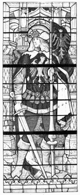 147. Cologne Cathedral.
White and stain enter so largely into Late Gothic glass that
there remains little to be said about grisaille. The glass of the
period is, for the most part, in grisaille and colour, the difference
between it and earlier grisaille being, that it consists so largely
of figure-and-canopy work. Windows, however, do occur all in
white or all in white and stain. Figures, for example, in white
and stain, occur, as in the South transept at York, on a ground
of delicately painted quarries. Again, a common arrangement
is that of figures in white and colour against a background
of quarry work, a band of inscription separating the pavement
upon which they stand from quarries below them. Such figures
form a belt across many moderate-sized windows in parish
churches. Mere quarry lights also occur, with a border in
which perhaps some colour occurs. But the subject of quarries
and quarry windows is reserved for consideration in a chapter
by itself.
It must not be supposed that the drift of Later Gothic in the
direction of white glass was uninterrupted. That was by no
means so. At certain places, and at certain periods, and
especially by certain artists, there seems to have been a reaction
against this tendency, if ever there was any yielding to it. For
example, notwithstanding all that has been said about the
lighter tone of Decorated glass, some of the very finest fourteenth
century German work, at S. Sebald’s Church, Nuremberg,
is as intensely and beautifully rich as anything in Early work.
There rows of small subjects are framed in little canopies as
deep in colour as the pictures, and white glass is conspicuous
by its absence. The nearest approach to it is an opaque-looking
horn colour, and that is used only very sparingly. Possibly,
however, it is not quite fair to call these windows rich, for the
upper part of them is light. So light is it, and so little has
it to do with the stained glass, that one scarcely accepts it as
part of the window, and therefore speaks of it as if it ended
with the colour.
The unfortunate plan has been adopted here, as in the
cathedral at Munich and elsewhere in Germany, of filling only
about half the window, from the sill upwards, with strong
stained glass. This ends abruptly at an arbitrary and very
unsatisfactory canopy arch, which, in a way, frames it; and
above it the window is filled with plain white rounds. At
Freiburg there is yet a further band of plain rounds next the
sill of the windows. The object of this is, doubtless, to get
light into the church; but the effect is as if the builders had
run short of coloured glass, and had only finished off the window
temporarily. As a means of combining white and colour this
German shift is not, of course, to be compared to the plan current
elsewhere of distributing them in alternating bands. It does not
attempt to combine them, but cuts the window deliberately in
two. Not until you have shaded off from your eyes the
distracting rays of white light, can you properly appreciate or
enjoy the coloured glass.
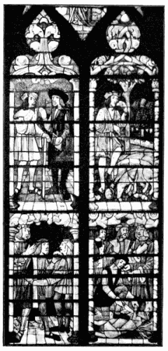
148. THE PRODIGAL SON, TROYES.
But, if these windows must be considered, as in a sense they
must be, as conforming to the demand for more light, there are
others in which strong colour is carried consistently through,
not only in the fourteenth but in the fifteenth century. (It
is irritating and annoying to have to hark back in this way
to periods supposed to have been long since left behind, but any
arbitrary line of division between the styles must, as it were,
cut off points which project from one into the other, sometimes
very far indeed across the boundary line; and hence
the absolute necessity, at times, of seeming to retrace our
steps, if we would really trace the progress of design.) There
are shown opposite four lights out of a large window in the
clerestory of the cathedral at Troyes, in which the history of
the Prodigal Son is pictured in little upright subjects, framed
in canopies of quite modest proportions and of colour which
in no wise keeps them separate from the richly coloured figures
underneath. One of them, for example, is of green, very much
the colour of an emerald, on an inky-purple ground. The result
is a very rich window, full of quaintly dramatic interest when
you come to examine it; but there are no broadly marked
divisions of colour in the glass to affect the architecture of the
building one way or the other, nor does it tell its tale very
plainly. It is more easily read on page 194 than from the floor
of the church.
In the windows so far discussed the figure subjects, however
small and however close together, have always been marked off
one from the other, slightly as it might be, at first by the
marginal lines round the early subject medallions, and then by
canopies. It is shown in another fifteenth century window from
Troyes (opposite) how even that amount of framework was now
sometimes abandoned.
Progress in glass design, it was said, was in the direction of
light and of picture. Moved by the double impulse, the designer
of the Later Gothic period framed his coloured pictures in white.
But where he happened not to care so much about light, or had
not to consider it, he omitted even the narrow shaft of white or
colour (which, so long as he used a canopy, usually divided
the picture from the stonework) and left it to the mullions to
separate them vertically. Horizontally he divided them slightly
by a band of ornament, as at Troyes, of about the width of
the mullions, or more frequently, and more plainly, by lines
of inscription on white or yellow bands. If the subjects were
arranged across the window in tiers alternately on ruby and
blue grounds, that, of course, separated each somewhat from the
one next above and below it, but it banded those on the same
level together. This helped the architectural effect, but confused
the story-telling.
If the pictures were arranged, throughout the width as well as
the length of the window, alternately in panels on red and blue
grounds, that kept the pictures rather more apart, but made the
distribution of the colour all-overish. That mere change of
ground could not keep pictures effectively separate will be clear
when it is seen (opposite) how little of the background extends
to the mullion. The greater part of the figures come quite up
to the stonework, and the subjects consequently run together.
It is difficult to realise, except by experience, how little the
stonework can be depended upon to frame stained glass. It
seems when you see it all upon paper that the mullions, with
their strongly marked mouldings, must effectually frame the
glass between them. They do nothing of the kind. They go
for so much shadow: what you see is the glass. This the glass
painters realised at length, and took to carrying their pictures
across them. And it has to be confessed that so long as they
schemed them cleverly the interference of the mullion was not
much felt.
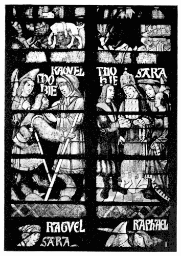
149. THE STORY OF TOBIT, TROYES.
The distinction drawn so far between “single figures” and
“subjects” has answered its obvious purpose; but that also is,
in a manner, arbitrary. Figures standing separately, each in a
light by itself, form very often a series—such as the four Evangelists,
the twelve Apostles, the Prophets, the Doctors of the
Church, or a succession of kings, bishops, or other ecclesiastics.
More than that, they form perhaps a group. When we discover
that facing the figure of the Virgin Mary is that of the
Angel Gabriel, we see at once that, though each figure occupies
a separate light of the window, and each stands in its own
separate niche, we have in reality here a subject extending
through two lights—the Annunciation. So in a four-light window—if
in one light stands the Virgin with the Infant Christ,
and in the others a series of richly garbed figures with crowns
and gifts in their hands, it is clear that this represents the
Adoration of the Magi—a subject in four lights; and the canopies
over them may be taken to be one canopy with four niches. A
yet more familiar instance of continuity between the single
figures in the lights of a window occurs where the central light
contains the Christ upon the cross, and in the sidelights stand
the Virgin and S. John. We have in such cases the beginning
of the subject extending through several lights. It is only a short
step from the Annunciation, or the Adoration, or the Crucifixion
described, to the same subject, under one canopy, extending
boldly across the window, with shafts only to frame the picture
at its sides. That is what was done—especially in Germany.
It occurs already in Early Decorated glass, where the upper
part of a big geometric window is sometimes occupied by
brassy pinnacle work, which asserts itself, perhaps, upon a
ground of mosaic diaper, in the most unpleasant way. In
the white glass of a later period the effect was happier.
At first the designer did not, as a rule, aspire to carry his
subjects right across a big window. Accepting the transom as
a natural division, he would perhaps divide a four-light window
vertically into two, so as to get four subjects, each under a
canopy extending across two lights; or, in a five-light window,
he would probably separate these by other narrow subjects in
the central lights. Divisions of this kind often occur already in
the stonework of the window, the lights being architecturally
divided by stronger mullions into groups. In that case all the
glass painter does is to emphasise the grouping of the lights
schemed by the architect. Where the architect has not provided
for such grouping he does it, perhaps, for himself. It
enables him to design his figures on a larger scale, and to get
a much broader effect in his glass than he could do so long as
he kept each picture rigorously within the limits of a single
light. Consideration for his picture had probably more to do
with his reticence than respect for its architectural framework;
and so soon as ever he realised how little even a strong mullion
would really interfere with his work, he made no scruple to
take all the space he wanted for his purpose. Infinite variety
of composition is the result. The upper half of the window
is perhaps devoted to a single subject, or to two important
pictures, whilst below the transom the lights are broken up
into quite little pictures; or in place of these smaller pictures
may be found little panels of heraldry, as occurs often in
Flemish work. These or the smaller pictures may be continued
in the sidelights of a broad window, flanking, and in
a way framing, a large central picture. Sometimes, as in the
nave of Cologne Cathedral, the upper half of the window may
contain one imposing composition; below that may be a series
of important single figures, each provided with its separate
canopy; and below that again, at the base of the window, may
be a series, or several series, of small heraldic panels.
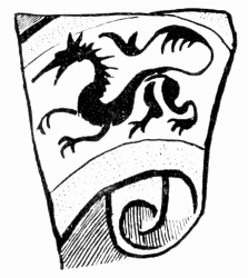 150. Fairford.
The canopy extending across a broad window (page 200) may
be so schemed that there is obvious recognition of the lights into
which it is divided, or it may sprawl across the window space
with as little regard to intervening mullions as possible. There
is now, in short, full scope for the fancy of the artist, were he
never so fanciful; and it would be a hopeless task to try and
catalogue the lines on which the design of a large window
might now be set out.
We do not in the fifteenth century arrive yet at the most
remarkable achievements in glass painting. But you have only
to compare such pictures as those on pages 194, 196, with that
on page 127 to see what a complete revolution has come over
the spirit of design. It is not only that the draughtsman has
learnt to draw, and the painter to paint; they work on quite a
different system. It was explained (page 44) how in early days
the glazier conceived his design as mosaic, how he first thought
it out in lead lines, and only relied on paint to help him out
in details which glazing could not give him. Now, it is easy
to see that the painter begins at the other end. He thinks
out his picture as a painting, and relies upon glazing only for
the colour which he cannot get without it.
In the beginning, it was said, the glazier might often have
fixed his lead lines, and trusted to his ingenuity to fill them in
with painted detail. Now, it would seem, the painter might
almost have sketched his picture, and then bethought him how
to glaze it. But that is not yet really so. He did not even
conceive his design as a picture and then translate it into
glass. His work runs so smoothly it cannot be translation.
The ingenuity with which he leads up little bits of colour
in the midst of white, is no mere feat of engineering; it is
spontaneous. It is clear that he had the thought of glazing
in his mind all along—that he designed for it, in fact. The
difference between the thirteenth century and the fifteenth
century designer is, that one thinks first of glazing, is primarily
a glazier, the other thinks first of painting, is primarily
a painter.
151. RENAISSANCE WINDOW, TROYES CATHEDRAL.
The customary line between Gothic and Renaissance glass is
drawn at about A.D. 1530. That is to say, that there are to
be found examples, presumably of that date, which are still
undoubtedly Gothic in character. But he would be a bold man,
even for an archæologist, who dared to say precisely when the
Gothic era came to an end.
Quite early in the sixteenth century the new Italian movement
began to make itself felt in France, Germany, Flanders; in
due course it spread to this country. Eventually it supplanted
the older style; but it was only by degrees that it insinuated
itself into the affections of cis-alpine craftsmen. And in stained
glass, even more plainly than in wood or stone carving, is seen
how gradually the new style was assimilated by the mediæval
craftsmen—more quickly, of course, by the younger generation
than the older—so that, concurrently with design in the quasi-Italian
manner, Gothic work was still being done. Much of the
earlier Renaissance work shows lingering Gothic influence. In
the first quarter of the sixteenth century a great deal of glass was
designed and executed by men hesitating between the old love
and the new, only partially emancipated from mediæval tradition,
or only imperfectly versed in the foreign style.
There is a window at S. Nizier, at Troyes, for example, in
which the details are Renaissance, but the feeling is quite
Gothic. The subjects are even explained by elaborate yellow
scrolls or labels inscribed in black, very much after the manner
of those which form such a feature in the German Gothic
work at Shrewsbury (page 186). Renaissance forms are traced
with a hand which betrays long training in the more rigid
mediæval school; and Gothic and Italian details are put together
in the same composition with a naïveté which is sometimes
quite charming.
You can see that the designer of the window on page
203 was not untouched by Renaissance influence. Possibly
he thought the hybrid ornament in his canopy was quite up
to date.
In the glass in the nave of Cologne Cathedral the suspicion
aroused by the side columns of the otherwise quite Gothic
canopy on page 191 is confirmed by definitely Renaissance
forms in the ornament in the window head. Again, at the
Church of S. Peter, at Cologne, is a sort of pointed canopy
with ornament which looks at first like Gothic crockets, but
on nearer view it is just Italian arabesque in white and stain.
Apart from architectural accessories and detail of costume or
ornament, to justify the attribution of the work to this or
that period, it is very often difficult to give a name to early
Renaissance work; the only safe refuge is in the convenient
word transitional.
But for the nimbus in perspective, and the shield of arms and
its little amorino supporter, it would have seemed safe to describe
the “Charge to S. Peter” from S. Vincent at Rouen on page 207
as “Gothic.”
In French glass a lingering Gothic element is noticeable at a
period when Italian forms had firmly established themselves in
contemporary plastic art; but, then, glass painting was not an
Italian art; and, whilst wood carvers and sculptors were imported
from Italy, and directly influenced the Frenchmen working with
them, glass painting remained in the hands of native artists.
Before very long the Renaissance did, of course, assert itself,
in glass painting as in all art, and we arrive at windows
absolutely different from anything that was done in the Middle
Ages. The change was in some places much more rapid
than in others. Wherever there was a strong man his influence
would make for or against it. But meanwhile much
intermediate work was done, belonging more or less to the
new school, whilst retaining very much of the character of
Gothic glass.
That Gothic character was something well worth keeping; for
it is the character which belongs inherently to the material.
152. St. Mary’s, Shrewsbury.
The Gothic glass painters did, in fact, so thoroughly develop
the resources of the material, that a Renaissance window treated
really like glass inevitably suggests the lingering of Gothic
tradition. This is no slight praise of Gothic work; and, by
implication, it tells against the later Renaissance glass painters,
whose triumphs were in a direction somewhat apart from their
craft. The great windows at Brussels, for example (page 71),
illustrate a new departure. They seem to have nothing in
common with mediæval art. On the other hand, one traces
the descent of such masterpieces of translucent glass painting
as are to be found at Arezzo (page 397), through those same
intermediate efforts, directly to Gothic sources.
To trace the steps by which the new encroached upon the
old, as one may do, for example, at Rouen, is almost to
come to the conclusion that the short but brilliant period of
Renaissance glass painting is really the after-fruit of Gothic
tradition, fertilised only by the great flood of Renaissance feeling
which swept over sixteenth century art. Nowhere is this
more clearly argued than in the windows at Auch, completed,
according to all accounts, as early as 1513. A strain of Gothic
is betrayed by the cusping which here and there fringes a
semicircular canopy arch; but no less mistakably mediæval is
the technique throughout, and equally so the setting out of the
windows. For the somewhat imposing canopies are not, for
once, devised as frames to correspondingly important pictures;
but are simply shrines adorned with figures each confined to its
separate light: it is only the small subsidiary predella or other
such pictures which extend beyond the mullions. No doubt
there is doctrinal intention in the juxtaposition of Prophets,
Sibyls, and the rest—one of whom may even be supposed to be
addressing the other—but to all intents and purposes decorative,
they are just a row of standing figures, as distinct
one from the other as the usual series of figures under quite
separate canopies. It is only the canopy which connects them.
This kind of composition (which is seen again at Troyes, page
200) would never have occurred to a man altogether cut off
from Gothic tradition.
153. Chapel of the Bourbons, Lyons.
It is worth remarking that, even when Gothic and Renaissance canopies
alternate at Auch in a single window, or where Gothic niches are built,
as it were, into or on to larger Renaissance structures, there is no
appearance of incongruity. Truth to tell, the Gothic is not so purely
Gothic, nor the Renaissance so purely Renaissance, as that they should
clash one with the other. Both are seen through the temperament of the
artist. He mixed
them in his mind; and the result is quite one, his style in short.
 154. S. Godard, Rouen.
Early Renaissance glass submitted itself, one can hardly say
duly, but almost as readily as late Gothic design, to the restraint
of Gothic mullions. The windows in which, as it happens, some
of the best Early French Renaissance work is found (and it is
in France that the best is to be found) are often smaller than
the great Perpendicular windows referred to, and do not lend
themselves to such elaborate subdivision. But the lines on
which they are subdivided are very much as heretofore. The
canopy still extends through several lights, and covers a single
subject. Only now it is Renaissance in design. That does not
mean to say merely that round arched architecture takes the
place of pointed. The round arch occurs indeed, as in the
windows in the Chapel of the Bourbons, in Lyons Cathedral
(on pages 204 and 349), supplemented by amorini and festoons
of fruit. But more often the canopy takes the form of a frieze
of Renaissance ornament, painted in white and stain, as at
S. Godard, Rouen (opposite), or glazed in white on colour, as in
the cathedral of the same city (pages 75, 350), supported at each
end by a pilaster. Not seldom it resolves itself into arabesque
only very remotely connected with architecture at all. Indeed,
if it simulate anything, it is goldsmith’s work rather than
masonry. Executed, as at Rouen (pages 75, 206), in brilliant
yellow on a dark coloured ground, it has very much the appearance
and value of beaten gold. That, rather than sculpture,
must have been in the mind of the designer. One form of
imitation is not much better than another; but here, at all
events, there is nothing which in the least competes with the
surrounding architecture; and it will scarcely be denied by
any one who takes the least interest in ornament, that design of
this kind is vastly more amusing than the dull array of misplaced
pinnacles which often did duty for ornamental detail in Gothic
shrinework. A German version of a canopy which ceases
almost to be a canopy and becomes more like arabesque, is
given on page 350. That is supported by columns (the caps are
shown in the illustration) rather out of keeping with the ornament
they support, which makes very little pretence of being
architectural. The canopies on pages 204, 350, are supported
only on little brackets at each side, and have no shafts at all.
This marks a new departure. The picture has now no frame
at its sides, only the stone mullion.
155. S. Patrice, Rouen.
It was explained, in reference to glazing, what confusion of
detail resulted from the use of leads of which some were intended
to form part of the design and some not. Similar confusion is
inevitable when certain of the mullions are meant to be accepted
as frame to the picture and others to be ignored. The perhaps
not very conspicuous canopy is often the only hint as to which
of the stone divisions you are to accept as such, and which not.
Even that was not always there to serve as a guide. Already,
as early as 1525, the date given to the window illustrating the
life of S. Peter (page 207), the canopy was sometimes annulled,
and the window given over entirely to picture, either one
complete subject or a series of smaller ones. The window
dedicated to S. Peter contains in its four lights eight equal
subjects, a plan adopted in several others of the windows at
S. Vincent, Rouen. In a series of unframed subjects, such as
these, there is much less danger of confusion should some one
prominent figure recur throughout always in the same costume.
That is the case here, and again at Châlons, where the figure of
Our Lord, robed in purple, is conspicuous throughout: the mind
grasps at a glance that this is not one picture but a series.
156. SUBJECT, S. VINCENT, ROUEN, 1525.
A change of period is indicated by the departure from the disc-shaped
nimbus. On pages 207, 210, 234, 397, the nimbus is
shown in perspective; an attempt is even made to make it
hover above the head, an effect not possible to produce in leaded
glass; even at Arezzo it is not achieved. Neither is the use of
a mere ring of light, whether in flat or in perspective, a happy
substitution for the Gothic colour disc, as may be seen, for
example, at Cologne. The idea of the nimbus only keeps within
the border line which separates the sublime from the ridiculous,
so long as the thing is frankly accepted as a symbol, not as
an effect. But, were it otherwise, the use of the strongly
marked disc of colour about the head of prominent personages
has an enormous value as a means of distinguishing them from
the background or from surrounding figures. Its decorative
importance is no less than its symbolic. Very especially is this
so in glass; and the glass painter who wantonly departs from
its use, reduces it to a mere ring (which does not separate it at
all from the background) or poises it in the air, is beginning to
wander from the way, narrow if you please, which leads to
success in glass. This is said with some reluctance in face
of the all but perfect little panel from S. Bonnet, at Bourges,
on page 210. It is true that there the nimbus of the boy saint,
though in perspective, does by its dark tone separate the
head from the light ground, as the face is separated from
the darker drapery of his teacher; and, in so far, little of
definition is sacrificed; but, after all, admirably as the design
is schemed, the oval nimbus is not a whit less conventional
than the round disc of mediæval times, and it does lack
something of distinction and dignity which that conveyed.
The date inscribed (1544) serves to remind us that we are
nearing the middle of the century, at which period glass
painting may safely be said to have reached its zenith and
to be nearing the verge of decline.
It will have been seen in the examples lately instanced how
story is gradually more and more naturally set forth in glass.
There is now no vestige of flat treatment left. Even the
standing figure (page 191) stands forth from his niche, and
though he may be backed by a curtain of damask, there is
shown above that a background of receding architecture. So in
the S. Bernard windows at Shrewsbury (pages 56, 203) there is
architectural distance shown in perspective, and again in the
subjects from Fairford, whether it be the portcullised gate of
Jerusalem that is represented (page 251), or the very inadequate
palace of King Solomon (page 188), or the Garden of Eden, in
which the scene of the Temptation is primitively pourtrayed
(page 372), there is some attempt to render the scene. Even
in the fifteenth century work at Troyes (page 194) the Prodigal
is not merely shown among the swine, joining them in a dinner
of gigantic acorns, but he leans against an oak tree, and in
the distance is a little forest of trees. In Renaissance glass
the scene is much more naturally rendered, and forms almost
invariably an important part of the composition. Witness the
palace of Herod (page 74) when Salome dances before him,
which is a great advance upon the Gothic throne-room of King
Solomon (page 188).
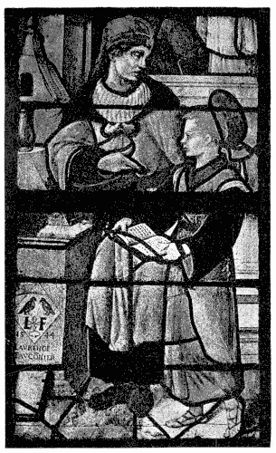
157. SUBJECT, S. BONNET, BOURGES.
The scene takes one of three forms: either it is architectural,
or it is landscape, or it is of architecture and landscape
combined. A very favourite plan of the French was to show
distant architecture (glazed in deep purple) through which were
seen glimpses of grey sky, and perhaps a peep of landscape;
and it resulted invariably in a beautiful effect of colour. In fact,
a scheme of colour which recurs again and again at Rouen,
and in other French glass of the first part of the sixteenth
century, consists in the introduction of figures in rich colour
and white upon a background where white, green, purple, and
pale blue predominate to such an extent as to give quite a
distinctive character to the glass. The more distant landscape
was painted very delicately upon the pale grey-blue glass which
served for sky, as shown on page 255, and in the same way
architecture was also painted upon it. In the view through
the arches above the screen in a window at Montmorency
(page 213), both trees and buildings are represented in that way
upon pale grey glass, the green of the trees and hills stained
upon it. Sometimes the distance is painted upon white, as at
King’s College, Cambridge; but in France the pale grey-blue
background is so usual as to be quite characteristic of the period.
All this is a long way from the mere diaper of clouds which in
the early fifteenth century sometimes took the place of damask
pattern upon the blue which formed a background to the Crucifixion,
or other scene out of doors. It is now no longer a case
of symbolising, but of representing, the sky, and it is wonderful
what atmospheric quality is obtained by the judicious use of
pale blue painted with the requisite delicacy. The beauty of
this kind of work, especially on a small scale, is beyond dispute.
Together with the rendering of the flesh, it implies consummate
skill in painting. The painter comes quite to the front; but he
justifies himself inasmuch as he is able to hold the place. He
does what his Gothic predecessors could not have done, and
does it perfectly. Could the Gothic artist have painted like
this, he also might have been tempted so far in the pictorial
direction as to have sacrificed some of the sterner qualities of
his design.
The architectural environment of the figures on page 213
fulfils somewhat the function of the Perpendicular canopy; it
forms a kind of setting of white for the colour; but, in the first
place, it does not pretend to frame them at the side, and, in
the second, the attempt at actual perspective necessitates an
amount of shading upon the white glass which detracts at once
from its purity and from its value as setting to the colour.
The idea is there that you see through the window into space;
and, though that effect is never obtained, it is wonderful how
far some of the glass painters later in the century went towards
illusion. A certain false air of truth was sometimes given to
the would-be deception by an acknowledgment of the window-shape—that
is, by making the foremost arch or arches follow the
shape of the window head, and form, as it were, a canopy losing
itself in perspective. Architecture proper to the subject, or
not too inappropriate to it, is sometimes schemed so far to
accommodate itself to the window-shape as to form, with the
white pavement, a more or less canopy-like setting for the
figures. It may be a sort of proscenium, the sides of which
recede into the picture, and form what may be called the
scenery. At King’s College, Cambridge, Esau is seen bargaining
away his birthright at a table where stands the coveted
pottage, in the midst of spacious halls going back into distant
vistas, seen through a sort of canopy next the actual stonework.
That concession to the framework of the window does mend
matters somewhat. The base of the picture opposite, for
example, is much more satisfactory than it would have been
had it not acknowledged the window-sill; but the architecture in
the top part of the lights is not a frame to the picture at all, nor
yet a finish to the glass: it is part of the picture, which thus,
you may say, occupies the window as a picture its canvas. In
reality that is not quite so. There is some acknowledgment,
though inadequate, of the spring of the arch by a horizontal
cornice parallel with the bar; and the arcading, though interrupted
by the mullion and by the marble columns, steadies
the design; and altogether the architecture is planned with
ingenuity, though without frank enough acceptance of the
window-shape. One would be more tolerant to such misguided
freedom of design were it not for the kind of thing it led to.
It must be admitted that both French and Flemings, until
they began to force their perspective, and to paint shadow
heavily, did very beautiful and effective work in this way.
A multitude of figures, as, for example, in the Judgment
of Solomon at S. Gervais, Paris, more or less in rich colour,
could be held together by distant architecture and foreground
pavement largely consisting of white glass, in a way which left
little to be desired, except fuller acknowledgment of the stonework.
But it took a master of design to do it, and one with
a fine sense of breadth and architectural fitness.
When such architecture was kept so light as to have the
full value of white, and when the figures against it were also
to a large extent in white, and the colour was introduced only
in little patches and jewels skilfully designed to form, here the
sleeves of a white-robed figure, there a headdress, there again
the glimpse of an underskirt, and so on—all ingeniously designed
for the express purpose of introducing rich colour, the whole
shot through with golden stain—the effect is sometimes very
beautiful.
158. SAINTS, CH. OF S. MARTIN, MONTMORENCY.
Admirable Flemish work, Renaissance in detail, but carrying
on the traditions of Gothic art, is to be found in plenty at
Liège, both in the cathedral (1530 to 1557) and at S. Martin.
This is excellent in drawing and composition, most highly
finished in painting, fine in colour, and silvery as to its white
glass, which last is splendidly stained. In the same city there
is beautiful work also at S. Jacques, with admirable treatment
of the canopy on a large scale. It differs from French work
inasmuch as it is Flemish, just as the glass at the church
of Brou differs in that there is a characteristic Burgundian
flavour about it; but those are details of locality, which do
not especially affect the course of glass painting, and which
it would be out of place here to discuss.
In England we are not rich in Renaissance glass. The best
we have is Flemish, from Herkenrode, now in the cathedral at
Lichfield. The greater part of this is collected in seven
windows of the Lady Chapel—no need to explain which; the
miserable shields of arms in the remaining two convict themselves
of modernity. In the tracery, too, there is some old
glass, but it is lost in the glare of new glazing adjacent.
Otherwise this glass is not much hurt by restoration. Four
of the windows are treated much alike; that is, they have
each three subjects, extending each across the three lights
of which they are composed, some with enclosing canopy, and
some without. A fifth three-light window is broken up into
six tiers of subjects, each of which appears at first sight as if it
were confined to the limits of a single light, but there is in
fact connection between the figures; for example, of three
figures the central one proves to be the Patron Saint of the
Donor, himself occupying one of the sidelights, and his wife
the other. If the Saint is seated the Donors stand. If he
is represented standing they kneel before him. The two larger
six-light windows at Lichfield are divided each into four; that
is to say, the four quarters of the window have each a separate
subject which extends laterally through three lights, and in
depth occupies with its canopy about half the entire height of
the window.
The Lichfield glass has very much the character of that
at Liège. So has the Flemish glass now at the east end of
S. George’s, Hanover Square, a church famous for its fashionable
weddings. This is some of the best glass in London, well
worthy the attention of the guests pending the arrival of
the bride. The design, however, is calculated to mystify the
student, until he becomes aware that the lights form part of a
“Tree of Jesse,” adapted, not very intelligently, to their present
position, and marred by hideous restoration, such as the patch
of excruciating blue in the robe of the Virgin. The vine,
executed in stain upon white, with grapes in pot-metal purples,
is not nearly strong enough to support the figures; this may
be in part due to the decay of the paint, which has proceeded
apace.
Again, at Chantilly (page 218) may be seen how lead lines
quarrel with delicate painting. The more delicate the painting,
the greater the danger of that—a danger seldom altogether
overcome.
159. S. GEORGE’S, HANOVER SQUARE, LONDON.
The most important series of Renaissance windows in this
country is in King’s College Chapel, Cambridge. “Indentures”
still remain to tell us that these were contracted for in 1516
and 1526. Apart from some strikingly English-looking figures
in white and stain upon quarry backgrounds in a side chapel,
and other remains of similar character, and from a very
beautiful window almost opposite the door by which one enters—differing
in type, in scale, in colour, altogether from the other
windows—the glass throughout the huge chapel was obviously
planned at the time of the first contract, and there is a certain
symmetry of arrangement throughout which bespeaks the
period of transition. The windows consist each of two tiers
of five lights. A five-light window offers some difficulty to the
designer if he desire (as in the sixteenth century he naturally
did) to introduce subjects extending across more than one
light. A subject in two lights does not symmetrically balance
with a subject in three. He might carry his subject right
across the window, but that might give him very likely a
larger space to fill than he wanted; and besides, the time was
hardly come for him to think of that. He might carry it across
the central group of three; but that would leave him a single
light on each side to dispose of. Remains the idea of a subject
in two lights at each side of the window, and a central
composition occupying only one light. That was not a very
usual plan, although it was adopted, at Fairford for example,
where the side subjects in two lights under a canopy are
effectually separated by a central subject which has none. At
King’s the sidelights have no canopies further than such as may
be accepted as part of the architecture proper to the subject,
schemed more or less to frame the picture (as in the case of the
window at Montmorency, page 213); it is only in the centre
lights that the figures (two in each light, one above the other)
are enclosed in canopy work. These figures (described as
“messengers”), with elaborately flowing scrolls about them
inscribed with texts of Scripture, are many of them quite
Gothic in character, even though they have Renaissance
canopies over them. The designs of these mostly do duty
many times over, as if this merely decorative or descriptive
work were not of much account; and the same figure occurs,
here well painted, there ill done, or painted perhaps in a
late, loose way, quite out of keeping with the drawing: there
is no sort of sequence in them. The notion of these intermediate
figures, at once distinguishing the subjects one from
the other, and throwing light upon their meaning, is good.
But in effect it fails of its object, thanks to the independent
spirit of the later painters, who thought more of their pictures
than of architectural restraint.
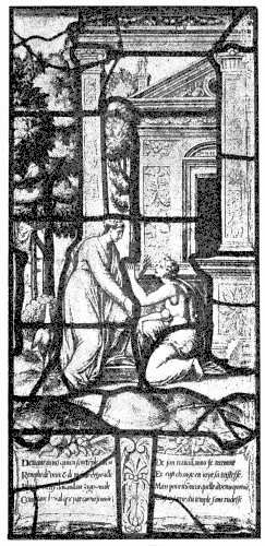
160. THE STORY OF PSYCHE, CHANTILLY.
“Photo-Tint” by James Akerman, London, W. C.
The subjects on each side of the window are very large
in scale, very pictorially and very freely treated, very finely
designed at times, and very splendid in effect; but they are
most unequal, and they are all more or less of a tangle. Their
confusion is the greater inasmuch as there is no attempt to
balance one picture with another. A landscape background
on one side of the window answers to an architectural background
on the other. On one side the interest of the subject
is towards the top of the lights, on the other to the bottom,
and so on. Either subject or both may be so merged with the
“messengers” that a casual observer would hardly be aware of
the existence of such personages.
All this makes it difficult to trace the subject; and yet the
windows are in a certain pictorial way the more effective. In
fact the unity of the window has been preserved: the white
landscape on one side, and the white architecture on the other,
make equally a setting for the colour, and form, with the
“messengers” and their little canopies, one framing, not several
frames. Right or wrong, the artist has done what he meant
to do, and done it oftentimes very cleverly, though not with
uniform success. The inequality spoken of is not only in workmanship
but in design. Some of these pictures have characteristics,
such as the needless evasion of leading, which one
associates rather with quite the end of the century than with
anything like the date of the second contract: possibly the
execution of the work extended over a longer period of time
than is generally supposed. However that may be, the windows
generally, remarkable as they are, are not markedly enough of
a period to serve as an object lesson in glass design. They are
neither quite late enough to illustrate the decline of art, nor
workmanlike enough to show the culmination of sixteenth
century design—painter-like and pictorial, but in which the
designer knew how to make the most of the glass in which it
was to be wrought.
That is best seen in some of the French and Flemish work
above referred to, in the work, for example, at Ecouen and
Montmorency, so fully illustrated in Monsieur Magne’s most
admirable monograph. The figure, for example, of William
of Montmorency (page 66), the father of the great Anne, might
serve for a votive picture of the period; but it is designed,
nevertheless, as only a man careful of the conditions under
which glass painting was done could design. Careful of conditions!
That is just what the designers of the King’s College
glass were not, or not enough. And so begins the end.
The magnificent windows of Van Orley at S. Gudule, Brussels,
mark in a sense the summit of design, as well as of painting,
in stained glass. But it is design of a kind not strictly proper
to the material, for which reason the discussion of his work,
though it was done well within the first half of the sixteenth
century, has been reserved by way of introduction to the period
which it inaugurated, the period when the glass painter not
merely put painting first of all, but sacrificed to it qualities
peculiar to glass.
The heavy painting of this work and much that followed
it has already been discussed. But something of that was
perhaps implied in the very ideal of the painter; the execution
only follows out the scheme of the design. The scope as well
as the power of the designer is better illustrated in the two
great transept windows, than in those of the chapel of the
Holy Sacrament. Even in the very inadequate rendering of
the one of them on page 71 may be seen how large and dignified
the man’s conception was. The effect is gorgeous; but it
is produced as simply, for all the unsurpassed elaboration of
ornamental detail, as a Goth could wish. An unsophisticated
designer of the thirteenth century could scarcely have gone more
directly to work. He would not have grouped his figures with
such art, but he would have separated each from the other and
from the ground in much such a straightforward way. Yet the
motif of the design, the idea of making figures and architecture
stand as it were in strong and round relief against the light,
went far to bring about excessive use of paint; and the design
is therefore in a measure at fault, as was the later Netherlandish
work, founded upon it, of which it may be taken as
the nobler type.
It is a far cry from the slender Perpendicular canopy to this
triumphal arch. The architecture is here no frame to the
picture, but the backbone of the picture itself, and it is disposed
in the most masterly way. It takes the place of a magnificent
high altar. Sometimes in compositions of this kind the altar-like
canopy enshrines a rich picture, just as veritable stonework
might frame a painted altar-piece, whilst in the foreground kneel
the Donors. In this case Charles the Fifth and his wife Isabella
and their attendant saints are the picture, the object of their
adoration, the Almighty, being relegated to one of the side
arches. Similarly in a three-light window (of much more
glassy character, however) at Montmorency, Guy de Laval has
the central position, and the crucifix before which he kneels
is put on one side. This is rather characteristic of the period.
In the sixteenth century windows were erected, not so much
to the glory of God, as to the glorification of the Donor, who
claimed a foremost, if not the very central, place for himself.
The donor was no doubt always, as to this day, an important
person in connection with the putting up of a stained glass
window. But in early days he was content to efface himself,
or if he appeared upon the scene at all it was in miniature,
modestly presenting the little image of his gift in a lower
corner of the window. In the fourteenth century he is still
content with the space of a small panel, bearing his effigy or his
arms, at the base of the window. Even in the fifteenth he is
content at times to be represented by his patron saint, as in the
beautiful window in the chapel of Jacques Cœur, at Bourges.
In the sixteenth he is very much in evidence. No scruple
of modesty, or suspicion of unworthiness, restrains him from
putting in an appearance in the midst of the most serious and
sacred scenes, very much sometimes to the confusion of the
story. Eventually the donor, his wife, and perhaps his family,
with their patron saints, who literally back them up in their
obtrusiveness, claim, if they do not absorb, all our attention,
and the sacred subject takes quite a back place. In the foreground
of the scene of the Last Judgment which occupies the
great west window at S. Gudule, Brussels, kneels the donor,
with attendant angels, on a scale much larger than the rest of
the world, competing in fact in importance with the figure of Our
Lord in Majesty above.
However, the vain-glory of princes and seigneurs resulted
in the production of works of such consummate art that, as
artists, we can but be grateful to them. In the presence of the
splendid achievement of Van Orley, who shall say that the
artist does not justify himself? Nothing equal to it in its way
was ever done.
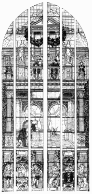 161. The Parable of the Pharisee and the Publican, Gouda.
It may not be according to the strict rules of the game: it is not; but
that it is magnificent, no fair-minded artist can deny. Our just cause
of quarrel is, not with that, but with what that led to, what that
became in less competent hands. It is the price we pay for strong men
that they induce weak ones to follow them in a direction where they are
bound to fail. Van Orley’s triumphant answer to any carping of ours
would be, to point to the great west window of the cathedral, designed
on earlier and more orthodox lines,and say: “Compare!” We have no right
to limit art to what small folk can do.
The further development of the Netherlandish canopy is shown in the
Gouda glass above. Here is still considerable skill in the way
in which the window is set out, and the patches of colour are introduced
(for example, in the two figures leaning on the balcony and the wreath
of leaves and fruit above them) amidst the predominant white,—if
only the white glass had been whiter in effect. But there is altogether
too much of this architectural work, even though it is used, in the
pictured parable at least, to dramatic purpose. The notion of the
Pharisee gesticulating away in the far distance, whilst the Publican
modestly fills the foreground, is cleverly conceived and skilfully
carried out; but the picture is overpowered by its ponderous frame.
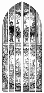 162. Gouda, 1596.
It is in the wonderful series of late sixteenth century windows at
Gouda, in Holland, that the fullest and furthest development of
pictorial design is shown. The period of their execution extends from
1555 to 1603; and, as they are admittedly the finest works of their day,
they may be taken to represent the best work of the latter half of the
sixteenth century. They are, in fact, typical of the period, only at its
best; it is not often that work of that date was designed with such
power or painted with such skill. The diagrams given here and on pages
79, 244, 258, do no manner of justice to the glass; but they will help
the reader better to understand what is said concerning it. They
indicate at least the lines on which these daring designers planned
their huge windows, the main lines which pictorial design on a large
scale is destined henceforth to take.
In the clerestory of S. Eustache, Paris, are some large
two-light windows which somewhat recall the Gouda work;
but the design is rather original. One vast architectural composition
in white, not very heavily painted, fills the window,
against which stand a series of giant Apostles in colour, one
in each light, occupying about one-third of the height of the
window. This much recognition of the separate openings is something to
be thankful for towards the middle of the seventeenth century.
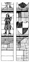 163. S. Sebald’s, Nuremberg.
A striking feature, we have seen, about the later Renaissance canopy as
shown at Gouda, and already at Brussels, is its vast dimensions. It no
longer frames the picture: it is a prominent, sometimes the most
prominent, feature in its design.
Even earlier than that the canopy was already sometimes of very
considerable extent. At S. Sebald’s, Nuremberg, there is a great
altar-like canopy ending in a pediment about two-thirds of the way up
the window, with plain white glass above, in which the shafting at the
side takes up practically the entire width of the two outer lights, as
here shown in the diagram of a portion of the glass. Yet this window is
as early as the year 1515, and before the period when masses of deep
shadow were represented by paint. Accordingly the canopy in this
instance is glazed in pot-metal of steely grey-blue, which, with the
little figures, mainly in steely grey armour against a white ground, and
the heraldic shields at the side, mainly in red and white, all very
slightly shaded, has a singularly fresh, bright, and delicate effect.
Another instance of preponderating architectural work occurs
also at Nuremberg in the choir of the church of S. Lorenz, and
though it belongs to the beginning of the seventeenth century,
that too is leaded up much as it might have been in the fifteenth.
But the great clumsy column, opposite, with its clumsier figure
of Fame, against a ruby background extending right up to the
stonework of the window, is not a satisfactory filling to the
outer light of a big window.
The last thing to expect of late Renaissance work is modesty
in the use of architectural accessories, whether in the form of
frame or background. Frame and background they are not;
they claim to be all or nothing. Just as ornamental design was
gradually pushed out of use by figure work, so the picture was in
time overpowered by its frame. And the frame was in the end
such that, when it came to be discarded, it was not much loss.
 164. S. Lorenz, Nuremberg.
In the latter half of the sixteenth century and thenceforward design
continued to travel in the direction of what was meant for a sort of
realism. If the more or less altar-like canopy was retained, it was
meant to appear as if it stood bodily under the arch of the window; if
it was abandoned, you were supposed to see more or less through the
window, perhaps into distant country, perhaps into receding aisles of
the church.
It formed part of the canopy scheme, that the structure should end
before it reached the top of the window, so that you could see beyond it
into space. The designers would have been only too happy if they could
have done away with the glass above that. If they had had big sheets of
plate glass, they would certainly have used them to produce the effect
of out of doors—there was already a plein air school in the
eighteenth century—as they had not, they were obliged to accept
the inevitable, and lead up their white glass; but they went as far as
they could to doing away with its effect, using thin, transparent
material, which was not meant to appear as though it formed part of the
composition. Occasionally they would use pale blue glass, or tint it in
a blue enamel, further to suggest the sky beyond. This (page 222) would
commonly be glazed in squares. The pure white glass also was often
glazed in square or, as at Brussels, diamond quarries (page 71).
Subjects themselves, it has been explained, came to be glazed as much as
possible in rectangular panes; but it marks, it may here be mentioned, a
decline of design, as well as of technique, when these came to interfere
in any way, as they did, with the drawing. Having made up his mind that
his design is to be glazed in rigid square lines, the artist should
logically have designed accordingly. He had only to mark off
the glazing lines on his cartoon, and scheme his composition so that it
was not hurt by them. Towards the seventeenth century the plain glass,
the extra part beyond the canopy or beyond the picture, would often be
glazed in some simple pattern. That, you might imagine, stood for the
window behind the picture or the monument. At the church of S.
Jacques, Antwerp, above a picture of the Circumcision, is a canopy
leaded in squares and painted to look like falsehood, beyond which clear
glass is glazed in a pattern.
Occasionally an attempt is made to merge the picture into
the plain glazing above, as at S. Paul’s, Antwerp, where the
yellow sky, against which is shown the distant city, and so
on, is glazed in squares, which further off become gradually
white, and then at their interstices have smaller diamond-shaped
pieces of glass let in.
Where a subject glazed in quarries is represented against
a background of plain glazing of more elaborate design, there
is difficulty in joining the two, except by means of a strong
lead outline to the figures, or whatever may come next to the
plain glass, which outline the seventeenth century designer was
anxious before all things to avoid. Accordingly, as the plain
pattern work approached the margin of the painted work,
he replaced the leads by paint, which sham leads, of course,
could be made to disappear as seemed good to him. But
these little games of his, to judge by results, were hardly
worth the candle.
It will be seen how, in the French glass on page 200, the
canopy came to be backed and surrounded by unpainted glass,
quarries in that case. There the canopy sufficiently occupies
the window space not to strike one unpleasantly; but that
is sixteenth century work; later, and especially in Flanders,
canopies are represented, as in the cathedral at Antwerp (1615),
adrift, as it were, in a sea of plain glazing. Even when the
glass has some quality of glass the effect of that is not happy.
When the glass is thin and transparent it is disastrous.
At S. Jacques, Antwerp, again, coats of arms hover unsupported
in mid-air, the mere lines of the glazing being quite
inadequate to their apparent support. It is different, of course,
where the heraldic device, as opposite, is itself little more than
plain glazing. That is a very mild form of art; but, in its way,
it is satisfactory enough.
Perhaps least fortunate of all in effect are the landscapes at
S. Jacques, which float, without even a canopy to frame them,
in an atmosphere of leaded glass. Antwerp is rich in glass,
much of it very cleverly executed, which would serve very well
to illustrate how not to design a window.
165. Gouda, 1688.
The place of the canopy was supplied sometimes, especially
in later Netherlandish work, by the cartouche so dear to the
Dutch. It fulfilled very much the office of the canopy, framing
the design; and, had it been kept white, it would have framed it well,
affording circular and other shapes which form a welcome variation upon
the usual arched opening. But it was not white at all; very much the
reverse. Indeed the idea of the Dutch cartouche, with its
interpenetration of parts, and curling and projecting straps and bolts,
tempts the painter to a heavy method of painting, destructive of the
very quality of white. The device depends for its effect far too much
upon force of shadow to be of any great use in white glass. The
comparatively early cartouche in the lower half of the window at Gouda,
given on page 223, is of the simplest kind, and has none of that
too-seductive bolt work; but it is dull and heavy in effect, being
painted in heavy brown, with the idea of giving atmospheric effect to
the picture supposed to be seen through it.
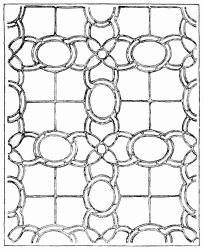 166. Plain Glazing, S. Gervais, Paris
A great cartouche is often used as a kind of base to a
canopy extending across the whole width of a wide window,
or the base of the canopy may include a very important
cartouche, occupied in either case by a long inscription. Here
again the oblong patch of white or yellow may have value,
in proportion as it is allowed to preserve the quality of glass.
There is, however, something poor and mean about large areas
of small lettering, and it is a pity to see the opportunity which
bold inscriptions give quite thrown away. Moreover, the
inscriptions are invariably too long. The framers of inscriptions
do not realise the multitude of readers they scare away
by the volume of their wording. The design of a window at
S. Jacques, Antwerp, consists merely of an inscription label,
with a helmet above and mantling in black and white (the
black, of course, paint) set in plain glazing.
Up to the very last whole windows were glazed very often
in plain patterns, usually all in clear white glass. A couple of
designs, into which a little colour is introduced, are given below
and opposite. In spite of the increased facility for cutting glass,
afforded from the beginning of the century by the use of the
diamond, patterns were seldom very elaborate; but, by way
of illustrating what can be done by means of the diamond,
there is shown overleaf quite a conjuring feat of glazing.
The thick black lines in the drawing represent the leads; the
white spaces enclosed are plain white glass, rather poor in
quality; the thinner lines stand for cracks, possibly not, or
not all of them, of the glazier’s doing, for it would be almost
impossible to handle such work without breaking it. It is
well-nigh incredible that each of these fleurs-de-lys should have
been cut out of a single piece of glass, the marginal band to it
out of a second, and so with the background spaces. Glaziers
may be inclined to question the possibility of such a tour de
force, even in poor thin glass. Certainly one would not have
thought it possible; but there it is, in the museum at Angers,
close to the eye, where you can see and examine it. This is
glazing with a vengeance. It is not the sort of thing that any
one would undertake, except as a trial piece, to show his skill;
but if ever a glazier deserved his diploma of mastership here is
the man.
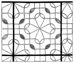 167. Plain Glazing, Lisieux.
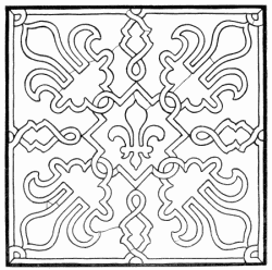 168. A Tour de Force in Glazing, Angers Museum.
The composition of some of the windows belonging to the first half of
the seventeenth century at Troyes does not follow the general tendency
of the period. The better part of this, if not the greater, is
attributed to Linard Gontier (1606-1648). But the design of these
windows, and the style of them, is so varied, and sometimes so little of
the period, that one is disposed to think, either that he was a painter
only and did not design them at all, or that he borrowed his designs
freely from Italian and other sources. The panel on page 400, the Virgin
girt with clouds and cherubs, distinctly recalls the work of the Della
Robbia School; and again the figures opposite remind one of late
sixteenth century paintings. An unusual thing, however, about some of
these windows is the way they are set out. The disposition of the design
of the three-light window from S. Martin ès Vignes is as simple and
severe as though it had been Gothic. The glazing, too, is not in
squares, but follows the design. Except for the rather robustious
drawing of the figures, and the futile kind of detail which does duty
for canopy work, the glass might belong to the first half of the
sixteenth century.
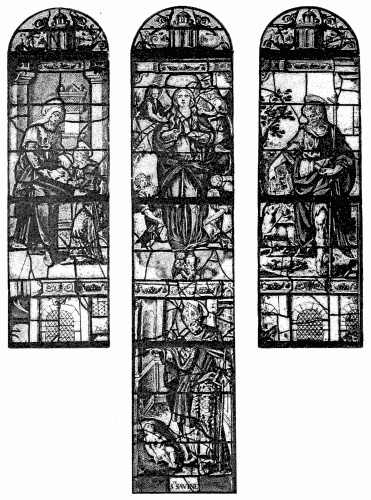
169. Three Lights, S. Martin-ès-Vignes, Troyes.
Again, in the subject of the marriage of SS. Joachim and
Anna on page 234, it is rather by the types of feature and the
cast of draperies, than by the composition, that the date of the
work proclaims itself. It is proclaimed, of course, unmistakably
by the use of enamel, not only in the warm-coloured flesh, but
throughout, to support, and sometimes to supply the place of,
pot-metal glass. Nevertheless, the effect of much of this glass
is brilliant to a degree almost unprecedented in the first half of
the seventeenth century. The painter had skill enough to get
the maximum of modelling with the minimum of paint. He
could afford, therefore, to use paint sparingly, leaving plenty of
glass clear, and seldom sacrificing its translucency, as was done
in the group of donors on page 81, whose black mantles are
rendered in solid paint. Those heavily painted figures recall a
couple of Donors in a window at Antwerp (1626), equally black
robed, against a nearly black screen, all in paint: they would
have made a capital votive picture; but they are about as
unlike glass as anything one can conceive.
Exceptionally good seventeenth century work is to be found
also at Auch. It seems that it was proposed (towards 1650) to
complete the windows in a way worthy of the splendid beginning
in the choir; but the art was not forthcoming; and the
Chapter of that day was wise enough to fall back upon comparatively
unimportant quarry windows, with borders and
tracery in white and stain and blue enamel, which is at least
brilliant in colour, and pleasing in effect. That may be said
also of the Western Rose. In the Roses of the transepts, the
artist goes further, and produces, by means of arabesque in
white and stain, upon a ground mainly of blue and ruby, occasionally
varied by green, each light defined by a simple border
of white and stain, a couple of flamboyant Rose windows with
glass which would do credit to the period of the stonework.
They might well (at the distance they are placed from the eye)
be taken at first sight for Early Renaissance work. In fact
they are really mosaic glass—so rare a thing by this time that
the windows are probably of their kind unique.
Even at its best enamelled glass is less effective than the earlier
work. In proportion as the place of pot-metal is supplied by
enamel, the colour is inevitably diluted, and at times it is quite
thin. Indeed, it is pretty well proved, by the work of men who
are masters in their way, that, in painted as distinguished from
mosaic glass, the choice lies between weak colour and opacity.
At Auch and at Troyes we have weak but still often pure and
brilliant colour.
170. St. Martin ès Vignes, Troyes.
The opposite defect of opacity reaches probably its greatest
depth in the four great Rubens-like windows at S. Gudule in
the chapel of Our Lady immediately opposite that of the
Holy Sacrament, where Van Orley’s windows are. The design
is there absolutely regardless of any consideration of glass or
architecture. Each window is treated as a vast oil picture,
without so much as a frame. Here is no vista of distant architecture,
nor any such relief of lighter colour as you find at
Gouda. Force of colour is sought by masses of deep shadow,
into which the figures merge. This shadow being obtained by
paint, and the glazing being in the now usual squares, there are
literally yards of painted quarries, which, except when the sun
is at its fiercest, are all but black. And withal the effect is not
rich as compared with even the common Gothic glass, though
it is not without a certain picturesqueness when perchance the
sun struggles through. A painter might find it an admirable
background to his picture; no architect would choose it for his
building. Three of these windows were designed, it seems, by
a pupil of Rubens, Van Thulden, who worked under him at
the Luxembourg, and they have all the character of his work—except
that the colour is dull.
At New College, Oxford, are some smaller windows with
figures, also recalling the manner of the master, and said to be
by pupils of his. They, too, are dull and heavy in effect. The
canopies over the figures are terrible caricatures of the Gothic
shrines in the ante-chapel. Better seventeenth century glass is
to be found at Oxford in the work of the Van Lingen, a family
of Dutchmen settled in England, who executed windows in
Wadham and Balliol Colleges and elsewhere. Some of these
are rich in colour. Apart from the rather interesting use of
enamel made in them, they are not of great value; but they
show as well as more important examples the kind of thing
which did duty for design.
The windows in Lincoln’s Inn Chapel, London, illustrate not
unfairly the dreary level of dulness as to colour and design
to which seventeenth century glass declined. That it could
fall still lower was shown, for example, by Peckitt, of York,
who is responsible for the glass on the north side of New
College Chapel, Oxford, facing the work of the Dutchmen.
These date from 1765 to 1774.
The history of eighteenth century windows may, if one may
plagiarise a famous bull, be put into the fewest possible words:
there were none—worth looking at. To find pleasure even in
Sir Joshua’s design at New College, you must consider it as
anything but glass.
The course of glass design was picture-ward. Picture design,
however, did not stand still, and hence arises some confusion
in the use of the word “pictorial.” It is time to try and clear
that up. Stained glass, it may be truly said, has been from
the very first pictorial. The earliest glass, therefore, and the
latest, the best and the worst, may alike be termed pictorial.
The difference is in the conception as to what constituted a
picture, say, in the thirteenth century and the seventeenth. It
all depends upon the kind of picture attempted.
Archaic art aims already at nature. We probably do not
give the early painter credit enough for his intention of rendering
natural things naturally. In part at least the stiffness of
his design comes from lack of skill, and often where we find
him quaint he meant no doubt to be perfectly serious and
matter-of-fact. But it was not alone incompetence that held
his hand. He was restrained always by a decorative purpose
in his work. Here again he was not conscious of sacrificing to
any higher rule of art; he bothered himself as little about that
as a bee about the way it shall fashion its cell; he worked in the
way to which he was born; but the idea had not yet developed
itself that a picture could be painted quite apart from the decoration
of something, and it never entered his mind to do anything
but adapt himself to the decorative situation.
A picture, then, in mediæval times was a work of decorative
art, designed to fit a place, to fulfil part of a scheme of decoration,
in which it might more often than not take the first place,
but no more; it had no claim to independence.
In glass the picture obeyed two conditions which more or
less pulled together: as art it subserved to decorative and
architectural effect; as craftsmanship it acknowledged and
accepted the limitations of glass painting. In the course of
years the ideal of architectural fitness underwent successive
changes, and the limitations of the glass painter grew less; his
scope, that is to say, was widened, and his art took what we
call more pictorial shape. Still, so long as the pictorial ideal
itself was restrained within the limits of mediæval ambition,
glass painting might safely approach the pictorial. It was
not until painting broke loose from traditional decorative
trammels and set up, so to speak, on its own account, until
pictorial came to mean something widely different from decorative,
that the term became in any way distinctive of one kind of
art or another. It is in that later sense that the word pictorial
is here used.
Artists still differ, and will continue to differ, as to the precise
use of the term. There are artists still who contend that,
since in old time art was decorative, and since in their opinion
all art should be decorative, therefore the picture which is not
decorative is not art. Arguing thus in a circle, they would say
(the pictorial including in their estimation the perfection of
decorative fitness, and all art which overshot the mark ceasing
to count with them) that art was always at its best when it
was most pictorial. But that is a species of quibbling about
words which not only leads us no further, but hinders mutual
understanding. It is wiser to accept words in the sense in
which they are generally understood, and to try and see where
the real difference of opinion is.
Difficult it may be, impossible even, to draw the line between
a picture which is decorative and decoration which is pictorial;
but there is no difficulty in drawing a band on one side of
which is decoration and on the other picture. You have only
to draw it wide enough. If we can succeed in defining a picture
as distinguished from a work of decorative art, and can
then show how a stained glass window, in attempting to conform
to conditions which we have agreed to call pictorial, fails
of its decorative function, it will then not be so difficult to see
how, in proportion as glass aims at the pictorial, it falls short
of making good windows. Granted, then, that a picture may
fulfil all decorative conditions, and that a decoration may sometimes
rightly be pictorial, that the two go, as historically they
did, a long way hand in hand, it is contended that there is a
point at which decoration and picture part company and take
distinctly different ways; thenceforth, if either is led away by
the other, it is at the cost of possible success in the direction
more peculiarly its own.
Now, the first point at which picture definitely parts company
with decoration is where the painter begins to consider
his work apart from its surroundings. The problems the artist
may set himself to solve are two. “How shall I adorn this
church, this clerestory, this chancel, this window, with stained
glass?”—that is distinctly a problem of the decorator; “How
shall I realise, on canvas or what not, this thought of mine,
this fact in nature, this effect seen or imagined?”—that is distinctly
a problem of the painter. Each, it is granted, may
be swayed more or less by the other consideration also, but
according as a man starts with the one problem or the other,
and seeks primarily to solve that, he is painter or decorator.
Suppose him seriously to endeavour to combine pictorial and
decorative qualities in his work, there will come times when
he has perforce to choose between the two. Upon the choice
he makes will hang the final character of his work, decorative
or pictorial.
We are too much in the habit of laying down laws as to
what a man may or may not do in art. He may do what
he can. He may introduce as much decorative intention into
his picture, as much pictorial effect into his decoration, as it
will stand; it is not till he overweights one with the other,
attempts more than his means or his power allow him, and
fails to do the thing that was to be done, that we can say he
has gone wrong.
When the two ideals of decoration and painting were more
nearly one, and in proportion as that was so, success in the
two directions was possible; when painting aimed at effects,
of painting—in proportion, that is, as it became pictorial—it
was impossible. It is safe to say, since masters attempted it
and failed—since, for example, the finest work in glass which
aims at the pictorial and depends upon painting ends always
in being either thin or opaque in effect—that the happy medium
was not found. The fact is, the time came when a painter,
in order to design successfully for glass, was called upon to
relinquish some of the effects he had come greatly to value
in painting: effects of light and shade, atmosphere, reflected
light, relief, perspective, violent foreshortening. To seek these
at the expense of qualities proper to decoration and to glass,
was to attempt picture; to sacrifice such pictorial qualities
to considerations of architectural fitness, to the quality of
the glass, its translucency, its colour, its consistent treatment,
was to attempt decoration; and in proportion as the sacrifice
is not made, the work of the glass painter may be characterised
as “pictorial.” There should now be no possible
misunderstanding as to what is meant by the word. It
implies something of reproach, but only as applied to glass.
Let the pictorial flourish, in its place—that is, in picture.
All it is here meant to assert is that, pictures being what
they are, what they were already by the end of the sixteenth
century, the pictorial element in stained glass is bound to spoil
the window.
There are two respects in which a stained glass window
differs from a picture: first, in that it is a window; second, in
that it is glass. Suppose we take these two points separately.
It scarcely needs showing that the designing of a window is
a very different thing from the painting of a picture. In the
first place, the architectural frame of the window is there, arbitrarily
fixed, whereas the painter chooses his frame to suit his
picture. The designer of a window has not only to accept
the window-shape, but to respect both it and the architecture
of the building. The scale of his work, the main lines of its
composition, if not more, are practically determined for him
by architectural considerations, just as the depth of colour in
his scheme is determined by the position of his window and
the amount of light he desires “or is allowed” to shut out.
Moreover, he has to accept the window plane, to acknowledge
it as part of the building, to let you feel, whatever he does, that
it is a window you see, and not something through the window
or standing in it. That was tried, as we have seen, at Gouda
and S. Gudule; but, even if the illusion had been achieved, it
would have been destructive of architectural effect. The idea
of a picture seen through the mullions of a window is one of
the will-o’-the-wisps which led glass painters astray. They
did not succeed; and, had they done so, they would have
given a very false, and to some of us a very uncomfortable,
impression of not being protected from the outer air.
Mullions are in any case a very serious consideration. It
has been shown already (page 197) how the artist sought
continuity of subject through the lights of his window, and
gradually extended his picture across them. And if he is at
liberty to occupy a four-light window with the Virgin and
Child and the Three Kings, and if it is lawful to introduce
more than one figure into a light, why may not each king be
accompanied by an attendant, holding his horse or bearing
gifts; why should not the Kings kneel in adoration; why
should not Joseph be there, the manger, and the cattle;
why should there not be one landscape stretching behind the
Magi, binding the whole into one picture? So with the Crucifixion.
If the Virgin and S. John may occupy sidelights, why
not introduce as well in a larger window the two thieves, the
Magdalene at the foot of the cross, the good centurion, the
soldiers, the crowd? Obviously there is no reason why the
subject should not be carried across a window; and from the
time that windows were divided into lights it was done, at all
events in the case of certain subjects, such as the Tree of Jesse,
which spread throughout the window, or the Last Judgment,
for which the available space was yet never enough.
But there is a wide difference between designing a subject
which extends through the whole width of a window and
designing it so that it appears to be seen through the window.
In the one case the mullions are seriously taken into account;
in the other they are ignored. If you were looking at a scene
through a window, of course the mullions would interfere.
Why, therefore, consider them if you wish to produce the effect
of something seen through? Naturally you would not allow the
stonework to cut across the face of a principal personage, or
anything of that kind; but, apart from that, its intervention
would only add to the air of reality. The problem of dealing
with the mullions is thus rather shirked than solved. Its
solution is not really so difficult as would seem. Mullions
count for much less in the window than one would suppose.
The eye, for example, follows naturally the branches of a Tree
of Jesse from one light into another, and it is not felt that the
stonework interferes with it at all seriously, whilst the scheming
of the figures, each within a single light, is a very distinct
acknowledgment of its individuality. So in the case of a
subject. If the design is so planned that the important figures
are grouped in separate lights, the landscape or other continuous
background helps to hold the picture together, and is not hurt
by the mullions.
The important thing is that mullions should be considered;
only on that condition do they cease to interfere with the
design. There is no reason always to put a border round
each light, or even to keep every figure within the bounds of
a single light. A reclining figure, such as that of Jesse at the
base of the window (below), Jacob asleep and dreaming, or the
widow’s son upon the bier, may safely cross two or three lights,
if it be designed with reference to the intervening stonework.
Further, it seems desirable that the shape of each separate
window opening should be acknowledged by at least a narrow
fillet of white or pale colour next the masonry, broken, it may
be, here and there by some feature designed to hold the lights
together, but practically clearing the colour from the stonework,
and giving to the division of the window the slight
emphasis it deserves. It is not worth while dividing a window
into lights and then effacing the divisions in the glass. Given
a window of four or five lights, the decorator has no choice but
to design a four or five-light window. He must render his
subject so that the constructional divisions of the window keep
their proper architectural place; if his subject will not allow
that, he must abandon his subject, or give very good reason why
not. The reason of mere pictorial ambition will not hold good.
The test of a good picture-window is, how the mullions affect
the design. If to take them away would make it look foolish,
then it has probably been designed as a window, decoratively;
if to take them away would improve it, then it has been designed
pictorially; and, however good a picture it might have been, it
is a bad window design.
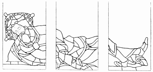
171. S. Mary’s, Shrewsbury.
It is quite possible, nay, probable, that in connection with
any given window, or series of windows, there will be architectural
features which deserve to be emphasised. It may be
the springing of the arch which calls for accentuation; it may
be a string-course in the walls that asks for recognition; it
may be that the proportion of the window wants correction.
Whatever it be, it is the part of the decorator to feel the want
and to meet it, to grasp the situation and to accept it. In not
doing so, he shows perhaps pictorial, certainly not decorative,
instinct. So with regard to the plane of a glass picture. It is
not necessary to restrict one’s design to silhouette, to make
one’s picture as flat as the first glass painters or the Greek
vase painters made theirs. How much of distance and relief a
man may indulge in is partly his own affair. It depends upon
what he can manage to do without destroying the surface of
his window. So long as he preserve that, he may do as he
pleases, and yet not lay himself open to the charge of being
unduly pictorial; only it is as well to remember that on the
simplest and severest lines grand work has been done, and may
still be done, without falling into archaism; whilst the Crabeths,
and the rest of the astoundingly clever glass painters of Gouda
fail to reconcile us to the attempt to render the sky beyond
(page 258) or distant architectural vistas in glass.
It has sometimes been contended that all lines of perspective
(which in the sixteenth century begin to take a very important
place in design) are amiss in glass, inasmuch as they destroy
its flatness. That is surely to go too far. So long as no effect
of relief is sought, no effect of distance attempted, no illusion
aimed at, one can hardly find fault with lines indicating the
perspective necessary perhaps to the expression of the design—assuming,
of course, that the lines of perspective take their
place in the decorative scheme, and help the composition of
the window. They do that very cleverly in Crabeth’s picture
of “Christ Purifying the Temple” (page 244). Our complaint
is rather with the strong relief attempted, the abuse of
shadow, and especially of painted shadow. The case is far
worse where, as at S. Eustache, Paris, the architectural
background is shown obliquely. In that case, no uncommon
one in the seventeenth century, when the painter would just
as likely as not choose his point of view as best suited his
picture, without any reference whatever to its architectural
setting, the painter shows himself, as glass painter, at his most
pictorial and worst.
So much for the window as an architectural feature, now let
us look at it as glass.
It becomes here very much a question of craftsmanship.
To a workman it seems so natural, and so obvious, that the
material he is working in, and the tools he is using, must from
beginning to end affect the treatment of his design, that it
appears almost unnecessary to insist upon such a truism.
Experience, however, goes to show that only the workman
and here and there a man who ought, perhaps, to have been one,
have any appreciation of what artists call treatment. The rest
of the world have heard tell that there is such a thing as technique,
to which they think far too much importance is attached.
That is so, indeed, when artists think technique is enough; but
not when they look upon it as indispensable, the beginning of
all performance, not when they insist that a man shall know
the grammar of his art before he breaks out into poetry.
Now the A, B, C, of workmanship is to treat each material
after its kind. It is a truism, therefore, to say that glass should
be treated as glass. Yet we find that a man may be enthusiastic
to a degree about an art, learned above most men in
its history, and yet end in entirely misconceiving its scope.
“What is to be condemned on canvas,” said Winston, “ought
not to be admitted on glass.” As well might he have said, that
what would be condemned on glass should not be allowed on
canvas, or that language and behaviour which would be unbecoming
in church should not be tolerated on the platform, or
at the dinner-table.
The fallacy that one rule applies to all forms of art is responsible
alike for the muddiness of seventeenth and eighteenth
century windows and for the thin transparent tinting of nineteenth
century Munich glass.
That “art is one” is a fine saying, rightly understood. So
is humanity one, and it is well to remind ourselves of the fact;
but race, climate, country, count for something; and to speak
with effect we must speak the language of the land. Each
separate craft included in the all-embracing title of art, and
making for its good and its glory, works under conditions as
definite as those of climate, has characteristics as marked as
those of nationality, and speaks also a language of its own. And,
to express itself to full purpose, it must speak in its own tongue.
The only pictures, then, which prove satisfactory in glass are
the pictures of the glass painter; and by glass painter is not meant any
one who may choose to try his hand at glass painting, but the man who
has learnt his trade and knows it from end to end, to whom use has
become second nature, who thinks in glass, as we say. Now and again,
perhaps, where a draughtsman and a glass painter are in unusual
sympathy, it may be possible for the one to translate the design of the
other into the language of his craft; but good translators are rare, and
translation is at best second-hand. Success in glass is achieved mainly
by the man to whom ideas come in the form of glass, who sees them first
in his mind’s eye as windows. Even such a man may lack taste, insight,
discretion; he may be led away by a misplaced ambition—it is not
merely on the stage that the low comedian aspires to play
Hamlet—but only the man who knows so well the dangers ahead that
he insensibly avoids them, who knows so surely what can be got out of
his material that he makes straight for that, who does, in short, the
best that can be done in glass, can dare to be “pictorial” without
danger of being false to his trade.
A painter without experience of glass might, of course, be coached in
the technique of the material; but he would never get the most out of
it. Conditions which to the glass painter would be as easy as an old
coat, would be a restraint to him, and the greater his position the more
impatient he would be of such restraint, the more surely his will would
override the better judgment of the subordinate who happened to know.
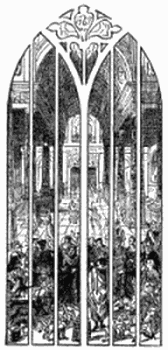 172. Christ purging the Temple, Gouda.
It was unfortunate that at a critical period in the history of
glass, just when great painters from the outside began to be
called in to design for it, knowledge was in rather an uncertain
state. The use of enamel had been discovered; it offered
undoubted facilities to the painter; it was believed in; it was
the fashion. Any one who had protested the superiority of the
old method would possibly have been set down as an old fogey,
even by glass painters. At that moment, very likely, a glass
painter, anxious of course to conciliate the great man, but
flushed also with faith in his new-found method, would have
said to Van Orley, in reply to any question about technique:—“Never
you mind about glazing and all that; give us a design,
and we will execute it in glass.” And he did execute it in a
masterly and quite wonderful way. Still the success of it is
less than it would have been had the designer known all about
glass: in that case his artistic instinct would have led him
surely to trust more to qualities inherent in glass, and less to
painting upon it. Van Orley’s picture scheme depended too
much upon relief to be really well adapted to glass, but it was
splendidly monumental in design, and to that extent admirably
decorative. Something of decorative restraint we find almost
to the end in sixteenth century work; the picture had not yet
emancipated itself entirely, and the pictorial ideal did not
therefore necessarily go beyond what glass could do; in any
case, it did not take quite a different direction.
It may be as well to define more precisely the ideal glass
picture. The ideal glass picture is, the picture which gives full
scope for the qualities of glass, and does not depend in any way
upon effects which cannot be obtained in glass, or which are to
be attained only at the sacrifice of qualities peculiar to it.
And what are those qualities? The qualities of glass are
light and colour, a quality of light and a quality of colour to
be obtained no other way than by the transmission of light
through pot-metal glass.
Compare these qualities with those of oil painting, and see
how far they are compatible. Something depends upon the
conception of oil painting. The qualities of glass are compatible
enough with the pictorial ideal of the oil (or more
likely tempera) painters whom we designate by the name of
“primitives”; and, indeed, fifteenth century Italian windows
often take the form of circular pictures which one of the masters
might have designed. A painting by Botticelli, Filippo Lippi,
Mantegna, or Crivelli, might almost be put into the hands of a
glass painter to translate. It is quite possible that some of the
Florentine windows were executed in Germany from paintings
by Italian masters; the odd thing is that they are attributed
sometimes to sculptors. Ghiberti and Donatello may, for all
one knows, have been great colourists; but it is so universal a
foible to ascribe works of decorative art to famous painters
or sculptors who could never by any possibility have had a
hand in them, that one never has much faith in such reputed
authorship.
The severity of the “primitive” painters’ design, the firm
outline, the comparatively flat treatment, the brilliant, not
yet degraded, colour—all these were qualities which the glass
painter could turn to account. Without firm and definite outline,
of course, a design does not lend itself to mosaic. But it
is especially the early painter’s ideal of colour which was so
sympathetic to the glass painter. A designer for glass must be
a colourist; but the colour he seeks is sui generis. Not every
colourist would make a glass designer. Van Thulden may not
have been a colourist of his master’s stamp, but Peter Paul
Rubens himself could not have made a complete success of
those windows in the Chapel of Our Lady in S. Gudule.
Reynolds was a colourist, but he came conspicuously to grief
in glass. Velasquez was a colourist, but one fails to see how
by any possibility the quality of his work could be expressed
in glass.
On the other hand, colour in which the simple artist delighted,
as in light and sunshine, in the sparkle of the sea, in the purity
of the sky, in the brilliancy of flowers, in the flash of jewels, in
the deep verdure of moss, in the lusciousness of fruit or wine,
colour as the early Florentine painters saw it and sought it—this
is what glass can give, and gives better than oil, tempera,
or fresco, on an opaque surface. How far these early painters
deliberately sacrificed to pure bright colour qualities of light
and shade, aerial perspective, and so on, may be open to
question. The certain thing is that, if we want the quality of
glass in all its purity and translucency, we have to sacrifice to
it something of the light and shade, the relief, the atmospheric
effect, the subtlety of realistic colour, which we are accustomed
nowadays to look for in a picture. Happy the men
who could contentedly pursue their work undisturbed by the
thought that there were effects to be obtained in art beyond
what it was possible for them to get.
Even the Italian painters soon travelled beyond the limits
of what could possibly be done in glass. Flesh-painting, as
Titian understood it, or Correggio, or Bonifacio, is hopelessly
beyond its range. But it was the Dutch who formed
for themselves the idea most widely and hopelessly beyond
realisation in glass. The Crabeths, like good glass painters,
struggled more or less against it; but they could not keep out
of the current altogether; and in proportion as their work
aims at anything like chiaroscuro it loses its quality of glass.
Rembrandt, to have realised his ideal in glass, would have had
to paint out of it every quality which distinguishes it and gives
it value. In proportion, as the painter’s aim was light and
shade rather than colour, and especially as it was shade rather
than light (or perhaps it would be fairer to say, as it was light
intensified by obscuring light around it) it was diametrically
opposed to that of the glass painter. His pursuit of it was a
sort of artistic suicide. It led by quick and sure degrees to
what was to all intents and purposes the collapse of glass
painting. Realism of a kind was inevitable when once the
painter gained the strength to realise what he saw, but when
the glass painter, seeking the strength of actual light and
shade, began to rely upon painted shadow for his effects, the
case was hopeless. Glass asks to be translucent.
The point of perfection in glass design is not easily to be
fixed. Glass painting, it must be confessed, as it approaches
perfection of technique, is always dangerously near the border
line; the painter is so often tempted to carry his handiwork a
little further than is consistent with the translucency of glass.
It happens, therefore, that one expects almost to find consummate
drawing and painting marred by some obscuration of the
glass. If on the other hand we travel back to the time when
the evil does not exist, we find ourselves at a period when
neither drawing nor painting were at their best. It is by no
means surprising that this should be the outcome of the
association of glazier and painter. According as one cares
more for glass or for painting one will be disposed to shift,
backwards or forwards, the date at which glass painting began
to decline. It may safely be said, however, that pictorial glass
painting was at its best during the first half of the sixteenth
century. That is the period during which you may expect to
find masterly drawing, consummate painting, and yet sufficient
recognition of the character of glass to satisfy all but the
staunch partisan of pure mosaic glass—who, by the way, stands
upon very firm ground.
In Flanders, as has been said, and in France, are to be
found exquisite pictures in glass, admirably decorative in design,
glowing with jewel-like brilliancy of colour, not seriously obscured
by paint, the figures modelled with a delicacy reminding
one rather of sculpture in very low relief than of more realistic
painting and carving, the colour delicate and yet not thin, the
effect strong without brutality.
But it is in Italy that are to be seen probably the finest
glass pictures that have ever been painted; the work, nevertheless,
of a Frenchman—William of Marseilles—who established
himself at Arezzo, and painted, amongst other glass,
five windows for the cathedral there, which go about as far
as glass can go in the direction of picture. The man was a
realist in his way—realist, that is, so far as suited his artistic
purpose. Not merely are his figures studied obviously from
the life, but they are conceived in the realistic spirit, as when,
in the scene of the Baptism, he draws a man getting into his
clothes with the difficulty we have all experienced after bathing,
or when, in the Raising of Lazarus (page 397), he makes more
than one onlooker hold his nose as the grave-clothes are unwrapped
from the body. In design the artist is quite up to
the high level of his day (1525 or thereabouts); but you see all
through his work that it was colour, always colour, that made
his heart beat (we have here nothing to do with the religious
sentiment which may or may not be embodied in his work),
colour that prompted his design, as in the case of so many a
great Italian master.
This man possibly did in glass much what he would have
done on canvas; but he could never have got such pure,
intense, and at the same time luminous, effects of colour
in anything but glass, and he knew it, never lost sight of it,
and tried to get the most out of what it could best give him—that
is to say, purity of colour, and translucency and
brilliancy of glass. Whatever amount of pigment he employed
(probably more than it seems, the light is so strong in Italy)
it seldom appears to do more than just give the needful
modelling. Now and again, in the architectural parts of his
composition, the white is lowered by means of a matt of paint,
where a tint of deeper-coloured glass had better have been
employed; but even there the effect is neither dirty nor
in the least heavy. And in the main, for all his pictorial
bias, the system of the artist is distinctly mosaic; his colour
is pot-metal always or purest stain. The sky and the landscape,
for example, in which the scene of the Baptism is laid,
are leaded up in tints of blue and green. In the scene where
Christ purges the Temple the pavement is of clear aquamarine-tinted
glass, against which the scales, moneybags,
overturned bench, and so on, stand out in quite full enough
relief of red and yellow, without any aid of heavy shading,
or cast shadow, such as a Netherlander would have used.
And, for all that, the difficulty even of foreshortening is
boldly faced. Not even in the most violently shaded Flemish
glass would it be easy to find a figure more successfully
foreshortened than the kneeling money-changer, scooping
up his money into a bag. That a designer could do this
without strong shading, means that he was careful to choose
the pose or point of view which allowed itself to be expressed
in lightly painted glass. There is no riotous indulgence in
perspective, but distance is sufficiently indicated; and the personages
in the background, drawn to a smaller scale than the
chief actors in the scene, keep their place in the picture.
Everywhere it is apparent that the figures have been composed
with a cunning eye to glazing.
These are not pictures which have been done into glass; they
are no translations, but the creations of a glass painter—one
who knew all about glass, and instinctively designed only what
could be done in it, and best done. This man makes full use
of all the resources of his art. His window is constructed as
only a glazier could do it. He does not shirk his leads. He
uses abrasion freely, not so much to save glazing, as to get
effects not otherwise possible. Thus the deep red skirt or
petticoat of the woman taken in adultery is dotted with white
in a way that bespeaks at a glance the woman of the people,
whilst more sumptuous draperies of red and green are, as it
were, embroidered with gold, or sewn with pearls. These are
the effects he aims at, not the mere texture of silk or velvet.
He delights in delicate stain on white, and revels in most
gorgeous stain upon stain. In short, these are pictures indeed,
but the pictures of a glass painter.
Work like this disarms criticism. One may have a strong
personal bias towards strictly mosaic glass, and yet acknowledge
that success justifies departure from what one thought
the likelier way. Things of beauty decline to be put away
always in the nice little pigeon-holes we have carefully provided
for them. Shall we be such pedants as to reject them because
they do not fit in with our preconceived ideas of fitness?
Alas!—or happily?—alas for what might have been, happily
for our wavering allegiance to sterner principles of design, it is
seldom that the glass painter so perfectly tunes his work to the
key of glass. In particular, he finds it difficult to harmonise
his painting with the glazing which goes with it. He is
incapable in the early sixteenth century of the brutalities of his
successors, who carry harsh lines of lead across flesh painting
recklessly; but the very association of ultra-delicate painting
with lead lines at all demands infinite tact. An idea of the
point to which painting is eventually carried may be gathered
from the representation of little nude boys blowing bubbles in
which are reflected the windows of the room where they are
supposed to be playing. That is an extreme instance, and a
late one. Short, however, of such frivolity, and in work of the
good period, painting is often so delicate that bars and leads
unquestionably hurt it. It is so even in the very fine Jesse
window at Beauvais (page 368).
Occur where it may it is a false note which stops our admiration
short; and, after all our enthusiasm, we come back heart-whole
to our delight in the earlier, bolder, more monumental,
and more workmanlike mosaic glass. The beautiful sixteenth
century work at Montmorency or at Conches does not shake
the conviction of the glass-lover, that the painter is there a
little too much in evidence, that something of simple, dignified
decoration is sacrificed to the display of his skill. The balance
between glass decoration and picture is perhaps never more
nearly adjusted than in some of the rather earlier Italian
windows.
At once a distinguishing feature of picture-glass, and a characteristic
of later work generally, is the mise-en-scène of the subject.
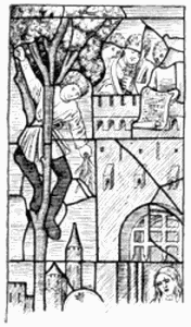 173. From The Entry into Jerusalem, Fairford.
In quite the earliest glass the figures, it was shown, were cut out
against a ground of plain colour (pages 33, 127), or diapered perhaps
with a painted pattern, or leaded up in squares, or broken by spots of
pot-metal (page 37), which, by the way, being usually of too strongly
contrasting colour, assert themselves instead of qualifying its tone.
Sometimes the ground was leaded up in the form of a more or less
elaborate geometric diaper (page 336). Occasionally it was broken by the
simplest possible conventional foliage. The figure stood on a cloud, an
inscribed label, a disc or band of earth. In the fourteenth century
spots breaking the ground took very often the form of badges,
fleurs-de-lys, heraldic animals, cyphers, and so on (page 156), and
even in the fifteenth it was quite common to find figures against a flat
ground, broken only by inscription, either on white or yellow labels
(pages 186, 339), or leaded in bold letters of white or yellow into the
background itself (page 196). But simultaneously with this the figure
was frequently represented against a screen of damask (page 191), above
which showed the further background, usually more or less architectural
in character. In the Fairford windows (page 187) is shown this
treatment together with the label which helps to break the formality of
the horizontal line. Sometimes the line is curved, as though the figure
stood in a semicircular niche, or broken, as though the recess were
three-sided. Sometimes the figure stood upon a pedestal (page 391), but
more usually, as time went on, upon a pavement. Certain subjects were
bound to include accessory architecture, but at first it was as simple
as the scenery in the immortal play of Pyramus and Thisbe. But even in
the fifteenth century it was rendered, one may judge how naïvely, from
the little Nativity on page 54, a subject hardly to be rendered without
the stable. Again, the quite conventional vinework, also from Malvern,
shown in the upper part of page 345 (a jumble of odds and ends), forms
really part of the scene depicting Noah in his vineyard—see the
hand holding the spade handle. The Fairford scenery (pages 251, 372),
quaint as it is, goes much nearer to realism than that; and towards the
sixteenth century, and during its first years, there was a good deal of
landscape in which trees were leaded in vivid green against blue, with
gleaming white stems suggestive of birch-bark, always effective, and
refreshingly cool in colour. There is something of that kind in the
window facing the entrance to King’s College, Cambridge; but the more
usual English practice in the fifteenth century was to execute the
landscape in white and stain against a coloured ground. That is the
system adopted in the scene of the Creation at Malvern (page 252), where
trees, water, birds, fishes, are all very delicately painted and
stained. In the left-hand corner it will be seen that solid or nearly
solid brown is used for foliage in order to throw up the white and
yellow leafage in front of it. There is some considerably later work
very much in this manner at S. Nizier, Troyes. But that kind of thing
was not usual in French glass.
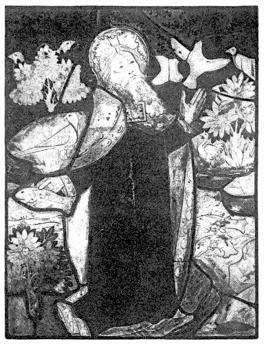
174. From The Creation, Malvern Abbey.
The sky had of course from the first been indicated by a
blue background; but, the blue ground being used, in alternation
with ruby, for all backgrounds, except a few in white,
it was not distinctive enough to suggest the heavens, without
some indication of clouds, which accordingly were leaded
up upon it, sometimes in mere streaks of colour, sometimes
in fantastically ornamental shapes. It was a later thought,
which came with the use of paler glass, to paint the blue with
clouds, indicating them, that is to say, more or less in the form
of diaper. As with the sky so with the sea. It was at first
glazed in wave pattern; eventually the wave lines were painted
on the blue.
The blue background, which had gradually become paler and
paler, became soon in the sixteenth century pale enough to
stand approximately for a grey-blue sky, on which was painted,
with marvellous delicacy, distant landscape, architecture, or
what not, always in the brown tint used generally for shading,
although a tint of green was given to grass and trees by the
use of yellow stain. This distant view painted upon blue
was a beautiful and most characteristic feature of sixteenth
century glass. The French painters adopted it, and made
it peculiarly their own, though it occurs also in German
and Flemish glass. Backgrounds of this kind, which in themselves
suffice to mark the departure from Gothic use, are
shown on pages 207, 213, and on a larger scale opposite. The
wintry landscape there with the bare tree trunks against
the cold grey sky, forms the upper portion of the subject
shown on page 207, in which Our Lord gives His charge to
Peter; the paler grey behind the heads of the group stands
for the sea. The wintry effect of the scene is not suggestive of
the Holy Land, but it brings the subject innocently home to
us. The leads, it will be seen, take the lines of the larger
limbs of the trees, whilst the lesser branches and small twigs
are painted on the glass. There is ingenuity in the glazing
as well as delicacy in the painting. This is a very different
thing from the landscape painted in enamel colours. The
propriety, the beauty, the decorative quality of such work as
this, comes of the acceptance of the necessary convention of
treating the painted background, of rendering it, that is, always
more or less in monochrome, and not attempting anything
like realism in colour.
The painted landscapes illustrated are of the simplest.
The French painters went much further than that, associating
with their painting broad masses of pot-metal colour, but
still keeping distinctly within the convention of deliberately
simple colour. By the use of silvery-white and shades of pot-metal
blue and purple and green, they produced the most
pleasing and harmonious effects. There was no great variety
in the tune they played, but the variations upon it were infinite.
Let us picture here a few of them.
1. Ecouen.—A distant city, in white, and beyond that more
distant architecture, painted on the pale blue of the sky.
2. Conches.—Against a pale blue sky, broken by cumulous
white clouds, a grey-blue tower.
3. Conches.—A grey-blue sea and deeper sky beyond: from
the waves rises a castle, in white, breaking the sky-line, the
pointed roofs of its turrets painted in black upon the background.
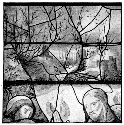 175. Background to the Charge of S. Peter, S. Vincent, Rouen. (Comp. 156.)
4. Freiburg, 1528.—A smoke-grey sea, fading away towards
the horizon into pale silver, the sky beyond dark blue, its
outline broken by a range of deeper blue mountains.
5. Conches.—Beyond the foreground landscape in rich green,
a pale blue sea, with slightly deeper grey-blue sky beyond,
a tower in darker blue against it; a strip of deep blue shore
divides the sky and sea, and gives support to the dark tower;
against that a smaller tower catches the light, and stands out
in glittering white.
6. Montmorency.—A canopied figure subject in gorgeous
colour; the foreground a landscape with rich green herbage,
separated by a belt of white cliffs from buildings of pale grey,
amidst trees stained greenish, backed by purple hills; further
a pale blue sky; against the sky, overshadowed beneath the
canopy arch by a mass of purple cloud, the stained and painted
foliage of a tree, growing from this side the hill.
7. Montmorency.—S. Christopher crossing the stream; blue
water painted with waves and water plants, the foliage stained.
8. S. Nizier, Troyes.—A vineyard, very prettily managed; the
vines painted on the blue, their leaves stained to green, the
grapes grey-blue, whilst grey stakes are leaded in pot-metal.
Sometimes, as at Ecouen, far-off architecture would be painted
not upon blue but upon a pale purple hill. At Laigle figures
and animals are painted upon green, but they do not hold their
own. On the other hand, at Alençon, some distant figures
appearing in very pale grey against a delicate greenish landscape
(stained upon the grey), are charming in effect.
White backgrounds painted as delicately as the blue are
not rare. At Groslay, for example, steely-white architecture
is separated from white sky beyond by grey-blue hills, a church
with blue steeple breaking the sky. But white does not lend
itself so readily to combination with colour as blue; and, as a
rule, such backgrounds are grisaille in character, relieved, of
course, with stain.
The great sea-scape at Gouda (page 223), representing the
taking of Dalmatia in Egypt (a very Dutch Dalmatia), is
nearly all in grisaille, against quarries of clear white, with
only a little stain in the flags and costumes, and one single
touch of poor ruby (about two inches square), which looks as
if it might be modern. The port in perspective, the ships, the
whole scene, in fact, is realistically rendered, and comes as near
to success as is possible in glass.
Delightful peeps of landscape are sometimes seen through the
columns and arches of an architectural background. Whether
the architecture be in purple of divers shades, or in white
with only shadows in purple, or whether the nearer architecture
be in white and the more distant in purple, in any
case a distance beyond is commonly painted upon the grey-blue
sky seen through it. Possibly, as at Conches, further vistas
of architecture may be stained greenish upon it—any colour
almost, for a change. But whatever it may be, and wherever
it may be, in the best work it is colour; and it is always more
effective than where the shadow is represented by paint, even
though the brown be not laid on with a heavy hand, infinitely
more effective than when blue or other coloured enamels are
relied upon, as in some instances at Montmorency. Enamel
may, for all one can tell, have been used in some of the
landscapes here commended—it is impossible to say without
minute examination of the glass, which is rarely feasible—but
it never asserts its presence; and in any case it has not been
used in sufficient quantity to damage the effect.
It will be gathered from the descriptions of early sixteenth
century glazed and painted distances, that they were as carefully
schemed with a view to glazing (though in a very different way)
as a Gothic picture. Sometimes, as at Conches, they are rather
elaborately leaded; and where that is the case there is not so
much danger of incongruity between the delicacy of the painting
and the strength of the leads—which assert themselves less than
where they occur singly. It stands to reason also that the
more mosaic the glass the less fragile it is. Painting alone
upon the blue is best employed for small peeps of distance. It
adapts itself to smaller windows; and it must be done (as for a
while it was done) so well, that it seems as if the designer
must himself have painted it. Were the artist always the glass
painter, and the glass painter always an artist, who knows what
case pictorial glass might not make out for itself?
 176. The Relief of Leyden, Gouda.
It is a coarser kind of distance than the French that we
find at King’s College, Cambridge. There the landscape backgrounds
are in white and stain, grey-blue being reserved for
the sky beyond, broken more or less by white clouds, or, occasionally,
by the white trunks of trees, the foliage of which is
sometimes glazed in green glass, sometimes painted upon the
blue and stained. Here and there a distant tree is painted
entirely upon the blue. This treatment is not ill adapted to
subjects on the large scale of the work at King’s College,
but one does not feel that the painters made anything like
the most of their opportunity. The inexperience of the
designers is shown in their fear of using leads, a most unnecessary
fear, seeing that, at the distance the work is from
the eye, the bars themselves have only about the value of
ordinary lead lines.
Stronger and more workmanlike, but not quite satisfactory, is the much
later landscape (1557) of Dirk Crabeth at Gouda. There the sky is blue,
leaded in quarries, on which are trees, painted and stained, and some
rather florid clouds. In the later work generally the lead lines are no
longer either frankly acknowledged or skilfully disguised. The outline
of a green hill against the sky will be feebly softened with trivial
little twigs and scraps of painted leafage. The decline of landscape is
amply illustrated at Troyes. At Antwerp again there is a window bearing
date 1626, in which the landscape background of a quite incomprehensible
subject extends to a distant horizon, above which the sky is glazed in
white quarries, with clouds painted upon it. This is an attempt to
repeat the famous feat of glass painting which had been done some twenty
years before at Gouda. The Relief of Leyden, of which a diagram is here
given, is in its way a most remarkable glass picture. In the foreground
is a crowd of soldiers and citizens, upon the quay, about lifesize. They
form a band of rich colour at the base of the composition; but the
design is confused by the introduction of shields of arms and their
supporters immediately in front of the scene. Beyond are the walls and
towers of the city of Delft, and the adjacent towns and villages, and
the river dwindling into the far distance where Leyden lies—in the
glass a really marvellous bird’s-eye view over characteristically flat
country. The horizon extends almost to the springing line of the window
arch, and above that rises a sky of plain blue quarries, broken
only towards the top by a few bolster-like and rather dirty
white clouds. Absolute realism is of course not reached, but it is
approached near enough to startle us into admiration. It is astonishing
what has here been done. But the painter has not done what he meant to
do. That was not possible, even with the aid of enamel.
In the course of the preceding chapters the reader has been
rather unceremoniously carried from country to country, in a
way which may have seemed to him erratic. But there was
a reason in the zig-zag course taken. The progress of the glass
painter’s art was not by any means a straight line. Nor did it
develop itself on parallel lines in the various countries in which
it throve. It advanced in one place whilst it was almost at
a standstill in another.
That is easily understood. It was inevitable that glass
painting, though it arose in France, should languish there
during the troublous times when English troops overran it
under Edward III. and throughout the Hundred Years’ War,
that it should revive in all its glory under Francis the First,
and that during the disturbances of the Fronde it should
again decline. The extremity of France was England’s opportunity;
and our greatest wealth of stained glass windows dates
from the reign of the later Plantagenets. The Wars of the
Roses do not appear greatly to have affected art; but after
the Reformation we were more busy smashing glass than
painting it.
In Germany the course of art ran smoother. Glass throve
under the Holy Roman Empire, and it was not until the
Reformation that it suffered any very severe check. Mediæval
Swiss glass may be classed with German.
In the Netherlands glass painting blossomed out suddenly
under the Imperial favour of Charles V. It continued to bear
fruit under the Dutch Republic, until it ran to seed at the end
of the seventeenth century.
So it happens that, in following the development of glass
painting, it has been necessary to seek the best and most
characteristic illustrations first in one country and then in
another, to travel from France to England, from England to
Germany and back to France, thence to Flanders, to France
again, and finally once more to the Netherlands, to say nothing
of shorter excursions from one place to another, as occasion
might demand. In each separate locality there was naturally
some sort of progress, but we cannot take any one country as
all-sufficient type of the rest; and to have traversed each
in turn would have been tedious. There were everywhere
differences of practice and design; in each country, for that
matter, there were local schools with marked characteristics
of their own. Some of the characteristic national differences
have been pointed out in passing. To describe them at
length would be to write a comparative history of glass, of
which there is here no thought. What concerns us is the
broadly marked progress of glass painting, not the minor local
differences in style.
Something more, however, remains to be said of Italian
glass than was possible in any general survey. The mere facts,
that the Renaissance arose in Italy so long before it reached
this side the Alps, and that glass painting was never really quite
at home in Italy (any more than the Gothic architecture
which mothered it), sufficiently account for the difficulty, nay,
the impossibility, of classing it according to the Gothic periods.
Indeed, one is reminded in Italian glass less often of other
windows of the period, English, French, or German, than of
contemporary Italian painting.
The comparative fitness of the works of the “Primitive”
painters for models of glass design has already been pointed
out. It is so evident that the Italian sense of colour could
find more adequate expression than ever in glass, that one is
inclined to wonder, until it is remembered that Italian churches
were at the same time picture galleries, that it did not more
commonly find vent in that medium. Even as it is, Italian
painters did found a school of glass painting, comparatively
uninfluenced by the traditional Gothic types of design, whilst
observing the best traditions of glazier-like technique. Hence
it is that we find in Italy windows such as are nowhere else to
be seen, windows which at their best are of the very best.
There are resemblances in Italian glass to German work;
and some of it is said to have been executed by Germans.
It is none the less Italian. Though it were executed in
Germany, glazier and painter must have worked under the
direct influence of the Italian master, and in complete accord
with him, putting at his service all their experience in their
craft, and all their skill. So well did they work together, that
it seems more likely that the executant not only worked under
the eye of the master, but was at his elbow whilst he designed.
That alone would account satisfactorily for the absolutely
harmonious co-operation of designer and glass-worker. One
thing is clear, that the artist, whatever his experience in glass,
great or little, had absolute sympathy with his new material,
felt what it could do, saw the opportunities it offered him, and
seized them.
An Englishman, or a Frenchman, who found himself for the
first time in Italy, would be puzzled to give a date to the
windows at Pisa or Milan, or in either of the churches of
S. Francis at Assisi. Even an expert in the glass of other
countries has to speak guardedly as to Italian work, or he may
have to retract his words. Italian Gothic is so Italian and so
little Gothic, it is of no use attempting to compare it with
Northern work. To those, moreover, who have been in the
habit of associating the Renaissance with the sixteenth century,
the forms of Quattro-Cento ornament will persist at first in
suggesting the later date—just as the first time one goes to
Germany the survival of the old form of lettering in inscriptions
throws a suspicion of lingering Gothic influence over even
full-blown Renaissance design. It takes some time to get over
the perplexity arising from the unaccustomed association of an
absolutely mosaic treatment of glass (which with us would
mean emphatically Gothic work) with distinctly Renaissance
detail, such as one finds at the churches already mentioned,
at the Certosa of Pavia, or at Florence.
At Assisi the glass means, for the most part, to be Gothic.
One is reminded there sometimes of German work, both by the
colour of the glass and by the design of some of the medallion
and other windows. The ornament generally inclines to the
naturalistic rather than to the Quattro-Cento arabesque, or to
the geometric kind shown on page 96; and though it includes
a fair amount of interlacing handwork of distinctly Italian
type, and is sometimes as deep in colour as quite Early glass,
it is approximately Decorated in character. That is so equally
with the brilliant remains in the tracery lights of Or San
Michele at Florence. But it is characteristic of Italian glass
of the fourteenth and fifteenth centuries that, both by the
depth of its colour and the very quality of the material, it
should continually recall the thirteenth century. Sometimes,
as at Milan, for example, you find even sixteenth century glass
in which there is practically no white at all except what is used
for the flesh tint.
In the cathedral at Pisa are some windows with little
subjects, framed in ornament, all in richest and
most brilliant colour, which are at first sight
extremely perplexing. The leading is elaborately
minute, and there is no modelling in the figures,
which yet have nothing of archaic or very early
character. It turns out that the paint upon the
glass has perished, and there is hardly a vestige
of it left to show that this was not intended for
mere mosaic. The effect, nevertheless, is such
as to prove how much can be done in pot-metal
glass, and how little it depends upon the
painting on it.
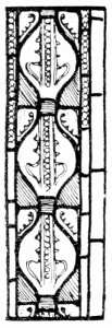 177. Assisi.
Elsewhere, as at Arezzo (in work earlier than
that of William of Marseilles), the paint has often
peeled off to a very considerable extent, revealing sometimes
patches of quite crude green and purple, which go to show
that the Italians habitually used glass of a raw colour, where
it suited their convenience, and just toned it down with brown
enamel. The result proves that it was a dangerous practice;
but, where the paint has held, the effect is not dull or dirty, as
with us it would be. The Italian sun accounts probably both
for the use of this scum of paint and for its not injuring the
effect of colour.
The same quality of deep rich pot-metal colour associated
with Renaissance design, is the first thing that strikes one in
the windows at Bologna, in the cathedral at Milan, and in
Florence everywhere. At Milan in particular there are compositions,
in which blue and red predominate, magnificently
rich and deep, in spite of recent cleaning. The cunning way
in which green is occasionally used to prevent any flowing
together of red and blue into purple, is a lesson in colour.
Two schemes of design prevail in the nave windows (the old
glass in the choir is so mixed up with new that it does not
count), both equally simple. In the one the rectangular
divisions formed by the mullions and the stouter bars are
accepted, without further framing, as separate picture spaces;
in the other the main form of the window is taken as frame
to a single picture, the mullions being only so far taken into
account that the prominent figures are designed within them.
Some of these windows are late enough in the century to show
a falling off in treatment. In the Apostle window (attributed
to Michel Angelo?) the white glass is all reduced to a granular
tint of umber; and in the one illustrating the Life of the Virgin
there is a most aggressively foreshortened figure, which may
have been effective in the cartoon, but is absurd in the glass.
It is not, therefore, at Milan that typically Italian glass is best
to be studied, though there is enough of it to startle the student
of glass whose experience had not hitherto extended so far as
Italy. Neither is Italian glass at its best at Bologna, though
the city was noted for glass painting, which was practised there
by no less a person than the Blessed James of Ulm. But, truth
to tell, the best windows at Bologna (they are most of them
fairly good) are not those of the Saint but of Pellegrino Tibaldi
and Lorenzo Costa. It is at Florence that the distinctive quality
of Italian glass is best appreciated. There is a vast quantity
of it, varying in date from the early part of the fifteenth to the
latter part of the sixteenth century, but it is uniformly Italian,
and, with few exceptions, it is extremely good.
Figures under canopies are of common occurrence in Florentine
windows; but the canopies differ in several respects, both
from the ordinary Gothic canopy and from the shrine-like
structure of the later Renaissance. In the first place, the
canopy returns in Italy to its primitive dimensions. It may or
may not be architecturally interesting, but there is in no case
very much of it. The Italians never went canopy-mad; and
they kept the framework of their pictures within moderate
dimensions. The Italian canopy of the fifteenth and sixteenth
centuries, then, was just a niche, sometimes of Renaissance
design, sometimes affecting a more Gothic form with pointed
or cusped arch and so on, under which, or in front of which,
the figures stood. It bore definite relation to the figures, and
it was neither impossible of construction nor absurd in perspective.
Occasionally, in later work, as at the Certosa at Pavia,
it was delicate in colour, but, as a rule, it was strong and rich.
It was not merely that the shadowed portions were glazed in
pot-metal, as when, at Santa Croce, the coffered soffits of the
arches are one mosaic of jewellery, but that the canopy
throughout was in colour.
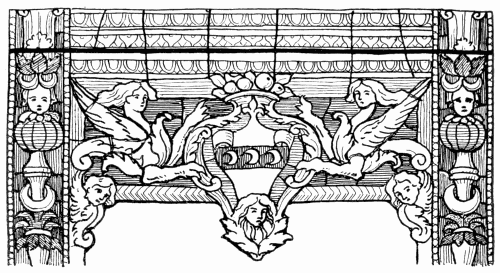
178. S. Maria Novella, Florence.
That is the most striking characteristic of Italian canopy work,
and indeed of other ornamental setting—that it is as rich
as the picture, a part of it, not a frame to it. Constructionally,
of course, it is a frame; but the colour does away with the
effect of framework. It serves rather to connect the patches of
contrasting colour in the figures, than to separate one picture
from another. Occasionally this results in too much all-overishness,
more commonly it results in breadth, making you feel
that the window is one. It was explained what use was made
of white canopy work in Gothic glass, judiciously to break up
the surface of the window. In Italy the surface is
judiciously left unbroken, and in that case also the
result is most admirable.
 179. Florence.
With the exception of an occasional brassy yellow canopy, recalling
German colour, the same system of connecting canopy and subject together
by colour is adopted alike at S. Croce, at S. Maria Novella, and at the
Duomo at Florence. The composition of the windows is simple: within a
border of foliage or other ornament, two or three tiers of figures,
under modest canopies, separated perhaps by little medallions containing
busts or demi-figures. That occurs at S. Domenico, Perugia, as well as
at Florence.
A modification of the canopy occurs in the nave
windows of the Duomo. The space within a narrow border
which frames the broad lancet, is divided into two by a strong
upright bar, and the divisions thus formed are treated as
separate trefoil-arched lancets, each with another border of its
own, the space above being treated much as though it were
tracery. (Something like this occurs, it will be remembered,
already in the thirteenth century, at Bourges.) In the tall
spaces within the borders are the usual tiers of figures under
canopies. Again, in the chapel of the Certosa in Val d’Ema,
near Florence, there is a window with double-niched canopies
and pronounced central shaft dividing the broad lancet into
two narrow ones.
The Italian canopy is not of so stereotyped a character as in
Decorated or Perpendicular design; and generally it may be
said that there is, both in the design and colour of Italian glass,
more variety than one finds out of Italy. The plan is less
obvious, the scheme less cut and dried; you know much less
what to expect than in Northern Gothic, and enjoy more often
the pleasure of surprise.
180. S. Giovanni in Monte, Bologna.
Elaborately pictorial schemes of design are less common in
Italian glass than might have been expected. There is a
famous window in the church of SS. Giovanni e Paolo, at
Venice (1473), in which the four lights below the bands of
tracery which here takes the place of transom are given over
to subject. There green trees and pale blue water against
a deep blue sky and deeper blue hills, anticipate a favourite
sixteenth century colour scheme; but the glass is a mere wreck
of what was once probably a fine window.
Figure groups on a considerable scale are chiefly to be found
in the great “bull’s-eye” windows, which are a striking feature in
Italian Gothic churches, occupying a position where in France
would have been a rose—over the West door, for example.
181. Arezzo.
These great circular windows, which occur at Arezzo, at
Bologna, at Siena, and especially at Florence, are usually
surrounded by an arabesque border. Occasionally the border
consists of a medley of cherubic wings and faces; occasionally,
as at Siena, it is in white, more in the form of mouldings; in
one case, at least, it disappears, as it were, behind the figure
group in the lower part of the window; but, as a rule, it consists
of Renaissance pattern, such as are shown here and on
page 70, large in scale, simple in design, and as mosaic in
execution as though it had been twelfth century work. The
centre of these circular lights may have, as at the Duomo at
Florence, a single upright figure, enthroned, occupying a sort
of tall central panel, supported by angels in the spandrils at the
sides; or it may have a subject running across it, as in the
case of Perino del Vaga’s “Last Supper” (1549) at the West
end of the cathedral at Siena. But very often it enclosed one
big figure subject, such as the “Descent from the Cross” at
Santa Croce, attributed to Ghiberti. An earlier manner of
occupying a bull’s-eye is shown in the East window at Siena,
dating probably from about the beginning of the fourteenth
century. This is subdivided by four huge cross bars (two
horizontal and two vertical) into nine compartments, or a cross
consisting of one central square, four squarish arms, and four
triangular spandrils. Each of these divisions is taken as
though it were a separate light, and has its own border,
enclosing a separate subject. The bars, it is true, are of great
size, wide enough almost to have been of stone; but the
scheme rather suggests that the designer was not quite aware,
when he designed it, how much less significant they would
appear in the glass than they did in his drawing.
Unquestionably the finest windows in Florence are the great
lancets in the apse and south apsidal transept of the Duomo,
finer than the three lights at the East end of S. Maria Novella,
which are so much more often spoken of, possibly because
they are seen to so much more advantage in the dark-walled
Lady Chapel. It is difficult to trace in these Duomo windows
the hand of Ghiberti or Donatello (1434), their reputed
designers. They are planned on the simplest lines. In the
upper series, the space within a narrowish border is divided,
by a band of ornament or inscription, into two fairly equal
parts, in each of which stand two figures facing one another
(opposite) under the simplest form of canopy, if canopy it can
be called. It is a mere frame, at the back of which is a two-arched
arcade, with shafts disappearing behind the figures.
They stand, that is to say, not under but in front of it.
182. Figures, Duomo, Florence.
In the lower series the arrangement is the same, except that
the upper compartment contains a single figure, larger in scale,
and seated, under a canopy of rather more architectural pretensions.
Some of the canopies have cusped arches, and
some of the borders are foliated in a more or less Gothic
way; but obviously the Gothicism throughout is only in
deference to prevailing fashion. In feeling and effect the
work is Renaissance.
The design here given shows about one half of a window;
but it gives, unfortunately, no hint of the colour. The depth
of it may be imagined when it is told that the only approach to
white in it is in the beaded line round the nimbus of the figure
to the right, and that is of the horniest character. The flesh is
of a rich brownish tint.
The head on page 270 goes nearer to suggesting colour.
There again the face is brown, the hair and beard dark and
bluish; against it the band round the head, which is ruby,
tells light. The orange-yellow nimbus, rayed, is rather lighter
still, the beaded fillet edging it bone-white. The drapery is of
brightest yellow diapered with occasional blue trefoils, each of
which has in its centre a touch of red. The background is of
very dark blue, the architecture nearest it bright green, beyond
that it is dark red.
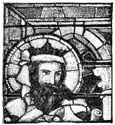 183. Florence.
This short explanation will serve to indicate the key in which
the colour is pitched. The glass itself, it has been said, is as rich
as French work of the twelfth century, as deep as German of the
fourteenth, but more vivid than either; there are no low-toned
greens or inky blues. The blue is sapphire, the green has the
quality of an emerald. In this palette of pure colour the artist
revelled. Nowhere as in the Duomo at Florence is one so impressed with
the feeling that the designer was dealing deliberately always with
colour. Plainly that, and no other, was his impulse, colour—broad,
large, beautiful, impressive, solemn colour masses. Elsewhere the
story-teller speaks, or the draughtsman, here the colourist confesses
himself. The grand scale of his figures allows him to treat his colour
largely, and its breadth is no less notable than its brilliancy. There
is infinite variety in it; but the general impression is of great masses
of red, blue, yellow, green, purple, brown, and so on, held together by
the same colours distributed in smaller threads and spots, as in diapers
on drapery. The broad mass of any one colour is itself made up of many
various tints of glass. The accidental fusion of colour, as of red and
blue into purple, is guarded against by framing, say, the blue with
green, or the ruby with brownish-yellow. At other times neutral tones
are deliberately produced by the combination of, for example, red and
green lines.
The event proves that in this way, and by the choice of
deep rather than low tones, not only mellowness but sobriety
of colour is to be obtained. The artist would certainly have
chosen rather to be crude than dull; but it is very rarely that
a false note occurs, and then most likely it is due to the decay
of the brown paint upon which he relied to bring it into tone.
At Arezzo one was disposed to think nothing could be finer
than the glass of William of Marseilles; at Florence one is
quite certain that nothing could be more beautiful than the glass
in the Duomo. Each is, after its kind, perfect. But at Florence,
at all events (les absents ont toujours tort), one finds that this is
not only the more decorative kind, but the more dignified. One
is disposed to ask, whether it is not better that in glass there
should be no deceptive pictures, no perspective to speak of,
only simple and severely disposed figures, which never in any
way disturb the architectural effect, which give to the least
attractive interior—the Duomo is as bare as a barn and as drab
as a meeting-house—something of architectural dignity.
184. Prato.
Glass in tracery lights and Rose windows cannot consistently
be planned on the lines suitable to lancets or other upright
shapes; and it is interesting to observe the modifications of
design necessitated by its adaptation to circumstances so
different. This applies not only to Gothic glass but to
Renaissance, the best of which, as it happens, is in Gothic
windows. Happily it never occurred to sixteenth century
artists to hamper themselves by any affectation of archaism,
and their work is deliberately in the new manner. One can
understand, too, a certain “up-to-date” contempt on their
part for the “old-fashioned” stonework; but it is rather
surprising that so few of them seem to have realised how
greatly their own work would have gained by a little more
consideration of (if not for) the stonework.
Where, as at Gouda, by way of exception, Gothic windows
were built to receive later glass, tracery is to all intents and
purposes abandoned: the builders would have done away with
mullions had they known how otherwise to support such huge
glass pictures. It has been explained already, in reference
to the influence of the window-shape, and especially of the
mullions, upon glass design, how much more formidable these
divisions appear upon paper than in the window. That is very
plainly seen in many a window where the designer has relied
upon them to frame his subjects. The pictures have a way of
running together in the most perplexing way, and one has to
pick them out for oneself again. The practical conclusion
from that is, that the designer is under no obligation to confine
himself too strictly within the separate lights of a large window.
What he is bound to do is to take care that the mullions never
hurt his picture; if they do, it is his picture which is to blame.
He may urge with reason that the upright shafts of stone are
there merely for the support of the window, and that it is not
his business to emphasise them, enough if he acknowledge
them. In tracery, however, it is his bounden duty to take
much more heed of the stonework. It was designed, in intricate
and often very beautiful lines, with deliberately ornamental
intent; it was meant to be seen, and it is his function
to show it off. The question he has to put to himself is
now no longer: does the stonework hurt my design? but: does
my design hurt the stonework? And he should not be satisfied
unless it helps it. The artist who, at Bourges, having fleur-de-lys-shaped
tracery to deal with, carried across it a design
quite contrary to the lines of the stonework, was guilty of a
blank absurdity.
The Early Rose windows, which were habitually filled with
rich coloured glass, consisted either of simple piercings, as at
Lincoln, or they were made up of piercings very definitely
divided by massive stonework. In proportion as mullions
become narrow, and form in themselves a design, it seems
doubtful how far deep-coloured glass can do them justice. Only
strong tracery lines will stand strong colour. At Châlons-sur-Marne,
for example, the foils of certain cusped lights surrounding
a central circular picture are successfully ornamented with
arabesque of deep yellow upon paler yellow ground; and again
at Or San Michele, Florence, certain gorgeous wheels of ruby
and yellow, or of blue, green, and yellow, and so on, are
unusually satisfactory. In such cases not only breadth of effect
but definition of the tracery forms is gained by keeping them
(more especially in their outer circumference) much of one
tone, whilst contrast of colour between one light and another
helps still further to assist definition. But this applies only to
stonework strong enough to take care of itself. There is a sort
of perverse brutality in putting into delicate and graceful
tracery deep rich glass which hides its lines. Such lines want
sharply defining against the light.
Early windows had, of course, no tracery properly so called.
The great Rose windows, and the smaller Roses surmounting
a pair of lancets, were rather piercings than tracery; and it
was not difficult to adapt the design of a medallion window
to suit them. A small piercing was ready designed for a
medallion subject; nothing was wanted but a border round it,
narrower, of course, than would have been used for a broad
lancet light, but of the same foliated character. The individual
quatrefoils or other principal openings, which went to make
up a great Rose window, were filled in the same way. If the
opening were wedge-shaped, as it often was, the obvious thing
to do was to introduce into it a medallion (probably circular)
of the full width of the opening, at about its widest, and
to fill up the space about it with foliated ornament or geometric
mosaic, with which also the smaller and less important
piercings would naturally be filled. Sometimes the recurring
figure medallions were set alternately in foliated ornament and
geometric diaper; or the lights might be grouped in pairs, two
with foliage and two with diaper. Similar alternation of the
two common kinds of Early filling, naturally occurred in minor
openings which contained no medallion. Something of this
kind occurs at Reims.
When the shape of the great Rose permitted it—if, that is
to say, the circular outline was strongly pronounced—it was
possibly further acknowledged by a fairly broad border, following
it and disappearing, as it were, behind the stonework;
otherwise, except in the case of smaller medallion-shaped
openings, it was not usual to mark them by even so much as
a border line. Small Roses had sometimes, as at Auxerre, a
central figure medallion round which were secondary foliage
medallions set in diaper. A certain waywardness of design,
already remarked in medallion windows, was sometimes shown
by filling the central medallion with ornament and grouping
the pictures round it.
As the lights of a Rose window radiated from the centre,
features which recurred throughout the series arranged themselves
inevitably in rings; and according to the disposition of the
emphatic features of the design, the rays or the rings pronounced
themselves. This is partly the affair of the architect who sets
out the stonework, but it lies with the glazier whether he
choose to subdue or to emphasise either feature. It is hard to
say why one or other of these schemes of glass design, in rays
or in rings, should be preferred; but, as a matter of experience,
the sun and star patterns are not among the most happy.
Perhaps the stone spokes of a wheel window assert themselves
quite enough any way, and the eye wants leading, not vaguely
away from the centre, but definitely round the window.
The circular belts of pattern formed by medallions or other
features answer to, and fulfil the part of, the horizontal bands
in upright windows (page 153), and bind the lights together.
The band has it all its own way in a mere “bull’s-eye,” such as
you find in Italy, where there are no radiating lines of masonry.
It is strongly pronounced in some circular medallion windows
at Assisi, in which an extraordinarily wide border (a quarter
of their diameter in width) is divided into eight equal panels,
each enclosed in its own series of border lines, within which
is a medallion set in foliated ornament. This is fourteenth
century work; but, as in thirteenth century Roses, the bars
follow and accentuate the main divisions of the window.
Even when it came to the glazing of a Rose window in a
later Gothic style, it is not uncommon to find a series or two
of medallions running round the window, as occurs at Angers.
They hold the design together; but in the nature of the case
they are on too small a scale for the pictures to count for more
than broken colour. Indeed you may see here the relative
value in such a position of small figure subjects and bold ornament.
The scrollwork is as effective as the medallions are
insignificant. In fact, compared to them, the illegible medallion
subjects in the lancet lights below are readable by him who
runs. It has to be confessed that quite some of the most
beautiful and impressive Rose windows are perfectly unintelligible,
even with a good field-glass. This is so with the
West Rose at Reims. In the centre it is ablaze with red and
orange, towards the rim it shades off into deliciously cool
greens and greenish-yellows. It may mean what it may;
the colour is enough.
Room for figure work on an intelligible scale is only to
be found by a device which verges on the ridiculous. In the
beautiful North Rose at S. Ouen, Rouen, figures which should
be upright are arranged in a circle like herrings in a barrel.
Similar figures on a smaller scale occur in certain tracery
lights at Lincoln, two of which are here given. Again in the
North Rose at Le Mans there are twenty-four radiating figures.
In fact, they were customarily so arranged, even down to the
sixteenth century, a period at which one does not credit the
designer with mediæval artlessness.
It is obvious that out of a series of twenty or more figures,
radiating like the spokes of a wheel, only a very few can stand
anything like upright. The designer of the South Rose at
S. Ouen has endeavoured to get over the difficulty, as well as
to accommodate his design to the exceeding narrowness of the lights as
they approach their axis, by giving his personages no legs, and making
them issue from a kind of sheath or bouquet-holder. A number of the
figures pretending to stand in the radiating lights by a Rose or wheel
window must be ridiculously placed. And then there occurs the question
as to whether they shall all stand with their feet towards the hub.
Where the figures have space to float, it is different. The angels in
the Late Gothic Rose window at Angers, with swirling drapery which hides
their feet, and makes them by so much the less obviously human, if not
more actually angelic, solve the difficulty of full-length figures (on
any appreciable scale) in the only possible way.
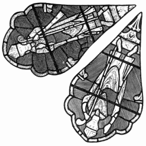 185. Two Lights of a Rose Window, Lincoln.
A portion of a simple and rather striking wheel window of
the Decorated period, in which concentric bands of ornament
form a conspicuous feature, is shown overleaf. In the small
Rose from Assisi (page 278) the glazier has very successfully
supplemented the design of the architect, completing the four
circles, and accentuating them further by glazing the central
spandrils in much darker colour than the rest of the glass,
which is mainly white.
In the elaborate tracery of the Decorated or geometric period
the mullions, as was said, ask to be pronounced. This was
usually done in the Second Gothic period by framing each light
with a border, separated from the stonework always by a
fillet of white glass. The exception to this was in the case
of trefoiled or other many-foiled openings, in which a central
medallion or boss, usually circular, extended to the points of
the cusps, and the border round the cuspings stopped short
against the border to that. Or again in triangular openings
a central boss would sometimes extend to its margin, and the
borders would stop against that, or pass seemingly behind it.
A typical form of Decorated tracery occurs in the West window at York
Minster, by far the most beautiful part of it. There, every important
opening has within its white marginal line a broader band of ruby or
green, broken at intervals by yellow spots, within which border is
foliage of white and yellow on a green or ruby ground. Some of the
smaller openings show white and yellow foliage only, without any
coloured ground. A plan equally characteristic of the period is
illustrated at Tewkesbury. There again occurs similar white foliage, its
stem encircling a central spot of yellow. This also is on green and ruby
backgrounds, the former reserved for the more prominent openings; but
the border is in white, painted with a pattern. This broader white
border more effectively relieves the dark lines of the masonry than the
border of colour, which sometimes confuses the shapes of the smaller
tracery openings: it does so, for example, in the Late glass on page
200.
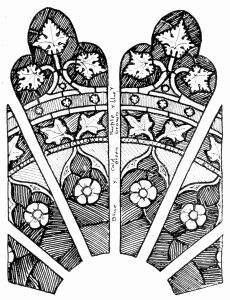 186. Part of a Rose Window, German 14th Century.
For what was said of the difficulty of carrying a broad border
round the heads of Decorated lights applies more forcibly still
to tracery. The merest fillet of colour is often as much as
can safely be carried round the opening, if even that. On the
other hand, a broad border of white and stain, even though it contain a
fair amount of black in it, may safely be used—as at Châlons,
where it frames small subjects in rich colour. Some admirable Decorated
tracery occurs at Wells, much on the usual lines, and containing a good
deal of pleasant green; but there the white and yellow foliage in the
centre part of the lights is sometimes so closely designed that very
little of the coloured ground shows through it, and it looks at first as
if what little ground there is had all been painted-out. At S. Denis
Walmgate, York, the background to the foliage in white and yellow (which
last predominates) is painted solid: the only pot-metal colour (except
in the central medallion head) is in a rosette or two of colour leaded
into it; the border is white. Another expedient there employed is to
introduce figures in white and stain upon a ground of green or ruby,
diapered. At Wells there occur little figures of saints in pot-metal
colour, planted upon the white foliated filling of the tracery lights.
Decorated circular medallions occupying the centre of ornamental tracery
lights are usually framed in coloured lines; occasionally the inner
margin of the medallion is cusped, in imitation of stonework.
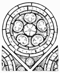 187. Assisi.
An effective plan, adopted at Evreux, is to gather the lights
into groups, by means of the colour introduced into them,
which grouping may or may not be indicated by the stonework.
In any case, it is a means of obtaining at once variety and
breadth of colour.
Perpendicular tracery lights are themselves, in most cases,
only copies in miniature of the larger lights below, and the
glass is designed on the same plan. A good illustration of this
is at Great Malvern, where the design consists of the orthodox
canopy work in white and stain, with little figures also nearly
all in white, colour occurring only in the lower skirts of their
drapery, in the background about their heads, and behind the
pinnacles above. The effect is beautifully silvery. Often such
figures under the canopies are angels, all in white and stain.
Sometimes seraphim, in stain upon a white ground, quarried
perhaps, fill the lights, without canopies. These are all typical
ways of filling the tracery of a Perpendicular window.
It was quite a common thing to fill it with glass wholly of
white and stain. In the centre there might be a medallion head
in grisaille, or an inscribed label, the rest of the space being
occupied by conventional foliage having just a line of clear
white next the stonework. Beautiful examples of this treatment
occur at Great Malvern; occasionally the foliage is all in yellow
with white flowers. Small openings are thus often glazed in a
single piece of glass, or in any case with the fewest possible
leads. At S. Serge, Angers, there is larger work of a similar
kind, a bold scroll in white and stain on a ground of solid
pigment, out of which is scratched a smaller pattern, not so
bold as in the least to interfere with the scroll, but enough to
prevent anything like heaviness in the painted ground. Similar
treatment is adopted in the cathedral at Beauvais. Once in a
while one comes, in English work, upon figures in white and
stain on a solid black ground extending to the stonework,
without any line of white to show where the glass ends and the
stonework begins. It would be impossible more emphatically
than that to show one’s contempt for the architecture.
Some disregard, if not actually contempt, is shown for architecture
in the practice, common no less in Late Gothic than in
Renaissance design, of carrying a coloured ground right up to
the stone, without so much as a line of light to separate the
two. Comparatively light though the colour may be, it is
usually dark enough, unless it be yellow, to confuse the forms
of any but the boldest tracery. Something of the kind occurred
by way of exception even in fourteenth century glass, as at
S. Radegonde, Poitiers, and at Toulouse, where the tracery
of the windows is one field of blue, irregularly sprinkled with
white stars. The lines of the tracery are lost, and one sees
only spots of white.
The Later Gothic plan was to keep tracery light, even though
the window below it were altogether in rich colour, and the
effect was good; as at Alençon, where a distinctly blue window
has in the tracery only angels in white and yellow on a white
ground; or, again, at Conches, where white-robed angels, on
a ground of rich stain, contrast pleasantly with the cool blue
of the lights below.
Unusual treatment of the tracery occurs at Auch (1513). In the main the
tracery lights contain figures in colour upon a ruby or paler-coloured
ground, which, as in so many a Renaissance window, runs out to the
stonework; but occasionally here and there a light is distinguished by a
border of white. Moreover, the ground is, as a rule, not of one colour
throughout, nor even throughout a single light, but varied; and that not
symmetrically or pattern-wise, but so as artfully to carry the colour
through. In fact, the artist has taken his tracery much more seriously
than usual, and has carefully studied how best he could balance by the
colour in it the not quite so easily-to-be-controlled colour of his
figure composition below. The result is that the windows are all of one
piece—each a complete and well-considered colour composition: the
tracery is not merely the top part of the frame to the coloured picture
below.
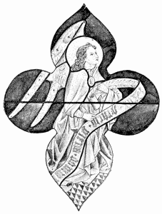 188. Lyons.
In Renaissance glass the tracery was more often in comparatively full
colour, even though the lights below were pale. A grisaille window at
Evreux, with practically blue tracery, has a very pleasant effect.
It was not often that the Renaissance glass painters gave
very serious attention to the tracery which they had to fill.
They were, for the most part, content to conceive each separate
opening as a blue field upon which to place an angel (as above),
a crown, a fleur-de-lys, or other emblem, as best might fit. In
very many sixteenth century windows the design consists merely
of angels, emblems, labels, or even clouds, dotted about, as
suited the convenience of the designer. Sometimes, as at
S. Alpin, at Troyes, there occurs in a tracery light a tablet
bearing a date,—presumably, but not always positively, that of
the window. Such devices were very often in white upon a
ground of blue, purple, or ruby. Angels of course adapted
themselves to irregular shapes in the most angelic way; and
they are introduced in every conceivable attitude—standing,
kneeling, flying, swinging censers, singing, playing on musical
instruments, bearing scrolls or shields; angels all in white,
angels in white with coloured wings, angels in gorgeous array
of colour: and more accommodating, still, is the bodiless
cherub, beloved of Luca della Robbia.
There is a quite charming effect of colour in a Jesse window
at S. Maclou, Rouen, where the tracery lights are inhabited by
little cherubs, in ruby on a grey-blue ground, in grey on deeper
grey-blue, and in emerald-like green upon the same.
The scroll without the angel was a very convenient filling for
smaller openings. Some elaborately twisted scrolls, in white
and stain on purple, occur at Moulins.
Larger and more prominent lights often contain a separate
picture, or one picture runs through several lights, or perhaps
all through the tracery. Worse than that is, where the picture
runs through from the lights below; as at Alençon, where the
trees grow up into the blue of the tracery, broken otherwise
only by white clouds; or at Conches, where the architecture
from the subject below aspires so high. It is almost worse
still where, as at Alençon again, and at the chapel at Vincennes,
it is the canopy which so encroaches. In the exceptional case
of a Jesse window there seems less objection to accepting the
whole window as a field through which the tree may grow;
yet the tracery is not the happiest part of the Beauvais window
(page 368). Sometimes the heads of the lower lights are made
to appear as though they were part of the tracery.
A happier form of Renaissance tracery design is where
medallion heads in white and stain are introduced upon a
ground of plain colour—blue at Châlons, purple-brown at
Montmorency. These are sometimes most beautifully painted,
as are the Raffaellesque little cherubs amidst white clouds,
also at Montmorency; but they are much more delicately done
than they need have been, and less effective than they might.
Very delicate painting upon white does produce an effect even
at a distance; at least it gives quality; but there should be
some relation between effort and effect; and here the effect is
weak as compared with the expenditure of art. In the tracery
on page 213, fairly effective though monotonous, the birds are
glazed in with such unnecessary avoidance of lead, that the
cutting of the ground must have been a work of great difficulty.
In glass of every period it has been the custom to
put too much into tracery; in Early work too much detail,
in Later too much finish. What is wanted is breadth.
The very simplest form of window glazing, the easiest and the
thriftiest thing for the cutter to do, and the most straightforward
for the glazier, is to frame together parallel-sided
pieces of glass in the form of a lead lattice.
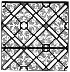 189. Lincoln.
Quarries, as all such little square or rhomboid shaped panes
of glass came to be called, were used from the first. Ordinarily
they were set on end, so as to form diamonds; which as time
went on, were generally not rectangular, but long in proportion
to their breadth.
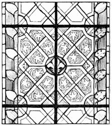 190. Evreux.
For the most part they were painted with patterns traced
in brown; and, on the discovery of silver stain, they were in
parts tinted yellow. From the fourteenth century onwards,
quarry lights, framed in borders, and enlivened with colour,
form a very important variety of grisaille.
Many a grisaille pattern was not far removed from quarry
glazing, as may be seen opposite. It was natural that, for
clerestory and triforium windows in particular, the glazier
should do all he could to simplify his work. Clerestory
windows are placed too high to be fairly seen in a narrow
church, and triforium lights are often half shut off from view
by projecting shafts of open arcading in front of them. It is
only when, by rare chance, they happen to front you squarely
at the end of an aisle or transept, that they are properly seen.
There is no occasion, therefore, to indulge in subtleties of
design; the one thing needful is that the effect of the windows
as a whole, should be pleasant, since all study of detail is out
of the question, except from the triforium galleries opposite, or
by the aid of a field-glass; and light arrangements of grisaille
and colour are in most cases all that is wanted. The colour
may be more or less, according as it is desired to exclude light
or to admit it; but some very simple, unpretending, and perhaps
even rude treatment, is indicated by the conditions of
the case, which to contradict, is wasteful and unworkmanlike.
The effect, for example, of the band of figures across the grisaille in
the triforium of the transepts at Evreux is admirable; but the way in
which seven saints out of the eight are cut vertically in two by the
pillars of the architectural screen in front of them, is nothing less
than exasperating. These figures tell only as the patches of colour; and
that could so easily have been obtained by much simpler means. In such a
position, quarries may well take the place, not only of figures, but of
more interesting grisaille; and, even though they be not painted at all
(as is again the case at Evreux), but merely broken by occasional
sun-discs in white and stain crossing them, and framed in a simple block
border of white and colour, the effect may be entirely adequate. It is
not meant to deny that figures in rich colour embedded in carefully
designed grisaille are more attractive; but, for its purpose, quarry
work, with borders and bosses of colour, is in the majority of such
cases, enough.
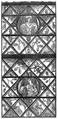
191. Quarry Window, Evreux.
Figures or figure subjects in formal bands across tall quarry lights are
always effective; so are figures planted more casually upon the
quarries—kneeling donors, flying angels, or whatever they may be.
So again, are figure panels alternating with bosses of ornament; but, if
the window occupy a position where the figures can be
appreciated, a surrounding of quarries seems hardly of interest enough,
and if not, the figures seem rather thrown away. One is tempted to make
exception in favour of figures in grisaille, which, if very delicately
painted (as for example at S. Martin-cum-Gregory, York), show to
advantage on a quarry ground, which has the modesty not to compete with
them in interest. The quarries keep their place perfectly as a
background; and the slight painting upon them is just enough to give the
glass quality, and to indicate that, however subordinate, it is yet part
of the picture.
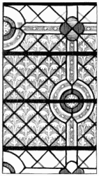 192. Lincoln.
A quarry window, no less than any other, wants a border,
if only to prevent the strongly marked straight lines of lead
from appearing to run into the stone work. A simple line
of colour with another of white next the mullions is enough
for that. Even this is occasionally omitted, more especially in
tracery lights, but in that case the glass seems to lack finish.
The most satisfactory border to quarry lights into which otherwise
no colour is introduced, is a broadish border of white,
painted with pattern and in part stained. A coloured border
seems to imply other colour breaking the field of quarries. By
itself it is too much or not enough. Its proportion is a thing
to be determined in each case on the spot; but even in narrow
lights, if they contain bosses of colour (as do those in the
transepts at Le Mans) a broad border about one fifth the
width of the window, with a broad white line next the stone,
is very effective.
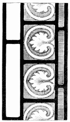 193. German Quarry Border.
The monotony of any great surface of quarry work, has led
to the introduction of medallions and the like, even where it
is not desired to introduce pot-metal colour. In the window
from Evreux, illustrated opposite, the effect of the delicately
painted little angel medallions, in white on a ground of stain,
is all that could be wished. Any little surprise of that kind is
always welcome; but, should it occur too frequently, it becomes
itself monotonous.
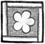 194. Early English Quarry.
There is no end to the variety of forms in which colour
may be introduced into quarry work. It is best in the form
of patches, and not in the form of lines between the quarries
as occurs occasionally, at Poitiers, for example, at Rouen
cathedral, and at Châlons (page 167).
Big rosettes, discs, wreaths, rings of colour, and the like, are more
effective than small spots. They need not be heavy, there may be any
amount of white in them. In narrow lights, they may sometimes with
advantage come in front of the border; that admits of the biggest
possible medallion, and it is best to have such features large and few.
Mean little rosettes are too suggestive of the contractor; in the church
of S. Ouen, at Rouen, one is uncomfortably reminded of him—it
would be so easy to estimate for glass of that kind at so much the foot!
Heraldic shields form often peculiarly effective colour-patches in
quarry windows, more especially because of the accidental arrangement of
colour they compel. There is a point at which symmetry of colour palls
upon the eye.
195. Quarry Patterns (Shaw).
The even surface of quarry lights all in white and stain is broken
sometimes by an occasional band of inscription, which may either take
the line of the quarries, or cross them in the form of a label. At
Evreux some quarry lights are most pleasingly interrupted by square
patches of inscription in yellow, or, which is still more satisfactory,
in white. In the same cathedral there is a very
interesting instance of inscription, in letters some five or six inches
high, leaded in blue upon a quarry ground.
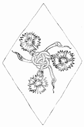 196. 14th Century Quarry.
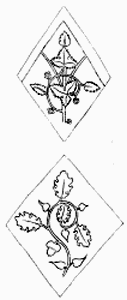 197. 14th Century Quarries.
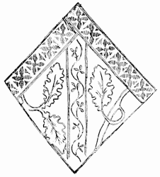 198. 14th Century Quarry.
The patterns with which quarries are painted naturally followed the
ordinary course of grisaille. In the thirteenth century the designs were
strongly outlined, and showed clear against a cross-hatched ground;
which, however, did not, as a rule, extend to the lead, but a margin of
clear glass was left next to it, in acknowledgment of the quarry shape.
The combination of quarries and strap ornament in the example at Lincoln
(page 287) is unusual, but the quarries themselves are, but for the
absence of a clear line next the leads, characteristically of the
thirteenth century. The quarry border from Nuremberg (above) is rather
later in character. In that case also, as it happens, there is no
marginal line of clear glass. The typical treatment is shown below.
Later, as in other grisaille, the cross-hatched ground was omitted; and
the foliage took, of course, more natural form. It was presently more
delicately traced (page 290), and more often than not tinted in yellow
stain. Consistently with the more natural form of leafage the design in
fourteenth century work was often one continuous growth trailing through
the window, and passing behind the marginal band of stain which now
usually emphasised the top sides of the quarries. Often a futile attempt
was made (page 286) to give the appearance of interlacing to these
bands, but that was nullified by the stronger lead lines. True,
interlacing was only possible where, as in some earlier work, the bands
were continued on all four sides of the quarry, so that the lead fell
into its place as interspace between two interlacing
bands. It was better when there was no pretence of interlacing (below).
Additional importance was sometimes given to the marginal band by
tracing a pattern upon it, or, as on page 291,, painting it in brown, and
then picking out geometric tracery upon it. There came a time when
marginal lines were omitted altogether. That was the usual, though not
invariable, practice in the fifteenth century, by which time the
draughtsman had apparently learnt to husband his inventive faculty. The
continuous growth of the pattern, as well as the marginal acknowledgment
of the lead lines, died out of fashion, and quarries were mostly painted
sprig fashion. The character of these sprigs will be best judged from
the specimens on page 289, some of the most interesting given in “Shaw’s
Book of Quarries.” Quarry patterns do not, of course, occur in that
profuse variety; it is seldom that more than two patterns are found in a
single window, often there is only one. The range of design in quarries
of this kind is limited only by the invention of the artist. It includes
both floral and conventional ornament, animal and grotesque figures,
emblems and heraldic badges, cyphers, monograms, mottoes, and so on.
There is scope not only for meaning in design, but for the artist’s
humour; but, when all is said, the Late Gothic pattern windows,
now given over entirely to quarry work, are of no great account as
concerns their detail. The later quarry patterns are often pretty
enough, sometimes amusing, but they go for very little in the decoration
of a church. Plentiful as quarry work is everywhere, and characteristic
as it is of Perpendicular glass, there is not much that shows an attempt
to do anything serious with the quarry window. All that was done was to
paint more or less delicate and dainty patterns upon the little lozenge
panes. However, they were traced with a light hand and a sure one, and
with a kind of spontaneity which gives them really what artistic charm
they have.
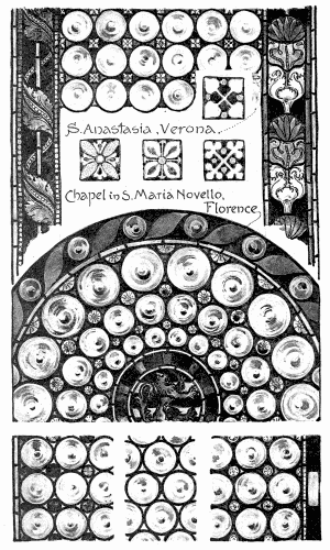
199. Round Glass, Roundels, or Bull’s-Eyes.
“Photo-Tint” by James Akerman, London, W. C.
The occasional endeavours to get stronger and bolder effects in quarry
work were not very successful. At Evreux and at Rouen there are some
late quarries painted more after the fashion of bold mosaic diaper; but
the effect, though satisfactory enough, is not such as to convince one
that that is the better way.
200. Heraldic Glass.
To heraldry, and especially to shields of arms surrounded by mantling
(page 293), quarries form an excellent background, but only in the event
of there being enough of them left free to show that it is a quarry
window upon which the heraldry is imposed, or rather into which it is
inlaid. Odds and ends of quarries want to be accounted for, as forming
the continuation of the glass above and below. In the case of a window
not a quarry window, it is a mistake to break up the background, as was
sometimes done, into quarries, or rather into fragments of quarries. The
object of the square or diamond shape is to break up a plain surface. If
the ground is naturally broken up by figures, foliage, mantling, or what
not, why introduce further quarry lines? They are not in themselves
interesting. Their great value is in that they give scale to a window;
but that is only on condition that they are seen in their entirety.
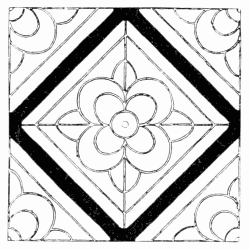 201. Quarry from Chetwode Church.
In Germany the place of quarries was supplied by roundels
(page 292) unpainted. What applies to quarries applies in
many respects to them; and they have a brilliancy which
flat glass has not. They were usually enclosed in painted
borders of white and stain, and have a very delicate and pearly
effect; but where (as at S. Peter’s, at Cologne) they occur in
great quantity as compared with coloured subjects, these appear
to be floating rather uncomfortably in their midst. The Italians,
who also used roundels in place of quarries, often let colour into
the interstices between them, and also little painted squares or
pateræ of white and stain. In the sham windows decorating the
Sistine Chapel at Rome, separating Botticelli’s series of Popes,
the pointed spaces between the rounds are coloured diagonally
in successive rows of red, yellow, and green; but the result
is most pleasing where, as at Verona and elsewhere, the little
triangular spaces are neither of one tint nor yet symmetrically
arranged, but distributed in a quasi-accidental and unexpected
way. Sometimes it was the little pateræ that was in colour and
the rest white. In any case, the effect is refined, as it is at
Arezzo also, where the monotony of roundels, in sundry clerestory
windows, is broken by figure medallions and other features
in white and colour. The adaptation of roundels to the circular
shape is shown in the portion of a round window from
Santa Maria Novella. What more remains to be said about
roundels and quarry windows is reserved for the chapter on
“Domestic Glass.”
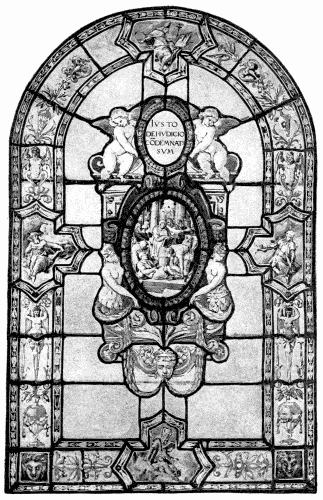
202. Window in the Certosa in Val D’ema, Florence.
It is customary to draw a distinction between “Ecclesiastical”
and “Domestic” glass.
In mediæval days the Church was the patron of art; and,
when kings and corporations commissioned stained glass
windows, it was usually to present them to Mother Church.
It is in churches, then, that the greater part of the old glass
remains to us, iconoclastic mania notwithstanding; and it is
only there that the course of glass painting can be traced.
Once in a while, as at S. Mary’s Hall, Coventry, one comes
upon a great window designed to decorate a civic building;
but the whiles are few and far between. When such windows
do occur they prove not to differ widely from more familiar
church work.
What, then, is the difference between the two kinds of glass?
It is not that the one is ecclesiastical the other secular, the
one religious the other profane art. “Sacred Art” is a term
consecrated by use; but, strictly speaking, it is a meaningless
combination of words, signifying, if it signify anything, that the
speaker confounds the art of telling with the thing told. Art
has no more a religion than it has a country. No doubt there
clings always to the art of the devout believer some fervour of
faith, as there may hang about the sceptic’s doing a chill of
doubt. The historian will enrich his glass with story, the
preacher will convey in it a dogma. Poet or proser, philosopher
or fool, may each in turn peep out of the window. Youth will
everywhere betray its ardour, manhood its vigour, age its
experience. A live man cannot help but put himself into his
work. But none of that is art. His art is in the way he
expresses himself, not in what he says; and there is no more
religion in his glass painting than in his handwriting, though
the graphologist may read in it his character.
The difference between church glass and domestic arises,
speaking from the point of view of art, solely from architectural
conditions. In so far as they are both glass, the same
methods of glazing and painting apply to both. It is only in
so far as the position and purpose of the two are different,
that they call for different treatment in design. The treatment
suitable to a great hall does not materially differ from that
adapted to a church; the same breadth of design, the same
largeness of execution, are required; what suits a cloister
would suit a passage. When, however, it comes to the
windows of dwelling-rooms, the scheme and execution appropriate
even to the smallest chapels of a church, would most
likely be out of place. The distinction is very much as that
between wall decoration in fresco and cabinet paintings in
oil- or water-colour.
In the house there is less need than in the church for severity,
and more for liveliness, less occasion for breadth, and more
for delicacy. The scale of the dwelling-room itself justifies,
perhaps demands, a smaller treatment. Here, if anywhere, is
opportunity for that preciousness of execution which, in work
of more monumental character, it seems a pity to expend upon
so frail a substance as glass—frailer than ever when it was the
thin white glass employed for window panes. For, so far from
the glazier of the sixteenth or seventeenth century imagining, as
we mostly do, that it was any part of the purpose of domestic
glass to shut out the view—less need in those days!—he
employed in most cases a material which was not merely
translucent but absolutely transparent.
This use of transparent glass marks a distinction, and forms
something of a new departure. It was employed to some
extent in Renaissance church work; but there it was more as a
background to the stained glass window than as a part of it.
Here the transparent glass is the window; and the design,
whether in pot-metal or in enamel, shows more or less against
the clear.
The relationship of certain seventeenth century windows at
Antwerp to the Italian windows on pages 295, 299, 352, is
obvious. They may be quite possibly founded upon them.
There is the same arrangement of subjects in cartouches, set
in geometric glazing of clear glass. But in the Italian windows
one kind of glass is used throughout (the little pieces of
thin pot-metal colour in the cartouches, and so on, scarcely
count); and the proportion of the painted work to clear glass
is so schemed that, although you may feel that the plain work
wants just a touch of enrichment to bring it all together, you
are not asked deliberately to imagine yourself to be looking
through, beyond the painting, into space.
203. Italian Grisaille, Florence.
“Photo-Tint” by James Akerman, London, W. C.
The detail in these windows from the Certosa in Val d’Ema, near
Florence, is all outlined and painted in brown upon clear white glass,
the flesh warmer in tint than the rest; the high lights are brushed out
of a matt tint, and some pale stain is washed in. The artful thing about
the design is, the cunning way in which the borders are planned, so as
to avoid the absolute parallelism of marginal lines. For the rest the
design is rather characteristically Late Renaissance, though the
relation of border to cartouche, and of both together to clear glass, is
better than usual. It will be noted that these are not strictly domestic
windows; but they are designed to be seen about on a level with the eye,
and from a distance of not more than ten feet, which is as far as the
width of the cloister allows one to get away from them.
They fulfil, therefore, altogether very much the conditions which apply
generally to domestic glass, and may be taken, if not as types of
domestic work, at least as something on the way from the church to the
house. This, though the common type of Italian Renaissance grisaille,
was not invariable. At S. Frediano, Lucca, for example, there is a white
window, which, except for a little medallion in its centre, might at a
glance almost pass for thirteenth century work: the Cinque-Cento scroll
is so rendered, with cross-hatched ground and all, as to suggest the
early mediæval craftsman; it is centuries away from Da Udine in style.
 204. Certosa in Val d’Ema.
The domestic quarry window differed, in mediæval work, in
no respect from church work. In the sixteenth century it
took rather a new form. It consisted no longer of a more
or less diaper-like all-over pattern, but of a panel, designed
to be glazed in quarries. Here, again, is an approximation
to the seventeenth century practice of leading up pictures in
rectangular panes, but only an approximation. There is this
important difference, that the quarry window starts from the
lead lines, and is religiously designed within them.
Thus to accept, the simple square and obviously fit lines of
quarry glazing, and to expend his art in painting upon them,
simplifies the task of the glass painter; and he very frequently
fell back upon that plan, more readily perhaps when he
happened to know more about painting than about glazing.
That was Da Udine’s case, who is credited with the design
of the windows in the Laurentian library at Florence, as of
those at the Certosa in Val d’Ema. They bear a date some
few years after his death; but they are so like what he certainly
would have done that, directly or indirectly, the design
is clearly due to him. The one illustrated on page 298 is quite
one of the best of these windows; in the others the ornament
is even less coherent. The characteristic arabesque is painted
in brown enamel, with redder enamel for the flesh tints, some
yellow stain, and a little blue enamel in the heraldic lozenge,
all upon clear white glass. The effect is delicate and silvery
and no appreciable amount of light is excluded (a point usually
of some importance in domestic work); but, though the main
forms are designed within the lead lines, one feels that these
have not been considered enough, that the leads compete with
the painting, and that the bars, in particular, which are far
thicker than need be, and occur with unnecessary frequency
(in fact, at every horizontal quarry joint but one), very seriously
mar the effect of delicate painting. That is as much as to say
that the design, graceful and fanciful as it is, does not fulfil the
conditions of quarry glass.
It is not enough for complete success in this form of window
that the quarry lines shall be the basis of the design; the
painting also must be strong enough to hold its own against
leads and bars. That is hardly the case with the exceptionally
delicate ornament in the Dutch glass opposite. But here, notwithstanding
that the scroll is slighter than the Italian work
and more delicately painted, the central patch of enamel colour
in the shield and mantling does, to some extent, focus the
attention there, and so withdraw the eye from the lead lines.
The window is not merely cleverly designed; it is a frank,
straightforward, manly piece of work, marred only by the
comparative heaviness of the leads. The truth is that a glass
painter becomes so used to lead lines, and gets to take them
so much for granted, that they do not offend him; and he is
apt to forget how obtrusive they may appear in the eyes of
the unaccustomed. Hence his sometimes seemingly brutal
treatment of tenderly painted ornament.
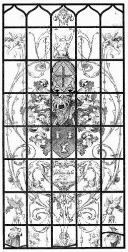
205. Dutch Quarry Window, S. K. Museum.
Other good examples of Dutch domestic glass, not quite
so good as this, but painted with admirable directness, are
to be found at the Musée des Antiquités at Brussels. At the
Louvre also the Dutch work is good. There are two lights
there in which cartouches enclosing small oval subjects (fables)
spread over the greater part of the quarry glazing, leaving only
the lowermost of them comparatively empty. On these are
painted butterflies, a dragon-fly, even a gad-fly, almost to the
life. These flies upon the window pane, like the little miniature
figures in the bottom corner quarries on page 301, are trivial
enough in idea; but the idea is cleverly and daintily expressed;
and one does not expect much else than triviality in seventeenth
century design. Moreover, in the privacy of domestic
life it is permitted to be trivial.
For dignity of treatment it would be difficult to match the
specimen of Flemish glass shown on page 304, now at Warwick
Castle. Like the Dutch and Italian work, it is painted on clear
glass but without the prettiness of flesh tint, and the background
to the ornament (it shows dull grey in the print) is brilliant
yellow stain. This little light and its companion on page 98
are as large in style as they are beautiful in effect.
There is a gayer touch in the less seriously decorative panel
of French work in the Louvre given on page 307. In that pot-metal
is used for the dark ruby of the outer dress, and for the
little bits of blue rather cunningly let into the spandrils of the
arch. The fancifully designed canopy, the arabesque, and a
portion of the drapery are in stain, all delicately painted upon
clear glass, and glazed mainly on quarry lines—from which,
however, the designer saw fit to depart. What he meant by
the unfortunate circular lead line about the head is difficult
to imagine. It can hardly be, like other erratic leading, the
result of mending. No fracture could possibly have steered so
carefully between the figure and the ornament. It looks almost
as if at the last he had lost confidence in his technique, and,
in trying vainly to avoid lead lines, had ended in giving them
extraordinary emphasis.
206. Grisaille, Warwick Castle.
“Photo-Tint” by James Akerman, London, W. C.
In ultra-delicate domestic work the leads are more than
ever the difficulty. One is uncomfortably conscious of them
in the wonderful series of windows—formerly at Ecouen, and
now in the Château de Chantilly—in which is set forth in forty
pictures the story of Cupid and Psyche. A specimen of these
is given on page 218, thanks to the friendly permission of
Monsieur Magne, who illustrates the whole of them in his
admirable monograph of the Montmorency glass. The legend
to the effect that Raffaelle designed and Palissy painted them,
is past all possible belief; but they are very remarkable
specimens of sixteenth century work, restored about the period
of the First Empire, and mark somewhere about the high-water
mark of French domestic picture glass.
A glance at these windows is enough to show that they
were never schemed with any definite view to glazing. Rather
it would appear that the pictures were first designed and then
the leads introduced where best they could be disguised. But
the disguise is everywhere transparent. Such gauzy painting is
inadequate; it hides nothing. You see always the thick black
lines of lead, cruel enough, but clinging in a cowardly way to
the edges of weak forms, sneaking into shadows, and foolishly
pretending to pass themselves off as the continuation of painted
outlines not one-twentieth part so strong as they. The sparing
use of glazing lines makes them all the more conspicuous. They
must originally have asserted themselves even more than they
do now; for the accidental lead lines introduced in reparation,
however much they damage the pictures, do in a measure
support the original glazing lines, and pull the windows together.
The Chantilly glass goes to prove the impossibility of satisfactorily
disposing of the leads in very small figure subjects in
grisaille. In work on a larger scale it wants only a man who
knows his trade to manage it. Witness what was done in
church work.
The propriety of executing figures in grisaille at all has been
called in question by Viollet le Duc. “Every bit of white
glass,” he said, “should be diapered with pattern traced with
a brush; and, since this treatment is not possible in flesh
painting, flesh ought not to be painted.” Moreover, he says
that grisaille has always the appearance of vibrating, and the
vibration fatigues the eye; therefore, he argues, it is labour lost
to paint white figures. Far be it from an ornamentist to deny
that a great deal too much importance is attached to figure
work in decoration. But the amount of tracing necessary on
white glass is relative. In grisaille it is quite safe to leave some
glass clear; and, if it is not worth while to paint figures, is it worth
while to paint anything worth looking at, or worth painting?
207. Louis XIII. and Anne of Austria.
The truth is, it wearies the sight to look at any glass for
long at a stretch, and for a mere coup d’œil the most brutal
workmanship would often do. But, if work is ever to be seen
from near, the charm is gone when once you know how coarse
it is. One tires of crude work, and delights more and more in
what is delicate. Whoever has taken pleasure in such work
as the windows at S. Alpin at Troyes would find it hard to
renounce the figure in grisaille.
208. Domestic Glass, The Louvre.
To return to the leading of grisaille. Of the two extremes,
the bold, even the too bold, acknowledgment of the constructional
lines of a window, is far preferable to the timid attempt
to conceal them. The glaziers of the Renaissance eventually
got over the difficulty by the simple plan of inserting into
quarry windows (usually unpainted) or into pattern work of
plain glass only, little panes of painted glass. In this way
there are introduced into some windows at the Château
de Chaumont some very beautiful little portrait medallions,
outlined with a firmness and modelled with a delicacy which
remind one of the drawings of Clouet. At the Germanic
Museum at Nuremberg are some similar medallion heads,
quite Holbein-ish in character. A later portrait panel, lacking
the style and draughtsmanship of these, but very cleverly
painted (by Linard Gontier they say), is reproduced on page
305. It represents, as the inscription and cypher go to show,
Louis Treize and Anne of Austria, as bride and bridegroom.
Its date, therefore, speaks for itself. Another little pane by
Gontier, from the Hôtel des Arquebusiers at Troyes, now in
the library there, is given on page 310. The characteristic
ornamental work surrounding this, though not forming a consecutive
frame to the picture, is of about the same period
with it (1621). Its design consists of that modified form of
Arab foliation (compare it with the detail on page 352), which
was very much used in damascening and niello work; indeed,
the French still call that kind of pattern “nielle.” Here it is
traced in a fine brown outline, and filled in partly with yellow
stain and partly with blue enamel. The effect is pleasing.
It was in Switzerland that glass painting other than for
churches was most extensively practised. The Council
Chambers of Swiss towns, and the halls of trade and other
guilds, were enriched with bands of armorial glass across the
windows; and throughout the sixteenth century it was the
custom to present to neighbouring towns or friendly Corporations
a painted window panel. Great part of these have been
dispersed, and in Switzerland they are now perhaps rarer than
in the museums of other countries. The Germanic Museum at
Nuremberg and the Hôtel Clûny, at Paris, are rich in Swiss
glass; and we have some at South Kensington. Superb
examples, however, still remain in Switzerland—for example, in
the Rath-haus at Lucerne—though they belong to a period as late
as the first ten years of the seventeenth century.
209. Pierced Quarries, Warwick.
The usual form of design consisted of a sort of florid canopy
frame of moderate dimensions, enclosing a shield or shields of
arms, supported by fantastically dressed men-at-arms. There
was often great spirit in the swagger of these melodramatic
swashbucklers, admirably expressive of the idea which underlies
all heraldry: “I am somebody,” they seem to say, “pray
who are you?” It is a comparatively modest specimen of this
class that is presented on page 90. In the windows of a private
house it was frequently the master and mistress who supported
the armorial shield, all in their Sunday best, and very proud
of themselves too. Little Bible subjects were also painted,
mainly in grisaille. It was for window panes that Holbein
drew the Stations of the Cross, now among the chief treasures
of the museum at Bâle. These also must be classed with
domestic work. They may in some cases have been destined
for a church; but they would much more appropriately decorate
a private oratory.
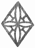 210. Quarry of Fretted Lead.
These heraldic or pictorial panes go even beyond the delicacy
of cabinet pictures, and are sometimes more on the scale of
miniatures; but of such miniature painting the Swiss were
masters. They carried craftmanship to its very furthest point,
and among them traditions of good work lingered long after
they were quite dead in France. Of English work there was
not much; and of that the less said the better.
Far into the eighteenth century the Swiss still had a care for
their window panes, and, when painting went out of fashion,
engraved them with armorial or other devices. Precisely that
kind of engraving was employed also upon polished mirrors, of
which one finds examples in Italy.
Unpainted quarry windows in English houses were sometimes
relieved, at the same time that ventilation was secured, by the
occasional introduction (in the place of glass) of little fretted
panels of pierced lead, as shown on page 308. Below is a
diamond-shaped piercing of the Jacobean period.
211. Domestic Window Pane, Troyes.
No one can have paid much attention to stained glass without
observing the conspicuous part played in its design by the
quasi-architectural canopy.
Inasmuch as it, in a sense, enshrines the figure, there exists
some sort of symbolic reason for its use. But that is not
enough to account for its all but universal employment. A
more obvious excuse for it is, the purpose it fulfils in the construction
of design. It is a means of accounting for the position
of figures midway up the window, perhaps one above the other,
and not standing upon the sill. It is at once framework and
support to them, preventing them from seeming to float there
in space.
Where the designer of the church designed also the glass for
it, it was almost inevitable that he should plan it more or less
upon architectural lines; and so we find that in windows known
to have been designed by architects the canopy is very often
the most conspicuous part of the design. But at all times the
master-builder must have been a power, and at all times also
even glaziers and glass painters must have been so intimately
acquainted with forms of architecture, that it is not surprising
they should have introduced them into their work.
The fact is, the designer happens upon something like a
canopy almost without intending it, and, having arrived so
far, perfects the resemblance to it. Suppose a window of four
long lights, in each of which it is desired to introduce three
figures. That means dividing it horizontally into three, which
may be done by the use of bands of inscription, as at a in the
diagram overleaf: there is no suggestion of architecture there.
Supposing you wish to frame the window at the sides, so as
to stop the picture, as at b, to the left of the diagram; you have
still no very distinct suggestion of architecture. But if, the
better to frame the picture, you add an extra band of colour, as
shown at c, you arrive at once at something so like perspective
as to indicate an architectural elevation. Indeed, that is precisely
the form the canopy takes sometimes in Italian glass.
Even when the cinque-centist framed his picture merely in
lines he could hardly help giving them the appearance of
mouldings, painting upon (as at Arezzo) egg-and-tongue or
other familiar architectural enrichment in white and stain.
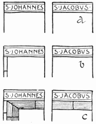 212. Diagram.
In the clerestory at Freiburg is a window in which the serried saints
appear at first sight to be simply framed by lines of pale purple; but
on examination these resolve themselves into a simple architectural
elevation, with even a hint of unsuspected shadow in it. The date of
that example is 1512; and canopies, not to go back to Græco-Roman
decoration, begin with the beginning of Gothic. It is adduced,
therefore, to show, not the origin of canopy work, but how inevitably
something of the sort occurred. Its immediate source is clearly
imitation. The thing is borrowed straight from architecture, and
indicates, it may justly be said, if not a certain lack of inventive
faculty on the part of the designer, at least some disinclination to
take the pains to invent.
So in the thirteenth century we have funny little glass penthouses
over the figures of saints, architectural in form but not
in colour; in the fourteenth windows are crossed by rows of
tall brassy disproportioned tabernacles, as yet flat fronted; in
the fifteenth, white ghosts of masonry pretend to stand out
over the figures; in the sixteenth, altar-like, or other more or
less monumental, structures, are pictured with something like
the solidity of stonework; and eventually the canopy is merged
in painted glass architecture, which joins itself on as best it can
to the actual masonry.
The forms of canopy typical of each period of architecture
have been discussed in the several chapters on design, but
something remains to be said upon canopy work in general,
and upon particular instances of it.
The Early canopy goes for nothing as design. Its one merit
is that it is inconspicuous. One could wish that the Decorated
were equally so. There is, as a rule, no shutting your eyes to its
mass of overpowering shrinework. When, by way of exception,
it chances to be modest it is sometimes more interesting—as
where it is scarcely more than a cusped arch, or where, as at
Strassburg, it takes the form of an arcaded band across the
window, in which are series of little demi-figures. At Cologne
Cathedral also sundry saints are pigeon-holed in this way.
Apropos of this, it should be mentioned that it invariably adds
to the interest of a canopy, when; for example, the broad shaft
of a Decorated canopy enniches angels and other figures, or
when they are introduced among its pinnacles or in its base.
The wide-spreading German canopy affords scope for variety
of design not possible so long as the structure is confined
within a single light. In some four-light windows at Erfurt
(1349-1372) the broad shafts of the canopies, with saints in
separate niches, occupy the whole width of the outer lights,
leaving only two lights for the central picture. In a five-light
window at Strassburg the canopy is five-arched, allowing
separate arches in the outer lights for figures of saints, whilst
the three central ones cover a single subject.
In canopies which include niches with separate subsidiary
subjects, these are sometimes by way of prelude to the main
story. In the cathedral at Berne is something of the kind.
There, among the pinnacles of the canopy which crowns
the subject of the Adoration, are seen the Kings setting out
on their pilgrimage, journeying by night, having audience of
Herod, and arriving finally at the city of Bethlehem.
In the great altar-like canopies of the Renaissance there is
sometimes a gallery above, with angels or other figures, which
give points of colour amidst the white. In any case, the canopy
is usually more interesting when it is peopled.
The Perpendicular canopy is in effect much more pleasing
than what had gone before, but it sins in its simulation of
stonework. There also little figures in white and stain are
very effectively introduced into the shafts and other parts of
the construction, but more in the form of architectural
sculpture. There are some very interesting instances of this
at Fairford, though the canopies themselves are not otherwise
peculiarly interesting.
The useful device of low, flat-topped canopies, adopted in
the nave windows at Cologne Cathedral, seldom occurs out of
Germany. It is there most successful. Indeed, these particular
canopies are interesting examples of the interpenetration of
architectural tracery as well as of its moderate and modest use.
Late German canopies are often much more leafy than
French or English; they are less architectural—or rather, the
architecture breaks out into more free and flowing growth. The
charm of Late Gothic canopy work, as was said, lies in its
colour, or in the absence of colour—in its silvery effect, that is
to say. And one may safely add that quite the most satisfactory
canopies, in whatever style, are those in which white largely
prevails, modified by stain, but preserving its greyish character.
In later Renaissance work white is still largely used; but it is
made less brilliant by painted shadow, and so has less to excuse
its architectural pretensions. At Milan there is a window
in which what should be white is in various granular tints
of brown.
The coloured canopy, to which the Italians adhered (as
well as to the border enclosing it), does not frame them as the
white glass does. The idea appears to be, on the contrary, that
it should form part of the picture. Elsewhere than in Italy
coloured canopies, other than yellow, are rare; but they occur.
There are, for example, the hideous flesh-coloured constructions
peculiar to Germany. At Troyes are some not unsatisfactory
little canopies in green, and others in purple (1499).
At Châlons-sur-Marne is an effective canopy (1526-1537) of
golden arabesque on purple. At Freiburg (1525) is a steely-blue
Renaissance canopy, from which depend festoons of
white and greenish-yellow, against the ruby ground of the
subject. And there are others satisfactory enough. But so
invariably effective is the framework of white and stain, that
to depart from it seems almost like giving up the very excuse
for canopies.
The Late Gothic canopy work does most effectually frame
the pictures, and gives light, of course, at the same time. It
goes admirably with the colour scheme, which includes always
a fair quantity of white, even in comparatively rich figure
subjects. There is no denying, nor any desire to deny, its
altogether admirable effect. If the effect were not otherwise to
be obtained, the end would justify the means. But the effect
is due simply to the setting of the subjects in a framework
of white, not to the architectural character of the design.
All that those Perpendicular canopies do could be done equally
without architectural forms at all. Canopies make no more
beautiful screens of silvery-white than, say, the Five Sisters
at York. Intrinsically they are less interesting than pattern
work. They give less scope for arranging subjects variously,
just as one will; and they allow less range for the fancy of the
artist. The most interesting canopies, and among the most
effective, are those Early Renaissance picture frames (French,
German, or Italian) which, whilst just sufficiently suggesting
something near enough to architecture to be called canopies,
are really little more than arabesque. One might almost say
they are pleasing in proportion as they depart from the quasi-architectural
formula.
The enormous value of the mass of white afforded by the
canopy, as a setting for colour, has reconciled us too readily
to its use. Why not this mass of white without pretended
forms of masonry, without this paraphernalia of pinnacles?
The architect alone, perhaps, in his heart likes canopy work,
and would prefer it to any other kind of ornamental device.
When he plans a window, or directs its planning, forms of
architectural construction occur to him naturally. Supposing
him to be an artist (as we have perhaps a right to expect him
to be) he produces a fine thing; but were he to work upon
more workmanlike lines, or, to speak quite precisely, more upon
the lines of the worker in glass, how much better he would do—being
an artist! In his reliance upon inappropriate structural
forms, he makes the obvious mistake of depending upon
the kind of thing with which he is most familiar, not the thing
especially called for. Each particular craft has a technique of
its own.
One other class of person also loves canopy work—the tradesman;
but his affection for it is less disinterested, and more
easily accounted for. The stock canopy (as every one knows
who has been, as it were, behind the counter) is a famous
device for cheapening production. The examples chosen for
illustration throughout these pages do, on the whole, much
more than justice to the periods which they were chosen to
represent; but, taken altogether, they do not, even so, form a
very effective plea for canopy work.
Were the canopy more defensible than it is in glass, it would
still have monopolised far too large a place in the scheme
of mediæval and Renaissance design. We owe largely to it,
in connection with the gradually increasing claims of figure
work, the all but extinction of pattern glass. Figure work is
practically implied by the canopy. Occasionally, indeed,
architecture has formed the whole motif of a window; but
the case is so rare that it does not count. Once in a while
there may be excuse, and even occasion, for almost any device.
There is no valid reason of art why figures and figure
subjects should not be framed in ornament, designed indeed
with reference to the architecture of the building, but not in
the least in the likeness of architecture. This ornament might
perfectly well be in white and stain. Ornamental setting in
colour does occur in thirteenth century medallion windows,
and again (though only by exception) in certain Early Renaissance
glass; but by that time pictures, as a rule, absorbed all
the interest of design. The instinct which makes us want to
give even pictured personages some sort of roof above their
heads is more natural than logical. Anyway, to make windows
to look like niches in the wall, is an absurd ideal of design, and
the nearer the glass painter gets to it the further he has gone
off the track. If anything in the nature of a canopy be desirable,
clearly it should be constructed on the lines, not of masonry,
but of glazing.
There is a direction in which glass has never been fully
developed, that of purely ornamental design. This is the more
to be deplored because that direction is the one in which was
most scope for the peculiar depth and brilliancy of colour
characteristic of mosaic glass. Ornament was used in the
thirteenth century not only as a setting for figure medallions,
but as of sufficient interest to form of itself most beautiful
windows in grisaille. Presently the attractions of figure work
put an end to that; and, furthermore, the preference for picture
naturally led to the development of design in the direction
of glass painting, which lent itself so much more readily than
mosaic to pictorial expression. We owe to that, not only the
perfection of glass painting, and its ultimate degradation, but
the neglect of latent possibilities in more thoroughly mosaic
glass, aye, in pure glazing.
Even in figure work, much might be done for clerestory and
other distant work, at all events, in pure mosaic glass. Those
who have not closely observed old glass have no conception of
the amount of leadwork there is in the windows they admire, at
the very moment that they deprecate leading, so little do these
interfere with the design, when disposed with the cunning of a
craftsman. One can imagine figures on a large scale boldly
blocked out, with broad shadows, in which not only the shadows,
but even the reflected lights in them, might be glazed in pot-metal,
and from the floor of a big church the leads would be
inappreciable. But, except in work upon an absolutely heroic
scale, there would always be the difficulty of the flesh; the
features would have to be painted; and glass pictures of this
kind would needs be designed with a severe simplicity not
calculated to satisfy the modern pictorial sense.
The advocates of painting complain that due consideration of
the qualities of glass would limit the artist to the baldest kind
of pictorial effect. Something certainly must be sacrificed to fit
treatment of the material, or glass suffers, whatever picture may
gain. That is what has happened. But if so much sacrifice
is necessary to figure, why always adopt that form of design?
Why not sometimes at least abandon subject, and seek what can
best be done in glass, even though that be barbaric? It is not
quite certain but that glass really lends itself only to a rather
barbaric kind of design, or what we are barbarous enough to
call barbaric. This is certain: the interest of figure work has
put an end to ornamental glass. It has become almost an
article of faith with us that, to the making of a window worth
looking at, figure design is indispensable. That should not be
so. And, seeing that picture does not afford full scope for the
qualities which glass-lovers most dearly love in glass, it seems
rather cruel that picture should so largely preponderate in its
design as to suppress the possibilities in the way of ornament.
Why should it be so?
There are two very important reasons for the introduction of
figure into glass, the one literary, the other artistic. In the
first place, we love a story, that is no more than human;
we want to know what it is all about, that is no more than
rational; and figure subjects afford the most obvious means of
satisfying those cravings of ours. But artists want these
cravings satisfied by means of art. Some of them, perhaps,
think more of the means employed than of the end achieved,
and would have “art for art’s sake.” Theirs is a doctrine of
very limited application. Sanity insists upon subordination
of the means to end; and art is not an end in itself, nor is
craftsmanship. It is not, therefore, for one moment suggested
that story, sentiment, meaning, in windows, should be ruthlessly
sacrificed to craftsmanship, even though expression implied
the use of figure, which it does not. What is claimed, is
merely this: that when you employ a material or a process
some consideration is due to it.
Before undertaking to express an idea, it is always as
well for the artist to consider how far its expression is consistent
with art. If it can be expressed only at the cost of all
that is best in art, it were better to adopt some other means
of expression. If a particular craft is your one means of
expression, and that particular thing cannot well be said
in it, then say what can be said; it will be to much more
purpose than saying even a better thing and saying it ill.
The better the thought, the greater the crime of saying it
inadequately.
After all, the sentiment, or what not, which people ask
for in glass, and which compels figure work, is not, in the
majority of instances, by any means so important, even in
their eyes, but that they would sacrifice it readily enough
if they knew the price in art at which they would have to
pay for it. Let patrons of stained glass, if they care for
art, ponder this statement; it is not spoken in haste, but
in conviction.
There is one reason of sentiment which would argue against
great part of the use that is made of figure work, at all events
in church glass, the doubt, namely, as to how far it is possible,
in these days, to reconcile the devout with the decorative
treatment of sacred subjects. We are all admiration when we
gaze up at the splendid figure of Moses in the great transept
window at Chartres. But it is the artist in us that is entranced,
the lover of glass, and especially of colour; the artless worshipper
might feel that the dignity of the Lawgiver would
perhaps have been better expressed with less attention to
decorative effect. We are not shocked at the archaic effigy,
because we realize that reverence underlies its simplicity. In
modern work it is otherwise. Artistic intention, admirable or
not from the æsthetic point of view, is responsible for the
introduction into our churches of delineations of all that
Christians hold sacred so ridiculous, it is a wonder devout
worshippers allow them to be there. The excuse for glass
is its decorative effect. Its value is in its colour. A Saint in
stained glass (to mention no higher Person) stands in a window
for just so much colour: is not that rather a degradation of
the saint?
In the second place, apart altogether from what has been
called the literary interest (which no one will dispute) there
is in figure work a charm, altogether artistic, in the very
unexpectedness of the colour-patches you get in it, not
accidental quite, but in many instances at least, inspired
by accident. The besetting sin of ornament is obviousness;
it has a way of distributing itself too symmetrically and evenly,
of laying its secret bare to the most casual glance. We see at
once there is nothing to find out in it, and our interest drops
to zero.
In figure design, on the contrary, there are breaks even
in the very best balanced scheme; there is always something
unexpected, unforeseen, something to kindle interest; in fact,
the difficulty is, there, to distribute the composition evenly
enough. The question arises whether this sameness, and
consequent tameness, of ornament, the way the points of
intended interest recur with irritating frequency and regularity,
resolving themselves into mere spots—whether this defect is
inherent in ornament, and inseparable from it.
Proof that it is not is afforded by heraldry, distinctly a branch
of ornamental design, in which, for precisely the same reasons
as in figure work, we get just that inevitable deviation from
system, and more especially from symmetry, which seems
necessary to the salvation of ornament. Where by happy
chance an ornamental window has been patched with glass
not belonging to it, or where portions of it have been misplaced,
we get similar relief from monotony. Here the unexpectedness
of contrast, colour, and so on, is accidental; in heraldry it is,
in the nature of things, unforeseen of the artist, and unavoidable.
May not similar results be obtained of set purpose and
design? Surely they may. Were it otherwise, it would be
worth falling back now and then upon haphazard, and letting
colour come as it might.
Happily there is no occasion for that feeble sort of fatalism.
Given a colourist and a man with that sense of distribution
(whether of line, mass, or colour) which makes the artist, what
is to hinder him from deliberately planning so much of surprise
as may be necessary to tickle the appetite for the ornamental?
The ogre in the path is what we call economy. Because
ornament can without doubt be more cheaply executed than
figure work, it is taken for granted that it must be reserved
by rights for cheap work. What else is there to recommend
it? And, that being so, ornament being but padding,
by all means, it is argued, let it be not only cheap but of
the cheapest!
Design, moreover, if it be worth having at all, is costly, and
there is clearly thrift in repeating the same pattern, and even
one unit of it, over and over again. The practice of saving
design in this way has become at last so much a matter of
course, that no one thinks of designing an ornamental window,
as a whole, without repetition of pattern—except the artist;
and with him it is a fond desire which he hopes perhaps some
day to fulfil—at his own expense.
Under circumstances such as these, what wonder ornament
is monotonous? It could not well be otherwise. But these
conditions are not in the nature of things. Ornamental design
has subsided because no one asks for, cares for, or encourages,
ornament. It needs only to be in the hands of an artist—not
necessarily a Holbein, but just a Rhodian potter, a Persian
carpet weaver, a mediæval carver, or a nameless glazier—to be
worthy of its modest place in art.
Considering the costliness of good figure work and the
absolute worthlessness of bad, considering the way in which
glass lends itself especially to ornament, considering how in
ornament the qualities most necessary to decorative effect and
most characteristic of the material can be obtained, surely the
wiser policy would be to do what can so readily be done.
When glass lends itself so kindly to ornament it seems a sin
to neglect it. Is it quite past praying for, that there may still
be a future for windows merely ornamental, which shall yet
satisfy the sense of beauty?