Printing owes its development first and chiefly to movable metal
types. The so-called invention of printing was the discovery of a
method of making serviceable type in quantity. The idea of a separate
type for each letter of the alphabet was probably conceived long
before Gutenberg’s time, but it remained for him and his associates to
devise an apparatus for making them quickly and accurately enough to
be of practical value. That apparatus was the type mold, which
experience has since proved to be the most efficient means of securing
exactness and uniformity in a number of small pieces of metal.
Type is made of an alloy of lead, tin, and antimony. Its length
(technically called height-to-paper) is .918 of an inch. Each type is
cast separately in a mold, and has the letter or printing character in
bold relief on one end.
Exact uniformity of body is necessary in order that the types, when
composed in lines and pages, may be locked together by pressure at the
sides so as to make a compact mass. All types in a printing form must
be of the same height, so that their faces may present a uniformly
level surface from which an impression may be made that will show all
the characters clearly. A short type will print faintly or will not
print at all, while a long one will be unduly forced into the sheet.
![[Diagram of a line of metal type]](https://openoldbooks.sgp1.digitaloceanspaces.com/books/type/images/p08a-s.png)
There are on an average about one hundred and fifty roman letters and
other characters required in ordinary book printing. These letters are
divided into a number of classes: full-body letters, ascending
letters, descending letters, short letters; and in some cases, small
capitals, which are larger than short letters but not so tall as
capitals or ascenders. Only a few letters, like J and Q, cover
nearly the entire surface on the end of the type; other letters, like
B h l i, cover the upper portion chiefly and leave a blank space at
the bottom; while the small letters, like a e o u v, occupy only the
middle portion of the surface; still others, like g y p, cover the
middle and lower portions of the surface. As all these irregular
shapes must be made to appear in line with each other, the type-body
on which they are made is larger than the letter. The blank parts
around the face of a letter are called the counter, the shoulder, and
the beard. The counter is the shallow place between the lines of the
face. The shoulder is the low flat part of the type around the face.
The beard is the sloping part between the face and the shoulder.
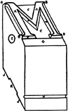 A A, the face
B B, the serifs
C C, the counter
E, the pin-mark
F F, the beard
G, the shoulder
H, the nick
J J, the feet
K, the groove
An important feature of a type is the nick on the side of the body. In
many cases there may be two, three, or even four nicks on a type.
Usually all the types of a font have nicks that are identical in
number and position, and when the types are composed in lines these
nicks match each other and form continuous grooves on the lower part
of the line of type.
The nicks serve as guides to the compositor when taking the type from
the case to his composing stick, and they assist in distinguishing the
types of one font or face from those of another on the same size of
body.[1] Individual letters of different type faces sometimes bear
such close resemblance that they are more readily distinguished by
the nick or some other body-mark than by the face. A difference in
alignment of nicks in a line will readily show the presence of a
wrong-font letter. Typefounders sometimes make an extra nick on a few
small-capitals (o s v w x z) in order to distinguish these types from
the lower-case letters of the same font.
A font of type is an assortment of one size and kind that is used
together. It is usually all the type in the composing-room of a
certain kind matching in body, nick, and face. A small font may be
held in one case, but several cases may be required for a font of
large quantity.
An ordinary font of roman type for book work will include these
characters:
Roman Capitals—A B C D E F G H I J K L M N O P Q R S T U V W X Y Z
Æ Œ
Small Capitals—a b c d e f g h i j k l m n o p q r s t u v w x y z
æ œ
Lower-case Letters[2]—a b c d e f g h i j k l m n o p q r s t u v w
x y z æ œ fi fl ff ffi ffl
Figures—1 2 3 4 5 6 7 8 9 0 (or oldstyle  )
)
Marks of Punctuation—Period . comma , colon : semi-colon ; hyphen -
apostrophe ’ exclamation mark ! question mark ? parenthesis ( bracket [
The latter two are used in pairs () [], the second type being set in
reversed position.
Quotation Marks are made by two inverted commas “ at the beginning
and two apostrophes ” at the end of the quoted matter. In some fonts
there is a double mark |"| |"| cast on single bodies, but these are
not often used.
Dashes—En – em — two-em —— three-em ———
Reference Marks—Asterisk or star * dagger † double
dagger ‡ section § parallel ‖ paragraph ¶ index (hand, or
fist) ☞
Braces—Two-em  three-em
  pieced
braces
pieced
braces 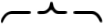 made on em bodies, which may be extended more
or less with dashes
made on em bodies, which may be extended more
or less with dashes 
The dollar-mark $, short-and (or round-and) &, and sterling pound-mark
£ are also included with all full fonts.
The character  is an old-style ligature (two joined letters cast
on one type) made in some fonts of old-style faces. It is one of the
many letter combinations formerly common, in imitation of the work of
old manuscript writers.
is an old-style ligature (two joined letters cast
on one type) made in some fonts of old-style faces. It is one of the
many letter combinations formerly common, in imitation of the work of
old manuscript writers.
Many styles of roman types have italic letters to match, but the
italic fonts include only capitals, lower-case, figures, and
punctuation marks:
Italic Capitals—A B C D E F G H I J K L M N O P Q R S T U V W X Y
Z Æ Œ
Italic Lower-case—a b c d e f g h i j k l m n o p q r s t u v w x
y z æ œ
Italic Figures—1 2 3 4 5 6 7 8 9 0 ( )
)
Italic Points, etc.[3]—. , : ; - ’ ! ? ) $ &
Small capitals are not made for italic fonts, except in rare cases.
When they are needed in composition, capitals of a smaller size of
type are justified into the text line.
Other extra characters, not included in ordinary fonts but which may
be added when required, are accented letters (â é ë ī ō û etc.),
fractions ¾ 5⁄13 etc.), mathematical signs (+ × ÷ = etc.),
superior (ab 42) and inferior (ab 12) letters and figures,
leaders (…………), commercial signs (@ ℔ ⅌ ℀ ¢), and many other characters for special kinds of
printing.
Fonts of advertising, jobbing, and display types usually consist of
the capitals, lower-case letters, figures, and points, with
occasionally a few extra characters. For many recent styles of heavy
faces the founders furnish fractions, accented letters, and other
special characters to match in boldness of face, but these are not
included in ordinary letter-fonts.
The quantity of each character apportioned to a regular font is the
estimated average required for ordinary composition in the English
language. It is rare that more than a fraction of a small font can
be used in any piece of composition. No general scheme can meet the
needs of every kind of work; tables and statistical matter will need
extra figures, directories and other lists will call for surplus
capitals, dialogue matter will need more than the usual portion of
commas and apostrophes for quote-marks; even plain descriptive
composition will often call for extra “sorts.” For these and other
peculiar kinds of composition extra quantities of some characters,
as well as other material, must be provided.
Ordinary roman and other faces used in large quantities are measured
by weight. The proportion of letters in a 100-pound font, showing the
proportions of each character, is given on the next page.
Miscellaneous faces used in small quantities are put up in fonts
containing a certain number of each letter, the size of the font being
designated by the number of capital A’s and lower-case a’s it
contains.
| Scheme for 15-A 30-a Job Font of 12-Point[4] |
|---|
| CAPITALS |
|---|
| A | 15 |
| B | 6 |
| C | 10 |
| D | 8 |
| E | 18 |
| F | 7 |
| G | 7 |
| H | 8 |
| I | 15 |
| J | 5 |
| K | 5 |
| L | 10 |
| M | 8 |
| N | 15 |
| O | 15 |
| P | 8 |
| Q | 3 |
| R | 15 |
| S | 15 |
| T | 15 |
| U | 8 |
| V | 5 |
| W | 6 |
| X | 3 |
| Y | 6 |
| Z | 3 |
| & | 6 |
|
| LOWER-CASE |
|---|
| a | 30 |
| b | 12 |
| c | 16 |
| d | 18 |
| e | 40 |
| f | 12 |
| g | 12 |
| h | 20 |
| i | 30 |
| j | 8 |
| k | 8 |
| l | 20 |
| m | 16 |
| n | 30 |
| o | 30 |
| p | 12 |
| q | 6 |
| r | 30 |
| s | 30 |
| t | 30 |
| u | 16 |
| v | 8 |
| w | 12 |
| x | 6 |
| y | 12 |
| z | 6 |
| fi | 3 |
| fl | 3 |
| ff | 3 |
| ffi | 2 |
| ffl | 2 |
|
| POINTS |
|---|
| period | 31 |
| comma | 31 |
| colon | 6 |
| semi-colon | 6 |
| hyphen | 9 |
| apostrophe | 13 |
| ! | 9 |
| ? | 8 |
| ( | 6 |
|
| FIGURES |
|---|
| 1 | 5 |
| 2 | 4 |
| 3 | 4 |
| 4 | 4 |
| 5 | 4 |
| 6 | 4 |
| 7 | 4 |
| 8 | 4 |
| 9 | 5 |
| 0 | 6 |
| $ | 4 |
| £ | 5 |
|
| Proportion of Letters &c. in 100 lb. of Roman Type |
|---|
| CAPITALS |
|---|
| oz |
| A | 8½ |
| B | 5 |
| C | 7½ |
| D | 6½ |
| E | 10 |
| F | 5 |
| G | 5½ |
| H | 6½ |
| I | 6 |
| J | 4½ |
| K | 4 |
| L | 6 |
| M | 7½ |
| N | 7½ |
| O | 7½ |
| P | 6 |
| Q | 2½ |
| R | 8 |
| S | 8 |
| T | 9 |
| U | 5 |
| V | 3½ |
| W | 7 |
| X | 2 |
| Y | 4½ |
| Z | 2 |
| Æ | ¾ |
| Œ | ¾ |
| & | 3½ |
| | ——— |
| | 10 lb |
|
| SMALL CAPS. |
|---|
| oz |
| A | 2½ |
| B | 1½ |
| C | 2 |
| D | 2 |
| E | 3½ |
| F | 1½ |
| G | 1½ |
| H | 2 |
| I | 1¾ |
| J | 1¼ |
| K | 1¼ |
| L | 2 |
| M | 2¼ |
| N | 2½ |
| O | 2½ |
| P | 1¾ |
| Q | ¾ |
| R | 2¼ |
| S | 2¼ |
| T | 2½ |
| U | 1½ |
| V | 1 |
| W | 2 |
| X | ¾ |
| Y | 1¼ |
| Z | ½ |
| Æ | ¼ |
| Œ | ¼ |
| & | 1 |
| | ——— |
| | 3 lb |
|
| LOWER CASE |
|---|
| lb | oz |
| a | 4 | 6 |
| b | 1 | - |
| c | 1 | 14 |
| d | 3 | - |
| e | 6 | 8 |
| f | 1 | 1 |
| g | 1 | 4 |
| h | 3 | 8 |
| i | 2 | 12 |
| j | - | 5 |
| k | - | 8 |
| l | 1 | 8 |
| m | 2 | 10 |
| n | 4 | 6 |
| o | 4 | 4 |
| p | 1 | 6 |
| q | - | 5 |
| r | 3 | 5 |
| s | 3 | 6 |
| t | 3 | 12 |
| u | 2 | 2 |
| v | - | 14 |
| w | 1 | 10 |
| x | - | 5 |
| y | 1 | 4 |
| z | - | 4 |
| æ | - | 1 |
| œ | - | 1 |
| fi | - | 5 |
| ff | - | 4 |
| ffi | - | 4 |
| fl | - | 3 |
| ffl | - | 3 |
| | —————— |
| | 58 | 12 |
|
| FIGURES |
|---|
| oz |
| 1 | 8 |
| 2 | 6½ |
| 3 | 5½ |
| 4 | 5 |
| 5 | 6½ |
| 6 | 5 |
| 7 | 5 |
| 8 | 5 |
| 9 | 5 |
| 0 | 10 |
| $ | 2 |
| £ | ½ |
| | ——— |
| | 4 lb |
|
| POINTS |
|---|
| lb | oz |
| period | 1 | - |
| comma | 1 | 8 |
| colon | - | 2 |
| semi-colon | - | 3 |
| hyphen | - | 9 |
| apostrophe | - | 4 |
| ! | - | 2 |
| ? | - | 2 |
| — | - | 3 |
| ( | - | 2 |
| [ | - | 1 |
| | —————— |
| | 4 | 4 |
|
| TOTALS |
|---|
| lb |
| Capitals | 10 |
| Small Capitals | 3 |
| Lower-case | 58¾ |
| Figures | 4 |
| Points | 4¼ |
| Spaces and quads | 20 |
| | ——— |
| | 100 lb |
|
| SPACES AND QUADS |
|---|
| lb | oz |
| hair | - | 2 |
| 5-to-em | - | 10 |
| 4-to-em | 1 | - |
| 3-to-em | 6 | - |
| en-quad | 2 | 4 |
| em " | 1 | 10 |
| 2-em " | 4 | 2 |
| 3-em " | 4 | 4 |
| | —————— |
| | 20 lb | |
|
Weight fonts of body type are usually put up by the founders in
sections or parts of fonts as given in the above summary of totals,
so that one or more of these sections may be obtained to supplement a
font already in use.
It will be noted that braces, dashes, and reference-marks are omitted
in the above list. These characters, like fractions, commercial signs,
etc., are not now considered parts of ordinary fonts, but are put up
in separate packages and must be specially ordered when wanted.
Font schemes apportioned in quantities like the foregoing are more or
less closely adhered to for original packages of foundry-cast type. To
insure precision, when ordering, it is necessary to state not only the
quantity (by number of letters or weight) but also whether a complete
font or part of a complete font (capital font, lower-case font, or
figure font) is referred to.
All printing type has, first, a name denoting its size, and second,
one denoting the style of its face. For instance, the type used for
the text of this book is 10-point (its size) Lining Caslon Oldstyle
(the foundry name of its face).
The size of a type is the vertical thickness of its body—the
thickness of a line up and down the page. The width of a type is its
set. Thus a 12-point en-quad is 12-point body and 6-point set, a
10-point figure of the thickness of an en quad is 10-point body and
5-point set, etc. The total length of a type, including feet and face,
is its height-to-paper.
American type sizes conform to a graduated scale known as the point
system. The unit of the system is a division of space called a
point, which is .0138+ (approximately 1⁄72) of an inch. Type bodies
are multiples of this point.
The usual sizes are graduated by points up to 12-point. Sizes above
18-point are multiples of 6-point up to 60-point (18, 24, 30, 36, 42,
48, 54, 60). Larger sizes are 72-point, 84-point (rare), 96-point,
120-point, and 144-point, the latter being the largest type commonly
cast in a mold.
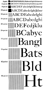
The above squares show one em of the sizes stated. The letters show
the size of face made on the body.
In addition to the small sizes shown in the accompanying illustration,
there are some intermediate sizes like 5½-point and 4½-point,
and type as small as 3-point has been made. These are rare, however,
as type smaller than 5½-point is not practicable for extended use.
These small sizes are employed for special purposes, like miniature
editions of books (parts of the Bible, prayer books, etc.) cut-in
notes, piece-fractions, small borders, special characters, and
occasional words or lines that are required to be put in the smallest
possible space. The size of type known as agate (fourteen lines to an
inch) is considered the common standard of measurement for newspaper
and magazine advertising space.
Many plain types for books, periodicals, etc., are made only in small
sizes. Certain faces are made in a few sizes only, while others are
made in more or less complete series from 6-point to 48-point. The
irregular sizes of 5½-point, 7-point, 9-point, and 11-point are
mostly roman faces, with companion italics, and a few bolder styles
for headings and other display in combination with romans of the same
body. Many new faces are now made by founders in graded series from
6-point to 72-point, and in some cases even larger. Type faces adapted
to many kinds of work are made in nearly all the regular sizes, while
those faces designed for small and dainty work, like personal and
society cards and stationery, are made only in the smaller sizes of
the list.
Types are now often cast with faces larger or smaller than is commonly
made on the body, such as a 12-point face on 10-point body, giving the
effect of compactness; or an 8-point face made on a 10-point body,
which gives a lighter appearance as if opened with 2-point leads.
These are known as bastard types. Because of this irregularity in the
faces of types it is difficult to know the exact body-size of a type
by merely examining a printed sheet.
Borders, ornaments, florets, and decorative characters cast on
type-bodies are now made mostly in sizes based on the 6-point as the
unit (6, 12, 18, 24-point, and larger multiples), but 8-point,
10-point, and 14-point sizes are sometimes used.
Before the adoption of the point system, type sizes were named in a
haphazard way. Arbitrary names were given to certain sizes and in many
cases types of the same name made by different founders varied so much
in size that they could not be used together without great
inconvenience to the printer. Some of these old names still survive
and are applied to the point-system bodies which approximate the old
sizes.
| POINT SIZE | OLD NAME |
|---|
| 3-point | … | excelsior |
| 4-point | … | brilliant |
| 4½-point | … | diamond |
| 5-point | … | pearl |
| 5½-point | … | agate |
| 6-point | … | nonpareil |
| 7-point | … | minion |
| 8-point | … | brevier |
| 9-point | … | bourgeois |
| 10-point | … | long primer |
| 11-point | … | small pica |
| 12-point | … | pica |
| 14-point | … | english |
| 16-point | … | columbian |
| 18-point | … | ⎰ great primer
⎱ three-line nonpareil |
| 20-point | … | paragon |
| 22-point | … | two-line small pica |
| 24-point | … | two-line pica |
| 28-point | … | two-line english |
| 32-point | … | two-line columbian |
| 36-point | … | two-line great primer |
| 40-point | … | two-line paragon |
| 44-point | … | meridian |
| 48-point | … | canon, four-line pica |
While these old names and their sizes are now nearly obsolete, young
printers should learn the names and associate them with their
corresponding sizes of the point system. In the foregoing list there
are several intermediate sizes (16, 20, 22, 28, 32, 40, 44-point)
rarely used for type of recent design. Fonts of these odd sizes may be
sometimes found, and there has been a size of 15-point made, but
little used. These odd sizes are, however, mostly old faces, scripts,
and black-letter, originally cast on old bodies and later, after the
introduction of the point system, made on new point-bodies which are
nearest to their original sizes.
The point system has been applied to the width of types, as well as to
the body-size; that is, the set of each type is fixed at a given
number of points or fraction thereof. This method simplifies in a
degree the process of accurate justification, as each line, though
containing various letters and spaces, is composed of the same number
of units. An advantage over the old method of unrelated widths is in
the saving of time in composition, by reducing the number of different
widths in the characters of the alphabet. By the old method each type
had its own special width; in a complete font there might be a hundred
or more different widths. By the modern point system those characters
which are nearly alike in width are made on the same set, or, if
different, the variation is governed by the standard unit.
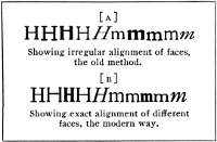
Showing irregular alignment of faces, the old method.
Showing exact alignment of different faces, the modern way.
American founders have adopted the practice of casting type-faces on
uniform lining systems, variously known as American line, standard
line, uniform line, etc. The earlier practice was to cast the type of
a font so that the letters would align at the bottom only with their
mates of the same font, without reference to any other face of type.
When the compositor had occasion to use two or more different faces of
type in the same line, these faces were rarely in even alignment, but
were irregularly high or low, as shown in the accompanying example
[a]. This lack of uniformity made it necessary when a different face
was used in the line, as is often required in jobbing and
advertisements, to use thin leads, cards, or pieces of paper above and
below different parts of the type-line in order to get the faces in
line—an operation more or less troublesome and expensive. By the
modern lining system, the faces made on any given size of body are
cast to align with each other, as shown in the second example [b].
These different faces require no more adjustment than if they were all
of one font.
On different sizes of type the shoulder, or blank space, at the bottom
of the letter increases gradually with the size of the type, so that a
word of small type placed beside a larger size must have some spacing
material below as well as above to keep it in its right alignment.
This necessary difference in the face-alignment of various sizes is
graduated by points, in the lining system, so that when more than one
size type is used in the same line the justification is made by using
point-body leads. This makes the use of slips of card and paper
unnecessary and secures greater accuracy and solidity of the composed
page.
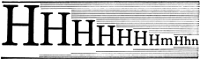
30-point to 6-point lined up with 1-point.
Faces of radically different style are not, however, all cast on the
same alignment, but are classified into three groups. One group
embraces the majority of type-faces, those having capitals and small
letters, g y p j. Another group embraces fonts of capitals only,
mostly faces known as title letters and combination lining faces
which, having no descenders, may be made lower on the body. A third
group includes those faces having long descenders, like script types,
which must be placed high on the body.
![These types show letters cast on [A] the common line, [B] title line, [C] script line.](https://openoldbooks.sgp1.digitaloceanspaces.com/books/type/images/p17c-s.png)
These types show letters cast on [
a] the common line, [
b] title line, [
c] script line.
A common class of “lining” types for job work are the combination
series, or those having two or more sizes of face (capitals only) cast
on bodies of the same size. Each face is made to line with the others
on the same body, and all the faces are readily used in combination,
with a single size of spaces and quads. In order that the type of each
face may be readily distinguished, the nicks are varied in number or
position—a single nick for one face, two nicks for another, etc.
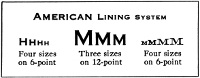
American Lining System
When the face of a letter is so large that it projects over the
type-body, it is known as a kerned type. Letters of this kind are
common in italic and script fonts, and there are a few letters, like f
and j, in some oldstyle roman fonts which have the tip of the letter
overhang. Kerned types are a source of trouble because of the ease
with which these projections break off during composition, proofing,
etc. Yet they cannot be entirely dispensed with, especially in italic
and script faces having a definite slope, where the long letters would
have wide gaps on the side (as shown in the script line above) if they
were cast on bodies wide enough to hold the entire face. In some
styles of upright faces having extra long descending letters g, p, q,
y, these descenders may be kerned.
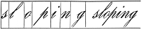
Showing why some letters must be made on kerned types.
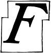
Large italic letters are sometimes mortised at the
corners, instead of kerned, to allow the next letter to fit close.
Modern type-makers try, by changing the shape of the letters slightly,
to avoid kerns as much as possible, because of the extra care and
expense involved in casting. Too often, unfortunately, this avoidance
of the kern, in order to meet mechanical convenience, is secured by
sacrificing the distinctive form of the letter.
Short metal spaces and quads (from quadrat, a square), used for
blanks between words and elsewhere, are of various thicknesses, as
illustrated below. An em is a square of type body of any size. This
10-point em □ is ten points square; a 10-point three-to-em
space is one third of the em, a four-to-em is one fourth, etc. The en
quad is really a thick space, though called a quad, and is equal to
half the em. Larger blanks are the two-em and three-em quads, used to
fill the last lines of paragraphs and other wide spaces.
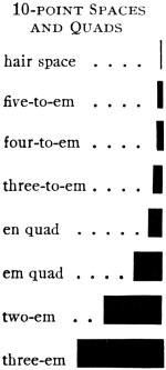
The metal blanks shown here are the regular spaces and quads belonging
to a font of type of the size of 10-point. They enable the compositor
to obtain the many different spacings required to make lines the
required length, and to properly separate words and place them
wherever desired in the line. While these thicknesses of spaces are
the usual kinds for sizes of type up to 12-point, larger types may
have other kinds of spaces, six-to-em, eight-to-em, and even smaller
divisions. The thickness of the hair space does not always bear the
same proportion to the em quad; in some sizes it is one sixth of the
em, in others it may be one eighth or one twelfth. Very thin spaces
(copper ½-point, brass 1-point), for exact spacing and justifying,
are supplied by dealers.
A space of the thickness intermediate between the three-to-em and the
en quad, known as a patent space, has been made for use in book work.
Although it has great advantage as a substitute for two of the thinner
spaces when these are needed in spacing a line, its use has been
limited and it is not included with the usual assortment furnished by
dealers.
The common spaces and quads for general work, when the type itself is
used for printing, are about seven-eighths of the height of the type,
so that they are well below the printing surface. A type-page composed
with these spaces will have a little deep hole at the top of each
space. These numerous little holes present a difficult surface for
making a good wax mold when an electroplate is made for printing.
Where much molding is to be done, higher spaces, quads, and other
blanks are provided. These high spaces and quads reach nearly to the
shoulder of the type.
![[Diagram of a type mold]](https://openoldbooks.sgp1.digitaloceanspaces.com/books/type/images/p20-s.png)
Solid lines indicate one half of the mold. Dotted lines
show the other half in position. Shaded portion represents type metal
filling aperture in the mold. The molten type metal flows through the
opening at
A, down to the side
B, where the matrix (not shown in this
diagram) molds the face of the type. The tag of metal, called the jet,
marked
C, is cut off after casting.
D is a narrow flange on the mold
which forms the nick on the under surface of the type body.
The mold in which type is cast consists of two essential parts—the
steel box in which the body is formed, and the matrix which contains a
sunken image of the character. The matrix covers the opening at one
end of the mold, and on the opposite end (which is the foot of the
type) is an opening through which the melted metal is injected. A mold
is made for a single body-size of type but it is adjustable sideways
to correspond to the various widths of the letters in an alphabet. One
mold may be used to cast, in succession, all the letters of a font of
type, or it may be used to cast any number of fonts of different faces
that may be made on the same body, by merely changing the matrices
that form the face. The mold is made in two sections, which are
fitted together so as to close up to the required width of the letter,
and, after the cast is made, to open slightly in order to release the
type.
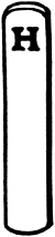
Matrix
The Matrix. There are three different methods of making type
matrices. By the oldest method the first step is to cut the character
on the end of a small bar of soft steel, called a punch; when this is
done, the steel is hardened and it is used to stamp an impression in a
bar of copper. This copper bar is a matrix in the rough, and its sides
are next trimmed and squared so that it will fit the mold.
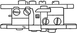
Type-mold complete, in two parts, but without the
matrix (which is shown separately above). Position of the matrix when
cast is made is indicated by the letter
H on the end of the type
within the mold. The upper and lower halves of the mold slide
horizontally, to make the interior casting-box wide or narrow to
conform to the required widths of various letters.
The second method of making a matrix is by electrotype process. The
original pattern of the letter may be engraved by hand or by other
operation, or it may be a perfect type-face of a previous casting.
This is fitted into a small frame of brass and then held in the vat of
an electro-galvanic battery, which deposits a thick film of copper
around the pattern and fills the opening in the brass frame. When this
electro-plating process is completed, the pattern letter is extracted
and the brass frame, with its copper impression of the letter, becomes
the essential feature of the matrix. It is then reinforced by riveting
another plate on the back, and is trimmed and fitted to place on the
mold.
A third process of making matrices is with an automatic matrix-cutting
machine, in which the shape of the desired letter is cut in the face
of a plate of composition metal by a small rapidly-revolving cutting
point. A large pattern of the letter is placed in one part of the
machine, and while the operator traces the outline with the point of a
lever all the motions are duplicated in miniature by the cutting tool
on the bar of metal, which becomes, when completed, a matrix.
Casting the Type. The old-time method of casting type was with hand
molds, the melted metal being poured in at the foot of the mold with a
small ladle while the mold was held in the hand. In the modern casting
machine, the mold with its matrix, is assembled by the side of the
metal pot, in which the metal is kept at a uniform temperature by
means of a gas furnace.
In the center of this metal pot is a rod with a spring attachment
which, at each operation of the machine, acts as a plunger to force a
small stream of hot metal through a side aperture into the jet-hole of
the mold. After the casting, the two parts of the mold separate
slightly, the matrix is drawn away from the face of the type, and the
cast is moved out; then the mold and matrix close together again and
the operation is repeated. Cold water or air is circulated near the
mold to keep an even temperature. The matrix for one character only is
placed in the machine and when enough types have been cast, it is
taken out and replaced by another, the change usually requiring but a
few moments.
There are several kinds of type-casting machines in use, such as hand
casters, steam casters, and automatic casters. The older style is the
hand caster, which is operated by a small wheel with a handle
attached. Steam casters are operated by mechanical power (originally
steam power).
When type is cast by a hand machine it is unfinished, as a piece of
metal called the jet still adheres to the bottom of each type. This
jet is broken off, and the types are set in long lines and fastened in
a narrow channel, face down. A small plane smooths away the rough
surface caused by breaking off the jet. This leaves a shallow groove
on the bottom of each type and allows it to stand squarely on its
feet. The types also have slight burs and sharp edges of metal which
must be rubbed off before they are ready for inspection and for the
font-room. Type cast on the older “steam” machines require the jet to
be broken off after the casting, and the final finishing of the type
is done afterward by other operations. These finishing touches are
done mostly by hand, with the aid of a polishing stone or a small
dressing wheel.
On the automatic machine, which is the modern method of casting type,
breaking off the jet, rubbing, dressing, etc., are all accomplished
automatically on the machine, the types coming out in a continuous
line practically ready for the compositor’s case.
The foregoing describes in a general way the methods of making type by
the regular founders. There is now a great deal of type made by
automatic composing and casting machines installed directly in many
composing rooms.
Two distinctive styles of these machines are now extensively used—the
Linotype and the Monotype. Both of these have reached a high degree of
efficiency because of their nice mechanisms, based on the principle of
automatically operated molds, matrices, and delivery devices.
In the Linotype the matrices for a desired line of words are assembled
side by side and the line is cast in one piece.
In the Monotype the mechanism automatically and rapidly adjusts the
matrix of the desired letters one at a time over the mold, and each
type is cast and moved along into lines and then into a column on a
galley.
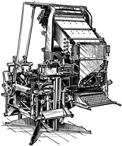
Four-Magazine Linotype Machine
The Linotype (line-o’-type) consists of a mechanism for assembling
brass dies or matrices in lines, presenting them in front of a mold in
which a type-high metal bar, or slug, is cast, and returning the
matrices to their respective channels for use again. The brass
matrices have the characters of the alphabet, figures, points, etc.,
sunk into their edges; these are held in a magazine, which is an
arrangement of channels in an inclined position above a keyboard. By
the pressing of a key the required matrix is released, which drops and
is carried into place by a small belt. Wedge-shaped space-bands are
also controlled by a key, and when sufficient matrices and space-bands
are assembled to make the line a bell rings. By operating a lever the
line of matrices then moves in front of the mold inserted in the side
of a wheel and behind which is a pot of melted metal.
By the next operation the space-bands are pushed between the words,
thus spreading them to the measure. The line justified, a plunger in
the metal-pot forces a quantity of metal into the mold and against the
line of matrices, forming a metal strip or slug with the letters in
relief on one edge. After the cast is made, a turn of the mold-wheel
and other mechanism shaves off the surplus metal on the foot of the
slug and pushes it between knife-edges, where it is trimmed on the
sides, and is then pushed on to a galley. The melting of the metal is
done by a small gas furnace under the metal-pot.
After the matrices have been used for the line they are lifted by an
arm to the top of the machine and distributed again, each character in
its particular channel in the magazine. The matrices for each
character have a set of notches or teeth different from every other
character; and as they are moved along the distributing apparatus by
horizontal screws each matrix reaches a point where its notches are
matched and it drops into the top of its channel. There are a number
of matrices of each character, and the arrangement of the machine is
such that three lines of matrices may be kept in operation at
once—one being assembled, one at the casting mold, and the third
being distributed.
The work of the operator is to manipulate the keyboard and, at the end
of each line, move a lever which engages the mechanism that carries
the assembled line to the mold. All other operations are performed by
mechanical power.
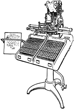
Monotype Keyboard
The Lanston Monotype is a type-casting machine which produces separate
types set in lines of any length, up to sixty ems pica, spaced and
justified. It is in two parts—a keyboard and a casting machine. The
function of the keyboard section is to punch a series of holes in a
moving strip of paper, which unwinds from one spool to another,
passing under a series of punches in its journey. The punches are
operated by pressing the keys on the keyboard, the result of this
operation being a roll of perforated paper ribbon. This ribbon is then
taken to the casting machine, which contains a pot for melted metal, a
stationary mold for the size of type to be cast, and a matrix-plate.
The matrix-plate is about five inches square, and has on its face
depressed images or matrices of each letter and character of the font.
The perforated strip of paper, when fed to its place, controls the
movement of the matrix-plate, so that the required letter is adjusted
exactly in place over the mold, while the melted metal is squirted in
to form the type. The type then moves away and takes its proper place
in the line, until the line is completed, when it is automatically
moved out on to a galley.
The Monotype keyboard, being an entirely separate machine, may be and
usually is operated in any place away from the casting apparatus and
work may be executed on it anytime before casting. The perforated roll
may be fed through any number of times to produce duplicate castings
of the matter, and a matrix-plate for a different face may be used if
desired. In the casting of the line the proper spaces are cast with
it, the spacing needed to justify each line being indicated on the
perforated record during composition on the keyboard.
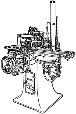
Monotype Casting Machine
A peculiarity of Monotype composition is that, while the keyboard
produces the perforated roll in the usual sequence from beginning to
end of the story, the casting machine reverses the process by starting
at the end of the composition and finishing up with the beginning.
The metal used for casting type is a mixture of lead (five parts),
antimony (two parts), tin (one part), and sometimes a small addition
of copper. Lead forms the chief part of all type metal, as it melts
easily and fuses readily with other metals; but lead alone is too soft
for the service required of type. Antimony is brittle and gives
hardness, and tin is added to impart toughness. Lead and antimony in
approximately these proportions make an alloy which has the unusual
quality of expanding slightly, instead of shrinking, when cooling,
thus permitting a full, sharp cast in all parts of the mold. Tin flows
readily when melted and increases the smoothness of the cast on the
surface of the mold. A small quantity of copper may sometimes be added
to give still greater toughness.
The metal used for small sizes of type is commonly harder than that
used for the large sizes, the softness of the metal gradually
increasing with the size of type made. Script types and faces with
delicate lines are usually cast with metal a little harder than that
used for the normal and bolder faces.
The foregoing refers more particularly to type cast by the regular
foundries. The metal used in automatic casting machines, like the
Monotype, contains a larger proportion of lead and less antimony;
while the metal used for casting line-slugs in the Linotype machine is
composed of still larger proportion of lead and very little of the
other two metals. Stereotype metal and metals used for leads, slugs,
furniture, etc., are largely lead.
Large types, such as are used for posters and large bills, are made of
wood. The smallest size for practical use is 48-point, or 4-line pica.
Sizes of wood type are multiples of the pica, and are so named, as
8-line, 10-line, etc. They are much cheaper than metal types, though
not as durable or satisfactory for printing. The wood commonly used is
maple, and the letter is made on the end of the grain. It must be well
seasoned and polished. Pine and other soft woods are used for very
large sizes of wood type and poster engravings.
The manner of cutting the letter is by routing away the blank parts
with a small rapidly-revolving cutter. The strip of wood, large enough
to make several letters, and planed type-high, is placed in a machine
equipped with a pantagraph apparatus. A pattern letter is put in
place, and over this a guide-point is moved. On another part of the
machine is the revolving cutting tool. As the guide-point is moved
over the pattern its motions are duplicated on the block under the
cutting tool, which cuts away the wood. When the letters on a block
are thus routed out, they are sawed apart, the finishing touches
given, and the letters oiled.
![[A piece of metal type]](images/p07-f.png)
![[Diagram of a line of metal type]](images/p08a-f.png)

![[Diagram of type sizes]](images/p13-f.png)


![These types show letters cast on [A] the common line, [B] title line, [C] script line.](images/p17c-f.png)


![[Diagram of a type mold]](images/p20-f.png)


