The Book and the printers of the second generation—The German
workmen dispersed through Europe—Caxton and the introduction
of printing into England—Nicholas Jenson and his supposed
mission to Mayence—The first printing in Paris; William Fichet
and John Heinlein—The first French printers; their installation at
the Sorbonne and their publications—The movement in France—The
illustration of the Book commenced in Italy—The Book in
Italy; engraving in relief and metal plates—The Book in Germany:
Cologne, Nuremberg, Basle—The Book in the Low
Countries—French schools of ornament of the Book; Books of
Hours; booksellers at the end of the fifteenth century—Literary taste
in titles in France at the end of the fifteenth century—Printers
and booksellers' marks—The appearance of the portrait in the
Book—Progress in England—Caxton and his followers.
CONSIDERING the influence of
printing on the book trade of
the fifteenth century, as referred
to in the preceding pages, the
dealers in manuscripts were not
disposed to give way at the first
blow. An entire class of workmen
would find themselves from day to day without
employment if the new art succeeded; these were the
copyists, miserable scribes, who for meagre remuneration
frequented the shops of the merchants, where they
transcribed manuscripts by the year. Before printing
the publication of books was so effected, and the booksellers
were rather intermediaries between the copyist
and the buyer, than direct dealers having shops and
fittings complete. It is evident that they would not
provide themselves with these costly books long in
advance without being sure of disposing of them.
Small as was the remuneration of the writers, it was
much to them; and they were naturally the first to
protest against the new invention. At the same time,
their opposition and that of the booksellers was soon
overcome, swamped, and choked by the growing crowd
of printers. Then, as always happens in similar cases,
in place of fighting against the current, most of the
former workers in manuscript followed it. The writers
designed letters for engraving in wood, the booksellers
sold the printed works, and some of the illuminators
engraved in relief or cast their histoyres. For a long
time these last continued to decorate books with the
ornamental drawings with which they had adorned the
manuscripts, and so contributed to form the fine school
of illustrators who carried their art to so high a point
from the end of the fifteenth century.
As previously related, the revolution of Mayence
caused the flight of a crowd of artisans who found their
liberty suddenly compromised by the conqueror. The
want of money at this time always brought a diminution
of patronage, and working printers have been at
all times tenacious of their privileges. It so happened
that their guild, in place of remaining established at
Mayence many years longer, was, as it were, turned
out, scattered to the four cardinal points by the dispersion
of its members, and scattered many years before
the natural time. In point of fact, in the common
order of things, a workman here and there quits the
principal workshop to try the world. He makes his
way timidly, unconscious apostle of a marvellous
art. If he succeeds,
he gathers
some pupils
round him; if he
fails, no trace of
him remains; in
any case invention
propagates
itself more
gradually. With
printing it was a
thunderclap.
Hardly had it
made its appearance
when the
exodus commenced.
The
greater part of
the Mayence men
went to Italy: to
Subiaco and to
Rome, Arnold Pannartz, Conrad Sweynheim, Ulrich
Hahn; to Venice, John of Spire, Vendelin of Spire,
Christopher Valdarfer, Bernard Pictor (of Augsburg),
Erhardt Ratdolt, Peter Loslein; to Ferrara, Andrew
Belfort; to Foligno, John Neumeister; Henry Alding
tried Sicily; Andrew Vyel, of Worms, printed at
Palermo. Lambert Palmart was at Valencia, in Spain,
in 1477; Nicholas Spindeler at Barcelona; Peter
Hagenbach at Toledo; not far from Mayence—that
is, at Cologne—Ulrich Zell, a pupil of Gutenberg,
who dated his first work 1466. It was Arnold Ther
Hoernen who numbered a book with Arabic figures;
it was Koelhof who first used signatures to indicate
to the binder the order of the sheets; it was at Eltvil
that Henry Bechtermuncze, as we have already said,
printed his Vocabularium in German, with the types of
the Catholicon; at Basle, Berthold Rüppel, of Hanau, was
the first established in that city which after Mayence
did the most for printing; at Nuremberg, Koburger,
who took nearly the first rank among his contemporaries,
set as many as twenty-four presses to work,
and was named by Badius the prince of printers. And
how matters went on! For instance, the very year that
followed the death of Gutenberg, monks, the Brothers
of the Common Life of Marienthal, in the Rheingau,
themselves published a copy of the indulgences accorded
by Adolph of Nassau, Archbishop of Mayence. Before
1480, presses were everywhere in Germany: at Prague,
Augsburg, Ulm, Lubeck, Essling, etc.
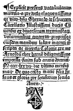
Fig. 8.—Imprint of Arnold Ther Hoernen, printer, of
Mayence.
It is to be remarked that the Mayence men did not
turn towards Holland. Is it that they found there
the descendants of Laurent Coster firmly established
in their workshops? Must the coexistence, the simultaneous
advance, of the invention in Germany and in
the Low Countries be admitted? It is a secret for
us and for many others, but we know for certain that
Flemish printers were established at Utrecht in 1473,
at Delft, Bruges, Gouda, Zwoll, Antwerp, and Brussels.
At Louvain there was besides John of Westphalia,
who published in 1474 a work of Peter Crescens, and
several other works.
Colard Mansion was printing at Bruges about 1473;
and was employed by William Caxton, who had been
for some years trading as a merchant in the Low
Countries, to print the "Recuyell of the Histories of
Troy," by Raoul Le Fevre, which Caxton had translated
into English at the command of Queen Margaret. This
was issued in 1474, and was the first book printed in
the English language. In 1475 or 1476 Caxton returned
to England with a fount of types, which he had employed
Mansion to cut and cast for him, and established himself
as a printer in the precincts of Westminster Abbey.
In 1477 he produced the first book printed in England,
"The Dictes and Sayings of the Philosophers," followed
by a large number of important works, many of them
written or translated by Caxton himself. Thus was
typography firmly established in England; and Caxton's
immediate successors, Wynken de Worde, Richard
Pynson, William Machlinia, have had a glorious roll of
followers, which has never been broken to this day.
From Westminster the art spread in England to Oxford,
where Theodoricus Rood, from Cologne, printed an
Exposicio Sancti Jeronimi in 1478; and to St. Albans in
1480 by a printer who has never been identified, and
who produced the famous "Chronicle" and "Boke
of St. Albans."
The invasion, we see, had been most rapid. In less
than fifteen years, every important city had followed
the movement, and was ready to establish printing
offices. If we may credit a certain controverted document,
Charles VII. had on the 3rd of October, 1458,
sent to Mayence one of the best medal engravers of the
Mint of Tours to study the process of which marvels
were spoken: "The 3rd of October, 1458, the King
having learned that Messire Guthenberg, living at
Mayence, in the country of Germany, a dexterous man
in carving and making letters with a punch, had brought
to light the invention of printing by punches and types,
desirous of inquiring into such a treasure, the King has
commanded the generals of his mints to nominate persons
well instructed in the said cutting and to send
them secretly to the said place to inform themselves of
the said mode and invention, to understand and learn
the art of them, in order to satisfy the said Lord
King; and it was undertaken by Nicholas Jenson, who
took the said journey to bring intelligence of the said
art and of the execution of it in the said kingdom,
which first has made known the said art of impression
to the said kingdom of France" (Bibliothèque de
l'Arsenal, Hf 467, pp. 410, 411).
Nicholas Jenson on his return met with a cool reception
from Louis XI., who did not continue the works
of his father. It may be supposed that this coolness
was the cause of his expatriating himself and retiring
to a place where his industry could be better exercised.
Ten years after the above mission we find him established
at Venice, his art of engraver of letters joined
to that of printer. His Eusebius, translated by Trapezuntius,
and his Justinian, were composed in 1470 with
such marvellous and clear types that from that day the
best typographers have imitated his founts. In spite
of its success, he did not confine himself to these letters,
but he made use also of Gothic, in which he printed
by preference pious books.
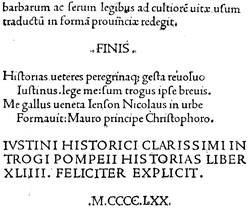
Fig. 9.—Imprint of Nicholas Jenson to a Justinian,
printed in 1470 at Venice. This type has prevailed up to now.
In spite of the attempts of Jenson in the name of the
King of France—that is, if these attempts ever took
place in the manner indicated above—the invention was
not known to have commended itself to the powerful
university of Paris. In general, and especially for the
introduction of innovations in that learned body, it was
necessary to fight, to strike without much chance of
success, save in case of having acquaintance in the
place. We have seen John Fust, obliged suddenly
to retake the road to Germany, in a fair way to find
himself taxed with sorcery, not an inconsiderable
matter. For others the sale of unauthorised books had
had most unhappy consequences unless the Parliament
intervened. So ten years had passed since the journey
of Jenson, and ten or twelve since the first manifestations
of typography at Mayence, without the diabolical
discovery finding admittance to the Sorbonne. A still
more extraordinary thing, a Cologne printer issued
about 1472 a small folio in Gothic type, thirty-one
long lines to a page, which was a work written in
French. The Histoires de Troyes of Raoul Le Fevre,
chaplain of the dukes of Burgundy, first found a
publisher in Germany, and soon after another in
England, before a single press was definitely installed
at Paris.
As we have said of Peter Schoeffer, numerous
German students were in the university, where they
pursued their studies, and frequently remained later as
masters. It has been found that in 1458 a former
student of Leipzig named John Heinlein, a native of
Stein, in the diocese of Spire, entered as regent of the
college of Burgundy, from whence he passed to the
Sorbonne in 1462, the year of the troubles in Mayence.
After the manner of latinising names so common at
that time, he called himself Lapidanus, from the name
of his native place, which means Stone in German.
Heinlein met in Paris a Savoyard, William Fichet,
born in 1433 at Petit Bornand, who became an associate
of the Sorbonne about 1461, and finally rector in 1468.
These two men were great friends, and their particular
instincts attracted them to men of elevated studies. They
divined at once the enormous help printing would bring
to their work. Besides, it grieved them to see through
the whole of France, especially in Touraine, German
colporteurs carrying on their trade under cover of other
commerce, a practice from which the most grave inconveniences
might result. It occurred to them that to
prevent fraud they would themselves create a printing
establishment; but if they deliberated on it, it must
have been in secret, for the registers of the Sorbonne
are silent on their enterprise. If Fichet conceived the
idea, it may be believed that, from his German origin,
Heinlein put it into execution. M. Philippe thinks that
he was formerly at Basle. In all probability it was from
that city he tried to obtain his workmen. In 1468 six
years had elapsed since the craftsmen were dispersed
and fled from Mayence. At all events, it was from
Basle that Ulrich Gering, Michael Freyburger, and
Martin Krantz, printers recommended to the two
Sorbonnists, departed, and in due course arrived in
Paris. Of these three men, who were the first to
establish a printing office on the French side of the
Rhine, Ulrich Gering was a student as well as a
printer, so was Freyburger, originally of Colmar.
Krantz was a letter-founder, and the only real workman
of the three companions.
We have often regretted with regard to these men,
as also to Gutenberg, Fust, and Schoeffer, that no
really authentic portrait has transmitted their features
to us. Every one will recall the fur cap and loose
pantaloons of the mediocre statue at Mayence, but
there is really no portrait of Gutenberg. As to Gering,
M. Philippe, in his Histoire de l'Origine de l'Imprimerie
à Paris, publishes a grotesque figure muffled in the
ruff of the sixteenth century, after a picture preserved
at Lucerne, but for which much cannot be said.
Lacaille, in his Histoire de l'Imprimerie, gives a full-length
portrait of Gering, said to be taken from a
painting in the College Montagu.
The workshop of the three Germans was set up
within the walls of the Sorbonne—in ædibus Sorbonnicis—in
1469. There they set to work at once, their
printing establishment consisting simply of a room,
none too light, a table, a press, and formes. Krantz
doubtless struck the types chosen by the Sorbonnists,
for there were then in use two sorts of letters: German
Gothic and Roman. They kept to the Roman, as
being more round and clear; and as soon as they
obtained matrices and cast their type, they entered on
their task with ardour.
The tendencies of Fichet and Heinlein were not
towards transcendent theology, but rather towards the
literature of the ancients and contemporary rhetorical
works. Besides, it may be said, considering that men are
far from perfect, Fichet counted on making the authorised
presses serve his own purpose. We find him publishing
a treatise on rhetoric in quarto in 1471; meantime
he supervised the work confided to his artists. They
commenced with a large volume of "Letters" of Gasparin
of Bergamo, which was set up in quarto with
the Roman type, the form of which had been
accepted. At the end of the work, the impression of
which cost much time—possibly a year—the three
printers placed a quatrain in Latin distichs, which
is at once a statement of identity and a promise for the
future.
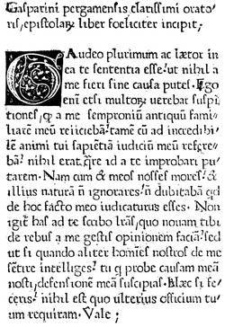
Fig. 10.—"Letters" of Gasparin of Bergamo. First page of
the first book printed at Paris, in 1470.
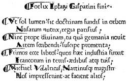
Fig. 11.—Colophon in distichs in the "Letters" of
Gasparin of Bergamo, first book printed at Paris, at the office of the
Sorbonne.
If we try to apportion to each of the three printers
his share in the making of the book, it may be supposed
that the intellectual part of the composition and the correction
fell to Freyburger and Gering, while the heavier
work of founding, placing in formes, and press work
fell to Krantz. This essay, satisfactory as it appeared,
was far from perfection. The first Parisian printers had
multiplied abbreviations and irregular contractions, and
enormous difficulties and inevitable faults ensued.
Further, either they had more than one punch, or the
leaden matrix was deformed, for the characters frequently
differ. At the same time, we must commend
them for having used the æ and œ, which were uniformly
written e in the manuscripts, thus giving rise
to errors without number. Their punctuation was the
comma, semicolon, and full stop.
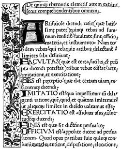
Fig. 12.—Rhetorique of Fichet, printed at Paris in
1471. The marginal ornaments are drawn by hand.
Fichet and Heinlein had become the modest librarians
of the Sorbonne, and this new employment gave them
greater facilities for surveillance. The printing office
did not remain inactive. It issued successively the
"Orthography" of Gasparin of Bergamo, the "Letters"
of Phalaris, two books of Æneas Sylvius, the "Conspiracy
of Catiline" of Sallust, the "Epitome of Titus
Livius" of Florus, and finally the "Rhetorics" of
William Fichet, which, if we may credit a letter addressed
to Bessarion, was finished in 1471. Following came the
"Letters" of Bessarion, the Elegantia Latinæ Linguæ
of Valla, the first folio volume from the Sorbonne
presses; and others, thirteen volumes in 1470-71 and
seventeen in 1472.
At the end of 1472 the workshop was somewhat
broken up, Fichet having left for Rome and Heinlein
preaching in Germany. The three printers had
shown by their works that they were in earnest;
besides, they had from the first gratuitously distributed
copies among the nobles, who, being accustomed to
pay highly for manuscripts, did not fail to note the
difference. The associates then resolved to quit the
Sorbonne and create an establishment for themselves;
their patrons being no longer there to sustain them in
case of failure, and in giving up their presses and types
it may be judged that they were not without anxiety
on that point.
Their oldest dated book, the Manipulus Curatorum of
Montrochet, was also the first that they printed in their
new quarters, at the sign of the "Golden Sun" in the
Rue St. Jacques. They remained united up to the
year 1477, when Gering alone printed at the "Golden
Sun," but he obtained associates, George Mainyal in
1480 and Berthold Rembold in 1494, who lived with
him in the Rue de la Sorbonne, where he established
himself on leaving the Rue St. Jacques. Ulrich Gering
died on the 23rd of August, 1510, after a half-century
of work.
The movement inaugurated by the Sorbonne was
promptly followed. German workmen opened their
shops nearly everywhere in France; then the French
themselves scattered. At Lyons in 1472 a Frenchman
was established, the same at Angers, Caen, Metz,
Troyes, Besançon, and Salins. But in the central
provinces we find Henry Mayer at Toulouse, John
Neumeister at Albi; in the east Metlinger at Dijon;
and Michael Wensler, of Basle, at Macon, among
others, about 1493.
We have now arrived at an epoch of greater efforts.
The Lyons printers used ornamental letters, from which
were developed engravings in the Book. Since the
block books illustration had been neglected, as the means
were wanting to distribute the plates here and there
in the forme; Schoeffer still employed initial letters in
wood very like vignettes. John Fust was now dead, but
Peter Schoeffer continued to print without intermission.
If we search for the precise epoch in which illustration
appeared in the history of the Book, we shall
perhaps have to go back to the time of Albert Pfister,
printer of Bamberg, who issued in 1461 an edition of
the "Fables of Ulrich Bohner" with a hundred and
one figures on wood. This may be said to be the
unconscious combination of xylography with typography,
a kind of transformation of old elements to
new things without other importance; art had no place
in this adaptation.
Up to this time Germany had not, in its school of
painters or miniaturists, men capable of giving a
personal impulse to ornament. In the German editions
of the block books the influence of Van Eyck had
made itself felt very sensibly, and the Flemish had
preserved their supremacy on this point; on the other
hand, the German printers who went to seek their
fortune in Italy fell into the middle of a circle admirably
prepared to receive them and to communicate
their ideas to them. It is believed that the first book
printed in Italy with woodcuts in the text and with an
ascertained date is the work of a German established
at Rome, Ulrich Hahn, in 1467. An account in the
Annuaire du Bibliophile, which, being without citation
of authority, we quote for what it is worth, relates
that Ulrich Hahn was established as a printer at
Vienna about 1462, but was driven thence by the publication
of a pamphlet against the burgomaster of the
city, and was attracted to Rome by Torquemada, who
confided to him the impression of his work the Meditationes.
Hahn was an engraver, as were also most
of his confrères at that time—that is, he cut in relief
designs to be intercalated in the text—and Passavant
relates that the designs of the Meditationes were from
compositions of Fra Angelico, who died in 1455. Be
that as it may, the book, the printing of which was
finished on St. Sylvester's Day, 1467, is the first known
with engravings, and only three copies of it exist:
one at Vienna, one at Nuremberg, and one in Lord
Spencer's library; it is composed in Gothic type in folio.
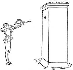
Fig. 13.—Wood engraving of Matteo Pasti for Valturius'
De Re Militari: Verona, 1472.
Illustration found a true artist at Verona, Matteo
Pasti, who furnished designs for a volume on military
art by Valturius, printed in Roman characters in folio,
at the expense of John of Verona, and dedicated to
Sigismond Pandolfi. Pasti's eighty-two figures are
simple outlines, and we here reproduce one of the
principal—an archer shooting at a butt. Published
in 1472, the volume of Valturius followed soon after
the Meditationes, but the engravings enable us to see
how the Italian process, consisting mostly of lines
without shadows, differed from the Dutch and German.
One thing to be remarked here is the purity of the
design, in spite of the roughness of the engraving; we
see in these figures Italian art at its height, despite the
somewhat coarse translation of the wood-cutter.
At Venice the German inventors had reaped their
harvest. At the end of the fifteenth century, fifty years
after the invention of typography, the printing offices
and booksellers' shops were counted by hundreds.
It was in this city that for the first time a title with
frontispiece carrying indication of the contents, the
place, the date, and the name of the printer, was given
to the Book. We give here this ornamental title,
placed before a Calendario of John de Monteregio,
printed by Pictor, Loslein, and Ratdolt in 1476, folio.
The German Erhardt Ratdolt was probably the promoter
of these innovations. He soon afterwards published
the first geometrical book with figures, the
"Elements of Euclid," 1482, folio; in the same year
he produced the Poeticon Astronomicum of Hyginus,
previously printed at Ferrara, with illustrations on wood
of excellent design, but laboriously and unskilfully
engraved. Yet the art of the Book could not remain
mediocre in this city, where the artists were creating
marvels. John of Spire and afterwards Nicholas Jenson,
the emigrant from France, of whom we have spoken
above, had created, after Italian manuscripts, that Roman
letter, the primitive type of which has come down to our
time very little retouched. At the death of Jenson in
1481, his materials passed into the hands of Andrew
d'Asola, called Andrea Torresani, who did not allow the
good traditions of his master to die, and who produced
among others a book bearing signatures, catchwords,
and paging ("Letters of St. Jerome," 1488). Torresani
was the father-in-law of Aldus Manutius, who was to be
for ever illustrious in the art of printing at Venice,
and raised his art to the highest perfection.

Fig. 14.—Title-page of the Calendario, first
ornamental title known. Printed in 1476 at Venice.
But if decoration by means of relief blocks found
a favourable reception in Italy and, above all, a group
of artists capable of carrying it to success, there were
at the same time other experiments conceived in
a different way. The discovery of Maso Finiguerra
gave to the art a new process of reproduction, and
printing presses had now to render possible and practicable
the working of engraved plates. In order to make
that which follows comprehensible, we enter into a few
technical details, the whole subject having been so
admirably and fully treated by MM. Delaborde and
Duplessis.
In the engraved wood block, as in the printing type,
it is a projection in the wood or metal which, being
inked and passed under a press, leaves on paper its
lines in black. Naturally then the intercalation of an
engraving of this kind in typographical composition is
made without difficulty, and the impression of both is
taken at once. On the other hand, a line engraving is
obtained from incised lines on a plate of copper; that is,
an instrument called a burin traces the lines, which are
filled with greasy ink. These incised lines only are
inked. The surface of the plate is cleaned off to avoid
smudging. The sheet of paper destined for the impression
has then to be made very pliable, so that at
the striking of the press it runs, so to speak, to find the
ink in the lines and hold it. It is therefore impossible
to take a text from relief characters at the same time
as an engraved plate.
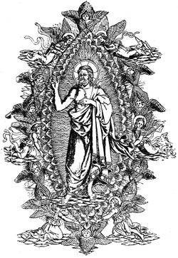
Fig. 15.—Engraving on metal by Baccio Baldini for El
Monte Santo di Dio, in 1477.
However, this kind of reproduction, which, contrary
to that from wood, allowed of half-tints or toning down,
attracted in good time the workers at the Book. It
appeared to them possible to reconcile the two printings
by the successive passage of the same sheet of paper
through the press, to receive at first the impression
from the type and afterwards to find the ink deposited
in the incisions in the copper. The first manifestation
of this new method of illustration was made at
Florence, the home of line engraving, by Nicholas di
Lorenzo in 1477, for the work of Antonio Bettini, of
Siena, called El Monte Santo di Dio. Here the artists
were never known. Common opinion has it that
Baccio Baldini borrowed from Sandro Botticelli the
subjects of his plates. Italian engraving always seeks
its source in Pollajuolo, Botticelli, and Baldini. It
is not the simple work of a niellist, but it had not
yet reached perfection either in the work or in the
impression; the illustrations of the Monte Santo are
proof of this, as are also those of the Dante, by Baldini,
in 1481, for the same Nicholas di Lorenzo. From this
we reproduce the Misers.
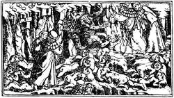
Fig. 16.—Metal engraving by Baccio Baldini from the
Dante of 1481.
At this epoch engravings from the burin were taken
with a pale ink, the composition of which is very
different from the fine black ink of Schoeffer as well
as of the old Italian printers. And besides in most
cases the proofs were obtained with the frotton, like
the ancient block books, an eminently defective process.
The press was not yet well adapted to the delicate
work of line engraving, and the workmen, who did not
apply the plates until after the text was printed, preferred
not to risk the loss of their sheets by the use
of inappropriate presses. These, with the insignificant
attempts made by the Germans in 1479,
[2] are the
beginnings of the process of line engraving in the
ornamentation of the Book. In fact, the process failed
to take its due position for want of a more convenient
mode of working. Relief engraving had got
ahead; with it the sheets used for the impression
did not require working more than once to register
the figures with the text; in a word, the labour
was not so great. A century had to pass before line
engraving completely dethroned the vignette on wood,
a century in which the latter attained its height, and
showed what able artisans could make of a process
apparently the least flexible.
Not to leave Italy, which had the honour of making
the book with engraved illustrations known to the world,
we pass by some years, during which Arnold Bucking
gave at Rome a Cosmographia of Ptolemy, 1478, with
incised plates, which is the first printed atlas that was
produced, whilst as regards ordinary publications there
appeared in all parts classical and Italian works, such
as Cicero, Virgil, Tacitus, Pliny, Eusebius, among the
ancients, and Dante, Petrarch, Boccaccio, etc., among
moderns. Among the editions of Dante, we may cite
that of Peter of Cremona, dated 18th November, 1491,
with one engraving to each canto, of which the earlier
are after Botticelli, and perhaps drawn by him directly
on the wood. Passavant believes these figures to be
cut in relief in the metal. On some of the plates there
is a signature, a Gothic b, the signification of which
leaves a free field for conjecture, and perhaps for
error. Copies of this book with the complete series of
twenty plates are extremely rare; one in the Hamilton
Palace Library sold in May, 1884, for £380; the
Royal Library of Berlin recently agreed to pay £1,200
for a proof set of the plates.
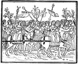
Fig. 17.—Plate from the Hypnerotomachia Poliphili,
printed by Aldus Manutius, in 1499.
As we shall see later apropos of German vignettes
of the same period, the characteristic of Italian engraving
was sobriety, the complete absence of useless work
and the great simplicity of the human figure. This
special manner will be found in the famous edition of
the Hypnerotomachia Poliphili of Francis Colonna,
printed in 1499 by Aldus, copied sixty years later by
a French printer, and lately reproduced in reduced
size.
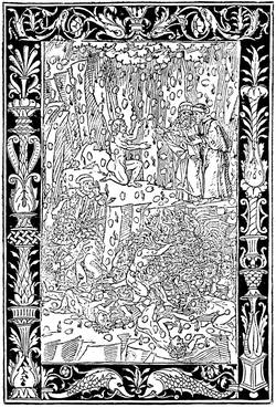
Fig. 18.—Plate from Bonino de Bonini's Dante, at
Brescia, in 1487.
The Italian illustrators, whether they were working
in wood, or, as some writers have it, in metal, adroitly
brought their figures forward by contrasting some rudimentary
work in the persons with the more accentuated
and often stippled ground, which formed a dark
background. This was also the ordinary process in
their ornaments, among the most interesting of which
are the borders of the plates to an edition of Dante by
Bonino de Bonini, Brescia, 1487, of which a specimen
is here reproduced.
If we return from Italy, which then took the lead,
to Germany, a school of Formschneiders is found about
the year 1470 at Augsburg, whose secluded workshops
were of no benefit to the booksellers. These
ill-advised artisans went still further. Apparently
furious to see printing so widely spread as to render
their bad woodcuts difficult to get rid of, they united
in a body to interdict Gunther Zainer and Schüssler
from putting engravings into their books. They must
nevertheless have come to an ultimate arrangement,
for Zainer printed in 1477 a book on chess by Jacopo
da Cessole, with vignettes. He was one of the few
German printers who employed Roman characters in
place of the Gothic of Peter Schoeffer. At Cologne
in 1474 Arnold Ther Hoernen published a work entitled
Fasciculus Temporum, with small illustrations
engraved on wood. A Bible without date contains most
interesting illustrations. As to the celebrated Todtentantz,
or "Dance of Death," published about 1485,
it contains forty-one relief plates of the most ordinary
kind, the same as in the "Chronicle of Cologne" of
1499, of which the figures, though less German, less
distorted, are worth little compared with those of the
Nuremberg books, more German, but more artistic.
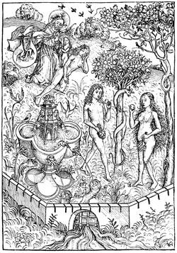
Fig. 19.—The creation of woman, plate from the
Schatzbehalter, engraved after Michael Wolgemuth.
At Nuremberg, Antony Koburger, called by Badius
the prince of booksellers, directed an immense establishment,
employing more than a hundred workmen,
without counting smaller houses at Basle and Lyons.
Koburger was a capable and a fortunate man. He
had at first put forth a Bible very indifferently illustrated
with the cuts of the Cologne Bible, but he had
before him something better than copying others.
Michael Wohlgemuth, born at Nuremberg in 1434,
was then in the full vigour of his talent. To his school
the young Albert Dürer came to study; and as he was
able to draw on wood as well as to engrave on copper
and paint on panel, Koburger was attracted to him, and
engaged him to make a set of illustrations for a book.
The projected work was the Schatzbehalter, a sort of
ascetic compilation, without interest, without arrangement.
Michael Wohlgemuth set to work; and, thanks
to the ability of his engravers, of whom William Pleydenwurff
was probably one, Koburger was able to put
the book on sale in the course of 1491 in three hundred
and fifty-two folios of two columns. Without being
perfection, the designs of Wohlgemuth, very German,
very striking, present the vigour and merit of the
future school of Nuremberg. The figure is no longer
a simple line, in the manner of the block books, but
a combination of interlaced cuttings, intended to imitate
colour. Those representing the creation of Eve
and the daughter of Jephthah are here reproduced.
In the search for harmony between the text and
engravings of this curious work, we shall find grace
and gaiety laid aside, on the other hand a freedom
and boldness that interest and permit us to appreciate
at their value the Nuremberg artists and Koburger,
the printer. In fact, the German artists are more
individual, each one taken by himself, than the Italian
illustrators could be, condemned as they were to
the hierarchical commonplace and to a certain form of
idealism into which the art of Italy entered little by
little. The German painters, naturalists and believers,
presented their heroes in the image of that robust
nature that was before their eyes. It was in this
rude and unpolished spirit that Michael Wohlgemuth
decorated the Schatzbehalter; he also composed the
designs for the "Nuremberg Chronicle" of Dr. Hartman
Schedel, printed by Koburger in 1493.
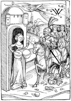
Fig. 20.—The daughter of Jephthah, plate taken from the
Schatzbehalter engraved after Michael Wolgemuth.
With Dürer, at the latter end of the fifteenth century,
the Book was no more than a pretext for engravings.
Thausing, his biographer, says that the great artist felt
the necessity of designing an Apocalypse at Rome at
the time that Luther was premeditating his religious
revolution in face of the worldly splendours of the
pontifical court. The "Apocalypse," published in 1511
in Latin, with Gothic characters, was an album of
fifteen large wood engravings. The Four Horsemen is
the best of these plates, and the boldest; but in this gross
fancy, in these poor halting old hacks, the fantastic and
grand idea which the artist meant to convey can hardly
be seen. It may be said the genius of Dürer was little
adapted to vignettes, however large they were, and did
not easily lend itself to the exigencies of a spun-out
subject. The title of his "Apocalypse" is of its kind a
curious example of German genius, but, in spite of its
vigour, it does not please like an Italian headpiece or
like a French or Flemish frontispiece. The other works
of Dürer published in the fifteenth century, "The Life
of the Virgin" and "The Passion," were also sets
of prints that received a text in the sixteenth century.
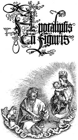
Fig. 21.—Title of the "Apocalypse," by Albert Dürer,
printed in 1498. First edition, without text.
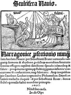
Fig. 22.—Title of Sebastian Brandt's "Ship of Fools,"
printed in 1497 at Basle by Bergman de Olpe.
For the rest of his illustrations Dürer belongs to the
sixteenth century, and we shall have occasion to recur
to his works. At present it remains to speak of a
curious work printed at Basle by Bergman de Olpe
in 1497, which appears to be the first comic conception
of fifteenth century artists: the Navis Stultifera, or
"Ship of Fools," of Sebastian Brandt. This work of
the school of Basle lacks neither originality nor vigour.
At the time when it was published its success was
immense, from the strange tricks of its clowns, with
fools' caps, with which every page was adorned. Alas!
the best things fall under the satire of these jesters,
even the Book and the lover of books, if we may
judge by the sarcasms against useless publications
volleyed by the personage here reproduced. "I have
the first place among fools.... I possess heaps of
volumes that I rarely open. If I read them, I forget
them, and I am no wiser." Brunet sees in these
humorous caricatures more art than is really to be
found in them. Their value is owing more to their
spirit and humour than to any other artistic merit.
Even the engraving is singularly fitted to the subject,
with its peculiar cutting, somewhat executed in hairlines.
The designer was certainly not a Holbein,
but he is no longer the primitive artisan of the first
German plates, and his freedom is not displeasing.
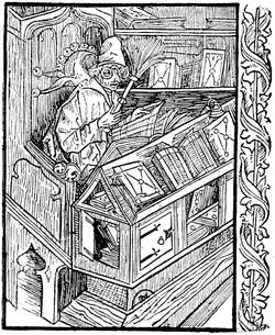
Fig. 23.—The Bibliomaniac. Engraving from the "Ship of
Fools."
We have before spoken, apropos of engraving by the
burin in Italy, of the small share of Germany in the
essay at illustration by that means, and we do not see
a real and serious attempt in the two little coats of
arms in copper plate in the Missale Herbipolense,
printed in 1479.
The Flemish had not taken any great flights in
the midst of this almost European movement. The
school of Burgundy, whose influence was felt in all the
surrounding countries, had lost its authority in consequence
of the progress realized at Mayence. Without
doubt the great Flemish artists were there, but they
were honoured painters, and their inclination did not
descend to seeking the booksellers beyond making
them offers of service. Besides, the first of these,
officially established in Flanders, were two Germans,
John of Westphalia and John Veldener, of Cologne,
who established themselves in the university of Louvain
in 1473, three years after the first Paris printers.
John of Westphalia, who took his own portrait for
his mark, edited the Fasciculus Temporum, a book
which had enormous success in the fifteenth century.
At Haarlem, in spite of the block books attributed
to Laurent Coster, illustration was backward. About
1485, a Dutch translation of the Malheurs de Troye of
Le Fevre was put on sale. This French book was
published at Cologne before France possessed the
smallest typographical workshop. At Bruges Colard
Mansion illuminated the cuts of his Metamorphoses of
Ovid in 1484. Simple engraving appeared to him far
remote from manuscripts of which the vogue had
not yet passed away. At Zwoll Peter van Os, the
publisher, cut up and used the xylographic plates of
the Biblia Pauperum, while the master à la navette, John
of Cologne, an artist in the best sense of the word,
was ornamenting certain popular publications with his
designs. At Utrecht Veldener came from Louvain to
establish a workshop. He published for the second
time a Fasciculus in 1480; he created a style of
decoration with flowers and leaves, which shortly
after developed into the trade of Rahmenschneiders.
Antwerp had attracted Gerard de Leeu from Gouda,
and he produced the romance of Belle Vienne. Schiedam
had an inventive engraver who illustrated an edition of
the Chevalier Delibéré of Oliver de la Marche, in folio,
with Gothic letters, after 1483, as we read in the
colophon:—
"Cet traittié fut parfait l'an mil
Quatre cens quatre vings et trois
Ainsi que sur la fin d'avril
Que l'yver est en son exil,
Et que l'esté fait ses explois.
Au bien soit pris en tous endrois
De ceulx à qui il est offert
Par celui qui Tant a souffert,
La Marche."
The French language, bright and harmonious, thus
found hospitality in other countries. For many examples
of French books published abroad, we cannot
cite one German work printed in France. Spreading
from the north to the south, typography had from
1490 its two principal centres at Paris and Lyons.
After the success of the three Germans at the
Sorbonne, events took their own course. In 1474
Peter Cæsaris and John Stol, two students who
had been instructed by Gering and Krantz, founded
the second establishment in Paris, at the sign of the
"Soufflet Vert;" and they printed classical works.
Ten years later appeared Antony Vérard, Simon
Vostre, and Pigouchet, the first of whom gave to
French bookselling an impulse that it has not since
lost; but before them Pasquier-Bonhomme published
his Grandes Chroniques in 1476, three volumes folio,
the oldest in date of books printed at Paris in
French.
The French school of illustration was at its most
flourishing point at the end of the fifteenth century, but
solely in miniature and ornamentation by the pencil.
The charming figures of the manuscripts had at this
time a Flemish and naturalistic tendency. The most
celebrated of the great artists in manuscripts, John
Foucquet, could not deny the source of his talent nor
the influence of the Van Eyck school, yet the touch
remained distinctly personal. He had travelled, and
was not confined to the art circles of a single city, as
were so many of the earliest painters of Flanders. He
had gone through Italy, and from thence he transported
architectural subjects for his curious designs in
the Heures of Etienne Chevalier, now at Frankfort; a
precious fragment of it is preserved in the National
Library of Paris. Side by side with this undoubted
master, whose works are happily known, lived a more
modest artist: John Perréal, called John of Paris,
painter to Charles VIII., Louis XII., and Anne of
Brittany.
In joining with these two masters, to serve as a
transition between Foucquet and Perréal, John Bourdichon,
designer to the kings of France from Louis XI.
to Francis I., we obtain already a not despicable
assemblage of living forces. Without doubt these men
were not comparable either with the admirable school
of Flanders, or the Germans of Nuremberg, or the
masters of Italy; but, moderate as we may deem their
merit, they did their tasks day by day, painting miniatures,
colouring coats of arms, rendering to the kings,
their masters, all the little duties of devoted servants
without conceit, and preparing, according to their
means, the great artistic movement in France of the
seventeenth century. That these men, leaving the
brush for the pencil, devoted themselves to design
figures on wood, is undeniable. It is said that one
of them followed Charles VIII. to the Italian wars,
and probably sketched the battles of the campaign as
they took place. Now in the books published at this
epoch in France we meet with vignettes which so
very nearly approach miniatures, that we can easily
recognise in them French taste and finish. Such are,
for example, the illustrations of the Mer des Histoires,
printed by Le Rouge in 1488, where suppleness of
design is blended in some parts with extraordinary
dexterity in engraving. Nevertheless, others leave
something to be desired; they maim the best subjects by
their unskilful line and their awkwardness of handling.
Were not these engravers on wood printers themselves:
the Commins, Guyot Marchants, Pierre Lecarrons, Jean
Trepperels, and others? We are tempted to see in
certain shapeless work the hasty and light labour of
an artisan hurried in its execution. As mentioned
above, the part taken by the booksellers in the making
of the plates does not make our supposition in itself
appear inadmissible.
Printing had been established about twenty years in
Paris when Philip Pigouchet, printer and engraver on
wood, began to exercise his trade for himself or on
account of other publishers. Formerly bookseller in
the University, he transported his presses to the Rue
de la Harpe, and took for his mark the curious figure
here reproduced. At this moment a veritable merchant,
Simon Vostre, conceived the idea of putting
forth Books of Hours, until then disdained in France,
and of publishing them in fine editions with figures,
borders, ornaments, large separate plates, and all the
resources of typography. The trials made at Venice
and Naples between 1473 and 1476 warranted the
enterprise. Entering into partnership with Pigouchet,
the two were able on the 17th of April, 1488, to place
on sale the Heures à l'Usaige de Rome, octavo, with
varied ornaments and figures. The operation having
succeeded beyond their hopes, thanks to the combination
of the subjects of the borders, subjects that could
be turned and re-turned in all ways so as to obtain the
greatest variety, Simon Vostre reapplied himself to the
work, and ordered new cuts to augment the number of
his decorations. Passavant's idea is commonly received
that the engraving was in relief on metal; the line
in it is very fine, the background stippled, and the
borders without scratches. Wood could not have resisted
the force of the press; the reliefs would have
been crushed, the borders rubbed and broken. In all
the successive editions hard work and wear are not
remarked, and we are forced to admit the use of a
harder material than the pear or box-wood of ordinary
blocks.
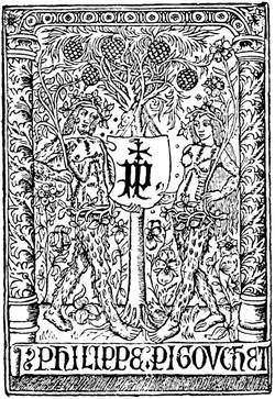
Fig. 24.—Mark of Philip Pigouchet, French printer and
wood engraver of the fifteenth century.
According to his wants, Simon Vostre designed new
series of ornaments. Among them were histories of the
saints, Biblical figures, even caricatures against Churchmen,
after the manner of the old sculptors, who thought
that sin was rendered more horrible in the garb of
a monk. Then there were the Dance of Death and
sibyls, allying sacred with profane, even the trades, all
forming a medley of little figures in the margins, in
the borders, nestled among acanthus leaves, distorted
men, fantastic animals, and saints piously praying. The
Middle Ages live again in these bright and charming
books, French in their style, imbued with good sense
and perfect toleration.
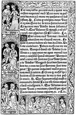
Fig. 25.—Border in four separate blocks in the Heures à
l'Usaige de Rome, by Pigouchet, for Simon Vostre, in 1488. Small
figures from the "Dance of Death."
The Book rose under Simon Vostre and Philip
Pigouchet to the culminating point of ornamentation.
Here design and engraving improve and sustain each
other. It is not only the stippled backgrounds of the
borders that please the eye. And who was this unknown
designer, this painter of bold conceptions, whose
work is complete in little nothings? However, the
large full-page figures have not always an originality
of their own, nor the French touch of the borders.
Thus that of the Passion here reproduced is inspired
line for line by the German, Martin Schongauer. Are
we to suppose, that duplicates of blocks passed between
France and Germany, or was a copy made by
a French designer? It is difficult to say. Still the
coincidence is not common to all the missals of the
great Parisian bookseller. The Death of the Virgin
here reproduced is an evident proof of it. It forms part
of the 1488 book, and is a truly French work.
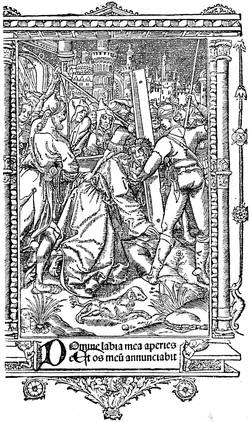
Fig. 26.—Plate copied from Schongauer's Carrying of the
Cross, taken from the Heures of Simon Vostre.
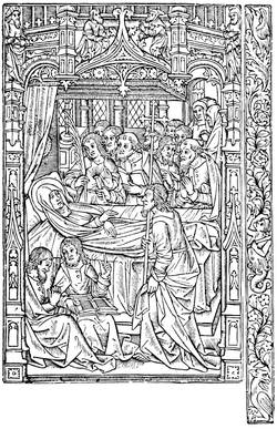
Fig. 27.—The Death of the Virgin, plate taken from the
Heures of Simon Vostre, printed in 1488. The border is separate.
It may be said that from the artistic association of
Philip Pigouchet and Simon Vostre was born the art of
illustration of the Book in France; they worked
together for eighteen years, in steady collaboration, and,
as far as we know, without a cloud. At Vostre's commencement
in 1488 he lived in the Rue Neuve Notre
Dame, at the sign of "St. Jean l'Evangeliste;" and in
1520 he was still there, having published more than
three hundred editions of the Missal, according to the
use of the several cities.
Contemporary with Simon Vostre, another publisher
was giving a singular impulse to the Book by his
extreme energy, true taste, and the aid of first-class
artists. Antony Verard, the most illustrious of the old
French booksellers, was a writer, printer, illuminator,
and dealer. Born in the second half of the fifteenth
century, he established himself in Paris on the Pont
Notre Dame, both sides of which were then covered
with shops, and about 1485 commenced his fine
editions with a "Decameron" in French by Laurent de
Premierfait. M. Renouvier remarks in his notice of
Verard that his first books were not good, the plates
were often unskilful, and were probably borrowed or
bought from others; this may be very well understood
in a beginner whose modest resources did not permit
bold enterprises; the figures were in most cases
groundworks for miniatures, outlines and sketches rather
than vignettes.
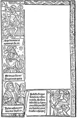
Fig. 28.—Border of the Grandes Heures of Antony
Verard: Paris, 1498 (?).
Antony Verard was accustomed to take a certain
number of fine copies on vellum or paper of each book
published by him, in
which authorised painters
added miniatures and
ornaments. It is curious
now to find what the cost
to one of the great lords
of the court of Charles
VIII. was of one of these
special copies in all the
details of its impression,
and we find it in a document
published by M.
Senemaud in a provincial
journal (Bulletin de la
Société Archéologique de la
Charente, 1859, part 2,
p. 91), which enables
us at the same time to
penetrate into a printing office of a great French publisher
of the fifteenth century. According to this document,
Verard did not disdain to put his own hand to the work,
even to carrying the book to the house of his patron
if he were a man of consequence. It is an account of
Charles de Valois-Angoulême, father of Francis I. He
was then living at Cognac; and he ordered Verard to
print separately for him on vellum the romance of Tristan,
the "Book of Consolation" of Boetius, the Ordinaire du
Chrétien, and Heures en François, each with illuminations
and binding. In the detail of expenses Verard
omits nothing. He reckons the parchment at three
sous four deniers the sheet, the painted and illuminated
figures at one écu the large and five sols the small. We
give here the outline of one of the plates of the Tristan,
ordered by the Duc d'Angoulême, reduced by two-thirds,
and from it it may be judged that the profession
of the illuminator, even for the time, was by no means
brilliant. The binding was in dark-coloured velvet, with
two clasps with the arms of the Duke, which cost sixty
sous each. The work finished, Verard took the route
for Cognac, carrying the precious volumes. He was
allowed twenty livres for carriage; and this brings the
total to 207 livres 10 sous, equivalent to £200 to £240
of present money.
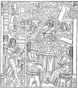
Fig. 29.—Plate from the Tristan published by Antony
Verard, a copy of which was illuminated for Charles of Angoulême.
Verard had preceded Simon Vostre in the publication
of books of hours, but his first volume dated
1487 was not successful for the want of borders and
frontispieces. At the most he had introduced figures intended
for illumination, which, as well as the vignettes,
were cut in wood. In 1488, the same year that Simon
Vostre commenced his publications, Verard put forth,
by "command of the King our lord," the book called
the Grandes Heures, which is in quarto, Gothic letter,
without paging, twenty lines to the full page. This
Grandes Heures contained fourteen engravings, large
borders in four compartments, smaller subjects and
initials rubricated by hand. He also published more
than two hundred editions between 1487 and 1513,
and among them the Mystère de la Passion, with eighty
figures; the Grandes Chroniques, in three folio
volumes, printed by John Maurand; the Bataille
Judaïque of Flavius Josephus; the Legende Dorée
of Voragine, all books for which he called to his aid
rubricators, illuminators, and miniaturists. From the
first he had two shops where he put his productions
on sale: one on the Pont Notre Dame, the other at the
Palace of Justice, "au premier pilier devant la chapelle
où l'on chante la messe de messeigneurs les présidents."
From 1499, when the Pont Notre Dame was
burned, Verard transported his books to the Carrefour
St. Severin. At his death in 1513 he was living in the Rue
Neuve Notre Dame, "devant Nostre-Dame de Paris."
Besides Verard, Vostre, and Pigouchet, many others
will be found who imitated them in the publication of
books of hours. The first was John du Pré, who
published a Paris missal in 1481, and who was at once
printer and bookseller. Like Pigouchet, Du Pré printed
books of hours on account of provincial publishers,
without dreaming of the competition he was creating
for himself. The encroachments of the publishers upon
one another, the friendly exchanges, the loans of
plates and type, form one of the most curious parts of
the study of the Book. Thielman Kerver, a German,
also began to put forth books of hours in 1497 in Paris,
ornamenting them with borders and figures on wood,
and modelling his work completely upon that of Simon
Vostre. But after having imitated him, he was associated
with him in the publication and sale of the Paris
Missal; the competition of these men was evidently an
honest one, or the sale of pious works was sufficient to
maintain all engaged in it. Established on the Pont
St. Michel, at the sign of the "Unicorn," he sold his
stock to Gilles Remacle about the beginning of the
sixteenth century.
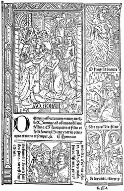
Fig. 30.—Page of the Grandes Heures of Antony Verard:
Paris, fifteenth century.
Thielman Kerver in his own works shows himself as
the rival of Simon Vostre. The Hardouins, who followed
the same profession, do not appear to have attained the
success of their predecessors; and, excepting in the
Heures à l'Usage de Rome, published in 1503 by Gilles
Hardouin on the Pont au Change, at the sign of the
"Rose," they servilely imitated them. There was also
among the disciples of Vostre William Eustache, bookseller
to the King, "tenant la boutique dedans la grant
salle du palais du costé de messeigneurs les présidens,
ou sur les grans degrés du costé de la conciergerie à
l'ymage St. Jean levangeliste." Eustache made use of
the work of Pigouchet and Kerver, not to mention the
printers of the end of the fifteenth century.
We have named the principal, the fortunate ones;
but what becomes of the crowd of other publishers
whose hopes vanished before the success of Vostre
and Verard? There were Denis Meslier, with his quarto
Heures de Bourges, and Vincent Commin, bookseller of
the Rue Neuve Notre Dame, who thus appealed to his
customers:—
"Qui veult en avoir? On en treuve
A tres grand marché et bon pris
A la Rose, dans la rue Neuve
De Nostre-Dame de Paris."
There were also Robin Chaillot, Laurent Philippe, and
a hundred others whose names have died with them
or are only preserved on the torn pages of their works.
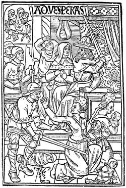
Fig. 31.—Plate from a book of hours of Simon Vostre,
representing the massacre of the Innocents.
But if books of this kind found vogue and a large
sale at this epoch, the dealers did not keep to pious publications
only. By a singular mixture of the sacred and
the profane, the bookmen put on sale on their stalls the
"Decameron" of Boccaccio as well as the "Hours of the
Immaculate Virgin," and the purchasers thought fit to
make the acquaintance of the one as well as the other.
Besides, the end of the fifteenth century had its literary
preferences, its alluring titles, its attractive frontispieces.
At the commencement of the present century double
titles—"Atala; or, The Child of Mystery;" "Waverley;
or, Sixty Years Since"—were common, although now
out of fashion. Since then came books of travels—Voyages
au Pays des Milliards, etc. In the fifteenth
century, and even since the fourteenth, a series of titles
was in public favour. There was first the Débats,
or "Dialogues:" Débat de la Dame et de l'Escuyer,
Paris, 1490, folio; "Dialogue of Dives and Pauper," London,
Richard Pynson, 1493; and many other eccentric
titles. There came also thousands of complaintes,
a kind of lay in verse or prose; blasons, light pieces describing
this or that thing; doctrinals, that had nothing
to do with doctrine. And among the most approved
subjects, between the piety of some and the gaiety of
others, the Dances of Death established themselves
firmly, showing, according to the hierarchy of classes
then prevalent, Death taking the great ones of the earth,
torturing equally pope, emperor, constable, or minstrel,
grimacing before youth, majesty, and love. Long
before printing appeared, the Dances of Death took
the lead; they were some consolation for the wretched
against their powerful masters, the revenge of the
rabble against the king; they may be seen painted,
sculptured, illuminated, when engraving was not there
to multiply their use; they may be seen largely displayed
on walls, sombre, frightful, at Dresden, Leipzig,
Erfurt, Berne, Lucerne, Rouen, Amiens, and Chaise-Dieu.
It was the great human equality, attempted first
by the French, then by the inimitable Holbein.
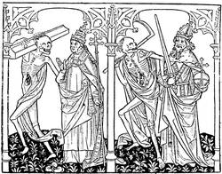
Fig. 32.—Dance of Death, said to be by Verard. The Pope
and the Emperor.
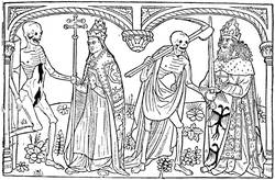
Fig. 33.—Dance of Death of Guyot Marchant in 1486. The
Pope and the Emperor.
We can imagine the impression these bitter ironies
made on the oppressed and disdained lower classes. The
first "Dance of Death" was produced by Guyot Marchant
in 1485, in ten leaves and seventeen engravings,
in folio, with Gothic characters. Marchant describes
himself as "demeurant en Champ Gaillart à Paris le
vingt-huitiesme jour de septembre mil quatre cent
quatre-vingtz et cinq." The book must have gone off
rapidly, for it was republished in the following year,
with additions and new engravings. French illustration
was already moving forward, as may be judged
by the reproductions here given from the folio edition
of 1486. Pope and emperor, glory and power, are led
and plagued by Death, hideous Death, with open body
and frightful grin.
We could wish that the tendencies and processes
of what may be called the second generation of printers
were well understood. In a few years they surmounted
the difficulties of their art, and made the Book a model
of elegance and simplicity. The smallest details were
cared for, and things apparently the most insignificant
were studied and rendered practical. Speaking of titles,
an enormous progress was here made in the publications
of the end of the century. In Italy the subjects of
decoration ordinarily formed a framework for the front
page, wherein were included useful indications. The
most ancient specimen of this kind has already been
referred to. A model of this species is the "St. Jerome,"
published at Ferrara by Lorenzo Rossi, of Valenza, in
1497, folio; the title, much adorned, is in Gothic letters;
the engraved initial is very adroitly left in outline, so as
not to burden or break the text.
In Germany there was already the appearance of bad
taste and prodigality, the letters crossing each other,
the Gothic type
covered with bizarre
appendices,
the titles intricate;
later they
became illegible
even for the Germans.
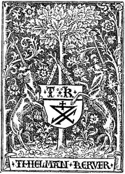
Fig. 34.—Typographical mark of Thielman Kerver.
In France the
first page gave
the most circumstantial
indications
of the contents
of the work,
the name and
abode of the
printer and bookseller.
Often
these titles were
ornamented with
movable frameworks, printed in Gothic, sometimes in two
colours, which necessitated two printings, one for the
black and one for the red ink. The mark of the printer
or publisher generally appeared, and it was nearly always
a charming work. These French marks were all more
or less treated heraldically; that is to say, the initials
occupy a shield, sustained by supporters and cut with extreme
care. The first was that of Fust and Schoeffer at
Mayence, of admirable simplicity and grace. In France
this early specimen of the trade mark took with Simon
Vostre and Verard the shape of delicate illustrations,
finely designed and carefully engraved; but the custom
of allusive marks did not prevail, as we shall have
occasion to see, until the sixteenth century. The mark
of Pigouchet has already been given; that of Thielman
Kerver is conceived in the same principles of taste and
art. The sign of his house being the "Unicorn," Kerver
took as supporters to his shield two unicorns affrontées.
In these colophons are found philosophic aphorisms,
satirical remarks, marvels of poetry. A certain bookseller
paid court to the powerful university, which
dispensed glory and riches to the poor tradesmen by
buying many books. Andrew Bocard engraved on his
mark this flattery as a border:—
"Honneur au Roy et à la court,
Salut à l'université
Dont nostre bien procède et sourt.
Dieu gart de Paris la cité!"
The Germans introduced into their colophons some
vainglorious notices. Arnold Ther Hoernen, already
mentioned, who printed the Theutonista at Cologne in
1477, boasted in it of having corrected it all with his
own hands. Jean Treschel, established at Lyons in
1493, proclaims himself a German, because the Germans
were the inventors of an art that he himself possessed
to an eminent degree. He prided himself on being what
we may call a skilled typographer; "virum hujus artis
solertissimum," he writes without false modesty. At
times, in the colophons of his books, he attempted Latin
verse, the Sapphic verse of Horace, of a playful turn,
to say that his work was perfected in 1494.
"Arte et expensis vigilique cura
Treschel explevit opus hoc Joannes,
Mille quingentos ubi Christus annos
Sex minus egit.
Jamque Lugduni juvenes, senesque,
Martias nonas celebres agebant
Magna Reginæ quia prepotenti
Festa parabant."
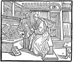
Fig. 35.—Frontispiece to Terence, published by Treschel
at Lyons in 1493. The author writing his book.
The portrait is another element of illustration, the
figure of the author prefixed to his work. It had
already been a custom in the manuscripts to paint on
the first leaf of the work the likeness of him who composed
it, frequently in the act of presenting his book to
some noble patron; and in this way is often preserved
the only known portrait of either patron or author.
Printing and engraving rendered these effigies more
common, the portraits of one often served for another,
and the booksellers used them without very much scruple.
As we shall see later, this became in the sixteenth
century a means of illustrating a book plainly, but only
at the time when the portrait, drawn or painted, commenced
to be more widely used. Previously the clichés
of which we speak went everywhere, from the Italians
to the French, from Æsop to Accursius; these uncertain
physiognomies began with the manuscript romances
of chivalry, from whence they were servilely copied in
typography. From the first the Italians mixed the
ancient and the modern. Thus in a Breviarium, printed
in 1478, there is an engraved portrait of Paul Florentin.
On the same principle, the portrait of Burchiello, an
early Italian poet, was later reproduced in England as
a likeness of William Caxton.
In France the author is often represented writing,
and it was so up to the middle of the sixteenth century.
In an edition of Des Cas des Nobles Hommes, by Jean
Dupré, in 1483, Boccaccio is represented seated, having
before him his French translator, Laurent de Premierfait.
This plate is one of the oldest representations of
authors in French books. In the Roman de la Rose,
first edition of Paris and Lyons, in folio, probably
published by William Leroy about 1485, William de
Lorris, the author, is shown in his bed:—
"Une nuyt comme je songeoye,
Et de fait dormir me convient,
En dormant un songe m'advint...."
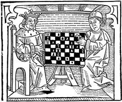
Fig. 36.—Woodcut from Caxton's "Game and Playe of the
Chesse."
There is also a portrait of Alain Chartier in his Faits,
printed in 1489. In the Terence of Treschel, of Lyons,
in 1493, we see a grammarian of the fifteenth century
in a furnished room of the time occupied in writing at a
desk; this is Guy Jouvenal, of Mans, the author of the
commentary.
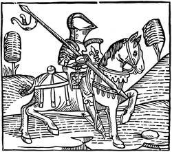
Fig. 37.—The Knight, a woodcut from Caxton's "Game and
Playe of the Chesse."
While this good work was progressing so nobly in
France, Italy, and Germany, the typographers of England
were by no means idle, although the illustration of the
Book in the fifteenth century was not there so forward.
William Caxton had produced over sixty works, the
colophons of many of them revealing much of the
personal life and character of the first English printer.
Some of them were ornamented with woodcuts; we
reproduce two from the "Game and Playe of the Chesse,"
printed in folio, about 1476. The first represents a
king and another person playing at chess; the smaller
cut is a representation of the knight, who is thus
described in Caxton's own words: "The knyght ought
to be maad al armed upon an hors in suche wise that
he have an helme on his heed and a spere in his right
hond, and coverid with his shelde, a swerde and a mace
on his left syde, clad with an halberke and plates tofore
his breste, legge harnoys on his legges, spores on his
heelis, on hys handes hys gauntelettes, hys hors wel
broken and taught, and apte to bataylle, and coveryd
with hys armes." The other Caxton block which we
reproduce is a representation of music from the "Mirrour
of the World," a thin folio volume of one hundred leaves
printed in 1481, with thirty-eight woodcuts. These specimens
will serve to show the rudimentary character of
English wood engraving in the fifteenth century. No
authentic portrait of Caxton is known, and the one that
is generally accepted is really a portrait of an Italian
poet, Burchiello, taken from an octavo edition of his
work on Tuscan poetry, printed 1554; this was copied
by Faithorne for Sir Hans Sloane as the portrait of
Caxton, and was reproduced by Ames in his "Typographical
Antiquities," 1749. Lewis prefixed the
portrait here given to his "Life of Mayster Willyam
Caxton," 1737, which is a copy of Faithorne's drawing
with some alterations. John Lettou and William
Machlinia issued various statutes and other legal works.
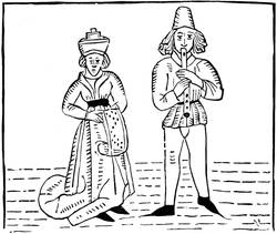
Fig. 38.—Music, a woodcut from Caxton's "Mirrour of the
World."
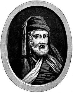
Fig. 39.—William Caxton, from Rev. J. Lewis' "Life."
Wynken de Worde continued printing up to 1534,
and issued over four hundred works. He used no less
than nine different marks, all of them bearing Caxton's
initials, evidencing the regard of the pupil for his
master; the mark which we reproduce is one of rare
occurrence. Richard Pynson began in 1493, and continued
well into the sixteenth century, and was one of
the first of the "privileged" printers, authorised to
issue the legal and parliamentary publications. One
of the marks used by him is here reproduced. Julian
Notary began in 1498. The only style of illustration
used by any of these early printers was the woodcut, and
of this there was very little beyond the title-page and
printer's mark. The artistic form of the Book originated
on the Continent, but England was not slow to
adopt it and fashion it to her own ends.
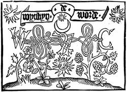
Fig. 40.—Mark of Wynken de Worde.
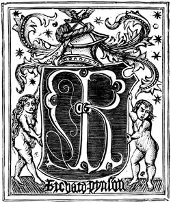
Fig. 41.—Mark of Richard Pynson.
Thus was printing spread abroad, carrying with it to
the countries where it was established the rules of an
unchangeable principle; but, according to its surroundings,
it was so transformed in a few years that its origin
was no longer recognised. It was light in Italy,
heavy in Germany, gay in France. Painting, of which
it was accidentally the issue, returned to it under
the form of illustration a short time after its first and
fruitful essays. The Gothic character, generally used
in Germany, continued in France with the Vostres, the
Verards, and others up to the middle of the sixteenth
century, although the first artisans before this used
Roman type; it was also the prevailing type used in
English books. In Italy it was Jenson, a Frenchman,
who gave to the matrix the alphabet preserved to the
present time; and it was the Venetians and Florentines
who learned before all others the art of judicious
ornamentation of the Book. The French came very
near perfection, thanks to their printers and booksellers,
at the end of the century; and the Germans found
illustrious artists to scatter their compositions in their
large, heavy works.