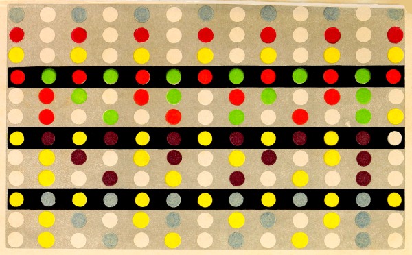
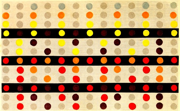
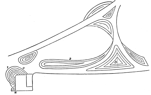
315. As to the advantages the painter will find in it when it is
required,—
1. To perceive and to imitate promptly and surely
the modifications of the light on the model.
2. To harmonize those colours of a composition
which are essentially inherent to the nature of the objects to be produced.
316. We learn by the law of simultaneous contrast of colours,
that when we regard attentively two coloured objects at the same time,
neither of them appears of the colour peculiar to it; that is to say,
such as it would appear if viewed separately, but of a tint resulting
from the peculiar colour and the complementary of the colour of the
other object. On the other hand, if the colours of the objects be not
of the same tone, the lightest tone will be lowered, and the darkest
tone will be heightened.
317. The first conclusion from this is, that the painter will rapidly
appreciate in his model the colour peculiar to each part, and the
modifications of tone and of colour which they receive from contiguous
colours. He will also perceive and be prepared to imitate modifications
in them, which, if they had not always escaped him because of their
feeble intensity, might have been disregarded, because the eye is
peculiarly susceptible of fatigue when it seeks to disentangle
modifications, the cause of which is unknown, and which are not very
prominent.
318. Let us now return to mixed contrast (77 et seq.),
in order to make it evident that the painter is liable to see the colours
of his model inaccurately. As the eye, after observing one colour for
a certain time, has acquired a tendency to see its complementary, and
as this tendency is of some duration, it follows, not only that the
eyes of the painter thus affected cannot see correctly the colour
which he had for some time looked at, but also whatever colour he
sees while this modifying influence lasts. So that, conformably to
what we know of mixed contrast, he will see,—not the colour which is
before him,—but the result of this colour, and of the complementary
of that seen previously. It must be remarked, that besides the want of
clearness of view which will arise, in most cases, from the want of
exact coincidence of the second image with the first—for example, when
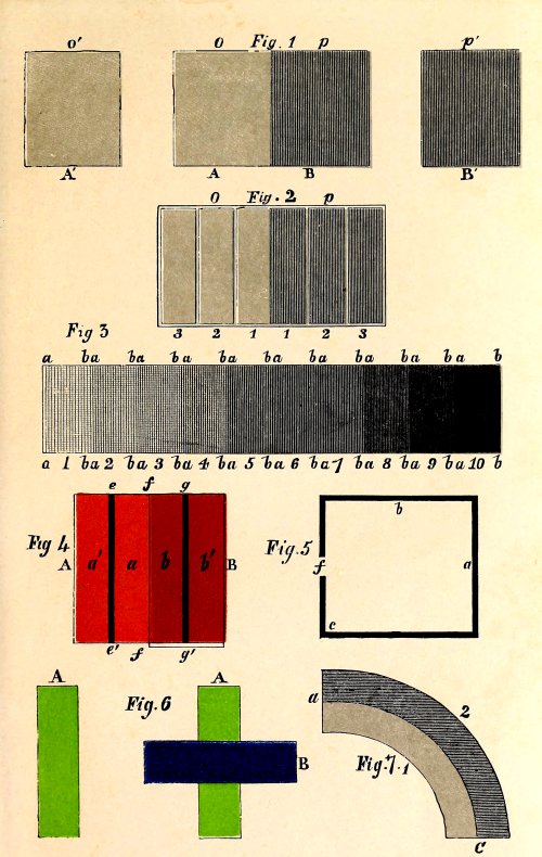
the eye has seen a sheet of green paper A (Plate III., fig. 4),
in the first place, and, in the second place, a sheet of blue paper, B, of the
same dimensions, but placed differently, this second image, not being
coincident in all its surface with the first, A, as represented in the
figure, the eye will see the sheet B violet only in the part where the
two images coincide. Consequently, this defect of perfect coincidence
of images will affect the outline of the second image, as well as the
colour which it really possesses.
319. We can establish three conditions in the appearance of the same
object relatively to the state of the eye; in the first, the organ
simply perceives the image of the object without taking into account
the distribution of colours, light, and shade; in the second, the
spectator, seeking to understand this distribution, observes it
attentively, when the object presents to him all the phenomena of
simultaneous contrast of tone and colour that it is capable of exciting
in him. In the third case, the organ, from the prolonged impression
of the colours, possesses in the highest degree a tendency to see the
complementary of these colours; these different states of the organ
being continuous.
I have no doubt that the dull colouring with which many artists of
merit have been reproached is partly due to this cause, as I shall show
more minutely hereafter.
320. The painter, knowing that the impression of one
colour beside another is the result of the mixture of the first with the
complementary of the second, has only to estimate mentally the
intensity of the influence of this complementary, to reproduce faithfully
in his imitation the complex effect which he has before his eyes.
321. A painter wishing to imitate a white stuff
with two contiguous borders, one red, the other blue, perceives each
of them changed by the influence of their reciprocal contrast; thus
the red becomes more and more orange, in proportion as it approaches
the blue, as this latter becomes more and more green as it approaches
the red. The painter, therefore, making the borders of a single red
and a single blue, reduced in some parts by white or by shade, will
reproduce the effects he wishes to imitate. Whenever it is found that
the painting is not sufficiently marked, he is sure of what he must add
without departing from the truth, farther than by exaggerating a little
(305).
2. A grey pattern drawn upon a yellow ground: the ground may be of
paper, silk, cotton or wool; according to its contrast, the design will
appear of a lilac or a violet colour (66).
The painter who would imitate this object, can reproduce it faithfully
with grey. But if a painter, ignorant of the reciprocal influence of
blue and red, convinced that he must represent what he sees, adds
green to his blue, and orange to his red; as in the second example, he
will trace a pattern more or less violet upon the yellow ground. Now,
supposing that the painter had perfectly seized the modifications of
the model, and, subsequently, had retouched his copy sufficiently to
produce a perfectly faithful effect, it is evident it would have been
perfect only after a number of trials, since he must have effaced what
was first done.
3. I cite a third example of the influence of contrast, not relating to
colours, like the two preceding, but to the different tones of the same
colour, contiguous to each other.
Suppose several bands in juxtaposition, 1, 2, 3, 4,
(Plate 1, fig. 3), of different tones in flat tints
of the same scale, to form part of an object: to imitate it perfectly,
it is evident that it must be painted in flat tints; but this object
will appear to the eye a channeled surface, the lines where the two
bands touch will appear like a relief by the effect of contrast of
tone (9-11); therefore, if the painter is ignorant of this,
he will reproduce, not an absolute copy of the model, but an exaggerated one. I
the more willingly cite this example, because it gave me an opportunity
of enabling a most skilful paperstainer to appreciate the utility of
the law of simultaneous contrast. In going with him over his factory,
he showed me a chimney-board representing a child whose figure stood
out from a ground formed of two circular bands in grey flat tints; 1
and 2 (Plate I., fig. 7); the first was higher
than the second; the phenomenon of contrast of tone was manifested at
the borders, a a, of the two bands, so that the part of the band
2, contiguous to the band 1, was darker than the rest, as the part of
the band 1, contiguous to 2, was lighter than the rest, conformably
to what has been stated above (11). This effect,
not being what the skilful artist wished to obtain, he inquired of
me how it was to be avoided. I replied, that the grey of the band 2
must be reduced with white, in proportion as it approached the border
a a; and, on the contrary, the grey of the band 1 must be
strengthened with black, in proper gradations, beginning at the same
border. And I proved to him, that to imitate the model faithfully,
we must copy it differently from what we see it.
322. From the above we educe the six following principles:—
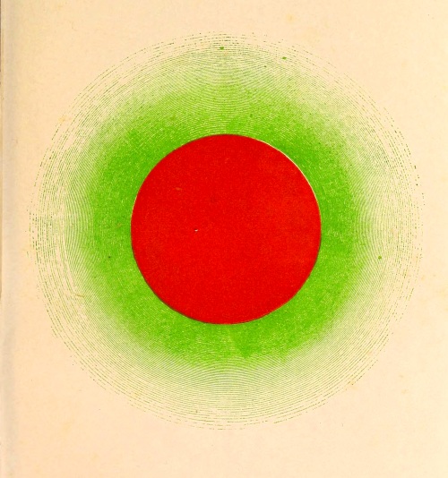
1. Put a colour upon a canvas, it not only colours that part of the
canvas to which the pencil has been applied, but it also colours the
surrounding space with the complementary of that colour.
Thus, a red circle is surrounded with a green areola, becoming weaker
as it extends from the circle:—
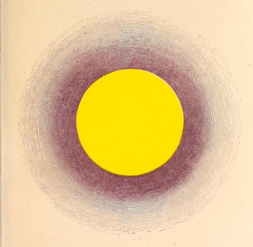
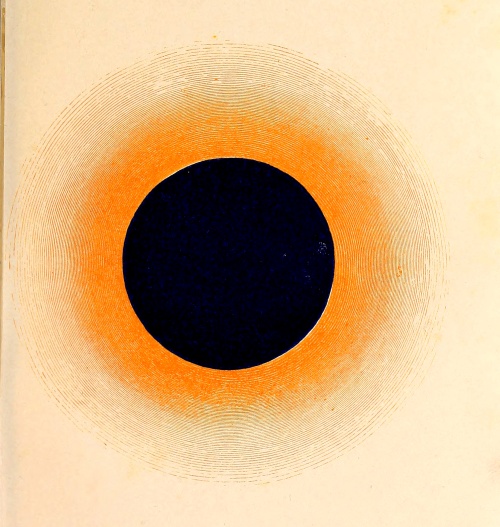
| A green |
circle is |
surrounded with a |
red |
areola. |
| An orange |
” |
” |
blue |
” |
| A blue |
” |
” |
orange |
” |
| A yellow |
” |
” |
violet |
” |
| A violet |
” |
” |
yellow |
” |
| (See Plates 3,
4, 5.) |
2. White placed beside a colour heightens its tone; it is as if we took
away from the colour the white light which enfeebled its intensity (44-52).
3. Black placed beside a colour weakens, and in some cases
impoverishes, its tone, as upon certain yellows (55).
It is, in fact, adding to black the complementary of the contiguous colour.
4. Put grey beside a colour, the latter is rendered more brilliant, and
at the same time it tints this grey with its complementary (63).
323. From this principle it results that in many cases where grey
is near to a pure colour in the model, the painter, if he wishes to
imitate this grey which appears to him tinted with the complementary of
the pure colour, need not use a coloured grey, as the effect will be
produced in the imitation by the juxtaposition of the colour with the
grey contiguous to it.
Besides, the importance of this principle cannot be doubted, when
we consider that all the modifications which a monochromous object
presents (excepting those which result from the reflections of coloured
lights emanating from neighbouring objects,) arise from the different
relations of position between the parts of the object and the eye of
the spectator; so that it is strictly true to say that, to reproduce by
painting all these modifications, it suffices to have a colour exactly
identical to that of the model, with black and white. In fact, with
white we can reproduce all the modifications due to the weakening of
the colour by light, and with black, those which are due to the height
of its tone. If the colour of the model in certain parts gives rise
to the manifestation of its complementary, because these parts do not
return to the eye enough colour and white light to neutralize this
manifestation, the modification may be imitated by the employment of a
normal grey tone, properly surrounded with the colour of the object.
It is necessary, in many cases, to employ with the colour of the
object the colours which are near it; that is to say, the hues of the
colour. For example; in imitating a rose, we can employ red shaded with
a little yellow, and a little blue, or, in other terms, shaded with
orange and violet; but the green shadows which we perceive in certain
parts arise from the juxtaposition of red and normal grey.
5. To put a dark colour near a different, but lighter colour, is to
heighten the tone of the first, and to lower that of the second,
independently of the modification resulting from the mixture of the
complementaries. An important consequence of this principle is, that
the first effect may neutralize the second, or even oppose it. For
example; a light blue placed beside a yellow tinges it orange, and
consequently heightens its tone; while there are some blues, so dark
relatively to the yellow, that they weaken it so much as not only to
hide the orange tint, but even to cause sensitive eyes to feel that
the yellow is rather green than orange. A very natural result, if we
consider that the paler the yellow, the greener it appears.
6. Put beside each other two flat tints of different tones of the same
colour, chiaro-’scuro is produced, because, in setting out from the
line of juxtaposition, the tint of the band of the highest tone is
insensibly enfeebled, while, setting out from the same line, the tint
of the band of the lowest tone becomes heightened; thus there is a true
gradation of light.
The same gradation takes place in all the juxtapositions of colours
distinctly separated.
I believe that attention to these principles, and especially a perfect
knowledge of the consequences of the last three, exercises a very
happy influence upon the art of painting, giving to the artist such
a knowledge of colours as he cannot possess before the law of their
simultaneous contrast and its consequences have been developed.
Among the details which the painter endeavours to render, there are
many which, due to contrast, either of colour or of tone, must be
produced spontaneously. I presume that the Greek painters, whose
palette was composed only of black, white, red, yellow, and blue, and
who executed so many pictures which their contemporaries have spoken
of with intense admiration, painted conformably to the simple method
of which I speak; devoting themselves to great effects, many
small ones resulted from them.
324. In all, or nearly all, compositions of painting, we must
distinguish the colours which the painter is under the necessity of
using, and those which he may choose, because, unlike the former, they
are not inherent to the model (313). For
example, in painting a human figure, the colour of the flesh, the eyes,
and the hair, are fixed by the model; but the painter has a choice of
draperies, ornaments, background, &c. In an historical picture, the
flesh colours are, in the majority of the figures, at the choice of the
painter, as are also the draperies and all the accessories, which can
be placed and imagined according to his judgment.
In a landscape, the colours are determined by the subject, yet not so
arbitrarily but that we can substitute for the true colour that of
a neighbouring scale; the artist may choose the colour of the sky,
imagine numerous accidental effects, introduce into his composition
animals, draped-figures, carriages, &c., of which the form and colour
may be so selected as to produce the best possible effect with the
actual objects of the scene.
325. A painter may also choose a dominant colour which produces, on
every object in his composition, the same effect as if they were
illuminated by a light of the same colour, or as if they were seen
through a coloured glass (259).
326. Although the law of contrast affords different methods of
imparting value to a colour, genius alone can indicate the mode in
which this idea should be realized in a painting.
327. Whenever the artist would attract the eye by colours, doubtless
the principle of harmony of contrast must be his guide. The law
of simultaneous contrast indicates the means of giving value
to the pure colours by each other; means which, although spoken of,
are but little known, as may be commonly seen in portraits of vivid
colours, badly assorted; and in those numerous small compositions in
tints broken with grey, where we look in vain for a pure tone; which,
however, from the objects represented in them, are eminently adapted to
receive all vivid colours.
328. The contrast of the most opposite colours is as agreeable as
possible, when they are of the same tone. But if crudity or too great
intensity of colours is feared, we must have recourse to the light
tones of their respective scales.
329. When the painter breaks tones with grey, and wishes to avoid
monotony, or when on the planes which are more remote, yet not so
remote as to render their differences of colour inappreciable, he
wishes every part to be as distinct as possible, he must have recourse
to the principle of harmony of contrast, and mix his colours
with grey.
330. This method of bringing out a colour by contrast, in using either
light tones complementary or more or less opposed, or broken tones
more or less grey, and of tints complementary to each other; or, in
employing a broken tone, of a tint complementary to a more or less pure
contiguous colour, ought especially to fix the attention of portrait
painters. A portrait will have a very poor effect when neither the
colour of the dress nor of the background have been well chosen.
331. The portrait-painter must endeavour to find the predominating
colour in the complexion he has to paint; and this found and faithfully
reproduced, he has to seek whatever accessories at his disposal will
give value to it. It is a very common error to suppose that the
complexion in women, to be beautiful, must consist only of red and
white: if this opinion be true for most of the women of our temperate
climate, it is certain that in warmer regions there are brown, bronzed,
or even copper complexions endued with a brilliancy, I may say beauty,
appreciated only by those who, in pronouncing upon a new object, lay
aside habitual expressions, which (albeit unconsciously to most men),
exercise so powerful an influence upon their judgment of objects seen
for the first time.
See the section in which I have treated of the application of the
law of contrast to dress. (Div. V.)
332. In order to make the best use of colours without being under
the necessity of multiplying them, as, for example, in draperies of
a single colour, recourse may be had to the coloured rays emanating
from neighbouring bodies, whether visible to the spectator or out of
sight. For example, a green or yellow light falling upon part of a blue
drapery renders it green, and by contrast heightens the blue-violet
tone of the rest; a golden yellow light falling on part of a purple
drapery imparts to it a golden tint, which makes the purple of the rest
come out, &c.
333. The principle of harmony of contrast then procures for the painter
in chiaro-’scuro the means of realising, with respect to brilliancy
of colours and distinction of parts, such effects as are produced in
paintings of flat tints.
334. Having treated of the utility of the law of simultaneous contrast
in the intelligent use of pure opposite colours, and of colours broken
by grey similarly opposed when it is required to multiply pure and
varied colours, it now remains for me to treat of those cases in which
the painter, desiring less diversity in the object, less variety in the
colours, employs sparingly the harmony of contrast, preferring
the harmony of scale and the harmony of hues.
335. The greater the variety of colours and accessories in a
composition, the more the eyes of the spectator are distracted, and
the more difficulty is experienced in fixing attention. If then, this
condition of diversity of colours and accessories is obligatory on the
artist, the more obstacles there are to surmount in drawing and fixing
the attention of the spectator upon the physiognomy of the figures,
whether they represent the actors in a single scene, or whether they
are simply portraits. In the latter case, if the model has such an
ordinary physiognomy, as recommends itself neither by its expression
nor its beauty, and still more, if he must conceal or dissemble a
natural defect, all that is accessory to this physiognomy, all the
resources of contrasted colours, well assorted, should come to his aid.
336. But if, fervently inspired, he appreciates the purity of
expression, the nobility and loftiness of character pertaining to his
model; or even if a physiognomy, to most eyes commonplace, strikes him
by such an expression as he judges to belong only to men animated by
noble ideas, it is to such a model that he will address himself and fix
his chief attention; so that in giving it life upon his canvas, no one
can mistake either the resemblance, or the sentiment which directed his
pencil. Everything being accessory to the physiognomy, the draperies
will be of black or of sombre colours; and if ornaments relieve them,
they will be simple, and always in keeping with the subject.
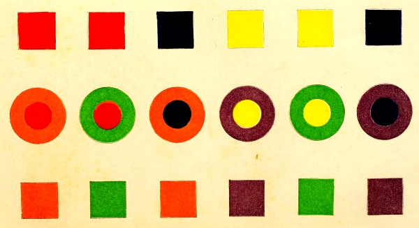
337. When, in this point of view, we examine the masterpieces of
Vandyke, and trace the beauty of their effect to the simplicity of
the means which produce it,—when we consider the elegance of their
attitudes, which always appear natural, the taste which presided over
the selection of all the accessories, we are struck with admiration
of the genius of the artist, who has not had recourse to those means,
so much abused at the present day, of attracting attention, either
by giving to the most vulgar person an heroic attitude, to the most
commonplace physiognomy pretension to profound thought, or by seeking
extraordinary effects of light, such as filling the figure with a
strong light, while the rest of the composition is in shade.
338. These reflections indicate the course which an historical painter
must take, when he would particularly fix the attention upon the
physiognomy of the persons in a remarkable scene. The more he employs
allied scales, the more care he must take to select such as do not lose
too much by their mutual juxtaposition.
339. There is another important direction to give, which is to avoid
as much as possible the same kind of images on different objects; thus
figures clothed in draperies with large flower patterns, in a room
where the carpet and porcelain vases repeat the same images, are never
free from objection, for it is troublesome to the eye to distinguish
those parts of the picture which the similarity of ornaments tends to
confound. Upon the same principle, the painter must generally avoid
placing beside the faithful copy of a model the copy of an imitation
which repeats this model. For example, when, he paints a vase of
flowers, the artist produces most effect, other things being equal,
in painting a vase of grey or white porcelain, instead of a vase upon
which a profusion of similar objects are its ornaments.
340. When it is required that a certain colour shall predominate in a
composition, or to speak more correctly, when the scene is illuminated
by a coloured light, shed over every object, we must not only take
simultaneous contrast into consideration, but also the modification
which results from the mixture of colours (172),
comprising the recomposition of white light by means of a proper
proportion of the differently coloured elementary rays.
341. We must here attentively study the article which treats of the
principal cases of the modifications of light resulting from coloured
rays falling upon bodies of various colours (261, et seq.),
when, although the coloured light chosen imparts value to certain
colours of the objects upon which it falls, it also impoverishes and
even neutralizes others. Consequently, in employing any predominant
colour, we must renounce the advantages of others, or the effect
produced will be false. For example: if orange colour predominates, for
the colouring to be true it must necessarily follow—
- 1. That the purples must be more or less red.
- 2. That the reds must be more or less scarlet.
- 3. That the scarlets must be more or less yellow.
- 4. That the orange must be more intense, more vivid.
- 5. That the yellows must be more or less intense, and orange.
- 6. That the greens lose their blue, and consequently become yellower.
- 7. That the light blues become more or less light grey.
- 8. That the deep indigo becomes more or less maroon.
- 9. That the violets lose some of their blue.
Thus we see that orange light heightens all the colours which contain
red and yellow, while, neutralizing a portion of blue in proportion
to its intensity, it destroys wholly or partially this colour in the
body which it illuminates, and consequently disturbs the greens and the
violets.
342. With reference to the true imitation of colouring, it appears
to me that painters of interiors, have, other things being equal,
more skill than historical painters in faithfully reproducing the
modifications of light. Historical painters, attaching more importance
to the attitudes and physiognomy of their figures than to the other
parts of their composition, attend less to small details, the faithful
imitation of which is the essential merit of the painter of interiors.
Besides, the historical painter is never in a position to see the whole
of the scene he would represent, while the painter of interiors, having
constantly his model before him, sees it completely, as he imitates
it upon the canvas. Hence, therefore, in every small composition the
colours, as well as the objects represented, must be distributed with
a kind of symmetry, so as to avoid being what I can best express by
the term spotty. In fact, for want of a good distribution of
objects, the canvas will not be filled in some parts, or, if it is,
there will be, in many places, evident confusion; so also if the
colours be not properly distributed, the picture will be spotty,
because they are too far isolated from the others. (See 249-251.)
343. I believe that those painters who will study the mixed and
simultaneous contrasts of colours, in order to employ rationally
the coloured elements of their palette, will perfect themselves in
absolute colouring as by studying the principles of geometry
they perfect themselves in linear perspective. I have no doubt but that
the difficulty encountered by painters ignorant of the law of contrast,
of faithfully imitating their model, has been with many the cause of
a colouring dull and inferior to that of artists, who, less careful
than they in the fidelity of imitation, or not so well organized for
seizing all the modifications of light, have worked more by their first
impressions, or, in other words, seeing the model more rapidly, their
eyes have not had time to become fatigued; and thus, content with the
imitation which they have made, they have not returned to their work
too often to modify, to efface, and afterwards to reproduce it upon
a canvas soiled by the colours first put on. There are, indeed, many
painters, to whom the maxim, “Let well alone,” is peculiarly applicable.
344. The tapestries of Gobelins and of Beauvais, and also the
carpets of Savonnerie, and certain very elaborate mosaics, may all
be considered as works which resemble the method of painting in
chiaro-’scuro; while the windows of Gothic churches correspond
more or less exactly to painting in flat tints; so also
with tapestries for furniture and carpets, which, instead of being
fabricated with scales of at least sixteen or eighteen tones, as they
are in the royal manufactories, are composed with scales consisting
of three or four tones only, and, far from imitating the effects of
chiaro-’scuro, the coloured objects produced present to the eye
only small monochromous bands of a single tone.
345. There are also some works whose coloured designs are upon a kind
of mixed system, being the result of the juxtaposition of monochromous
single tinted parts, of a visible size, but in which the effects
of chiaro-’scuro are sought by using gradations of scale or
a mixture of hues; such are ordinary mosaics, carpets, embroidered
tapestries, &c.
346. In the patterns of tapestries and carpets, when the principal
effects to be aimed at have been determined, it may be seen what points
of ordinary painting may be sacrificed to obtain them, and what must
be done for perfecting the special portion of their imitation.
Beginning with the physical condition of the coloured elements the
weaver employs, and the texture of the tapestry, we see the necessity
of representing in this kind of work only large, well-defined objects,
and especially such as are remarkable for the brilliancy of their
colours. The patterns for hangings must recommend themselves more by
the opposition of their colours than by the minute finish of their
details. To pretend to rival painting in these manufactures is to
establish a confusion most detrimental to the progress of arts,
absolutely distinct from painting, both in their purpose and their
means of execution.
347. The principles truly essential to these arts of imitation being
once deduced from the peculiarities of
each, it becomes easy to point out by what efforts we
may hope to obtain true perfection.
348. To make mixtures of coloured threads intelligently, we must be
guided by the three following rules:—The first two resulting directly
from observation of facts; the third being the natural deduction from
the facts comprised in the two former.
When we unite Red with Yellow, Red with Blue, Yellow with Blue, the
threads must not reflect a perceptible quantity of the third primary
colour, if we would have Orange, Violet, and Green as brilliant as it
is possible, by this method, to obtain.
Example A.—Red and Yellow.
Plate 11.
| 3 |
Red |
threads with |
1 |
Yellow |
thread, |
| 2 |
” |
” |
1 |
” |
” |
| 1 |
” |
” |
1 |
” |
” |
| 3 |
Yellow |
” |
1 |
Red |
” |
| 2 |
” |
” |
1 |
” |
” |
yield mixtures which appear to the eye in
proportion to the two colours mixed. There is no appearance of grey
in any of these mixtures, when we employ a red more inclining to orange
than to crimson, and a yellow more inclining to orange than to green.
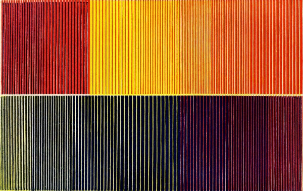
PLATE XI.
B.—Red and Blue.
| 3 |
Red |
threads with |
1 |
Blue |
thread, |
| 2 |
” |
” |
1 |
” |
” |
| 1 |
” |
” |
1 |
” |
” |
| 3 |
Blue |
threads with |
1 |
Red |
thread, |
| 2 |
” |
” |
1 |
” |
” |
yield mixtures which appear to the eye in
proportion to the two colours mixed. If we use a red and a blue
inclining to violet, the mixture will contain no grey.
C.—Yellow and Blue.
| 4 |
Blue |
threads with |
1 |
Yellow |
thread, |
| 3 |
” |
” |
1 |
” |
” |
| 2 |
” |
” |
1 |
” |
” |
| 1 |
” |
” |
1 |
” |
” |
give mixtures which appear to the eye in the
proportions of the two colours mixed. If we use yellow and a blue
inclining to green more than to red, the mixture will contain little or
no grey.
Experiment on all the preceding mixtures demonstrates the rule above;
or rather, this rule is but the expression of a generalization of facts.
349. When we mix Red with Green, Orange with Blue, Yellow with
Violet, the colours are more or less completely neutralized, according
as they are more or less perfectly complementary to each other, and as
they are mixed in proper proportions. The result is a grey, the tone of
which is generally higher than that of the colours mixed, if the latter
are of a suitably high tone.
Examples.—Red and Green.
Plate 12.
- 3 Red threads with 1 Green thread give a dull Red.
- 2 Red threads with 1 Green thread give a duller and a deeper Red.
- 1 Red thread with 1 Green thread give a Reddish-grey.
- The tone a little higher than the preceding.
- 3 Green threads with 1 Red thread give a Green Grey,
- the tone higher than the Green or the Red.
- 2 Green threads with 1 Red thread give a Grey, less
- Green, and of a higher tone than the two colours.
In repeating the same mixtures with higher tones of the same scales of
Green and Red, the tone of the mixture of 2 Green with 1 Red is higher
relatively to that of the colours mixed, than it is in the mixtures above.
1 Red thread and 1 Yellowish-green thread give a Carmelite-brown or an
Orange-grey, the tone of which is equal to that of the colours mixed.
1 Red thread and 1 Bluish-green thread give a copper-coloured mixture
or catechu-brown of a higher tone than that of the colours mixed.
Hence we may conclude that red and green threads, properly assorted,
and in suitable proportions, yield Grey.
Orange and Blue.
| 3 |
Orange |
threads with |
1 |
Blue |
thread give |
a dull Orange. |
| 2 |
Orange |
” |
1 |
” |
” |
a duller Orange. |
| 1 |
Orange |
” |
1 |
” |
” |
Chocolate-grey. |
| 3 |
Blue |
” |
1 |
Orange |
” |
Violet-grey. |
| 2 |
Blue |
” |
1 |
Orange |
” |
Violet-grey. |
| |
Redder than the preceding. |
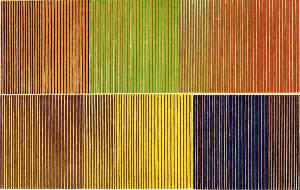
PLATE XII.
The results are the same with deeper tones than the preceding, except
that the corresponding mixtures are browner.
3 orange threads with 3 blue threads present a remarkable phenomenon,
according to the intensity of the light and the position from which it
is observed. The tapestry being placed in a vertical plane before the
incident light when the warp is horizontal, we perceive blue and
orange stripes; but if the warp is vertical, we may then see
the upper part of each blue stripe violet, and its under part,
as well as the upper part of each orange stripe green, while
the rest of each of the latter will appear red, bordered on the
lower part with yellow. We may also see the upper part of each
blue stripe, violet, and its under part, as well as the upper
part of each orange stripe, green, and the rest of each of these
stripes red, bordered on the lower part with green, and in the
upper part with yellow. We say that they may be seen in this manner,
because if the light were strong enough for distinct vision, we should
not see the horizontal blue and orange stripes.
Yellow and Violet.
| 3 |
Yellow |
threads with |
1 |
Violet |
give |
a Greyish-yellow. |
| 2 |
” |
” |
1 |
Violet |
” |
Yellow-grey. |
| 1 |
” |
” |
1 |
Violet |
” |
Grey, |
| |
much nearer normal grey than the preceding. |
| 3 |
Violet |
threads and |
1 |
Yellow |
give |
a Greyish-violet. |
| 2 |
” |
” |
1 |
Yellow |
” |
dull Violet, |
| |
greyer than the preceding. |
It is remarkable that in the mixture of a yellow with a violet thread,
seen from a greater distance than that at which they appear
neutralized, the yellow is so much weakened in proportion to the
violet, that the mixture appears of a dull violet.
Yellow and blue afford an analogous result.
350. When Blue, Red, and Yellow are combined in such proportions
that they do not neutralize each other, the result is a colour much
greyer or more broken than if the proportion of complementary colour
were more equal.
As Red mixed with a Greenish-yellow gives a Carmelite mixture, I
shall add the following:—
1. Crimson-red and greenish-yellow give mixtures so much duller
as these colours more nearly neutralize each other. A mixture of
one crimson-red with one greenish-yellow thread produces a brick or
copper-orange, the tone of which is higher than that of the colours
mixed.
2. Scarlet-red and greenish-blue give mixtures which are without
vigour or purity, relatively to the corresponding mixtures made with
crimson-red and violet-blue.
3. Red and blue-grey give violet mixtures, which are not so dull as the
preceding, because the colours contain no yellow.
4. The red of the mixture 3, worked with a green-grey, gives mixtures
much duller than the preceding, as might have been expected, on account
of the yellow contained in the green-grey.
5. Orange and blue-violet give very dull mixtures.
6. Orange and red-violet give dull mixtures, but redder or less blue
than the preceding.
ON THE PRINCIPLE OF CONTRAST IN CONNEXION
WITH THE PRODUCTION OF TAPESTRY.
351. The tapestry-weaver should therefore thoroughly understand the
effects of contrast, to know the influence which the part of the copy
he proposes to imitate receives from the colours surrounding it, and
so judge what coloured threads to choose. The following examples will
explain better than the most profound reasoning the necessity for the
tapestry-worker to possess a knowledge of the law of contrast.
First Example.
352. If there be two coloured stripes in a picture, one red the other
blue, touching each other, the phenomenon of contrast between two
contiguous colours would have arisen, had not the painter sustained the
red by blue, and the blue stripe by making it red or violet next to the
red stripe (320).
353. Suppose a weaver wishing to imitate these two stripes, but
ignorant of the law of contrast of colours, after choosing the wools
or silks, he is sure to make two stripes, which will produce the
phenomenon of contrast; for he will select his wools or silks of only
one blue or one red, to imitate two stripes of different colours, each
of which appears homogeneous throughout, but which the painter has only
succeeded in making so by neutralizing the phenomenon of contrast,
which would undoubtedly have resulted had each been painted of a
uniform colour.
354. Suppose the painter has painted the stripes with uniform colours,
then contrast will arise, so that the red contiguous to the blue will
appear orange, and the blue contiguous to the red will appear greenish.
If the weaver be ignorant of the law of contrast, in attempting to
imitate his model he will be sure to mix yellow or orange with his red,
and yellow or green with his blue, in those parts of the stripes which
come in contact. Hence the contrast will be more exaggerated than if he
had worked the two stripes with homogeneous colours.
355. Suppose a weaver has to copy the series of ten grey stripes in
flat tints (fig. 3, Plate 1) described (11),
it is evident that if he is ignorant of such effects he will exaggerate it
in the imitation; for instead of working ten tints of the same scale
so as to produce ten bands in flat tints, he will make ten bands,
each graduated conformably to what he sees; he will probably also
have recourse to lighter and darker tones than those which correspond
exactly to the model, and thus he will require a greater number of
tones than would have been necessary had he been aware of contrast,
rendering the copy an exaggeration of the model.
When we attentively observe the rosy flesh tints of many pictures, we
perceive in the shadows a more or less apparent green tint, resulting
from the contrast of rose with grey. (I presume that the painter has
made his shadows without using green, and that he has not corrected the
effect of contrast by using red.) Now a weaver, ignorant of the effect
of rose upon grey, in imitating the shaded part will have recourse to
a green-grey, which will exaggerate an effect that would have been
produced naturally by employing a scale of pure, not of greenish grey.
QUALITIES WHICH PATTERNS FOR
GOBELINS TAPESTRY MUST POSSESS.
356. To determine the qualities which model pictures for tapestry must
possess, we must decide what are specific qualities peculiar to this
kind of imitation.
The weaver imitates objects with coloured threads of a certain
diameter. These threads are applied round the threads of the warp.
Their surface is not uniform but furrowed, those which are parallel to
the threads of the warp being lower than those which are perpendicular
to it; the effect of these furrows being such as would be produced upon
a picture, by a series of dark parallel lines, cut at right angles by
another series of finer parallel lines, less dark than the preceding.
357. There are these differences then between tapestry and painting:—
1. Tapestry never presents those blended colours which the painter
obtains so easily by indefinitely mixing or dividing his pigments.
2. The symmetry and uniformity of the furrows of tapestry prevent
the lights being as vivid, and the shadows as vigorous, as in a
painting; for though the furrows obscure the lights, the salient
parts of the threads which are in the shades, have the ill effect of
enfeebling the latter by the light they reflect.
3. The lines surrounding the different objects in a painting,
although straight or curved in every direction, may be of extreme
fineness without ceasing to be perfectly distinct, while the threads of
the weft and the warp, always crossing at right angles, interfere with
such a result whenever the lines of the pattern do not exactly coincide
with these threads.
4. The painter has other resources, which are denied to the weaver,
for increasing the brilliancy of the lights and the vigour of the
shadows. For instance: he opposes opaque body-colours to glaring
colours, he modifies an object of a single colour by varying the
thickness of the layer of paint which he places on the canvas; and
within certain limits he can produce modifications, by changing the
direction of the strokes of his pencil.
358. Hence, to raise the effects of tapestry as nearly as possible to
those of painting, it is requisite:—
1. That the objects be represented of such a size that the position
of the spectator does not permit of his distinguishing either the
coloured elements from each other, or the furrows which separate them;
so that threads of two mixed scales (377), and
the hatchings of different scales, more or less distant, interwoven
together (378), may be mingled into a
homogeneous colour, and that the cavities and salient parts may appear
as a uniform surface.
2. That the colours be as vivid and strongly contrasted as possible,
so that the lines which surround the different objects be more
distinct, and the lights and shadows be as different as possible.
359. Thus patterns for tapestry must not only recommend themselves
by correct outline and elegant forms, but must also represent larger
objects: figures draped rather than nude, vestments decorated with
ornaments, rather than simple and uniform. Consequently, every thing
allied to miniature, by minuteness or by finish in details, is foreign
to its special object.
360. The elements of Beauvais tapestry for furniture are essentially
the same as those of Gobelins tapestry; but with this difference, that
the light and the middle tones are of silk, while in the Gobelins
tapestry these tones are almost always of wool. The scales of Beauvais
are less varied in colour than those of the Gobelins, and their tones
are less numerous. But the working of the threads is the same in both
kinds of tapestry; so that as to the employment of coloured threads,
depending in like manner on the knowledge and observance of the
principles of mixture and contrast of colours, I need not add to what I
have already said on this subject in the preceding section.
361. The furrows caused by the weft and the warp have not the
inconvenience they present in the Gobelins tapestry. In fact, the
regular grain of the tapestry for furniture is so far from producing
a bad effect in the image represented on it, that we are obliged to
give the appearance of this grain to many paper-hangings by means of
parallel lines cutting it, or by points symmetrically placed.
COLOURED GLASS WINDOWS IN
LARGE GOTHIC CHURCHES.
362. I am about to examine, according to the preceding views, the
coloured glass windows which concur so powerfully with architecture,
in giving to vast gothic churches that harmony which we cannot fail to
recognise whenever we enter them. These structures rank with those works
of art which are most impressive by their size, the subordination of
their various parts, and by their complete fitness for the purposes
to which they are applied. The stained glass of gothic churches has
always a most appropriate effect, intercepting the white light, which,
by giving too vivid a glare, is less conducive to meditation than the
coloured light which this glass transmits. We shall find its splendid
effect to arise, not only from the contrast of colours, but also from
the contrast of its transparency with the opacity of the surrounding
walls, and of the lead which binds its parts together. The impression
produced on the eye by this twofold cause becomes more vivid the more
frequently it is repeated and the longer it is sustained, when yellow,
blue, violet, orange, red, and green stained glass appears like most
precious jewels.
363. The upright windows usually represent, within a border or a ground
analogous to the rose windows, the figure of a saint in harmony with
those which stand in relief about the portals of the edifice; and to be
fully appreciated they must be judged of as parts of a whole, and
not as a Greek statue which is intended to be seen isolated on all sides.
The glass is of two kinds, the one painted on its surface by pigments
afterwards vitrified (glass painting); the other, melted with the
material that colours it (glass staining); the first is generally used
in the composition of the nude parts of the human figure, and the
second in that of the drapery. All the pieces of glass are united by
strips of lead. What has struck me as being most effective in windows
with human figures, is the exact observance of the relations of size of
the figures and of the intensity of the light which renders them
visible, with the distance at which the spectator is placed; a distance
at which the strips of lead surrounding each piece of glass appear only
as lines or as small black bands.
364. It is not necessary, for an effective whole, that the painted
glass, when viewed closely, should exhibit fine hatchings, careful
stippling, or blended tints; for, with the coloured stained glass for
draperies, they should compose a system which compares with painting
in flat tints, and certainly we cannot doubt that a painting on glass,
executed entirely according to the system of chiaro-scuro, not
to speak of the cost of its execution, will have the disadvantage of
the finish in its details entirely disappearing at the distance at
which it must be viewed as a whole.
365. The first condition, which must be fulfilled by every
work of art, is, that it be presented without confusion and as distinctly
as possible. Let us add that paintings on glass, executed on the
method of chiaro-’scuro, cannot receive the borders and grounds
of rose windows which have such fine effects of colour, as they have
less brilliancy and transparency than the glass in which the colouring
material has been incorporated; they are also less capable of resisting
the injuries of time.
Variety of colours in these windows is so necessary to attain the best
possible effect, that those which represent figures entirely nude,
edifices, or large objects of a single colour, or slightly tinted,
whatever may be the perfection of their execution with regard to finish
or truth of imitation, will have an inferior effect to windows composed
of pieces of varied colours suitably contrasted; but a bad effect
results from the mixture of coloured glass with transparent colourless
glass, when the latter has a certain extent of surface in a window; yet
a good effect is obtainable by mixing ground glass with coloured glass,
and also of small pieces of colourless transparent glass, framed in
lead, so that at the distance at which they must be viewed they produce
the effect of a symmetrical juxtaposition of white parts with black
parts.
366. I conclude that we must refer the causes of the beautiful effects
of coloured glass of great churches—
1. To their presenting a very simple design,
whose different well-defined parts may be seen without confusion at a
great distance.
2. To their offering a union of coloured parts
which are distributed with a kind of symmetry, but which are also
vividly contrasted, not only among themselves, but also with the opaque
parts which surround them.
367. Coloured windows appear to me to produce their utmost effect only
in the vast edifices where the different-coloured rays reach the eye
of the spectator on the floor of the church so much scattered that
they impinge upon each other, whence results an harmonious mixture,
not found in a small structure lighted by coloured windows. It is this
intimate mixture of the coloured rays, transmitted into a vast edifice,
which permits of tapestries placed on the ground floor. But when the
lower walls have not colourless glass windows, it is evident that, if
tapestries be placed too near coloured windows, the harmony of their
colours must be lost, as when blue rays fall upon red draperies, yellow
rays upon blue draperies, &c.
Thus, when coloured glass is to be put in a window, it is necessary to
take into consideration, not only its beauty, but also the effect which
the coloured light it transmits will have upon the objects illuminated
by it.
368. The coloured windows of a large church may be regarded as real,
transparent tapestries, intended to transmit light, and to ally
themselves harmoniously with the sculptures on the exterior, which
destroy the monotony of the high walls of the edifice, and with the
different monuments of the interior, among which tapestries must be
taken into account.
369. My ideas on the employment of stained glass for windows may be
summed up in the following terms:—
1. They produce their utmost effect only in
the rose windows, bay windows, or pointed windows of large Gothic
churches.
2. Only when they present the strongest harmonies
of contrast, not of colourless transparent glass with the black
produced by the opacity of the walls, iron bars, and strips of lead,
but of this black with the intense tones of red, blue, orange, violet,
and yellow.
3. Their designs must always be as simple as
possible, and admit of the harmonies of contrast.
4. While admiring painted windows, of which a
large number consist of paintings of undoubted merit, especially in
regard to the difficulties overcome, I confess that it is a kind of
painting which should not be much encouraged, because it never has the
merit of a picture properly so called, it is more costly, and will
produce less effect in a large church than a stained window of much
lower price.
5. Windows of a pale grey ground, with light
arabesques, have a very poor effect wherever they are placed.
See the relations of the law of contrast with the decoration of the
interiors of churches.
370. I propose to examine only the optical, not the chemical, effects
produced by patterns printed upon woven fabrics.
Printing on textile fabrics was for a long time limited, so to speak,
to cotton cloths. It is only of late years that it has been extended
to fabrics of silk and wool, for furniture and clothing. This branch
of industry has now undergone an immense extension, fashion having
accepted these products with extreme favour; but, whatever may be the
importance of the subject, in a commercial point of view, I must treat
it briefly. This book is not directed exclusively to that branch of
inquiry, and as all the preceding part is intimately connected with it,
I shall merely state some facts which show, that, in ignorance of the
law of contrast, the manufacturers and printers of cotton, woollen, and
silk stuffs are constantly exposed to error in judging the value of
recipes or colours, or as to the true tint of the design applied upon
grounds of a different colour.
371. At a certain calico-printer’s a recipe for printing green had
always succeeded up to a certain period, when it began to give bad
results. They were lost in conjectures upon the cause, when a person,
who at the Gobelins had followed my researches on contrast, recognised
that the green of which they complained, being printed on a ground
of blue, inclined to yellow through the influence of orange, the
complementary of the ground. She therefore advised that the proportion
of blue in the colouring composition should be increased in order to
correct the effect of contrast. The recipe, modified according to this
suggestion, gave the beautiful green which they had obtained formerly.
372. Thus every recipe for colours to be applied upon a ground of
another colour, must be modified conformably to the effect which the
ground will produce. It is this great facility in correcting the
ill effect of certain contrasts which explains why they so often
succeed without being able to account for it. Here, notwithstanding
their colour, the eye judges them to be colourless, or of the tint
complementary to that of the ground. These appearances have been the
subject of questions frequently addressed to me by the manufacturers
of printed stuffs, and by drapers: they are due to the law of
simultaneous contrast of colours. In fact, when the patterns
appear white, the ground acts by contrast of tone ( 9);
if they appear coloured (and this appearance generally succeeds to that where they
appear white), the ground then acts by contrast of colour (13).
The manufacturer of printed stuffs therefore will not seek to attribute the
cause of these phenomena to the chemical actions in his operations.
373. Ignorance of the law of contrast has, among drapers and
manufacturers, been the subject of many disputes, which I have been
happy to settle amicably, by demonstrating to the parties that they had
no possible cause for litigation in the cases they submitted to me. I
will relate some of these, to prevent similar disputes.
Certain drapers gave to a calico-printer some cloths of single
colours, red, violet, and blue, upon which they wished black figures
to be printed. They complained that upon the red cloths he
had put green patterns; upon the violet, the figures
appeared greenish-yellow; upon the blue, they were
orange-brown or copper-coloured—instead of the black
which had been ordered. To convince them that they had no ground for
complaint, it sufficed to have recourse to the following proofs:—
1. I surrounded the patterns with white paper, so
as to conceal the ground; the designs then appeared black.
2. I placed some cuttings of black cloth upon
stuffs coloured red, violet, and blue; the cuttings appeared like the
printed designs, i. e., of the colour complementary to the
ground, although the same cuttings, when placed upon a white ground,
were of a beautiful black.
374. The modifications which black designs undergo
upon different coloured grounds are the following:—
Plate 13.
Upon Red stuffs they appear Dark Green.
Upon Orange stuffs they appear of a Bluish-black.
Upon Yellow stuffs they appear Black, the violet tint of
which is very feeble, on account of the great contrast of tone.
Upon Green stuffs they appear of a Reddish-grey.
Upon Blue stuffs they appear of an Orange-grey.
Upon Violet stuffs they appear of a Greenish-yellow Grey.
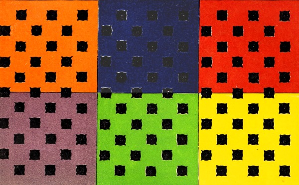
PLATE XIII.
These examples are sufficient to enable us to comprehend their
advantage to the printer of patterns in colours complementary to the
colours of the ground, whenever contiguous tints are to be mutually
strengthened without going out of their respective scales.
DESIGNS FOR PAPER-HANGINGS.
375. The manufacture of paper-hangings has now arrived at such a point,
that a knowledge of the law of contrast of colours is indispensably
necessary to this branch of industry. We cannot estimate the true
relations between the law of contrast and the art of paper-staining
without dividing the papers into several categories to which the law is
applicable.
1. Papers having figures and landscapes, or
flowers of different sizes, and of varied colours, not intended for
borders; these approach the nearest to painting.
2. Papers with patterns of one colour, or of
colours but slightly varied.
3. Those employed as borders.
376. The study which I recommend to artists occupied in fabricating
paper-hangings, is in some measure that immediately applicable to every
pictorial composition, or, in other words, the tapestry of figures
and landscapes. But, whatever be the merit of paper-hangings of this
category, they are not sought by persons of refined taste, and they do
not appear to me destined to be any more so in future, for the twofold
reason that the taste for arabesques, painted upon walls, or upon wood,
and that for lithographs, engravings, and paintings, is spreading every
day. These last three objects exclude, at least, all those papers with
figures and coloured landscapes.
377. The applications of the law of contrast to this class
of paper-hangings are easy, when we thoroughly understand the divisions of
the book to which I referred above. In order to prove the advantage to
be derived from the knowledge of this law, I need only refer to the bad
effect presented by contiguous bands of two tones of the same scale of
grey (serving as the ground to the figure of an infant), in consequence
of the contrast of tone arising from their juxtaposition (321).
378. On the Law of Simultaneous Contrast of
Colours in relation to Paper-hangings with Designs in a Single Colour,
or in Colours but slightly varied.
The remarks in 372 are applicable here also,
as are those of 374. The best executed, and in
the best taste, are those with black figures, or of figures much darker
than the ground.
Paper-hangings, I do not say the most tasteful, but those most
convenient for use, present very light grounds, with white or grey
figures.
379. Grey patterns, upon papers tinted of a light
colour, exhibit the phenomenon of maximum contrast; that is to say, the
grey appears coloured with the complementary of the ground.
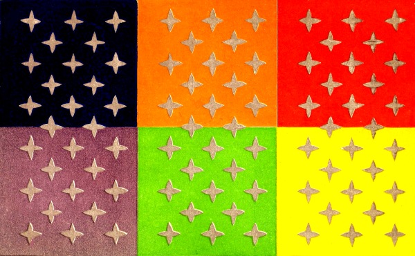
PLATE XIV.
Thus, conformably to the law, (Plate 14)
| Grey |
patterns |
upon |
a Rose |
ground |
appear |
Green. |
| ” |
” |
” |
an Orange |
” |
” |
Blue. |
| ” |
” |
” |
a Yellow |
” |
” |
Violet or Lilac. |
| ” |
” |
” |
a Green |
” |
” |
Rose. |
| ” |
” |
” |
a Blue |
” |
” |
Orange-grey. |
| ” |
” |
” |
a Violet |
” |
” |
Yellow. |
380. I mention these examples to instruct artists, for, in
manufactories of paper-hangings, disputes arise between the proprietors
and the preparers of the colours. For instance, a few years ago, the
proprietors of one of the first manufactories in Paris, wishing to
print grey patterns upon grounds of apple green and of rose, refused
to believe that his colour preparer had given any grey to the
printer, because the designs printed on these grounds appeared coloured
with the complementaries of the colour of the ground. It was only when
the colour preparer, having attended a lecture I gave for M. Vauquelin,
at the Museum of Natural History, and hearing me speak of the mistakes
that these contrasts of colours might occasion, suspected the cause of
the effects which he had unconsciously produced, and which had really
caused him much annoyance.
381. Every paper of one colour, or one belonging to the second
category, should receive a border generally darker and more complex in
design and colour than the paper which it frames.
The assortment of two papers exercises a very great influence on the
effects they are capable of producing; for each of them may be of a
fine colour, ornamented with designs in the best taste, yet their
effect will be mediocre, or even bad, because the assortment will not
be conformable to the law of contrast.
382. The ground of a border contributes greatly to
the beauty of the pattern, whether this be of flowers,
ornaments, or any other object. As we cannot treat of
this influence in an absolute or methodical manner, I shall
select a certain number of remarkable facts which I have
had occasion to observe, and I shall principally dwell on
those from which we can deduce conclusions, which, apparently
not flowing from previous observation, might escape
many readers, in spite of the great interest they have in
knowing them. Besides, the exhibition of these facts will
give me occasion to apply the law of contrast to designs presenting
many tones of the same scale, and of different hues,
and also often of different scales, more or less distant from
each other. I shall not treat of simple borders, presenting
black or grey designs upon a uniform ground, for I have
already spoken of the modifications which in this case
black designs undergo (374), and grey
designs also (379).
383. The design of a border, either of ornaments,
flowers, or any other object, being cut out and pasted upon
a white card, designs identical with the preceding, which
had been pasted upon cardboard, were then cut out, and
placed upon grounds of black, red, orange, yellow, green,
blue, and violet; then compared, not only by myself, but
also by many persons whose eyes are much accustomed
to seeing colours. When we had perfectly agreed upon
their value, the results were noted as follows:—
1.—BORDER OF EIGHT INCHES IN HEIGHT, REPRESENTING
GILT ORNAMENTS UPON DIFFERENT GROUNDS.
Plate 15.
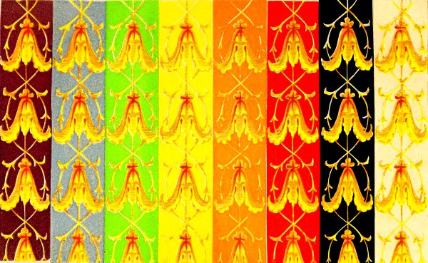
PLATE XV.
384. These ornaments, executed by the ordinary processes of
paper-staining, contained no particle of metallic gold; yellow, lakes,
and orange, of different tones and hues, had been exclusively employed
in their production. After having stated the modifications which the
painted gilt ornaments experience from the colour of the grounds,
I shall indicate those which the metallic gilt ornaments receive
comparatively from the same grounds; this comparison presenting results
which appear to me interesting.
Black Ground.
385. Painted gilt ornaments placed upon black ground, compared
with the same ornaments placed on a white ground, appear much more distinct than
the latter; because the yellows and orange-yellows, colours eminently
luminous, and the black ground, which reflects no light, give rise to
contrast of tone, which the white ground, essentially luminous, cannot
give with the colours which are themselves luminous. (See 53.)
We perceive thus, that the colours placed upon black are lowered in
tone; but it must be noted that yellows and orange-yellows, far from
being weakened (58), would only cause the black to gain in purity.
In considering more particularly the effects of two grounds, we see
that a black imparts a red to the ornaments, and it is important to
remark that the brightness of this red, instead of reddening the
yellows, really gilds them. (See 394.)
We may thus understand how black, in taking away some grey, imparts
brilliancy, and how this grey, which may be considered as a tarnished
or subdued blue, may, with yellow, produce an olive colour. It is also
necessary to remark, that the gilt ornaments in question present an
olive-grey tint, which, far from being diminished by the white ground,
is exalted by it.
Although the black ground lowers the tone of the colours, while white
heightens them, it lowers yellow more in proportion than red, and
consequently renders the ornaments redder than they appear upon a white
ground; and, in taking away the grey, it purifies the colours, and acts
also by giving them some red, or by taking away some green.
Metallic Gilt Ornaments.
386. Gilt ornaments stand out better from black than
from white, but the orange colour is weakened and really impoverished.
The black ground then does not purify the real gilt ornaments as it
does the painted imitation of gold.
Deep Red Ground.
The yellows are more luminous, the whole effect with the painted
ornament is clearer, more brilliant, less grey than upon a white ground.
Red much deeper than the ornament, lowers the tone of it; and this
effect is also augmented by the addition of its complementary, green, a
bright colour.
This example is of much importance, enabling us to see how the red,
which appears as though it could be of but little advantage to
ornaments, because it tends to weaken them by making them greener,
is notwithstanding favourable, because the lightening or weakening
of the colour is more than compensated for by the brilliancy of the
complementary of the ground which is added to the yellow. We shall
return to this effect in a moment. There is this analogy between the
influence of the red ground and that of the black ground, that the
tone of the colour is lowered; but there is this difference, that the
ornaments become green on the first, while they become orange upon the second.
387. The red ground is not so advantageous for gilt ornaments as it is
for the painted imitations of them, because the metal loses too much of
its orange colour, and appears inferior to gold upon a black ground.
The red ground appears darker, and more violet than the ground upon
which painted ornaments are placed.
Grounds of a light-red are still less favourable to the gold than red
grounds of a dark tone.
Orange Ground deeper
than the Ornaments.
388. The painted ornaments are bluer or rather greener than upon a
white ground. The yellow and orange are singularly lower in tone.
This ground, then, is very disadvantageous to ornaments, as might have
been expected.
389. Orange is not favourable to metallic gilt. The metal becomes too
white, while the orange ground is redder and more vivid than that upon
which the painted ornaments are placed.
Yellow Ground of Chromate of Lead more brilliant
than the Yellow of the Ornaments.
390. The yellow of the painted ornaments is excessively enfeebled by
the complementary of the ground which is added to it, the ornaments
appear grey in comparison with those upon a white ground.
391. The yellow ground is not so unfavourable to gilt ornaments as it
is to painted ones. The first assortment may, in certain cases, be
recommended.
The yellow appears more intense, and perhaps greener.
Bright Green Ground.
392. Painted ornaments are darker upon a bright green ground than upon a
red or white ground. They have acquired some red, but not the brilliant
tint which is given to them by black—it is a brick-red tint.
393. It follows from the comparison of the effects of ornaments upon
red and upon green grounds, that the first is much more advantageous
than the second, because it adds an essentially brilliant tint to the
colour of the ornaments, while the latter, adding red, or taking away
green, produces a brick-red.
394. Upon a bright green ground, metallic gilt
ornaments acquire red, as the painted ornaments do, while the red,
not sensibly diminishing the brilliancy of the metal, but, on the
contrary, augmenting the intensity of its colour, produces an excellent
effect.
The green ground is more intense and bluer than the same ground upon
which the painted ornaments are placed.
395. The study of the effects of red and of green grounds upon
painted ornaments, on the one hand, and upon gilt ornaments on the
other, is extremely interesting to paperstainers and decorators; it
demonstrates to them the necessity of taking into consideration, in
the juxtaposition of bodies which it is proposed to associate, the
brilliancy which these bodies naturally possess, and the brilliancy we
wish to impart to them, if they have none. The preceding examples
(386, 394) explain
why the paperstainer will choose dark red instead of green for his gilt
ornaments, and why a decorator will prefer green to red for the colour
of the hangings of a show-room of gilt bronzes, gilt clocks, &c.
Blue Ground.
396. Observation agrees perfectly with the law that it is really upon a
blue ground, that painted ornaments, whose dominant colour is the
complementary of blue, show themselves to the greatest advantage with
respect to intensity of the gold-yellow colour. This effect more than
compensates for the slight difference which may result from the red
ground giving a little more brilliancy. The ornaments upon the latter
ground, compared with those on the blue, are less coloured and appear
whiter.
With metallic gilt ornaments the blue ground is deeper and less
violet than with painted ornaments.
Violet Ground.
397. Conformably to the law, the violet ground giving greenish-yellow
to the painted ornaments, is favourable to them; they appear on this
ground less olive-grey, more brilliant than upon the white ground, and
less green than upon the red ground.
Metallic gilt ornaments stand out quite as well, the ground is
raised in tone, and the violet appears bluer or less red.
398. It is remarkable that gilt ornaments, compared with their painted
imitations, heighten all the grounds upon which they are placed. We
cannot say that this metal causes the grounds to lose their brilliancy,
for orange gaining some red, by the juxtaposition of the gold, appears,
nevertheless, more brilliant than the orange in juxtaposition with the
painted ornaments. The gold, by its orange colour, gives also some
blue, its complementary, to bodies which surround it.
2.—BORDER OF FOUR INCHES
IN BREADTH PRESENTING ORNAMENTS
COMPOSED OF FESTOONS OF BLUE FLOWERS, OF WHICH THE
EXTREMITIES ARE HELD BY GREY LEAVES OF ARABESQUES.
Plate 16.
399. These ornaments are opposed in some respects to the preceding by
their dominant colour, which is blue.
Black Ground.
400. Grey lowered three tones in comparison with grey; upon white less
reddened.
Blue flowers lowered two tones at least.
Red Ground.
401. The grey is greenish, while upon white it is reddish.
The blue flowers are lowered three tones, and the blue inclines to
green.
Orange Ground.
402. Grey much lowered; less red than upon white. Flowers paler, and of
a blue less red or less violet, than upon a white ground.
Yellow Ground.
403. Grey higher than upon white ground, more violet.
Flowers of a more violet-blue, less green than upon a white ground.
Green Ground.
404. The grey is reddish, while upon a white ground it appears greenish.
The blue gains red or violet, but it loses much of its vivacity; it
resembles some blues of the silk-vat, which, giving yellow to the
water, become slaty-blue-violet.
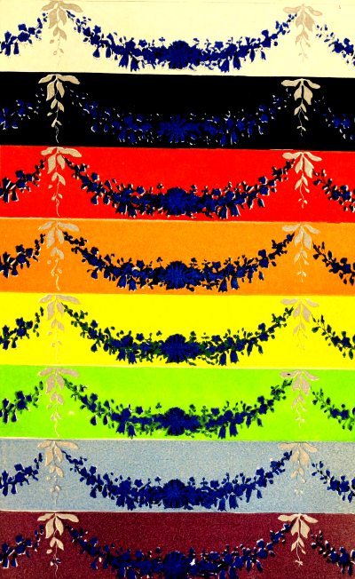
PLATE XVI.
Blue Ground.
405. The blue ground being fresher than that of the ornament, it
follows that it gives orange to the blue of the flowers; that is
to say, it greys them in the most disagreeable manner.
The grey ornament is oranged, and lighter than upon the white
ground.
Violet Ground.
406. Grey lowered, yellowed, impoverished. Blue tends to green, and is
impoverished.
3.—BORDER OF FIVE INCHES AND A HALF IN BREADTH,
REPRESENTING ROSES WITH THEIR LEAVES.
Plate 17.
407. This border is particularly useful as an example
of the effect of two colours, red and green, which are very common in
the vegetable world, and often represented upon paper-hangings.
Black Ground.
The green is less black, lighter, fresher, and purer, and its brown
tones redder than upon a white ground. With respect to its lighter
tones, I see them yellower, while, on the contrary, they appeared bluer
to three persons accustomed to observe colours. This difference, as I
at last found, arose from my comparing the general effect of leaves
upon a black ground with that of leaves upon a white ground; while the
other persons instituted their comparison more particularly upon the
browns and the light tones of green, placed upon the same ground. This
difference in the manner of seeing the same objects will be the subject
of some remarks hereafter.
Rose lighter, yellower than upon a white ground.
Dark Red Ground.
408. Green more beautiful, less black, lighter than upon a white ground.
Rose more lilac, perhaps, than upon a white ground. The good effect of
the border upon this ground is due chiefly to the greatest part of the
rose not being contiguous to red, but to green; because the border and
the ground exhibit flowers, the rose of which contrasts with the green
of their leaves; while the same green contrasts with the red of the
ground, which is deeper and warmer than the colour of the flowers.
Orange Ground.
409. The green lighter, a little bluer than upon a white ground.
Red much more violet than upon a white ground.
The general effect not agreeable.
Yellow Ground.
410. Green bluer than upon a white ground.
Rose more violet, purer than upon a white ground.
The whole exhibits a good effect of contrast.
Green ground, the tone of which is nearly equal to that of the lights
of the leaves, and the hue of which is a little bluer.
Green of the leaves lighter, yellower than upon a white ground.
Rose fresher, purer, more velvety than upon a white ground.
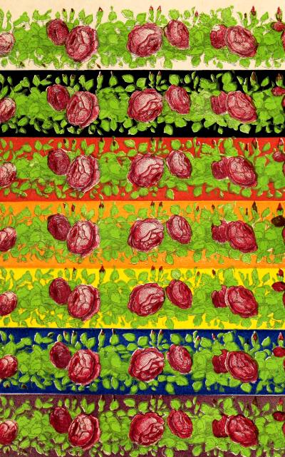
PLATE XVII.
Ground of an agreeable effect from harmony of analogy with the colour
of the leaves, and from harmony of contrast with the rose of the flowers.
Blue Ground.
411. Green lighter, more golden than upon a white ground.
Rose yellower, less fresh than upon a white ground.
Although the green leaves do not exactly produce a bad effect upon the
ground, yet the roses lose much of their freshness, and the appearance
of the whole is not agreeable.
Violet Ground.
412. Green yellower, lighter than upon a white ground.
Rose faded.
If the ground does not injure the green of the leaves, yet it injures
the rose so much that it is not agreeable.
4.—BORDER OF SIX INCHES IN BREADTH,
REPRESENTING WHITE FLOWERS, AS CHINA ASTER, POPPY, LILY OF THE VALLEY,
ROSES; SOME RED FLOWERS, AS THE ROSE-WALLFLOWER SOME SCARLET OR ORANGE,
AS THE POPPY, POMEGRANATE, TULIP; BIGNONIA AND VIOLET FLOWERS, AS
LILAC, VIOLETS, AND TULIPS WITH GREEN LEAVES.
413. This border was remarkable for the pleasing combinations of
the flowers among themselves, and of the flowers with their leaves.
In spite of the multiplicity of colours, and of the hues of red and
violet, there was no disagreeable juxtaposition, except that of a
pomegranate next to a rose; but the contact only took place at one
point, and the two flowers were in very different positions.
Black Ground.
414. The whole lighter than upon a white ground.
Orange finer, brighter than upon a white ground.
White the same.
Green lighter, redder. The roses and the violets gain nothing from the
black.
Red-Brown Ground.
415. The whole lighter than upon a white ground.
Whites and greens of fine effect. An orange-flower contiguous to the
ground, for the reason explained above (407),
acquires a brilliancy which it has not upon a white ground.
Orange Ground.
416. The whole more sombre, duller than upon a white ground.
Orange-flowers and roses dull, lilacs bluer.
This assortment is not good.
Yellow Ground.
417. The orange-flower contiguous to the ground evidently loses
vivacity in comparison with the white ground.
The whites are less beautiful than upon a red ground.
The greens are bluer than upon a white ground.
The roses become bluer, the violets acquire some brilliancy.
The whole effect is good, because there is but little yellow in the
border, and but little orange contiguous to the ground.
Green Ground.
418. The ground being fresher than the green of the leaves, had not a
good effect, relatively to them. On the other hand, the green in the
border was in too small a quantity to produce a harmony of analogy, and
it had not sufficient red for a harmony of contrast.
Blue Ground.
419. The oranges have a fine effect, the greens were reddened as well
as the whites. The roses and the lilacs lost some of their freshness.
This arrangement did not produce a good effect, because there was not
sufficient yellow or orange in the border.
Violet Ground.
420. Orange more beautiful than upon a white ground.
Roses, and violets especially, less beautiful than upon a white ground.
A poor assortment.
Grey Ground.
421. As might be easily foreseen, this ground was extremely favourable
to all the colours of the border.
422. The examination we have just made of four sorts of borders enables
us to verify the exactness of the conclusions which are directly
deducible from the law of simultaneous contrast of colours, and
presents to us effects which we could scarcely have deduced from the
same law without the aid of experiment. I now speak—
1. Of the influence which a complementary exercises
by imparting brilliancy to the colour to which it is added.
2. Of the very different manner in which not only
different people, but even the same person, will judge of the colours
of a more or less complex pattern, having a certain number of colours,
according to the attention the spectator gives at a certain moment to
different parts (407).
423. Our examination of the border of roses with their leaves (No. 3),
and especially of that of the border of flowers varied in their forms
and hues (No. 4), shows the necessity of a knowledge of the law of
contrast to assort the colours of objects represented upon a border
with the colour which serves as a ground to them. The examination of
the border No. 4 has demonstrated experimentally that this assortment
presents so much the more difficulty as we wish to have purer tints for
the ground, and more varied colours in the objects we intend placing on
it; besides, in demonstrating the good effect of grey as a ground for
these latter objects, it has furnished an example of a fact which may
be deduced from the law, and which is in perfect accordance with what
practice taught us long ago.
424. Having made it a rule in this work never to state any observations
which I have not myself verified, I must mention that, not possessing
every requisite for the examination of the subject of this section, I
am obliged to develop certain points of it only.
We must regard—
1. The duration of the reading, and
2. The kind of light which illuminates the printed or written paper.
A.—INFLUENCE OF DURATION
IN THE READING.
425. From the different conditions in which the eyei s found when it is
apt to perceive the phenomena of simultaneous, successive, and mixed
contrasts of colours (77 et seq.), it may be conceived
that in order to judge of the effect upon the sight of the assortments of
the colour of the letters and that of the paper as to the degree of
facility that they respectively present for reading, it may happen that
one assortment will be more favourable during a brief reading, while
the contrary will take place if the reading be prolonged during several
hours. Besides, an assortment presenting the greatest contrast will be
more favourable to a reading of short duration, while it will be less
so to a prolonged reading; because, in consequence of the intensity of
its contrast, it will fatigue the eye more.[2]
B.—INFLUENCE OF THE KIND OF
LIGHT
ON PRINTED OR WRITTEN PAPER.
426. The light we employ to supply the place of that of the sun,
changing the relations of colour under which the same bodies appear
to us illumined by daylight, it is evident that if we neglected this
difference of relation it would give rise to error; because any
assortment of colours favourable to read in diffused daylight, might be
less so by the light of a lamp, &c.
427. I will now examine—
The influence of different assortments of the colours of writing and
printing for reading by diffused daylight.
Reading of a Few Minutes’ Duration.
428. Letters upon paper can be read without fatigue only when there is
a marked contrast between the letters and the ground. This contrast may
be of tone, or of colours, or both.
429. Contrast of tone is the most favourable condition for
distinct vision, if we consider white and black as the two extremes
of a scale, comprehending the gradations from normal grey; in fact,
black letters upon a white ground present the maximum of contrast of
tone, and may be read in a perfectly distinct manner without fatigue by
diffused daylight. Indeed, all whose sight is enfeebled by age require
the utmost contrast of tone.
430. The Egyptians employed various colours, as red, yellow, blue,
green, and white, to decorate their monuments.
Lancret remarks, “All who have seen Egyptian paintings, can attest
that when seen, even for the first time, they were not disagreeable;
and, that if at first the colours appear distributed arbitrarily,
it is because observers have not combined a sufficient number of
observations, and that it will one day be found that this part of the
arts of the Egyptians was, like all the rest, submitted to invariable rules.”
431. Champollion the Younger expresses himself in these terms on the
application of colours to Egyptian architecture: “I should like to
introduce into the great temple of Ipsamboul, all who refuse to believe
in the elegant richness that painted sculpture adds to architecture; in
less than a quarter of an hour, I engage that they would perspire away
all their prejudices, and that their à priori opinions would
quit them through every pore.”
432. The fact of colouring hieroglyphics being once admitted, the
colouring of the other figured objects which accompany them appears
to have been a necessary consequence, either to bring out certain
symbols, or allegories more distinctly and more agreeably, by the
effect of their various colours, or because, if the hieroglyphics only
were differently coloured, there would be no harmony between them and
the other figured objects. No one can mistake the harmony between the
hieroglyphics and other painted objects, and we therefore should not
see any impropriety in them if we mistook them for figures traced
by the capricious imagination of the artist. This harmony clearly justifies
Lancret and Champollion the Younger, in the passages quoted above.
433. The discovery of Greek temples coloured on the exterior is
doubtless a very remarkable fact in archæology; for if any monuments
seemed to reject the application of colours to their external
decoration, it was assuredly those of the Greeks. At this day, it
is impossible not to admit that it was among these people that the
alliance of colours with architecture was made, not in the declining
epoch but at a period when monuments were erected in the best style;
in fact, the ruins of coloured temples discovered by the excavations
made in Greece, Italy, and Sicily, in places where many Greek colonies
prospered, have this characteristic in a remarkable degree.
434. If we seek the cause which determined the Greek architect to seize
upon one of the most powerful means that the painter has of addressing
the eye, we shall find it especially, I think, in a taste for colours,
rather than in the intention of rendering the various parts of an
edifice more distinct from each other; and of substituting painted
ornaments for ornaments in relief, whether sculptured or moulded, or of
augmenting the relief these ornaments already possessed; indeed, the
communication of the Greeks with the Egyptians, may have induced them
to imitate the latter in this application of colours to ornaments.
435. In the coloured drawings of Greek monuments which I have been
able to procure, I have remarked not only the number of colours
employed in these monuments,—white, black, red,
yellow, green, and blue,—but also the use
which has been made of them under the relation of variety and
purity of tint, of distinct view of the parts, and of
the harmony of the whole. For instance, the principal lines,
as the fillets of the architrave and of the cornice, are red;
the mutules blue, and their guttæ white; the triglyphs
blue, their channels black, and their guttæ white;
and the more extended parts of the frieze and the cornice, as well as
the architrave, are of light yellow.
We see that red, a brilliant colour, indicated the greater part
of the principal lines; that blue, associated with black
in the triglyphs and their channels, formed an harmonious and distinct
union of the neighbouring parts: also that the dominant colour, light
yellow, produced a much better effect than it would if the
most intense or the most sombre colours had predominated. Finally,
the colours were distributed in the most intelligent manner possible
without being motley, presenting a variety and lightness in the tints,
with easy separation of parts.
436. In the great Gothic churches, colour has rarely been employed on
the exterior, except in a few cases, and always in a restrained manner,
and without injury to the general harmony; for the colour on porches
and in niches is altogether insignificant in this point of view; and,
besides, there is nothing to show that it was not added long after the
erection of the structure on which it is found. One of the things I
most admire in these vast edifices is the art, or, if you will, the
luck, with which they have succeeded without colour, by having recourse
only to architecture and sculpture, in giving to the exterior of the
edifice a variety which in no respect injures the imposing effect of
the whole.
437. If we now regard the interior of these churches, the magic of the
colours of the stained windows will complete the enjoyments the sight
can receive from colour allied to architecture—enjoyments which can
only strengthen the power of the religious sentiment in all who enter
these edifices to address their prayers to God. M. Boiserée, author of
a work full of research, as original as profound, on the cathedral of
Cologne, thinks that the ceilings of Gothic churches ought, according
to a general custom, to represent the celestial vault, and be painted
blue, studded with gilt stars.
438. If painting has from the beginning really concurred
with architecture, and even with painted sculpture, in the interior
decoration of Gothic churches, it can only have been in a secondary
degree and on the system of flat tints, from the time when it had
been decided to put in windows of stained glass; for no painting
applied upon an opaque body, such as stone, wood, &c., could sustain
itself beside the brilliant coloured light transmitted by the glass;
and if this painting had been graduated according to the rules of
chiaro-’scuro, all its merit would have disappeared, for want of pure
and white light, the only kind suitable for illuminating it.
439. Is it true that the vicinity of stained glass necessarily requires
as an effect of harmony, painting on the contiguous walls? Without
deciding absolutely in favour of the contrary opinion, I confess that,
after reflecting long upon the deep impressions I have received in
great Gothic churches where the walls present only the simple effects
of light and shade upon a uniform surface of stone, where there are
no colours except those transmitted by the stained glass, I say that
the sight of more varied effects would have appeared to me an error
against the principle of suitability of the place to its destination;
and this opinion was especially fortified by seeing, after the
coronation of Charles X., the fine vault of the ancient cathedral at
Rheims, which had been painted for the occasion blue, sprinkled with
fleurs-de-lis. I am reminded of the impression it produced upon
me some years before, when it presented to my sight only the uniform
colour of the stone.
440. I shall treat in succession—
- 1. On the assortment of stuffs with the wood of seats, &c.
- 2. On the assortment of frames with the pictures,
- engravings, and lithographs which they surround.
- 3. On the general decoration of interiors of churches.
- 4. On the decoration of museums, galleries, &c.
- 5. On the decoration of houses, palaces, &c.
441. There should be between the two parts of the seat—the wood and
the stuff—harmony of contrast and harmony of analogy. The beauty of
the wood and of the stuff which accompanies it, may mutually enhance
each other. From what has been said, it is evident that we must assort
violet or blue stuffs with yellow woods, as the root of ash, the yew,
satinwood, maple, &c. Green stuffs with rose or red-coloured woods, as
mahogany, cherry-tree, rosewood, &c.
Violet, or blue-greys, are equally good with yellow woods, as
green-greys are with the red woods.
But to obtain the best possible effect it is necessary to take into
consideration the contrast resulting from depth of tone; for a dark
blue or violet stuff will not accord so well with a yellow wood as a
light tone of the same colours; and it is for this reason that yellow
does not assort so well with mahogany, as with a wood of the same, but
not so deep a colour.
442. Among the harmonies of contrast of tone that can be made with wood,
may be mentioned ebony, the brown colour of which permits its
employment with light stuffs to produce contrasts of tone, rather
than contrasts of colour. We can use it with very brilliant, intense
colours; such as poppy, scarlet, aurora, flame-colour, &c.
443. When we employ painted woods instead of those which retain their
natural colour, it is better for a stuff to give the wood such a
colour as will best assort with the stuff. For assortments of this
kind, I believe we cannot do better than refer to the examples of the
assortments of the principal colours with white, black, and grey.
(P. 49 et seq.)
444. Ebony wood, on account of its dark colour, be employed with dark
stuffs to produce the assortments of analogy. In this case it can be
allied with brown tones, and with red, blue, green, and violet. It is
scarcely necessary to remark that these assortments prevent our using
with ebony, white and yellow inlaying woods, which can be used with
more or less advantage in those assortments which enter into the case
of harmonies of contrast.
445. Frequent use is made of crimson woollen, velvet, and mahogany.
This assortment, which is related to the harmony of analogy, is
preferable to many others, only in consideration of the great stability
of the colour of the stuff, and therefore independently of every idea
of harmony. This induces me to examine it under several relations, that
we may make the best possible use of it, according to the particular
purpose.
When, in assorting crimson with mahogany, we wish to produce the
harmony of analogy, by marking out the lines where the wood and the
stuff touch, we can employ a cord or narrow galloon of yellow, or of
golden yellow with gilt nails; or, better still, a narrow galloon of
green or black, according to our wish to render the border more or less
prominent.
When, in assorting these colours, we are guided by the twofold motive
of the stability of the crimson colour and of the beauty of the
mahogany, we must necessarily increase the distance which separates the
stuff from the wood, by making the black or green border wider.
446. As the red woods always lose more or less of their beauty by the
juxtaposition of red stuffs, we can never ally mahogany to colours
which belong to the vivid reds, such as poppy or cherry; and more
particularly to orange-reds, such as scarlet aurora; for these colours
are so bright, that, taking away from this wood its peculiar tint, it
becomes no better than oak or black walnut.
447. If a frame is necessary to a picture, engraving, or drawing,
to isolate it from the objects around it, it is always more or less
injurious to the illusion the painter or designer has desired to
produce, when it occupies its destined place. I only purpose here to
examine the relation of colour between the frame and the object it
surrounds.
448. Gilt frames accord well with large pictures painted in oil, when
the latter do not represent gildings, at least so near the frame as to
render it easy for the eye to compare the painted gold with the metal
itself.
I will instance a bad effect from such proximity. A Gobelins tapestry,
after Laurent, represents a genius armed with a torch, near which is a
gilt altar, executed in yellow silk and wool, all of which are entirely
eclipsed by the metallic brilliancy of the gilt bronzes profusely
spread over the mahogany frame of the tapestry. This may convince us
that the richness of a frame may not only be a fault against art, but
also against common sense.
449. Bronze frames which have but little yellow brilliancy do not
injure the effect of an oil picture which represents a scene lighted by
artificial light, such as that of candles, torches, a conflagration, &c.
450. When black frames, such as ebony, detach themselves sufficiently
from an oil painting, they are favourable to large subjects; but
whenever they are used, it is necessary to see whether the browns of
the painting or drawing which are contiguous, do not lose too much of
their vigour.
451. A grey frame is favourable to many landscape scenes painted in
oil, particularly when the picture having a dominant colour, we take a
grey lightly tinted with the complementary of that colour.
452. Gilt frames accord perfectly with black engravings and
lithographs, when we take the precaution of leaving a certain extent of
white paper round the subject.
453. To conclude. The rule to be followed in
assorting a frame to a picture is, that its colour, brightness, and
ornaments also, injure neither the colours, nor the shadows, nor the
lights of the picture, nor the ornaments which it represents.
When we propose to put a border between the frame and an engraving,
plain or coloured, we must take into consideration,—
1. The effect of the height of tone of this
border upon the different tones of the design.
2. The effect of the complementary of the colour
of the border upon the colour of the design.
3. The intensity of the diffused light which
is considered most suitable to light the design. Because for a given
border the mutual relations between the browns, the half-tints, the
lights and the whites, change with the intensity of the daylight, and
change more for a given composition with certain borders than with others.
A composition of small or medium size may be
painted so that the artist himself will do well to choose the frame
best adapted to it, and to paint up those parts of his picture which
are contiguous to it. (See also 483.)
I now resume this subject, no longer to treat of it relatively to a
given architectonic form, but to consider it under the most general
point of view.
Conformably to the principle enunciated above (346),
of judging the productions of art by the rules drawn from the nature of the
materials employed, I establish two distinct classes of churches, not according
to their form, but to a fundamental consideration which subordinates
the interior decoration to the quality of the light, coloured or
colourless, diffused through plain or coloured glass.
Stained Glass Windows.
1. From the bad effect of the mutual proximity of white and stained
glass (365), it results that where one is employed in a
church the other must be excluded, at least from the nave, choir, in a word, from
all that the spectator can embrace at one point of view. The colourless
glass in some of the chapels of the aisles is of no consequence in the
general effect.
2. If pictures be near stained windows, they must be flat, or present
subjects as simple as possible, since their effects are entirely
sacrificed to those of the stained glass (438).
3. We can place pictures in a large church where the light is
transmitted through coloured glass; but, for the view to be
satisfactory, they must necessarily encounter such a union of
conditions, that they will almost always be found out of place. In
fact, if the pictures are not at a certain distance from the glass,—if
the coloured lights which emanate from them are not, by their mutual
admixture, in the requisite proportions for producing white light, or,
at least, a very faintly coloured light—or if this feebly coloured
light is insufficient to lighten the interior of the church properly,
the pictures will lose their colour, unless they have been executed
with reference to the nature of the light from the stained windows; but
this is not, to my knowledge, ever realized.
White Glass Windows.
454. Churches with white glass windows harmonize with every ornament we
can imagine in the employment of wood, marbles, porphyry, granite, and
the metals. Mosaics may ornament the floors and adorn the walls with
true pictures, as we see in St. Peter’s at Rome. Painting in fresco,
in oil, plain and coloured sculptures, also combine to ornament the interior.
1. In churches of this class, the profusion of riches at the disposal
of the decorator, far from being always of advantage to him, may be
the cause of difficulties; for, the more varied the objects he has to
arrange, the greater the difficulty of presenting only such objects as
are in keeping with the place he has to embellish. It is not enough
to have precious woods, marbles, metals, pictures; he must also make
these objects harmonize. Thus, he must avoid putting coloured marbles
contiguous to the white stone of which the walls are constructed; he
must also proscribe surrounding bas-reliefs in white stone with slabs
or borders of red or green marble.
2. The cathedral of Cologne, for churches with coloured
glass, and St. Peter’s at Rome, for those with white glass,
are two types which it will be sufficient to mention when we wish to
demonstrate that beauty is compatible with different systems.
3. Much as I admire the marvels which the arts have accumulated in
churches where white light freely enters, and although I acknowledge
the effects which certain pictures of the first order are capable of
producing in the Christian mind, yet the churches in which we see these
decorations, resemble museums of art more than temples consecrated to
prayer; and under this aspect they do not appear to me to fulfil the
conditions imposed by the principle of fitness of edifices to their
purpose in the same degree as Gothic churches with stained glass
windows.
455. The essential condition which these edifices must fulfil, is, that
the light be as white and as vivid as possible; but always diffused and
distributed equally and in the most suitable manner upon all the objects
exhibited to the spectator, so that they may be seen without fatigue,
and distinctly in every part.
Picture Galleries.
456. There is generally a disposition to be prodigal of ornaments and
gilding in such buildings. Without pretending that all decoration
should be proscribed, yet I believe that there is less disadvantage in
erring by deficiency than by excess; in fact, the pictures, &c., are
the precious objects, and it is to them that we must attract attention.
Let me add, that one of the most injurious things to the effect of
pictures is their accumulation—their being crammed all together;
the position they then occupy, so different from that for which the
painters destined them, diminishes the illusion which each would
produce if it were in its proper place. Few, except the intelligent
connoisseur and amateur, on seeing a picture exhibited in a gallery,
experience all the effect which the artist wished to produce. Even
the contiguity of the frame to the picture is destructive of the
illusion of perspective: hence the difference between the effect of a
framed picture and the effect of the same picture when seen through
an opening, which permits us to see neither frame nor limits: it then
recalls all the illusion of the diorama.
Sculpture Galleries.
457. Statues of white marble or stone, as well as plaster casts, stand
out well in a gallery, the walls of which are of a pearly-grey colour;
and if we would augment the whiteness of the statues by neutralizing
the red hue which the marble, stone, or plaster might have, we could
colour the walls with a chamois or orange-grey tint. If, on the
contrary, we preferred giving to the statues a warm colour, which many
sculptors esteem so highly, the walls must be of blue-grey. Green walls
will give to the statues a rosy tint, which is not disagreeable.
The tone of their colour must be lower, the brighter we wish the
sculptures to be.
458. When there are bronzes, the colour of the walls of the gallery
must be determined by that which we wish to predominate in the statues;
because, as is very well known, the metallic alloy of which they are
formed yields two very different tints; one green, acquired by
exposure to atmosphere; the other the peculiar golden tint which
it possesses where it is not oxidized. If we wish to exalt this green
tint, the colour of the walls of the gallery must be red; while
they must be blue to bring out the brilliancy of the metallic
bronze, which has not experienced the action of the atmosphere.
459. The walls of the gallery are considered as giving rise to effects
of contrast, and not of reflection.
Museums of Natural History.
460. In these edifices it would be wrong to give the walls any positive
colour, for the objects exhibited should appear to the eyes of the
naturalist of the colour peculiar to each; consequently the interior of
cabinets, glass-cases, and drawers must necessarily be white, or normal
grey, very light in tone.
Wainscoting.
461. From the fact that wainscotings are generally concealed by the
furniture placed before them, we may conclude that they must be of a
dark, rather than of a light colour, and that, if they have ornaments,
these must be simple, and not prominent. The wainscoting may be
considered as serving as a ground to the furniture, whenever it is not
entirely concealed by the latter. We shall see hereafter what colour is
necessary to be given them that they may suit their purpose.
Hangings.
462. In consequence of an apartment never being too light—for we
can always diminish superfluous light—hangings should be of a light
colour, that they may reflect, not absorb, light.
463. We proscribe all dark hangings, whatever be their colour, because
they absorb too much light; we proscribe also red and violet hangings,
because they are exceedingly unfavourable to the colour of the skin.
For this latter reason we reject the light tones of the red and violet
scales. Orange is a colour that can never be much employed, because it
fatigues the eye too much by its great intensity.
1. Among the simple colours, there are scarcely
any which are advantageous, except yellow and the light tones of
green and of blue. Yellow is lively; it combines well with mahogany,
furniture, but not generally with gilding (see 469).
2. Light green is favourable to pale complexions
as well as to rosy ones; to mahogany furniture, and to gilding.
3. Light blue is much less favourable than green
to rosy complexions, especially in daylight; it is particularly
favourable to gilding, it does not injure mahogany, and associates
better than green with yellow or orange woods.
4. White or whitish hangings of a light grey
(either normal green, blue, or yellow), uniform or with velvet patterns
of the colour of the ground, are also very useful.
5. When we would choose hangings upon which to
place a picture, their colour must be uniform, and make the greatest
contrast possible with that which predominates in the picture, if the
hangings are not of a normal grey. I shall return to this assortment
(483).
464. Hangings in the best taste are those—
1. Which present designs of a light tone, either
normal or coloured grey, upon a white ground, or the reverse, and
in which the pattern is at least equal in extent of surface to the ground;
for a small pattern has a very poor effect, at least in a large room.
2. Patterns of two or more tones of the same or
very near scales assorted conformably to the law of contrast.
465. Hangings of brilliant and varied colours representing real
objects, forming patterns more or less complex, do not admit of
pictures; and as such hangings should exhibit themselves distinctly,
they must not be concealed by the furniture in any of their parts.
466. When we have to adapt a border to a monochromous hanging,
or to one presenting a dominant colour, we must first determine whether we
can have recourse to a harmony of analogy or to a harmony of contrast;
in all cases the border ought to detach itself more or less from the
hangings, which it is intended to surround and separate from contiguous
objects.
Harmony of contrast is the most suitable to papers of a uniform pure
colour, such as yellows, greens, and blues; consequently we recommend
for the dominant colour of the border, the complementary of that of
the hangings, whether this border represents ornaments, arabesques,
flowers, or imitations of fringes or tissues. But, as a contrast of
colour ought not generally to offer also a contrast of tone, then the
general tone of the border must only surpass that of the hangings so
far as to avoid a deadening effect. If a double border be required,
the exterior border must be of a much deeper tone than the other, and
always narrower.
467. Among the colours suitable for borders we recommend the following
as harmonies of contrast:—
1. For yellow hangings, violet and blue mixed
with white; if a fringe, of flowers garnished with their leaves, or
ornaments.
2. For green hangings, red in all its hues; the
painted gilt-yellows upon a dark-red ground; the borders of brass.
3. For white hangings, orange and yellow; the
borders of brass or gilt moulding: these are much better on blue than
on green.
468. Among the harmonies of analogy, I recommend the following:—
For yellow hangings, a border of brass or gilt moulding.
White or Whitish Hangings of Normal Grey, Pearl Grey, or very pale
coloured Grey, of a uniform colour, or with a Velvet Pattern of the
Colour of the Ground.
469. Although papers of this kind admit of
borders of all colours, yet we must avoid too great a contrast of
tone in a border containing pure colours; for the intense tones of
blue, violet, red, green, are too crude to combine with these light
grounds. Gilt brass borders accord well with these grounds, especially
with the pure or grey whites. If a grey present a tint of green, of
blue, or of yellow, we may use borders of the complementary of these
tints, taken many tones above, or of a grey, deeply tinged with this
complementary.
470. Among the harmonies of analogy, we may take for grey hangings,
borders of some tones higher, and of a grey contrasting with their
tint, but very lightly.
For Borders of Hangings that present a pure Colour with White,
or many Tones belonging either to the same Scale or to contiguous
Scales (see 466).
For chintzes, we must have analogous borders.
For larger patterns than chintzes, repeated like the latter, a binding
of galloon suffices.
Hangings with human figures, landscapes, or other pictures, require a
frame either of painted, gilt, or bronzed wood, or, better still, a
border imitated by painting.
Colour of the Wainscoting relatively
to the Hangings.
When the Hangings and the
Border make a Contrast of Colour.
471. The dominant colour of the wainscoting must generally be more or
less approximating, and may be—
1. The same as that of the border, but a little darker, and especially
more or less broken with black.
2. Grey lightly tinted with the colour of the border, and of the same
tone, or very near it.
3. The complementary of the colour of the hangings, when the dominant
colour of the border is not its complementary. If we employ a
complementary lightly broken with black, the moulding must be picked
out in brown on the border and on the wainscoting.
4. A grey complementary to the colour of the hangings, when the border
is not the complementary of the hangings.
In these cases we bring out upon the colour of the hangings, properly
so called, that of the wainscoting, which we always render more or less
dull. Thus the colour of the hangings and the wainscoting are agreeably
harmonized, and the border suitably separates them.
5. A normal grey of many tones, with which we may combine white.
472. When the colour of the wainscoting is the same as that of the
hangings, but duller or deeper, in general it has a poor effect,
arising particularly from the fact that the colour of the border, which
contrasts with that of the hangings and of the wainscoting, is in too
small superficial proportion to the other.
When the Assortment of the Hangings and the Border
make either the Harmonies of Contrast of Scale or
of Contrast of Hue, or the Harmonies of Analogy.
The dominant colour of the wainscoting may be—
1. The complementary of the colour of the
hangings, but more or less broken, and a little deeper.
2. Grey complementary to the colour of the
hangings.
3. A colour which, without being complementary,
contrasts with that of the hangings.
4. Grey, tinted by a colour which, without being
complementary to that of the hangings, contrasts with them.
473. When the hangings are white, or of an extremely feeble tone
of colour, and the border does not stand out very strongly by its
colour, we may make a harmony of tone or of hue with the tint of the
wainscoting. For example, white, or nearly white hangings, with a gilt
or brass border, harmonize well with a wainscoting which differs only
by some tones more from the colour of the hangings.
474. The cornice of a white ceiling must be of light colours, and but
little varied; not according with those of the hangings, but of the
wainscoting. White parts, which may be confounded with the ceiling,
must be carefully avoided, as must also whatever will cause too much
difference between the parts of the whole. When the hangings are white,
or of a very pale grey, with a gilt or brass border, the cornice may
present ornaments of the same material, and in this case they may stand
upon a white or upon a grey, a little deeper than that of the hangings.
475. The colour of the covering of chairs should be complementary
to that of the hangings, properly so called, or, more generally,
the same as that of the border, because this may be different from
its complementary, and contrast, nevertheless, with the tint of the
hangings. We see, then, that the chairs should contrast with the
hangings, as may also the wainscoting; but the colour of the chairs
being pure, it will also be purified by that of the wainscoting, which,
for this reason, we have advised to be deadened.
476. Rooms differing in dimensions, according as they belong to the
lively or grave harmonies, will be adapted to very different purposes.
1. In small rooms—such, for example, as boudoirs, where the hangings
are bright—a harmony of contrast of hue, of scale, or a harmony of
analogy, is generally preferable to a harmony of contrast of colour,
if the hangings are uniform, or have a dominant colour. If they have a
decided colour allied to white, or if they present patterns of various
colours, such as chintzes, the furniture most suitable will be
a divan of the same material as the hangings; and it is conformable
with the object of boudoirs, or of similar places, to diminish their
apparent extent to the eye, by employing only one material for the
hangings and the chairs, instead of seeking to fix the eye upon
distinct objects.
2. In large rooms there is an arrangement of good effect—viz.,
white, or very light grey hangings, with furniture of a pure colour,
such as red, yellow, green, blue, and violet. When we employ these
pure colours, we must heighten the tone only so much as to avoid a
faded appearance. Sky-blue is the most suitable for this arrangement;
crimson, which is also employed, is too harsh, especially if the room
is neither very large nor well lighted.
477. Grave Assortments are adapted to places devoted to quiet
meetings, such as libraries, museums, studies, &c. In general, the
smaller the place, or the less space there is to receive the hangings,
the more the assortment must be that of a harmony of analogy.
The hangings or the pictures must present only normal grey, or a grey
of a colour more or less broken; the chairs must be black or of a
dark grey, either normal or coloured; and in this case we can take a
grey tinted with the complementary of the colour of the grey of the
hangings. If more contrast is desired, we can have recourse to the
brown tones of this complementary of the colour, which tints the grey
of the hangings.
478. Window and Bed-curtains should be similar to each other.
The curtains should generally be of the colour of the chairs, and their
borders of the colour of the hangings, or of the colour of the hangings
bordered with the colour of the chairs.
479. Doors.—Doors being, by their use, size, and position,
relatively to the plane of the wall, absolutely distinct from the
wainscoting, should be distinguished from it by their colour,
notwithstanding the contrary practice of painters, who make them the
same. Their different parts might be painted in many low tones of the
same, or of approximating scales, and always according to the harmony
of analogy, as the parts of one object are concerned. The colour of the
doors should be of normal grey, or of a grey tinged with the colour of
the hangings or of its complementary, which will thus always unite with
the hangings, either by harmony of analogy, or by harmony of contrast.
The door frames should be darker than the door itself.
480. Window Frames should be like the doors, according to a rule
which has long been generally observed. The fastenings must be black,
bronzed, or of brass.
481. Whatever may be the dominant colours of the subjects represented
in their central part, with regard to brilliancy and contrast, they
should always be separated from the chairs by a sufficient interval to
prevent discord with the colour of the latter.
1. The more numerous and vivid the colours are, the more we must
control their brilliancy; and the carpet most suitable will be one of
simple colours and pattern. In many cases, an assortment of green and
black will have a good effect.
2. If the furniture is of a single colour, or of many tones, either
of the same colour or of approximating scales, we can, without
disadvantage, employ a carpet of brilliant colours, and thus establish
a harmony of contrast between them and the dominant tint of the furniture.
482. But if the furniture is of mahogany, and we wish to bring out
its colour, then we must not have either red, scarlet, or orange as a
dominant colour in the carpet.
In short, to get the best effect of the colours of the furniture, in
the first case, the colours of the carpet, more or less sombre, must
enter into the harmonies of analogy; while in the second, where harmony
of contrast of colour does not exist in the furniture, we can, if we
choose, have recourse to this harmony in the carpet without ill effect.
483. Whenever pictures are placed on hangings,
the latter must be of a single colour, or of two very similar colours
or tones of the same scale. The pattern of these hangings must be as
simple as possible. Whenever a picture is placed on coloured hangings,
we must always take care that the dominant colour of the hangings be
complementary to the dominant colour of the picture.
Engravings and plain lithographs must never be placed beside oil
paintings, or even coloured drawings.
Pearl grey, or rather deep normal grey, is a good tint to receive
engravings and plain lithographs in gilt or yellow wood frames.
484. Yellow hangings can receive with advantage landscapes, in which
green grass, and leaves, and a blue sky predominate. The most suitable
frames in this case are those of violet ebony, or wood painted grey
or black. Gilt frames have not a bad effect on the picture; but the
gold of the frame and the yellow of the hangings do not contrast
sufficiently to most eyes.
485. Oil-paintings in gilt frames have a good effect on hangings of
olive-grey more or less deep, according to the tone of the picture.
Carnations and the gold assort well on a similar ground. Papers of
a deep green, and even of a deep blue, may also be advantageously
employed in many cases.
486. Notwithstanding the present taste for decorations, which it is so
easy to satisfy by means of paper-hangings, woven fabrics, and other
accessories, I think there are in large suites of apartments two rooms
for which a paneling more or less finished is very suitable; these
are the dining and the billiard rooms; the scene being, as it were,
concentrated on the dining or billiard tables, there is no reason to
distract the attention by clothing the walls with ornaments. Where an
interior is paneled, the floor should be in parquetry; a pavement of
tiles, stones, or marbles would be out of keeping.
487. The colour of the curtains, for paneled interiors, must be chosen
conformably to the preceding principles. For example—
Blue curtains will bring out the golden tint of many woods, especially
of polished oak.
488. We can arrange marbles together on the principle of harmony of
contrast or of harmony of analogy. Bronze adapts itself to them very
well. If granite and porphyry are to be added, the lower courses must
be composed of the latter.
Blinds are preferable to curtains, which are not suited to marbles.
489. The painting on a wainscot which is not beautiful enough to be
seen uncovered has for its object the imitation—1. Of hangings; 2. Of
wood more or less costly; 3. Of marble.
490. When we decorate walls of a pale grey ground, which require to be
warmed with arabesques, we must endeavour to imitate pictures rather
than mosaics.
491. The more carefully arabesques are executed, the more variety
they will present in their forms and colours, and the less they
should resemble the draperies, with which they are associated. Thus,
white curtains with a simple and ample border, or curtains of a
slightly-elevated tone of colour, or of an extremely simple design,
should have the preference to curtains which are related to arabesques
by their vivid colours, their varied patterns, or striking colour; in
short, the colour of the curtain, if it has any, must be sacrificed to
that of the arabesques.