THE RAILWAY TRAIN.
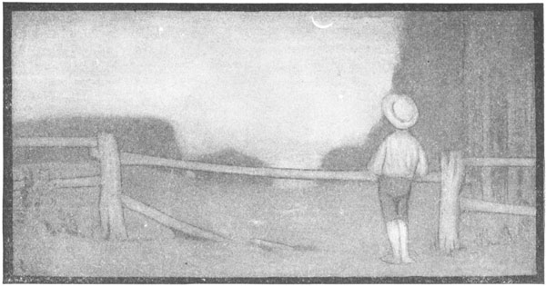
I LIKE TO SEE IT LAP THE MILES,
AND LICK THE VALLEYS UP,
AND STOP TO FEED ITSELF AT TANKS;
AND THEN, PRODIGIOUS, STEP
AROUND A PILE OF MOUNTAINS,
AND, SUPERCILIOUS, PEER
IN SHANTIES BY THE SIDES OF ROADS;
AND THEN A QUARRY PARE
TO FIT ITS SIDES, AND CRAWL BETWEEN,
COMPLAINING ALL THE WHILE
IN HORRID, HOOTING STANZA;
THEN CHASE ITSELF DOWNHILL
AND NEIGH LIKE BOANERGES;
THEN, PUNCTUAL AS A STAR,
STOP—DOCILE AND OMNIPOTENT—
AT ITS OWN STABLE DOOR.
EMILY DICKINSON
The Circle in Three Positions.
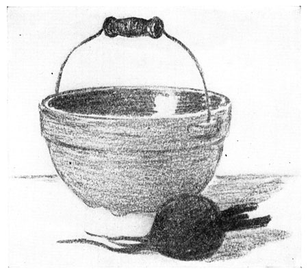
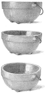
In order to understand the sketches on this page, you must place a large
bowl on a table in front of you, so that its top will be exactly opposite
the level of your eyes. You can manage this by putting some books on the
table for the bowl to rest upon, piling them up until just the right
height is reached. Then sit directly in front of the bowl, and at some
distance from it, as you would naturally do when making a sketch. Hold
your pencil straight out in front, at arm's length, so as to hide the
entire upper edge of the bowl. If the top of the bowl is exactly opposite
your eyes, your pencil will be exactly horizontal when it hides the edge
from you. You will not be able to see into the bowl, nor to find that the
edge curves above or below the pencil. The appearance of the circular
top, in this position, will be a horizontal line.
If you lower the bowl a little, you will find that you can no longer hide
the top with a horizontal pencil. The top looks more natural in this
position. You have often drawn a narrow ellipse for the appearance of a
circular shape seen slightly below the eye.
If the bowl is lowered still more, the ellipse will appear wider from
front to back.
Make sketches from a bowl, in these three positions.
The Foreshortened Circle.
When a surface, because of its position, appears less wide than it really
is, we say that it is foreshortened. The circular top of the bowl appears
in three positions on page 59. In the first picture it is foreshortened
to such an extent that its width from back to front has disappeared
altogether. In the second, the foreshortened circle appears as a narrow
ellipse. In the third, the ellipse is wider, because the bowl is seen
further below the eyes.
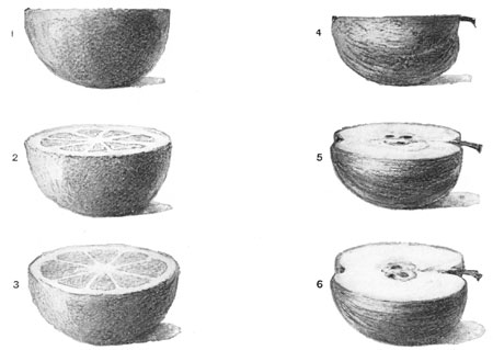
On this page are some sketches of a half-orange and a half-apple. Can you
tell the positions in which they were held? Notice the foreshortened
circle in Sketch 2. The sections of the orange are changed in appearance
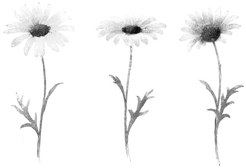
very much as the petals of the daisy are foreshortened, in the middle
sketch on page 22.
Read again the lesson on page 48. Then decide which sketch of the
half-orange is most pleasing. Which picture of the half-apple do you like
best?
Draw a half-lemon in a position showing a foreshortened circle of
pleasing proportions.
The Foreshortened Square.
Circular shapes are not the only ones that are foreshortened when they
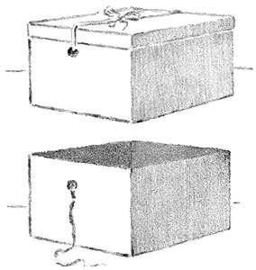
are seen under certain conditions. Figure 1 on this page is a picture of
a square hat-box, showing the top and two sides. Not one of the three
shapes is seen as it would actually measure. The top looks like a long
narrow diamond. It is not so different from the shape of a narrow ellipse
as you might at first suppose. If you changed the straight lines into
curved lines, rounding off the four corners or angles of the diamond, you
would have an ellipse. You could also place a box like this turned
cornerwise, so that its top would look like a straight line. Where would
the top be to look like that?
The two sides of the box are also foreshortened in this position; they
appear shorter from front to back than they really are. You can see that
the two farther vertical edges or corners appear shorter than the nearer
one, just as trees in the distance appear smaller than trees of equal
size near you. The lines on the top and bottom of the box appear to slant
upward, instead of keeping their actual direction, which is horizontal.
Figure 2 shows the same box with the cover off. The inside was lined with
colored paper and the dark value of the diamond-shaped mass adds interest
to the picture.
Place cornerwise, on a table in front of you, a large box with a square
top. See if the three faces in sight are foreshortened. Notice if the
edges appear changed, in direction and in length. Make a sketch in
outline, showing just how the box appears to you.
Measuring a Foreshortened Surface.
A good way to prove to yourself that the appearance of a surface or shape
differs from its reality, is to test it in some way.
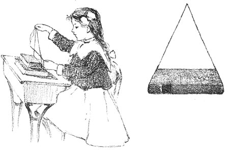
The girl in the picture is measuring the appearance of a book. She has
put two books on the desk, with their backs facing her. Under the cover
of the top book she has placed a string long enough to allow her to hold
both ends of it in one hand, in such a way as to hide the two ends of the
cover. She knows that in reality the ends of the cover do not slant; they
are perfectly horizontal. But she finds that to hide the ends of the
cover she must bring the lines made by the string toward each other. This
proves that the ends of the book in this position must be represented by
slanting lines. When the strings hide the ends of the cover, she finds
that they meet directly opposite the eye. Holding the string tight, and
keeping their meeting point exactly opposite the eye, she slips a
horizontal pencil between the two lines, starting near the place where
they meet, and moving down until the pencil hides the further edge of the
cover. The appearance of the cover is shown in the space bounded by the
horizontal pencil, the nearer edge of the cover, and the two slanting
parts of the string seen between them.
Arrange a large book on the desk in front of you. With a string, make the
test that has been explained. Draw in values what you see.
The Study of Perspective.
What a Picture may Show Us. The pencil sketch on the next page would be
quite difficult for you to draw, but it is not too difficult for you to
understand and enjoy. It is one that will help you to use your eyes
intelligently, in trying to find out of doors some of the things that are
shown you in pictures. One of the best things that pictures can do for us
is to help us to see in our own surroundings things that are interesting
and beautiful.
Perspective. The lessons in this chapter have helped you to see how
surfaces and shapes change in appearance, as they are seen under
different conditions. You have also found that certain edges and outlines
appear to change their direction, when seen in different positions. There
is a name given to the study of these things, which you will often hear
used. It is perspective. Perspective is only another name for the study
of appearances, as differing from facts. You will hear some one say, for
instance, that a certain sketch or picture is good in perspective; you
will understand that the picture shows, in some interesting way, the
effect of distance and position, or how certain appearances differ from
actual facts.
Perspective of the Railroad. One of the best places in which to study
perspective is on a bridge over a railroad track. You have noticed, no
doubt, how the rails seem to come together as they stretch into the
distance, and how the telegraph poles seem to grow shorter and shorter,
until they disappear altogether. You know that the rails are just as far
apart a mile away from you as they are at your feet, but a sketch drawn
so would not be correct in perspective, because it would not show how the
track looked.
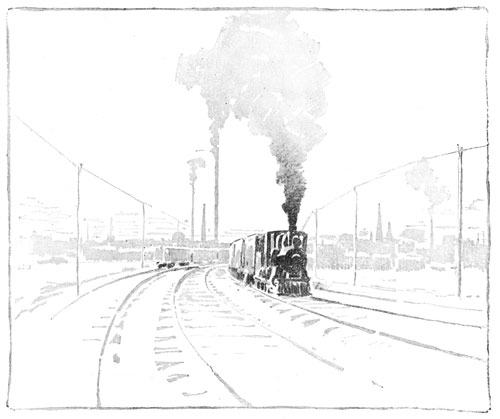
Perspective Affecting Apparent Size. The sketch on page 58 will
interest you. Have you watched an engine grow from a mere speck in the
distance to its full size as it rushes past you, and then grow smaller
and smaller again as it hurries away, and finally disappears in the
far-off horizon?
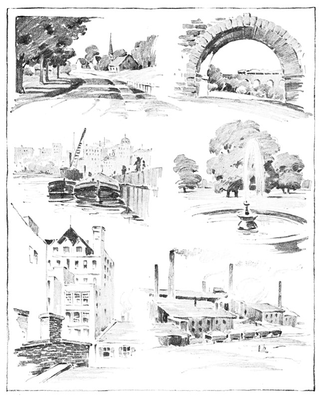
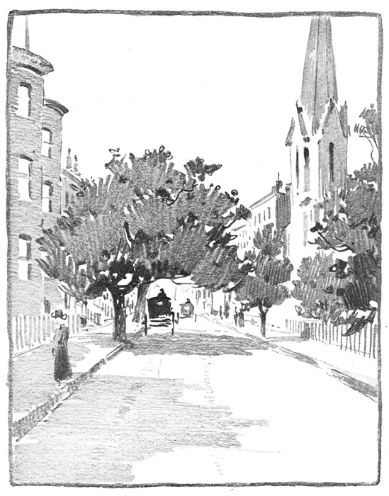
Perspective of a Street. Do you see anything on page 64 that makes you
think of the railroad? If you stand in the middle of the street and look
down its length you will notice that the lines of the sidewalk seem to
run together, that the trees and houses decrease in height as they are
seen farther away, and that people in the distance appear smaller than
people near you. When you can see these effects for yourself, you will
begin to understand what the study of perspective means.
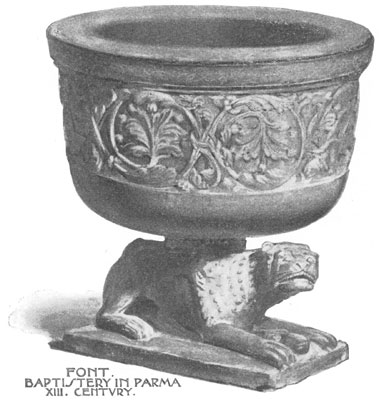
A Beautiful Baptismal Font.
In the fine old city of Parma, in northern Italy, is a beautiful
cathedral, built hundreds of years ago. Near the cathedral is a building
much smaller in size called a baptistery, a place where baptisms are made
in connection with church services. This baptistery is built of red and
gray marble, and is one of the finest in Italy. It contains but one room,
and in the middle of its floor, under the beautiful dome, is a very large
font, carved from one piece of yellowish red marble. In one corner of the
room is a smaller font—the one shown you on this page. It is standing on
a lion whose paws are set upon the head of a ram, and it is richly carved
in foliage and in strange animal forms. To it are still brought for
baptism all the children born in Parma.
Some Tools With Which to Measure and Plan.
By the time you have come to this chapter in your book, you will have
drawn a great many pictures of objects. In doing this you have depended
on your eyes and hand alone. You have not used a ruler to measure with,
nor any tool that would tell you the exact length of a line or the exact
size of any shape.
But sometimes it is necessary that a line or shape should be of exact
length or size. On this page are shown some very simple tools which you
can make yourself, and which you will find useful in carrying out the
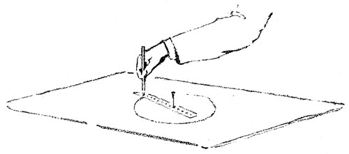
lessons in this chapter on Measuring and Planning. Figure I is a "circle
maker." It can be used in place of a compass. To make it, take a strip of
cardboard seven inches long and one inch wide. Bisect its short edges and
rule a line connecting these points. Upon this line, mark off, by
measuring with a ruler, inch, half-inch, and quarter-inch spaces. Through
these points draw lines, and pierce holes with a pin where they cross the
center line. A pin placed through the first hole will act as a pivot.
Push a sharp pencil through one of the other holes, just far enough to
allow the lead to make a mark. The pin marks the center, and the pencil
swings around it, as shown in the sketch at the top of page 68. The line
drawn by the pencil is the circumference of the circle. The distance
between the center and the circumference is the radius of a circle. We
speak of one radius and of two or more radii of a circle.
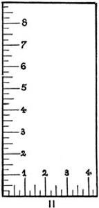
Figure II is a little tool that will help you to draw square corners.
Mark with a ruler upon an end and one side of the back of an envelope,
the spaces for inches, and their divisions into halves and quarters.
"Square corner" is another name for right angle. You will often wish to
use this measure, called a test square, in squaring corners, and in
drawing lines at right angles to each other. A No. 9 envelope will be a
good size to use, as the long edge will serve as a ruler. You can make
the drawings in this chapter with a ruler and compass, or you can use
these simple tools, made by yourself.
Dividing a Circular Space.
There are many ways in which a circular shape may be divided and
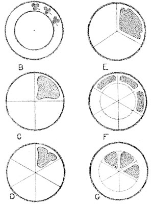
decorated. Sketch B shows two circles drawn around the same center, with
different radii. Such circles are called concentric. Sketch C shows the
circle divided into fourths. To do this, place the angle of your test
square at the center of the circle and rule two radii. Repeat to secure
four right angles at the center of the circle.
Sketches D, F, and G show circles divided into sixths, by setting off the
radius six times on the circumference, and drawing diameters connecting
these points.
Sketch E shows a circle divided into thirds. Set off the radius six times
on the circumference; draw a radius from every other point.
Draw concentric circles, and divide them into halves, fourths, thirds,
and sixths.
Some Divisions of Square Spaces.
A square is said to be on its diameters when one of its diameters is
vertical and the other horizontal; it is said to be on its diagonals when
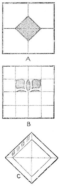
the diagonals are in this position. Sketch A shows the larger square on
its diameters and the small inner square on its diagonals.
To draw a square on its diameters, place your test square to locate the
lower left corner of the square, and draw the two sides at right angles,
extending the lines to the desired length. Use your test square in
drawing all other corners of your square. For the diameters, bisect each
side and connect the points of bisection. For a design plan like Sketch
A, bisect the semi-diameters and connect these points. Diameters of a
square bisect opposite sides; diagonals bisect opposite angles.
In Sketch B, each side is quadrisected, or divided into fourths, and the
opposite points connected. This division of a square may be used for a
decorative plan in a number of ways, one of which is shown in the sketch.
To draw a square in the position of Sketch C, use your test square, and
draw the diagonals first, dividing them into inch spaces. Connect the
ends of the diagonals to get a square. In the plan for the border design
in Sketch C, connect the outer points on the diagonals to form the space
for a border decoration.
Draw two squares, one on its diameters, and one on its diagonals. Show by
divisions made in each, some plan for a design.
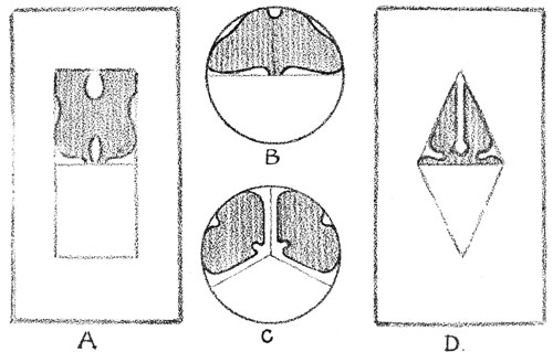
How an Oblong Space May be Divided.
You can draw an oblong with your test square in the same way that you
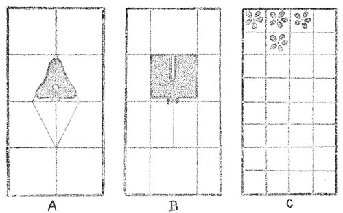
drew a square, measuring the sides to get the length you wish. In Sketch
A the semi-diameters are bisected and the points connected, forming a
diamond-shaped space, something like a square on its diagonals. In making
the unit used in the upper half of this space, the lines of the triangle
are changed very slightly, but this change makes an interesting
decoration. In Sketch B the sides are quadrisected, and the space is
divided by connecting some of the opposite points, making an oblong on
its diameters for the middle space. In the upper half of this space a
simple shape, very like a square, is used. It can be reversed, as can the
triangular shape in Sketch A, to fill the lower half of the space.
Sketch C shows a plan for dividing the oblong into many small squares. In
each of these, or in every other one, a simple unit could be placed, to
make an "all-over" pattern.
Draw an oblong, and by dividing its sides, make a plan for a decorative
design. Show how a decoration can be made by slightly changing the lines
of an enclosing shape.
The Equilateral Triangle.
With the help of your circle maker or compass you can easily draw an
equilateral triangle.
Rule a horizontal line of any desired length, for the base of your
triangle—that side upon which the triangle seems to rest. Place the
pivot of your circle maker at one end of the line, and take a radius
equal to its length. Draw above this line part of the circumference of a
circle, called an arc. Then take as a center the other end of the
horizontal line, and with the same radius, draw an intersecting arc. Rule
lines from the intersecting arcs to each end of the line. You have drawn
an equilateral triangle.
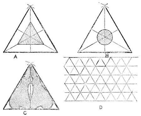
Sketches A and B show you how an equilateral triangle may be divided.
Sketch C shows how one line may divide the triangle into two shapes,
whose outlines may be slightly changed or modified, to make a decoration.
For a surface covering like Sketch D, construct one equilateral triangle
and carry the base line across the paper. Rule a line parallel to this,
passing through the apex of the triangle. Set off upon these lines
lengths equal to one side of your triangle. Draw lines connecting these
points, as shown in the sketch. Repeat this process for a surface
covering.
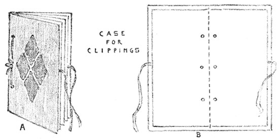
A Case for Newspaper Clippings.
When you know how to measure accurately and can plan good proportions,
you can make many simple articles, both useful and beautiful.
To make the case for newspaper clippings shown on this page, cut an
oblong of stiff manila paper, 8 ½ × 9 ½ inches. Use your test square
in measuring all corners, to get right angles. Then cut an oblong 9 ½ ×
10 ½ inches of "cover" paper, of some good color. Fit the manila oblong
within this, in such a way as to leave an inch margin of colored paper
all around it. Fold over this margin, pasting it down neatly. Cut an
oblong 8 ¼ × 9 ¼ inches, of tinted paper of lighter weight. Lay this
oblong as an inside lining to the cover, pasting to leave a narrow margin
of the dark cover paper around the lining. Place the cover on your desk,
with the long edges from left to right. Fold the nearer edge to meet the
farther edge. Crease well. Bisect the crease, and place a point 3⁄8 of an
inch up from the crease. Measure three inches from each end, and place
points at these distances, 3⁄8 of an inch up from the crease. Within the
folded cover, place six or eight No. 9 envelopes, the bottom edges of the
envelopes touching the crease. Fit the envelopes within the cover, to
leave an equal margin around the front and ends of the case. Holding the
envelopes firmly within the cover, make holes with an eyelet punch at the
points placed for them. Tie the envelopes in the case with raffia, tape,
or cord.
How to Draw Letters.
Before the Days of Printing. There was once a time when all the books
in the world were lettered by hand. This hand printing was done by men
called monks, who lived in monasteries, away from the noise and bustle of
the world, and who often devoted their whole lives to the lettering of
religious books. They did this lettering on sheepskin or parchment
instead of on paper, and they spared no pains in making these manuscripts
as beautiful as possible. Color was often used for initials and for
capital letters, and sometimes artistically designed borders were placed
around the lettering, making each page in these manuscript books as
beautiful as a picture. The great amount of time that was necessary to
make one of these books made them very expensive, and only people of
great wealth could own them.
Type and the Printing Press. When type and the printing press were
invented, the printer at first tried to make his pages look like the
manuscript pages of the monks. For this reason, the earlier printing was
artistic, although the letters were not as clear and perfect as type
letters are now. The first books printed from type were also expensive,
but little by little the process was made cheap, until at last type
letters lost much of their beauty. Lately, however, printers have
realized that single letters are like design units in an all-over
pattern. The size of the letters, their shapes and thickness, the spaces
between them, and the spaces between the lines are all of great
importance.
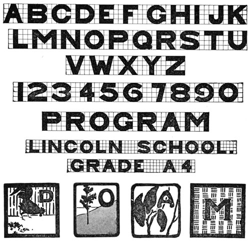
A Simple Alphabet. On the next page is a simple alphabet, planned on
squared paper. You can print in this style, any title or words you may
wish on a program or book-cover. Plan your printing on a separate piece
of paper, marking the height of the space you intend to fill with the
letters. Quadrisect this height and draw through these points horizontal
lines. Lay off on the lower horizontal, distances equal to the
quadrisection. From these points erect vertical lines, using your test
square. Mark in a sketchy way the width of each letter in the word you
are planning, making the thickness of each letter the width of a square,
and leaving the same distance (the width of a square) between each
letter. Be careful to keep uniform thickness in slanting lines and
curves, as in K and C. Avoid angles in your curves. If you have more than
one word in your line, leave three squares for the space between the
words, and if more than one line of printing is used, guard against too
much space between the lines. The width of two squares would be a safe
distance in a style like this.
Transferring the Letters. When your plan is complete, rub soft lead
pencil evenly over the back of the paper, and place the plan exactly
where you wish the lettering to go, on your book-cover or program, with
the lead painting next to the cover. Then mark over the letters with a
sharp point, and a faint tracing will appear on the under surface. You
can then finish your lettering in ink or color, as you prefer.
All lettering must be done with much care, with exactness, and with the
greatest neatness.
Colors in Full Intensity and their Neutral Values.
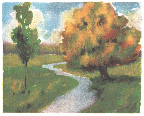
Light and Dark Colors. When you painted an autumn scene like the one on
page 2, you found that it could be done with three colors—yellow, red,
and blue. Blue made the sky and water; blue and yellow the grass and the
foliage of the smaller tree; blue and red the distance; yellow, red, and
blue the tree trunks and the autumn colors of the large tree. Look again
at the sketch. Do you see that the two trees are darker than the grass,
that the water and the sky are of nearly the same value, and that the
tree-trunks are the darkest colors in the picture? In the winter scene on
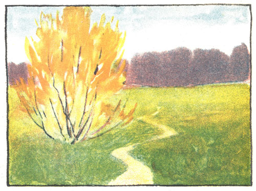
page 8, and in the spring picture of the yellow bush, both dark and light
colors have been used. The colored flower studies all show dark and light
colors. Both light and dark colors are needed to express truth and
beauty, just as in music we need both high and low tones for perfect
melody.
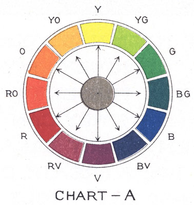
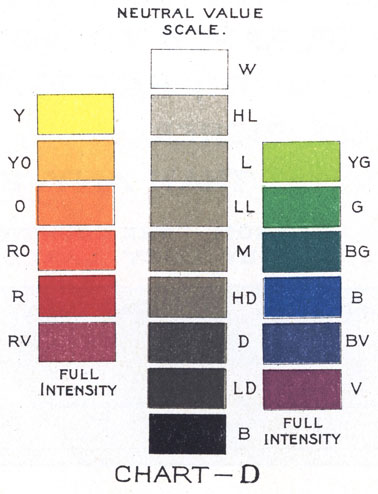
An Orderly Arrangement of Colors. In Chart A these colors are arranged
in an orderly way. Yellow (Y) is the lightest color and is placed
directly opposite violet (V), the darkest color in the circle.
Yellow-orange (YO) and yellow-green (YG) come next to yellow on either
side. Then orange (O) and green (G) follow, and next to them are
red-orange (RO) and blue-green (BG). Next in the circle are red (R) and
blue (B), and after them red-violet (RV) and blue-violet (BV). The colors
in the chart are the strongest that your three colors can make. Colors of
this strength are said to be in full intensity.
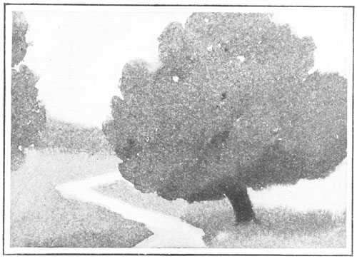
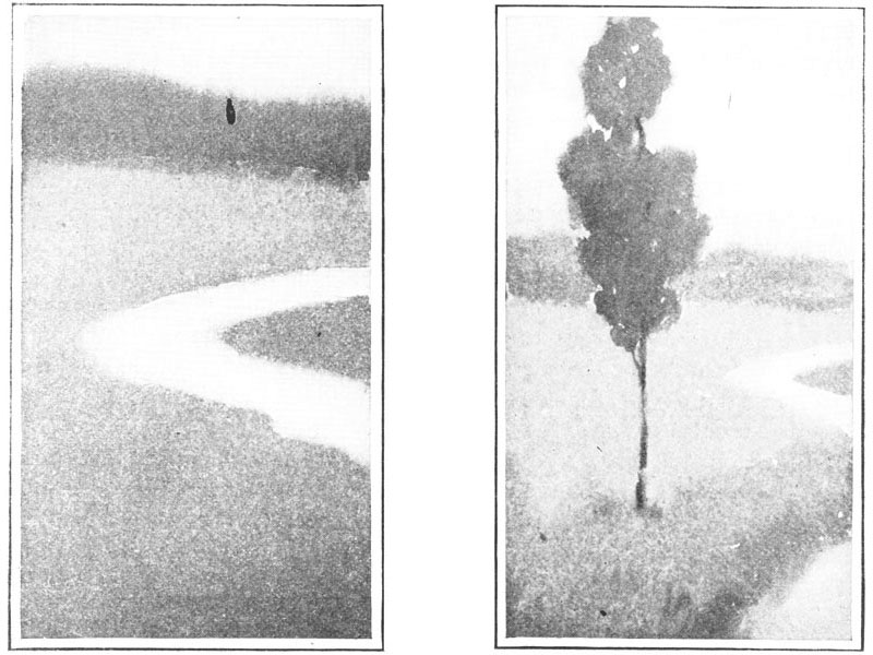
Expressing Colors in Neutral Values. On page 4 are "finder" pictures
taken from the autumn scene on page 2. These are done in gray washes that
correspond to the colors in the autumn sketch. The trees are shown in
grays that make them just as dark as the trees in the colored picture.
When we make gray washes just as light and as dark as colors that we wish
to represent, we say that we express those colors in neutral values.
The Neutral Value Scale. In Chart D the scales are arranged to show the
grays or neutral values that correspond to the different colors in their
full intensity. In this chart yellow is as light as the gray wash called
High Light (HL). Yellow-orange and yellow-green are of the same value as
Light (L). Orange and green are of the same value as Low Light (LL).
Red-orange and blue-green are of the same value as Middle (M). Red and
blue equal the neutral value High Dark (HD). Red-violet and blue-violet
are equal to Dark (D), and violet, the darkest color, is expressed by Low
Dark (LD). Low Dark is almost black.
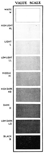
The Neutral Value Scale.
A scale of neutral values, larger in size than that on page 78, is
printed on this page. White and black are added. They do not correspond
to any color, but they help us to see the many steps that may be taken
between them. Only seven of these steps from black to white are shown in
our scale. Of course there are other grays, not represented in the scale,
just as there are tones of music not expressed in the musical scale or
octave. The musical scale and this value scale are used to help locate
all other notes and all other degrees of light and dark. You could make,
for instance, other grays between High Light and White. But it is useful
to know that certain grays have definite names, and definite places in
the scale.
With the aid of this larger scale, we can more easily compare the values
of the colors of a landscape, a flower, or a still-life group with the
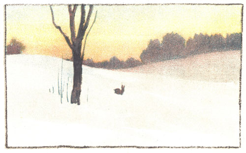
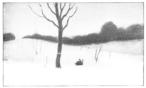
same values in gray. Turn to pages 8 and 9. On page 8 the winter
landscape is in color, and you see the same scene on page 9 in neutral
values. In it the sky and part of the snow are of the same value, and
they match the gray marked High Light in the scale. The distant hill is
Low Light; the dark band of trees on the horizon is High Dark, and the
tree in the foreground is Dark. In this way you can find in the scale the
neutral values used in a picture.
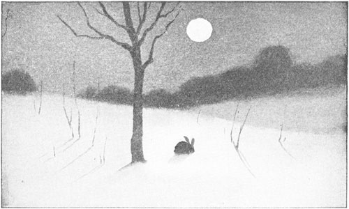
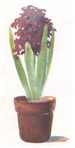
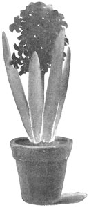
Name the values of the hyacinth, on page 53. What values were used in the
moonlight picture on page 10? Make a little scale showing these values
and giving their names.
Dividing a Space into Large and Small Spaces.
Plaids are most attractive when seen in color. Before the color is added,
however, definite spaces must be divided by lines into other spaces,
making an interesting variety. In drawing from flowers, you found that a
spray showing large and small shapes made a more interesting sketch than
one in which leaves and flowers were of uniform shapes and sizes.
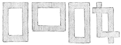
Sketches 1 and 2 show how vertical and horizontal lines may divide a
square into a variety of spaces. Either arrangement is more beautiful
than sketch 3, where the spaces are more nearly alike. Look at the
still-life group in sketch 4, where the three objects are so nearly of
the same size. Do you think this group as pleasing as the group shown in
sketch 5? Our designs, as well as our pictures, must show variety and
good arrangement of shapes and spaces, in order to be interesting.
Too much variety in a picture or design is as bad as not enough variety.
Look at the number of lines and spaces in sketch 6. The design is crowded
and "fussy," like an overtrimmed bonnet, or a room in which there is too
much furniture. The still-life group in sketch 7 shows the same effect of
too much variety.
Draw four squares, each four inches on a side. Divide each into large and
small spaces of pleasing variety by using vertical and horizontal lines,
four inches in length.
Large and Small Spaces in Two Values.
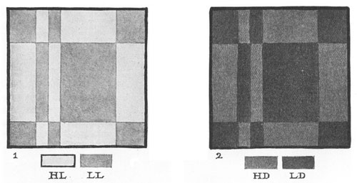
One way of adding to the interest and beauty of large and small spaces is
to show them in values. Compare Sketches 1 and 2 on this page with
Sketches 1 and 2 on page 81. You will find the plaids which are shown in
values more interesting than those which are made with lines only. The
two values in each sketch on this page are chosen from the neutral value
scale on page 80. In Sketch 1, High Light (HL) and Black (B) are used,
and in Sketch 2, we find Middle (M) and Black (B). You see how different
in effect the two plaids are. The same difference can be shown in
landscape, flowers, or in any other picture or design, by changing the
values. Sketches 3 and 4 show simple groups of still life, first drawn in
outline from the objects, and then painted in values chosen from the
value scale. Sketch 3 is painted in the same values as the plaid in
Sketch 1, and Sketches 2 and 4 are alike in values.
Choose two of your best plaid designs, done in the lesson on page 81, and
paint the spaces in one, HL and B; in the other M and B.
Pictures in Different Keys.
In your study of music you have learned to sing in different keys. Some
songs are pitched in high keys, and others in low. Or, the same song may
be sung in several different keys. The tune or melody remains the same,
but there is a difference in the sound.
Pictures are sometimes spoken of as being painted in keys. If the darker
values of the scale are used, the picture is said to be in low key. If
the picture is full of light color, it is said to be in a high key.
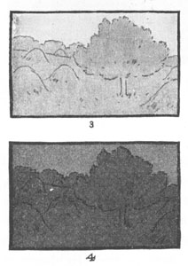
Sketches 1 and 2 show you how different the same design appears, when
painted in different keys. Sketch 3 is a landscape in the same values
used in Sketch 1. Sketch 4 shows the same scene in a lower key. The soft,
silvery light of early morning has given place to the deeper tones of
dusk.
Draw two four-inch squares and divide them alike into large and small
spaces. Using two values, paint one in a high key, and the other in a low
key. Make a little scale under each sketch, naming the values you have
used.
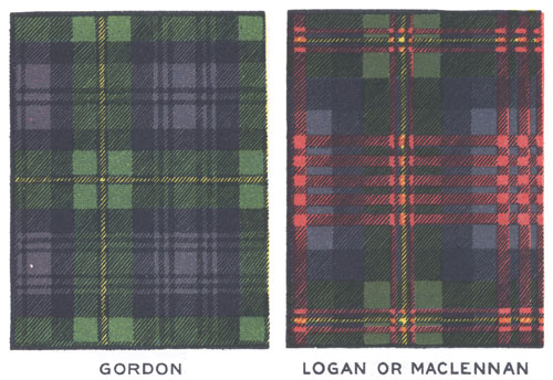
Scotch Plaids.
Long, long years ago, before the days of kings and queens, people lived
together in great families or tribes. In Scotland these tribes were
called clans, and the sign or badge of a clan was shown in the tartan
plaid. This was a heavy piece of woolen cloth worn over the shoulders, as
a protection from the weather. A sort of skirt, called a kilt, was made
from the same plaid, and this costume was worn by both men and women of
the clans in the Highlands of Scotland. The tartans were woven in bright
colors, forming designs like those at the top of this page. They were
often very beautiful in their arrangement of spaces and colors. Each
different design received a name from the clan that wore it. Those at the
top of this page are the Gordon and the Logan or MacLennan tartans.
Copy in colors some good plaid design, that you can find in ginghams, in
silk, or in woolen cloth.
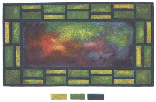
A Stained Glass Window.
Some stained glass windows are as beautiful to look at as fine paintings.
Their rich colors glow with light, and they show an interesting variety
and arrangement of shapes. They are usually made of colored glass, held
together by lead grooves. These are represented in the design on this
page by the heavy black lines.
You can make with water-colors an effect very much like stained glass.
With pencil, draw an oblong ten inches long and about seven inches wide.
Within this, draw another oblong, for the central piece of glass. The
size of this inner oblong you must determine for yourself. Remember that
its size fixes the width of the border. In the border space, draw some
simple straight line design. Paint the smaller oblong, by wetting its
surface evenly, and dropping in red, yellow, and blue. Let the colors
blend as they will, and use the brush to carry color to the edges of the
oblong. When this is dry, paint the shapes in the border in flat washes
of any two colors. Last of all, paint strong, black lead lines.
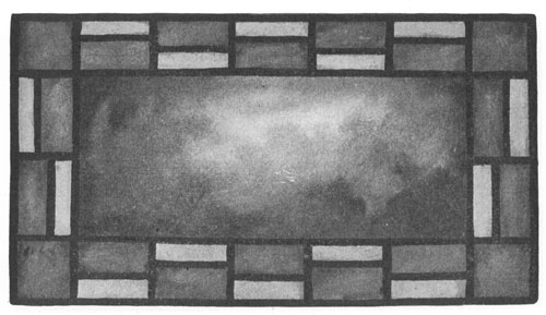
The Stained Glass Window in Values.
The greater part of the illustrations which appear in books and magazines
is done in neutral grays. All sorts of color effects are represented by
grays in these different pictures, and this is done by people who
understand just what neutral value is needed to represent a certain
color, its tints, or its shades. You have often represented flowers,
landscapes, figures, and still life in gray washes, or with pencil or
charcoal. In Chart D you see that certain colors like yellow,
yellow-orange, orange, yellow-green and green are represented in their
full intensity by grays chosen from the upper end of the neutral value
scale, and that the darker colors like red, red-violet, blue,
blue-violet, and violet are represented in their full intensity by the
grays below middle gray.
Compare the colors you used in making your stained glass window design
with Chart D on page 77. Draw the same plan that you used for your
colored design. Cover the smaller oblong with a water wash and drop in
charcoal-gray, in values to suit the light and dark colors in your
stained glass window design. Fill the small oblongs in the border with
flat washes of gray. Try to determine just what grays would represent the
colors you used. Your lead lines should be of even thickness throughout.
Draw them when the rest of the work is thoroughly dry.
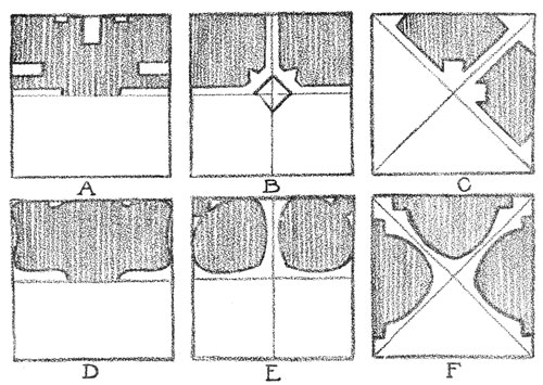
Several Ways of Decorating a Square Space.
On pages 69, 70, and 71 you learned how to draw and divide certain
shapes. You saw that by slightly changing the direction of construction
lines, decorative designs could be made. Construction lines are lines
used in drawing and dividing a shape. They may or may not be retained,
after the design is finished. In Sketch A on this page the four sides of
the square and the horizontal diameter may be taken as construction
lines. By following these lines with a narrow pathway and slightly
changing the direction of parts of them, designs can be made in great
variety.
In Sketch B diameters are drawn and in the center is a small square on
its diagonals. Little pathways lead from the sides of the square to the
center, resulting in a four-sided decoration. In Sketch C diagonals are
drawn and pathways sent along them to the center. Sketches D, E, and F
are like A, B, and C, except that curved lines have been used instead of
straight lines.
Draw six four-inch squares. Copy the construction lines and their
modifications as shown in the six sketches on this page. Finish each
design and strengthen the lines which will bring out the decoration.
Decorating an Oblong Shape.
The oblong is a favorite shape for book-covers, envelopes, card-cases,
portfolios, and other articles that can be made in the school-room.
Hundreds of objects about you in school and at home are also based, in
their proportions, on the oblong. Think of the books, boxes, rugs, doors,
and windows, that you constantly see. They are nearly always shaped like
an oblong. You will be interested to know some of the ways in which
decorations for these objects are planned. In a rug or a book-cover, for
instance, we often wish a design similar to that shown in Sketch A. In
planning for this, a smaller oblong was drawn within the larger one. The
lines of the smaller one were used as construction lines, and these were
modified in the same way as were the construction lines of the square on
page 87.
In Sketch D, the diameters of the oblong were drawn and the
semi-diameters bisected. Then these points were connected. In both Sketch
A and Sketch D, all construction lines not used in the design were
erased.
Draw two oblongs not less than eight inches high, and wide enough to make
a panel of pleasing proportions. Plan and draw designs similar to, but
not exactly like, those shown in Sketches A and D.
How to Use Shapes from Nature in Design.
If all our designs were like those which can be made by following the
construction lines of certain definite shapes, we would very likely grow
tired of seeing so much decoration of that kind. We may get many ideas of
beautiful lines and shapes from a plant or a flower, and we may use these
ideas in making designs, as the drawings on this page and the next will
show.
Look at the sketch of the marsh-marigold, and then at the small drawings
at the right. A is a petal, B is a stamen, C is a side view of the
flower, showing three petals and a stem, D is a leaf, and E a bud and
stem. In these sketches the lines are even, the shapes are regular, and
all "accidents of growth" are omitted. Sometimes the shapes were drawn
larger than their true size, and sometimes the parts were separated, as
in C and E. We need not copy just what we see, but we may modify shapes
or change their size and arrangement to suit the spaces which they are to
fill.
Study a wild flower in this way. See how many design ideas you can get
from one plant.
Shapes from Nature in Borders and Other Decorations.
Nature has suggested some of the most beautiful decorations we have. In
the baptismal font on page 65, the carved decoration was evidently from
the growth of a vine. The vine is not represented exactly as it grew. A
decoration that showed the actual appearance of the plant would not have
been adapted to the space.
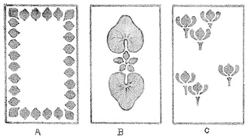
In the three oblongs on this page, the marsh-marigold shapes have been
used in three ways. In Sketch A, the petals of the flower were used in a
border design, and the size of the unit, or shape repeated, was carefully
planned. If the petal shapes had been drawn larger, the border would have
been too heavy for the size of the oblong.
In Sketch B, two leaves and an arrangement of petal shapes suggesting the
flower were used, and in Sketch C, the side view of the flower and a part
of the stem form a unit which is used to "spot" the oblong. These spots
are not crowded, but are placed with careful thought as to the best
appearance of the oblong. No matter how beautiful a unit, a border, or a
central group may be in itself, we must think of its effect upon the
object to be decorated.
Draw three oblongs four times the size of those on this page. Decorate
these with a border, a central group, and by spotting. Use the design
ideas you found in the lesson on page 89.
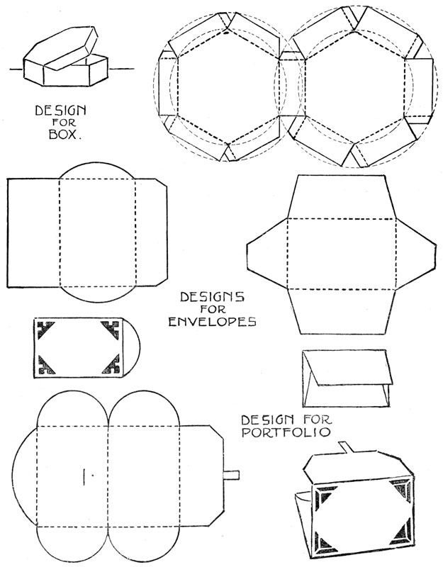
A Simple Design for a Portfolio.
Good proportion and the right arrangement of light and dark values will
often make an object beautiful, without the addition of ornament. In the
chapter on still life, the objects you studied were not decorated, but
they were well designed in their beauty of proportions, their color, and
their contrast in values.
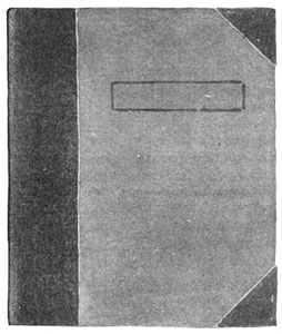
Many familiar objects such as envelopes, boxes, and book-covers, depend
for beauty on these simple elements. The sketch of the portfolio on this
page is beautiful because it has a fine proportion of parts, and because
the gray values of these parts are harmonious. If the dark band of the
back had been wider or narrower, if the space for the name had been
placed differently, or if the size of the corner-pieces had been changed,
the harmony of parts would have been disturbed, and the portfolio would
not have been beautiful. Or, if the dark gray trimming had been black,
there would have been too great a difference between the values used, and
that again would disturb the harmonious effect of the whole. You can tell
how large to make the parts, where to put them, and what arrangement of
values to use, only by trying several ways, and then selecting the most
beautiful.
This portfolio may be made by pasting tinted paper or book linen over
cardboards. The boards should be covered first with the material chosen
for the outside. Then the corners and back should be added, and a lining
of paper pasted across both boards on the inside. The space for a name on
the outside should be carefully planned. Within this space should be
drawn very carefully, the letters of any name you may wish to place on
the portfolio.
Color Schemes from Nature.
In the world about you, every object that you see has color. From the
bright colors you can so easily see in flowers, leaves, grasses, and the
sunset sky, to the grayed colors of tree trunks, clouds, the ground, and
buildings, there is the greatest variety and range. Even in the
moonlight, objects though greatly changed in effect, still have color. If
it were not for this, we could not see them. It is only in the darkest
night, when we can see but a few feet ahead of us, that objects seem to
lose their color.
In our houses, too, everything has color—not the bright hues that we
find in flowers and landscapes, but softer, grayed color. We would not
like carpets and wall-paper of the bright color we find in poppies, for
instance. The colors we use in our furnishings should not be glaring and
intense, but quiet and restful. To find these color relations, and to
train the eye to know and enjoy fine color harmonies, we study what
artists have done, in paintings and other works of art. In nature, too,
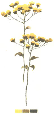
we find color suggestions in endless variety. In autumn the world is
flooded with rich color. Even the common weed that is shown you on this
page shows a combination of colors that would be safe to use in any work
of our own. See how the colors in the plant have been arranged in a
little scale. Such an arrangement is called a color scheme.
Make a sketch in color from some plant or seedhead. Under the sketch,
arrange in little oblongs the colors you found in the plant.
Using one of Nature's Color Schemes.
Nature's color schemes become most interesting to us when we use them in
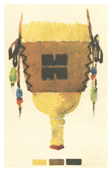
some work of our own. The brush-broom holder on this page shows in its
coloring the scheme found in the plant growth on page 92.
In making a holder of this kind, choose materials that will be strong,
and that will look well together. Pasteboards should be cut in good
proportions, of a size and shape to fit a particular broom. These should
be covered on both sides in the same way that you covered the sides of
your portfolio on page 91. The material for this covering may be stout
paper, linen, plain gingham, or leather, colored to suit one of the
colors in the scheme you have chosen. A simple design may be placed on
the holder in another color chosen from your scheme. Then holes for
lacing are to be punched in the sides. The cord for lacing should
harmonize in quality and color with the rest of your design. The color of
the broom itself may be brought into harmony with the holder by painting
it with water-color, or by dipping it in a mixture of water-color that
matches one of the colors in your scheme. A few Indian beads of bright
color strung on the lacing strings will add greatly to the effect.
A Raffia Basket.
Many of the baskets made by the American Indians are so beautiful that
they deserve to be classed as works of art. We wonder that a race of
people so savage in their tastes and so wandering in their habits could
have produced articles of so much beauty from the materials they found in
the wilderness of nature. Many of these materials it is impossible for us
to find or to use, but we can make with raffia and rattan, baskets that
are something like those made by the Indians.
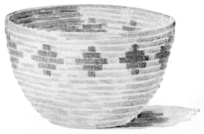
The sketch on this page is from a "soft coil" basket, made entirely of
raffia. The amount of raffia used depends entirely on the size of the
basket. Before beginning the basket, make a sketch showing its height,
the width of the top and bottom, the shape of its sides, and a simple
decoration in color. The bottom of the basket is to be made first,
beginning the coil at the center. The coil should measure about a quarter
of an inch in diameter, and is to be made of a number of strands of
raffia, placed with the large ends together, forming a blunt point. Wind
the strands tightly together with a strand of raffia, one end of which is
threaded through a large needle. Work back from the end until you have a
firm coil about half an inch in length. Start the spiral with this end,
doubling it back, and sewing it firmly in place. Wind the raffia strands
with the strand carrying the needle, sewing the coil thus made to the
center. After the first time around, the stitches should be made about a
quarter of an inch apart, and should be fastened through the upper part
of the last coil. Strands of raffia must be added to the coil, to keep it
of uniform size.
When a new needleful is taken, the end of the winding and sewing strand
must be hidden in the coil. The stitch is the same throughout the basket.
The bottom is kept perfectly flat, and the sides shaped to suit the
design. Any decoration in color, such as is shown in the sketch, is wound
in with colored raffia. When finishing the basket, the coil is to be cut,
and the end tapered, wound, and sewed firmly down to the coil below.
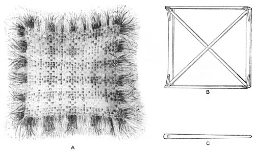
A Woven Cushion-Cover.
Raffia is an artistic material which lends itself to many uses. The
covers for the porch-pillow shown in the sketch on this page are woven
with raffia, on a strong loom. The size of the loom determines the size
of the woven cover. The cushion from which this sketch was made measured
eighteen inches square without the fringe, and about two and a half
pounds of raffia were used in the covers, the fringe, and the filling of
the cushion. Sketch C shows the wooden needle used in carrying the
strands of raffia over and under the warp.
Raffia is used both for the warp and the woof of the weaving. In
"stringing" the loom, fourteen to sixteen pieces of raffia should be used
as one strand or thread of the warp, and these strands should be tied
firmly to the ends of the loom. As many of these strands must be used as
can be tied on the loom without crowding. They may touch, but not
overlap. In weaving, the large needle is threaded with raffia to make a
strand equal in size to the strands of the warp, and this strand is woven
under and over the strands of the warp, making the familiar "basket
weave." The ends of the strands used in this way form the fringe, which
is trimmed to the desired length when the weaving is done.
Stripes, plaids, or simple figures may be woven in with colored raffia.
The two sides of the cushion may show different designs.
Color Schemes from Man's Handiwork.
Leaves, plants, flowers, insects, butterflies, shells, feathers, clouds,
and countless other objects in nature can furnish us with many delightful
color schemes. We can also learn much from the artistic work of people.
In Indian pottery and weaving we often see fine combinations of color.
The Indians understood how to make beautiful dyes from roots, berries,
and other vegetable growths, and the colors obtained in this way have a
peculiar quality and beauty, not found in many of the dyes in common use
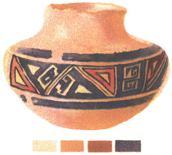
today. The picture on this page is from a fine specimen of Sikyatki
pottery. Sikyatki was an Indian village in New Mexico, and was the home
of a tribe of Pueblo Indians.
When the Indians wished to send a written message they made use of
picture-writing; that is, they made pictures so simple that they are
called signs or symbols. Their symbol of a tree, for instance, would look
much like the tree pictures made by very little children; three short
vertical marks sometimes meant three warriors; a zigzag line stood
sometimes for the lightning, sometimes for a serpent; and a wavy line
extending in a horizontal direction was the symbol of a brook, a river,
or the great ocean.
From a good Indian bowl or basket make an exact copy, and place
underneath it the scale of colors found in the object.
Using Color Schemes in Pottery.
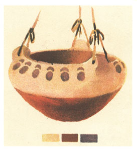
In planning a bowl or vase like the one shown you on this page, a sketch
of the front view should be made showing the diameter of the top and
bottom of the bowl, its height, its shape, the color scheme, and the
decoration. Such a drawing might be called a design for a bowl.
After drawing such a design, the next step is to make the bowl of clay.
For the bowl represented here, a lump of clay was rolled and patted into
a low, roughly shaped cylinder. The thumbs were then thrust into the
middle of the cylinder, and they, together with the fingers, pushed the
clay outward to form the bottom and part of the sides of the bowl. The
sides were finished by adding flat pieces of clay, their edges being
carefully worked until the pieces added seemed a part of the form. The
sides and bottom of the bowl were kept of uniform thickness. Then the
bowl was allowed to stand about a day, or until it became what is called
"leather hard." The border was then painted on with potter's colors, the
lower part of the bowl was colored, and the inside glazed. The bowl was
again allowed to dry, this time very thoroughly. It was then fired in a
potter's kiln.
Make a flower holder of clay. Use the color scheme you found in your
Indian bowl or basket. If possible, fire the bowl in a kiln.