Color, if you stop to think, is really the decorative touch which God
gives to the universe. It would have been just as easy to make
everything gray—every rose but the shadow of itself—every tree and
rock and cloud a monotone of gradation. Instead of that, everything we
look at, from a violet to an overbending sky, is enriched and
glorified by millions of color tones as infinite in their gradation as
the waves of sound and light. Even in the grayest days, when the
clouds are bursting into tears and the whole landscape is desolate as
the barrenest and bleakest of mountain sides, these infinite
gradations of color permeate and redeem its barrenness, and to the
true painter fill it with joy and beauty.
There are many of us, however, who are not true painters and to whom
the most exquisite of color schemes are but dull results. Many of us
walk around our galleries passing the best pictures in silence; others
ridicule what they cannot understand. Even our own beloved Mark Twain,
whose heart was always open to the best and warmest of human
impressions, and who expressed them in every line of his pen, when led
up to one of Turner's masterpieces, "The Slave Ship," a glory of red,
yellow, and blue running riot over a sunset sky, the whole reflected
in a troubled sea, remarked to his companion: "Very wonderful! Seen it
before. Always reminds me of a tortoise-shell cat having a fit in a
plate of tomato soup."
The education of such barbarians belongs to our generation and should
be taken up by those of us who know or think we do. For true color is
as great an educator as true music. This knowledge of color harmony,
this matching and contrasting of different colors, but very few men
and women possess. When they do, it is generally inherited and thus a
natural gift. The rest of the world wear blue and purple, or orange
and green, entirely ignorant of the harmonies of nature even as
bearing on their domestic surroundings. For myself, I have always held
that the most perfect harmonies required in either wall decoration,
furniture, dress goods, or any other fabrics that color enters into,
have their exact counterpart in some color tones of nature—that the
russet-browns and yellows of autumn; the contrasting opalescent hues
of a morning sky, rose-pink, pale blue, or delicate tea-rose yellow;
the gloom of a forest with its yellow-grays and blue-grays, the
gray-green moss of the lichens, the brown of the tree-trunks, the
black and gray hues of the rocks, all these, if carefully studied and
analyzed and reproduced, would make beautiful anything in the world
from a bonnet to a château. To illustrate:
Several years ago an intimate friend of mine, a distinguished
architect of New York, the late Mr. Bruce Price, in designing a number
of cottages at Tuxedo sought in vain for some color mixture current in
the paint-shops with which to cover the outside of his buildings. All
schemes of browns, olive-greens, colonial yellow with white trimmings
and the reverse, Pompeiian reds, slate-grays, and dull yellows
resulted in making "spots" of the houses, so that the effect he wished
to produce, that of the houses being merged into the forest, was lost.
Mr. Price was not only an architect, but he was an artist as well. He
had little skill with his brush, but he had that innate good taste,
with a keen eye to discern the subtle gradations in color, that only
needed change of occupation to make him a painter. One day, looking at
a new bare wooden cottage—unpainted as yet—in contrast to a mass of
foliage in the early autumn before the leaves had begun to turn, in
which the yellow-grays one often sees predominated, he suddenly
thought to himself: "The tree-trunks and underbrush do not stand out;
they are all of one piece, each keeping its place, while my house"—as
he rather inelegantly but forcibly expressed it—"sticks up like a
sore thumb." Later, this very clever man made an analysis of the local
color in these several grays, and his subsequent matching and
combining of these different tints resulted in the exact tones of the
forest before him, and when this was completed and the house painted
you felt should you enter the front door that the leaves must be over
your head.
Bringing the discussion down to more practical details, really to the
palettes which we hold in our hands, the question then naturally
arises as to how best to express true local color, with its varying
blues, yellows, and reds, and especially its varying grays.
In my own experience I find grays to be the prevailing tones
everywhere in nature.
I find also that the great masters of modern art, particularly the
school of 1830, known as the Barbizon school, and represented by such
men as Rousseau, Corot, Daubigny, Diaz, and Millet, and later by men
who in some degree represent that school, but to my mind have done
work equally good—even Monténard and Cazin—that all these masters
have loved, sought for, and expressed in their work this
all-prevailing quality, the gray.
A few very simple rules for testing the power, presence, and quality
of the prevailing gray in nature are so easily learned and so
convincing in their application that once applied they are never
forgotten.
Take, for instance, a morning in late spring or early summer, when all
nature is dressed from tree-top to grass-blade in a suit of vivid
green. To a tyro with so dangerous a weapon as a color-box, there is
nothing that will really bring down this game but some explosive
composed of indigo and Indian yellow, or Prussian blue and light
cadmium—perhaps the strongest mixture of vivid raw green.
Now, pluck a single leaf from a near-by branch, hold it close to one
eye, and with this as a guide note the difference in color tones
between it and the leaves on the tree from which you plucked the leaf
and which you had believed to be a vivid green. To your surprise, the
leaf itself, even with the sun shining through it, is many tones lower
and grayer than the color of the near-by branch as depicted on your
paper, while the near-by branch, in comparison, pales into a sable
gray-green, which you could perhaps get with yellow ochre, blue-black,
and a touch of chrome-yellow.
It does not seem to me that I can better illustrate this quality of
the gray than by rapidly going over some of the works of George Inness
lately on exhibition in New York—certainly to me the most marvellous
examples of the power of a human mind to harmonize the subtle
colorings of nature. I select Inness not only because he is to me one
of the great landscape-painters of his day, but because he chooses a
very wide range of subjects, from early morning to twilight,
expressing these truthfully, absolutely, perfectly, so far as local
color is concerned—that is, of course, as I see through either my own
spectacles or Inness's; but, then, remember, our eyes may need repair.
When these canvases are analyzed we find in the range of color nothing
stronger than yellow ochre in yellows, than light red in reds, and,
with hardly an exception, blue-black for blues. Indeed, his usual
palette, as does Mauve's and Cazin's, seems to me to be only yellow
ochre and blue-black, and with these two colors he expresses the
whole range of the color scheme in nature, with the varying lights of
day and night, except in depicting sunsets.
After the salient features of a landscape have been analyzed and
recorded in color, the more subtle qualities are to be detected and
expressed. The most important of these is the time of day. To an
outdoor painter—an expert examining the work of another expert—the
hour-hand is written over every square inch of the canvas. He knows
from the angle of the shadows just how high the sun was in the
heavens, and he knows, too, from the local color of the shadows
whether it is a silvery light of the morning, the glare of noontime,
or the deepening golden glow of the afternoon. In fact, if you will
think for a moment, the shadow of an overhanging balcony upon a white
wall is a perfect sun-dial for him, and this test can be indefinitely
applied to every part of the picture.
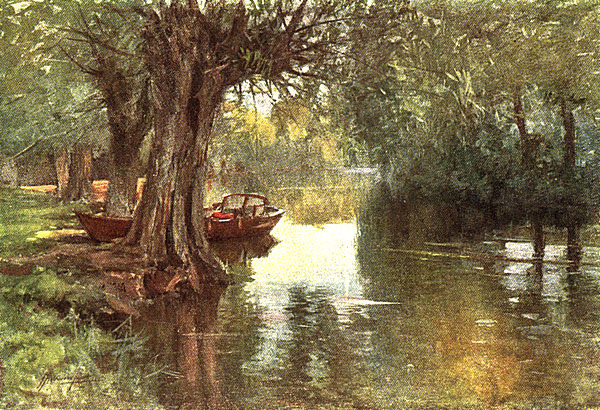 Under the Willows, Cookham-on-Thames
The next is the temperature: how hot or how cold it was—what month in
the year? It is unnecessary for Inness to cover his ground with snow
to make his picture express a certain degree of cold, neither is it
necessary for Monténard to fill his Provençal roads with clouds of
dust to show how hot they are. This is done by the opalescent tones of
the sky, by the values expressed in reflected lights and in the
illuminated shadows, so that you feel in looking across one of
Inness's fields of brown grass just how late is the autumn and just
how cool it has been, and in looking down one of Monténard's roads you
realize how useless would be an overcoat.
In this connection let me say that all nature is interesting and all
nature is beautiful, but all nature, as I have said, is not paintable.
The interior of a railroad station, for instance, is interesting,
as giving you certain mechanical results, construction, but it is not
picturesque—that is, paintable—unless one could treat it as Pennell
does, contrasting the black cars and locomotive with a puff of white
steam, giving the vistas with the perspective of track, and a centre
mass of people adding an idea of movement and color.
Above all, the outdoor painter should get the character and feeling of
the place he portrays on his canvas. If in Spain, his picture must
look like Spain. The air must be transparent, the architecture
clean-cut against the azure. If it be Holland, the atmosphere must be
moist, the air like a veil, and with all this there must be nothing in
the work that will be mistaken for the smoke-laden air of England.
Only thus, by this fidelity to the very nature and spirit of a place,
can the picture be made to express the essence of its life, which is
really the heart of the whole mystery.
Coming at last to our text, Water-Colors—the art of depicting nature
on a sheet of white paper by paints diluted with water—it will be
well to remind you that the art goes back to almost prehistoric times.
A few weeks ago, in the library of Mr. Jesse Carter, director of the
American Academy in Rome, I saw one of the earliest water-colors in
existence. It was painted upon a sheet of slate, and, although some
thousands of years old, still retained its color and remarkable
brilliancy. The subject was a group of figures, the centre object
being a girl of wonderful grace.
The present art of water-color painting, with a sheet of white paper
as background instead of the permanent stone, is, however, but little
more than one hundred and fifty years old, and owes its existence
largely to the men of the English school.
Mr. C. E. Hughes, in his delightful book on "Early English Water
Color," confined this English school to the men born between the
years 1720 and 1820.
In this group he places the great Gainsborough, who from 1760 to 1774
worked "in charcoal and water-color on tinted paper," which he said he
"loved to dash off of an evening, and which dazzled the fine ladies
and gentlemen who frequented the select watering-place of Bath," where
he was then living.
Then came Robert Cozens, the brothers Sanby, Thomas Hearne, Thomas
Malton, Samuel Scott, and a few others, all known as the
eighteenth-century painters.
These were succeeded by Thomas Girtin, who was born in 1775 and died
at twenty-seven years of age; and the great J. M. W. Turner, who first
saw the light in the same year, and on the day on which all great
Englishmen should be born—namely, April 23—a day dedicated to St.
George and the birthday of William Shakespeare.
Girtin and Turner worked together. Girtin, measured by the standard of
to-day, was an extreme impressionist, leaving behind him sketches
dashed in with an appearance of freedom which Peter DeWint and David
Cox might have envied when in after years they were at the height of
their power. Turner, on the contrary, devoted his time to acquiring
that triumphant grasp of detail which caused him to be known in his
earlier life as an extreme realist.
The change in Turner's work—the broader brush—came in his later
years when oil became his medium of expression, in which, no doubt,
his ability to note and yet sacrifice all unnecessary detail was a
potent factor.
A list of Englishmen greatly prized in their day now follows. Such men
as John Varly, Gilpin, Glover, William Havell (all of whom during some
part of their careers were members of the first Water Color Society
formed in England, in 1804, which body still survives in the old
Water Color Society whose rooms are still open on Pall Mall East) rose
into prominence, their works finding places both in private and public
collections.
This society was in turn succeeded by the New Society of Painters in
Miniature and Water Colors, which came into being in 1807 and went out
of existence in 1812—a victim, says Hughes, of the condition of
public apathy which brought about in the same year a reconstruction of
the older organization under the joint title of the Oil and Water
Color Society, and which eked out a precarious existence until the
birth of the association now known as the Royal Institute for Painters
in Water Colors.
Other names now confront us, among them two men, David Cox and Peter
DeWint, who in their day were considered masters of the medium. These
last struck a new note in water-color, or rather a new technic in its
handling. What Ruskin, the realist, in his "Modern Painters" describes
as "blottesque" was at that time looked upon by both teachers and
students as the one and only means by which white paper could be
properly stained. This method, to quote from a loyal believer in the
English transparent school, and whose enthusiasm is delightful, was
the laying on of the color in washes which filled certain definite
spaces indicated by a pen-and-ink outline.
These washes would indicate, say, a distant tree with a preliminary
tint and a subsequent elaboration; he would do it all in one process,
giving his blot an irregular edge and allowing the color to accumulate
where the shadows required it. His elaborative touches elsewhere were
of the same nature. They were brush blots as distinct from washes. To
this, I think, we may attribute on analysis the freedom of handling
which—though each man has his distinctive method—is characteristic
of both Cox and DeWint. If we add to these two methods of using the
brush a third—its manipulation as though it were a pen—we shall have
all the fluid processes on one or the other of which the beauty of all
modern water-color drawings depends. A fourth process is rubbing the
color into the grain of the paper. A fifth—a supplementary one—is
scratching out. Last is the ignominy of the stipple—the wetting of
the brush in the mouth, a technic entirely dependent upon the quantity
of saliva the student can spare for his work. Almost every early wash
water-color in existence can be classified according to the employment
in its making of some or all of these means.
In later years, especially in the last half of the eighteenth century,
we have Copley Fielding; Prout, with his picturesque sepia drawings,
the detail of his architecture in brown ink; Harding; Bonnington,
really a great man; Clarkson Stanfield; Rowbotham; David Roberts;
James Holland; Cattermole, who declined a knighthood and whose
intimates were Dickens, Disraeli, and Thackeray; and so on down to the
men of to-day, who are so well and ably represented in the annual
exhibitions of the Royal Academy and the present English Water Color
Societies.
As for our own progress in the art, the subject, of course, is too
well known for long discussion. Our oldest society, the American Water
Color Society, held its first public exhibition in the National
Academy of Design in New York in 1867, a date always remembered by me
with infinite pride and pleasure, for upon the walls of the smallest
room close up under the roof was hung my first exhibited
water-color—the only one of my three the hanging committee were good
enough to accept. Two years later—I am happy to say—in 1869, I was
elected a member, and I am further happy to say that I am still in
good standing and in high-hanging, and have so continued from that day
down to the present time—a trifle of some forty-six years.
As to my compatriots, I can truthfully say that its membership covers
some of the great water-colorists of our own or any other time, both
here and abroad—men entirely free to do as they pleased, working in
anything and all things so long as, to use their own expression, they
"get there," handling body color, in a veil of silver-gray as an
overwash or squeezed in chunks from a tube; undertones of charcoal
gray, overtones of pastel—anything for quality.
Their names are legion: the late E. A. Abbey, Walter Palmer, Chase,
the late Robert Blum, F. S. Church, Cooper, Curran, Eaton, Farrer, the
two Smillies, Childe Hassam, Keller, Murphy, Nicoll, Potthast, the
late Henry Smith, etc., etc.
These are but a haphazard choice of the men whose work shows the
widest ranges in selection, composition, mass, and technic, and who,
in the world of water-color painting, are masters of the medium.
As to our progenitors, the English water-color school—and I make the
statement with every respect for their high accomplishments—while I
believe we are indebted to them for the very existence of the art
itself, I must say that our own men and art-lovers the world over
would have been vastly benefited had these Englishmen allowed
themselves a little more freedom in their methods and not followed so
blindly the traditions of their past.
That we broke away so early is as much a question of race as of
training. The last idea that enters the heads of our own men is that
they want either to paint or to draw like somebody else. They all want
to paint like themselves, or they do not want to paint at all. They
are so many art sponges. They go abroad, wander about the Grosvenor
and the exhibitions, run over to Paris and haunt the Salon and shops,
and so on to Munich and Berlin, picking up a technical touch here or a
new idea of grouping or mass or color scheme there, and then, having
thoroughly absorbed it all, return home and use whatever suits them;
but a slavish imitation of any one English, French, or German
master—never; neither do they follow any other brush at home. They do
not believe in each other sufficiently to pay the highest form of
flattery—imitation.
Nor do many of them find their subjects abroad—a habit practised
these many years by your humble speaker, whose only excuse is that he
must paint, no matter where he is, and that his life in the
summer-time is dominated by his two children, both exiles, and more
exactingly still in late years by two little grandboys who have not as
yet crossed the ocean. No, these young American painters, with hardly
an exception, find their subjects at home, and they choose wisely.
And just here it can be said that if we are ever to have a school that
will leave its impress on the art of the world, the task will be the
easier if our men find their subjects at home—if they will show our
own people the beauty, dignity, and grandeur of the material that lies
under their very eyes, and also teach those fellows on the other side
to respect us, both because we can paint and because we have the
things to paint from. With a mountain and river scenery unrivalled on
the globe; with rock-bound coasts breaking the full surge of an ocean;
with forests of towering trees compared to which in girth and height
the trees of all other lands are but toothpicks; with plains ending in
films of blue haze and valleys sparkling with myriads of waterfalls;
with every type of the human race blended in our own, or distinct as
are the woodman of Maine and the soft-eyed mulatto of Louisiana; with
a history filled with traditions most romantic—Aztec, Indian, and
negro; with women who move like Greek goddesses and children whose
faces are divine, why go away from home to find something to paint?
Winslow Homer never did, and that's why his work will live when the
painters of Egyptian harems, Spanish dancers, and Dutch and Venetian
boats and palaces are forgotten.
To take a specific example or two, what subject, for instance, is more
worthy of a great master's brush than Homer's "Undertow," two
half-drowned young bathers locked in each other's arms, the two
beachmen dragging them clear of the mighty, blue-green wave curving
behind them? Here is a subject of almost weekly occurrence on our
coast. Who ever thought of painting it before? And that marvellous
picture of "The Cotton Pickers." This, to me, was the first clear
note Homer had sounded. The "Prisoners to the Front," painted just
after the war, was a strong, realistic picture, true and forceful in
color and composition, and, of course, admirable in drawing, but that
was all. It told its story at once, and having heard it to the end you
acknowledged its truth and went away content. But "The Cotton Pickers"
left something more in your mind. The gray dawn of the morning dimly
lighted up a field of cotton, the negro quarters on the horizon line;
dotted here and there, bending over the bolls, were groups of negroes,
singly and in pairs, filling their bags; in the foreground walked two
young negro girls, the foremost a dark mulatto—the whole story of
Southern slavery written in every line of her patient, uncomplaining
face.
This picture alone placed Homer in the first rank of American painters
of his day, and he has never lost this place, for not only was the
picture all it should be in composition and mass, but, unlike many of
Homer's pictures of an earlier period, it was deliciously gray and
cool in tone. It places him also in the front rank of the painters of
our time. Jules Breton never gave us anything more pleasing, and never
anything stronger in drawing, more true to life, or more poetic in
conception and treatment. I mention Breton because, of the men on the
other side, he is the only one who affects, so to speak, a similar
line of subjects. Breton loves his peasants and paints them as if he
did. Homer loved his subjects entirely in the same spirit. How
unequally the two men have been rewarded you all know. An all-wise
American who some years ago offered $40,000 for a Breton at auction
could not at the time have been induced to give one-tenth of that
amount for a Homer; and yet, for vigor, truth, sentiment, and
technic—yes, technic, for this picture was superbly painted—"The
Cotton Pickers," in my judgment, will outlive the other if the time
should ever come when picture-buyers think for themselves.
The Englishman, on the other hand, is the hardest man to pull out of a
groove. What has been is good enough for him, whether in
architecture, art, politics, or government. Any one who objects, or
seeks to improve or to point out a new and different way, is
"anathema." It is hardly more than twenty years ago that John Sargent,
whose works are often the strongest drawing card in the annual
exhibitions, was ignored by the jury of the Royal Academy.
"A slap-dash sort of a painter, my dear boy. Most dangerous to allow
his things to come in. No drawing, you know, no finish—altogether out
of the question." So spoke a Royal Academician when the question was
broached.
Whistler never found a vacant spot, no matter how high, where he could
hang even a 10 x 14.
"A mountebank in paint, my dear sir. Think of giving him a place
alongside of Sir Frederick Leighton! Impossible! Absolutely
impossible!" That the Luxembourg exhibited his portrait of his mother,
and that the art critics of Europe voted it "one of the greatest
portraits of modern times," made no difference. These Royal wiseacres
knew better. Some of them still think they know better, a fact easily
ascertained when you walk through the Exhibition, as I do every
summer, and have continued to do for the past thirty years.
And this adherence to tradition is not confined entirely to technic—I
refer now to many of the English painters of to-day—but appears in
their choice of subjects as well. It is the subjects which have been
successful—that is, which have been sold—that must be painted over
and over. Anything new is a departure, and a departure from the
standard in the selection of a subject is as dangerous as a departure
in the cut of a coat or the color of one's gloves—or was as dangerous
until Sargent, Abbey, Frank Brangwyn, and men of that ilk smashed the
current idols and taught men a new religion. A small congregation, it
is true, but big enough for them to gather together to sing hymns of
praise and pray for better things.
Let me illustrate what I mean by conforming to the standard. Three
years ago I was painting near a village, an hour from Paddington—a
lovely spot on the River Thames. This quaint settlement is one of
those little, waterside, old-fashioned-inn places, all drooping trees,
punts, millions of roses, tumble-down cottages, stretches of meadows
with the silver thread of the Thames glistening in the sunlight. There
is also a bridge, a wonderful old brick bridge, stepping across on
three arches, mould-incrusted, blackened by time, masses of green
rushes clustered about its feet—a most picturesque and lovable
bridge, known to about everybody who has ever visited that section of
England.
I had been there for a week, making my headquarters at the White Hart,
when my attention was attracted to a man across the river—it is quite
narrow here—a painter, evidently, who seemed to be surrounded by a
collection of canvases. He went through the same motions every day,
and then my curiosity got the better of me and I went over to see him.
Spread out on the grass lay eight canvases, all of one size, and each
one containing a picture of the old brick bridge.
"But why eight all alike?" I asked in astonishment.
"Because I can't sell anything else. I am known as the Sonning Bridge
painter. I've been at it for twenty years."
It is with this sort of thing, either in the selection of a subject,
in its treatment, or in its handling, that I have but little sympathy,
even though the great Ruskin, in speaking of this same English
water-color school, the one I have catalogued for you, insists that it
is the only "true school of landscape which has yet existed," an
appreciation which is followed by the outburst that "from the last
landscape of Tintoret, if we look for life we will pass at once to the
first landscape of Turner." It is, of course, only one of Ruskin's
dictatorial statements, admirable when written, because it was read
and approved by a class who knew no better and who accepted his words
as other blind devotees obeyed the Delphic Oracle—statements,
however, which are rejected by many of to-day who think for themselves
and who think clearly, having the world's work spread open before them
from which to judge.
Once in wandering around the Academia of Venice, taking in for the
fiftieth time Titian's masterpiece, I came across an Englishman who
had paused in his walk and was adjusting his long-distance
telescope—a monocle glued just under his left eyebrow. Mistaking my
red-backed sketch-book for a Baedeker, he said, in an apologetic tone:
"Pardon me—I've left mine at home—but will you be good enough to
tell me what Mr. Ruskin says about that picture?"
That I have personally refused to follow either Mr. Ruskin or the
example of the men he places on so high a pinnacle—I am now referring
entirely to their technic—is due to my having painted all my life
out-of-doors, the best place in which a man can study nature at close
range. This experience has taught me that weight and solidity are as
important in the rendering of a natural object as air and perspective,
and that the staining of paper with washes of transparent color does
not and cannot give them.
Nor can any brilliant light, a crisp, snapping light—a glint of the
sun's rays, for instance, on the break of the surf, or on the round of
a glossy leaf, reflecting like a mirror the opaque sky—ever be
achieved by careful working around the edges of an unwashed speck of
paper—the transparent man's only means of expressing a high light.
Nor will a single dab of Chinese white produce the effect of it,
should it be the only dab of opaque white in the composition. The
result in this case is still worse, for if transparent color has any
value when uniformly distributed it is in the expression of air and
perspective. The dab, then, is instantly out of plane, as it comes
nearer to the eye than the transparent wash about it, and the illusion
of distance is accordingly lost.
But another and quite a different thing occurs when the opaque color
forms part of the whole, the two systems blending each with the
other. To illustrate, my own experience has taught me that in nature
whatever the sun shines upon is opaque. The façade of a cathedral,
for instance, facing a sky where the rays of the sun strike it full is
opaque, while the angles of the architecture, casting shadows large
and small into which sink the blue reflections of the sky or the
reflected lights from near-by objects, are invariably transparent.
And now for my own system and the reasons why I have abandoned all
other systems. And in giving them to you I want to repeat what I said
in the beginning of this course, that I do not ask you students to
follow in my footsteps if your predilections, training, and innate
consciences lead you to a different view of treatment. Many of you may
not like my work at all, and you certainly have a large following,
especially among the younger men and women who have advanced ideas.
Many of you hold to the opinion that water-color men should stick to
their trade and not encroach upon the oil painters in their technic.
And many of you may at heart prefer, nay, even delight in, the broad,
loose washes of the early English school.
There may be a few of you, however, who have open minds free from
prejudice and free from the traditions of the past, and who are
dissatisfied with the want of "virility," if I may so express it,
shown in pictures painted on white paper, and with successive
washings, and may accordingly see something in my own methods which
may encourage you to follow in the path which I have cleared and which
I humbly trust will lead to infinitely better results than I have so
far achieved.
And in this you must have the courage of your opinions and be prepared
for criticisms. Those who are against me are more numerous than those
who are for me and my methods.
Only last month a distinguished New York daily paper, in reviewing a
recent exhibition, said:
"There really is nothing left to say about Mr. Smith's water-colors.
They appear with such unfailing regularity and are always so much the
same. Nothing in the present collection will surprise those who know
his work—and who does not? The artist's facility is undiminished, his
industry untiring, but to look for any fresh inspiration in his work
or a hint of anything but a conventional vision has long been a vain
hope."
I should be discouraged if I thought that this was the last word on my
work. I know better, because I am making a collection of such
criticisms, showing the rating of our several painters. These summings
up of mine will be extremely valuable as marking the changing taste of
the public; for I have never supposed that either ill will or
downright ignorance formed the basis of current criticism. The critics
are merely expressing the trend of public opinion. It is not new to
our age. Diaz, so one story goes, once came stumping (he had lost one
leg) into Millet's cottage at Barbizon fresh from the Salon. Millet
had been painting nudes—the most exquisite bits of flesh-painting
seen for many a day, and as modest as Chabas "September Morn."
"What do they say of my things?" asked Millet.
"That you are still painting naked women," replied Diaz.
Millet was horrified.
"I paint naked women! I never painted one in my life."
Hence "The Angelus" and "The Sowers" and the other masterpieces of
clothed peasants.
In 1825 Constable writes in answer to a scurrilous attack made on his
so-called "puerile" efforts:
"Remember the great were not made for me, nor was I for the great. My
limited and abstractive art is to be found under every hedge and in
every lane, and therefore nobody thinks it worth while picking up. My
art flatters nobody by imitation: it courts nobody by smoothness: it
tickles nobody by politeness: it is without either fol-de-rol or
fiddle-de-dee. How can I hope to be popular?"
Ruskin's attack on Whistler is another case in point. A lawsuit
followed and Whistler recovered one farthing damages, and had the
effrontery to dangle it under the great critic's nose that same night
at a reception where they both met, followed by the remark:
"Beat you, old man."
Even Mr. Thackeray went out of his way in his "art notes" to belittle
and ridicule Sir Thomas Lawrence because he lacked what he called the
"virility of his progenitors and associates."
And now for my own system.
I use a heavy, gray charcoal paper, which is made by Dupré & Company,
No. 141 Faubourg St. Honoré, Paris, and which costs about ten cents
per sheet, measuring about 40 x 30 inches each. This paper is evenly
ribbed but without the intermittent bands seen often in the lighter
charcoal paper, known as "Michelet," sold everywhere in our own art
stores. Dupré will send this paper to anybody who applies for it.
This paper I wet on both sides and thumb-tack over an oil canvas the
size of the picture to be painted. It dries tight as a drum, and the
canvas backing protects it from puncture or other injury.
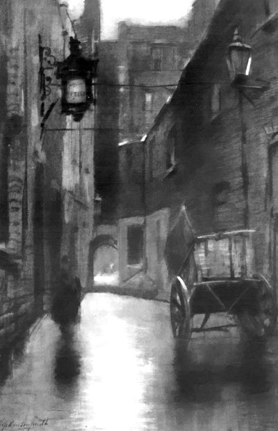
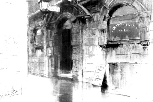
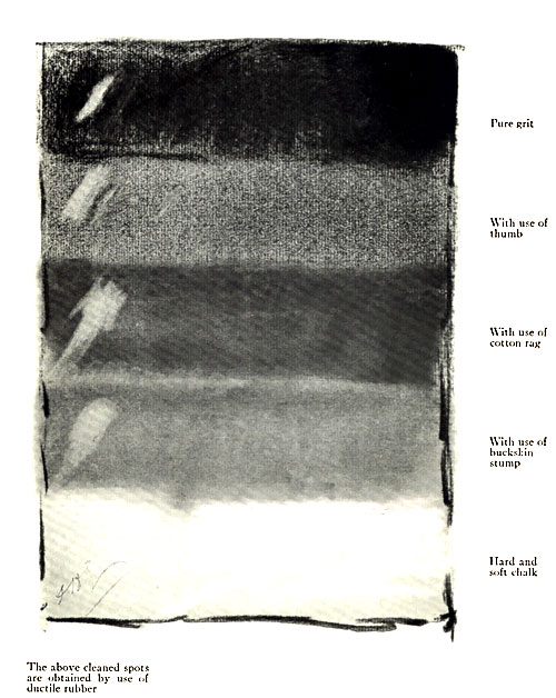
On this surface I make a full and complete drawing in charcoal of
the subject before me, not in outline, but in strong darks, jet-black,
many of them—a finished drawing really, in charcoal, which could be
signed and framed. This is then "fixed" by a spray of alcohol and gum
shellac, thrown by means of a common perfume atomizer, the whole
apparatus costing less than one American dollar.
On this I begin my color scheme in both opaque and transparent color,
recognizing the "natural facts" already explained to you, that is, the
skies and high lights being solidly opaque, the shadows being equally
transparent. This process requires certain modifications to be made in
the darks of the original drawing. The dense black shadow under the
eaves of a roof, for instance, are not in nature as black as the
charcoal, but perhaps a rich, warm brown. If the ground is in
sunlight, it is a dull, golden yellow and reflects the yellow glow of
the sand beneath. Or it may be a blue reflection, or even of a reddish
tone. These hard blacks then must be glazed in such a way as to
preserve the power of the shadow obtained by means of the under
charcoal, and yet keep it transparent (all shadows being
transparent) and at the same time preserve its true and proper tint.
This glaze is done by using the three semi-opaque primary
pigments—found in every color-box—namely:
- Light red,
- Cobalt-blue,
- Yellow ochre.
These colors, of course, form the basis of all intermediate tones, and
from them all intermediate tones can be made.
These three colors are at the same time semi-opaque, their opacity
being just sufficient to tint the hard black of the coal, while never
clogging or muddying its transparency.
So it is with the millions of other tones in the whole composition,
when such perfectly transparent colors as brown madder, Indian yellow,
and indigo are used as a glaze, altering and modifying the undertone
of charcoal to any desired tint and at the same time preserving the
all-important thing—its transparency.
In conclusion, let me say that I fully recognize that I am addressing
students whose training enables them to understand perfectly this
explanation, and that further instructions are therefore unnecessary.
One thing, however, may be accentuated, and that is the use of plenty
of clean water. Another is that you should keep your palettes
separate. For myself, I make use of a common white metallic
dinner-plate, known as iron-stone china, costing another ten cents,
for my sky-palette, squeezing the color-tubes in a row around its edge
and my Chinese white below them on one side toward the bottom. For my
transparent palette, I use an ordinary moist sixteen-pan color-box,
being always careful never to blur it with even a brush stroke of body
color (Chinese white); and for my opaque work, an oval white metal
palette, with thumb-hole, and indentations around its edge into which
I squeeze the contents of my moist water-color tubes, my Chinese
white being heaped up in a little mound near my thumb.
The result may be seen in some of the illustrations accompanying this
text.