The sentimental mood for the storied picture was now being
fostered by the universal reading of the novel, which in its mid-eighteenth-century
form gave its readers new experiences in the
presentation of actual contemporary life, with analysis of their
feelings and cultivation of there sensibilities. Pamela and Clarissa
Harlowe, Sophia Western and Amelia, Olivia, Maria, were as living
in interest as any of the beautiful high-born ladies whose portraits
in mezzotint, translated from the canvasses of the great painters,
appealed from the printsellers’ windows in all the monochrome
beauty of their medium. The public, steeped now in sentiment,
wanted to see their imaginary heroines in picture: nor had they
long to wait. The Royal Academy had become a vital factor in
forming public taste, and the printsellers’ shops were its mirrors.
But not all its members and exhibitors were Gainsboroughs and
Reynoldses. There were, for instance, Angelica Kauffman and
Cipriani, with their seductive Italian graces of design; there was
Bartolozzi, with his beautiful draughtsmanship, and his brilliant
facile craft on the copper-plate, but the medium that should
bring these into familiar touch with popular taste was still to seek.
However, it was at hand, and the man who found this medium,
and brought it to the service of popular art, was William Wynne
Ryland, “engraver to the King.”
Whether the so-called crayon method of engraving, in imitation
of soft chalk drawings, was invented by Jean Charles François, or
Gilles Demarteau, or Louis Bonnet—all three claimed the credit
of it—it was, at all events, from François, whose claim had obtained
official recognition, that Ryland, the pupil of Ravenet and Le Bas,
and, in a measure, of Boucher, learned the method while he was
still a student in Paris. Only later in his career, however, long
after he had left behind him his student days in Paris and Rome,
and achieved prosperity in London as a line-engraver and printseller,
with royal patronage, and with social success as a man of
fashion and pleasure, did he remember the process that François
had imparted to him. Then, in his necessity, when his extravagances
had brought him to bankruptcy, he called the dotted crayon
manner to memory, and saw in stipple-engraving, if suitably
employed, a possible asset of importance. Compared with line and
even with mezzotint it was a very easy and rapid way of engraving,
and though, of course, it could not compare with either in nobility,
richness and brilliance of effect, Ryland realised that its soft
rendering of tones by artistically balanced masses of dots might be
adapted to dainty and delicate drawings. The most fortunate
opportunity for proving this was at hand. He had some personal
acquaintance with Angelica Kauffman, whom Lady Wentworth
had brought to London some ten years before, and whose beauty,
talents and personal charm had meanwhile made her a fashionable
artistic idol, with Society and its beauties flocking to her studio to
be painted or to buy her pictures. Having first tested his stippling
with his own designs, gracefully French in manner, which he
published soon afterwards as “Domestic Employments,” Ryland
suggested the idea of stipple-engraving to the sympathetic young
painter. When he had experimented with one or two of her drawings,
she gladly recognised that stipple was the very medium for
the interpretation of her work to the public. The first prints
sold “like wildfire,” and so satisfied was Ryland of the profitable
prospect, that, on the strength of it, he promptly re-established
himself in a printselling business at 159, Strand. His confidence
was amply justified, the public being quick to show their appreciation
of the new method, introduced as it was with all the
persuasion of the fair Angelica’s graceful, fanciful designs of classic
story and allegory. This was in 1775, and within a very short
time Ryland found that, rapidly as she designed and he engraved, he
could scarcely keep pace with the demand for these prints, which,
the more readily to crave the popular fancy, he printed in red ink,
to imitate red chalk, later to be known as the “Bartolozzi red.”
Ryland had called Bartolozzi into consultation, and the gifted
Italian engraver, with his greater mastery of technique, his delicate
sense of beauty, and his finer artistic perceptions, had seen all that
might be done with the new way of stipple; he saw also its limitations.
With enthusiasm Bartolozzi and Ryland had worked together
till they had evolved from the crayon manner of François a process
of engraving which proved so happily suited to the classes of fanciful
and sentimental prints now fast becoming the vogue, that it simply
jumped into a popularity which no other medium of the engraver’s
art had ever attained.
The stipple method may be thus described. The copper-plate
was covered with an etching-ground, on to which the outlined
picture was transferred from paper. Then the contours of the
design were lightly etched in a series of dots, all the dark and
middle shadows being rendered by larger or more closely etched dots,
the later engravers using even minute groups of dots. This accomplished,
the acid was next applied with very great care, and all the
etched dots bitten in. The waxen ground was then removed from
the plate, and the work with the dry-point and the curved stipple-graver
was commenced. With these tools the lighter shadows were
accomplished, and the bitten portions of the picture were deepened
and strengthened wherever required, to attain greater fulness or
brilliance of effect.
Engraving in dots was, of course, no new thing; as an accessory
to line-engraving it had often been called into service by the earlier
artists. Giulio Campagnola, Albert Dürer, Agostino Veneziano,
Ottavio Leoni, for example, had used it; we frequently find it
employed by our own seventeenth-century line-men the better
to suggest flesh-tones, and Ludwig von Siegen, in describing his
invention of mezzotint in 1642, includes the “dotted manner”
among the known forms of engraving. Then there was the opus
mallei, or method of punching dots in the plate with a mallet and
awl, which was successfully practised by Jan Lutma, of Amsterdam,
late in the seventeenth century. This may be considered the true
precursor of stipple, just as the harpsichord, with the same keyboard,
but a different manner of producing the notes, was the
precursor of the pianoforte; but it must have been a very laborious
process, and Lutma found few imitators.
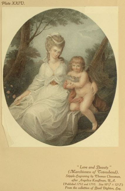
Under the ægis of Ryland and Bartolozzi, however, and with
the inspiration of Angelica Kauffman’s “harmonious but shackled
fancy,” as a contemporary critic put it, for its initial impetus,
stipple was developed as a separate and distinctive branch of the
engraver’s art. Its popularity was now to be further enhanced by
the gentle and persuasive aid of colour. Ryland had seen many
specimens of colour-printing in Paris, when he was with François
and with Boucher; he now bethought him that, just as the public
fancy had been captured by red-chalk imitations, so might it be
enchanted by engraved representations of water-colour drawings
actually printed in colours. Angelica Kauffman and Bartolozzi
eagerly encouraged the idea, and the two engravers, after many
experiments, determined the best process of colouring and printing
from the plates. Apparently they rejected the multi-plate method
tried six years previously by that interesting artist Captain William
Baillie; and Ryland’s earliest colour-prints were partially tinted
only with red and blue. Mrs. Frankau tells us, on the authority
of a tradition handed down in his old age from James Minasi,
one of Bartolozzi’s most trusted pupils, that an Alsatian named
Seigneuer was responsible for all the earlier colour-printed impressions
of Ryland’s and Bartolozzi’s stipples after Angelica Kauffman
and Cipriani, that then he set up on his own account as a colour-printer,
much recommended by Bartolozzi, and largely employed
by the publishers, and that his printing may be traced, though unsigned,
by a transparency of tone due to the use of a certain vitreous
white which he imported in a dry state from Paris. Minasi must,
of course, have been a perfect mine of Bartolozzi traditions, but
when my father in his boyhood knew him and his musical son, the
distinguished engraver would talk of nothing but music, for in
1829, with steel plates superseding the copper, and lithography triumphant,
there seemed no prospect that the coloured stipples, already
some time out of fashion, would eighty years later be inspiring
curiosity as to how they were done. One sees, of course, many
feeble colour-prints of the period, which of old the undiscriminating
public accepted as readily as to-day they buy, for “old prints,”
modern cheap foreign reproductions which would disgrace a sixpenny
“summer number.” On the other hand, the really fine
examples of the old-time colour-printing, combined with brilliant
engraving—and, of course, only fine things are the true collector’s
desiderata, irrespective of margins and “state” letterings, and other
foolish fads—are certainly works of art, though a very delicate art
of limited compass.
These colour-prints were done with a single printing, and the
plate had to be freshly inked for each impression. The printer
would have a water-colour drawing to work from, and having
decided upon the dominant tint, with this he would ink over the
whole engraved surface of the plate. Then he would wipe it almost
entirely out of the incisions and punctures on the copper which had
retained it, leaving just a sufficient harmonising ground-tint for the
various coloured inks, carefully selected as to tints, which were next
applied in the exact order and degree to ensure the right harmonies.
All this required the nicest care directed by a very subtle
sense of colour. Most difficult of all, and reserved for the last stage
of the inking, was adding the flesh-tints, an operation of extreme
delicacy. Then, before putting the plate in the printing-press, it
had to be warmed to the exact degree of sensitiveness which should
help the colours to fuse with tenderness and softness, without losing
any brilliant quality of tone. This was not the least anxious part
of the work, needing highly-trained artistic sensibility on the part
of the printer. How artistically important this matter of warming
the plates must have been in printing a combination of coloured
inks may be judged when I say that I have been privileged to
watch Whistler warming his etched plates ready for the printing-press,
and seen him actually quivering with excited sensibility as
the plate seemed to respond sensitively to the exigence of his
own exquisite sense of tone. But, of course, no eighteenth-century
colour-prints, however charming in tone, suggest that there were
any Whistlers engaged in the printing of them. Perhaps that is
why our modern master of the copper-plate never cared for these
dainty things, as he did greatly care for Japanese colour-prints. The
old printers, however, had their own definite manner of work, and
their own tricks of experience for producing pleasing and brilliant
effects. By the dusting of a little dry colour on to the moist, here
and there, during the printing process, they could heighten tones, or
by very, very lightly dragging a piece of muslin over the surface of the
plate they could persuade the tints to a more tender and harmonious
intimacy. Of course, when the plate was printed, the colour was
taken only by the dots and lines of the engraving, the white paper
peeping between. If would-be buyers of colour-prints would only
remember this simple fact, and examine the stippling closely to see
whether it really shows the colour, they would not so constantly be
deceived into buying entirely hand-coloured prints. Whether the
old printers and engravers authorised and sponsored the touching-up
of the prints with water-colour which one almost invariably finds,
at least to some slight extent, even in the best examples, with rare
exceptions, it is impossible to determine. At all events, it is presumable
that the eyes and lips were touched up before the prints
left the publishers’ shops.
It must not be supposed, however, that colour had ousted from
public favour the print in monochrome. As a matter of fact, it
was usually only after the proofs and earlier brilliant impressions
in monochrome had been worked off, and the plate was beginning
to look a little worn, that the aid of colour was called in to give the
print a fresh lease of popularity. Indeed, with mezzotint a slightly
worn plate generally took the colours most effectively. This is why
one sees so very seldom an engraver’s proof in colours, the extreme
rarity of its appearance making always a red-letter moment at
Christie’s. Therefore, in spite of the ever-widening vogue of the
colour-print, it was always the artist and engraver that counted,
while the printer in colours was scarcely ever named. And the new
industry of stipple-engraving may be said to have been, in its first
days of popularity, monopolised almost by Ryland and Bartolozzi, in
association with Angelica Kauffman and John Baptist Cipriani.
Cipriani had, by his elegant and tasteful designs, won immediate
favour on his arrival in England, and even the Lord Mayor’s coach
was decorated with panels of his painting. His style prepared the
way for Angelica Kauffman, and together they soon brought a new
pictorial element to the service of home-decoration. Their graceful
rhythmic treatment of classic fables was just what the brothers
Adam wanted for their decorative schemes, and the two Italian
artists were extensively employed to paint panels for walls and ceilings.
In time the fair Angelica outdistanced Cipriani in popularity,
and, painting panels for cabinets, commodes, pier-table tops, and
other pieces of decorative furniture, her taste was soon dominating
that of the fashionable world. No wonder then that, when Ryland
and Bartolozzi, through the medium of their facile and adaptable
engravings, made her charming, if not flawlessly drawn, compositions
readily accessible, the public eagerly bought them, and, framing
them, generally without any margin, according to their own oval
and circular forms, found them the very mural adornments that the
prevailing Adam taste seemed to suggest. In monochrome or in
colours, the prints, with their refined and fluent fancies, pictured
from Horace, Ovid, Virgil, Homer, and Angelica’s beautiful face
and figure vivid in several, had an extraordinarily wide appeal.
They flattered the fashionable culture of the day, when to quote
Horace familiarly in ordinary conversation was almost a patent of
gentility. On the continent they were even copied for the decoration
of porcelain.
For Ryland this meant another spell of prosperity: it also meant
disaster. His constant thirst for pleasure, and his ambition to shine
as a fine gentleman, stimulated by such easy and seemingly inexhaustible
means of money-making, led him into fatal extravagances.
Accused of forging a bill, instead of facing the charge, of which he
protested his innocence, he stupidly hid himself and tried ineffectually
to cut his own throat. After that, some flimsy evidence procured
his condemnation, and, as William Blake, looking in Ryland’s
face, had predicted years before, he was hanged at Tyburn in 1783.
They could have done no worse to a highwayman; and, after
all, by the introduction of stipple-engraving Ryland had certainly
increased the people’s stock of harmless pleasure. In his own stippling
there was a delicacy of touch, a smoothness of effect, equal to
Bartolozzi’s, but with less tenderness and suppleness of tone. Evidently
he formed his style to suit the designs of Angelica Kauffman, which
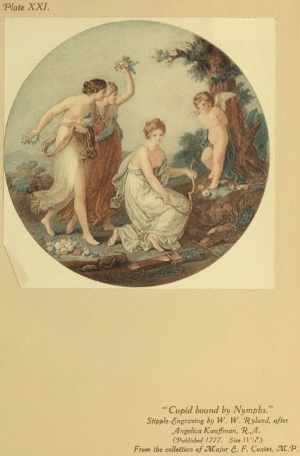
it rendered with appreciation of their refinement. This will be seen
in the charming Cupid bound to a Tree by Nymphs, among our illustrations,
and many other pleasing plates, such as Venus presenting
Helen to Paris, Beauty crowned by Love, The Judgment of Paris, Ludit
Amabiliter, O Venus Regina, Olim Truncus, Dormio Innocuus, Juno
Cestum, Maria, from Sterne’s “Sentimental Journey,” for which Miss
Benwell, the painter, is said to have sat; Patience and Perseverance;
Morning Amusement, a fanciful portrait of Lady Mary Wortley
Montagu, embroidering at a tambour-frame, and wearing the
Turkish costume which she so graphically describes in one of her
letters, and in which Kneller had painted her at the instigation of
Pope; fancy portraits, too, of the adventurous Lady Hester Stanhope,
and Mary, Duchess of Richmond.
Although Angelica Kauffman had Bartolozzi and his numerous
disciple—which meant, of course, most of the best stipple-engravers
of the day—at the service of her prolific pencil, her favourite of all
was Thomas Burke. In this she proved her sound judgment, for
certainly no other stipple-engraver, not Bartolozzi himself, could
equal Burke’s poetic feeling upon the copper, or surpass him in his
artistic mastery of the medium. After studying, it is believed, at
the art school of the Royal Dublin Society, he came to London
to learn mezzotint-engraving under his talented countryman, John
Dixon, who was winning reputation as one of Reynolds’s ablest
“immortalisers,” to borrow the master’s own word. Burke soon
showed that he could scrape a mezzotint with the best of them,
but the pupil’s manner developed on his own lines, differing from
the master’s in a more tender and luminous touch, a greater suavity
of tone. These qualities are patent in his beautiful rendering of
Angelica Kauffman’s Telemachus at the Court of Sparta, and it was only
natural that they should suggest his adopting the stipple method.
The technique he learnt from Ryland, and unquestionably he
“bettered the instruction.” The painter’s sense of effect, which
Dixon had taught him to translate into mezzotint, was of incalculable
value to him in his use of the new medium, for, by an individual
manner of infinitely close stippling suggestive of the rich broad
tone-surfaces of mezzotint, he achieved, perhaps, the most brilliant
and beautiful effects that stipple-engraving has ever produced.
Burke, in fact, was an artist, who, seeing a picture, realised how to
interpret it on the copper-plate with the just expression of all its
tone-beauties. There is a glow about his engraving which shows
the art of stipple at the very summit of its possibilities, and, happily,
brilliant impressions of several of his plates were printed in colours.
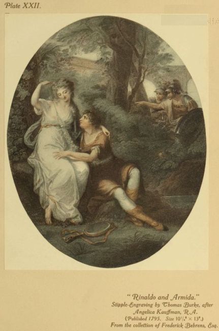
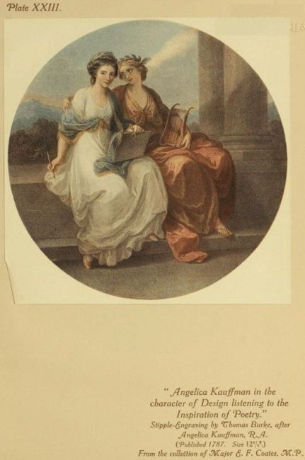
Thus, in such beautiful prints as Lady Rushout and Daughter, Rinaldo
and Armida, A Flower painted by Varelst, Angelica Kauffman as
Design listening to the Inspiration of Poetry, Cupid and Ganymede,
Jupiter and Calisto, Cupid binding Aglaia, Una and Abra, to name,
perhaps, the gems among Burke’s Kauffman prints, is shown what
artistic results could be compassed when stipple-engraving and
colour-printing met at their best. If, however, Angelica’s engaging
fantasies inspired Burke to his masterpieces, not less exquisite
was his rendering of Plimer’s miniatures of the Rushout daughters,
while his art could interpret with equal charm the homely idyllic
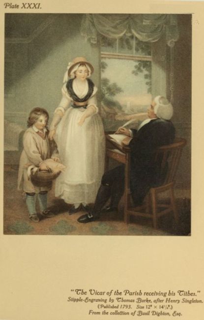
picture, as may be seen in the pretty Favourite Chickens—Saturday
Morning—Going to Market, after the popular W. R. Bigg, and The
Vicar of the Parish receiving his Tithes, after Singleton. But there
are pictures by the masters one would like Burke to have engraved.
The strange thing is that he did not do them.
Most of the engravers were now wooing the facile and profitable
popularity of the stipple method and the colour-print and all the
favourite painters of the day, from the President of the Royal
Academy to the lady amateur, were taking advantage of the fashion.
The constancy and infinitude of the demand were so alluring, and
the popular taste, never artistically very exacting, had been flattered
and coaxed into a mood which seemed very easy to please. It
asked only for the pretty thing.
Sir Joshua Reynolds, seeing, doubtless, what delicious and popular
things Bartolozzi had made of Cipriani’s Cupids and Graces, was
readily induced to lend himself, in the lighter phases of his art,
to the copper-plates of the stipple-engravers, pleasantly assisted by
the colour-printer. Still leaving the more dignified and pictorially
elaborate examples of his brush, the beautiful, elegant, full-length
portraits of lovely and distinguished women and notable men, to
the gracious interpretation of mezzotint, which had served him
so nobly and faithfully, he found that, in the hands of such artists
on copper as Bartolozzi, John Jones, Caroline Watson, Wilkin,
Cheesman, Dickinson, Nutter, Schiavonetti, Marcuard, Thomas
Watson, John Peter Simon, Grozer, Collyer, J. R. Smith, the
delicate art of stipple could express all the sweetness, tenderness,
and grace he intended in the pictures he enjoyed to paint of children
and of girlish beauty. So we have such delightful prints, both in
monochrome and in colour, as the Hon. Anne Bingham and Lavinia,
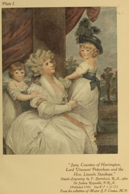
Countess Spencer, Lady Betty Foster, The Countess of Harrington and
Children, Lady Smyth and her Children, Lord Burghersh, Hon. Leicester
Stanhope, Simplicity (Miss Gwatkin), The Peniston Lamb Children,
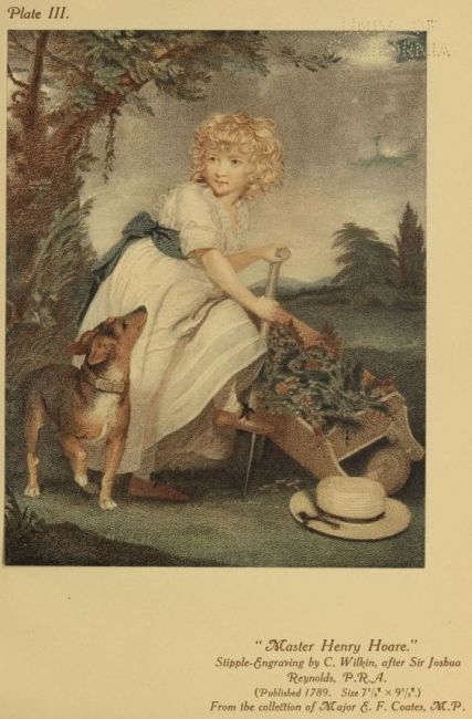
all of Bartolozzi’s best; Lady Cockburn and her Children, and Master
Henry Hoare, the Hon. Mrs. Stanhope as “Contemplation,” Lady Beauchamp
(afterwards Countess of Hertford), A Bacchante (Mrs. Hartley,
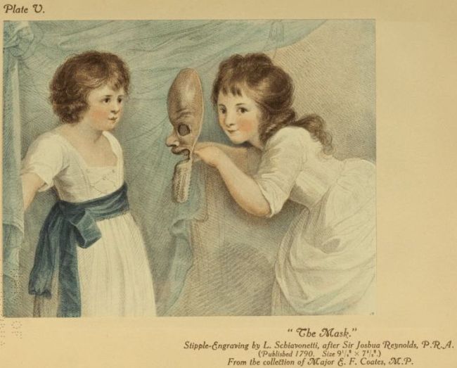
the actress, and her child), the Spencer children in The Mask, and
The Fortune Tellers, Miss Elizabeth Beauclerc (Lady Diana’s daughter
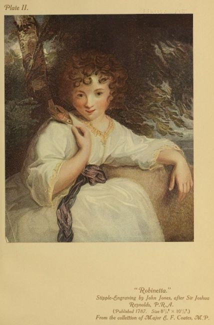
and Topham Beauclerc’s) as “Una,” Muscipula, Robinetta, Felina,
Collina, The Sleeping Girl, Infancy, Lady Catherine Manners, The Reverie,
Lord Grantham and his Brothers, Mrs. Sheridan as “St. Cecilia,”
Maternal Affection (Lady Melbourne and child), Perdita (Mrs.
Robinson), Mrs. Abington as “Roxalana,” The Age of Innocence, The
Infant Academy, The Snake in the Grass—but the list is endless. All
collectors of colour-prints know how desirable these Reynolds’ stipples
are to charm their walls withal, but almost unique must be the
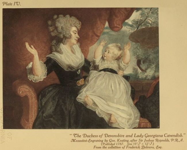
collector who can also hang among them Keating’s joyous mezzotint
of Reynolds’s famous portrait of the Duchess of Devonshire and
her baby daughter, printed in colours. This is one of those rare
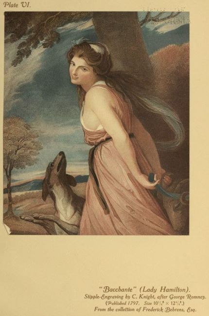
examples which, with J. R. Smith’s Bacchante and Nature (Lady
Hamilton), Henry Meyer’s Nature too, some of the Morland prints
by the Wards, Smith, and Keating; S. W. Reynolds’s Countess of
Oxford, J. R. Smith’s Mrs. Bouverie, and a few other important
Hoppner prints, C. Turner’s Penn Family, after Reynolds, Smith’s
Synnot Children, after Wright of Derby, and Mrs. Robinson, after
Romney, prove that, in the hands of an engraver with a painter’s
eye, mezzotint could respond to the coloured inks as harmoniously
and charmingly as stipple.
Gainsborough—at least, the Gainsborough of unapproachable
mastery and inimitable beauty, the greatest glory of our eighteenth
century art—seems to have been beyond the colour-printer’s ambition.
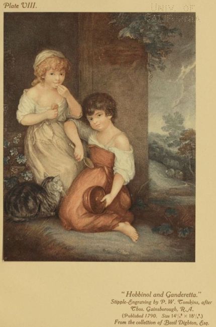
With the exception of the Hobbinol and Ganderetta (Tomkins),
reproduced here, and the Lavinia (Bartolozzi), both of which
were painted for Macklin’s “British Poets,” I doubt if anything
important of Gainsborough’s was reproduced in coloured stipple,
and, of course, these things cannot be said adequately to represent
the master; while, as to mezzotint, W. Whiston Barney’s version
of Gainsborough’s Duchess of Devonshire was, I understand, printed
in colours, though impressions are extremely rare. Romney’s
exquisite art, on the other hand, with its gracious simplicity of
beauty, lent itself more readily to the colour-printed copper-plate.
Among the numberless tinted engravings with which the small-paned
windows of the eighteenth-century print-shops were crowded,
none ingratiated themselves more with the connoisseurs than the
Romneys. So, in any representative collections of colour-prints
to-day, among the finest and most greatly prized examples must be
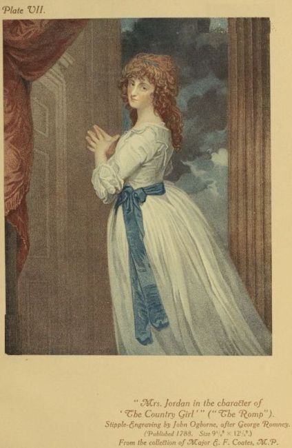
the lovely Emma and Serena (Miss Sneyd) of John Jones, Mrs. Jordan
as “The Romp” of Ogborne, Miss Lucy Vernon as “The Seamstress,”
and Lady Hamilton as “The Spinster” of Cheesman, the beautiful
Emma also as a “Bacchante” by Knight, as “Sensibility” by Earlom,
and as “Nature” in the two mezzotint versions, just mentioned, by
J. R. Smith and Henry Meyer.
Of course the pictorial miniatures of the fashionable Richard
Cosway, with their light, bright scheme of draughtsmanship, their
dainty tints, their soft and sinuous graces, their delicate decision of
character, were exceedingly happy in the stipple-engraver’s hands.
In colour the prints had a charm of reticence which was peculiarly
persuasive. Several of the most engaging were done by the artistic
Condé, such at Mrs. Bouverie, Mrs. Tickell, Mrs. Jackson, Mrs.
Fitzherbert, Mrs. Robinson as “Melania”, and the beautiful youth
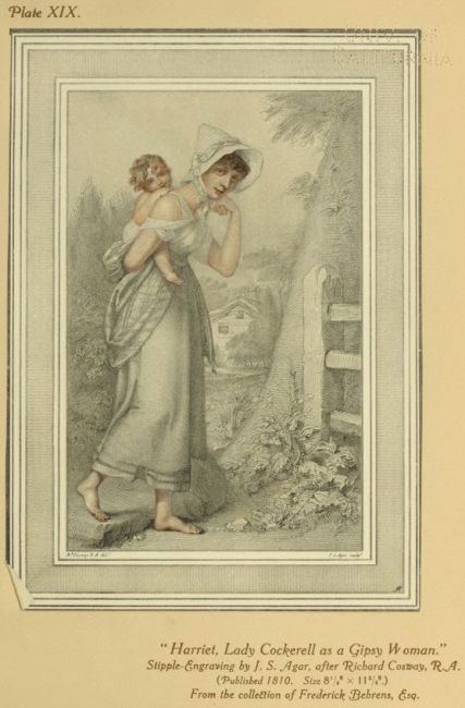
Horace Beckford; J. S. Agar did delicately Harriet, Lady Cockerell,
as a Gipsy Woman, Lady Heathcote, and Mrs. Duff; Cardon, with
his distinguished touch, engraved the charming Madame Récamier,
Schiavonetti the Mrs. Maria Cosway and Michel and Isabella
Oginesy, Bartolozzi the Mrs. Harding, Mariano Bovi the Lady Diana
Sinclair, and Charles White the pretty Infancy (Lord Radnor’s
children). Only less fashionable than Cosway’s were the miniatures
of Samuel Shelley. In portrait-manner, and in fanciful composition,
Reynolds was his model and inspiration, but the result, in
spite of high finish and a certain charm of elegance, was a very
little Reynolds, for Shelley’s drawing generally left something for
criticism. Naturally, miniature-painting found happy interpretation
in coloured stipple, and Shelley was fortunate in his engravers,
especially Caroline Watson, with her exquisite delicacy and brilliantly
minute finish, and William Nutter, who was equally at home with
the styles of many painters.
An artist whose dainty and original manner of portraiture,
enjoying a great vogue in its day, was also particularly well suited
to the tinted stipple was John Downman. A man of interesting
personality and individual talent, he began, as a pupil and favourite
of Benjamin West, to take himself seriously and ambitiously as an
“historical painter,” to borrow a definition of the period. Indeed, after
he had won a fashionable reputation for the singular charm and style
of his portraits, and become an A.R.A., we find a contemporary
critic of the Royal Academy exhibition of 1796 confessing surprise
at seeing a scriptural subject painted with such exceptional care
and simplicity of expression by “a hand accustomed to delineate the
polished and artificial beauties of a great metropolis.” But it was to
these portrait-drawings that the artist owed his popularity, and these
and the engravings of them, neglected for three-quarters of a century,
are the things that to-day make Downman a name to conjure with
among collectors. His portraits, exceptionally happy in their suggestion
of spontaneous impression and genial intuition of character,
were drawn with pencil, or with finely-pointed black chalk or charcoal.
The light tinting of hair, cheeks, lips and eyes, with the more
definite colouring, in the case of the female portraits, of an invariable
sash and ribbon on a white dress, was effected in a manner peculiar
to himself. Instead of the usual way, the colour was put on the
back of the drawing, and showed through the specially thin paper he
used with softened effect. How he happened upon this method of
tinting his drawings is rather a romantic story. Seized by the press-gang
and taken to sea, about the beginning of the American War of
Independence, he was kept abroad for nearly two years, and when,
at last, he managed to return to England he found his wife and
children in a state of destitution at Cambridge. There his happy
gift of portraiture brought him a livelihood. One day he left by chance
a drawing face downward upon the table, and one of his children
began daubing some pink paint on what was seemingly a blank piece
of paper. Downman, finding his drawing with daubs upon the back,
perceived delicate tints upon the face, and so he looked with a discoverer’s
eye, and thought the thing out; and the novel way he had
accidentally found of transparently tinting his drawings proved his
way to prosperity. It introduced him into the houses of the socially
great to the royal palace even, and the fashionable beauties of the
day, as well as those who would have liked to be fashionable beauties,
and the favourite actresses, all readily offered their countenances to
Downman’s charming pencil, knowing it would lend them the air
of happy young girls. Of course there was a willing market for
prints from these gladsome and novel presentations of faces which the
people seemed never to tire of; so among the collector’s prizes to-day
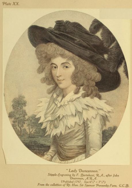
are the Mrs. Siddons by Tomkins, the Duchess of Devonshire and the
Viscountess Duncannon by Bartolozzi, Lady Elizabeth Foster by Caroline
Watson, Miss Farren (Countess of Derby) by Collyer, and Frances
Kemble by John Jones.
The social reign of the Court beauties lasted over a long period,
and survived many changes of fashion, from the macaroni absurdities
and monstrous headdresses to the simple muslin gown and the straw
“picture” hat. The days of “those goddesses the Gunnings”
seemed to have come again when the three rival Duchesses, Devonshire,
Rutland, and Gordon, were the autocrats of “the ton,” ruling
the modish world not only with the sovereignty of their beauty,
elegance, wit and charm, but with the fascinating audacity of their
innovations and the outvieing heights of their feathers.
“Come, Paris, leave your hills and dells,
You’ll scorn your dowdy goddesses,
If you once see our English belles,
For all their gowns and boddices.
Here’s Juno Devon all sublime;
Minerva Gordon’s wit and eyes;
Sweet Rutland, Venus in her prime;
You’ll die before you give the prize.”
So sang the enthusiastic poet; though the “satirical rogues”
who wrote squibs and drew caricatures were not quite so kind, and
a writer in the “Morning Post,” with a whimsical turn for
statistics, actually drew up a “Scale of Bon Ton,” showing, in a
round dozen of the leading beauties of the day the relative proportions
in which they possessed beauty, figure, elegance, wit, sense,
grace, expression, sensibility, and principles. It is an amusing list, in
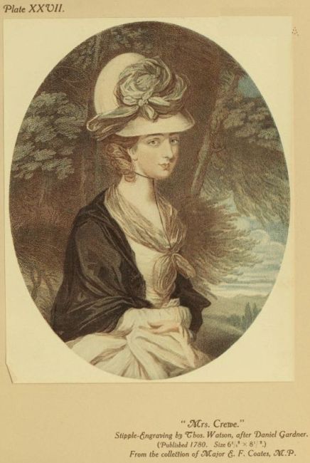
which we find the lovely Mrs. Crewe, for instance, credited with
almost the maximum for beauty, but no grace at all; the Countess
of Jersey with plenty of beauty, grace and expression, but neither
sense nor principles; the Duchess of Devonshire with more principles
than beauty, and more figure than either; her Grace of
Gordon with her elegance at zero, and the Countess of Barrymore
supreme in all the feminine attractions.
When personal gossip about these fashionable beauties was
rampant upon every tongue; when the first appearance of one of
them in a new mode was enough to ensure her being enviously or
admiringly mobbed in the Mall, naturally the portrait-prints in
colour responded to the general curiosity. But there was a public
which, having other pictorial fancies than portraiture, even pretty
faces could not satisfy without the association of sentiment and
story. So there were painters who, recognising this, furnished the
engravers with the popular subject-picture. It was well for their
link with posterity that they did so, for how many of them would
be remembered to-day were it not for these prints? One of the
most prominent was William Redmore Bigg, who won a great
popularity by painting, with the imagination of a country parson,
simple incidents of rustic and domestic life, charged with the most
obvious sentiment. The people took these pictures to their hearts,
and they were a gold-mine to the engravers. As to their artistic
qualities we have little opportunity of judging to-day except
through the familiar prints. These are innumerable, and they all
have a conventional prettiness. In colours the most pleasing,
perhaps, are the Saturday Morning of Burke, the Saturday Evening
and Sunday Morning of Nutter; Dulce Domum and Black Monday of
John Jones; Romps and Truants of William Ward; Shelling Peas
and The Hop Picker of Tomkins; College Breakfast, College Supper,
and Rural Misfortunes of Ogborne, The Sailor Boy’s Return and
The Shipwrecked Sailor Boy of Gaugain.
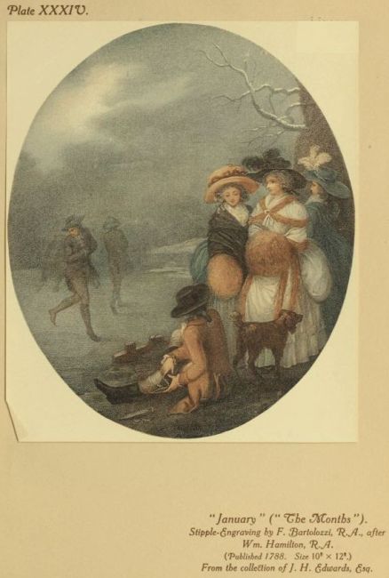
Then there was William Hamilton, a prolific and prevalent artist.
Sent to Italy in his youth by Robert Adam, the architect, he returned
with a sort of Italianate style of storied design, classical, historical,
allegorical, conventional; but, happily, he developed a light, pretty
and decorative manner of treating simple familiar subjects, which
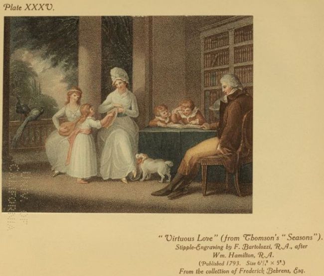
was pleasing alike to engravers and public. The charming plates
from Thomson’s Seasons, engraved by Tomkins and Bartolozzi; the
graceful set of The Months by Bartolozzi and Gardiner; the idyllic
Morning and Evening by Tomkins, with Noon and Night by Delattre,
the numerous designs of children at play, such as Summer’s Amusement,
Winter’s Amusement, How Smooth, Brother! feel again, The Castle in
Danger, by Gaugain; Breaking-up and The Masquerade by Nutter;
Blind Man’s Buff and Sea-Saw, Children feeding Fowls, Children playing
with a Bird, by Knight; Playing at Hot Cockles, and others by
Bartolozzi: these are among the prettiest colour-prints of the period
and the most valued to-day—especially The Months. Hamilton’s work
just synchronised with the popular vogue for the coloured stipple,
and without these prints how much should we know of an artist
so esteemed in his day, and so industrious? One might almost ask
the same of Francis Wheatley, whose popularity also survives but
through the engraver’s medium. It was only after his return from
Dublin, where he might have continued to the end as a prosperous
portrait-painter had not Dublin society discovered that the lady it
had welcomed as Mrs. Wheatley was somebody else’s wife, that
Wheatley began painting those idealised urban, rustic, and domestic
subjects, which gave him such contemporary vogue and led to his
prompt admission among the Royal Academicians. Had he never
painted anything else he would always be remembered by his
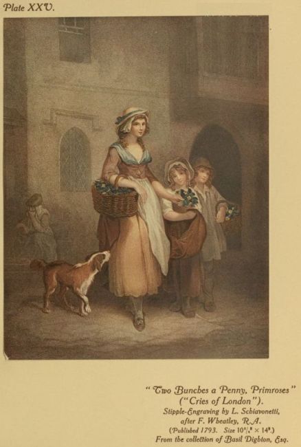
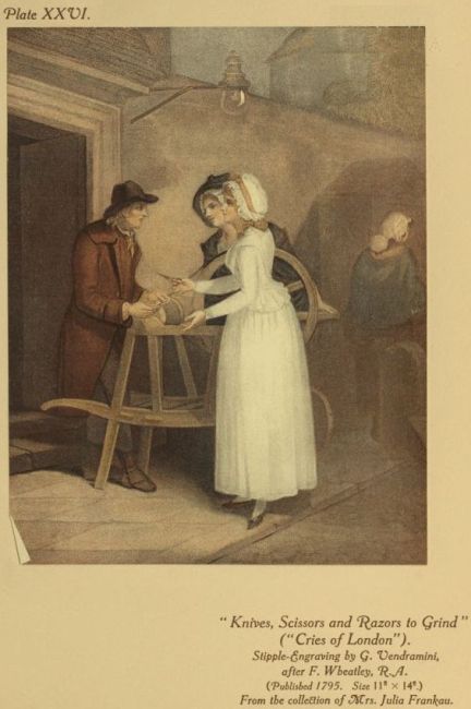
thirteen Cries of London, published by Colnaghi at intervals between
1793 and 1797, and so familiar to us through the accomplished
copper-plates of the Schiavonetti brothers, Vendramini, Gaugain
and Cardon, though, alas! so wretchedly hackneyed through the
innumerable paltry reproductions. But what a fascinating, interesting
set of prints it is! How redolent of old lavender! How
clean, serene, and country-town-like the London streets appear;
how sweet and fragrant they seem to smell; how idyllic the life in
them! As one looks at these prints one can almost fancy one hears
the old cries echoing through those quiet Georgian streets. Perhaps
the London streets of 1795 were not quite so dainty as Wheatley’s
sympathetic pencil makes them look to have been. But, remember,
that in those days lovely ladies in muslin frocks and printed calicoes
of the new fashion, who had sat to Reynolds, and whose portraits
were in the print-shop windows, were still being carried in the
leisurely sedan-chair, and there were many pretty airs and graces to
be seen; while in those streets, too, the youthful Turner was seeing
atmosphere and feeling his graphic way to immortality, and young
Charles Lamb was walking about, “lending his heart with usury”
to all the humanity he saw in those very streets which these Wheatley
prints keep so fragrant. Of the numberless other colour-prints
after Wheatley perhaps the most valued to-day are, in mezzotint,
The Disaster, The Soldier’s Return and The Sailor’s Return, by William
Ward, The Smitten Clown, by S. W. Reynolds; in stipple, the Summer
and Winter of the Bartolozzi “Season” set, of which Westall did
the Spring and Autumn; The Cottage Door and The School Door, by
Keating; Setting out to the Fair and The Fairings, by J. Eginton, and
the pretty Little Turkey Cock by Delattre, all admirable examples
of the kind of art that made Wheatley’s reputation.
The pleasant uninspired rusticities and sentimentalities of Henry
Singleton were to popular as to engage the abilities of some of the
leading engravers, who must certainly have made the best of them
for the colour-printer, since Singleton’s colouring was accounted
poor even in his own day. Among the most taking examples we
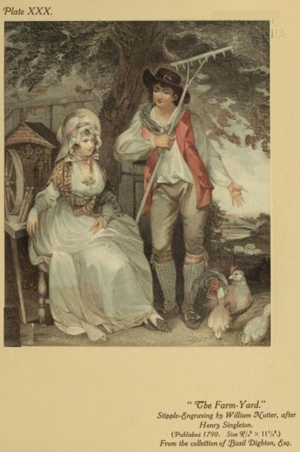
have Nutter’s pretty pair The Farmyard and The Ale-house Door,
Burke’s Vicar of the Parish, Eginton’s Ballad-Singer, Knight’s British
Plenty and Scarcity in India, some children subjects by Meadows
and Benedetti, and E. Scott’s Lingo and Cowslip, which shows that
genuinely comic actor, John Edwin, and that audaciously eccentric
and adventurous actress, Mrs. Wells, in O’Keefe’s notorious Haymarket
farce, “The Agreeable Surprise,” a group which Downman
also pictured, though with infinitely more spirit and character.
Subjects dealing with childhood were still greatly in demand,
but the public now wanted the children to be more grown-up, and
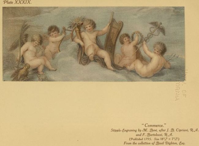
more mundane than the cupids and cherubim of Cipriani, or the
Baby Loves and Bacchanals of Lady Diana Beauclerc, so admired by
Horace Walpole, and so much flattered by the engravings of Bartolozzi,
Tomkins and Bovi. The prolific Richard Westall was not
behind his brother Academicians in adapting his inspiration to the
market, so, combining rural fancy, as required, with the sentiment of
child-life, he made many a parlour look homelier with his pleasant,
plausible picturings. When the charm of the engraving glossed
over the weaknesses, and colour-printing added its enticing advocacy
under Westall’s personal direction, we can find some justification for
their popularity in such prints as Nutter’s The Rosebud, The Sensitive
Plant, and Cupid Sleeping; Josi’s Innocent Mischief, Innocent Revenge,
and Schiavonetti’s The Ghost, a pretty but unequal companion to
The Mask of Reynolds.
Although at this productive period of the colour-print William
Blake’s “Songs of Innocence” were issued, with their sweetly
pictured pages of uniquely printed colour, and their magic simplicity
of poetry, every page having “the smell of April” as
Swinburne said, it does not appear that they exercised any imaginative
influence on the artists who were producing children subjects
for the popular prints. Yet certainly poetic sentiment informed the
grace and charm which were the characteristics of Thomas Stothard,
whose prodigiously industrious and productive pencil dominated in
a great measure the book-illustration of the day. Five thousand
designs are credited to him, and Blake himself engraved some
of these in stipple; but our present concern with Stothard is in
such engaging colour-prints as Knight’s Fifth of November, Feeding
Chickens, The Dunce Disgraced, The Scholar Rewarded, Coming from
School, and Buffet the Bear, Runaway Love, Rosina, Flora, and the
popular Sweet Poll of Plymouth, Nutter’s First Bite, and Just
Breeched; Strutt’s Nurs’d at Home and Nurs’d Abroad, and others of
more adult interest too numerous to mention.
Another popular favourite with the buyers of colour-prints was
the Rev. Matthew. William Peters, the only clergyman who ever
wore the dignities of the Royal Academy, though, as a matter of
fact, it was only after he had attained full academic honours that
he took holy orders. Eventually, after some successful years with
portraiture and fancy subjects, he resigned his R.A.’ship; but it
must be said that while he was painting for popularity there was a
good deal of the “world and the flesh” about his pictures, albeit his
was a very winsome view of both, to wit, the seductively pretty
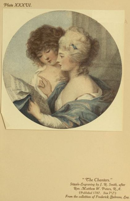
Sylvia and Lydia, by Dickinson; White’s Love and The Enraptured
Youth; John Peter Simon’s Much Ado about Nothing; Hogg’s Sophia,
and J. R, Smith’s The Chanters. The Three Holy Children in Simon’s
print, however, shows Peters more as we may imagine him in the
light of a “converted” Royal Academician—converted to be chaplain
to George “Florizel,” Prince of Wales.
John Russell, whose gracious portraits in pastel appealed to
fashion with the special charm of their uncommon medium, also
found happy interpretation on the copper-plate, especially from the
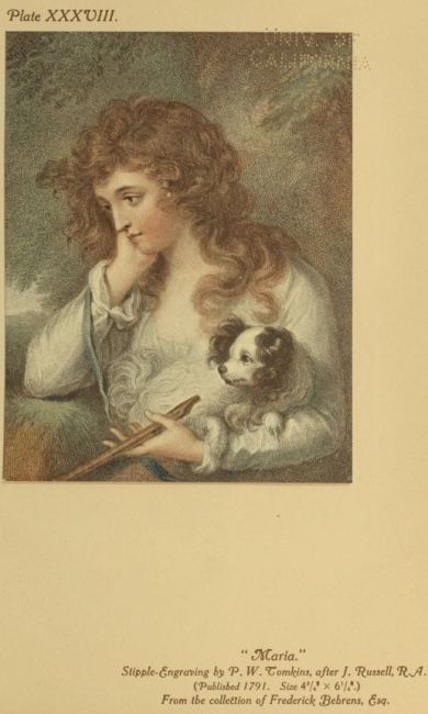
delicate graver of P. W. Tomkins. The most attractive examples
in colours are the charming Maria, Maternal Love (Mrs. Morgan and
child), and Children Feeding Chickens. Collyer’s Mrs. Fitzherbert is also
one of the most desirable among the numerous Russell colour-prints.
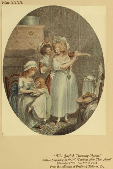
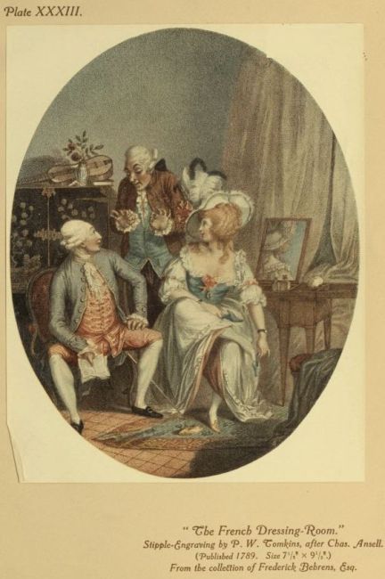
When the engravings of Charles Ansell’s Death of a Racehorse in
1784 had an immense sale, none presumably would have believed
that, a hundred and twenty-five years later, collectors would hold
him in high regard, not for the horses that made him famous, but
for four dainty little drawings of domestic “interiors,” thoroughly
representative of their period, preserved in P. W. Tomkins’s stipple
prints, especially charming and rare in colours. Tomkins engraved
other things of Ansell’s, Knight also; but the set of The English
Fireside and The French Fireside, The English Dressing-Room and The
French Dressing-Room (the two latter reproduced here), if really fine
in colour, must be a prize in the choicest collection. As these prints
give us intimate glimpses into the home-life of the “smart set” of
the period, so, thanks to the pictorial sense of that vivacious artist
Edward Dayes, we are able to see just how the fashionable world
comported itself in the parks. An Airing in Hyde Park and The
Promenade in St. James’s Park, the one engraved by Gaugain, the
other by Soiron, are alive with contemporary social and pictorial
interest, and in colours they are rare to seek. Social interest, too,
flavours chiefly the name of Henry William Bunbury. Classed generally
with the caricaturists, among whom, even in that period of
forcible and unrestricted caricature, he was certainly one of the most
spontaneously humorous as he was the most refined, he had, like his
brother caricaturist Thomas Rowlandson, his days of grace. In those
days he did, not with flawless drawing perhaps, but with a vivid
feeling for beauty, some charming things, which the engravers turned
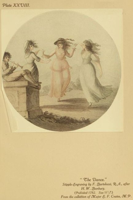
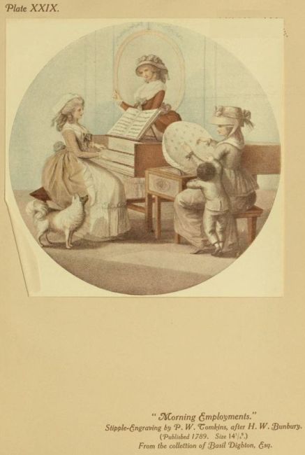
to good account in colour. Among these are Morning Employments
by Tomkins, The Song and The Dance by Bartolozzi, The Modern
Graces by Scott, and Black-eyed Susan by Dickinson.
From his popular task of whipping with genial graphic satire
the social follies and foibles of the day. Bunbury’s pencil would on
occasion “lightly turn to thoughts of love,” as in A Tale of Love,
so artistically engraved by J. K. Sherwin; and it was in this mood
that his discourse on love and romance would somewhat shock
Fanny Burney. She did not think it quite nice in a Court equerry,
who was also a husband and a father, to dilate so rhapsodically on such
topics; but he adored “The Sorrows of Werther,” which she told him
she could not read; and, after all, was he not the devoted husband of
Catherine Horneck, Goldsmiths “Little Comedy”? Rowlandson had
not, of course, Bunbury’s culture and refinement, but with all his
rollicking Rabelaisian humour, he had faultless draughtsmanship
with, when he chose, a daintiness of touch and a magic grace of
curve. Among his countless coloured plates, however, those that
can be accepted as true colour-prints can be numbered almost
on one hand. Opera Boxes and the interesting and vivid Vauxhall,
spiritedly engraved by Pollard, and capitally aquatinted by Francis
Jukes, were not, as generally supposed, actually printed in colours;
but The Syrens and Narcissa, both things of voluptuous charm, are
etched and stippled and veritably colour-printed in part. With
very few exceptions, Rowlandson’s prints were only etched by
him, then aquatinted and coloured by other hands, he supplying
a tinted drawing.
When the mantle of the fashionable portrait-painter had slipped
naturally from the shoulders of Reynolds to those of John Hoppner,
and the older beauties were not as young as they used to be, and a
new set of beautiful young women had meanwhile grown up, the
curious public called for the new faces. So Hoppner, already finely
interpreted by the best mezzotint men, now readily allied himself
with Charles Wilkin, a portrait-painter in oil and miniature of some
repute, who, as a very talented and individual stipple-engraver, had
won his spurs with Sir Joshua, notably in his rich engraving of the
famous Lady Cockburn and her Children. The new venture was A
Select Series of Portraits of Ladies of Rank and Fashion. These, charming
and desirable in monochrome, are delightful, but very rare, in colour.
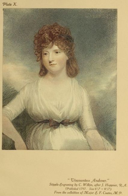
Seven of the portraits were done by Hoppner, and show him in most
gracious vein: these are Viscountesses St. Asaph and Andover,
Countess of Euston, the new Duchess of Rutland, Lady Charlotte
Campbell, Lady Langham, and Lady Charlotte Duncombe. The
other three are from the spirited pencil of the engraver himself—Ladies
Gertrude Villiers, Catherine Howard and Gertrude Fitzpatrick,
who as a child had sat to Reynolds for his Collina. Hoppner’s
Hon. Mrs. Paget as Psyche is also a charming coloured stipple,
engraved by Henry Meyer. The colour-printed mezzotint seems to
have found exceptional favour with Hoppner, for in that medium
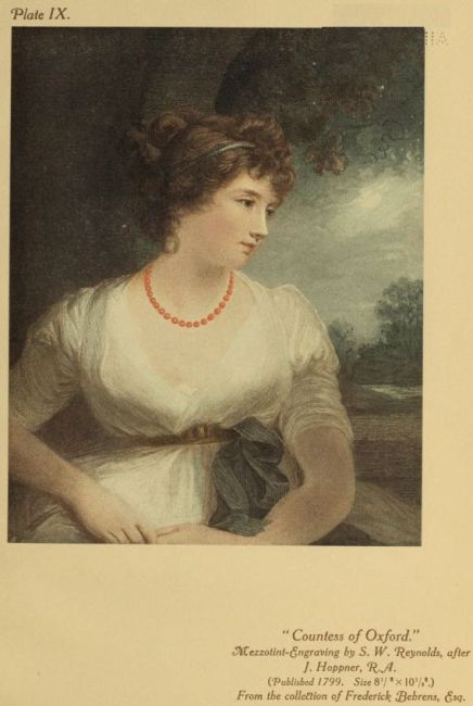
we have the lovely Countess of Oxford—a choice example—and
Mrs. Whitbread, by S. W. Reynolds; J. R. Smith’s Sophia Western
and Mrs. Bouverie, with an engaging suggestion of pastel; Charles
Turner’s Lady Cholmondeley and Child; John Jones’s Mrs. Jordan as
“Hippolyta”; John Young’s Lady Charlotte Greville, Mrs. Hoppner as
“Eliza,” Mrs. Orby Hunter, the Godsall children (The Setting Sun), and
Lady Lambton and Children (one of them Lawrence’s Master Lambton);
William Ward’s pretty Salad Girl, Mrs. Benwell, and The Daughters
of Sir Thomas Franklana, so well known in monochrome, but so
exceedingly rare in colour; James Ward’s Juvenile Retirement (the
Douglas children); Children Bathing (Hoppner’s own); Mrs. Hibbert,
and the graceful Miranda (Mrs. Michael Angelo Taylor), of which
only one impression is known in colours, exquisite in quality, that
in the very choice collection of Mr. Frederick Behrens.
Although Hoppner’s pre-eminence among the portrait-painters
was so long established, it was seriously challenged in the Royal
Academy exhibition of 1790 by the portrait of An Actress from the
brush of a painter only twenty-one years of age, who was destined
to preside over the Academy and become the most fashionable
painter of his day. This was Thomas Lawrence, and the portrait was
that of the popular and beautiful Miss Elizabeth Farren—Countess
of Derby seven years later—in her fur-lined white cloak and muff,
which was engraved by Charles Knight, with finishing touches by
Bartolozzi, who signed it, and is now one of the most desired of
colour-prints, as it is one of the most constantly reproduced.
The acknowledged beauties, however, did not monopolise the
“placidness of content or consciousness of superiority,” which
Dr. Johnson, so Johnsonianly, held was necessary to “expand the
human face to its full expression.” Happily there were artists
to see everywhere dainty and charming women who could be
attractively pictured with the artistic sense of nature and actuality,
perhaps even more picturesquely for not being able always to keep
their temperaments out of their faces and attitudes. One of these
artists was also an eminent engraver, and at the same time an
extensive printseller and publisher, with always one eye to his art
and the other to the main chance. John Raphael Smith loomed
very large in the London print-world of the later eighteenth century,
because he had not only the artistic ability to do the thing
popularly wanted, but also the commercial intuition as to what
would be likely to please the public in its varying fancies. A
master of mezzotint, and monarch among the translators of Gainsborough,
Reynolds and Romney, he used with lighter touch the
same medium for engraving many of his own vivacious picturings
of contemporary social scenes, with their manners and fashions very
much alive. A generous, convivial, cheerful liver himself, filling
every hour with the activities of art, commerce and pleasure,
J. R. Smith had the vivid pictorial eye for what was gay and
pleasing in the life around him. Also he possessed an instinctive
sense of fashion. Therefore, in the numerous attractive drawings
of petty women in varied attitudes of busy idleness, we get a more
real impression of the fashions of the passing hour than even the
stately canvasses of Sir Joshua could give us with all their artistic
defiance of the modistes. Smith would engrave these himself in
stipple suggesting crayon effects, with the original artist’s freedom,
and the mezzotinter’s broad handling of tones; or he would entrust
them to other engravers. Being a painter, he used colour on his
plates judiciously, and among the most highly-prized colour-prints
of the period J. R. Smith’s spirited engravings hold quite an
individual place. To name, perhaps, the most characteristic:
À Loisir; Black, Brown and Fair; Maid; Wife; Widow; and What
you Will; A Christmas Holiday; Flirtilla and Narcissa; The Fortune
Tellers; The Mirror, Serena and Flirtilla; Thoughts on a Single Life,
with its companion, Thoughts on Matrimony, engraved quite as well
by William Ward, at whose hands The Widow’s Tale makes a
charming appearance in coloured mezzotint. In this medium also
The Promenade at Carlisle House enjoys an elusive existence. Then
there are Smith’s Lecture on Gadding and The Moralist, stippled by
Nutter, and his Credulous Lady and the Astrologer, by Simon. But
not even his own designs inspired his mezzotint-scraper to finer
results than the splendid Almeria (Mrs. Meynott), after Opie, or
his stipple-graver to surer beauty than in his Mrs. Mills after
Engelheart, or his Snake in the Grass, after Reynolds, or those
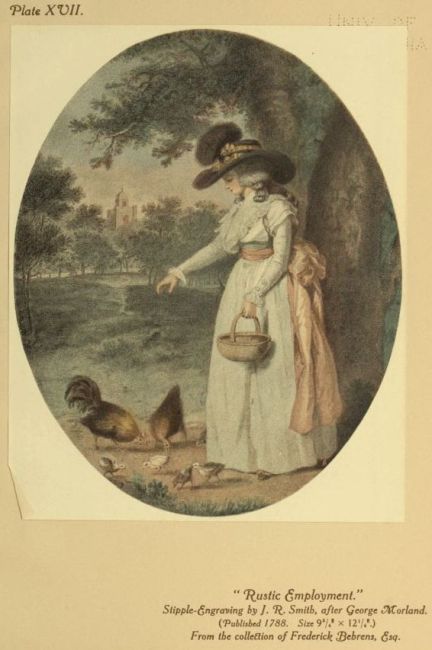
charming and familiar Morland prints Delia in Town and Delia in
the Country, Rustic Employment and Rural Amusement, and the Letitia
set, of course in their original form.
J. R. Smith’s was a dominating personality, and his influence on
his talented pupil, William Ward, was very strong. He taught
him by example, paying him the compliment of engraving in
mezzotint and charmingly colour-printing his pupil’s felicitous,
Morlandish picture, The Visit to the Grandfather. He certainly
made him work, and the results show not only in the innumerable
fine plates which Ward produced in mezzotint and stipple after
various painters, but in his own dainty drawings of charming
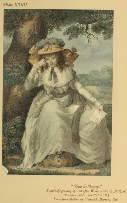
femininity. These, such as the well-known Louise, Alinda, Lucy of
Leinster, Almeida, The Soliloquy, Hesitation, Louisa Mildmay, and
The Cyprian Votary, were all translated to the copper with a verve
and charm, produced by an exact understanding of the artistic
economies of the stippled crayon manner, unsurpassed, perhaps not
equalled, by any other engraver. When finely tinted, they show the
colour-printer’s craft at its daintiest, and their collector’s taste at its
highest. In the same genre are Private Amusement (“Reflection”)
and Public Amusement (“Temptation”), engraved by Ward after
Ramberg—a favourite pair. But very different, of course, in character
are his fine mezzotints of the rural pictures of his talented,
irascible younger brother James. Of these, perhaps, the best print
in colours are The Citizen’s Retreat, Selling Rabbits, Compassionate
Children, The Haymakers, Outside of a Country Ale-house, Summer and
Winter, and the well-known Vegetable Market, the companion to
which, A Poultry Market, was finely engraved by James Ward himself,
whose own attractive plates of The Rocking Horse and Rustic
Felicity and A Cottager going to Market and A Cottager returning
from Market, have also been printed in colours. William Ward’s
popular fame as an engraver, however, will doubtless rest mainly on
his innumerable transcripts in stipple and mezzotint of the pictures of
his brother-in-law, that natural artist, that dissolute, happy-go-lucky
vagabond, that homely, facile painter of genius, George Morland.
In exploiting Morland as he did, John Raphael Smith proved
his unerring instinct for the right popular thing. He was answering
an unconscious call for artistic virility and freshness of vision. The
prints of the widest public appeal, however simple their intentions
in rusticity or domesticity of subject, were merely repeating pictorial
conventions, illustrating stereotyped sentiments. Bigg, Hamilton,
Wheatley, Singleton, Westall, they were all doing pleasing, pretty
things enough, and the public were buying the prints, and hanging
them on the walls of their homes, without even suspecting that
Nature as the true inspiration of art had but little to do with all this
picture-making. Then came Morland, with his natural instinct for
the true, the simple picture, his free and facile art, his charming
wizardry of the palette, his happy, unaffected realism. The others
had been idealising the commonplace; Morland knew that nothing
is commonplace if seen and treated with relative truth. J. R. Smith
saw, both as artist and prosperous publisher of prints, that here at
last was a virile genius that could charm the people’s love of pictures
to a clearer understanding of beauty through a true pictorial vision
of nature.
It was a curious coincidence that just about the same time an
obscure publisher in Kilmarnock had given the Scotch lovers of
song the means of recognising in the natural lyric note of Burns a
reviving impulse for English poetry. Here in Morland was a Burns
on canvas, a Burns who sang with his paint-brush, who could put
the moods of Green Grow the Rashes, O, of My Nannie, O, or The
Jolly Beggars, into enduring pigments as the poet had put them into
immortal song. And Morland’s simple pictures are classic to-day,
because in them, irrespective of subject, is the painter’s true poetry
of form and colour.
Always susceptible to the ready comradeship, in the first consciousness
of his brilliant easy powers, with his artistic ambitions bound
up in his joy of living, Morland came quickly under the influence
of Smith’s convivial yet energising personality. The publisher,
urged by the public’s clamorous response, stimulated him to a prolific
activity, and, with such engravers as Smith himself and the Wards to
interpret him with masterly understanding and sympathy, and all
the other engravers of note eager to do the same, Morland soon
commanded the market—or, at least, his exploiters did. It seemed
that Morland could do everything the public appeared to want,
so, before he developed into the Morland exclusively of the stable
and the farmyard and picturesque vagabondage, he challenged the
popular genre painters on their own ground, and beat them with the
magic simplicity of nature. Could the domestic Bigg do anything
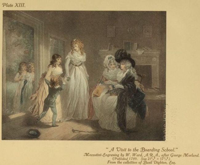
in his own line as charmingly life-like as A Visit to the Child
at Nurse and A Visit to the Boarding School? Look at William Ward’s
mezzotints of these pictures in colour, and then compare with their
sweet actuality of scene and sentiment the same engraver’s version
of Bigg’s The Birth of an Heir, with its scenic posturing and sentimentality.
Then, what colour-prints of children could Hamilton or
Stothard ever have designed to compare, for true suggestion of the
bright buoyancy of childhood, with such gems as Ward’s mezzotints
Children Birds-nesting, Juvenile Navigators, Blind Man’s Buff, The
Kite Entangled; Keating’s Playing at Soldiers, and Nurse and Children
in a Field; Dayes’ Children Nutting, and Tomkins’s stipple Children
Feeding Goats. Morland enjoyed to let the children of the neighbourhood
play and romp about his studio, and thus he could paint
them naturally, with no self-consciousness on their parts and happy
sympathy on his.
No wonder all the engravers were agog to make copper-plates
from his quickly finished paintings. That charming spontaneity of
picturesque impression, with luminous harmony of tones, which
distinguishes all Morland’s pictures, even those painted in his least reputable
days of hand-to-mouth living, is reflected in the best engravings of
his multitudinous works. Of those printed in colours one may attempt
a selection from the point of view of especially fine quality and rarity.
Among the stipples, therefore, must be named again J. R. Smith’s
Rustic Employment and Rural Amusement, Delia in Town and Delia in
the Country, and the famous Story of Letitia series—Domestic Happiness,
The Elopement, The Virtuous Parent, Dressing for the Masquerade, The
Tavern Door, and The Fair Penitent (re-issued in 1811 with the
ample costumes of 1786 incongruously altered to the current slim
Empire fashion, upsetting, of course, the pictorial balance of design).
Then there are Constancy (Mrs. Ward), Variety (Mrs. Morland), and
Morning; Thoughts on Amusement for the Evening—a very rare oval—by
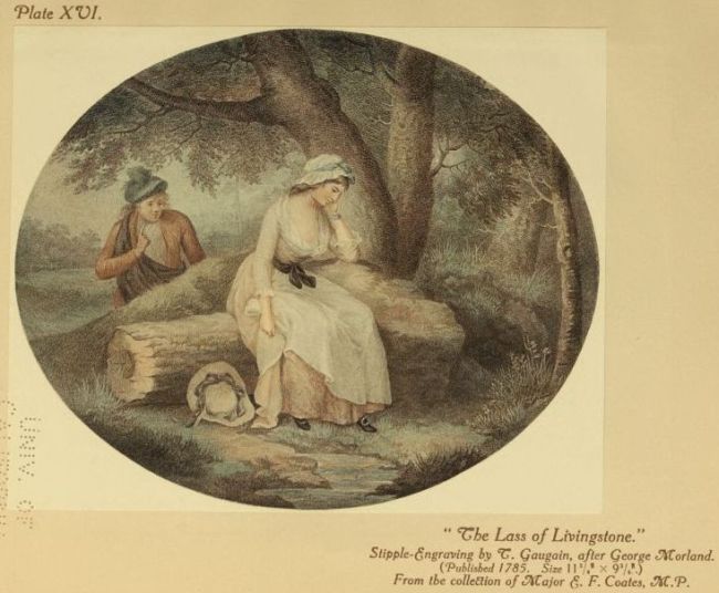
William Ward; Louisa, a pair of large ovals, The Lass of Livingstone,
and How Sweet to meet with Love’s Return, the famous Dancing Dogs,
and Guinea Pigs, all by T. Gaugain (the last pair re-issued by Phillipe);
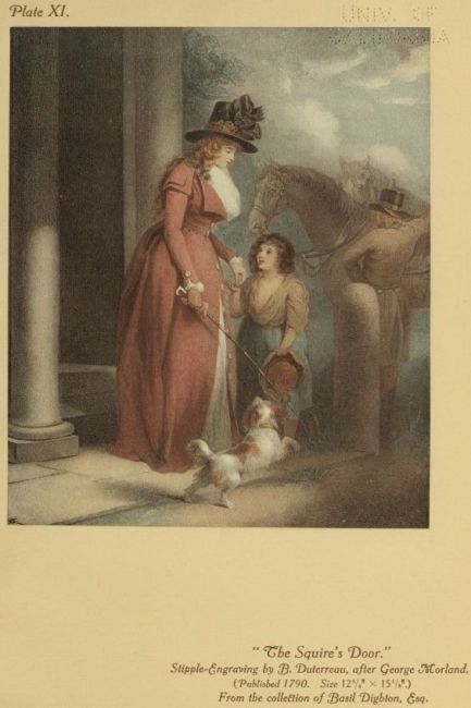
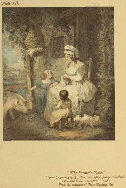
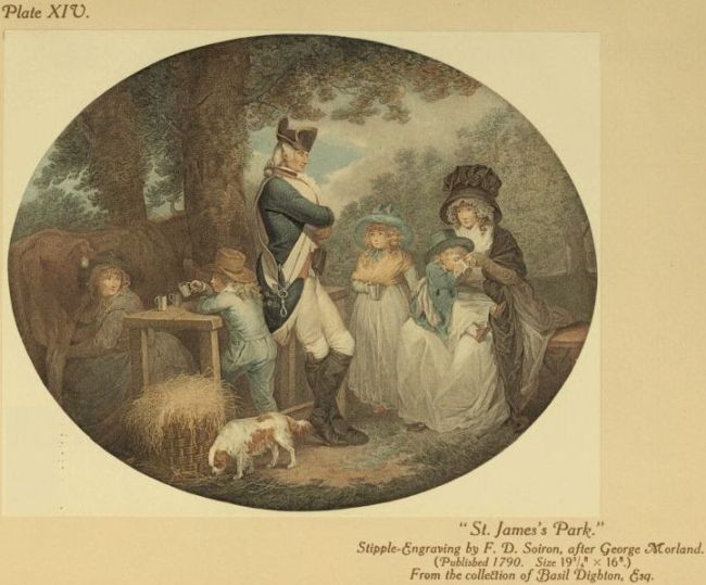
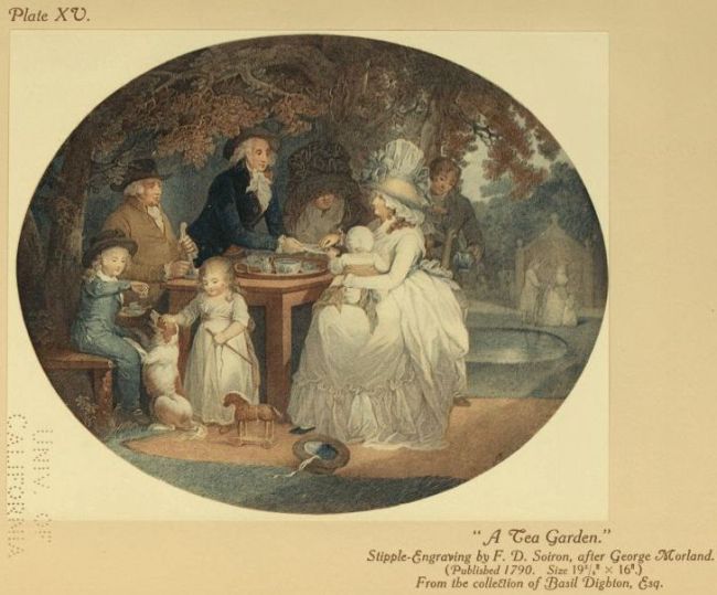
The Tea Garden and St. James’s Park, by F. D. Soiron; The Squire’s
Door and The Farmer’s Door, by Duterreau; The Farmer’s Visit to
his Married Daughter in Town, by W. Bond, and The Visit Returned
in the Country, by Nutter; Industry and Idleness (Mrs. Morland), by
Knight, and The Fair Seducer, and The Discovery, by E. J. Dumée.
Many of Morland’s pictures on the mezzotint plates seem to
have justified the colour-printer, but innumerable Morland prints
were coloured by hand entirely or in part, and it is said that
J. R. Smith employed his young pupil Joseph Mallord William
Turner upon this work. I doubt, however, if even Mr. Rawlinson
could detect Turner’s hand upon a Morland print, therefore we
must be content to distinguish the finest and rarest of the mezzotints
actually printed in colours. To those already named we may
add The Angling Party by Keating, and The Angler’s Repast by
William Ward, to whom we are also indebted for The Coquette at
her Toilet, The Pledge of Love (“Contemplating the Miniature”);
Contemplation (“Caroline of Lichfield”), very rare, and exquisitely
suggestive of the original in Mr. Thomas Barratt’s wonderful
Morland collection; Cottagers, Travellers, The Thatcher, First of
September—Morning, First of September—Evening, Inside of a Country
Ale-house, The Public-House Door, The Effects of Extravagance and
Idleness, The Turnpike Gate, The Sportsman’s Return, and The Farmer’s
Stable, Morland’s National Gallery masterpiece; The Return from
Market, a beautiful thing, and Feeding the Pigs, by J. R. Smith;
Sunset: a View in Leicestershire, by James Ward; Summer and Winter
by W. Barnard; Morning, or the Benevolent Sportsman; Evening, or
the Sportsman’s Return, by J. Grozer, and Selling Cherries and Shelling
Peas, a very rare pair, etched and mezzotinted by E. Bell. Then
there is “The Deserter” set, by Keating, Enlisting a Recruit,
Recruit deserted and detected hiding in his wife’s room, The Deserter
handcuffed and conveyed to a court martial, The Deserter pardoned and
restored to his family; a set of pictures studied with realism resulting
from one of Morland’s characteristic adventures, possible, perhaps,
only in the eighteenth century. Snipe Shooting, one of a set of four,
by G. Catton, Jun., must not be forgotten; it is of particular
interest as showing aquatint in effective combination with stipple
and etching. How important a place Morland fills in the history
of eighteenth-century prints, one realises only when, looking over
a collection like Mr. Thomas Barratt’s at Hampstead, where the
colour-prints are to be seen in their multitude, one attempts to note
down a few gems, and finds a long list has quickly accumulated.