Little is known of Jackson’s early years. It is
assumed that he was born in England about 1700, although many accounts,
probably based upon Nagler, have him born in 1701. Papillon12 conjectures
that he studied painting and engraving on wood with “an English painter”
named “Ekwits,” but is not sure he remembers the name correctly. He
believes this artist engraved most of the head pieces and ornaments in
Mattaire’s Latin Classics, published by J. and
R. Tonson and J. Watts in London, 1713, and remarks on
similarities with Jackson’s style. Chatto13 believes these cuts were executed
by Elisha Kirkall, interpreting the initials EK appearing on one
of the prints to refer to this engraver rather than to “Ekwits.” He goes
on to assume that Kirkall also engraved the blocks for Croxall’s edition
of Aesop’s Fables, 1722, by the same publisher, and adds that
Jackson was probably his apprentice and might have had some share in
their execution. Most accounts of Jackson, taking Chatto’s word, note
him as a pupil of Kirkall.
Linton14 believes that only Kirkall or Jackson could have made
the cuts, “unless some Sculptor ignotus is to be credited with
that most notable book of graver-work in relief preceding the work of
Bewick.”
But it is doubtful that Jackson was a pupil of Kirkall. For this
assumption we have the evidence of a curious and important little book,
An Enquiry into the Origins of Printing in Europe,15 which because
of a misleading title and an anonymous author has been overlooked as a
reference source. It is a transcription of Jackson’s manuscript journal
and was prepared for publication to coincide with
the launching of the wallpaper venture, Kirkall is mentioned as follows
(pp. 25-26):
... I shall give a brief account of the State of Cutting on Wood in
England for the type Press before he [Jackson] went to France in 1725.
In the beginning of this Century a remarkable Blow was given to all
Cutters on Wood, by an invention of engraving on the same sort of Metal
which types are cast with. The celebrated Mr. Kirkhal, an able
Engraver on Copper, is said to be the first who performed a Relievo Work
to answer the use of Cutting on Wood. This could be dispatched much
sooner, and consequently answered the purpose of Book-sellers and
Printers, who purchased these sort of Works at a much chaper [sic] Rate
than could be expected from an Engraver on Wood....
It does not seem reasonable that Jackson would learn the art of
woodcutting from Kirkall and then refer to him as a famous engraver on
copper and type metal. It is just as difficult to believe that Kirkall
taught Jackson to work on metal, not wood.
The “EK” who engraved the blocks for Mattaire’s Latin Classics
might very well have been Kirkall, whose style also might have had
something in common with Jackson’s early work. But this would not
necessarily indicate a definite influence. English pictorial relief
prints for book illustration in the first decades of the 18th century
had one characteristic in common; they were almost all done with the
engraver’s burin on type metal or end-grain boxwood. They therefore
showed elements of a “white-line” style as opposed to the black-line or
knife-cut method commonly used in other countries. While it is likely
that Jackson was an exception to the general rule in England (we have
his word for it in the Enquiry, as we shall see), he was also
deeply influenced by the prevailing English style of burin work on wood
or type metal. If Papillon saw a similarity between Jackson’s cuts and
those in the Latin Classics, it might have been because he was
unfamiliar with other examples of English work and did not recognize a
national style.
The initials “J. B. I.” appear on a small cut in the 1717 edition of
Dryden’s plays, also published by Tonson. If this is an early piece by
Jackson it would indicate that he might have been born earlier than
1701, although it is conceivable that he could have made it when he was
sixteen.
This is the extent of the evidence, or rather lack of evidence, of
Jackson’s early years in England. Nothing is certain except that
woodblock work was at a
particularly low ebb. Standards in typography and printing were rude
(Caslon was just beginning his career), far inferior to those on the
Continent. Cuts were used rather sparingly by printers, and almost
always for initial letters (these included little pictures), for
tailpieces, and for decorative borders. As a measure of economy the same
cut was often repeated throughout a book. Also, initial letters were
sometimes contrived to permit the type for different capitals to be
inserted in the center area, so that in some instances no more than two
cuts were needed to begin alternate chapters in a volume. Rarely were
woodblocks employed to illustrate the text. Pictures were almost always
supplied by the copper-plate engraver, even when the prints were small
and surrounded with typographical matter. This was an expensive and
troublesome procedure, but it was the only one possible where an able
group of cutters or engravers on wood did not exist and where printers
found it difficult to achieve good impressions on the uneven laid paper
of the time.
The main employment for knife cutters on wood was in making the
popular prints, or illustrated broadsides, which had been sold in city
and village throughout the country since the early 1600’s. Plank
and knife could be used for these prints because of the generally large
size of the pictures and the lack of sophistication of the audience.
They are described by Bewick from his memories as a boy in the 1760’s:16
I cannot, however, help lamenting that, in all the vicissitudes which
the art of wood engraving has undergone, some species of it are lost and
done away: I mean the large blocks with the prints from them, so
common to be seen, when I was a boy, in every cottage and farm house
throughout the country. These blocks, I suppose, from their size,
must have been cut on the plank way on beech, or some other kind of
close-grained wood; and from the immense number of impressions from
them, so cheaply and extensively spread over the whole country, must
have given employment to a great number of artists, in this inferior
department of woodcutting.... These prints, which were sold at a very
low price, were commonly illustrative of some memorable exploits, or
were, perhaps, the portraits of eminent men.... Besides these, there
were a great variety of other designs, often with songs added to them of
a moral, a patriotic, or a rural tendency, which served to enliven
the circle in which they were admired. To enumerate the great variety of
these pictures would be a task.
Bewick adds that some of these popular woodcuts, although not the
great majority, were very good. Since this was the main field for
woodcutters, it is an interesting conjecture that Jackson might have
been trained for this craft. As he matured, we can assume that he felt
the urge to excel as a woodcutter and left the country to develop his
potentialities.
It must be remembered that in painting and engraving England was far
behind the continental countries, which could boast of centuries of
celebrated masters. The medieval period persisted in England until the
time of Henry VIII. Traditional religious subjects, so indispensable to
European art, were thereafter generally proscribed. There was no
fondness as yet for themes of classical mythology, and the new and
developing national tradition in painting had to form itself on the only
remaining field of pictorial expression, portraiture. Standards of style
were set by foreign artists who were lured to England to record its
prominent personages in a fitting manner. Beside such masters as
Holbein, Zuccaro, Moro, Geeraerts, Van Dyck, Mytens, Lely, Kneller,
Zoffany, and Van Loo, among others, native painters seemed crude and
provincial. The list of foreign artists other than portraitists who
visited England before 1750 for varying periods is also impressive.
If good native painters were rare in the first decades of the 18th
century, good engravers or woodcutters were even rarer. Hogarth, whose
earliest prints were produced in the 1720’s, received his training from
a silversmith.
Jackson’s next move was toward the Continent.
Jackson arrived in Paris in 1725,
his age 24 if we accept 1701 as his birth date. Here flourished a
brilliant community of artists, craftsmen, dealers, and connoisseurs;
woodcutting, etching, and line engraving were highly developed and the
printing offices made extensive use of woodcuts for decoration and
illustration. The
woodcut tradition mimicked line engraving and was confined chiefly to
tiny blocks wrought with the utmost delicacy. The main influence came
from the 17th century—in particular from the etchings and line
engravings of Sébastien Le Clerc and from the etchings of Jacques
Callot, whose simple system of swelling parallel lines, with occasional
cross-hatchings, was adopted by both line engravers and woodcutters.
Le Clerc, whose style was influenced by Callot, had produced a vast
number of illustrations involving subjects of almost every type; his
designs, therefore, were ready-made for publishers who wanted good but
low-priced illustrations. Woodcutters copied his engravings shamelessly,
line for line. The overblown high Baroque style in ornament, swag, and
cartouche was also drawn upon as a source for decorative cuts. In an
attempt to imitate the full tonal scale of engraving, the woodcutters
used heavier lines in the foreground to detach the main figures from the
background, which was made up of more delicate lines. Background lines
were often narrowed further by scraping down their edges, an operation
that caused them to merge imperceptibly into the white paper. In this
way, although the natural vigor of the woodcut suffered, an effect of
space and distance was achieved. Because of the small scale this
technique was difficult, especially when cross-hatching was added, and
special knives as well as a phenomenal deftness were needed to work out
these bits of jewelry on the plank grain of pear, cherry, box, and
serviceberry wood.
Jackson’s initial impression of the state of woodcutting in France is
described in the Enquiry (p. 27):
From this Account it is evident that there was little Encouragement to
be hoped for in England to a Person whose Genius led him to prosecute
his Studies in the ancient Manner; which obliged Mr. Jackson to
go over to the Continent, and see what was used in the Parisian
Printing-houses. At his arrival there he found the French
Engravers on Wood working in the old Manner; no Metal Engravers, or any
of the same Performance on the end of the Wood, was ever used or
countenanced by the Printers or Booksellers in that City. He tells us
that he thought himself a tolerable good Hand when he came to
Paris, but far inferior to the Performances of Monsieurs
Vincent le Seur and Jean M. Pappillon....
Jackson admits benefiting from the friendship and advice of these
woodcutters, then goes on to describe their work with a ruthless
frankness. Le Sueur, he
says, was a brilliant copyist of the line engravings of Sébastien Le
Clerc but, because he was a line-for-line copyist, lacked skill in
drawing. Papillon’s father, also a woodcutter who copied LeClerc, avoided
cross-hatching, which Jackson considered an essential ingredient of the
true style of black-and-white woodcutting; Papillon himself, while
described as a draughtsman of the utmost accuracy, was criticized for
making his work so minute that it was impossible to print clearly.
Jackson says in the Enquiry (pp. 29-30):
If his Father neglected Cross Hatching, the Son affected to outstrip the
le Seurs in this difficult Performance, and even the ancient
Venetians, believing to have fixed a Non plus ultra in our
Times to any future Attempts with Engraving on Wood.
... I saw the Almanack17 in a horrid Condition before I left
Paris, the Signs of the Zodiack wore like a Blotch,
notwithstanding the utmost Care and Diligence the Printer used to take
up very little Ink to keep them clean. I have chosen to make
mention of these two Frenchmen as the only Persons in my time
keeping up to the Stile of the ancient Engraving on Wood; and as they
favoured me with their Friendship and Advice during my abode in
Paris, I thought in Justice to their good Nature it was
proper to give some Account of their Merit!
Acknowledgment of friendship and merit in this vein, while entirely
true (Papillon was minute to the point of exhibitionism, and his cuts
were often not adapted to clear printing), demonstrates the lack of tact
that made powerful enemies for Jackson wherever he traveled. Papillon no
doubt read the Enquiry, in which he was discussed at length, and
the well-known Essay, with its aggressive tone and irresponsible
claims. When Papillon’s Traité came out in 1766 he took the
opportunity to put the English artist in his place. Certainly his
account was colored by Jackson’s writings; there is no other explanation
for this display of personal bitterness in a work published 36 years
after the Englishman left Paris (pp. 327-328):
J. Jackson, an Englishman who lived in Paris for a few years, might
have perfected himself in wood engraving, which he had learned, as I
said previously on page 323, from an English painter, if he had been
willing to follow my advice. As soon as he arrived in Paris he came to
me asking for work; I gave him some things to execute for a few
months in order to allow him to live, for which he repaid me with
ingratitude by making a duplicate of a floral ornament of my design
which he offered, before delivering the block to me, to the person for
whom it was to be
made. From the reproaches I received when the matter was discovered,
I refused, naturally, to employ him further. Then he went the
rounds of the printing houses in Paris, and was forced to offer his work
ready-made and without order, almost for nothing, and many printers,
profiting by his distress, supplied themselves amply with his cuts. He
had acquired a certain insipid and limited taste, little above the
mosaics on snuffboxes, similar to other mediocre engravers, with which
he surcharged his works. His mosaics, however delicately engraved, are
always lacking in effect, and show the engraver’s patience and not his
talent; for the remainder of the cut has only delicate lines without
tints or gradations of light and shade, and lack the contrast necessary
to make a striking effect. Engravings of this sort, however deficient in
this regard, are admired by printers of vulgar taste who foolishly
believe that they closely resemble copper plate engraving, and that they
give better impressions than those of a picturesque type having a
greater variety of tints.
Jackson, having been forced by poverty to leave Paris, where he could
find nothing further to do, traveled in France; then, disgusted with his
art, he followed a painter to Rome, after which he went to Venice,
where, I am told, he married, and then returned to England, his
native country.
Whether or not Jackson was unethical he was certainly an active
competitor and many printers “supplied themselves amply with his cuts.”
He must have produced an enormous amount of work during his five years
in Paris because John Smith, in his Printers Grammar,18 says that
Jackson’s cuts were used so widely and for so many years in Paris that
they replaced the fashion of using “flowers,” or typographical
ornaments, and that this style did not come into vogue again until the
cuts were completely worn down through use.
This statement is not entirely true, but it is probable that
Jackson’s woodcuts, more broadly executed than the typical French
products, outlasted all others of the 1725-30 period. They were
consistently re-used, and appeared, as far as they can be traced, well
into the 1780’s.19
Elsewhere in the Traité, however, Papillon has a good word for
Jackson’s abilities:20
Jackson, of whom I have already spoken, also engraved in chiaroscuro;
I have a little landscape by him which is very nicely done.
It was inevitable that Papillon and Jackson should clash. The
Frenchman’s notion of woodcutting was influenced, as we have seen, by
copper plate engraving; he wanted, by incredible minuteness of cutting,
to achieve approximately the same results. This was in keeping with the
delicate French rocaille tradition on which Papillon was
nurtured; to him any other contemporary style of book decoration was
evidence of bad taste. Jackson, on his part, felt that this approach
violated the essentially broad, vigorous nature of the woodcut and, in
addition, made excessive demands on the printer. Since this impoverished
beginner, and an Englishman at that, refused to take his earnest advice
or to fall into the prevailing style, Papillon was enraged. After all,
Jackson was working as an employee. But Papillon was not entirely blind.
In a number of places in the Traité he made reference to other
woodcutters who were working in Jackson’s style, and he recorded some of
the works the Englishman illustrated during his five years in Paris.

Headpiece by J. M. Papillon for his
Traité historique et pratique de la gravure en bois, Paris, 1766,
vol. 3. This is an example of Papillon’s minute style, against
which Jackson rebelled. Actual size.
Enlarged
view.
Jackson’s blossoming out as a maker of wallpaper after his return to
England and his brash claims in this connection in the Essay,
must also have irked Papillon, who knew the field as an expert; his
father in 1688 had set up the first large printing house in France for
wall hangings, and after his death in 1723 Papillon had inherited it. In
1740, he sold the business to the widow Langlois, but he had run the
shop during Jackson’s residence in Paris and his former employee no
doubt had learned a great deal by observing its operation. Yet here more
than twenty years later was the upstart Englishman again, venturing into
wallpaper manufacturing with an air of moral superiority, attacking all
other products as unworthy. Jackson’s ridiculing of the Chinese style
must have been particularly galling since
Papillon and his father had specialized in producing such papers. These
were much better than comparable English work, but Jackson, confining
himself to English products, had attacked the whole style without making
distinctions.
According to the Enquiry (pages 32-55 of this book will be
drawn upon for the ensuing details of Jackson’s career),
M. Annison, Director of the Imprimerie Royale, for whom Jackson
produced many cuts, introduced him to Count de Caylus, collector,
connoisseur, etcher, and the leading spirit in French engraving at the
time. De Caylus had, in 1725, undertaken to direct the reproduction of
drawings and paintings in the best French collections.21 Pierre Crozat, the
famous collector, sponsored the publication of this ambitious work.
The drawings were reproduced in chiaroscuro while the paintings were
rendered in black-and-white by a corps of engravers. The chiaroscuros
were made by combining an etched outline, usually by de Caylus or
P. P. A. Robert, with superimposed tones, mainly in green or
buff, from one or two woodblocks cut in most cases by Nicolas Le Sueur,
or under his direction. This was not a new printing method. Hubert (not
Hendrick) Goltzius had first employed it in a set of Roman emperors
after antique medallions in 1557.22 To reproduce drawings by Raphael,
Parmigianino, and himself, Abraham Bloemart, as well as Frederick and
Cornelius Bloemart in the early 1600’s, had used this combination
extensively, and as described earlier, p. 11, Kirkall had used it
between 1722 and 1724.23 The combination method produced rather feeble prints
that lacked the vigor of straight woodblock chiaroscuro. The etched
outline was thin and ineffective, and the tints were pallid so as not to
overpower the drawing. Only Abraham Bloemart’s prints in this style were
convincing, although Kirkall’s chiaroscuros, in their soft, over-modeled
way, had individuality. But the Cabinet Crozat lacked distinction
entirely. The chiaroscuros had a mechanical look, a fact not
surprising when we remember that they were produced by a team of
engravers—assembled, as it were,
from several hands working in different media. The best prints were a
few chiaroscuros made entirely from woodblocks by Nicolas Le Sueur,
although these were also rather tepid, no doubt to harmonize with the
rest of the work.
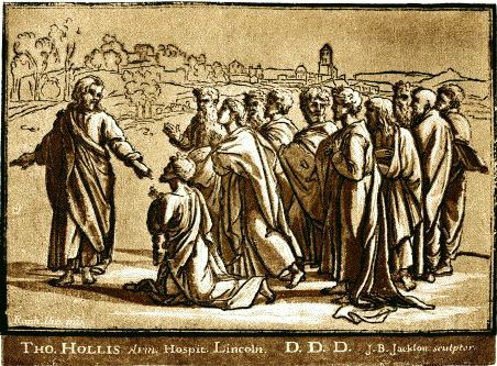
Jackson tells us that he worked on some tint blocks, first from a
drawing by Giulio Romano and later from a drawing by Raphael, Christ
Giving the Keys to St. Peter, the original modello for one of
the famous tapestry cartoons. Count de Caylus, he says, liked the work
and wanted to employ him further on the project, but Crozat rejected him
flatly. De Caylus, according to Jackson, was embarrassed and distressed
and offered recompense for the lost time and labor, but Jackson, not to
be outdone in generosity by a nobleman, refused, explaining that the
honor of knowing the Count and receiving his approbation more than made
up for his lost effort.
Vincent Le Sueur objected to the combination method and withdrew
early from the project. Possibly Jackson, who also disliked this method
and was not known for his discretion, was considered by Crozat to be a
disruptive element. Possibly his style of cutting was not retiring
enough for Crozat’s tasteful French notion of chiaroscuro. This project,
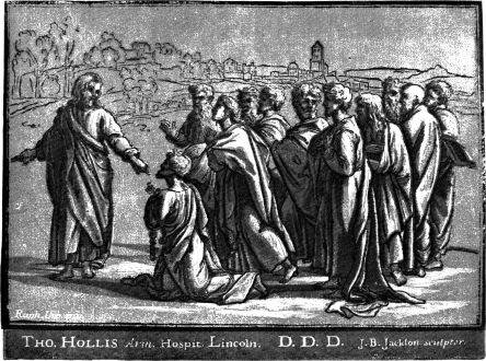
in any case, aroused the Englishman’s interest in the process. Christ
Giving the Keys to St. Peter, after Raphael, made about 1727, was
probably Jackson’s first chiaroscuro woodcut. No doubt he produced it on
his own and offered it as a plate for the publication, perhaps at the
time he was commissioned to cut the tint blocks to be used in
combination with de Caylus’ etching of this subject.
With both Papillon and the powerful Crozat against him, Jackson was
finished in Paris. De Caylus urged him to go to Italy. Accordingly, in
April 1730, he left Paris in the company of John Lewis, an English
painter, and set out for Rome, where he expected to continue his studies
in drawing and deepen his knowledge of art.
Jackson’s style was still being formed during his Paris period.
Confined for the most part to initial letters, headbands, and
tailpieces, his work differed from contemporary French cuts only in its
technical handling, which was firmer and broader. Little of a more
creative nature came his way, and the Paris stay therefore served as a
useful interim during which he became adept in his craft. The necessity
for keeping himself alive by cutting on wood developed his powers of
invention
and his facility: he became a remarkably rapid and skillful cutter.
Jackson gathered strength in Paris, but it was in Venice that he really
came to maturity as an artist.
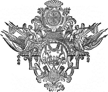
Tailpiece in Histoire générale de
Languedoc, by Claude Vic and J. J. Vaissete, Paris, 1730,
vol. 1. Note the even tone and clean cutting compared with
Papillon’s light-and-dark contrasts and dainty cutting. Actual size.
After leaving Paris, Jackson and
Lewis journeyed to Marseilles, where Jackson became seriously ill and
remained for six months, while Lewis continued to Genoa. Regaining his
health, Jackson went on to Genoa and then to Leghorn, Pisa, and Lucca,
arriving in Florence in January 1731. There, during a stay of several
months, he discussed with the Grand Duke of Tuscany a reprinting of
Vasari’s Lives of the Painters. Jackson was to make cuts for the
headpieces, but the project was eventually dropped, and he continued to
Bologna, where he remained a month chiefly in the company of the
woodcutter G. M. Moretti, who showed him some original blocks cut
by Ugo da Carpi for printing in chiaroscuro. He then proceeded to
Venice, arriving “three Days before the Feast of the Ascension in 1731,
and was highly surprized to find no one Engraver on Wood capable to do
such poor Work, he has seen at Bolonia.” Jackson was amply supplied with
strong recommendations from Florence, and on showing his work to leading
printers was urged to settle in Venice, where a fine woodcutter capable
of both designing and executing cuts was urgently needed. Here he also
met Count Antonio Maria Zanetti, who was well-known as a chiaroscuro
woodcutter besides being a collector and patron of the arts. Their first
meeting is described in the Enquiry:
... very soon after his [Jackson’s] Arrival he had an Interview with
Signior Antonio Maria Zannetti; from the Accounts he had heard
from Mr. Marriette in France of this Man’s Work in
Chiaro Oscuro, he expected to see some wonderful Performance, but
Parturiunt montes nascetur ridiculus mus is a most applicable
Proverb on this Occasion. I who have perused this grand Raccolta of
Zannetti’s, must acknowledge that they are a trifling
Performance, inferior to any Attempts of this Kind in our Times; and
indeed it is no Wonder, when we come to know that this Man never used a
Press, nor so much as a Hand Roll to print his Works with. Our
Countryman says he had room to suspect he neither did cut or print these
Works, which was confirmed by the poor Men who performed both. But such
was the Vanity of this Author, that he told the Public in his
Dedications that he was the Restorer of that lost Art, whereas he only
drawed them on the Blocks,
which might have been done as well by those that cut and printed them.
At this first Interview the low Cunning of this Man was discovered....24
Jackson undoubtedly disliked Zanetti’s soft and delicate treatment,
so characteristic of 18th-century work, and considered his
interpretation of Parmigianino and Raphael little short of sacrilege.
Since Jackson was incapable of hiding his feelings a quarrel became
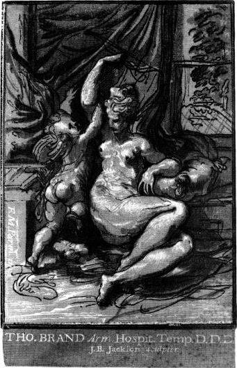
inevitable. The first rift came when Zanetti let Jackson have for a few
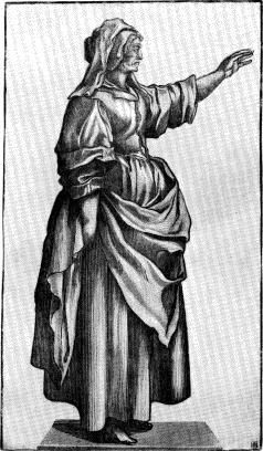
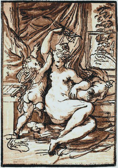
weeks a drawing by Parmigianino, the Venus and Cupid with a Bow,
to be executed in four blocks. The print was done “intirely in
Hugo’s [da Carpi’s] manner, with this Difference, that no
Oscuro block has a Contour to resemble the original Drawing it
was done from, which is seldom seen in Hugo’s works....” Zanetti,
surprised by the fine quality of the first proof, proposed to pass it
off on Mariette in Paris as an original da Carpi print. He even stained
it and cut holes in it to give the impression of aged worm-eaten paper.
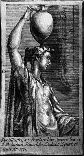
At the same time Jackson executed another chiaroscuro, also based on a
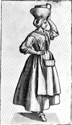
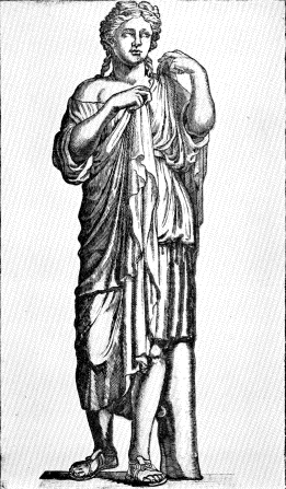
Parmigianino drawing, the Woman Standing Holding Jar on her Head.
Zanetti, says the Enquiry—
... caressed the Author with the highest Expressions of Zeal for his
Service, protesting he would communicate his Capacity to his
Correspondents all over Europe, which would be the Means to
advance his Fortune, especially amongst the English Quality and
Gentry who travelled Italy. The intent of all those fine Promises
was to get the two Sets of Blocks into his Hands, which he expected as a
Present for the Use of the two original Drawings, from which these
Prints were taken; but this not being complyed with, the
Restaurati expressed a Resentment at this Refusal, and took all
the Opportunities to distress the Undertakings of any Sort performed by
Mr. Jackson, during fourteen Years Residence in
Venice.
Zanetti was charged, in some obscure way, with obstructing Jackson’s
work in cutting 136 blocks for the Istoria del Testamento Vecchio e
Nuovo, popularly known as the Bibbia del Nicolosi,25 published by
G. B. Albrizzi in 1737. We are informed that Filippo Farsetti, one
of Jackson’s patrons, paid him for the whole set of cuts after rebuking
Zanetti for interference.
The Englishman evidently was kept well occupied with preparing cuts
for printers, among them Baglioni and Pezzana. For the latter he made 24
woodcuts for a quarto edition of a Biblia Sacra and an
unspecified number of ornaments for a folio edition. Jackson was given a
free hand to conceive and carry out the cuts as he pleased.
While working on these prints he began—
to consider on his favourite Work in Chiaro Oscuro, and by
intervals examined what he had projected at Paris. He began first
to make experiments with Tints, and having proved that Four Impressions
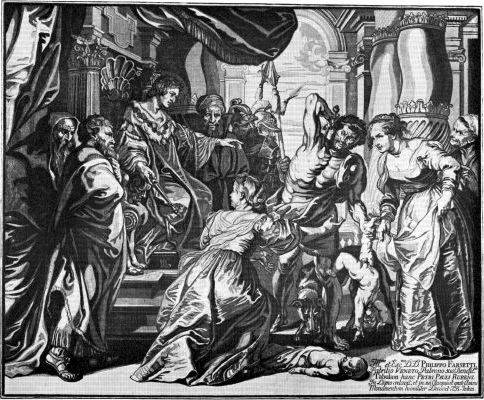
could produce Ten positive Tints, besides Tratti and
Lights; he resolved to try a large Piece from Rubens’s
Judgment of Solomon, with an intent to prove what could be done
with the Efforts of a Type Press before he launched into greater
Expences with another Machine.
He wanted this press in his home, where he could experiment as he
pleased without tying up workmen or equipment in Pezzana’s shop. It
might have been professional delicacy that prompted him to ask Pezzana’s
permission to have a private press built, or it might have been a bid
for patronage from the generous and influential printer. In any event,
Pezzana responded by having his carpenters build and install the press
at his own expense. To avoid official registrations or craft suspicions,
he had it registered as his own. The trial proofs of The Judgment of
Solomon, printed from four blocks, pleased Jackson in every regard
except vigor of impression. Unfortunately no edition was published,
despite the dedication to Filippo Farsetti.
Finished in 1735, this woodcut was probably the first to translate a
painting in a full range of tones. From the purely technical standpoint
it was an incredible achievement. Jackson created a vivid approximation
of a large and complex painting and at the same time produced a vigorous
woodcut. From four superimposed woodblocks, with almost no linework, he
was able to capture the full-blooded forms of Rubens. By keeping his
means simple Jackson asserted the importance of his cutting and
printing, the expressiveness of his drawing, and the fluidity of his
tones. Obviously such a procedure required major decisions as to what to
omit and what to stress; in other words it required interpretive
abilities of a high order.
Evidently Jackson believed that his new chiaroscuro method required
heavier pressure than the platen press was capable of. (On the usual
wooden screw press
the size of the platen never exceeded 13 by 19 inches, because the
impressions made with a larger platen would not have been strong enough;
for prints larger than the platen, the bed was moved and the platen
pulled down twice.) He had the press returned to Pezzana and set out to
build a more suitable printing machine.
He found there were other means to be employed beside a Type Press, and
having examined the Theory of his Invention put it in Practice, by
erecting a Rolling Press of another Construction than what is used for
printing Copper Plates.
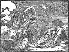
Illustration in Biblia Sacra
published by Hertz, Venice, 1740, vol. 1. Originally cut by Jackson
for Albrizzi’s Istoria del Testamento Vecchio e Nuovo, Venice,
1737. Actual size.
Enlarged
view.
In Paris Jackson had suggested using a cylinder press for printing
wood blocks. The gentlemen to whom the suggestion was made, Count de
Caylus, Coypel, and Mariette, were sure that the enormous pressure would
split the blocks. The Englishman, on the contrary, felt that the
pressure, properly controlled by a chase, would hold the blocks
together. Printing would be much more rapid and the exceptional vigor of
the impression would suggest a hand drawing. The use of cylinder presses
for chiaroscuro printing was already well known to experts. George
Lallemand and Ludolph Businck, sometime between 1623 and 1640, had used
not one but a series of six cylinders on three joined presses, with
three printers simultaneously inking separate blocks with different
tones. Impressions were then printed from each block in succession.
Papillon26 described this press, and also another with a special
chase designed at an unspecified date by Nicolas Le Sueur. Jackson’s
prints show a much stronger impression than those of Businck or Le
Sueur. No details of his press are known, although Thomas Bewick27 reported
that Jackson as an old man had shown him a drawing of its
construction.
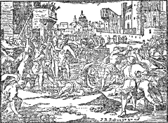
Illustration for Albrizzi’s
Istoria, in which it was cut No. 136. From Hertz’s Biblia
Sacra, vol. 1. Actual size.
Enlarged
view.
The cylinder press of Jackson’s design was finished in 1735 and paid
for by the income from prolonged sieges of work for printing offices.
But the overwork and resulting exhaustion laid him low; a serious
illness followed and for several months he was close to death. When he
eventually regained his health he found that his cuts for Baglioni and
Pezzana had been copied and mutilated by an engraver at Ancona. This
pirate was encouraged by the head of a large printing establishment
newly founded in Venice, who thereupon offered Jackson work at greatly
reduced prices. He refused the offer. With hack woodcutters now stealing
both his designs and his manner of cutting, and working at a far lower
rate than he could afford, he found that the market for his higher
priced work had almost entirely disappeared. He still received
occasional commissions, among others the title page to a translation of
Suetonius’ Lives of the Twelve Caesars, printed by Piacentini in
Venice in 1738. His splendid design, which shows considerable burin
work, is at odds with the crudity of the remainder of the book. Inferior
hands reproduced in woodcut outline Hubert Goltzius’ medallion portraits
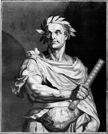
of Roman emperors, originally executed in chiaroscuro (see p. 22). Stimulated, no doubt, by the combination of
chiaroscuro and antiquity, Jackson produced a portrait of Julius Caesar
in four tones of brown after Egidius Sadeler’s engraving of a
subsequently lost painting attributed to Titian. This was not the only
time Jackson translated a line engraving and added chiaroscuro modeling
of his own. He did not make line-for-line copies. Jackson was interested
in broad effects even when leaning heavily on the delicate linear
conventions of line engraving. The lines, therefore, are firm and
widely spaced, like photographically enlarged details of copper-plate
work. Apparently Jackson felt that the addition of one or two tones from
wood blocks would supply the intermediate tints and at the same time
would prevent the line system from becoming obtrusive.
The decided influence of line engraving was probably the result of
his association in 1731 with G. A. Faldoni in Venice.
Influenced by Claude Mellan, this engraver made use of swelling parallel
lines to create tonal gradations. Jackson had first become interested in
this technical method through Ecman’s woodcuts after Callot, and once
Faldoni had strengthened the attraction he found kindred influences in
the engravings of Villamena and Alberti, particularly the former, from
whom he also acquired design ideas he later put to use in his
wallpapers. Jackson’s discovery that he could to some extent use
copper-plate techniques was not a reversion to the style of the Parisian
group of Le Clerc copyists. Jackson used the line system as a means for
creating forms in conjunction with tones; the Parisian woodcutters used
it to imitate the delicate quality of line engraving. He had a formal
aesthetic end in view; their purpose was to render realistic details in
a decorative framework.
With opportunities for book illustration gone, Jackson was in a
difficult position. His novel chiaroscuro experiments had consumed
valuable time and had lost him his standing as a steady worker for
printers. Near destitution and scouting around for fresh applications of
the woodcut, he decided to make prints for wallpaper on his new press.
It was a logical step for Jackson, not only because he knew something of
the process but also because he could make use of the chiaroscuro blocks
already prepared. Late in 1737 or early in 1738 he had his first samples
ready and sent them to Robert Dunbar in London, together with his
conditions for carrying on the trade in Venice. Negotiations dragged,
and Dunbar died before they could come to terms, but the idea of using
his skill and his machine for turning out wallpaper continued to occupy
his mind as a possibility. But, for the time, the undertaking had to be
laid aside while Jackson looked for more immediate means of
employment.
At this juncture Joseph Smith befriended him. A merchant of long
standing in Venice, who became the British consul there in 1745, Smith
was a bibliophile,
gem collector, and connoisseur of the arts. In spite of Walpole’s
sneering reference to him as “the merchant of Venice,” it must be said
that he was expert in his fields of interest. He had excellent taste.
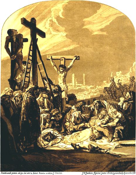
His fine collection of books was purchased by George III in 1765, and
the small Rembrandt Descent from the Cross once in his possession
is now in the National Gallery in London.
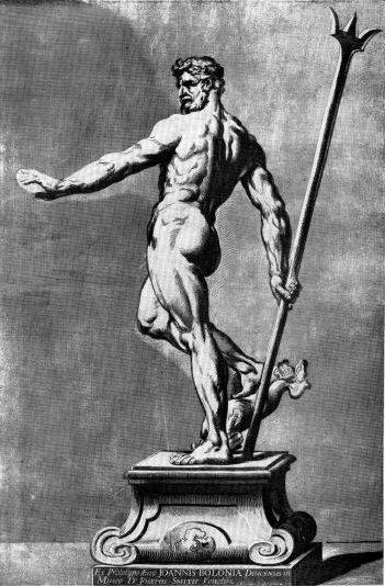
From Smith’s bronze statuette of Neptune, by Giovanni da Bologna,
Jackson produced a chiaroscuro print in four blocks, in imitation, he
asserted, of the prints of Andrea Andreani.28 In suggesting the influence
of this master, Jackson did not refer to his technique or style but to
his subject: in 1584-1585 Andreani had produced a chiaroscuro series
after other statues by Giovanni da Bologna (B. XII, VI, 1-4).
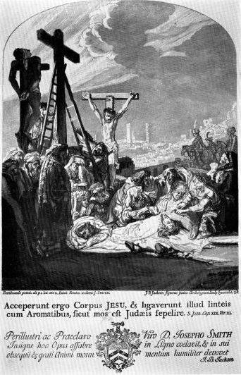
The next work in Smith’s collection to be reproduced in chiaroscuro
was Rembrandt’s Descent from the Cross. Jackson was evidently
well satisfied with the results, and with good reason. It is an
extremely effective print, with pale yellow lights and transparent
shadows. The drawing is remarkable in its feeling for the Rembrandtesque
style. The sky and other parts show English white-line burin work of the
type found in Mattaire’s Latin Classics and Croxall’s Aesop’s
Fables. The Enquiry says (p. 45):
As this Painting was extremely favourable for this sort of Printing, he
endeavoured to display all his Art in this Performance, and the Drawing
of Rembrandt’s Stile is intirely preserved in this Print; it is
dedicated to Mr. Smith, who generously gave the Prints to all
Gentlemen who came to Venice at that time in order to recommend
the Talents of a Man whose Industry might please the curious, and at
least be of some Use to procure him Encouragement to proceed in other
Works of that Kind.
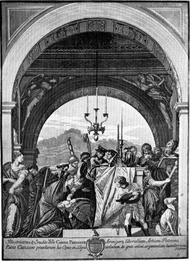
Encouragement soon came. Smith interested two of his friends, Charles
Frederick and Smart Lethieullier, and the three proposed in 1739 the
undertaking of a grand project in chiaroscuro, the reproduction of 17
huge paintings by Venetian masters. This was to be financed by
subscription, says the Enquiry (p. 46):
the Proposals in French, and the Conditions expressed therein,
were drawn up as they thought proper, without consulting the
Difficulties that must attend an Enterprize that required some years to
accomplish.
Their own subscriptions were no doubt generous but Jackson found that
his total income from this form of financing, together with possible
future sales, would hardly cover his expenses. Other hazards made his
situation even worse. War broke out in Europe before he was halfway
through, and many English gentlemen, his potential subscribers, left the
country. This exodus meant financial disaster, but Jackson kept at his
task. He should, he said, have gone to England for his own best
interests but felt that he couldn’t disappoint his distinguished
patrons.
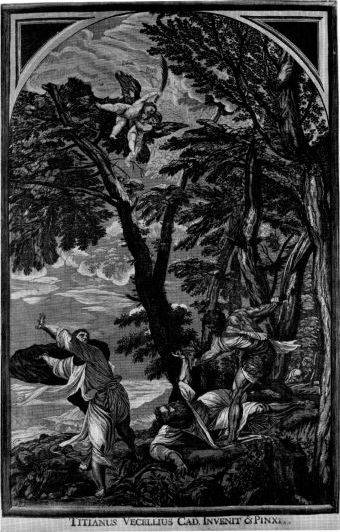
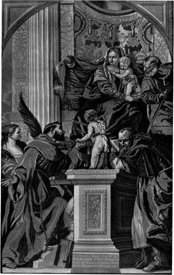
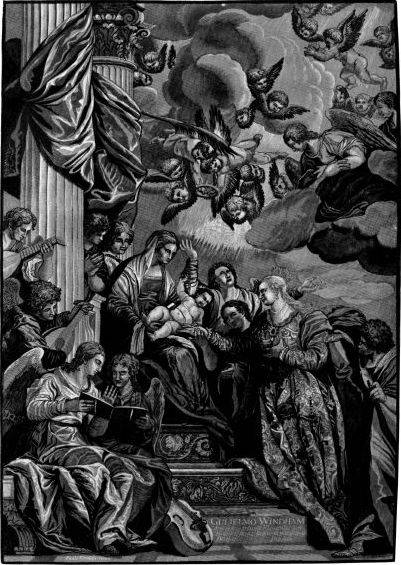
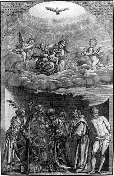
The first print completed was after Titian’s St. Peter Martyr
at the Dominican Church of Sts. Giovanni and Paolo. In coloring it is
similar to the Rembrandt print, with gray-green sky, yellow lights, and
cool brown shadows. While attractive and forceful, it is not as
effective as the Rembrandt because Titian, with his greater range of
color, presented a more complex problem. Most of the prints thereafter
leaned to monochromes in either browns or greens. The St. Peter
was finished in 1739 and in the same year five more prints were brought
to completion.
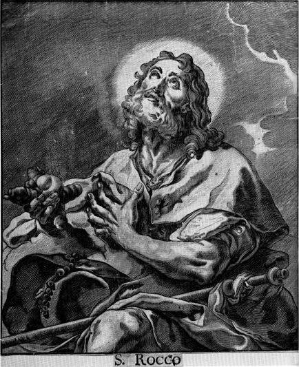
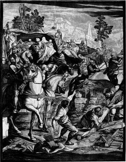
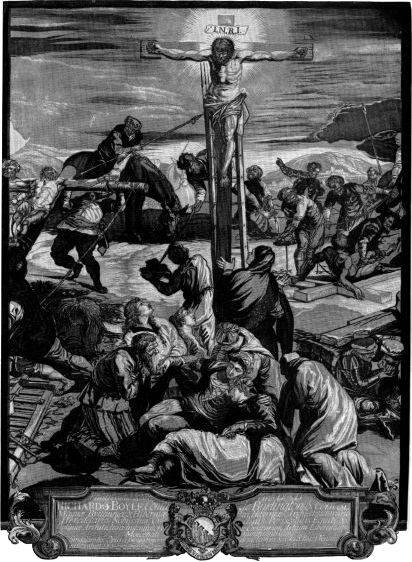
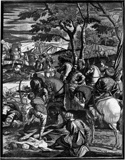
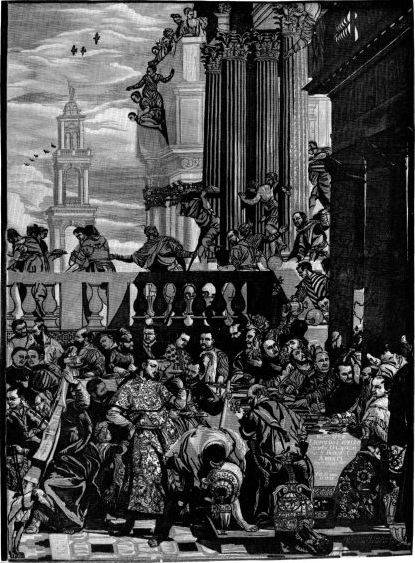
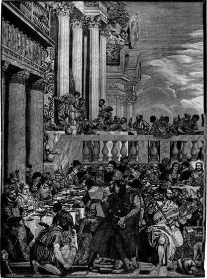
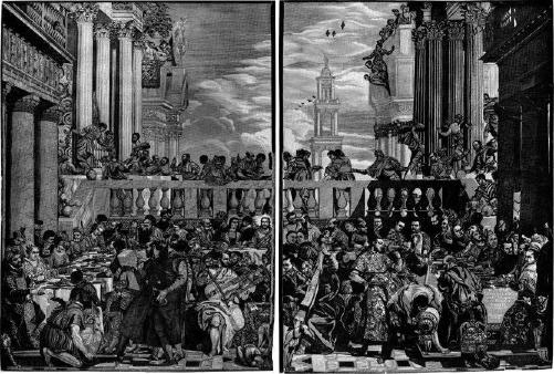
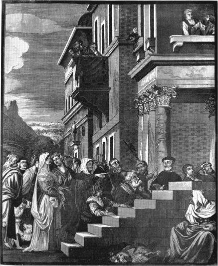
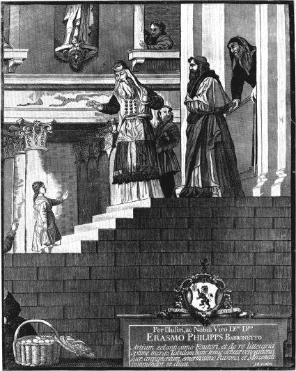
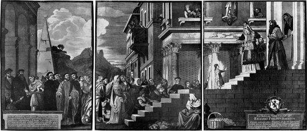
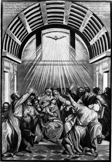
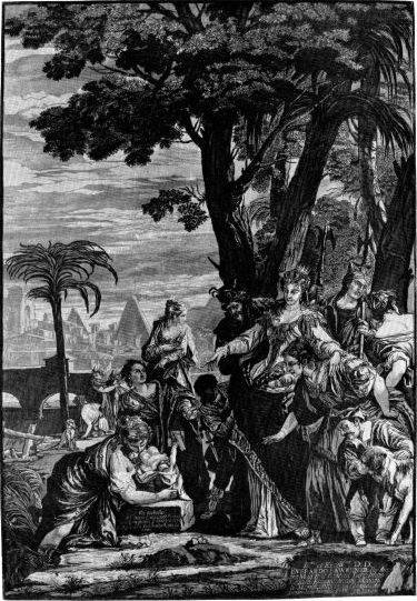
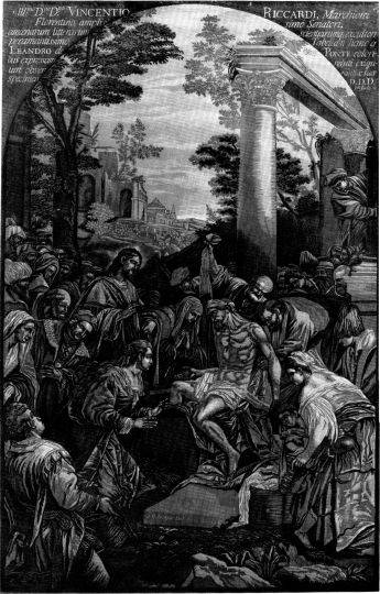
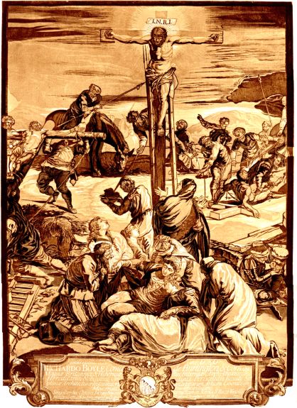
In 1740 he produced the three sheets which made up Tintoretto’s
Crucifixion in the Scuola di San Rocco.29 These were intended to be
joined, if desired, to form one long print measuring about 22 × 50
inches.
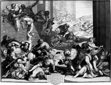
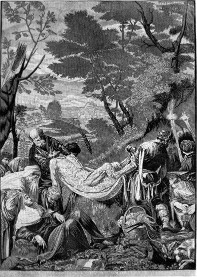
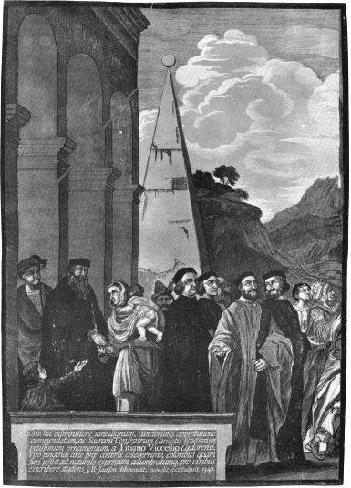
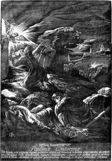
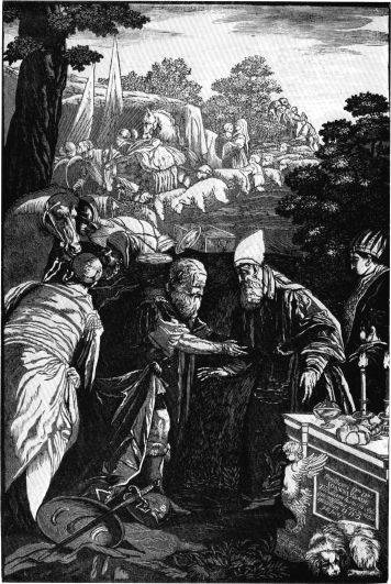
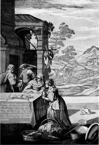
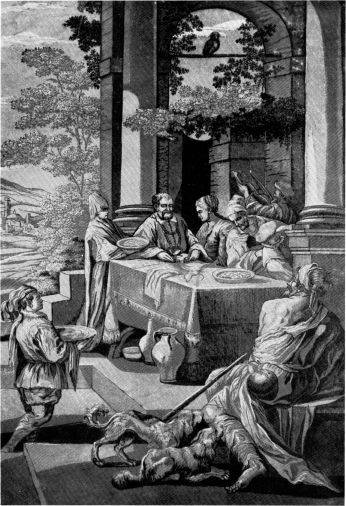
Of the ten remaining subjects, the last, Jacopo Bassano’s Dives
and Lazarus, was finished at the end of 1743, and the set of 24
plates (some paintings, as noted, were reproduced in three sheets and
some in two) was published as a bound volume by J. B. Pasquali
in Venice, 1745, under the title Titiani Vecelii, Pauli Caliarii,
Jacobi Robusti et Jacobi de Ponte; opera selectiora a Joanne Baptista
Jackson, Anglo, ligno coelata et coloribus adumbrata.
The Venetian prints were not merely an extension of chiaroscuro, they
represented a daring effort to go beyond line engraving for reproducing
paintings. Justification for this attempt is given in the Essay
(p. 6):
... and though those delicate Finishings, and minute Strokes, which make
up great Part of the Merit of engraving on Copper, are not to be found
in those cut on Wood in Chiaro Oscuro; yet there is a masterly
and free Drawing, a boldness of Engraving and Relief, which pleases
a true Taste more than all the little Exactness found in the Engravings
on Copper Plates ... and indeed has an Effect which the best Judges very
often prefer to any Prints from Engravings, done with all that
Exactness, minute Strokes of the Graver, and Neatness of Work, which is
sure to captivate the Minds of those whose Taste is formed upon the
little Considerations of delicately handling the Tools, and not upon the
Freedom, Life and Spirit of the separate Figures, and indeed the whole
Composition.
A novel device, embossing, was employed to give added strength to the
prints. This development had been foreshadowed by earlier prints and
pages of text which showed a slight indentation where the dampened paper
received the impression. Embossing had probably first been used
systematically by Elisha Kirkall in 1722-24, and by Arthur Pond in his
chiaroscuros, made in 1732-36 in conjunction with George Knapton, after
drawings by old masters. Jackson admired Pond’s work even though it
combined etched outlines with two tone blocks printed from wood.30 Pond’s
embossing was delicate and applied sparely only in certain forms, such
as ruined columns, but Jackson’s sunken areas were heavier and franker,
consciously intended to give an all-over effect. Since the paper could
not be pressed out without weakening the embossing, it often took on the
scarred and buckled look that characterizes the Venetian
chiaroscuros.
The set had occupied him for 4½ years, during which he had planned,
cut, and proofed 94 blocks.
No sooner was that ended, and a little Breathing required after that
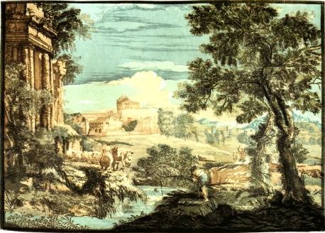
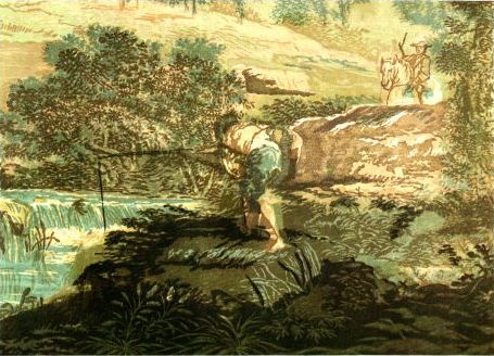
immense Fatigue, in the Year 1744 he attempted to print in Colours, and
published six Landskips in Imitation of Painting in Acquarello.
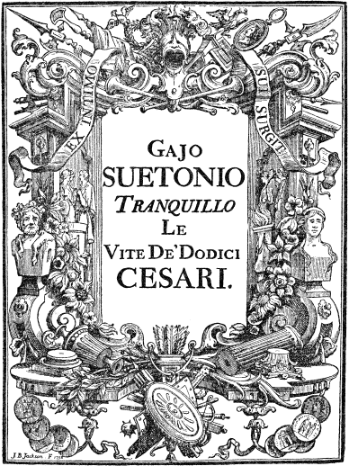
Title page for Gajo Suetonio tranquillo, le vite de’dodici
Cesari, Piacentini, Venice, 1738.
This new set, dedicated to Robert d’Arcy, British Ambassador to the
Republic of Venice, was based on gouache paintings by Marco Ricci,
probably done on goatskin or leather in his usual manner. For Jackson to
make these color prints was a logical step, since his work had tended
toward the full chromatic range even in the chiaroscuros, which
“adumbrated” color. His new prints were all color—clear,
sensitive, and tonally just. It is not surprising that he seized upon
Ricci’s opaque watercolors. The paintings of the Venetian masters had
darkened in ill-lit churches, the shadows had become murky, there were
too many figures. But the Ricci paintings were small and clearly
patterned, the color sparkled.
The original gouaches have not been located, but from other examples
in the same manner, in Buckingham Palace and in the Uffizi, it is plain
that Jackson took certain liberties. Ricci’s rather sharp colors were
considerably modified and mellowed when they weren’t changed entirely:
witness the two sets in different harmonies in the British Museum. Peter
A. Wick (1955) believes it most likely that Jackson did not copy
specific paintings, and suggests that details from Ricci’s etchings and
gouaches were combined and freely amended to create Ricci-like
designs.
Having determined his color scheme Jackson cut seven to ten blocks,
each designed to bear an individual color which was to combine with
others when necessary to form new colors. No outline block was used. To
obtain variations from light to dark in each pigment Jackson scraped
down the blocks with a knife; he thus lowered the surfaces slightly and
created porous textures which would introduce the white paper or the
underlying color. Examination of the prints clearly shows granular
textures in the light areas. Scraping to lighten impressions was a
common procedure in black-and-white printmaking, and was described by
both Papillon and Bewick. In addition Jackson no doubt used underlays,
that is, small pieces of paper pasted in layers of diminishing size on
the backs of the blocks where the color was most intense. The pressure
was therefore greatest in the deepest notes and lightest in the scraped
parts. The copper plate press enabled Jackson to get good register
without making marks on the blocks. The paper was dampened and fastened
to the chase at one end. After each impression the next inked block was
slid into the chase and printed wet into wet. Problems of register were
eliminated because the sheets were held in place at all times, the
blocks fitting the same form. No doubt the paper was sprinkled with
water on the reverse side after
each impression to eliminate shrinking and to keep it soft for printing.
This method would explain Jackson’s transparent effects.
Although the Ricci prints were certainly the most ambitious and
complexly planned prints of the century, the cutting is crisp and
decisive and the effect fresh and unlabored. As in the Venetian set
embossing is consciously applied. Most likely Jackson impressed the
finished prints, specially redampened for the purpose, with one or two
of the uninked blocks. Jackson interpreted Ricci’s qualities with great
spirit, and in doing so he liberated the color woodcut from its old
conventions. The “true”-color prints he produced in the medium preceded
the Japanese, if not the Chinese.31 In Japan, it must be remembered, simple
color printing in rose and green supplanted hand coloring in about 1741,
and rudimentary polychrome prints can be dated as early as 1745, but, as
Binyon32 puts it, “it was not until 1764 that the first rather
tentative nishiki-ye, or complete colour-prints were produced in
Yedo, and the long reign of the Primitives came to an end.”
In making his Ricci prints Jackson sought a method of color printing
that would overcome the deficiencies of Jacob Christoph Le Blon’s
three-color mezzotint process. Le Blon, a Frenchman born in
Germany, had begun experimenting with color printing as early as 1705.
His idea was to split the chromatic components of a picture into three
basic hues—blue, red, and yellow—in gradations of intensity
so that varying amounts of color, each on a separate copper plate, could
be printed in superimposition to reconstitute the original picture. This
was based upon a simplification of Newton’s seven primaries. Later, Le
Blon added a fourth, black plate. Incredibly, this is the principle of
modern commercial color printing, the only difference being that Le Blon
did not have a camera, color filters, and the halftone screen at his
disposal and had to make the separations by hand. Le Blon came to London
in 1719, produced an enormous number of color prints, published his
Coloritto, or the Harmony of Colouring in Painting in a very
small edition about 1722 (it is undated), and shortly thereafter failed
disastrously. About 1733 he returned to Paris, where he attracted a few
followers. Most of his prints have disappeared, only about fifty being
known at present.
The idea of full-color printing, then, was in the air, although
later, in the Enquiry, Jackson took pains to state that he had
not been following in the footsteps of the Frenchman, who, he claimed,
had made serious mistakes.
The Curious may think that this Tentamine was taken from the celebrated
Mr. le Blond; I must here take the Liberty to explain the
Difference.... Numbers are convinced already, that the printing
Copper-plates done with Fumo or Mezzotinto, are the most
subject to wear out the soonest of any sort of Engraving on that Metal.
Had this one Article been properly considered, le Blond, must
have seen the impossibility of printing any Quantity from his repeated
Impressions of Blue, Red, and Yellow Plates, so as to produce only
Twenty of these printed Pictures to be alike. This is obvious to every
one who has any Knowledge, or has seen the cleaning of Copper-plates
after the Colour was laid on; the delicate finishing of the Flesh must
infallibly wear out every time the Plate is cleaned, and all the tender
light Shadowing of any Colour must soon become white in proportion as
the Plate wears. The Nature of Impression being overlooked at first, was
the principal Cause that Undertaking came to nothing, notwithstanding
the immense Expence the Proprietors were at to have a few imperfect
Proofs at best, since it is evident they could be no other. The new
invented Method of printing in Colours by Mr. Jackson is under no
Apprehension of being wore out so soon.... Whatever has been done by our
English Artist, was all printed with Wood Blocks with a strong
Relievo, and in Substance sufficient to draw off almost any number that
may be required.
What Jackson neglected to mention was the difficulty of repeating
transparent color effects with large planks of wood. Few existing
impressions match each other and some prints are off register. What
saved him was his fine color sense, his brilliance as a woodcutter, and
his disinclination to make literal color reproductions.
The work that Jackson left behind became a part of the cultural
heritage of Venice, valued on its own account as well as for its
connection with the city. Zanetti33 describes the Venetian set and
Zanotto,34 in his Guida of 1856, urges a visit to the
Chiesa Abaziale della Misericordia, which evidently had on permanent
exhibition a “perfectly unique collection of woodcuts in various colors
by Jackson, quite unmatched.”
Gallo35 says that some of Jackson’s blocks found their way to
the printing house of the Remondini and were used to strike off new
impressions, after which they became the property of the Typografia
Pozzato in Bassano. This might explain some of the inferior examples of
the Venetian set which could hardly have come from the presses of
Jackson or Pasquali.
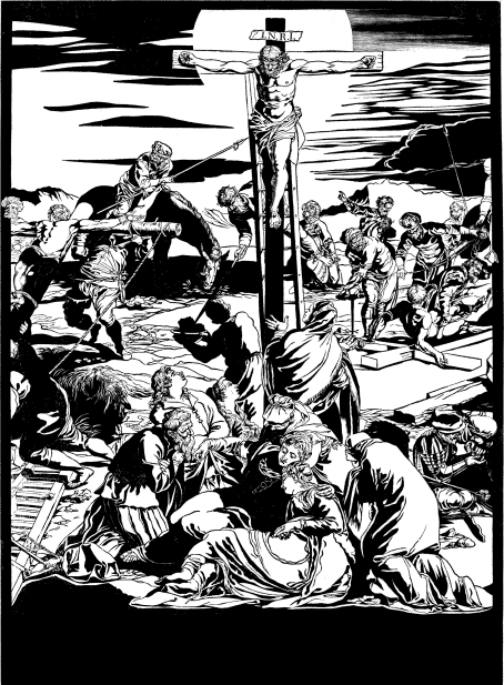
Trial proof of the key block of center sheet of The Crucifixion,
after Tintoretto. National Gallery of Art (Rosenwald Collection).
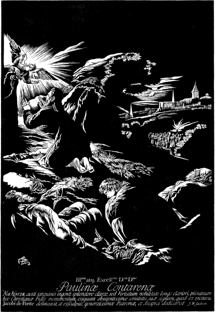
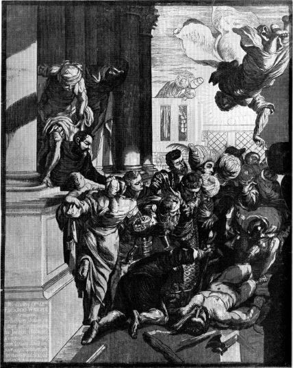
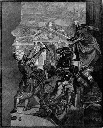
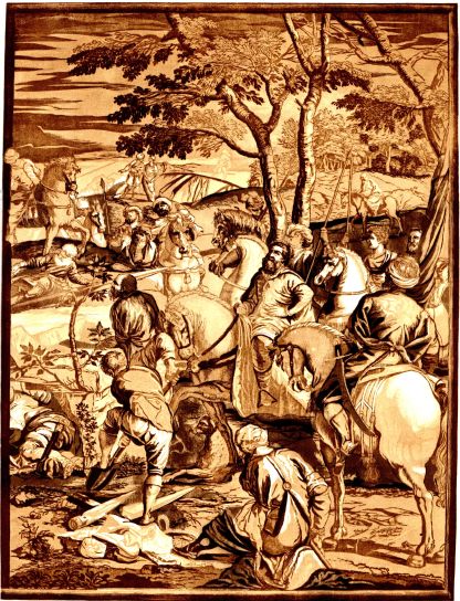
Trial proof of the key block of
Christ on the Mount of Olives, after Bassano. National Gallery of
Art (Rosenwald Collection).
Jackson was married in
Venice—whether to an Italian we do not know—and when he left
the city in 1745 to return to England he took a family along. He
mentions “an impoverish’d Family” in the Essay, but beyond this
we know nothing of his personal life.
As soon as he arrived in England he was invited to work in a calico
establishment, where he remained about six years. But making drawings to
be printed on cloth failed to give him the scope he required. At the
back of his mind was the passion to work with woodblocks in color. This
led him to take a bold and hazardous step—to leave his position
and attempt, obviously with little capital, the manufacture of
wallpaper, not to please an established taste but to educate the public
to a new type of product.
Wallpaper had come into popular use in England in the late 17th
century, having been obtained from China by the East India Company.
These hand-painted wall hangings, imported at great cost and in small
quantities, were correspondingly expensive. The subjects were gay and
fanciful—birds, fans, Chinese kiosks, pagodas, and flowers. Highly
desired because they offered an escape from the heavy grandeur of the
Baroque style, they were subsequently imitated by assembly-line methods.
They fitted naturally into the developing rocaille style
(corrupted into Rococo outside of France), and it is not surprising that
they were also produced extensively in Paris. In England these
imitations, which formed a substitute for expensive velvet and damask
hangings, completely dominated the wallpaper field.
The first notice of Jackson’s venture appeared in the Gentleman’s
Magazine of February 1752.36 A letter signed “Y. D.”
praised the editor “Sylvanus Urban” for attempting to revive the art of
cutting on wood. It mentioned that this art was in decline for more than
a century, but noted that—
Two of our countrymen, E. Kirkall and
J. B. Jackson, ought to be exempted from this general
charge; the former having a few years ago introduced the Chiaro
Oscuro of Hugo de Carpi into England, though he met with no
extraordinary encouragement for his ingenuity; and the art had died with
him had not the latter attempted to revive it, but with less
encouragement than his predecessor. Mr. Jackson, however, has
lately invented a new method of printing paper hangings from blocks,
which is very ornamental, and exceeds the common method of
paper-staining (as it is termed) by the delicacy of his drawings, the
novelty of his designs, and the masterly arrangement of his principal
figures.
The next notice appeared in the London Evening Post of April
30-May 2, 1752:
New invented Paper Hangings, printed in
Oyl, which prevents the fading or changing of the Colours; as also
Landscapes printed in Colours, by J. B. Jackson, Reviver of
the Art of printing in Chiaro Oscuro, are to be had at Dunbar’s
Warehouse in Aldermanbury, London; or Mr. Gibson’s, Bookseller, opposite
the St. Alban’s Tavern in Charles-street near St. James’s-Square, and no
where else.
Several months afterwards, in the September 1752 issue of
Gentleman’s Magazine, publication of the Enquiry into the
Origins of Printing in Europe was announced.
The Enquiry is an odd book. It combines rewritten versions of
two Jackson manuscripts, a study of the origins of printing in
Europe and an autobiographical journal covering, we suppose, the years
from about 1725 on. The writer, in his introduction, says that he had
been attracted by the two notices mentioned and went to see Jackson,
whom he already knew by reputation. As a “Lover of Art” he considered it
his duty to acquaint the public with Jackson’s ideas concerning the
origins of printing. These ideas, he felt, were an important
contribution. After devoting half the little book to a rambling account
of this subject, including a short history of woodcutting from Dürer
onward, the author suddenly shifts to the journal. It is regrettable
that he condensed it because we do not know what was
left out. It is possible that much autobiographical information was
excluded, as well as a picture of woodcutters and woodcutting of the
time. The book concludes with the statement that Jackson intended to
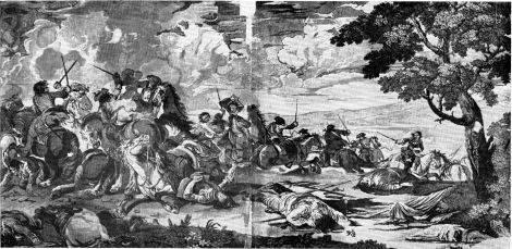
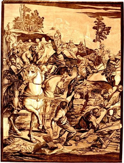
print in October of that year (1752) a paper hanging in two sheets
after an original painting “by F. Simonnetta of
Parma”37 representing the battle fought near that city in
1738.
This print was to be in full color, 3 feet 6 inches long by 2 feet
high, and was to serve as a specimen for a series of four of the same
size, the others being “History, Pictures and Landscapes.” They were to
be done by subscription:
No Money will be required of the Subscribers till the Prints are
finished, and only at the Delivery. It is to be hoped the Curious and
the Public will encourage this Undertaking, by a Man who has spent the
greatest Part of his Life in searching after and improving an Art,
believed by all to be lost, and has restored it to the Condition we now
see it in his Works.
The only known copy of this battle picture, made from about seven
blocks, is in the Print Room of the British Museum. It is a magnificent
piece. Probably nothing with this breadth of handling had ever been done
in woodcut before. The color is grave and beautifully harmonized,
although the paper has deteriorated and the colors have darkened
somewhat. The blocks were cut with ardor, almost fury; everything is
brought to life with masterly assurance. Martin Hardie, who made the
only previous comment on this print, which he could only surmise was
Jackson’s, says:38 “Jackson’s supreme achievement is a large battle scene,
with wonderful masses of rich colour superbly blended, reminiscent of
Velasquez in breadth, in dignity, and in glory of tone.”
There were competitors in London, among them Matthias Darley, who
produced papers in the Chinese style; Thomas Bromwich, who was
patronized by Walpole; and Robert Dunbar, Jr., of Aldermanbury, who in
addition sold Jackson’s papers. They lacked both Jackson’s gifts and his
unreasonable standards but they produced more generally acceptable
wallpaper with greater facility. These competitors did not work in oil
colors, like Jackson. Transparent tints were too difficult to control,
especially when applied with inking balls (composition rollers
did not come into use until well after 1800), and effects were too
heavy. They used distemper—powdered color mixed with glue and
water, with chalk added to give body. This was sometimes applied with
woodblock or stencil but most often it was simply painted in by hand
over a blockprinted outline. Often the painting was done directly on the
wall after the paper was hung. These wallpapers were weak when examined
critically, but nobody worried as long as a light bright pastel effect
was obtained. Jackson’s vigorous drawing and woodcutting were out of
place in this field. They were, like his tonal exactitude that made
holes in the wall, a distraction and an offense against interior
decoration.
Jackson’s business, therefore, did not prosper. In a last effort to
stir up public interest he published, in 1754, his well-known little
book, An Essay on the Invention of Engraving and Printing in Chiaro
Oscuro, illustrated with eight prints in “proper colours.” It sold
for two shillings and sixpence. The style was rather florid but his
arguments were presented with such vigor that it is easy to see why
critics have found it difficult to refrain from quoting at length. The
main body of text is only eight pages long, with an additional eight
pages of subsidiary descriptive material attached to the pictures.
On the title page appeared his favorite passage from Pascal, used
previously on the title page of the Enquiry: “Ceux qui sont
capables d’inventer sont rares: ceux qui n’inventent point sont en plus
grand nombre, et par conséquent les plus forts.” The first few pages of
the Essay enlarge on this theme:
It has been too generally the Fate of those who set themselves to the
Inventing any Thing that requires Talents in the Discovery, to apply all
their Faculties, exhaust their Fortune, and waste their whole Time in
bringing that to Perfection, which when obtained, Age, Death, or Want of
sufficient Supplies, obliges them to relinquish, and to yield all the
Advantages which their Hopes had flattered them with, and which had
supported their Spirits during their Fatigues and Difficulties, to
others; and thus leave behind them an impoverish’d Family incapable to
carry on their Parent’s Design, and too often complaining of the
projecting Genius of that Father who has ruin’d them, tho’ he has
enriched the Nation to which he belonged, and to which of Consequence he
was a laudable Benefactor.
He proceeds in this bitter vein for a time, then brings into the open
the main purpose of the book:
Another Reason perhaps is, that the Artist being totally engaged in the
Pursuit of his Discovery, has but little Time to apply to the Lovers and
Encouragers of Art for their Patronage, Protection, and Supplies
necessary for the carrying on such a Design, or he has not Powers to set
the Advantage which would result from it in a true Light; nor
communicate in Words what he clearly conceived in Idea: for certainly
there are Men enough, who from the mere Desire of increasing their
Wealth, would give him that Assistance, which, like the artificial Heat
of a Greenhouse, would bring that Art to a Ripeness, which would
otherwise languish and die under the Coldness of the first Designer, and
which in this Union of Riches and Invention would yield mutual Advantage
to both.
There are besides this amongst the Great, without Doubt, many who would
gladly lend their Patronage to rising Arts, if they knew their
Authors....
He gives as example the Duke of Cumberland, who had just sponsored a
tapestry plant at Fulham, and follows with an outline of the honorable
traditions of the woodcut, pointing out that Dürer, Titian, Salviati,
Campagnola, and other painters drew their work on woodblocks to be cut
by woodcutters, and adds that “even Andrea Vincentino did not
think it in the least a Dishonour, though a Painter, to grave on Wood
the Landscapes of Titian.” He builds up to the statement that
Raphael and Parmigianino drew on woodblocks to be cut in chiaroscuro by
Ugo da Carpi.
After having said all this, it may seem highly improper to give to Mr.
Jackson [he speaks of himself throughout in the third person] the
Merit of inventing this Art; but let me be permitted to say, that an Art
recovered is little less than an Art invented. The Works of the former
Artists remain indeed; but the Manner in which they were done, is
entirely lost: the inventing then the Manner is really due to this
latter Undertaker, since no Writings, or other Remains, are to be found
by which the Method of former Artists can be discover’d, or in what
Manner they executed their works; nor, in Truth, has the Italian
Method since the Beginning of the 16th Century been attempted by any one
except Mr. Jackson.
We cannot help concluding that Jackson was falsifying here. Taking
advantage of the public’s ignorance, he was puffing up his historical
importance in order to sell wallpaper. If the cognoscenti
complained that he had buried the chiaroscurists after da Carpi, he
always had the explanation that others did not work in the Italian
style, which he neglected to describe. Jackson knew what he was doing;
he was not as ignorant of art history as Hardie and Burch have surmised,
although
it is true that he was not always certain as to dates, since he believed
Andreani worked as a contemporary of da Carpi. In the Enquiry,
published only two years earlier, he had shown familiarity with the
prints of Goltzius, Coriolano, Businck, Nicolas and Vincent Le Sueur,
Moretti, and Zanetti, all of whom had worked to some extent in the
Italian manner.
Some writers have reacted strongly to this paragraph. Losing their
sense of proportion, they have been led to the conclusion that Jackson
was little better than a charlatan and that his work as a whole
reflected his low ethics. In some instances his culpability has been
magnified: Bénézit has even charged him with claiming to have invented
color printing.
The worst result of Jackson’s insistence on re-inventing the Italian
manner was that it made a major issue of what was at best a minor honor.
It minimized such technical contributions as the following, which did
not follow traditional recipes:
... Mr. Jackson has invented ten positive Tints in Chiaro
Oscuro; whereas Hugo di Carpi knew but four; all of which can be
taken off by four Impressions only.
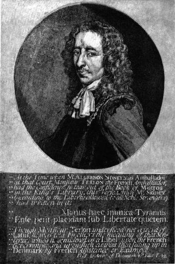
This technical system was used for the Venetian chiaroscuros, the
portrait of Algernon Sidney after Justus Verus, and others. He did not
mention that he needed a greater range of tones because he was working
after oil paintings, not drawings. The introduction of full color from a
series of blocks to translate water colors is also mentioned in the
Essay, but with no greater emphasis than in the Enquiry.
Since his wallpaper was to be done in color as well as in chiaroscuro,
and since the Essay included four plates in color, it is
astonishing that Jackson failed to make stronger claims for his
originality in this development.
He proceeded to describe his plan to replace wallpapers in the
Chinese style with his papers, which, he stated, would have no “...gay
glaring Colours in broad Patches of red, green, yellow, blue &c ...
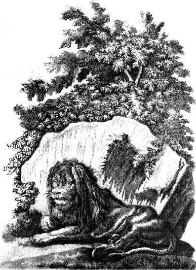
[with] no true Judgment belonging to it ... Nor are there Lions leaping
from Bough to Bough like Cats, Houses in the Air, Clouds and Sky upon
the Ground....”
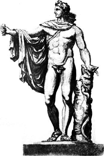
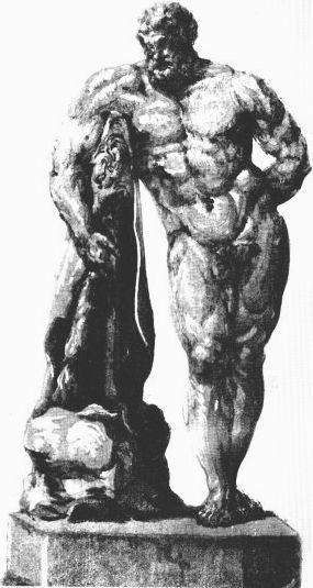
He proposed, instead, to use as subjects many of the famous statues
of antiquity; the landscapes of Salvator Rosa, Claude Lorrain, Poussin,
Berghem, Wouwerman, the views of Canaletto, Pannini—
Copies of the Pictures of all the best Painters of the Italian,
French and Flemish Schools, the fine sculptur’d Vases of
the Ancients which are now remaining; in short, every Bird that flies,
every Figure that moves upon the Surface of the Earth from the Insect to
the human; and every Vegetable that springs from the Ground, whatever is
of Art or Nature, may be introduced into this Design of fitting up and
furnishing Rooms, with all the Truth of Drawing, Light, and Shadow, and
great Perfection of Colouring.
This vast gallery of art and nature was to be printed in “Colours
softening into each other, with Harmony and Repose....”
Even if we feel that Jackson was building up his project to attract
attention, or that he was intoxicated by the idea of creating art on
such a grand scale, there is still something wrong in his conceiving it
in terms of wallpaper. What is certain is that Jackson was desperately
anxious to create color prints. In the absence of art patrons, wallpaper
was his only excuse for continuing as an artist. As a business venture
it was absurd, even tragic. There is good reason to believe that Jackson
lacked capital and rented the quarters for his business: his name does
not appear in the Poor Rate Book of that period in the Borough of
Battersea.
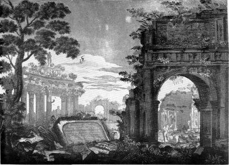
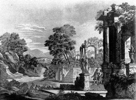
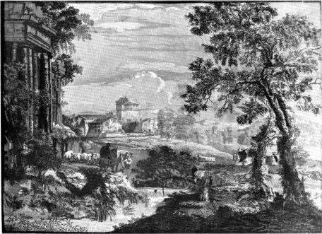
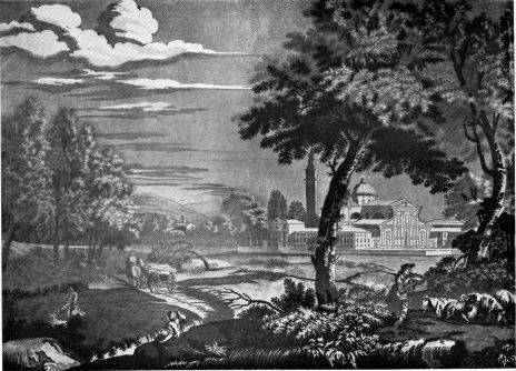
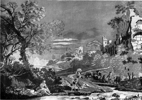
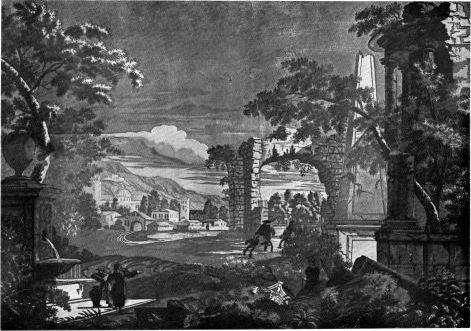
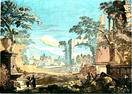
From a certain standpoint, this excursion by Jackson into wallpapers
featuring Roman ruins and classical antiquity appeared to come at an
appropriate time. Marco Ricci’s paintings as well as the somewhat later
work of Pannini and Zuccarelli, and Guardi’s early ruin pieces, were
already known. Ricci had visited England from 1710 to 1716. Zuccarelli
had come twice, once in 1742 and again in 1751 to stay until 1773,
becoming a foundation member of the Royal Academy; his classical
landscapes with their glib charm had a comparatively good reception. But
the strongest influence was undoubtedly that of Piranesi, whose powerful
etchings brought to life as never before the ravaged stones of Imperial
Rome and the Campagna. Their effect was widespread and
electrifying, although it was not until the 1760’s that they developed
their full force as an influence on English architecture and furniture
design, and came to supersede the Palladian style brought to England by
Inigo Jones at the beginning of the 17th century.
Jackson was too early; public taste was not yet ready for picturesque
landscape or antique forms in wallpaper. But the style became dominant
in the latter 18th century, particularly in England and France, and was
also exported to America. While it is difficult to estimate the degree
of Jackson’s influence in this development,
we know that no scenic papers can be dated before the Ricci prints, or
before Jackson’s wallpaper venture. Oman39 comments:
The use of wall-paper to imitate large architectural designs dates, as
we have seen, from the days of J. B. Jackson. During the
remainder of the century this style was used almost exclusively for
decoration of the halls and staircases of great houses.
These papers covered rooms with landscape panoramas or with
landscapes in Rococo scroll frames, relieved by decorative panels with
busts, statuettes, and floral ornaments. As in preceding work, they were
usually painted in opaque water colors. Most of the landscapes were
loose transcriptions of designs by Pannini, Vernet, Lancret and other
painters of architectural, scenic, and pastoral subjects. The treatment
was generalized and superficial, the touch light and detached.
In this approach to wallpaper we see the basic ideas of Jackson, but
with more emphasis on charm and elegance. Ironically, as years passed
and original sources grew obscure, it became the tendency to attribute
scenic papers in great houses to Jackson.40 If he was a failure as a pioneer in
the field, he remained its most highly prized legend.
The Essay continued with a criticism of the current taste in
wallpaper. Jackson enlarged on the lack of discrimination of persons who
would prefer popular papers to his.
It seems, also, as if there was great Reason to suspect wherever one
sees such preposterous Furniture, that the Taste in Literature of that
Person who directed it was very deficient, and that it would prefer
Tom D’Urfy to Shakespear, Sir Richard Blackmore to
Milton, Tate to Homer, an Anagrammatist to
Virgil, Horace, or any other Writer of true Wit, either
Ancient or Modern.
He added that his prints, made in oil colors, would be permanent
“whereas in that done with Water-Colours, in the common Way, Six Months
makes a very visible Alteration in all that preposterous Glare, which
makes its whole Merit....”
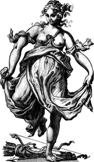
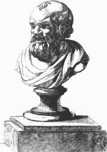
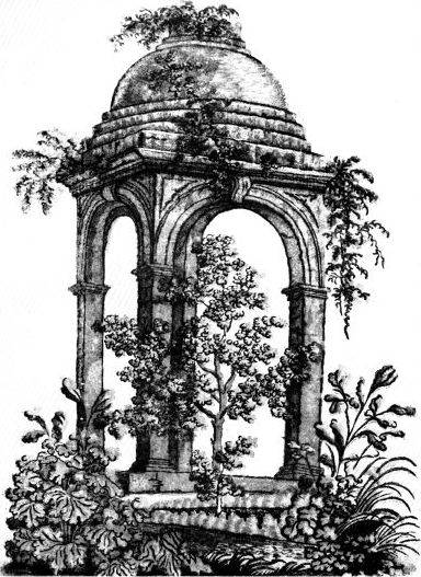
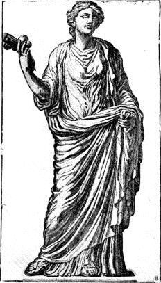
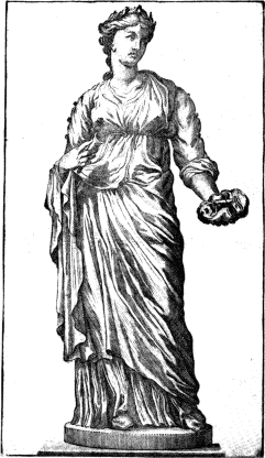
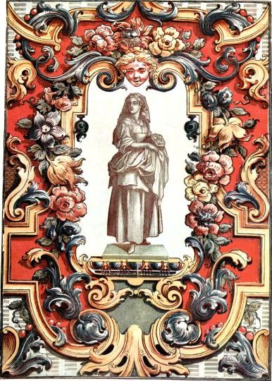
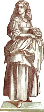
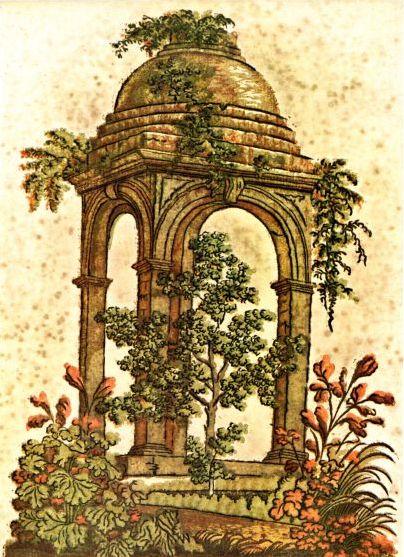
The Essay has eight plates, four of ancient statues in
chiaroscuro and four of plants, animals, and buildings, in probably six
colors. They were hastily done and no doubt had a rather fresh charm
when published, but unfortunately the oil in the pigments was inferior,
and every print in the book has darkened and yellowed
badly. The prints and neighboring pages are heavily spotted and stained.
This book which should have been his vindication became instead an
argument for his lack of merit, especially to those who were not
familiar with his other work.
We do not know how large a working force Jackson had or how many of
the projected plates he planned to assign to helpers or to carry out
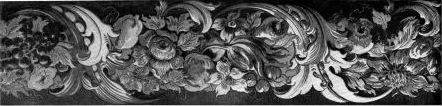
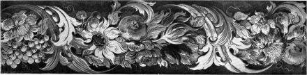
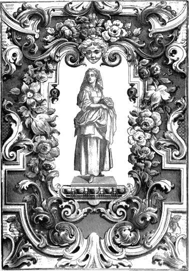
himself. Some of the decorative borders from four blocks, blue, red,
yellow, and gray-green, he undoubtedly made and printed himself. They
are heavy and rather fruity in effect but are incisively drawn and cut.
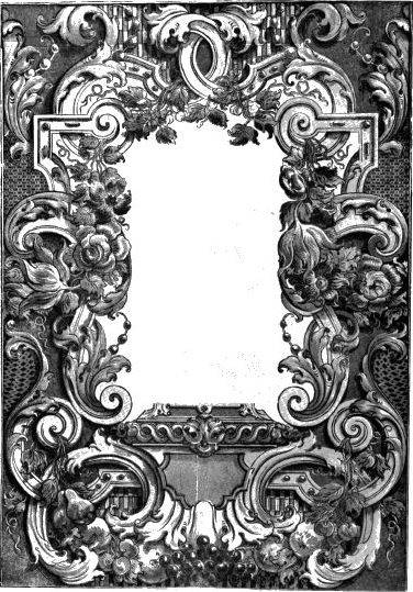
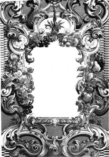
Also bearing Jackson’s stamp are some ornamental frames with fruit and
flowers in the same full range of colors.
An album ascribed to him, in the collection of the Victoria and
Albert Museum, contains drawings of flowers, foliage, details of
ornament and hand-colored designs, and a proof of the woodcut for the
title page to the Suetonius of 1738. Five of the drawings are
signed or initialed by Jackson, with dates from 1740 to 1753. The
designs, which might have been intended for calico or wallpaper, are
poorly done and not at all in his style. The drawings are competent but
cannot definitely be considered his, notwithstanding the signatures,
since we do not know Jackson’s handwriting from other sources. The most
that can be said for this album is that it probably comes from his
workshop.
While producing wallpaper, Jackson still made efforts to attract
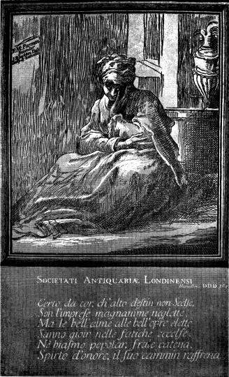
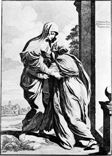
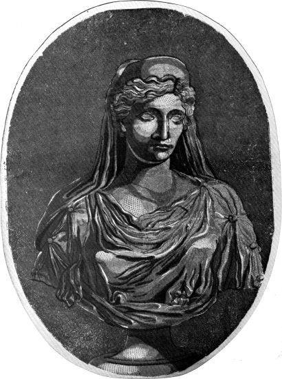
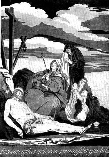
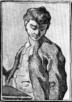
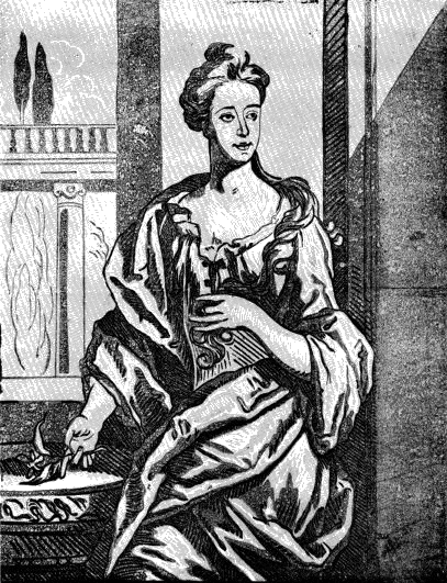
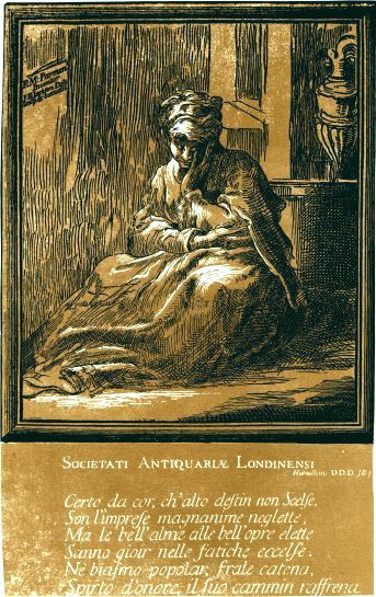
sponsors for full editions of his earlier chiaroscuros. The Woman
Meditating was dedicated to the Antiquarian Society of London.
Christ Giving the Keys to St. Peter, rejected by Crozat, we
assume, was dedicated to Thomas Hollis, whom Jackson may have met in
Venice. And the Venus and Cupid with a Bow was inscribed to
Thomas Brand, lifelong companion of Hollis who later added to his name
the latter’s patronymic. The Algernon Sidney has no dedication,
but since Hollis was a Sidney specialist and edited the first one-volume
edition of his works in 1769, there is a strong likelihood that the
print had some connection with this liberal gentleman. Jackson made it
either in Venice just before he left, or in England shortly after his
arrival.
Robert Dunbar, Jr., who had inherited the wallpaper manufactory on
his father’s death, went out of business late in 1754. In his possession
was a quantity of Jackson’s papers, for which he was the main outlet.
With this backlog of papers on hand, and no large distributor, Jackson’s
venture collapsed. This happened
shortly after the publication of the Essay, and its author was
never to have the opportunity to carry out his grandiose plans.
Jackson appealed to Hollis, who wrote to his former mentor, Dr. John
Ward, professor of rhetoric at Gresham College and the head of a society
founded by noblemen and gentlemen for the encouragement of learning:41
Dear Sir!—Do Me the Favour to accept these four prints of
Jackson’s. They are no where sold, & will soon be scarce. When
You consider their Merit, I am confident You will lament the hard
Fate of the ingenious Artist; who, at this Time, in his old age, &
in his own Country is unprotected unnoticed, and can difficultly support
Himself against immediate distress & Ruin.
I am, with great Respect,
Dear Sir!
Your obliged affect humble Servant
T. Hollis
Bedford Street, February 10, 1755
We do not know the results of this appeal. In any case Jackson seems
to have faded out as an artist. Little is known of his subsequent career
up to the time more than twenty years later, when Bewick mentions
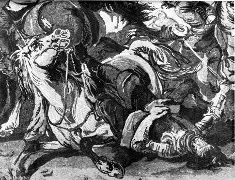
meeting him in advanced age. In 1761 he made a drawing of Salisbury
Cathedral for Edward Eaton, “bookseller at Sarum,” for a line engraving
dedicated by Eaton to the Lord Bishop of Winchester. This large view
included figures in the foreground in an attempt to give animation to
the scene. Unfortunately the engraver, John Fougeron, was little more
than an amateur. His execution was feeble and mechanical: Jackson’s
drawing suffered so badly that its quality cannot be determined. This
print was copied on a smaller scale in a steel engraving by
J. B. Swaine, published by J. B. Nichols & Son
in 1843, but it was hardly an improvement.
Bewick’s recollections of Jackson, written about forty years after
their meeting in Newcastle, imply that Jackson stayed in that city for a
period. The Town Clerk’s Office, however, has no record of his
residence. The following passage from Bewick’s Memoir is the last
evidence42 bearing on Jackson:
Several impressions from duplicate or triplicate blocks, printed in this
way, of a very large size, were also given to me, as well as a drawing
of the press from
which they were printed, many years ago, by Jean Baptiste Jackson, who
had been patronised by the King of France; but, whether these prints had
been done with the design of embellishing the walls of houses in that
country, I know not. They had been taken from paintings of eminent
old masters, and were mostly Scripture pieces. They were well drawn, and
perhaps correctly copied from the originals, yet in my opinion none of
them looked well. Jackson left Newcastle quite enfeebled with age, and,
it was said, ended his days in an asylum, under the protecting care of
Sir Gilbert Elliot, Bart., at some place on the border near the Teviot,
or on Tweedside.
If Bewick was correct in reporting that Jackson died while under the
protection of Sir Gilbert Elliot, probably in a Poor Law institution, it
is unlikely that the date could have been much later than 1777, the year
in which Sir Gilbert died. This would place the meeting of both artists
shortly before this time, when Bewick was in his early twenties (he was
born in 1753). Sir Gilbert lived in Minto House, Roxburghshire,
Scotland, but no evidence can be found for the supposition that Jackson
died in the vicinity. No obituary has been discovered. The record of
Jackson’s death, if it exists, probably lies in a parish register
somewhere on the Scottish border.
In most histories of prints it was
considered sufficient to note that certain artists worked in woodcut
chiaroscuro; the quality of such work was rarely discussed. But Jackson
was an exception: something about his prints aroused critics to defense
or attack. The cleavage is absolute, strange for one who was presumably
a mere reproductive artist. Nothing could show more clearly the
unsettled nature of Jackson’s standing than a sampling of these
opinions.
Horace Walpole in a letter, dated June 12, 1753, to Sir Horace Mann
describing the furnishings in Strawberry Hill, commented:43
The bow window below leads into a little parlour hung with a
stone-colour Gothic paper and Jackson’s Venetian prints, which I could
never endure while they pretended, infamous as they are, to be after
Titian, &c., but when I gave them this air of barbarous bas-reliefs,
they succeeded to a miracle; it is impossible at first sight not to
conclude that they contain the history of Attila or Tottila done about
the very era.
Von Heinecken44 says they are “in the manner of Hugo da Carpi but much
inferior in execution.” But Huber, Rost, and Martini45 noted Jackson’s
independent approach:
Jackson’s prints, which are certainly not without merit, are in general
less sought after by collectors than they deserve. His style is original
and is concerned entirely with broad effects.
Baverel46 also had a high opinion of Jackson’s work. Describing
the Venetian prints, he says that Jackson “had a skillful and daring
attack, and it is regrettable that he did not produce more work.”
Nagler’s47 criticism typifies the academic preconceptions of some
writers on the subject of chiaroscuro:
Jackson’s works are not praiseworthy throughout in drawing, and also he
was not thoroughly able to apply the principles of chiaroscuro
correctly.... Yet we have several valuable prints from Jackson....
And Chatto48 remarks:
They are very unequal in point of merit; some of them appearing harsh
and crude, and others flat and spiritless, when compared with similar
products by the old Italian wood engravers.
With this verdict W. J. Linton49 disagrees, saying, “...Chatto underrates
him. I find his works very excellent and effective. The Finding
of Moses (2 feet high by 16 inches wide) and Virgin Climbing
the Steps of the Temple (after Veronese), and others, are admirable
in every respect....” Duplessis50 attacks the Venetian set heatedly and at
length, yet he devotes more space to expounding Jackson’s deficiencies
than to discussing the work of any other woodcut artist, even Dürer or
da Carpi.
On the evidence we have, the new conception Jackson brought to
printmaking was not fully understood until the 20th century. Pierre
Gusman51 in 1916 probably first noted the technical distinction
between Jackson’s work and earlier chiaroscuros.
He [Jackson] conceived his prints in a different way from the Italians,
bringing in new aspects in accenting values and planes, because he did
not reproduce drawings but interpreted paintings. The whites even show
embossings in the paper to make the light vibrate, and a specially cut
block is sometimes impressed to help in modeling the forms. Jackson, in
short, very much the wood carver, combined the resources of the cameo
with those of the chiaroscuro and produced curious works of combined
techniques, but without equaling his predecessors, who were particularly
remarkable for their simplicity of style and treatment.
One year later, in 1917, Max J. Friedländer52 commented that relief
effects in block printing were not alien additions but natural
consequences of the method. His main emphasis, we note, is on the Ricci
prints.
A peculiarity of the color woodcut, which first was put up with as a
characteristic of the technique but finally was enhanced and utilized
fully as a means of expression, is the physical relief that stands out
in thick and soft paper with the sharp pressure of die wood-blocks....
No one has employed the relief of the woodcut so consciously and
artfully as the Englishman John Baptist Jackson in the eighteenth
century, who, particularly in some landscapes, created most effective
and richly colored sheets. He has gone so far as to express forms in
“blind-printing,” entirely without bordering lines or contrasting
colors, merely through relief pressing.
Anton Reichel’s important history of chiaroscuro, with its
magnificent color plates in facsimile, appeared in 1926.53 He says of Jackson
that his activity in chiaroscuro was “extraordinarily rich,” that he
created broad approximations of his subjects which made him neglect
details, but that these were “convincingly translated into the language
of the woodcut.”
Five heroic landscapes after M. Ricci represent the artistic high
point of his work, having a distinctive richness of color not previously
attained by any other master of chiaroscuro. Each of the prints has a
complete harmony of colors; the single color blocks—over ten can
be counted in each print—which show in their separate tones the
extraordinarily cultivated taste of the artist, give the composition a
decorative effect far from any realistic imitation of nature.... The
relief impressed with the blocks is so strong that, going beyond all
other prior attempts of the kind, it represents an essential factor of
the composition through its actual light-and-shadow effects.
Although by this time Jackson’s chiaroscuros were regarded with
respect and his color prints were acknowledged to be of prime
importance, some of the conservative wallpaper historians were still
repelled by their vigor, which did not suit genteel notions of interior
decoration. Sugden and Edmondson54 in 1925 certainly
failed to understand both Jackson’s work and the period in which it was
done. They comment:
Jackson’s bold claims to originality and merit are scarcely borne out by
anything he is known to have achieved. That he had a vogue, however,
seems certain, for apart from his “Essay” he has come down to us as a
historical figure. To modern tastes in art many of his productions seem
almost monstrous, and yet they were to some extent the expression of the
time-spirit in which they were born.
While Jackson had an influence on a
small coterie, it did not prolong the life of the color woodcut. In
Europe the medium did not survive his disappearance in 1755; no doubt it
seemed to later artists intractable and lacking in nuance. The
black-and-white woodcut, moreover, went into further decline and was
almost entirely disregarded except for the rudest sort of work. Almost a
century and a half were to pass before Gauguin and Munch swept aside old
taboos and found exciting new possibilities for color in the woodcut
process.
The lack of interest in the color woodcut was also the result of new
techniques in the copper-plate media, techniques that could be adapted
to color printing. In 1756 J. C. François introduced the crayon
manner, an etching process that could imitate the effects of chalk and
crayon drawings. During the following decades numerous technical
variations were developed, the most popular being the pastel manner, the
stipple, and the aquatint.
Of these methods only aquatint survived after early years of the 19th
century. It was less limited than its companion processes and had wide
application in rendering the effect of water-color wash. But color work
in this medium, however attractive to a public that appreciated delicacy
and charm, did not have mass appeal. The new audience created by the
advancing Industrial Revolution wanted printed pictures of a less subtle
type; they preferred imitations of sentimental,
banal, story-telling oil paintings with a high, waxy finish. Neither
aquatint nor other copper-plate media were suitable for these products,
and color lithography did not receive serious attention until the late
1830’s. The wood engraving, which had inherited the function of the
woodcut and which had greater flexibility in rendering tones and
details, became the logical vehicle for the new color picture.
In this situation Jackson suddenly appeared as the pioneer, as the
father of printed pictures based upon paintings in oil or water colors.
His intention had been translation rather than imitation and he would
have abhorred the feeble new product, but this did not concern his
successors—they were interested only in his technical principles.
Moreover, in their naïveté, they imagined they were improving on Jackson
because their prints were counterfeit paintings while his were not.
The earliest picture printers therefore, used wood engraving. Among
them were Frederich W. Gubitz of Berlin, who began the revival
about 1815; William Savage55 of London, a printer who published a book
describing his project in 1822; and George Baxter of London, whose work
dates from about 1830. All started with chiaroscuro and moved to full
color from a large number of wood blocks, although in 1836 Baxter began
printing his transparent oil colors over a base of steel engraving
reinforced with aquatint. Only Baxter persevered and was rewarded by
sensational popular success. His glassy and trivial prints with their
high sweet finish enjoyed a vogue among collectors that lasted into the
20th century. In about 1860, however, he was driven from the market by
the rise of a cheaper medium, chromolithography, which was responsible
in the next few decades for a universal outpouring of popular bathos.
This was picture printing in color geared for the mass audience.
It may seem an anticlimax to trace the color woodcut from Jackson to
Baxter, and finally to chromolithography, but it is not irrelevant.
Although spurned by the better artists, color had too popular an appeal
to be ignored. It was inescapable that Jackson’s successful technical
procedures should finally be adopted and corrupted in the area of
commerce.
Woodcut artists up to Jackson, with few exceptions, had used color
for one major purpose, to reproduce drawings in line and tone. By
enlarging the conception of the color woodcut Jackson brought the
primitive chiaroscuro phase of its
history to an end. After him, the chiaroscuro could not be practiced
again except as an archaism.56 The way was open for the modern woodcut,
although it was a long time in coming.
The range of Jackson’s work in tone and color exceeded that of all
previous woodcutters and can be divided as follows:
(1) chiaroscuros—after drawings, after paintings, after his
own pen and ink drawings after paintings, interpretations of engravings
and etchings, and interpretations of sculpture; and (2) full
color—after paintings in gouache and after his own water colors.
In addition he treated pictorial subjects in flat color areas without a
key or outline block, a procedure used before him only by the
17th-century Chinese; and he combined burin work with knife cutting.
But Jackson’s reputation, in the long perspective, must rest upon his
qualities as an artist. He had great distinction as a colorist but
lacked originality as a designer and was dependent upon others, for the
most part, for basic compositions. As an interpreter of these
compositions, however, he was imaginative and forceful. He did not
follow the example of most copper plate engravers and reproduce subjects
faithfully; his conception of the woodcut as a frank medium precluded
exact rendition. Except, possibly, for his first chiaroscuro, he always
translated freely, with the aim of making good woodcuts rather than
accurate representations of his subjects. Jackson’s work after others,
in short, was consciously intended as artful approximation. This
emphasis on the spirit rather than the letter, together with his novel
techniques, often gave his prints a somewhat hybrid character—an
ambiguous look that might serve to explain the uneasy feelings of many
critics. But his largeness of feeling is unmistakable, and this is what
finally places him among the masters.
The color woodcut is now an important form of printmaking. For this
medium in the Western world, Jackson is the main ancestral figure.