A book is a portion of the eternal mind
caught in its progress through the world
stamped in an instant, and preserved
for eternity.
—Lord Houghton (1809–1885)
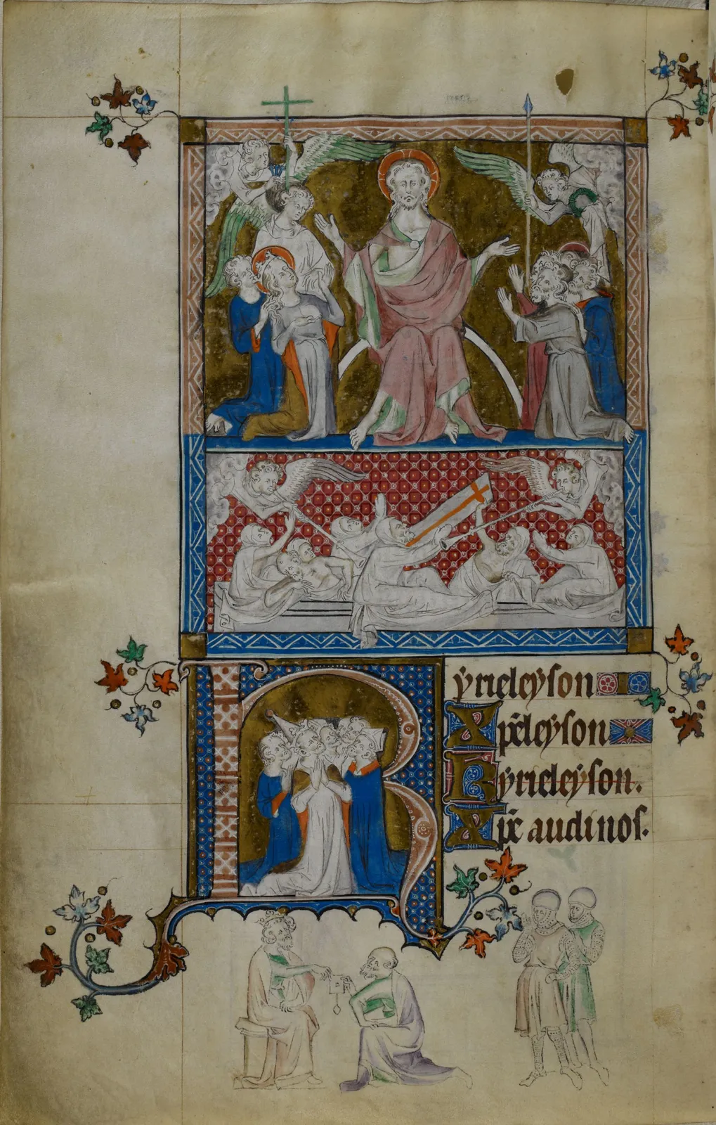
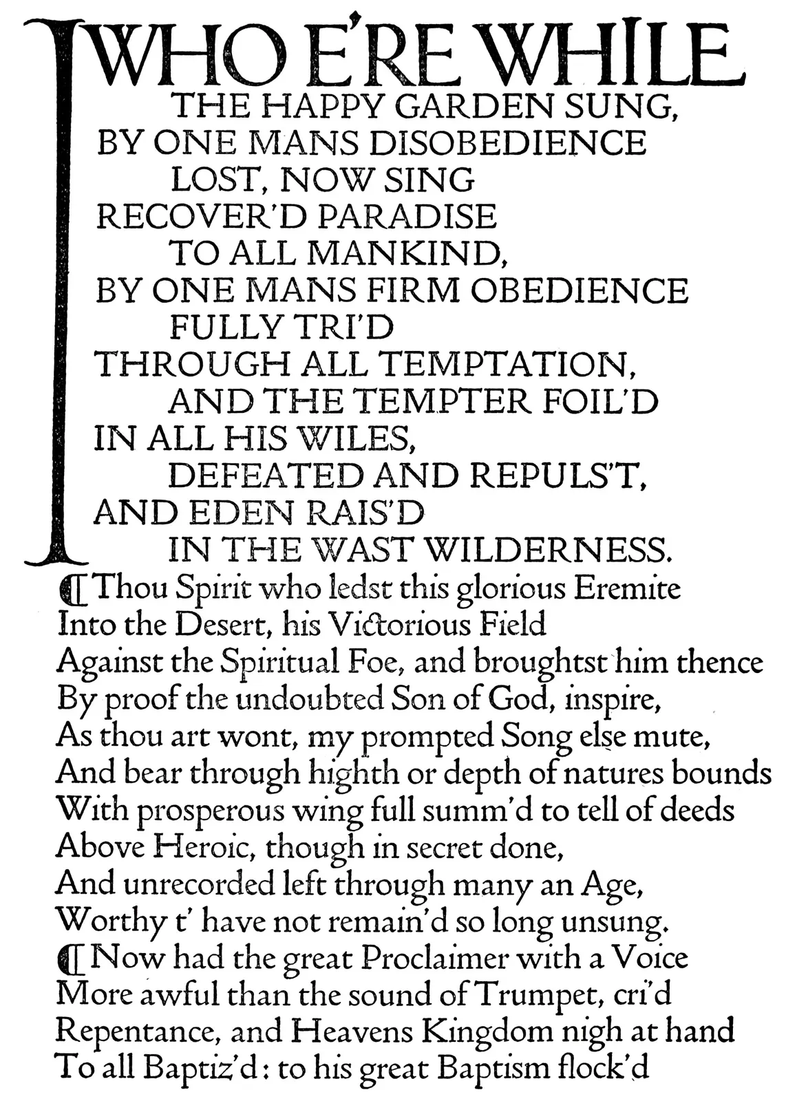
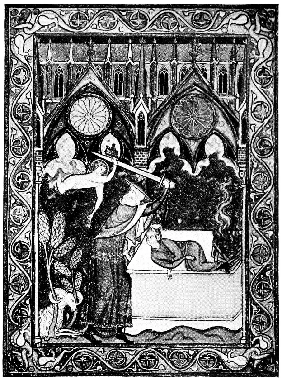
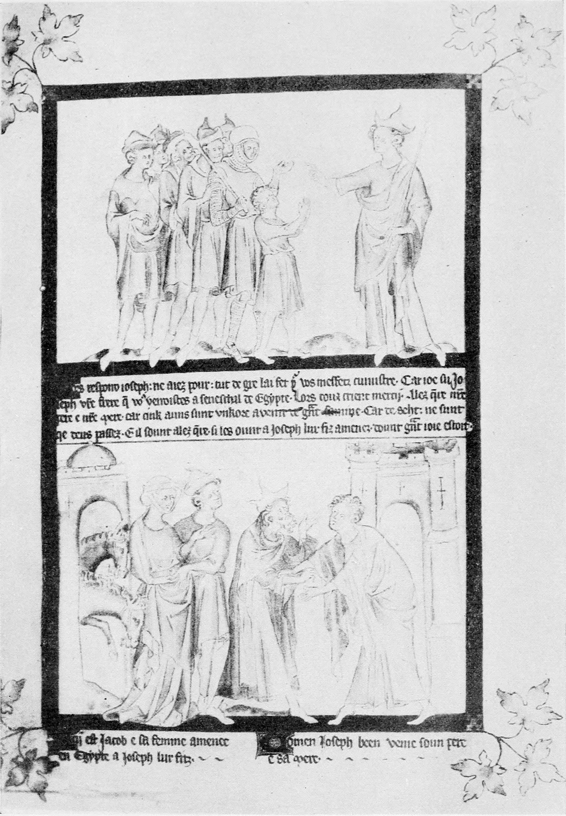
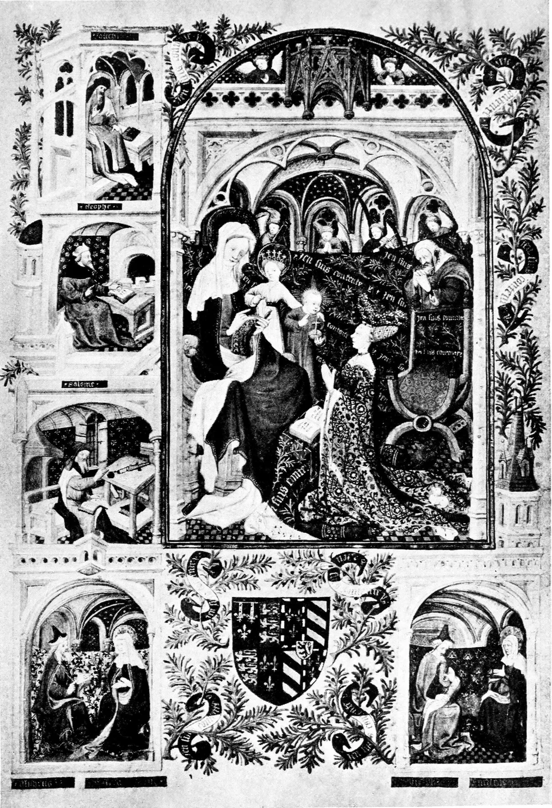
QUEEN MARY’S PSALTER, English, 14th Century
The Last Judgement
(Brit. Mus. Royal MS. 2B vii, 11 × 7 inches)
IN QUEST OF THE PERFECT BOOK
REMINISCENCES
& REFLECTIONS
OF A BOOKMAN
WILLIAM DANA ORCUTT
PUBLISHED · MCMXXVI · BOSTON
LITTLE, BROWN & COMPANY
Copyright, 1926, by Little, Brown
and Company · All rights reserved
·.·
Printed in the United States of America
Published September, 1926
·.·
Reprinted October, 1926
Reprinted November, 1926
THE AUTHOR is indebted to the Atlantic
Monthly for permission to reprint
as the first chapter of this volume an
essay which originally appeared in that
magazine; to the Christian Science
Monitor for permission to use, in
quite different form, certain material
which has been drawn upon in literary
editorials written by him for its
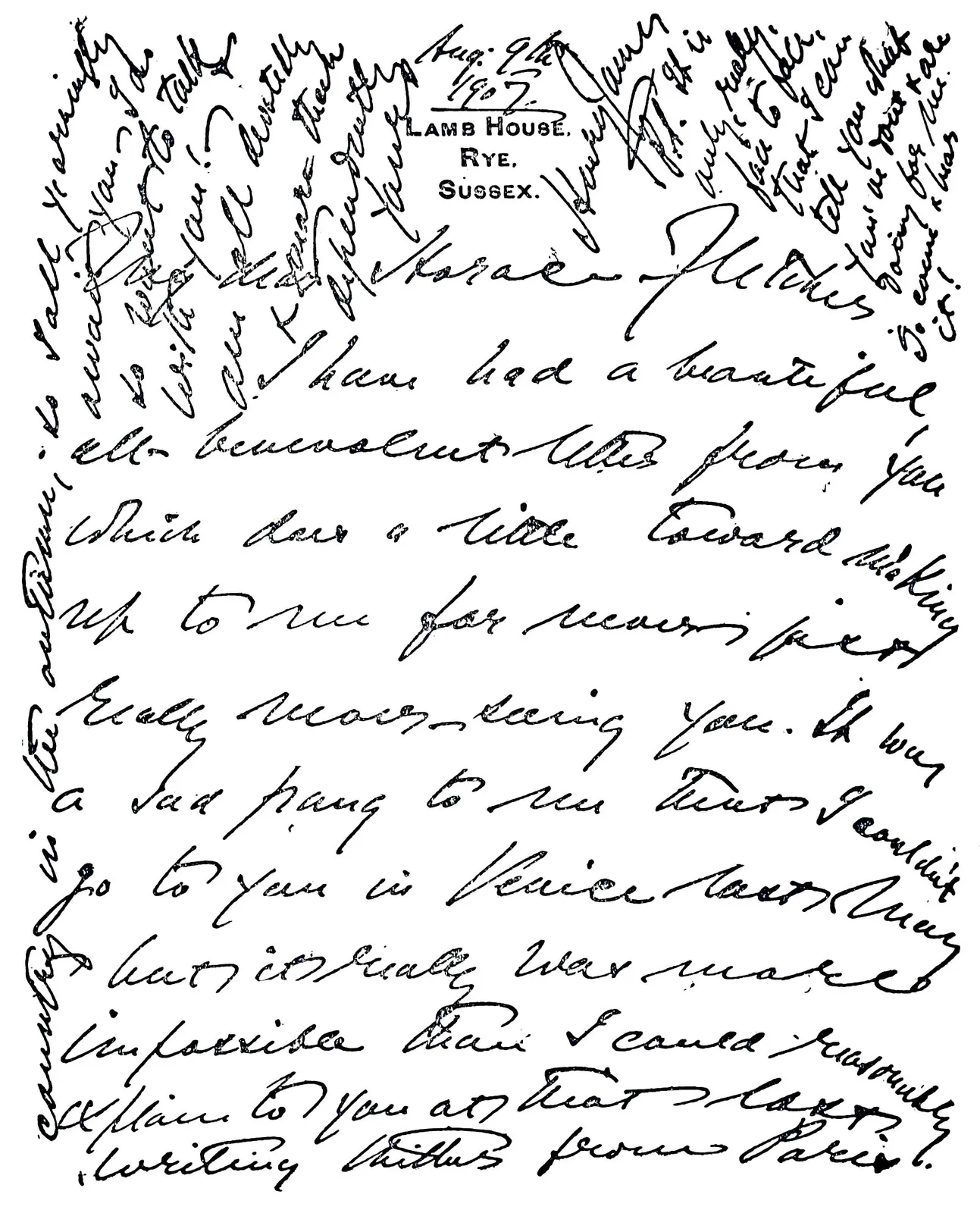
columns; to Alban Dobson, Esq.,
G. Bernard Shaw, Esq., Henry
James, Esq., Mrs. Anne
Cobden-Sanderson, and others, for
permission to print personal letters and
photographs.
To ITALY
That great Country whose Master-Spirits
in Art, Typography, and Literature
have contributed most toward
THE PERFECT BOOK
this Volume is Dedicated
FOREWORD TO THE THIRD EDITION
Years ago, I prepared what seemed to me a splendid Foreword to my first
novel, and was much chagrined when I was urged to leave it out. At the
time, the comment that came with the advice seemed a bit brutal: “A
Foreword is an admission on the part of an author that he has failed to
tell his story, or is an insult to the intelligence of his readers.”
Since then my own feelings have come in such complete accord that the
request of my publishers for a Foreword to this Third Edition comes
as a surprise. But, after all, this is not my story, but the story of
the Book, so, as recorder, I must recognize my responsibility. I have
claimed that this story was Romance, but since writing it, Romance has
allied itself to Drama, for the Gutenberg Bible, a copy of which sold
in February for a record price of $120,000, in September achieved the
stupendous value of $305,000! Surely the Book has come into its own!
After devoting a lifetime to printing as an art, I have naturally
been gratified to discover that so large and friendly an army of
readers exists to whom books mean something more than paper and type
and binders’ boards. To many of my readers, the ideas advanced in this
volume apparently have been novel, but appealing: “I have been over the
books in my library,” writes one, “and find many that now take on new
significance.” Another says, “I feel that I have missed much, all these
years, in not knowing how fascinating the story of the Book itself
really is.” Then there are those who are good enough to say that the
story of my adventures has helped to place the art of printing where it
rightfully belongs.
Some of my reviewers and some correspondents seem seriously to think
that I believe the Quest to be ended. Think of the tragedy of having so
alluring an adventure become an accomplished fact,—even granting that
it were possible! Where is the Perfect Book to be found? In the words
of the author or in the heart of the reader? In the design of a type
or in the skill of the typographer or the binder? In the charm of the
paper or in the beauty of the illumination or illustration? It must, of
course, be in the harmonious combination of all of these, but the words
of an author which find a place in one reader’s heart fail to interest
another; the design of a type that is appropriate to one book is not
equally expressive in all.
The word perfection has no place in our language except as an
incentive. To search for it is an absorbing adventure, for it quickens
our senses to perceive much that would otherwise be lost. If perfection
could become commonplace, the Quest would end,—and God pity the world!
Until then each of us will define the Perfect Book in his own words,
each of us will seek it in his own way.
A writer may be born who combines the wisdom of Solomon, the
power of analysis of Henry James, the understanding of Plato, the
philosophy of Emerson, and the style of Montaigne. This manuscript
may be transformed into a book by a printer who can look beyond
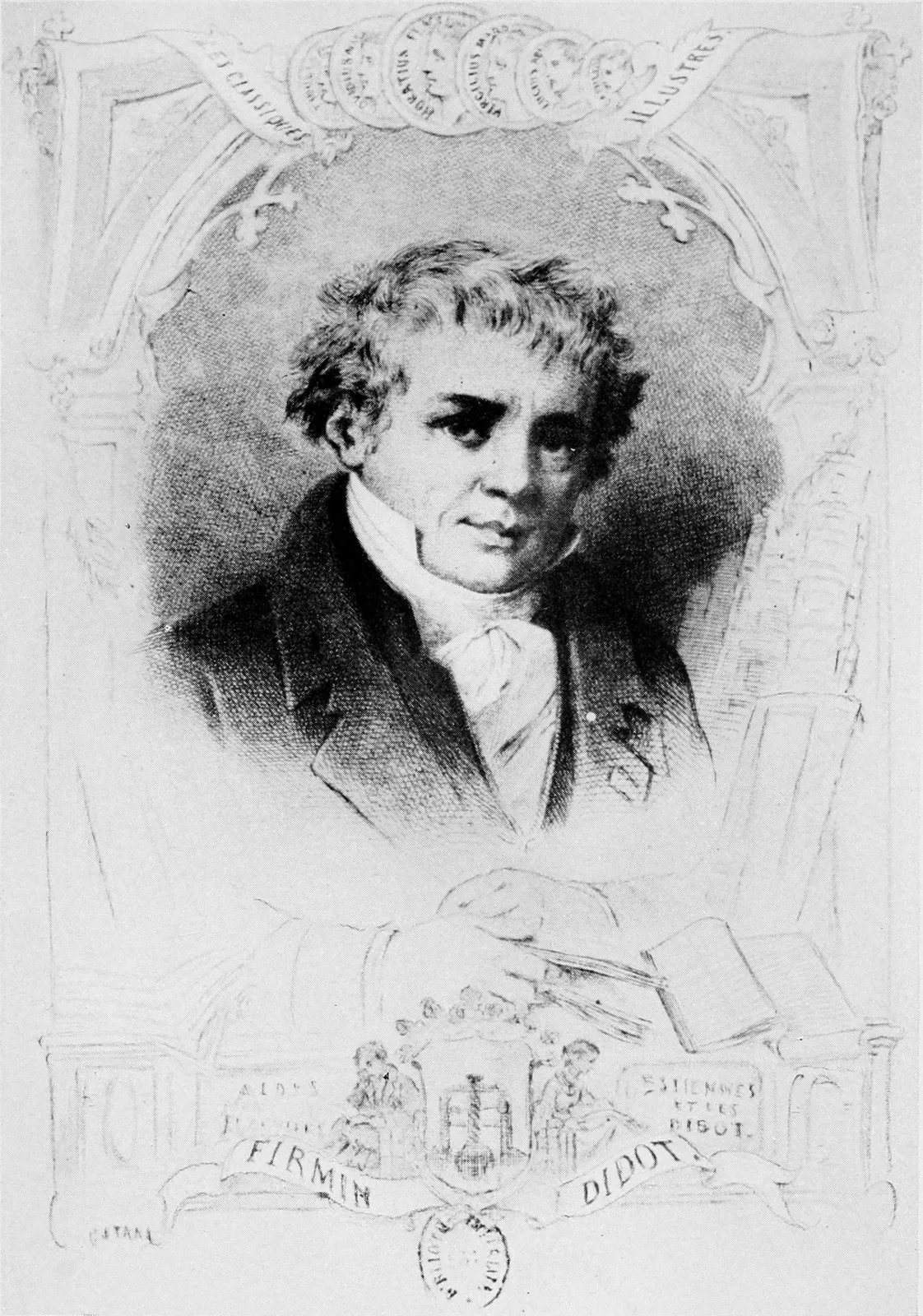
his cases of type, and interpret what Aldus, and Jenson, and Etienne,
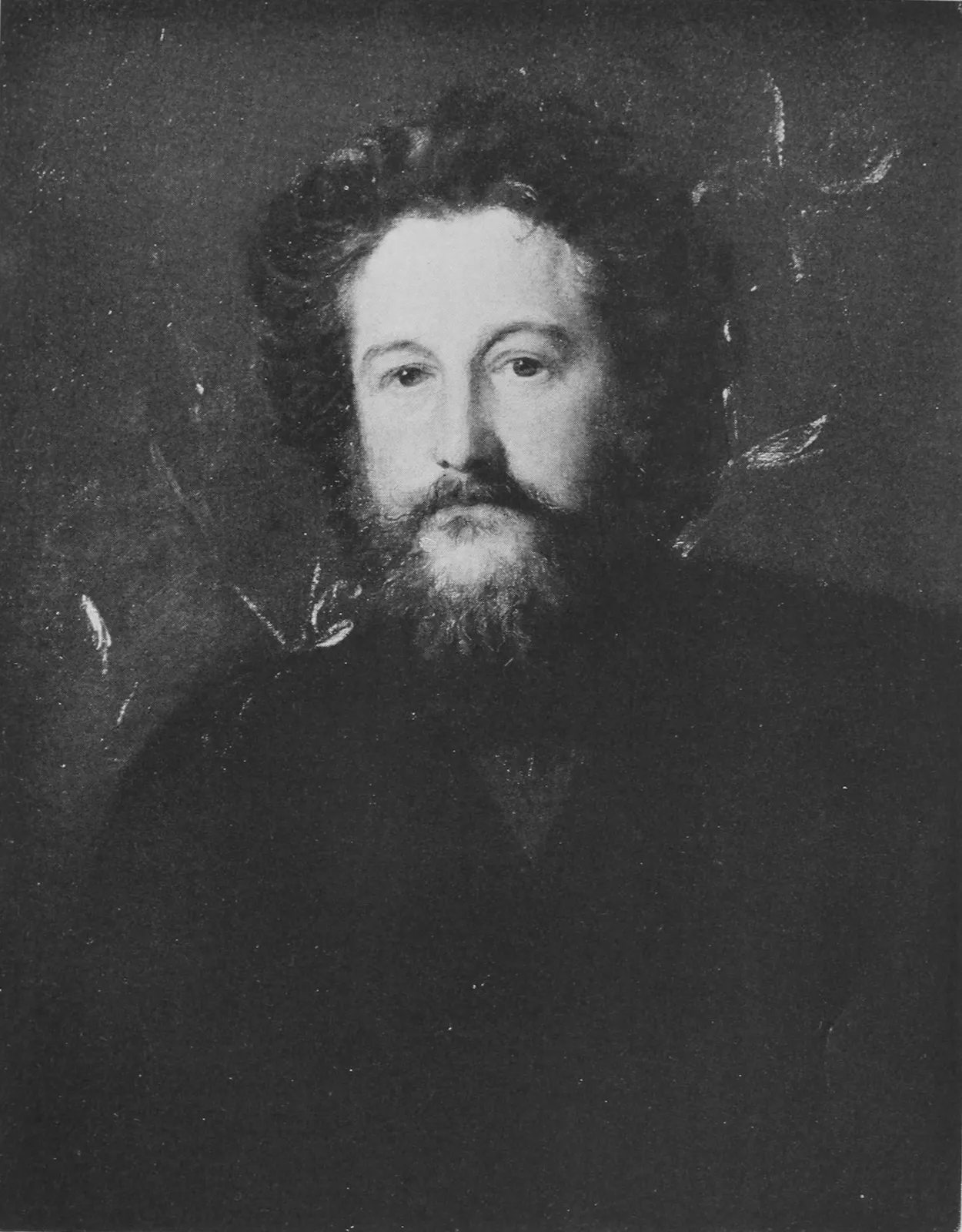
and Plantin saw, with the artistic temperament of William Morris and
the restraint of Cobden-Sanderson. There may be a binding that
represents the apotheosis of Italian, French, and English elegance.
A reader may be developed through the evolution of the ages
competent to appreciate the contents and the physical format
of such a volume, “for what we really seek is a comparison of
experiences.”
Until then the Quest will continue, going constantly onward and upward.
Its lure will keep us from slipping back upon false satisfaction and a
placid but—shall I say?—a dangerous contemplation of the humanistic
idyll.
“Here is a fine volume,” a friend remarked, handing me a copy of The
Ideal Book, written and printed by Cobden-Sanderson at the Doves
Press.
“It is,” I assented readily, turning the leaves, and enjoying the
composite beauty of the careful typography, and the perfect impression
upon the soft, handmade paper with the satisfaction one always feels
when face to face with a work of art. “Have you read it?”
“Why—no,” he answered. “I picked it up in London, and they told me it
was a rare volume. You don’t necessarily read rare books, do you?”
My friend is a cultivated man, and his attitude toward his latest
acquisition irritated me; yet after thirty years of similar
disappointments I should not have been surprised. How few, even among
those interested in books, recognize the fine, artistic touches
that constitute the difference between the commonplace and the
distinguished! The volume under discussion was written by an authority
foremost in the art of bookmaking; its producer was one of the few
great master-printers and binders in the history of the world; yet the
only significance it possessed to its owner was the fact that some one
in whom he had confidence had told him it was rare! Being rare, he
coveted the treasure, and acquired it with no greater understanding
than if it had been a piece of Chinese jade.
“What makes you think this is a fine book?” I inquired, deliberately
changing the approach.
He laughed consciously. “It cost me nine guineas—and I like the looks
of it.”
Restraint was required not to say something that might have affected
our friendship unpleasantly, and friendship is a precious thing.
“Do something for me,” I asked quietly. “That is a short book. Read
it through, even though it is rare, and then let us continue this
conversation we have just begun.”
A few days later he invited me to dine with him at his club. “I asked
you here,” he said, “because I don’t want any one, even my family, to
hear what I am going to admit to you. I have read that book, and I’d
rather not know what you thought of my consummate ignorance of what
really enters into the building of a well-made volume—the choice
of type, the use of decoration, the arrangement of
margins. Why,
bookmaking is an art! Perhaps I should have known that, but I never
stopped to think about it.”
One does have to stop and think about a well-made book in order to
comprehend the difference between printing that is merely printing and
that which is based upon art in its broadest sense and upon centuries
of precedent. It does require more than a gleam of intelligence to
grasp the idea that the basis of every volume ought to be the thought
expressed by the writer; that the type, the illustrations, the
decorations, the paper, the binding, simply combine to form the vehicle
to convey that expression to the reader. When, however, this fact is
once absorbed, one cannot fail to understand that if these various
parts, which compositely comprise the whole, fail to harmonize with the
subject and with each other, then the vehicle does not perform its full
and proper function.
I wondered afterward if I had not been a bit too superior in my
attitude toward my friend. As a matter of fact, printing as an art has
returned to its own only within the last quarter-century. Looking back
to 1891, when I began to serve my apprenticeship under John Wilson at
the old University Press in Cambridge, Massachusetts, the broadness
of the profession that I was adopting as
my life’s work had not as
yet unfolded its unlimited possibilities. At that time the three great
American printers were John Wilson, Theodore L. De Vinne, and Henry O.
Houghton. The volumes produced under their supervision were perfect
examples of the best bookmaking of the period, yet no one of these
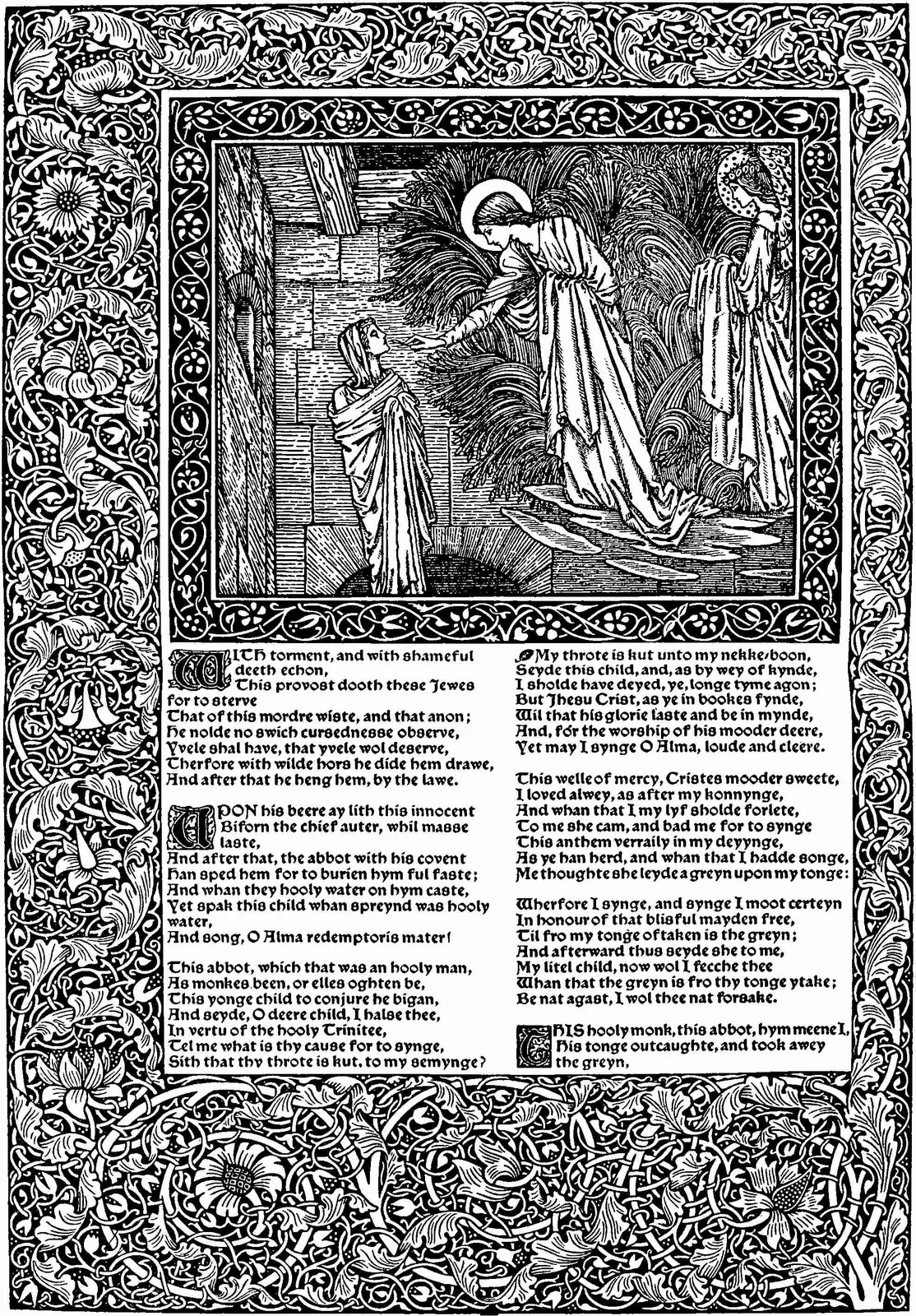
three men looked upon printing as an art. It was William Morris who in
modern times first joined these two words together by the publication
of his magnificent Kelmscott volumes. Such type, such decorations, such
presswork, such sheer, composite beauty!
This was in 1895. Morris, in one leap, became the most famous printer
in the world. Every one tried to produce similar volumes, and the
resulting productions, made without appreciating the significance of
decoration combined with type, were about as bad as they could be. I
doubt if, at the present moment, there exists a single one of these
sham Kelmscotts made in America that the printer or the publisher cares
to have recalled to him.
When the first flair of Morris’ popularity passed away, and his
volumes were judged on the basis of real bookmaking, they were
classified as marvelously beautiful objets d’art rather than
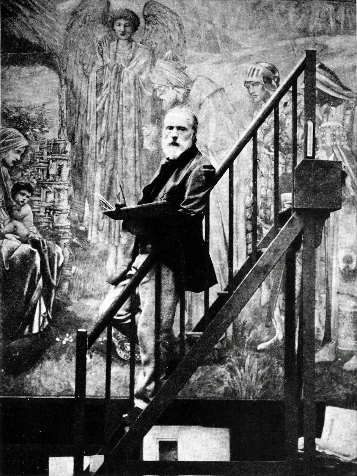
books—composites of Burne-Jones, the designer, and William Morris,
the decorator-printer, co-workers in
sister arts; but from the
very beginning Morris’ innovations showed the world that printing
still belonged among the fine arts. The Kelmscott books awoke in me
an overwhelming desire to put myself into the volumes I produced. I
realized that no man can give of himself beyond what he possesses,
and that to make my ambition worth accomplishing I must absorb and
make a part of myself the beauty of the ancient manuscripts and the
early printed books. This led me to take up an exhaustive study of the
history of printing.
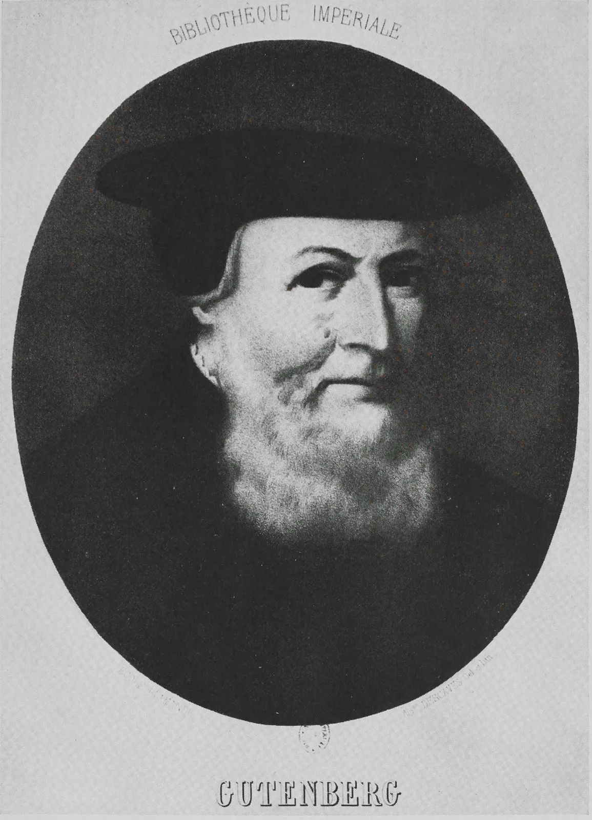
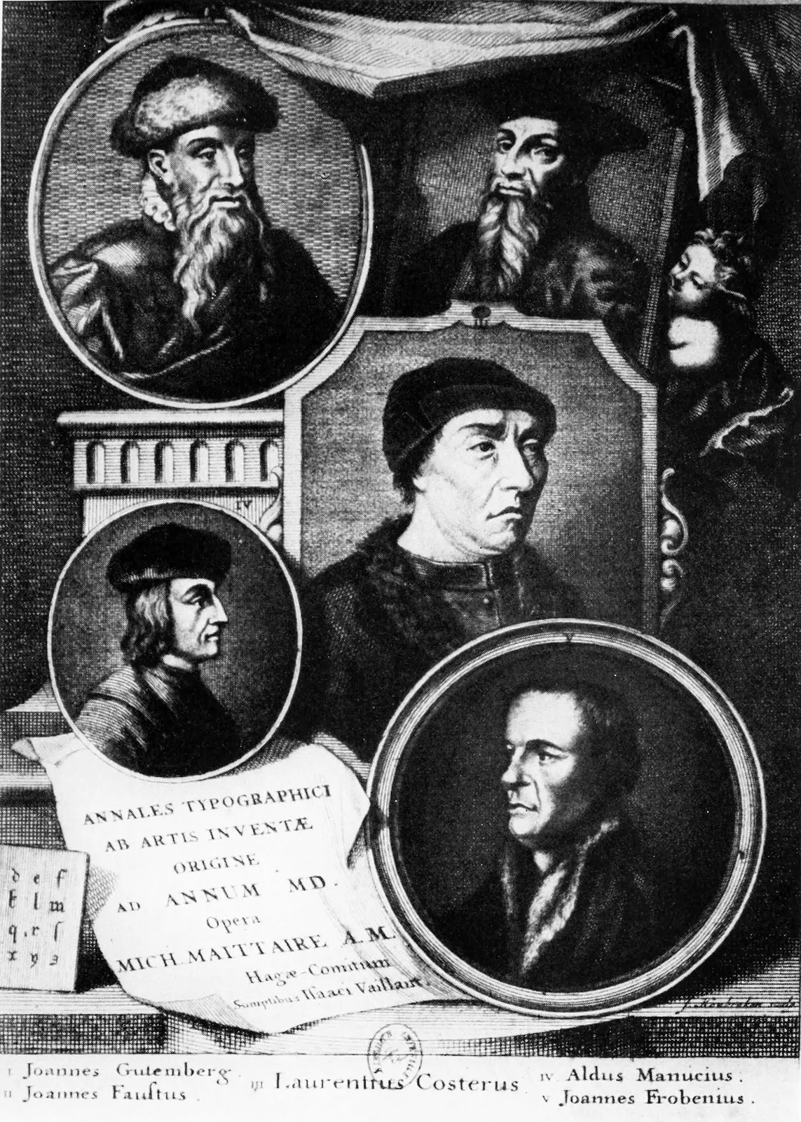
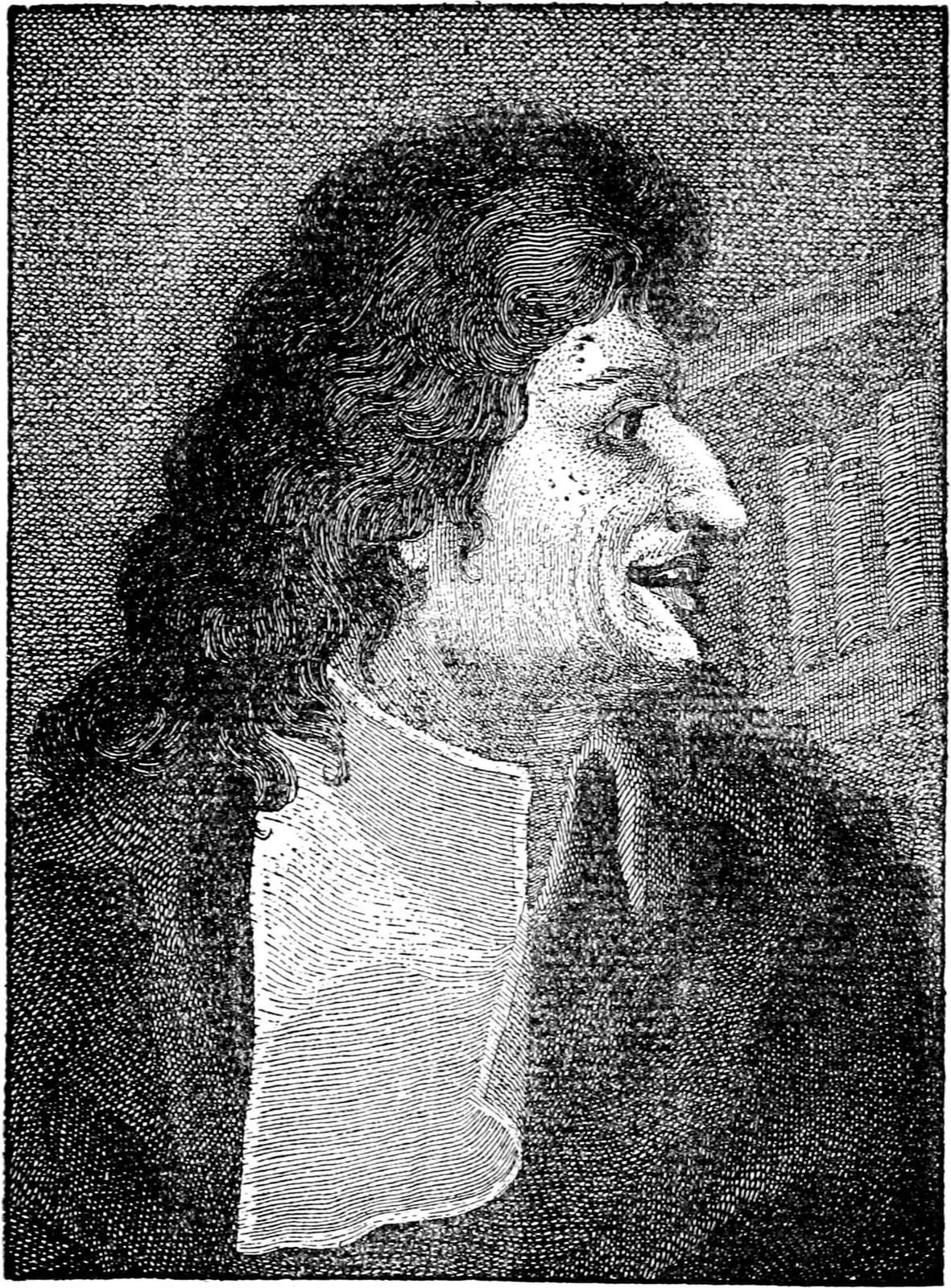
JOHN GUTENBERG, c. 1400–1468
From Engraving by Alphonse Descaves
Bibliothèque Nationale, Paris
Until then Gutenberg’s name, in my mind, had been preëminent. As
I proceeded, however, I came to know that he was not really the
“inventor” of printing, as I had always thought him to be; that he
was the one who first foresaw the wonderful power of movable types as
a material expression of the thought of man, rather than the creator
of anything previously unknown. I discovered that the Greeks and the
Romans had printed from stamps centuries earlier, and that the Chinese
and the Koreans had cut individual characters in metal.
I well remember the thrill I experienced when I first realized—and
at the time thought my discovery was original!—that, had the Chinese
or the Saracens possessed Gutenberg’s wit to join these letters
together into words, the art of printing must have found its way to
Constantinople, which would have thus become the center of culture and
learning in the fifteenth century.
From this point on, my quest seemed a part of an Arabian Nights’ tale.
Cautiously opening a door, I would find myself in a room containing
treasures of absorbing interest. From this room there were doors
leading in different directions into other rooms even more richly
filled; and thus onward, with seemingly no end, to the fascinating
rewards that came through effort and perseverance.
Germany, although it had produced Gutenberg, was not sufficiently
developed as a nation to make his work complete. The open door led
me away from Germany into Italy, where literary zeal was at its
height. The life and customs of the Italian people of the fifteenth
century were spread out before me. In my imagination I could see the
velvet-gowned agents of the wealthy patrons of the arts searching
out old manuscripts and giving commissions to the scribes to prepare
hand-lettered copies for their masters’ libraries. I could mingle with
the masses and discover how eager they were to learn the truth in
the matter of religion, and the cause and the remedies of moral and
material evils
by which they felt themselves oppressed. I could share
with them their expectant enthusiasm and confidence that the advent of
the printing press would afford opportunity to study description and
argument where previously they had merely gazed at pictorial design.
I could sense the desire of the people for books, not to place in
cabinets, but to read in order to know; and I could understand why
workmen who had served apprenticeships in Germany so quickly sought
out Italy, the country where princes would naturally become patrons of
the new art, where manuscripts were ready for copy, and where a public
existed eager to purchase their products.
While striving to sense the significance of the conflicting elements
I felt around me, I found much of interest in watching the scribes
fulfilling their commissions to prepare copies of original manuscripts,
becoming familiar for the first time with the primitive methods of
book manufacture and distribution. A monastery possessed an original
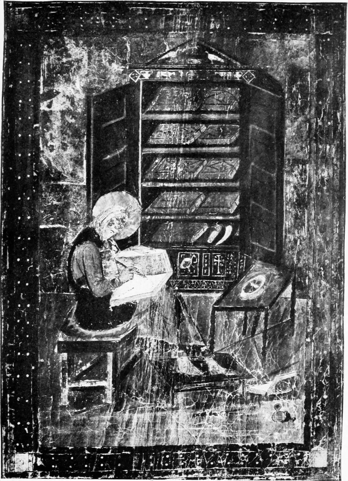
manuscript of value. In its scriptorium (the writing office) one
might find perhaps twenty or thirty monks seated at desks, each with a
sheet of parchment spread out before him, upon which he inscribed the
words that came to him in the droning, singsong voice of the reader
selected for
the duty because of his familiarity with the subject
matter of the volume. The number of desks the scriptorium could
accommodate determined the size of this early “edition.”
When these copies were completed, exchanges were made with other
monasteries that possessed other original manuscripts, of which copies
had been made in a similar manner. I was even more interested in the
work of the secular scribes, usually executed at their homes, for it
was to these men that the commissions were given for the beautiful
humanistic volumes. As they had taken up the art of hand lettering from
choice or natural aptitude instead of as a part of monastic routine,
they were greater artists and produced volumes of surpassing beauty. A
still greater interest in studying this art of hand lettering lay in
the knowledge that it soon must become a lost art, for no one could
doubt that the printing press had come to stay.
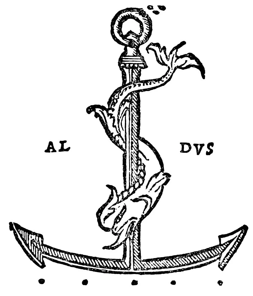
Then, turning to the office of Aldus, I pause for a moment to read the
legend placed conspicuously over the door:
Whoever thou art, thou art earnestly requested by Aldus to
state thy business briefly and to take thy departure promptly.
In this way thou mayest be of service even as
was Hercules
to the weary Atlas, for this is a place of work
for all who may enter
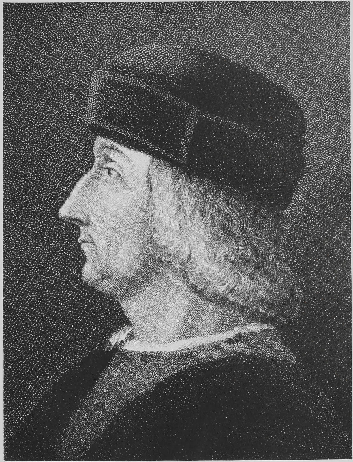
ALDUS MANUTIUS, 1450–1515
From Engraving at the British Museum
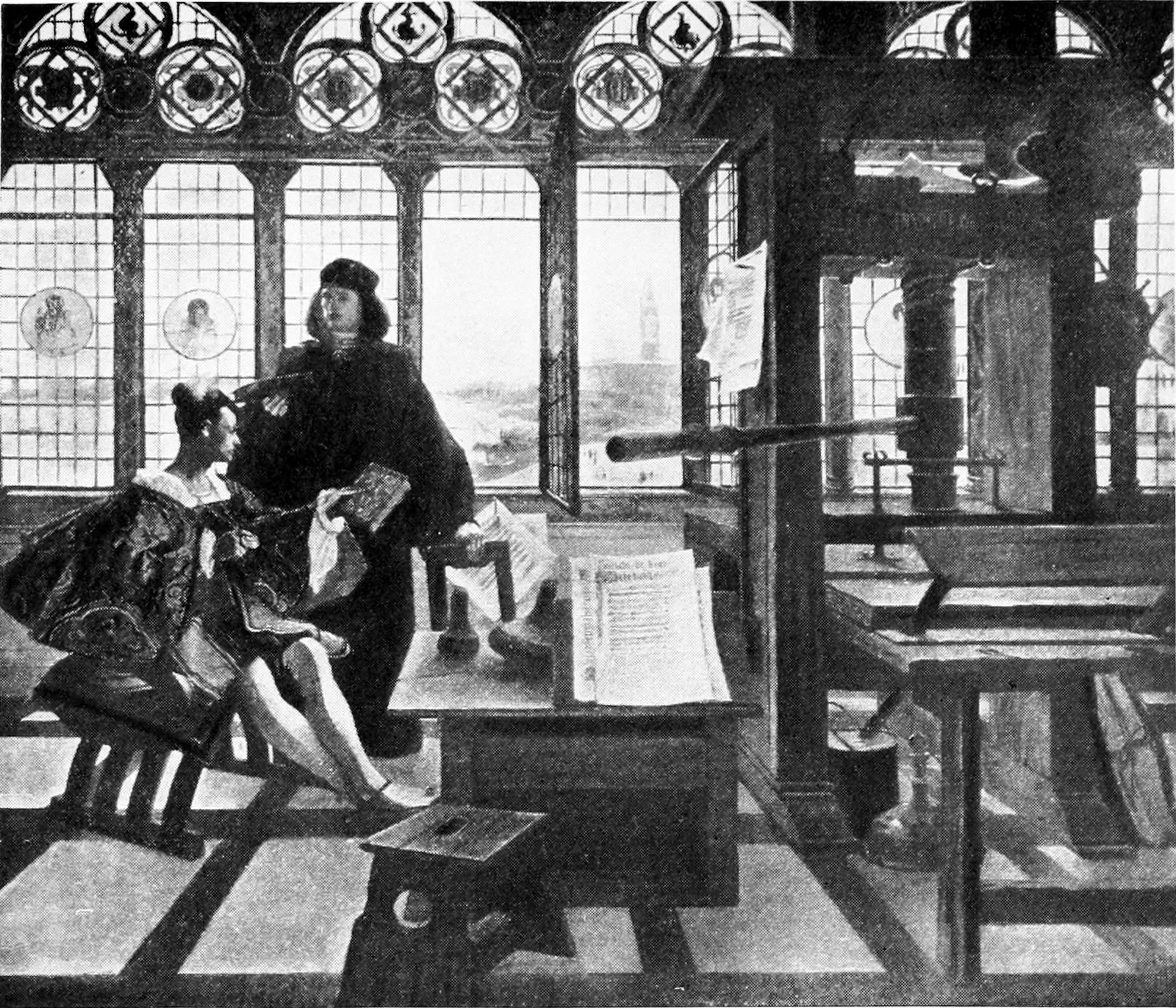
But inside the printing office I find Aldus and his associates talking
of other things than the books in process of manufacture. They are
discussing the sudden change of attitude on the part of the wealthy
patrons of the arts who, after welcoming the invention of printing,
soon became alarmed by the enthusiasm of the people, and promptly
reversed their position. No wonder that Aldus should be concerned as
to the outcome! The patrons of the arts represented the culture and
wealth and political power of Italy, and they now discovered in the new
invention an actual menace. To them the magnificent illuminated volumes
of the fifteenth century were not merely examples of decoration,
but they represented the tribute that this cultured class paid to
the thought conveyed, through the medium of the written page, from
the author to the world. This jewel of thought they considered more
valuable than any costly gem. They perpetuated it by having it written
out on parchment by the most accomplished scribes; they enriched it
by illuminated embellishments executed by the most famous artists;
they protected it with bindings in which they actually inlaid gold and
silver and jewels. To have this thought cheapened
by reproduction
through the commonplace medium of mechanical printing wounded their
æsthetic sense. It was an expression of real love of the book that
prompted Bisticci, the agent of so powerful a patron as the Duke of
Urbino, to write of the Duke’s splendid collection in the latter part
of the fifteenth century:
In that library the books are all beautiful in a superlative
degree, and all written by the pen. There is not a single one
of them printed, for it would have been a shame to have one of
that sort.
Aldus is not alarmed by the solicitude of the patrons for the beauty
of the book. He has always known that in order to exist at all
the printed book must compete with the written volume; and he has
demonstrated that, by supplying to the accomplished illuminators
sheets carefully printed on parchment, he can produce volumes of
exquisite beauty, of which no collector need be ashamed. Aldus knows
that there are other reasons behind the change of front on the part
of the patrons. Libraries made up of priceless manuscript volumes
are symbols of wealth, and through wealth comes power. With the
multiplication of printed books this prestige will be lessened, as the
masses will be enabled to possess the same gems of thought in less
extravagant and expensive form. If, moreover, the people are enabled
to read, criticism, the sole property of the scholars, will come into
their hands, and when they once learn self-reliance from their new
intellectual development they are certain to attack dogma and political
oppression, even at the risk of martyrdom. The princes and patrons of
Italy are intelligent enough to know that their self-centered political
power is doomed if the new art of printing secures a firm foothold.
What a relief to such a man as Aldus when it became fully demonstrated
that the desire on the part of the people to secure books in order to
learn was too great to be overcome by official mandate or insidious
propaganda! With what silent satisfaction did he settle back to
continue his splendid work! The patrons, in order to show what a poor
thing the printed book really was, gave orders to the scribes and the
illuminators to prepare volumes for them in such quantities that the
art of hand lettering received a powerful impetus, as a result of which
the hand letters themselves attained their highest point of perfection.
This final struggle on the part of the wealthy overlords resulted only
in redoubling the efforts of the artist master-printers to match the
beauty of the written volumes with the products from their presses.
These Arabian Nights’ experiences occupied me from 1895, when Morris
demonstrated the unlimited possibilities of printing as an art, until
1901, when I first visited Italy and gave myself an opportunity to
become personally acquainted with the historical landmarks of printing,
which previously I had known only from study. In Florence it was my
great good fortune to become intimately acquainted with the late Doctor
Guido Biagi, at that time librarian of the Laurenziana and the Riccardi
libraries, and the custodian of the Medici, the Michelangelo, and the
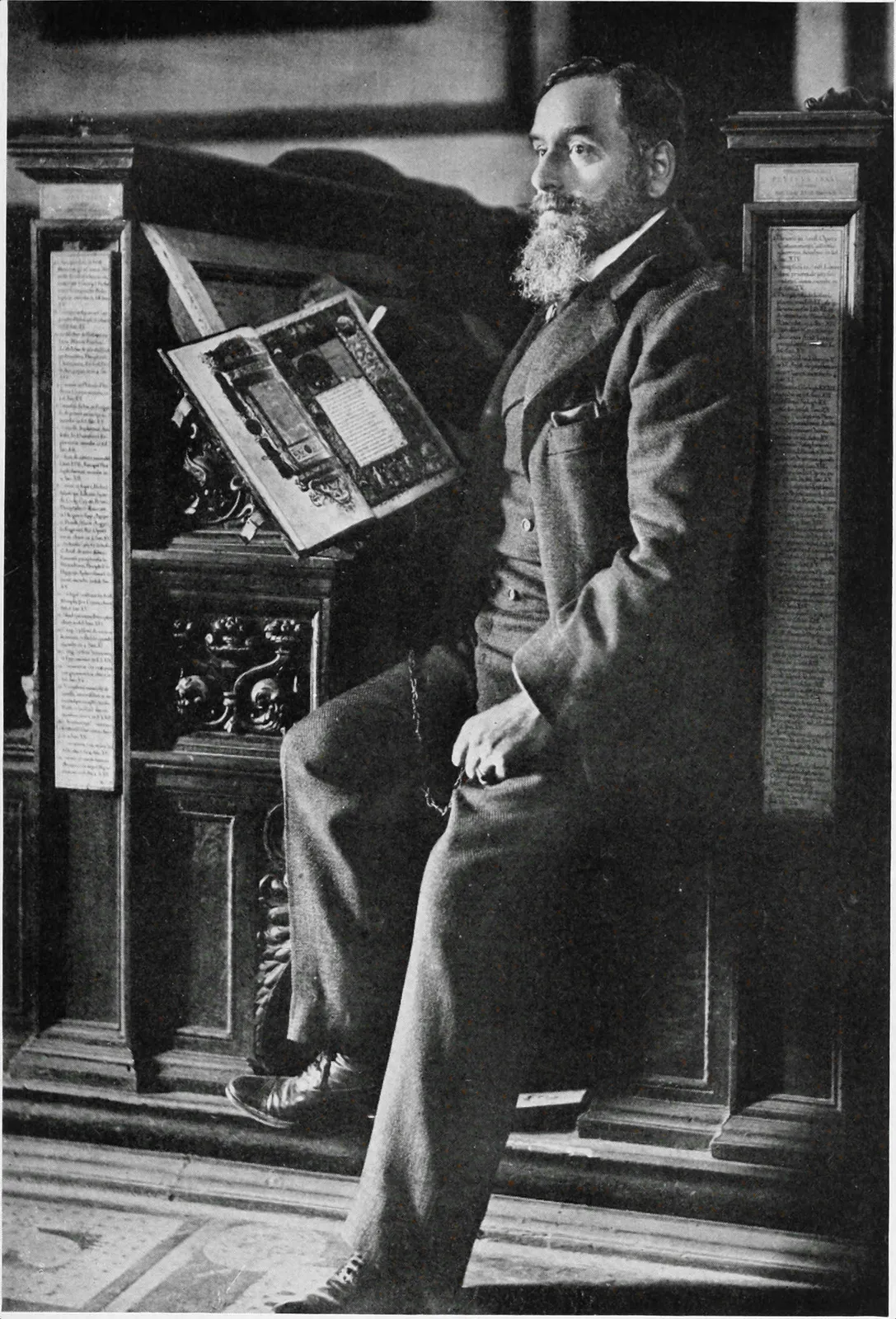
da Vinci archives. I like to think of him as I first saw him then,
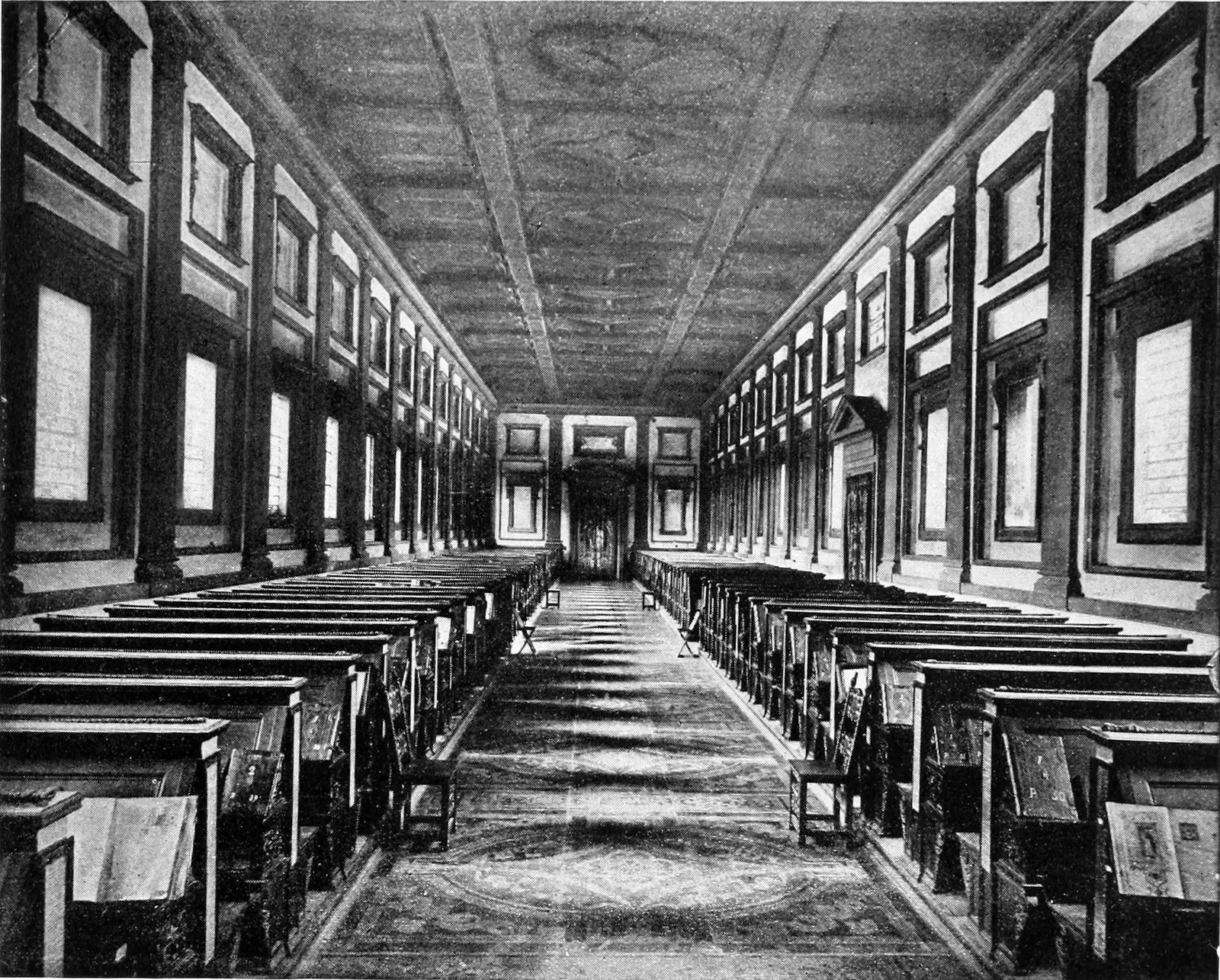
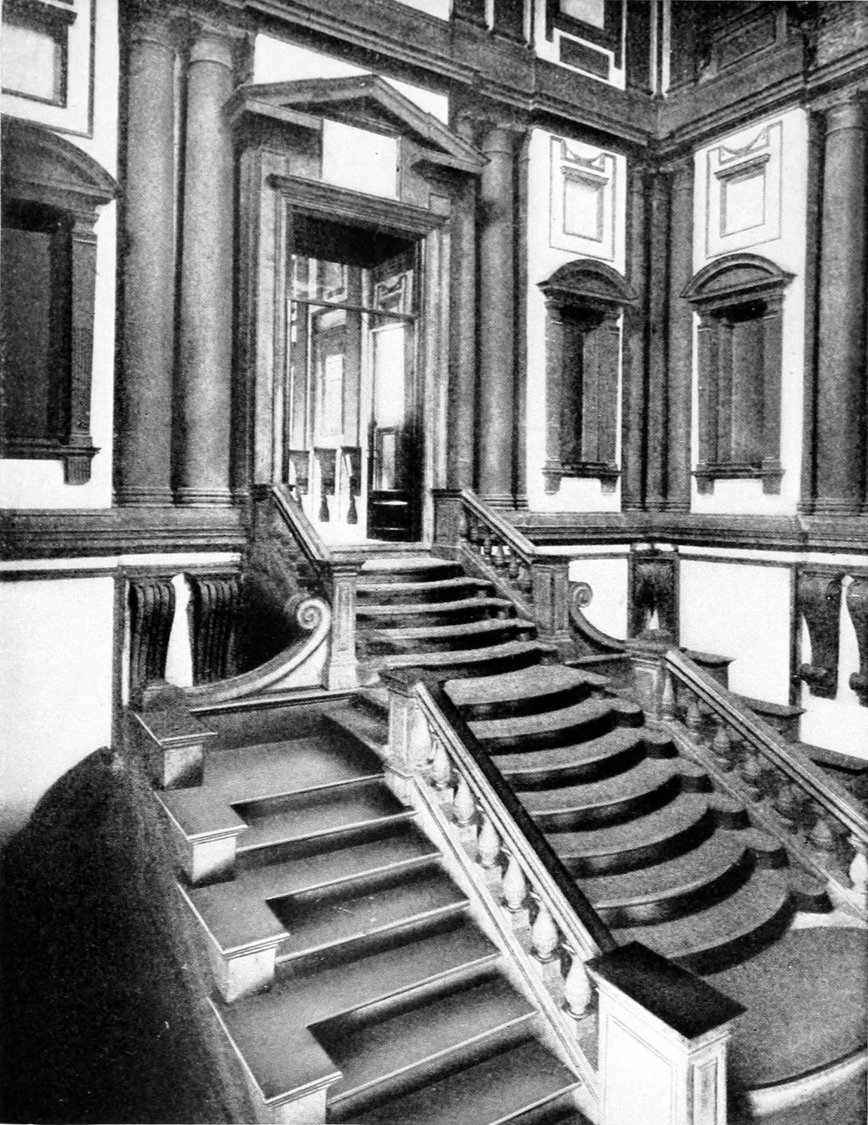
sitting on a bench in front of one of the carved plutei designed
by Michelangelo, in the wonderful Sala di Michelangiolo in the
Laurenziana Library, studying a beautifully illuminated volume resting
before him, which was fastened to the desk by one of the famous old
chains. He greeted me with an old-school courtesy. When he discovered
my genuine interest in the books he loved, and realized that I came as
a student eager to listen to the master’s word, his face lighted up and
we were at once friends.
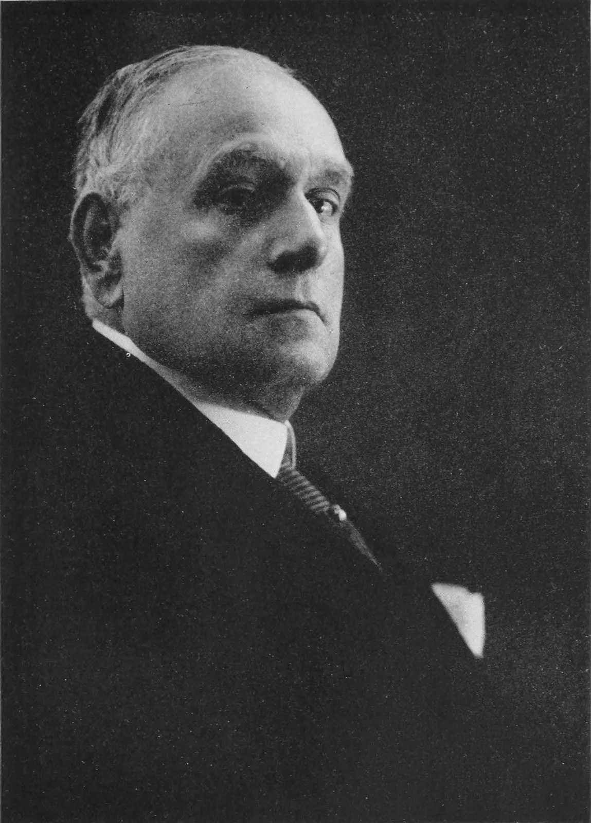
Dott. Comm. GUIDO BIAGI
Seated at one of the plutei in the
Laurenziana Library, Florence (1906)
In the quarter of a century which passed from this meeting until his
death we were fellow-students, and during that period I never succeeded
in exhausting the vast store of knowledge he possessed,
even though
he gave of it with the freest generosity. From him I learned for the
first time of the far-reaching influence of the humanistic movement
upon everything that had to do with the litteræ humaniores, and
this new knowledge enabled me to crystallize much that previously had
been fugitive. “The humanist,” Doctor Biagi explained to me, “whether
ancient or modern, is one who holds himself open to receive Truth,
unprejudiced as to its source, and—what is more important—after
having received Truth realizes his obligation to the world to give it
out again, made richer by his personal interpretation.”
This humanistic movement was the forerunner and the essence of the
Renaissance, being in reality a revolt against the barrenness of
mediævalism. Until then ignorance, superstition, and tradition had
confined intellectual life on all sides, but the little band of
humanists, headed by Petrarch, put forth a claim for the mental freedom
of man and for the full development of his being. As a part of this
claim they demanded the recognition of the rich humanities of Greece
and Rome, which were proscribed by the Church. If this claim had been
postponed another fifty years, the actual manuscripts of many of the
present standard classics would have been lost to the world.
The significance of the humanistic movement in its bearing upon the
Quest of the Perfect Book is that the invention of printing fitted
exactly into the Petrarchian scheme by making it possible for the
people to secure volumes that previously, in their manuscript form,
could be owned only by the wealthy patrons. This was the point at which
Doctor Biagi’s revelation and my previous study met. The Laurenziana
Library contains more copies of the so-called humanistic manuscripts,
produced in response to the final efforts on the part of patrons to
thwart the increasing popularity of the new art of printing, than any
other single library. Doctor Biagi proudly showed me some of these
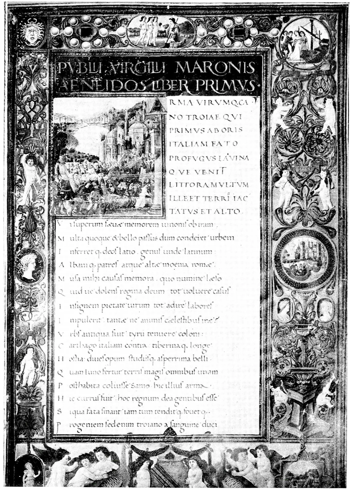
treasures, notably Antonio Sinibaldi’s Virgil. The contrast
between the hand lettering in these volumes and the best I had ever
seen before was startling. Here was a hand letter, developed under the
most romantic and dramatic conditions, which represented the apotheosis
of the art. The thought flashed through my mind that all the types in
existence up to this point had been based upon previous hand lettering
less beautiful and not so perfect in execution.
“Why is it,” I demanded excitedly, “that no type has ever been designed
based upon this hand lettering at its highest point of perfection?”
HAND-WRITTEN HUMANISTIC CHARACTERS
From Sinibaldi’s Virgil, 1485
Laurenziana Library, Florence (12 × 8 inches)
Doctor Biagi looked at me and shrugged his shoulders. “This, my
friend,” he answered, smiling, “is your opportunity.”
At this point began one of the most fascinating and absorbing
adventures in which any one interested in books could possibly engage.
At some time, I suppose, in the life of every typographer comes the
ambition to design a special type, so it was natural that the idea
contained in Doctor Biagi’s remark should suggest possibilities which
filled me with enthusiasm. I was familiar with the history of the best
special faces, and had learned how difficult each ambitious designer
had found the task of translating drawings into so rigid a medium as
metal; so I reverted soberly and with deep respect to the subject of
type design from the beginning.
In studying the early fonts of type, I found them exact counterfeits
of the best existing forms of hand lettering at that time employed
by the scribes. The first Italic font cut by Aldus, for instance, is
said to be based upon the thin, inclined handwriting of Petrarch. The
contrast between these slavish copies of hand-lettered models and the
mechanical precision of characters turned out by modern type founders
made a deep impression. Of the two I preferred the freedom of the
earliest types, but
appreciated how ill adapted these models were
to the requirements of typography. A hand-lettered page, even with
the inevitable irregularities, is pleasing because the scribe makes a
slight variation in forming the various characters. When, however, an
imperfect letter is cut in metal, and repeated many times upon the same
page, the irregularity forces itself unpleasantly upon the eye. Nicolas
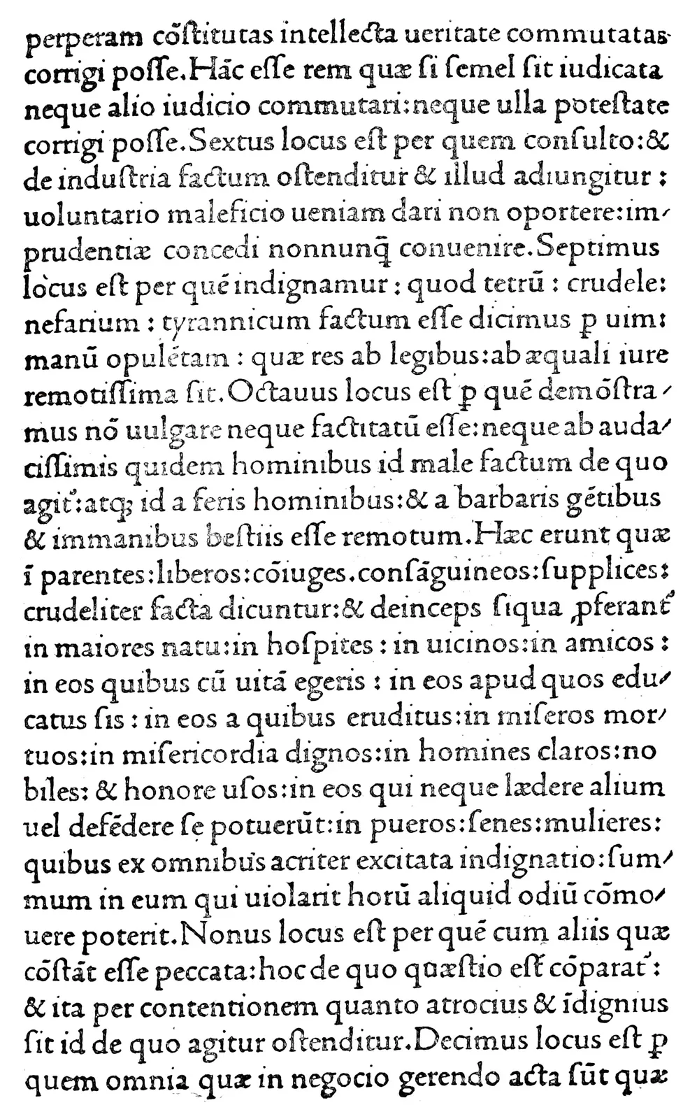
Jenson was the first to realize this, and in his famous Roman type he
made an exact interpretation of what the scribe intended to accomplish
in each of the letters, instead of copying any single hand letter, or
making a composite of many hand designs of the same character. For this
reason the Jenson type has not only served as the basis of the best
standard Roman fonts down to the present time, but has also proved
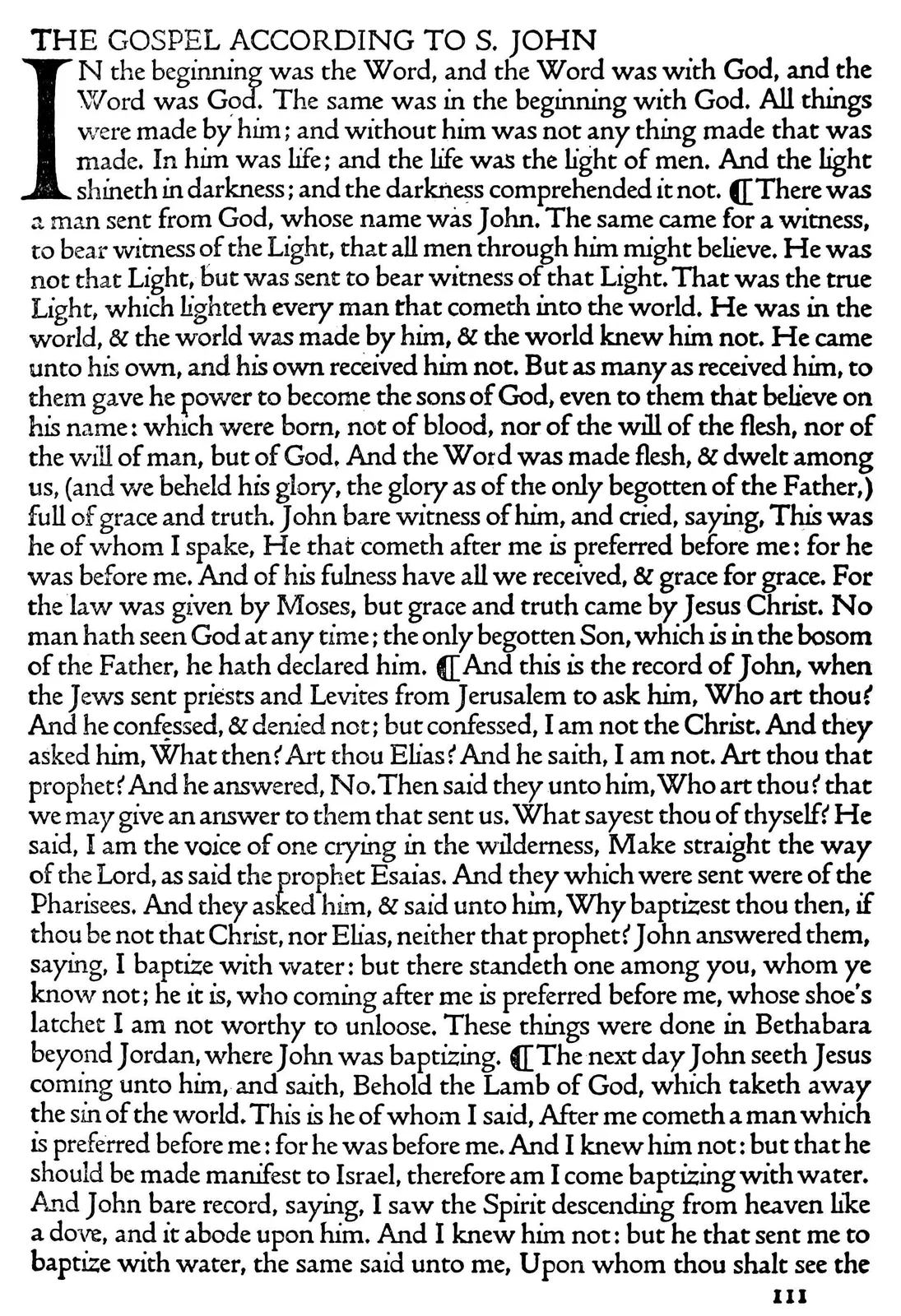
the inspiration for later designs of distinctive type faces, such as
William Morris’ Golden type, and Emery Walker’s Doves type.
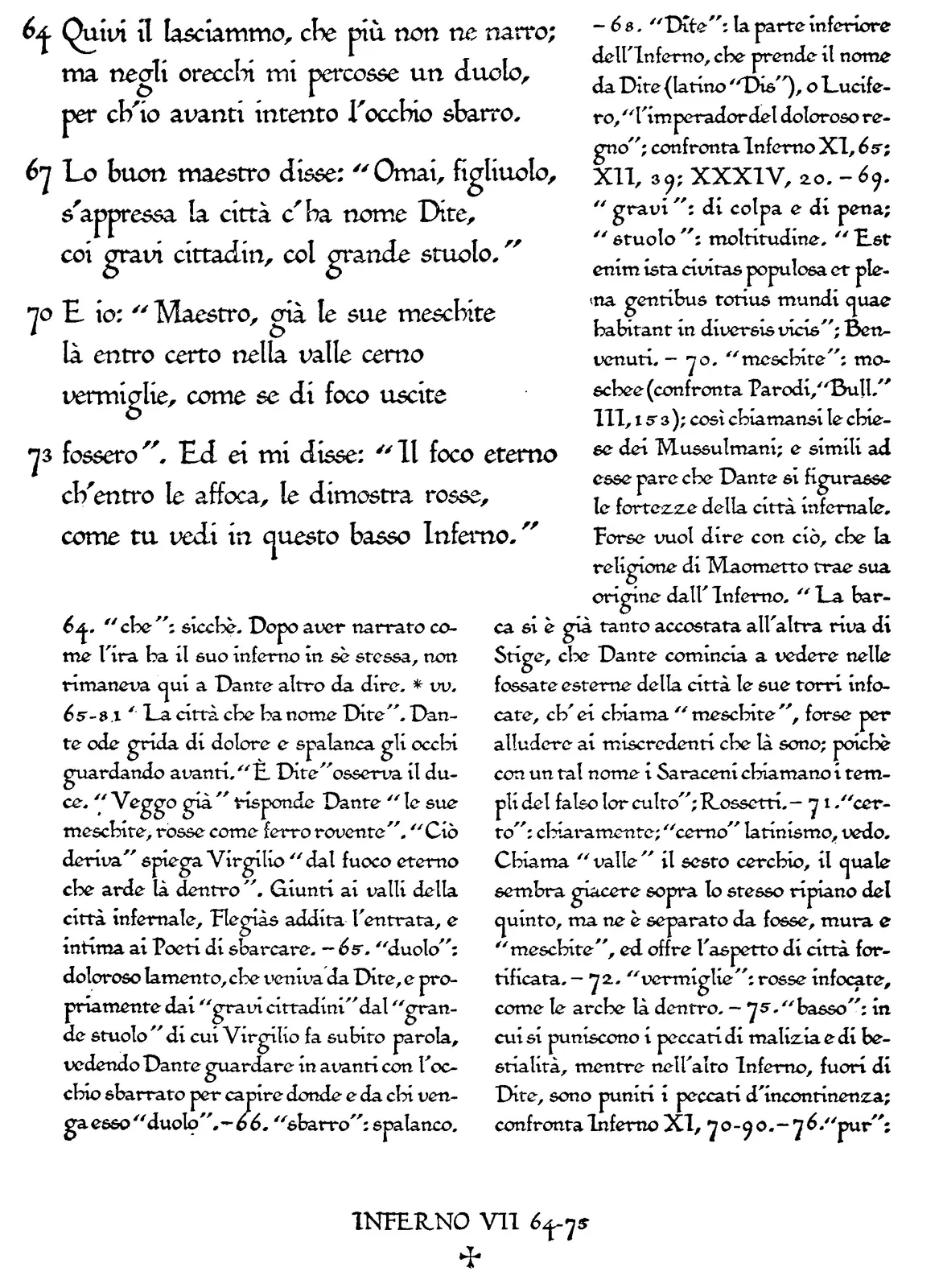
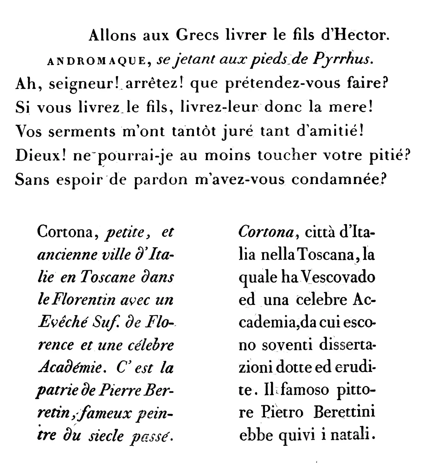
Specimen Page of proposed Edition of Dante. To be
printed by Bertieri, of Milan, in Humanistic Type (8¼ × 6)
William Morris’ experience is an excellent illustration of the
difficulties a designer experiences. He has left a record of how he
studied the Jenson type with great care, enlarging it by photography,
and redrawing it over and over again before he began designing his own
letter. When he actually produced his Golden type the design was far
too much inclined to the Gothic to resemble the model he
selected.
His Troy and Chaucer types that followed showed the strong effect of
the German influence that the types of Schoeffer, Mentelin, and Gunther
Zainer made upon him. The Doves type is based flatly upon the Jenson
model; yet it is an absolutely original face, retaining all the charm
of the model, to which is added the artistic genius of the designer.
Each receives its personality from the understanding and interpretation
of the creator (pages 22,
23).
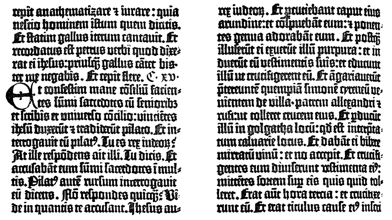
Jenson’s Roman Type.
From Cicero: Rhetorica, Venice, 1470 (Exact size)
Emery Walker’s Doves Type.
From Paradise Regained, London, 1905 (Exact size)
From this I came to realize that it is no more necessary for a type
designer to express his individuality by adding or subtracting from his
model than for a portrait painter to change the features of his subject
because some other artist has previously painted it. Wordsworth once
said that the true portrait of a man shows him, not as he looks at any
one moment of his life, but as he really looks all the time. This is
equally true of a hand letter, and explains the vast differences in the
cut of the same type face by various foundries and for the typesetting
machines. All this convinced me that, if I were to make the humanistic
letters the model for my new type, I must follow the example of Emery
Walker rather than that of William Morris.
During the days spent in the small, cell-like alcove which had been
turned over for my use in
the Laurenziana Library, I came so wholly
under the influence of the peculiar atmosphere of antiquity that I
felt myself under an obsession of which I have not been conscious
before or since. My enthusiasm was abnormal, my efforts tireless. The
world outside seemed very far away, the past seemed very near, and I
was indifferent to everything except the task before me. This curious
experience was perhaps an explanation of how the monks had been able to
apply themselves so unceasingly to their prodigious labors, which seem
beyond the bounds of human endurance.
My work at first was confined to a study of the humanistic volumes in
the Laurenziana Library, and the selection of the best examples to
be taken as final models for the various letters. From photographed
reproductions of selected manuscript pages, I took out fifty examples
of each letter. Of these fifty, perhaps a half-dozen would be almost
identical, and from these I learned the exact design the scribe
endeavored to repeat. I also decided to introduce the innovation of
having several characters for certain letters that repeated most
frequently, in order to preserve the individuality of the hand
lettering, and still keep my design within the rigid limitations of
type. Of the letter e, for instance, eight different
designs were
finally selected; there were five a’s, two
m’s, and so on (see illustration at
page 32).
After becoming familiar with the individual letters as shown in the
Laurenziana humanistic volumes, I went on to Milan and the Ambrosiana
Library, with a letter from Doctor Biagi addressed to the librarian,
Monsignor Ceriani, explaining the work upon which I was engaged, and
seeking his co-operation. It would be impossible to estimate Ceriani’s
age at that time, but he was very old. He was above middle height, his
frame was slight, his eyes penetrating and burning with a fire that
showed at a glance how affected he was by the influence to which I have
already referred. His skin resembled in color and texture the very
parchment of the volumes he handled with such affection, and in his
religious habit he seemed the embodiment of ancient learning.
After expressing his deep interest in my undertaking, he turned to a
publication upon which he himself was engaged, the reproduction in
facsimile of the earliest known manuscript of Homer’s Iliad.
The actual work on this, he explained, was being carried on by his
assistant, a younger priest whom he desired to have me meet. His own
contribution to the work was an introduction, upon which he was then
engaged, and which, he said, was to be
his swan song, the final
message from his soul to the world.
“This, I suppose, is to be in Italian?” I inquired.
He looked at me reproachfully. “No, my son,” he answered, with deep
impressiveness; “I am writing my introduction in Latin, which, though
called a dead language, will be living long after the present living
languages are dead.”
Ceriani placed at my disposal the humanistic volumes in the Ambrosiana,
and introduced me to his assistant, whose co-operation was of the
utmost value in my work. I was particularly struck by the personality
of this younger priest. He was in close touch with affairs outside the
Church, and asked searching questions regarding conditions in America.
He spoke several languages with the same facility with which he spoke
his own Italian. His knowledge of books and of bookmaking, past and
present, surprised me. All in all, I found him one of the most charming
men I have ever met. His name was Achille Ratti, and when he became
Bishop of Milan in 1921, and was elevated to the College of Cardinals
two months later, I realized how far that wonderful personality was
taking him. One could scarcely have foreseen, however, that in less
than a year from this time he would become Pope Pius XI.
When, after my drawings were completed, I returned to America, I took
up the matter of the type design with Charles Eliot Norton, my old
art professor at Harvard, then emeritus. Professor Norton was
genuinely interested in the whole undertaking, and as the proofs of
the various punches later came into my hands he became more and more
enthusiastic.
I had arranged to use this type in a series of volumes to be published
in London by John Murray, and in America by Little, Brown and Company.
An important question arose as to what should be the first title, and
after careful consideration I decided that as Petrarch was the father
of humanism his Trionfi would obviously be an ideal selection.
The volume was to be printed in English rather than in the original
Italian, and I settled upon Henry Boyd’s translation as the most
distinguished.
Upon investigation it developed that the original edition of this
book was long out of print and copies were exceedingly rare. The only
one I could locate was in the Petrarch collection of the late Willard
Fiske. I entered into correspondence with him, and he invited me to be
his guest at his villa in Florence. With the type completed, and with
proofs in my possession, I undertook my second
humanistic Odyssey,
making Florence my first objective. Professor Fiske welcomed me
cordially, and in him I found a most sympathetic personality, eager to
contribute in every way to the success of the undertaking. He placed
the volume of Boyd’s translation in my hands, and asked that I take it
with me for use until my edition was completed.
“This book is unique, and so precious that you certainly could not
permit it to go out of your possession,” I protested.
His answer was characteristic. “Your love of books,” he said, “is such
that this volume is as safe in your hands as it is in mine. Take it
from me, and return it when it has served its purpose.”
Then came the matter of illustrations. In London I had a conference
with Sir Sidney Colvin, then Keeper of Prints and Drawings at the
British Museum. Colvin had been made familiar with the undertaking
by John Murray, who had shown him and Alfred W. Pollard some of the
earliest proofs of the punches that I had sent to England. After a
careful examination of these, both men suggested to Mr. Murray that his
American friend was playing a joke upon him, declaring that the proofs
were hand-lettered and not taken from metal originals!
“There is a fate about this,” Colvin said, after
I had explained
my mission. “We have here in the Museum six original drawings of
Petrarch’s Triumphs, attributed by some to Fra Filippo Lippi and
certainly belonging to his school, which have never been reproduced.
They are exactly the right size for the format which you have
determined upon, and if you can have the reproductions made here at the
Museum the drawings are at your disposal.”
I made arrangements with Emery Walker, the designer of the Doves type
and justly famous as an engraver, to etch these plates on steel, and
the reproductions of the originals were extraordinarily exact. Those
Walker made for the parchment edition looked as if drawn on ivory.
Parchment was required for the specially illuminated copies which
were to form a feature of the edition, and before leaving America I
had been told that the Roman grade was the best. I naturally assumed
that I should find this in Rome, but my research developed the fact
that Roman parchment is prepared in Florence. Following this lead,
I examined the skins sold by Florentine dealers, but Doctor Biagi
assured me that the best grade was not Roman but Florentine, and that
Florentine parchment is produced in Issoudun, France. It seemed a far
cry to seek out Italian skins in France,
but to Issoudun I went. In
the meantime I learned that there was a still better grade prepared in
Brentford, England—this, in fact, being where William Morris procured
the parchment for his Kelmscott publications.
At Brentford I secured my skins; and here I learned something that
interested me exceedingly. Owing to the oil which remains in the
parchment after it has been prepared for use, the difficulty in
printing is almost as great as if on glass. To obviate this, the
concern at Brentford, in preparing parchment for the Kelmscott volumes,
filled in the pores of the skins with chalk, producing an artificial
surface. The process of time must operate adversely upon this
extraneous substance, and the question naturally arises as to whether
eventually, in the Kelmscott parchment volumes, the chalk surface will
flake off in spots, producing blemishes which can never be repaired.
For my own purposes I purchased the skins without the artificial
surface, and overcame the difficulty in printing by a treatment of the
ink which, after much experiment, enabled me to secure as fine results
upon the parchment as if printing upon handmade paper.
The volumes were to be printed in the two humanistic colors, black and
blue. In the original
manuscript volumes this blue is a most unusual
shade, the hand letterer having prepared his own ink by grinding
lapis lazuli, in which there is no red. By artificial light the
lines written in blue can scarcely be distinguished from the black. To
reproduce the same effect in the printed volume I secured in Florence
a limited quantity of lapis lazuli, and by special arrangement
with the Italian Government had it crushed into powder at the Royal
mint. This powder I took home to America, and arranged with a leading
manufacturer to produce what I believe to be the first printing ink
mixed exactly as the scribes of the fifteenth century used to prepare
their pigments.
The months required to produce the Triumphs represented a period
alternating in anxiety and satisfaction. The greatest difficulty came
in pressing upon the typesetter the fact that the various characters of
these letters could not be used with mathematical precision, but that
the change should come only when he felt his hand would naturally alter
the design if he were writing the line instead of setting the type.
The experiments required to perfect an ink that should successfully
print on the oily parchment were not completed without disappointments
and misgivings; the scrupulous care required in reading proofs and
perfecting the spacing, was laborious and monotonous; the scrutinizing
of the sheets as they came from the press was made happier when the
success of the lapis lazuli ink was assured.
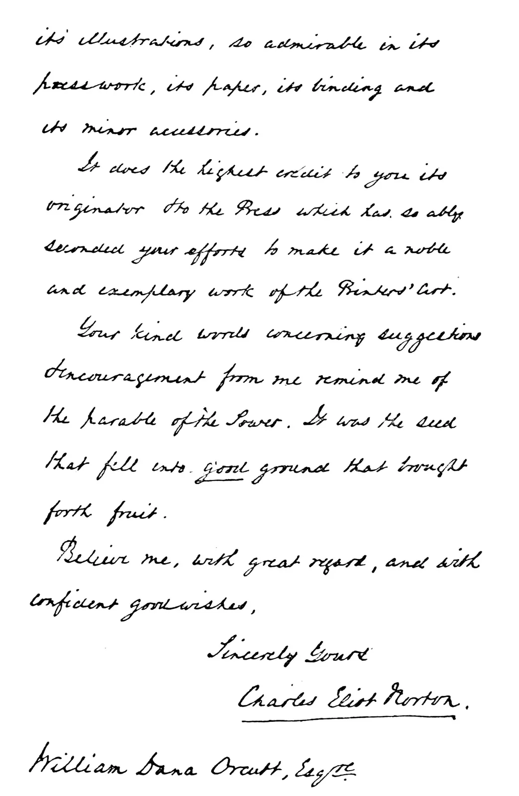
A Page from an Autograph Letter from Charles Eliot Norton
The rewards came when Professor Norton gave the volume his unqualified
approval—“so interesting and original in its typography and in its
illustrations, so admirable in its presswork, its paper, its binding,
and its minor accessories, … a noble and exemplary work of the
printers’ art”; when George W. Jones, England’s artist-printer,
pronounced the Humanistic type “the most beautiful face in the world,”
and promised to use it in what he hopes to be his masterpiece, an
edition of Shakespeare’s Sonnets; when the jury appointed by the
Italian Government to select “the most beautiful and most appropriate
type face to perpetuate the divine Dante” chose the Humanistic type,
and placed the important commission of producing the definitive edition
of the great poet, to commemorate his sexcentenary, in the hands
of that splendid printer, Bertieri, at Milan. Such rewards are not
compliments, but justification. Such beauty as the Humanistic type
possesses lies in the artistic ability and the marvelous skill in
execution of the scribes. My part was simply seizing the development of
a period apparently overlooked, and
undertaking the laborious task
of translating a beautiful thing from one medium to another.
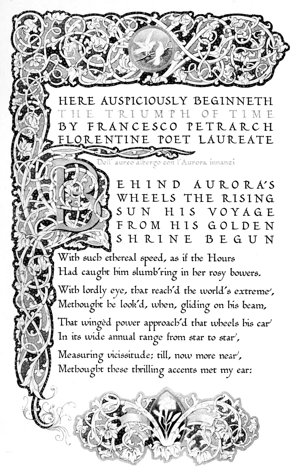
PETRARCH’S TRIUMPHS
Illuminated Page (10 × 6 inches)
Set in Humanistic Type designed by the Author
The Quest of the Perfect Book must necessarily lead the seeker into
far varying roads, the greatest rewards being found in straying from
the main street into the fascinating bypaths. My quest has resulted
in giving me greater appreciation of the accomplishments of those who
successfully withstood opposition and persecution in order to make the
printed book a living vehicle to convey the gems of thought from great
minds to the masses, never forgetful of the value of beauty in its
outward aspect. I believe it possible today to perpetuate the basic
principles of the early artist master-printers by applying beauty to
low-cost books as well as to limited editions de luxe. The story
of the printed book itself is greater than that contained between the
covers of any single volume, for without it the
history of the world would show the masses
still plodding on, swathed in theological
and encyclopædic bonds, while the
few would still be jealously
hoarding their limited
knowledge
The Kingdom of Books
CHAPTER III
II
THE KINGDOM OF BOOKS
A paraphrase of, “Would that mine adversary had written a book,” might
well be, “Would that mine enemy had printed a book”; for the
building of books has always yielded smaller financial returns for the
given amount of labor and ability than is offered in any other line of
intelligent human effort.
“Are all the workmen in your establishment blank fools?” an irate
publisher demanded of a printer after a particularly aggravating error.
“If they were not,” was the patient rejoinder, “they would not be
engaged in making books!”
There is an intangible lure that keeps all those associated with the
book under subjection. There is a mysterious fascination in being a
party to the perpetuation of a human thought that yields something
in addition to pecuniary returns. To the author, the inestimable
gratification of conveying a message to the world makes him forget
the tedious hours of application required before that message can be
adequately expressed. To the
publisher, the satisfaction of offering
the opportunity for occasional genius to come into its own more
than balances the frequent disappointments. To the book architect,
the privilege of supplying the vehicle for thought, and of creating
the physical form of its expression, yields returns not altogether
measurable in coin of the realm.
In 1891, during my apprenticeship at the old University Press, in
Cambridge, Massachusetts, John Wilson, its famous head, permitted me to
sit in at a conference with Eugene Field and his friend and admirer,
Francis Wilson, the actor, booklover, and collector. The subject under
discussion was the manufacture of a volume of Field’s poems, then
called A New Book of Verses, which later became famous under the
title of Second Book of Verse.
Field’s personal appearance made a deep impression that first time I
saw him. I was then an undergraduate at Harvard, and this was a live
author at close range! He entered the office with a peculiar, ambling
walk; his clothes were ill-fitting, accentuating his long legs and
arms; his hands were delicate, with tapering fingers, like a woman’s;
his face was pallid; his eyes blue, with a curiously child-like
expression. I remember my
feeling of respect, tinged somewhat with
awe, as I saw the pages of manuscript spread out upon the table, and
listened eagerly to the three-cornered conversation.
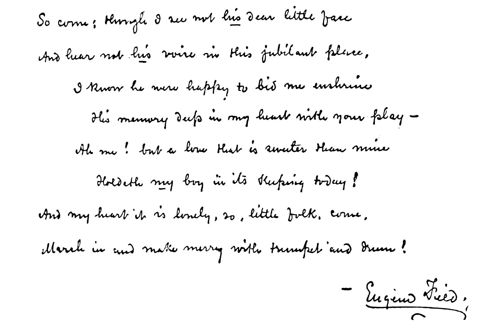
Autograph Page of Eugene Field Manuscript
From Second Book of Verse, New York, 1892
In considering the manufacture of his book, Eugene Field had clearly
defined ideas of the typographical effect he wished to gain; John
Wilson possessed the technical knowledge that enabled him to translate
those ideas into terms of type. The examination of the various faces
of type, the consideration of the proportions of the page, the
selection of the paper, the plan for the design of the cover and the
binding,—all came into the discussion.
As I listened, I was conscious of receiving new impressions which gave
me a fuller but still incomplete understanding. Until that moment I had
found little of interest in the adventure of making books. Now came a
realization that the building of a book, like the designing of a house,
offered opportunity for creative work. This possibility removed
the disturbing doubts, and I undertook to discover for myself how that
creative element could be crystallized.
Years later came an unexpected echo to the Field episode. After the
publication of the Second Book of Verse, the manuscript was
returned to
Field, who had it bound in half leather and placed it
in his library. Upon his death many of his books went by bequest to
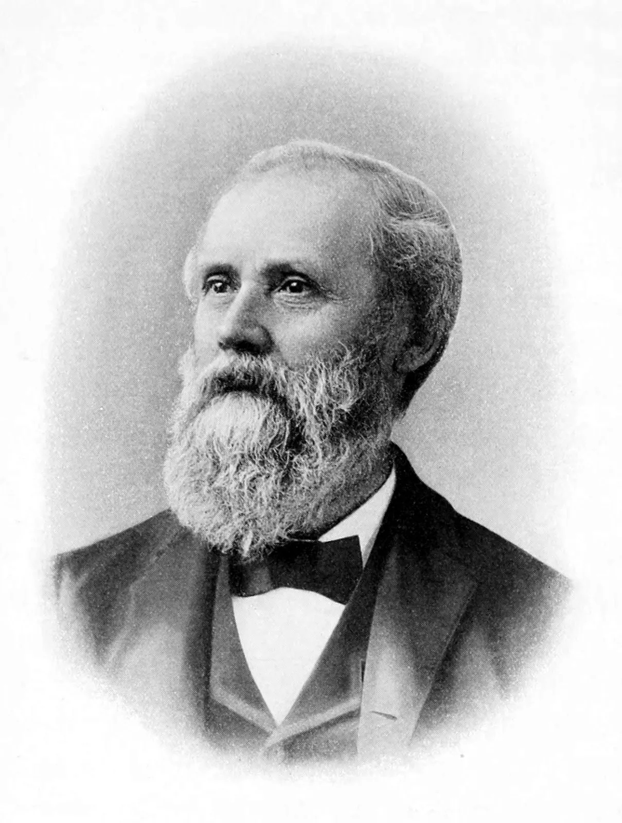
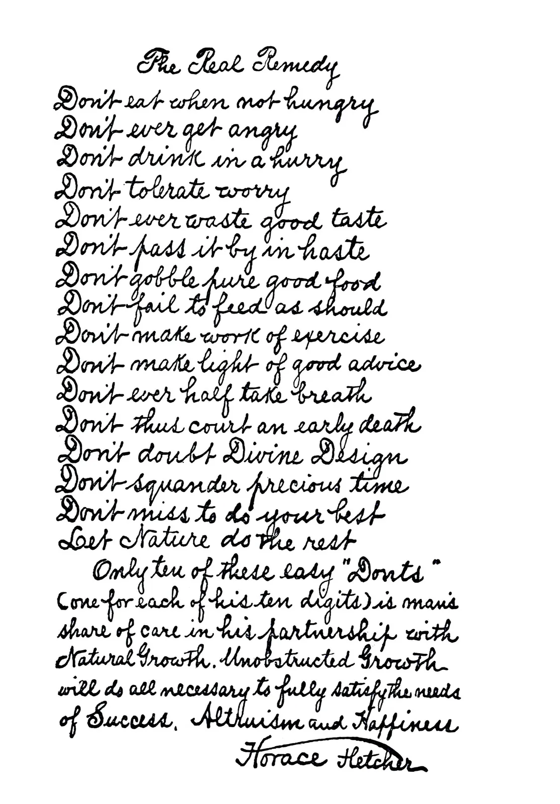
his life-long friend, Horace Fletcher, the genial philosopher and
famous apostle of dietetics. When Fletcher died, he bequeathed Field’s
personal volumes to me. By this curious chain of circumstances,
thirty-three years after I had seen the manuscript spread out upon the
table at the University Press, it came into my possession, bearing the
identical memoranda of instruction made upon it by John Wilson, whose
large, flowing hand contrasted sharply with the small, copper-plate
characters of the author’s handwriting.
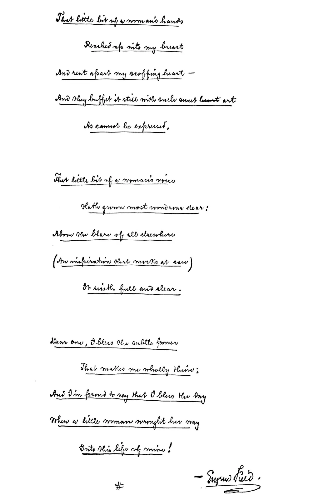
Autograph Verse in Eugene Field’s Own Copy of
Trumpet and Drum
The present generation of booklovers would think themselves transported
back ages rather than decades were they to glance into a great
book-printing office of thirty-five years ago. The old University Press
at that time acknowledged competition only from the Riverside and the
De Vinne Presses, and conditions that obtained there were typical
of the times. The business office was called the “counting-room”;
the bookkeeper and the head-clerk were perched up on stools at high,
sloping desks, and wore long, linen dusters and black skull caps. John
Wilson sat at a low table desk, and his partner, who was the financial
executive, was the proud possessor of the only roll-top desk in the
establishment. Near him, perhaps because of its value as a novelty and
thus entitled to the same super-care as the cash, was installed the
telephone. Most of the letters were written by Mr. Wilson in his own
hand. One of my first responsibilities was to copy these letters on the
wetted tissue pages of the copy-book with the turn-screw press.
JOHN WILSON IN 1891
Master-Printer
There was no particular system in effect, and scientific management
was unknown. Mr. Wilson used to make out his orders on fragments of
paper,—whatever came to hand. When the telephone was first installed
he refused to use it, as he
considered this method of conducting
business as “sloppy” and even discourteous. To employ a stenographer
would have been an evidence of a lazy disposition, and a dictated
letter was an offence against dignity and decorum.
A week’s work at that time consisted of fifty-nine hours instead of the
present forty-eight. Hand composition and electrotyping were figured
together as one process and charged at from 80 cents to $1 per thousand
ems. Changes required in the type by authors cost 50 cents an hour. An
author could afford in those days to rewrite his book after it was in
type, but today, with alterations costing five times as much, it is a
different proposition!
The wages were as ridiculously low as the prices charged to customers.
The girls in the composing room made from $9 to $12 a week, and those
receiving the maximum considered themselves potential Hetty Greens.
Today, receiving $40 to $45 a week, they find difficulty in making both
ends meet. The make-up man, with the “fat” he received in addition
to his wage of $16, actually earned about $20 a week, as against $50
to $60 a week now. The foreman of the composing room, with more than
two hundred
employees under him, received a weekly return of $23, as
against $75 to $100 now.
Typesetting, thirty-five years ago, was almost entirely by hand, as
this was before the day of the linotype and the monotype. Thorne
typesetting machines, which then seemed marvels of mechanical
ingenuity, failed to prove economical because they required two
operatives and so easily got out of order. The composing room itself
was laid out with its main avenues and side streets like a well-ordered
town, divisions being marked by the frames bearing the cases of type in
various faces and sizes. The correcting stones ran down the center.
The foreman of the composing room was the king of his domain and a
power unto himself. Each side street was an “alley,” in which from four
to eight typesetters worked, back to back. These were sometimes boys
or men, but usually girls or women. The “crew” in each alley was in
charge of an experienced typesetter. It was he who received from the
foreman the manuscript to be put into type; who distributed the copy,
a few pages at a time to each of his subordinates; who supervised the
work, and arranged for the galleys to be collated in their proper order
for proofing; and who was generally responsible for
the product of his
alley. As was characteristic of the times in well-conducted industrial
plants, the workers in this department, as in the others, were simply
a large family presided over by the foreman, who interpreted the
instructions from the management; and by the heads of the crews, who
carried out the detailed instructions of the foreman.
There was a pride in workmanship that is mostly lacking in
manufacturing plants today, due largely to the introduction of
labor-saving machinery, and again to the introduction of efficiency
methods. Both were inevitable, but the price paid for the gain in
production was high. I am old-fashioned enough to hope that modern
ideas of efficiency will never be applied in the printing industry to
the extent of robbing the workman of his individuality. Books are such
personal things! I am in full sympathy with that efficiency which cuts
out duplication of effort. I believe in studying methods of performing
each operation to discover which one is the most economical in time and
effort. I realize that in great manufacturing plants, where machines
have replaced so largely the work of the human hand, it is obviously
necessary for workmen to spend their days manufacturing only a part
of the complete article; but
when the organization of any business
goes so far as to substitute numbers for names I feel that something
has been destroyed, and that in taking away his individuality from the
workman the work suffers the same loss.
I have even asked myself whether the greatest underlying cause of
strikes and labor disturbances during the past ten years has not been
the unrest that has come to the workman because he can no longer
take actual pride in the product of his hand. Years ago, after the
death of one of my oldest employees, I called upon his widow, and
in the simple “parlor” of the house where he had lived, prominently
placed on a marble-top table as the chief ornament in the room, lay
a copy of Wentworth’s “Geometry.” When I picked it up the widow said
proudly, “Jim set every page of that book with his own hands.” It was
a priceless heirloom in which the workman’s family took continued and
justifiable pride.
The old University Press family was not only happy but loyal. When
the business found itself in financial difficulties, owing to outside
speculations by Mr. Wilson’s partner, the workmen brought their
bankbooks, with deposits amounting to over twenty thousand dollars,
and laid
them on Mr. Wilson’s desk, asking him to use these funds in
whatever way he chose. The sum involved was infinitesimal compared to
the necessities, but the proffer was a human gesture not calculable in
financial digits.
Proofreading was an art in the eighteen-nineties instead of an annoying
necessity, as it now seems to be considered. The chief readers
were highly educated men and women, some having been clergymen or
schoolteachers. One proofreader at the University Press at that time
could read fourteen languages, and all the readers were competent to
discuss with the authors points that came up in the proof. The proof
was read, not only to discover typographical errors, but also to query
dates, quotations, and even statements of fact. Well-known authors were
constantly running in and out of the Press, frequently going directly
to the proofreaders, and sometimes even to the compositors themselves,
without coming in touch with the counting-room. Mr. Wilson looked
upon the authors and publishers as members of his big family, and “No
Admittance” signs were conspicuous by their absence.
The modern practice of proofreading cannot produce as perfect volumes
as resulted from the
deliberate, painstaking, and time-consuming
consideration which the old-time proofreaders gave to every book
passing through their hands. Today the proof is read once, and then
revised and sent out to the author. When made up into page form and
sent to foundry it is again revised, but not re-read. No proof used to
go out from a first-class printing office without a first and a second
reading by copy. It was then read a third time by a careful foundry
reader before being made into plates. Unfortunately, with labor at its
present cost, no publisher could produce a volume at a price that the
public would pay, if the old-time care were devoted to its manufacture.
Time was when a reputation for careful proofreading was an asset to a
Press. One day the office boy came to my private office and said that
there was a man downstairs who insisted upon seeing me personally, but
who declined to give his name. From the expression on the boy’s face I
concluded that the visitor must be a somewhat unique character, and I
was not disappointed.
As he came into my office he had every aspect of having stepped off
the vaudeville stage. He had on the loose garments of a farmer, with
the broad hat that is donned only on state occasions. He wore leather
boots over which were rubbers, and carried a huge, green umbrella.
He nodded pleasantly as he came in, and sat down with great
deliberation. Before making any remarks he laid his umbrella on the
floor and placed his hat carefully over it, then he somewhat painfully
removed his rubbers. This done, he turned to me with a broad smile of
greeting, and said, “I don’t know as you know who I am.”
When I confirmed him in his suspicions, he remarked, “Well, I am Jasper
P. Smith, and I come from Randolph, New Hampshire.”
(The names and places mentioned are, for obvious reasons, not
correct.)
I returned his smile of greeting and asked what I could do for him.
“Well,” he said, “my home town of Randolph, New Hampshire, has decided
to get out a town history, and I want to have you do the printin’ of
it. The selectmen thought it could be printed at ——, but I says to
them, ‘If it’s worth doin’ at all it’s worth doin’ right, and I want
the book to be made at the University Press in Cambridge.’”
I thanked Mr. Smith for his confidence, and expressed my satisfaction
that our reputation had reached Randolph, New Hampshire.
“Well,” he said, chuckling to himself, “you
see, it was this way.
You made the history of Rumford, and I was the feller who wrote
the genealogies. That’s what I am, a genealogy feller. Nobody in
New Hampshire can write a town history without comin’ to me for
genealogies.”
After pausing for a moment he continued, “It was your proofreadin’ that
caught me. On that Rumford book your proofreader was a smart one, she
was, but I got back at her in good style.”
His memory seemed to cause him considerable amusement, and I waited
expectantly.
“It was in one of the genealogies,” he went on finally. “I gave the
date of the marriage as so and so, and the date of the birth of the
first child as two months later. Did she let that go by? I should say
not. She drew a line right out into the margin and made a darned big
question mark. But I got back at her! I just left that question mark
where it was, and wrote underneath, ‘Morally incorrect, historically
correct!’”
When the first Adams flat-bed press was installed at the University
Press, President Felton of Harvard College insisted that no book of his
should ever be printed upon this modern monstrosity. Here was history
repeating itself, for booklovers of the fifteenth century in Italy for
a long
time refused to admit that a printed volume had its place in a
gentleman’s library. In the eighteen-nineties one whole department at
the University Press consisted of these flat-bed presses, which today
can scarcely be found outside of museums. If a modern publisher were
to stray into the old loft where the wetted sheets from these presses
were hung over wooden rafters to dry, he would rub his eyes and wonder
in what age he was living. The paper had been passed through tubs of
water, perhaps half a quire at a time, and partially dried before being
run through the press. The old Adams presses made an impression that
could have been read by the blind, and all this embossing, together
with the wrinkling of the sheet from the moisture, had to be taken out
under hydraulic pressure. Today wetted sheets and the use of hydraulic
presses for bookwork are practically obsolete. The cylinder presses,
that run twice as fast, produce work of equal quality at lower cost.
In those days the relations between publishers and their printers were
much more intimate. Scales of prices were established from time to
time, but a publisher usually sent all his work to the same printer. It
was also far more customary
for a publisher to send an author to the
printer to discuss questions of typography with the actual maker of the
book, or to argue some technical or structural point in his manuscript
with the head proofreader. The headreader in a large printing
establishment at that time was a distinct personality, quite competent
to meet authors upon their own ground.
One of my earliest and pleasantest responsibilities was to act as Mr.
Wilson’s representative in his business relations with Mrs. Mary Baker
Eddy, which required frequent trips to “Pleasant View” at Concord, New
Hampshire. Mrs. Eddy always felt under deep obligation to Mr. Wilson
for his interest in the manuscript of Science and Health when
she first took it to him with a view to publication, and any message
from him always received immediate and friendly consideration.
In the past there have been suggestions made that the Rev. James Henry
Wiggin, a retired Unitarian clergyman and long a proofreader at the
University Press, rewrote Science and Health. Mr. Wiggin was
still proofreader when I entered the Press, and he always manifested
great pride in having been associated with Mrs. Eddy in the revision of
this famous book. I often heard the
matter referred to, both by him
and by John Wilson, but there never was the slightest intimation that
Mr. Wiggin’s services passed beyond those of an experienced editor. I
have no doubt that many of his suggestions, in his editorial capacity,
were of value and possibly accepted by the author,—in fact, unless
they had been, he would not have exercised his proper function; but
had he contributed to the new edition what some have claimed, he would
certainly have given intimation of it in his conversations with me.
The characteristic about Mrs. Eddy that impressed me the first time
I met her was her motherliness. She gave every one the impression of
deepest interest and concern in what he said, and was sympathetic
in everything that touched on his personal affairs. When I told her
of John Wilson’s financial calamity, she seemed to regard it as a
misfortune of her own. Before I left her that day she drew a check for
a substantial sum and offered it to me.
“Please hand that to my old friend,” she said, “and tell him to be of
good cheer. What he has given of himself to others all these years will
now return to him a thousand-fold.”
At first one might have been deceived by her quiet manner into thinking
that she was easily
influenced. There was no suggestion to which she
did not hold herself open. If she approved, she accepted it promptly;
if it did not appeal, she dismissed it with a graciousness that left no
mark; but it was always settled once and for all. There was no wavering
and no uncertainty.
After Mrs. Eddy moved from Concord to Boston, her affairs were
administered by her Trustees, so I saw her less frequently. To many her
name suggests a great religious movement, but when I think of her I
seem to see acres of green grass, a placid little lake, a silver strip
of river, and a boundary line of hills; and within the unpretentious
house a slight, unassuming woman,—very real, very human, very
appealing, supremely content in the self-knowledge that, no matter what
others might think, she was delivering her message to the world.
By this time, I had discovered what was the matter with American
bookmaking. It was a contracting business, and books were conceived and
made by the combined efforts of the publisher, the manufacturing man,
the artist, the decorator, the paper mills’ agent, and, last of all,
the printer and the binder. This was not the way the old-time printers
had planned their books. With all
their mechanical limitations,
they had followed architectural lines kept consistent and harmonious
because controlled by a single mind, while the finished volume of
the eighteen-nineties was a composite production of many minds, with
no architectural plan. No wonder that the volumes manufactured, even
in the most famous Presses, failed to compare with those produced in
Venice by Jenson and Aldus four centuries earlier!
When I succeeded John Wilson as head of the University Press in 1895,
I determined to carry out the resolution I had formed four years
earlier, while sitting in on the Eugene Field conference, of following
the example of the early master-printers so far as this could be done
amidst modern conditions. Some of my publisher friends were partially
convinced by my contention that if the printer properly fulfilled his
function he must know how to express his clients’ mental conception
of the physical attributes of prospective volumes in terms of type,
paper, presswork, and binding better than they could do it themselves.
The Kelmscott publications, which appeared at this time, were of great
value in emphasizing my contention, for William Morris placed printing
back among the fine arts after it had lapsed into a trade.
I had no idea, when I presented my plan, of persuading my friends
to produce typographical monuments. No demand has ever existed for
volumes of this type adequate to the excessive cost involved by the
perfection of materials, the accuracy of editorial detail, the supreme
excellence of typography and presswork, and the glory of the binding.
Sweynheim and Pannartz, Gutenberg’s successors, were ruined by their
experiments in Greek; the Aldine Press in Venice was saved only by the
intervention of Jean Grolier; Henri Étienne was ruined by his famous
Thesaurus, and Christophe Plantin would have been bankrupted by
his Polyglot Bible had he not retrieved his fortunes by later
and meaner publications. Nor was I unmindful of similar examples that
might have been cited from more modern efforts, made by ambitious
publishers and printers.
What I wanted to do was to build low-cost volumes upon the same
principles as de luxe editions, eliminating the expensive
materials but retaining the harmony and consistency that come from
designing the book from an architectural standpoint. It adds little
to the expense to select a type that properly expresses the thought
which the author wishes to convey; or to have the presses touch the
letters into the paper in such a way as to
become a part of it,
without that heavy impression which makes the reverse side appear like
an example of Braille; or to find a paper (even made by machine!) soft
to the feel and grateful to the eye, on which the page is placed with
well-considered margins; or to use illustrations or decorations, if
warranted at all, in such a way as to assist the imagination of the
reader rather than to divert him from the text; to plan a title page
which, like the door to a house, invites the reader to open it and
proceed, its type lines carefully balanced with the blank; or to bind
(even in cloth!) with trig squares and with design or lettering in
keeping with the printing inside.
By degrees the publishers began to realize that this could be done,
and when once established, the idea of treating the making of books
as a manufacturing problem instead of as a series of contracts with
different concerns, no one of which knew what the others were doing,
found favor. The authors also preferred it, for their literary children
now went forth to the world in more becoming dress. Thus serving in the
capacity of book architect and typographical advisor, instead of merely
as a contrasting printer, these years have been lived in a veritable
Kingdom of Books, in company with interesting people,—authors and
artists as
well as publishers,—in a delightfully intimate way because
I have been permitted to be a part of the great adventure.
During these years I have seen dramatic changes. Wages were somewhat
advanced between 1891 and the outbreak of the World War, but even at
this latter date the cost of manufacturing books was less than half of
what it is now. This is the great problem which publishers have to face
today. When the cost of everything doubled after the World War, the
public accepted the necessity of paying twice the price for a theater
ticket as a matter of course; but when the retail price of books was
advanced in proportion to the cost of manufacture, there was a great
outcry among buyers that authors, publishers, and booksellers were
opportunists, demanding an unwarranted profit. As a matter of fact, the
novel which used to sell at $1.35 per copy should now sell at $2.50 if
the increased costs were properly apportioned. The publisher today is
forced to decline many promising first novels because the small margin
of profit demands a comparatively large first edition.
Unless a publisher can sell 5,000 copies as a minimum it is impossible
for him to make any profit upon a novel. Taking this as a basis,
and a
novel as containing 320 pages, suppose we see how the $2.00
retail price distributes itself. The cost of manufacture, including
the typesetting, electrotype plates, cover design, jacket, brass
dies, presswork, paper, and binding, amounts to 42 cents per copy (in
England, about 37 cents). The publisher’s cost of running his office,
which he calls “overhead,” is 36 cents per copy. The minimum royalty
received by an author is 10 per cent. of the retail price, which would
give him 20 cents. This makes a total cost of 98 cents a copy, without
advertising. But a book must be advertised.
Every fifty dollars spent in advertising on a five thousand edition
adds a cent to the publisher’s cost. The free copies distributed for
press reviews represent no trifling item. A thousand dollars is not
a large amount to be spent for advertising, and this means 20 cents
a copy on a 5000 edition, making a total cost of $1.18 per copy and
reducing the publisher’s profit to 2 cents, since he sells a two-dollar
book to the retail bookseller for $1.20. The bookseller figures that
his cost of doing business is one-third the amount of his sales, or, on
a two-dollar book, 67 cents. This then shows a net profit to the retail
bookseller of 13 cents, to the publisher of 2 cents, and to the author
of 20 cents a copy.
Beyond this, there is an additional expense to both bookseller and
publisher which the buyer of books is likely to overlook. It is
impossible to know just when the demand for a book will cease, and this
means that the publisher and the bookseller are frequently left with
copies on hand which have to be disposed of at a price below cost. This
is an expense that has to be included in the book business just as much
as in handling fruit, flowers, or other perishable goods.
When a publisher is able to figure on a large demand for the first
edition, he can cut down the cost of manufacture materially; but, on
the other hand, this is at least partially offset by the fact that
authors whose books warrant large first editions demand considerably
more than 10 per cent. royalty, and the advertising item on a big
seller runs into large figures.
I wish I might say that I had seen a dramatic change in the methods
employed in the retail bookstores! There still exists, with a few
notable exceptions, the same lack of realization that familiarity with
the goods one has to sell is as necessary in merchandizing books as
with any other commodity. Salesmen in many otherwise well-organized
retail bookstores are still painfully
ignorant of their proper
functions and indifferent to the legitimate requirements of their
prospective customers.
Some years ago, when one of my novels was having its run, I happened
to be in New York at a time when a friend was sailing for Europe. He
had announced his intention of purchasing a copy of my book to read
on the steamer, and I asked him to permit me to send it to him with
the author’s compliments. Lest any reader be astonished to learn that
an author ever buys a copy of his own book, let me record the fact
that except for the twelve which form a part of his contract with
the publisher, he pays cash for every copy he gives away. Mark Twain
dedicated the first edition of The Jumping Frog to “John Smith.”
In the second edition he omitted the dedication, explaining that in
dedicating the volume as he did, he had felt sure that at least all the
John Smiths would buy books. To his consternation he found that they
all expected complimentary copies, and he was hoist by his own petard!
With the idea of carrying out my promise to my friend, I stepped into
one of the largest bookstores in New York, and approached a clerk,
asking him for the book by title. My pride was somewhat hurt to find
that even the name was
entirely unfamiliar to him. He ran over various
volumes upon the counter, and then turned to me, saying, “We don’t
carry that book, but we have several others here which I am sure you
would like better.”
“Undoubtedly you have,” I agreed with him; “but that is beside the
point. I am the author of the book I asked for, and I wish to secure a
copy to give to a friend. I am surprised that a store like this does
not carry it.”
Leaning nonchalantly on a large, circular pile of books near him, the
clerk took upon himself the education of the author.
“It would require a store much larger than this to carry every book
that is published, wouldn’t it?” he asked cheerfully. “Of course each
author naturally thinks his book should have the place of honor on the
bookstalls, but we have to be governed by the demand.”
It was humiliating to learn the real reason why this house failed to
carry my book. I had to say something to explain my presumption even in
assuming that I might find it there, so in my confusion I stammered,
“But I understood from the publishers that the book was selling very
well.”
“Oh, yes,” the clerk replied indulgently; “they
have to say that to
their authors to keep them satisfied!”
With the matter thus definitely settled, nothing remained but to make
my escape as gracefully as circumstances would permit. As I started to
leave, the clerk resumed his standing position, and my eye happened to
rest on the pile of perhaps two hundred books upon which he had been
half-reclining. The jacket was strikingly familiar. Turning to the
clerk I said severely,
“Would you mind glancing at that pile of books from which you have just
risen?”
“Oh!” he exclaimed, smiling and handing me a copy, “that is the very
book we were looking for, isn’t it?”
It seemed my opportunity to become the educator, and I seized it.
“Young man,” I said, “if you would discontinue the practice of letting
my books support you, and sell a few copies so that they might support
me, it would be a whole lot better for both of us.”
“Ha, ha!” he laughed, graciously pleased with my sally; “that’s a good
line, isn’t it? I really must read your book!”
The old-time publisher is passing, and the author is largely to
blame. I have seen the close
association—in many cases the profound
friendship—between author and publisher broken by the commercialism
fostered by some literary agents and completed by competitive bids
made by one publishing house to beguile a popular author away from
another. There was a time when a writer was proud to be classified as
a “Macmillan,” or a “Harper” author. He felt himself a part of the
publisher’s organization, and had no hesitation in taking his literary
problems to the editorial advisor of the house whose imprint appeared
upon the title pages of his volumes. A celebrated Boston authoress
once found herself absolutely at a standstill on a partially completed
novel. She confided her dilemma to her publisher, who immediately sent
one of his editorial staff to the rescue. They spent two weeks working
together over the manuscript, solved the problems, and the novel, when
published, was the most successful of the season.
Several publishers have acknowledged to me that in offering unusually
high royalties to authors they have no expectation of breaking even,
but that to have a popular title upon their list increases the sales
of their entire line. The publisher from whom the popular writer
is filched has usually done his share in helping him attain his
popularity. The royalty he pays is a fair division of the profits. He
cannot, in justice to his other authors, pay him a further premium.
Ethics, perhaps, has no place in business, but the relation between
author and publisher seems to me to be beyond a business covenant. A
publisher may deliberately add an author to his list at a loss in order
to accomplish a specific purpose, but this practice cannot be continued
indefinitely. A far-sighted author will consider the matter seriously
before he becomes an opportunist.
In England this questionable practice has been of much slower growth.
The House of Murray, in London, is one of those still conducted on the
old-time basis. John Murray IV, the present head of the business, has
no interest in any author who comes to him for any reason other than
a desire to have the Murray imprint upon his book. It is more than
a business. The publishing offices at 50a, Albemarle Street
adjoin and open out of the Murray home. In the library is still shown
the fireplace where John Murray III burned Byron’s Memoirs, after
purchasing them at an enormous price, because he deemed that their
publication would do injury to the reputation of the writer and of the
House itself.
John Murray II was one of the publishers of Scott’s Marmion.
In those days it was customary for publishers to share their
contracts. Constable had purchased from Scott for £1,000 the copyright
of Marmion without having seen a single line, and the
honorarium was paid the author before the poem was completed or
the manuscript delivered. Constable, however, promptly disposed of a
one-fourth interest to Mr. Miller of Albemarle Street, and another one
fourth to John Murray, then of Fleet Street.
By 1829 Scott had succeeded in getting into his own hands nearly all
his copyrights, one of the outstanding items being this one-quarter
interest in Marmion held by Mr. Murray. Longmans and Constable
had tried in vain to purchase it. When, however, Scott himself
approached Murray through Lockhart, the following letter from Mr.
Murray was the result:
So highly do I estimate the honour of being even in so small
a degree the publisher of the author of the poem that no
pecuniary consideration whatever can induce me to part with it.
But there is a consideration of another kind that would make it
painful to me if I were to retain it a moment longer. I mean
the knowledge of its being required by the author, into whose
hands it was spontaneously resigned at the same instant that I
read the request.
There has always been a vast difference in authors in the attitude they
assume toward the transformation of their manuscripts into printed
books. Most of them leave every detail to their publishers, but a few
take a deep and intelligent personal interest. Bernard Shaw is to be
included in the latter group.
A leading Boston publisher once telephoned me that an unknown English
author had submitted a manuscript for publication, but that it was too
socialistic in its nature to be acceptable. Then the publisher added
that the author had asked, in case this house did not care to publish
the volume, that arrangements be made to have the book printed in this
country in order to secure American copyright.
“We don’t care to have anything to do with it,” was the statement; “but
I thought perhaps you might like to manufacture the book.”
“Who is the author?” I inquired.
“It’s a man named Shaw.”
“What is the rest of his name?”
“Wait a minute and I’ll find out.”
Leaving the telephone for a moment, the publisher returned and said,
“His name is G. Bernard Shaw. Did you ever hear of him?”
“Yes,” I replied; “I met him last summer in London through
Cobden-Sanderson, and I should be glad to undertake the manufacture of
the book for Mr. Shaw.”
“All right,” came the answer. “Have your boy call for the manuscript.”
This manuscript was Man and Superman.
From that day and for many years, Shaw and I carried on a desultory
correspondence, his letters proving most original and diverting. On
one occasion he took me severely to task for having used two sizes of
type upon a title page. He wrote four pages to prove what poor taste
and workmanship this represented, and then ended the letter with these
words, “But, after all, any other printer would have used sixteen
instead of two, so I bless you for your restraint!”
We had another lengthy discussion on the use of apostrophes in
printing. “I have made no attempt to deal with the apostrophes you
introduce,” he wrote; “but my own usage is carefully considered and the
inconsistencies are only apparent. For instance, Ive,
youve, lets, thats,
are quite unmistakable, but Ill,
hell, shell, for I’ll,
he’ll, she’ll, are impossible
without a phonetic alphabet to distinguish between long and short
e. In such cases I retain the apostrophe, in all
others I discard
it. Now you may ask me why I
discard it. Solely because it spoils the printing. If you print a Bible
you can make a handsome job of it because there are no apostrophes or
inverted commas to break up the letterpress with holes and dots. Until
people are forced to have some consideration for a book as something
to look at as well as something to read, we shall never get rid of
these senseless disfigurements that have destroyed all the old sense of
beauty in printing.”
“Ninety-nine per cent. of the secret of good printing,” Shaw continued,
“is not to have patches of white or trickling rivers of it trailing
down a page, like rain-drops on a window. Horrible! White is the
enemy of the printer. Black, rich, fat, even black, without gray
patches, is, or should be, his pride. Leads and quads and displays of
different kinds of type should be reserved for insurance prospectuses
and advertisements of lost dogs.…”
His enthusiasm for William Morris’ leaf ornaments is not shared by all
booklovers. Glance at any of the Kelmscott volumes, and you will find
these glorified oak leaves scattered over the type page in absolutely
unrelated fashion,—a greater blemish, to some eyes, than occasional
variation in spacing. Shaw writes:
If you look at one of the books printed by William Morris,
the greatest printer of the XIX century, and one of the
greatest printers of all the centuries, you will see that he
occasionally puts in a little leaf ornament, or something of
the kind. The idiots in America who tried to imitate Morris,
not understanding this, peppered such things all over their
“art” books, and generally managed to stick in an extra large
quad before each to show how little they understood about the
business. Morris doesn’t do this in his own books. He rewrites
the sentence so as to make it justify, without bringing one gap
underneath another in the line above. But in printing other
people’s books, which he had no right to alter, he sometimes
found it impossible to avoid this. Then, sooner than spoil the
rich, even color of his block of letterpress by a big white
hole, he filled it up with a leaf.
Do not dismiss this as not being “business.” I assure you, I
have a book which Morris gave me, a single copy, by selling
which I could cover the entire cost of printing my books, and
its value is due solely to its having been manufactured
in the way I advocate; there’s absolutely no other secret
about it; and there is no reason why you should not make
yourself famous through all the ages by turning out editions
of standard works on these lines whilst other printers are
exhausting themselves in dirty felt end papers, sham Kelmscott
capitals, leaf ornaments in quad sauce, and then wondering why
nobody in Europe will pay twopence for them, whilst Kelmscott
books and Doves Press books of Morris’
friends, Emery Walker
and Cobden-Sanderson, fetch fancy prices before the ink is
thoroughly dry.…
After this I shall have to get you to print all my
future books, so please have this treatise
printed in letters of gold and
preserved for future
reference
Friends through Type
CHAPTER IV
III
FRIENDS THROUGH TYPE
In 1903 I again visited Italy to continue my study of
the art of printing in the old monasteries and libraries, sailing on
the S. S. Canopic from Boston to Naples.
Among the passengers on board I met Horace Fletcher, returning to his
home in Venice. At that time his volume Menticulture
was having a tremendous run. I had enjoyed reading the book, and in
its author I discovered a unique and charming personality; in fact,
I have never met so perfect an expression of practical optimism. His
humor was infectious, his philosophy appealing, his quiet persistency
irresistible.
To many people the name of Horace Fletcher has become associated with
the Gladstonian doctrine of excessive chewing, but this falls far
short of the whole truth. His scheme was the broadest imaginable, and
thorough mastication was only the hub into which the other spokes of
the wheel of his philosophy of life were to be fitted. The scheme
was nothing less than a cultivation of progressive human efficiency.
Believing that absolute
health is the real basis of human happiness
and advancement, and that health depends upon an intelligent treatment
of food in the mouth together with knowledge of how best to furnish the
fuel that is actually required to run the human engine, Horace Fletcher
sought for and found perfect guides among the natural human instincts
and physiologic facilities, and demonstrated that his theories were
facts.
During the years that followed I served as his typographic mentor.
He was eager to try weird and ingenious experiments to bring out the
various points of his theories through unique typographical arrangement
(see opp. page).
It required all my skill and diplomacy to convince him that type
possessed rigid limitations, and that to gain his emphasis he must
adopt less complicated methods. From this association we became the
closest of friends, and presuming upon this relation I used to banter
him upon being so casual. His copy was never ready when the compositors
needed it; he was always late in returning his proofs. The manufacture
of a Fletcher book was a hectic experience, yet no one ever seemed to
take exceptions. This was characteristic of the man. He moved and acted
upon suddenly formed impulses, never
planning ahead yet always securing exactly what he wanted, and those
inconvenienced the most always seemed to enjoy it.
A Page of Horace Fletcher Manuscript
“I believe,” he used to say, “in hitching one’s wagon to a star, but I
always keep my bag packed and close at hand ready to change stars at a
moment’s notice. It is only by doing this that you can give things a
chance to happen to you.”
Among the volumes Fletcher had with him on board ship was one he
had purchased in Italy, printed in a type I did not recognize but
which greatly attracted me by its beauty. The book bore the imprint:
Parma: Co’tipi Bodoniani. Some weeks later, in a small,
second-hand bookstore in Florence, I happened upon a volume printed in
the same type, which I purchased and took at once to my friend, Doctor
Guido Biagi, at the Laurenziana Library.
“The work of Giambattista Bodoni is not familiar to you?” he inquired
in surprise. “It is he who revived in Italy the glory of the Aldi. He
and Firmin Didot in Paris were the fathers of modern type design at the
beginning of the nineteenth century.”
“Is this type still in use?” I inquired.
“No,” Biagi answered. “When Bodoni died there was no one worthy to
continue its use, so
his matrices and punches are kept intact,
exactly as he left them. They are on exhibition in the library at
Parma, just as the old Plantin relics are preserved in the museum at
Antwerp.”
GIAMBATTISTA BODONI, 1740–1813
From Engraving at the Bibliothèque Nationale, Paris
I immediately took steps through our Ambassador at Rome to gain
permission from the Italian Government to recut this face for use in
America. After considerable difficulty and delay this permission was
granted, with a proviso that I should not allow any of the type made
from my proposed matrices to get into the hands of Italian printers,
as this would detract from the prestige of the city of Parma. It was a
condition to which I was quite willing to subscribe! Within a year I
have received a prospectus from a revived Bodoni Press at Montagnola di
Lugano, Switzerland, announcing that the exclusive use of the original
types of Giambattista Bodoni has been given them by the Italian
Government. This would seem to indicate that the early governmental
objections have disappeared.
While searching around to secure the fullest set of patterns, I
stumbled upon the fact that Bodoni and Didot had based their types upon
the same model, and that Didot had made use of his font particularly
in the wonderful editions published in Paris at the very beginning
of the nineteenth
century. I then hurried to Paris to see whether
these matrices were in existence. There, after a search through the
foundries, I discovered the original punches, long discarded, in the
foundry of Peignot, to whom I gave an order to cast the different sizes
of type, which I had shipped to America.
This was the first type based on this model ever to come into this
country. The Bodoni face has since been recut by typefounders as well
as for the typesetting machines, and is today one of the most popular
faces in common use. Personally I prefer the Bodoni letter to that
of Didot (see opp. page). The Frenchman
succumbed to the elegance of his period, and by lightening the thin
lines robbed the design of the virility that Bodoni retained. I am not
in sympathy with the excessive height of the ascending letters, which
frequently extend beyond the capitals; but when one considers how
radical a departure from precedent this type was, he must admire the
skill and courage of the designers. William Morris cared little for
it,—“The sweltering hideousness of the Bodoni letter,” he exclaimed;
“the most illegible type that was ever cut, with its preposterous
thicks and thins”; while Theodore L. De Vinne, in his Practice of
Typography, writes:
The beauty of the Bodoni letters consists in their regularity,
in their clearness, and in their conformity to the taste of the
race, nation, and age in which the work was first written, and
finally in the grace of the characters, independent of time or
place.
When authorities differ to such a wide extent, the student of type
design must draw his own conclusions!
The Bodoni Letter (bottom)
compared with the Didot Letter (top)
Fletcher’s idea of an appointment was something to be kept if or when
convenient, yet he never seemed to offend any one. He did nothing
he did not wish to do, and his methods of extricating himself from
unwelcome responsibilities always amused rather than annoyed. “If you
don’t want to do a thing very badly,” he confided to me on one such
occasion, “do it very badly.”
HORACE FLETCHER IN 1915
On board the Canopic Fletcher was surrounded by an admiring
and interested group. General Leonard Wood was on his way to study
colonial government abroad before taking up his first administration
as Governor of the Philippines. On his staff was General Hugh Lennox
Scott, who later succeeded General Wood as Chief of Staff of the United
States Army. The conversations and discussions in the smokeroom each
evening
after dinner were illuminating and fascinating. General
Wood had but recently completed his work as Governor of Cuba, and he
talked freely of his experiences there, while General Scott was full
of reminiscences of his extraordinary adventures with the Indians. He
later played an important part in bringing peace to the Philippines.
It was at one of these four-cornered sessions in the smokeroom that we
first learned of Fletcher’s ambition to revolutionize the world in its
methods of eating. That he would actually accomplish this no one of
us believed, but the fact remains. The smokeroom steward was serving
the coffee, inquiring of each one how many lumps of sugar he required.
Fletcher, to our amazement, called for five! It was a grand-stand
play in a way, but he secured his audience as completely as do the
tambourines and the singing of the Salvation Army.
“Why are you surprised?” he demanded with seeming innocence. “I am
simply taking a coffee liqueur, in which there is less sugar now than
there is in your chartreuse or benedictine. But I am mixing it with the
saliva, which is more than you are doing. The sugar, as you take it,
becomes acid in the stomach and retards digestion; by my
method, it is
changed into grape sugar, which is easily assimilated.”
“To insalivate one’s liquor,” he explained to us, “gives one the most
exquisite pleasure imaginable, but it is a terrific test of quality.
It brings out the richness of flavor, which is lost when one gulps the
wine down. Did you ever notice the way a tea-taster sips his tea?”
As he talked he exposed the ignorance of the entire group on
physiological matters to an embarrassing extent, clinching his remarks
by asking General Wood the question,
“Would you engage as chauffeur for your automobile a man who knew as
little about his motor as you know about your own human engine?”
No one ever loved a practical joke better than Horace Fletcher. I was
a guest at a dinner he once gave at the Graduates’ Club in New Haven.
Among the others present were President Hadley of Yale, John Hays
Hammond, Walter Camp, and Professor Lounsbury. There was considerable
curiosity and some speculation concerning what would constitute a
Fletcher dinner. At the proper time we were shown into a private room,
where the table was set with the severest simplicity. Instead of china,
white crockery was used, and the chief table decorations were three
large
crockery pitchers filled with ice water. At each plate was a
crockery saucer, containing a shredded-wheat biscuit. It was amusing
to glance around and note the expressions of dismay upon the faces of
the guests. Their worst apprehensions were being confirmed! Just as we
were well seated, the headwaiter came to the door and announced that
by mistake we had been shown into the wrong room, whereupon Fletcher,
with an inimitable twinkle in his eye, led the way into another private
dining room, where we sat down to one of the most sumptuous repasts I
have ever enjoyed.
Today, twenty years after his campaign, it is almost forgotten that
the American breakfast was at that time a heavy meal. Horace Fletcher
revolutionized the practice of eating, and interjected the word
fletcherize into the English language. As a disciple of Fletcher
Sir Thomas Barlow, physician-in-chief to King Edward VII, persuaded
royalty to set the style by cutting down the formal dinner from three
hours to an hour and a half, with a corresponding relief to the
digestive apparatus of the guests. In Belgium, during the World War,
working with Herbert Hoover, Fletcher taught the impoverished people
how to sustain themselves upon meager rations. Among his admirers and
devoted friends were such profound
thinkers as William James who, in
response to a letter from him, wrote, “Your excessive reaction to the
stimulus of my grateful approval makes you remind me of those rich
soils which, when you tickle them with a straw, smile with a harvest”;
and Henry James, who closes a letter: “Come and bring with you plenary
absolution to the thankless subject who yet dares light the lamp of
gratitude to you at each day’s end of his life.”
My acquaintance with Henry James came through my close association
with the late Sir Sidney Lee, the Shakesperian authority, and Horace
Fletcher.
“Don’t be surprised if he is brusque or uncivil,” Sir Sidney whispered
to me just before I met him at dinner; “one can never tell how he is
going to act.”
As a matter of fact, I found Henry James a most genial and enjoyable
dinner companion, and never, during the few later occasions when I had
the pleasure of being with him, did he display those characteristics of
ill humor and brusqueness which have been attributed to him. It may not
be generally known that all his life—until he met Horace Fletcher—he
suffered torments from chronic indigestion, or that it was in
Fletcherism that
he found his first relief. In a typically involved
Jamesian letter to his brother William he writes (February, 1909):
It is impossible save in a long talk to make you understand how
the blessed Fletcherism—so extra blessed—lulled me, charmed
me, beguiled me, from the first into the convenience of not
having to drag myself out into eternal walking. One must have
been through what it relieved me from to know how not suffering
from one’s food all the while, after having suffered all one’s
life, and at last having it cease and vanish, could make one
joyously and extravagantly relegate all out-of-door motion to a
more and more casual and negligible importance. To live without
the hell goad of needing to walk, with time for reading and
indoor pursuits,—a delicious, insidious bribe! So, more and
more, I gave up locomotion, and at last almost completely. A
year and a half ago the thoracic worry began. Walking seemed to
make it worse, tested by short spurts. So I thought non-walking
more and more the remedy, and applied it more and more, and ate
less and less, naturally. My heart was really disgusted all
the while at my having ceased to call upon it. I have begun to
do so again, and with the most luminous response. I am better
the second half hour of my walk than the first, and better the
third than the second.… I am, in short, returning, after an
interval deplorably long and fallacious, to a due amount of
reasonable exercise and a due amount of food for the same.
A Page from an Autograph Letter from Henry James to
Horace Fletcher
My one visit to Lamb House was in company with Horace Fletcher. The
meeting with Henry James at dinner had corrected several preconceived
ideas and confirmed others. Some writers are revealed by their books,
others conceal themselves in their fictional prototypes. It had always
been a question in my mind whether Henry James gave to his stories his
own personality or received his personality from his stories. This
visit settled my doubts.
The home was a perfect expression of the host, and possessed an
individuality no less unique. I think it was Coventry Patmore who
christened it “a jewel set in the plain,”—located as it was at the
rising end of one of those meandering streets of Rye, in Sussex,
England, Georgian in line and perfect in appointment.
In receiving us, Henry James gave one the impression of performing a
long-established ritual. He had been reading in the garden, and when
we arrived he came out into the hall with hand extended, expressing a
massive cordiality.
“Welcome to my beloved Fletcher,” he cried; and as he grasped my hand
he said, as if by way of explanation,
“He saved my life, you know, and what is more, he improved my
disposition. By rights he
should receive all my future royalties,—but
I doubt if he does!”
His conversation was much more intelligible than his books. It
was ponderous, but every now and then a subtle humor relieved the
impression that he felt himself on exhibition. One could see that he
was accustomed to play the lion; but with Fletcher present, toward whom
he evidently felt a deep obligation, he talked intimately of himself
and of the handicap his stomach infelicities had proved in his work.
The joy with which he proclaimed his emancipation showed the real
man,—a Henry James unknown to his characters or to his public.
If William James had not taken up science as a profession and thus
become a philosopher, he would have been a printer. No other commercial
pursuit so invited him as “the honorable, honored, and productive
business of printing,” as he expressed it in a letter to his mother
in 1863. Naturally, with such a conception of the practice of book
manufacture, he was always particularly concerned with the physical
format of his volumes. He once told me that my ability to
translate his “fool ideas” into type showed the benefit of a Harvard
education! He had no patience with
any lapse on the part of the
proofreader, and when the galleys of his books reached this point in
the manufacture even my most experienced readers were on the anxious
seat. On the other hand, he was generous in his appreciation when a
proofreader called his attention to some slip in his copy that he had
overlooked.
After his volume Pragmatism appeared and created such universal
attention, a series of “popular” lectures on the subject was announced
at Cambridge. The Harpers had just published a novel of mine entitled
The Spell, in connection with which I had devoted much time
to the study of humanism and the humanists of the fifteenth century.
Because of my familiarity with a kindred subject, I must confess to
a sense of mortification that in reading Pragmatism I found
myself beyond my depth. A “popular” presentation appealed to me as
an opportunity for intellectual development, so I attended the first
lecture, armed with pencil and notebook. Afterwards it so happened that
Professor James was on the trolley car when I boarded it at Harvard
Square, and I sat down beside him.
“I was surprised to see you at my lecture,” he remarked. “Don’t you get
enough of me at your office?”
I told him of my excursions into other philosophic pastures, and of my
chagrin to find so little in pragmatic fields upon which my hungry mind
could feed. He smiled at my language, and entered heartily into the
spirit.
“And today?” he inquired mischievously.—“I hope that today I guided
you successfully.”
“You did,” I declared, opening my notebook, and showing him the entry:
“Nothing is the only resultant of the one thing which is not.”
“That led me home,” I said soberly, with an intentional double meaning.
Professor James laughed heartily.
“Did I really say that? I have no doubt I did. It simply proves my
contention that philosophers too frequently exercise their prerogative
of concealing themselves behind meaningless expressions.”
Two of Professor James’ typographic hobbies were paper labels and as
few words as possible on the title page. In the matter of supplying
scant copy for the title, he won my eternal gratitude, for many a
book, otherwise typographically attractive, is ruined by overloading
the title with too much matter. This is the first page that catches
the eye, and its relation to the book is the same as the door of a
house. Only recently I opened a volume to a beautiful title page. The
type was perfectly arranged
in proportion and margin, the decoration
was charming and in complete harmony with the type. It was set by an
artist-printer and did him credit; but turning a few more pages I
found myself face to face with a red-blooded story of western life,
when the title had prepared me for something as delicate as Milton’s
L’Allegro. A renaissance door on a New England farmhouse would
have been equally appropriate!
I commend to those who love books the fascinating study of title pages.
I entered upon it from curiosity, and quickly found in it an abiding
hobby. The early manuscripts and first printed volumes possessed no
title pages, due probably to the fact that the handmade paper and
parchment were so costly that the saving of a seemingly unnecessary
page was a consideration. The incipit at the top of the first
page, reading “Here beginneth” and then adding the name of the author
and the subject, answered every purpose; and on the last page the
explicit marked the conclusion of the work, and offered the
printer an excellent opportunity to record his name and the date of
the printing. Most of the early printers were modest in recording
their achievements, but in the famous volume De Veritate Catholicæ
Fidei the printer says of himself:
This new edition was furnished us to print in Venice by Nicolas
Jenson of France.… Kind toward all, beneficent, generous,
truthful and steadfast in the beauty, dignity, and accuracy
of his printing, let me (with the indulgence of all) name him
the first in the whole world; first likewise in his marvelous
speed. He exists in this, our time, as a special
gift from Heaven to men. June thirteen, in the year of
Redemption 1489. Farewell
Bibliographers contend that the first title page was used in a book
printed by Arnold Ther Hoernen of Cologne in 1470. In this volume an
extra leaf is employed containing simply an introduction at the top.
It has always seemed to me that this leaf is more likely to have been
added by the printer to correct a careless omission of the introduction
on his first page of text. Occasionally, in the humanistic manuscript
volumes in the Laurenziana Library, at Florence, there occurs a
“mirror” title (see opp. page), which
consists of an illuminated page made up of a large circle in the center
containing the name of the book, sometimes surrounded by smaller
circles, in which are recorded the titles of the various sections. This
seems far more likely to have been suggestive of what came to be the
formal title page.
MIRROR TITLE
From Augustinus: Opera, 1485. Laurenziana Library, Florence
By the end of the fifteenth century the title page
was in universal use, and printers showed great ingenuity in arranging
the type in the form of wine cups, drinking glasses, funnels, inverted
cones, and half-diamonds. During the sixteenth century great artists
like Dürer, Holbein, Rubens, and Mantegna executed superbly engraved
titles entirely out of keeping with the poor typography of the books
themselves. In many of the volumes the title page served the double
purpose of title and full-page illustration (see pages228 and 241). What splendid
examples would have resulted if the age of engraved titles had
coincided with the high-water mark in the art of printing!
As the art of printing declined, the engraved title was discarded, and
the printer of the seventeenth century seemed to feel it incumbent
upon him to cover the entire page with type. If you recall the early
examples of American Colonial printing, which were based upon the
English models of the time, you will gain an excellent idea of the
grotesque tendency of that period. The Elzevirs were the only ones who
retained the engraved title (page241). The Baskerville volumes
(page247), in the middle of the eighteenth century, showed a
return to good taste and harmonious co-ordination with the text; but
there was no beauty in the title until Didot in Paris and
Bodoni
in Parma, Italy, introduced the so-called “modern” face, which is
peculiarly well adapted to display (page253). William Morris,
in the late nineteenth century, successfully combined decoration with
type,—over-decorated, in the minds of many, but in perfect keeping
with the type pages of the volumes themselves. Cobden-Sanderson,
at the Doves Press, returned to the extreme in simplicity and good
taste (page265), excelling all other printers in securing
from the blank space on the leaf the fullest possible value. One
of Cobden-Sanderson’s classic remarks is, “I always give greater
attention, in the typography of a book, to what I leave out than to
what I put in.”
The name of William Morris today may be more familiar to booklovers
than that of Cobden-Sanderson, but I venture to predict that within
a single decade the latter’s work as printer and binder at the
Doves Press at Hammersmith, London, will prove to have been a more
determining factor in printing as an art than that of William Morris
at the Kelmscott Press, and that the general verdict will be that
Cobden-Sanderson carried out the splendid principles laid down by
Morris more consistently than did that great artist-craftsman himself.
T. J. COBDEN-SANDERSON, 1841–1922
From Etching by Alphonse Legros, 1893
The story of Cobden-Sanderson’s life is an interesting human document.
He told it to me one evening, its significance being heightened by
the simplicity of the recital. At seventeen he was apprenticed to
an engineer, but he worked less than a year in the draft room. He
disliked business as business, and began to read for Cambridge, with
the idea of entering the Church. While at Trinity College he read for
mathematical honors, but three years later, having given up all idea
of going into the Church, he left Cambridge, refusing honors and a
degree, which he might have had, as a protest against the competitive
system and the “warp” it gave to all university teaching. Then, for
seven or eight years, he devoted himself to Carlyle and the study of
literature, “Chiefly German philosophy,” he said, “which is perhaps not
literature,” supporting himself by desultory writing and practicing
medicine. When he was thirty years old he was admitted to the Bar,
which profession he abandoned thirteen years later to become a manual
laborer. The following is quoted from notes which I made after this
conversation:
I despaired of knowledge in a philosophical sense, yet I
yearned to do or to make something. This was the basic idea
of my life. At this time it was gradually revealed to me that
the arts and crafts of life might be employed to make
society
itself a work of art, sound and beautiful as a whole, and in
all its parts.
It is difficult to associate Cobden-Sanderson’s really tremendous
contributions to bookmaking as an art with his self-effacing
personality. If I had met the man before I had become intimately
acquainted with his work, I should have been disappointed; having
had him interpreted to me by his books before I met him, his unique
personality proved a definite inspiration and gave me an entirely new
viewpoint on many phases of the art of typography in its application to
human life.
In person, Cobden-Sanderson was of slight build, with sloping
shoulders, his most noticeable feature being his reddish beard tinged
with gray. He was nervous and shy, and while talking seldom looked
one squarely in the eye, yet at no time could one doubt the absolute
sincerity of his every word and act. He was hopelessly absent-minded.
Invited to dine with me in London, he appeared the evening before the
date set, retiring overwhelmed with embarrassment when he discovered
his mistake. On the following evening he forgot the appointment
altogether! Later, when in Boston, he accepted an invitation to dine
with a literary society, but failed to appear because he could not
remember where the dinner was to be
held. He had mislaid his note of
invitation and could not recall the name of the man who sent it. On
that evening he dashed madly around the city in a taxicab for over an
hour, finally ending up at his hotel in absolute exhaustion while the
members of the literary society dined without their lion!
While president of the Society of Printers in Boston, I arranged for
Cobden-Sanderson to come to America to deliver some lectures on The
Ideal Book. Among these were four given at Harvard University. At
the conclusion of the last lecture he came to my library, thoroughly
tired out and completely discouraged. Seated in a great easy chair he
remained for several moments in absolute silence, resting his face upon
his hands. Suddenly, without a moment’s warning, he straightened up and
said with all the vehemence at his command,
“I am the veriest impostor who ever came to your shores!”
Seeing my surprise and incredulity, he added,
“I have come to America to tell you people how to make books. In
New York they took me to see the great Morgan Library and other
collections. They showed me rare incunabula. They expected me to
know all about them, and to be enthusiastic over them. As a matter of
fact, I know nothing
about the work of the great master-printers, and
care less!”
My face must have disclosed my thoughts, for he held up a restraining
hand.
“Don’t think me such an egotist as my words imply. It isn’t that
at all. It is true that I am interested only in my own work, but
that is because my work means something more to me than the books
I produce. When I print a book or bind one it is because I have a
message in my soul which I am impelled to give mankind, and it comes
out through my fingers. Other men express their messages in different
media,—in stone or on canvas. I have discovered that the book
is my medium. When I bind and decorate a volume I seem to be setting
myself, like a magnetized needle, or like an ancient temple, in line
and all square, not alone with my own ideal of society, but with that
orderly and rhythmical whole which is the revelation of science and
the normal of developed humanity. You asked me a while ago to explain
certain inconsistencies in my work, and I told you that there was no
explanation. That is because each piece of work represents me at the
time I do it. Sometimes it is good and sometimes poor, but, in any
case, it stands as the expression of myself at the time I did it.”
As he spoke I wondered if Cobden-Sanderson had not explained why, in
the various arts, the work of those master-spirits of the past had not
been surpassed or even equaled during the intervening centuries. It is
a matter for consideration, when the world has shown such spectacular
advance along material lines, that in painting, in sculpture, in
architecture, in printing, the work of the old masters still stands
supreme. In their time, when men had messages in their souls to give
the world, the interpretation came out through their fingers, expressed
in the medium with which each was familiar. Before the invention of
printing, the masses received those messages directly from the marble
or the canvas, or from the design of some great building. The printed
book opened to the world a storehouse of wisdom hitherto unavailable,
and made individual effort less conspicuous and therefore less
demanded. The few outstanding figures in every art have been those who,
like Cobden-Sanderson, have set themselves “in line and all square,
not alone with their own ideals of society, but with that orderly and
rhythmical whole which is the revelation of science and the normal of
developed humanity.” It is what Cobden-Sanderson has done rather than
his written words, that conveys the greatest message.
While Theodore Roosevelt was President of the United States, and on the
occasion of one of his several visits to Boston, his secretary wrote
that the President would like to examine with me some of the special
volumes I had built. I knew him to be an omnivorous reader, but until
then did not realize his deep interest in the physical side of books.
He came to the University Press one bitterly cold day in January, and
entered my office wrapped in a huge fur coat. After greeting him I
asked if he wouldn’t lay the coat aside.
“Of course I will,” he replied briskly; “it is just as easy to catch
hot as it is to catch cold.”
We devoted ourselves for an hour to an examination and discussion of
certain volumes I had produced. One of these was a small twelve-mo
entitled Trophies of Heredia containing poems by José-Maria
de Heredia, brought out in artistic format for a Boston
publishing house, which had proved a complete failure from a commercial
standpoint. Probably not over two hundred copies of the book were ever
sold. Evidently one of these had fallen into the President’s hands, for
he seized my copy eagerly, saying,
“Hello! I didn’t remember that you made this. Extraordinary volume,
isn’t it? I want to show you something.”
Quickly turning to one of the pages he pointed to the line, The
hidden warmth of the Polar Sea.
“What do you think of that?” he demanded. “Did you ever think of the
Polar Sea as being warm? And by Jove he’s right,—it is warm!”
Later, in Washington, I accepted his invitation for luncheon at the
White House and for an afternoon in his library, where we continued our
discussion of books. Before we turned to the volumes, he showed me some
of the unusual presents which various potentates had given him, such as
a jade bear from the Tzar of Russia, a revolver from Admiral Togo, and
line drawings made personally by the Kaiser, showing in detail every
ship in our Navy. When I expressed surprise that such exact knowledge
should be in the possession of another country, my host became serious.
“The Kaiser is a most extraordinary fellow,” he said
deliberately,—“not every one realizes how extraordinary. He and I have
corresponded ever since I became President, and I tell you that if his
letters were ever published they would bring on a world war. Thank God
I don’t have to leave them behind when I retire. That’s one prerogative
the President has, at any rate.”
I often thought of these comments after the World War broke out. An
echo of them came
while the desperate struggle was in full force.
Ernest Harold Baynes, nature-lover and expert on birds, was visiting
at my house, having dined with the ex-President at Oyster Bay the week
before. In speaking of the dinner, Baynes said that Roosevelt declared
that had he been President, Germany would never have forced the war at
the time she did. When pressed to explain, Roosevelt said:
“The Kaiser would have remembered what he outlined to me in some
letters he wrote while I was President. Bill knows me, and I know Bill!”
From the library we extended our examination to the family living-room,
where there were other volumes of interest on the tables or in the
bookcases. From these, the President picked up a hand-lettered,
illuminated manuscript which he had just received as a present from
King Menelik of Abyssinia. Some one had told him that it was a
manuscript of the twelfth or thirteenth century, but to a student
of the art of illumination it was clearly a modern copy of an old
manuscript. The hand lettering was excellent, but the decoration
included colors impossible to secure with the ancient pigments, and the
parchment was distinctly of modern origin.
“You are just the one to tell me about this,” Mr. Roosevelt exclaimed.
“Is it an original manuscript?”
He so obviously wished to receive an affirmative reply that I
temporized by asking if some letter of description had not come with it.
“Oh, yes,” he replied, immediately divining the occasion of my question
and showing his disappointment; “there was a missive, which is now in
the archives of the State Department. I saw a translation of it, but
it is only one of those banal expressions similar to any one of my
own utterances, when I cable, for instance, to my imperial brother,
the Emperor of Austria, how touched and moved I am to learn that his
cousin, the lady with the ten names, has been safely delivered of a
child!”
The President was particularly interested in the subject of
illustration, and he showed me several examples, asking for a
description of the various processes. From that we passed on to a
discussion of the varying demand from the time when I first began to
make books. I explained that the development of the halftone plate
and of the four-color process plates had been practically within this
period,—that prior to 1890 the excessive cost of woodcuts, steel
engravings, or lithography
confined illustration to expensive volumes.
The halftone opened the way for profuse illustration at minimum expense.
The President showed me an impression from one of Timothy Cole’s
marvelous woodcuts, and we agreed that the halftone had never taken the
place of any process that depends upon the hand for execution. The very
perfection to which the art of halftone reproduction has been carried
is a danger point in considering the permanence of its popularity.
This does not apply to its use in newspapers, but in reproducing with
such slavish fidelity photographs of objects perpetuated in books
of permanent value. It seemed paradoxical to say that the nearer
perfection an art attains the less interesting it becomes, because the
very variation incidental to hand work in any art is what relieves the
monotony of that perfection attained through mechanical means. Since
then, a few leading engravers have demonstrated how the halftone may be
improved by hand work. This combination has opened up new possibilities
that guarantee its continued popularity.
With the tremendous increase in the cost of manufacturing books
during and since the World War, publishers found that by omitting
illustrations from their volumes they could come nearer
to keeping the cost within the required limits, so
for a period illustrated volumes became
limited in number
There is no question that the public loves pictures, and the
development during recent years of so-called newspapers from which the
public gleans the daily news by means of halftone illustrations, is,
in a way, a reversion to the time before the printing press, when the
masses received their education wholly through pictorial design. The
popularity of moving pictures is another evidence. I have always wished
that this phase had developed at the time of our discussion, for I am
sure Mr. Roosevelt would have had some interesting comments to make on
its significance. I like to believe that this tendency will correct
itself, for,
after all, the pictures which are most worth
while are those which we ourselves draw
subconsciously from impressions made
through intellectual
exploits
The Lure of Illumination
CHAPTER V
IV
THE LURE OF ILLUMINATION
Sitting one day in the librarian’s office in the Laurenziana Library,
in Florence, the conversation turned upon the subject of illumination.
Taking a key from his pocket, my friend Guido Biagi unlocked one of the
drawers in the ancient wooden desk in front of him, and lifted from it
a small, purple vellum case, inlaid with jewels. Opening it carefully,
he exposed a volume similarly bound and similarly adorned. Then, as he
turned the leaves, and the full splendor of the masterpiece was spread
out before me,—the marvelous delicacy of design, the gorgeousness of
color, the magnificence of decoration and miniature,—I drew in my
breath excitedly, and bent nearer to the magnifying glass which was
required in tracing the intricacy of the work.
This was a Book of Hours illuminated by Francesco d’Antonio
del Cherico, which had once belonged to Lorenzo de’ Medici, and was
representative of the best of the fifteenth-century Italian work
(page146). The hand letters were
written by Antonio Sinibaldi
in humanistic characters upon the finest and rarest parchment; the
illumination, with its beaten gold and gorgeous colors, was so close a
representation of the jewels themselves as to make one almost believe
that the gems were inlaid upon the page! And it was the very volume
that had many times rested in the hands of Lorenzo the Magnificent, as
it was at that moment resting in mine!
For the first time the art of illumination became real to me,—not
something merely to be gazed at with respect and admiration, but an
expression of artistic accomplishment to be studied and understood, and
made a part of one’s life.
The underlying thought that has inspired illumination in books from
its very beginning is more interesting even than the splendid pages
which challenge one’s comprehension and almost pass beyond his power of
understanding. To the ancients, as we have seen, the rarest gems in all
the world were gems of thought. The book was the tangible and visible
expression of man’s intellect, worthy of the noblest presentation.
These true lovers of books engaged scribes to write the text in
minium of rare brilliancy brought from India or Spain, or in
Byzantine ink of pure Oriental gold; they selected, to write upon,
the finest material
possible,—sometimes nothing less than virgin
parchment, soft as velvet, made from the skins of still-born kids; they
employed the greatest artists of the day to draw decorations or to
paint miniatures; and they enclosed this glorified thought of man, now
perpetuated for all time, in a cover devised sometimes of tablets of
beaten gold, or of ivory inlaid with precious jewels (page112).
CARVED IVORY BINDING
Jeweled with Rubies and Turquoises
From Psalter (12th Century). Brit. Mus. Eger. MS. 1139
(Reduced in size)
For centuries, this glorification was primarily bestowed upon religious
manuscripts, and illumination came to be associated with the Church,
but by the fourteenth century the art ceased to be confined to the
cloister. Wealthy patrons recognized that it offered too splendid
a medium of expression to permit limitation; and lay artists were
employed to add their talents in increasing the illuminated treasures
of the world.
There would seem to be no reason why so satisfying an art as that of
illumination should not continue to be employed to make beautifully
printed books still more beautiful, yet even among those who really
love and know books there is a surprising lack of knowledge concerning
this fascinating work. The art of Raphael and Rubens has been a part of
our every-day life and is familiar to us; but the names of Francesco
d’Antonio, Jean Foucquet, and Jean Bourdichon have never
become
household words, and the masterpieces of the illuminator’s art which
stand to their credit seem almost shrouded in a hazy and mysterious
indefiniteness.
I have learned from my own experience that even fragmentary study
brings rich rewards:—the interest in discovering that instead of
being merely decorative, the art of illumination is as definitive in
recording the temporary or fashionable customs of various periods as
history itself. There is a satisfaction in learning to distinguish
the characteristics of each well-defined school:—of recognizing the
fretted arcades and mosaics of church decoration in the Romanesque
style; the stained glass of the Gothic cathedrals in the schools of
England, France, Germany, or Italy; the love of flower cultivation in
the work of the Netherlandish artists; the echo of the skill of the
goldsmith and enameller in the French manuscripts; and the glory of the
gem cutter in those of the Italian Renaissance. There is the romance
connected with each great masterpiece as it passes from artist to
patron, and then on down the centuries, commemorating loyal devotion to
saintly attributes; expressing fealty at coronations or congratulations
at Royal marriages; conveying expressions of devotion and affection
from noble lords and ladies, one to the other. Illuminated
volumes were not the playthings of the common people, and in their
peregrinations to their final resting places in libraries and museums,
they passed along a Royal road and became clothed with fascinating
associations.
There was a time when I thought I knew enough about the various schools
to recognize the locality of origin or the approximate date of a
manuscript, but I soon learned my presumption. Illuminators of one
country, particularly of France, scattered themselves all over Europe,
retaining the basic principles of their own national style, yet adding
to it something significant of the country in which they worked. Of
course, there are certain external evidences which help. The vellum
itself tells a story: if it is peculiarly white and fine, and highly
polished, the presumption is that it is Italian or dates earlier than
the tenth century; if very thin and soft, it was made from the skins
of still-born calves or kids, and is probably of the thirteenth or
fourteenth centuries.
The colors, too, contribute their share. Each old-time artist ground
or mixed his own pigments,—red and blue, and less commonly yellow,
green, purple, black, and white. Certain shades are characteristic of
certain periods. The application of
gold differs from time to time:
in England, for instance, gold powder was used until the twelfth
century, after which date gold leaf is beautifully laid on the sheet.
The raised-gold letters and decorations were made by building up with a
peculiar clay, after the design had been drawn in outline, over which
the gold leaf was skilfully laid and burnished with an agate.
As the student applies himself to the subject, one clue leads him
to another, and he pursues his search with a fascination that soon
becomes an obsession. That chance acquaintance with Francesco d’Antonio
inspired me to become better acquainted with this art. It took me into
different monasteries and libraries, always following “the quest,” and
lured me on to further seeking by learning of new beauties for which
to search, and of new examples to be studied. Even as I write this,
I am told that at Chantilly, in the Musée Condé, the Très Riches
Heures of the Duc de Berry is the most beautiful example of the
French school. I have never seen it, and I now have a new objective on
my next visit to France!
In this quest, covering many years, I have come to single out certain
manuscripts as signifying to me certain interesting developments in the
art during its evolution, and I study them whenever
the opportunity
offers. It is of these that I make a record here. Some might select
other examples as better illustrative from their own viewpoints; some
might draw conclusions different from mine from the same examples,—and
we might all be right!
There is little for us to examine in our pilgrimage until the Emperor
Justinian, after the conflagration in the year 532, which completely
wiped out Constantinople with its magnificent monuments, reconstructed
and rebuilt the city. There are two copies of Virgil at the
Vatican Library in Rome, to be sure, which are earlier than that,
and form links in the chain between illumination as illustration
and as book decoration; there is the Roman Calendar in the
Imperial Library at Vienna, in which for the first time is combined
decoration with illustration; there is the Ambrosiana Homer at
Milan, of which an excellent reproduction may be found in any large
library,—made under the supervision of Achille Ratti, before he
became Pope Pius XI; there are the burnt fragments of the Cottonian
Genesis at the British Museum in London,—none more than four
inches square, and running down to one inch, some perforated with
holes, and almost obliterated, others still preserving the ancient
colors of the
design, with the Greek letters clearly legible after
sixteen centuries.
These are historical and interesting, but we are seeking beauty. In the
splendor of the rebirth of Constantinople, to which all the known world
contributed gold, and silver, and jewels, medieval illumination found
its beginning. Artists could now afford to send to the Far East and to
the southern shores of Europe for their costly materials. Brilliant
minium came from India and from Spain,
lapis lazuli from Persia and Bokhara, and the famous
Byzantine gold ink was manufactured by the illuminators themselves out
of pure Oriental gold. The vellum was stained with rose and scarlet
tints and purple dyes, upon which the gold and silver inks contrasted
with marvelous brilliancy.
Gorgeousness was the fashion of the times in everything from
architecture to dress, and in the wealth and sumptuous materials at
their command the artists mistook splendor for beauty. The Byzantine
figure work is based upon models as rigid as those of the Egyptians,
and shows little life or variety (opp. page).
Landscapes and trees are symbolic and fanciful. Buildings have no
regard for relative proportions, and are tinted merely as parts of the
general color scheme. The illuminators
adhered so closely to mechanical rules that the volumes lack even
individuality.
PSALTER IN GREEK. Byzantine, 11th Century
Solomon, David, Gideon, and the Annunciation
(Brit. Mus. Add. MS. 19352. 9¼ × 8 inches)
There are comparatively few of these extravagant relics now in
existence. Their intrinsic value made them favorite objects of pillage,
and hundreds were destroyed for their jewels and precious metals. In
many of those that have endured, like the Codex Argenteus, at
Upsala, in Sweden, the silver letters have turned black, the gold ink
has become a rusty red, and the stained vellum now supplies a tawdry
background.
After passing the early stages of the art, there are ten examples I
particularly like to keep fresh in my mind as showing the evolution of
that insatiable desire on the part of booklovers of all ages to enrich
the book. Four of these are in the British Museum in London, four in
the Bibliothèque Nationale in Paris, one in the Library of San Marco
in Venice, and one in the Laurenziana Library in Florence. In each of
these storehouses of treasure there are many other manuscripts worthy
of all the time a pilgrim can spare; but these ten represent different
schools and different epochs, and in my own study have combined to make
illumination a living art and a romantic history.
The Lindisfarne Gospels is where I start my
illuminated
pilgrimage. It takes me back to the seventh century, when the world was
shrouded in darkest ignorance, and is a reminder that except for the
development in the Irish monasteries, as typified by early illuminated
volumes such as this, knowledge of books might have almost wholly
disappeared. It recalls the asceticism of those early Irish monks
carried even to a point of fanaticism; their toilsome pilgrimages to
Rome, visiting the different monasteries and collecting, one by one,
the manuscripts to bring back to form those early libraries that kept
alive the light of learning.
The Irish school of writing and painting passed over to England through
the monasteries established by the Irish monks in Scotland, and the
earliest of the English settlements was Lindisfarne. It was here that
the Gospels, one of the most characteristic examples of the
Celtic School, as translated to northern England, was produced. Such
knowledge of its date and origin as exists rests upon a colophon added
at the end of the manuscript, probably in the tenth century, which
would seem to place the date of the execution of the work at about the
year 700. For nearly two centuries it remained as the chief treasure
of Lindisfarne. In 875, so the tradition runs, in order to escape
from the invasion of the Danes, it was
decided to remove the body of
Saint Cuthbert and the most valued relics to the mainland, and the
Gospels was included. When the attempt was made to cross over to
Ireland, according to the legend, the ship was driven back by storm,
and the chest containing the precious volume was lost overboard. Here
is the quaint chronicle:
In this storm, while the ship was lying over on her side, a
copy of the Gospels, adorned with gold and precious
stones, fell overboard and sank into the depths of the sea.
Accordingly, after a little while, they bend their knees and
prostrate themselves at full length before the feet of the
sacred body, asking pardon for their foolish venture. Then
they seize the helm and turn the ship back to the shore and
to their fellows, and immediately they arrive there without
any difficulty, the wind blowing astern.… Amidst their
lamentations in this distress, at length the accustomed help of
their pious patron came to their aid, whereby their minds were
relieved from grief and their bodies from labor, seeing that
the Lord is a refuge of the poor, a helper in time of trouble.
For, appearing in a vision to one of them, Hunred by name, he
bade them seek, when the tide was low, for the manuscript…;
for, perchance, beyond the utmost they could hope, they would,
by the mercy of God, find it.… Accordingly they go to the
sea and find that it had retired much farther than it was
accustomed; and after walking three miles or more they find the
sacred manuscript of
the Gospels itself, exhibiting all its outer splendor of
jewels and gold and all the beauty of its pages and
writing within, as though it had never been touched
by water.… And this is believed to be due to the merits
of Saint Cuthbert himself and of those who made the book,
namely Bishop Eadfrith of holy memory, who wrote it with his
own hand in honor of the blessed Cuthbert; and the venerable
Æthelwald, his successor, who caused it to be adorned with gold
and precious stones; and Saint Billfrith the anchorite, who,
obeying with skilled hands the wishes of his superior, achieved
an excellent work. For he excelled in the goldsmith’s art.
This quotation from Mr. Eric George Millar’s Introduction to the
facsimile reproduction of this famous manuscript, published by the
British Museum, is given at such length to emphasize at the very
beginning of this pilgrimage the important place given to these
manuscripts in the communities for which they were prepared. The fact
that such a legend exists at all attests the personality the manuscript
had assumed. It was my very great pleasure, the last time I studied
the Gospels, to have Mr. Millar, who is an Assistant in the
Department of Manuscripts at the British Museum, explain many things in
connection with it which could not be gleaned without the exhaustive
study which he has given to it.
The Gospels includes 258 leaves of heavy vellum, measuring about
13 by 10 inches. The Latin text is written in beautifully designed,
semi-uncial characters. These differ from the capital letters
only by their relatively greater roundness, inclination, and inequality
in height. This style of lettering obtained until the eighth or ninth
century, when the semi-uncial character became the transition to the
minuscule. There are five full pages of decoration, in cruciform design
of most extraordinary elaboration; six pages of ornamented text; four
full-page miniatures of the Evangelists, in which the scribes are drawn
in profile, seated, with cushion, desk, and footstool; sixteen pages of
Canon tables, decorated in pure Celtic style; and numerous initials of
various sizes.
The great interest in this manuscript lies in the cruciform pages. When
I first saw them I thought the work a marvelous example of the amount
of intricate design an artist could devise within a given area of
space. Then, as I studied them, came the realization that, complicated
as they were, there was a definite plan the artist had established and
followed which preserved the balance of coloring and design.
In the illustration here given (page124), Mr. Millar showed
me how he has ingeniously
unraveled the knots. It is peculiarly
interesting as it demonstrates the methods by which the expert is able
to understand much that the casual observer fails to see. He pointed
out that the background of the page is occupied by a design of no less
than 88 birds, arranged in a perfect pattern, with 7 at the top, 7 at
the bottom, 9 on each side, 12 in the gaps between the outer panels,
four groups of 10 surrounding the rectangular panels, and 4 single
birds in the gaps between the points of the cross and the T panels.
The necks and the bodies are so cleverly balanced that even when at
first the scheme seems inconsistent, further examination shows that
the artist adhered religiously to his plan. The color arrangement is
carried out with equal thought and care.
THE LINDISFARNE GOSPELS. Celtic, about A.D. 700
(Brit. Mus. Cotton MS. Nero. D. iv. 12½ × 10 inches)
The four miniatures of the Evangelists show Byzantine influence, but
in the features, and the hair, and in the frames, the Celtic style
prevails. Gold is used only on two pages.
The Lindisfarne Gospels cannot be called beautiful when compared
with the work of later centuries, but can we fully appreciate the
beauty we are approaching without becoming familiar, step by step,
with what led up to it? In this manuscript the precious Gospels were
enriched by the labor of devoted enthusiasts in the manner they
knew
best, and with an ingenuity and industry that staggers us
today. Taking what the past had taught them, they gave to it their own
interpretation, and thus advanced the art toward its final consummation
and glory.
Taken merely as an example of illumination, few would share my interest
in the Alcuin Bible, a Carolingian manuscript of the ninth
century; but to any one interested in printing, this huge volume
at the British Museum cannot be overlooked. In the eighth century
the Irish and Anglo-Saxon missionary artists transplanted their
work to their settlements on the Continent, out of which sprang the
Carolingian School in France,—so named in honor of Charlemagne. Sacred
compositions, derived largely from Latin and Byzantine sources, were
now added to the highly ornamental letters. Solid backgrounds were
abandoned, and handsome architectural designs were used to frame the
miniatures.
If you will examine the Alcuin Bible with me, you will note
what a tremendous advance has been made. The manuscript is a copy
of the Vulgate said to be revised and amended by Alcuin of York to
present to Charlemagne on the occasion of that monarch’s coronation.
Some dispute this
tradition altogether; some claim that a similar
Bible, now in Rome, is entitled to the honor; but the controversy does
not detract from the interest in the book itself. This Alcuin of York
was the instrument of Charlemagne in establishing the reform in hand
lettering, which has been of the utmost importance in the history of
printing. Starting with the foundation of the School of Tours in 796,
the minuscule, or lower-case letter, which is the basis of our
modern styles, superseded all other forms of hand lettering. By the
twelfth century the clear, free-flowing form that developed from the
Caroline minuscule was the most beautiful hand ever developed, and was
never surpassed until the humanistic scribes of the fifteenth century
took it in its Italian form as their model and perfected it.
The volume is a large quarto, 20 by 14¼ inches in size, splendidly
written in double column in minuscule characters with uncial initials
(opp. page). There are four full-page illuminations, and many
smaller miniatures, with characteristic architectural detail that show
Roman influence, while the decorations themselves are reminiscent of
the Byzantine and the Celtic Schools.
ALCUIN BIBLE. Carolingian, 9th Century
Showing the Caroline Minuscule
(Brit. Mus. Add. MS. 10546. 20 × 14¼ inches)
It is the hand lettering rather than the illumination or the decoration
that particularly interests
me. When I first began my work in
designing my Humanistic type, I was amazed that the humanistic scribes
of the fifteenth century, upon whose letters I based my own, could have
so suddenly taken such a stride forward. The mere fact that there was a
greater demand for their work did not seem to explain the phenomenon.
Then I discovered that these fifteenth-century artists, instead of
adapting or copying the Caroline minuscule, set about to perfect it.
They mastered the principles upon which it was based, and with the
technical advantages that had come to them through the intervening
centuries, brought the design to its fullest beauty.
To supplement my study of the Alcuin Bible, I turn to the
masterpiece of the Carolingian School in the Bibliothèque Nationale
in Paris. The Golden Gospels of Saint Médard belongs to the
same period as the Alcuin Bible, and its hand letters are of
the same beautiful design, but more brilliant in that they are written
throughout in gold. In spite of the crude and unnatural figures, I am
always impressed with a feeling that the artist is, for the first time,
making a definite effort to break away from past tradition toward more
natural design. The Byzantine atmosphere still
clings to the work as a
whole (opp. page), but in the frames and the backgrounds there
is an echo of the ivory carving and the architecture of the new Church
of San Vitale at Ravenna, and the powerful influence of the early
Christian symbolism asserts itself in the miniatures.
GOLDEN GOSPELS OF ST. MÉDARD.
Carolingian, 9th Century
(Bibl. Nat. MS. Lat. 8850. 12 × 7½ inches)
The hand-lettered pages are enclosed in plain borders of green or red
tint, with outside rules of gold. Each picture page covers the entire
leaf. Every now and then, superimposed upon the solid background of the
margins, are tiny figures so far superior in freedom of design to the
major subjects as to make one wonder why the more pretentious efforts
are not farther advanced than they are. Yet why should we be surprised
that an artist, under the influence of centuries of precedent and the
ever-present aversion to change, should move slowly in expressing
originality? As it is, the pages of Saint Médard give us for the
first time motivation for the glorious development of the art to come
in the fourteenth and fifteenth centuries.
The rise of Gothic influence forms the great dividing line between the
old, or ecclesiastic, and the new, or naturalistic, spirit in monastic
art. The Psalter of Saint Louis, a Gothic manuscript
of the
thirteenth century, in the Bibliothèque Nationale in Paris, is an
example of this transition that I like to study.
By the beginning of the thirteenth century the initial—which in the
Celtic style had dominated the entire page—was losing its supremacy,
becoming simply one factor in the general scheme. A delicate fringe
work or filigree of pen flourishes, which had sprung up around the
initial as it became reduced in size, was later to be converted into a
tendril or cylindrical stem, bearing a succession of five leaves and
leaflets of ivy, usually entirely filled with burnished gold. Small
figures, and, later, groups of figures, take the place of the linear
ornament in the interior of the letter, and calligraphy and miniature
painting become successfully fused. An exact date cannot be assigned,
as it was the result of a slow and gradual growth.
From certain references made in the Calendar pages of the
Psalter, it is evident that the manuscript was copied and
illuminated between the year 1252, when Queen Blanche of Castile died,
and the death of Saint Louis in 1270. What a story this book could
tell! Written in French in red ink on one of the front end leaves is
this inscription:
This Psalter of Saint Louis was given by Queen Jeanne d’Evreux
to King Charles, son of King John, in the year
of our Master,
1369; and the present King Charles, son of the said King
Charles, gave it to Madame Marie of
France, his daughter, a nun at Poissy, on Saint Michel’s
Day, in the year 1400
The Psalter contains 260 leaves of parchment, 8½ by 6 inches.
Of these, seventy-eight are small, beautiful miniatures, depicting the
principal scenes in the early books of the Old Testament, and eight
are illustrations to the Psalms (page132),
the remaining leaves being occupied by the text. In these miniatures
is shown a refinement and delicacy of treatment combined with unusual
freedom in execution. Here is one of the best examples of the
reflection of the stained-glass windows of the Gothic cathedrals
(opp. page), to which reference has already
been made. There is no shading whatever. The body color is laid on the
design in flat tints, finished by strokes of the pen.
PSALTER OF SAINT LOUIS. Gothic, 13th Century
Abraham and Isaac
(Bibl. Nat. MS. Lat. 10525. 8½ × 6 inches)
PSALTER OF SAINT LOUIS. Gothic, 13th Century
Psalms lxviii. 1–3
(Bibl. Nat. MS. Lat. 10525. 8½ × 6 inches)
All this is interesting because this period marks the end of the
needless limitations illuminators placed upon themselves. Working on
vellum as a medium instead of in glass with lead outlines, should be a
much simpler operation! Still, one can’t help reveling in the bright
scarlet and the rich blue of the stained glass, and would be loath to
give it up.
The volume is bound in old boards, covered with blue and rose material
embossed with silver and reinforced with velvet. The clasps are gone.
The style of illumination in the thirteenth century shows no distinct
national characteristics, for, even in England, some of the work was
executed by French artists. The initial is usually set within a frame
shaped to its outline, the ground being either of gold, slightly raised
or burnished, or of color, especially dark blue and pale tints of
salmon, gray, or violet, sometimes edged with gold.
Queen Mary’s Psalter, a superb example of the English School in
the early fourteenth century, is a landmark in our pilgrimage because,
in addition to its surpassing beauty, it is an example of illumination
sought for its own artistic value instead of being associated wholly
with devotional manuscripts. No one can examine the charming series
of little tinted drawings in the margins of the Litany without being
convinced that the artist, whoever he may have been, was quite familiar
with the world outside the Church (see
frontispiece).
The earliest note of ownership in this manuscript is of the sixteenth
century:
This boke was sume tyme the Erle of Rutelands, and it was his
wil that it shulde by successioun all way go to the
lande
of Ruteland or to him that linyally suceedes by reson of
inheritaunce in the saide lande.
How fascinating these records are, made by different hands as the
precious manuscripts are passed on down the ages! Even though we have
no absolute knowledge of which Rutland is meant, an added personality
is given to the pages we are now permitted to turn and to admire. In
this manuscript there is also a second note, written in Latin on the
fly leaf at the end, paying a tribute to a certain Baldwin Smith, “an
honest customs officer,” who frustrated an attempt to ship the volume
out of England, and presented it to Queen Mary. It is now in the
British Museum.
Whether or not this was Queen Mary’s first acquaintance with the
manuscript is not known, but from the binding she put on it she surely
considered it a highly prized personal possession. It would naturally
be of special interest to her because of its connection with the old
liturgy she was so anxious to restore. The silver-gilt clasp fittings
are missing now. The crimson velvet with the pomegranate, the Queen’s
badge, worked in colored silks and gold thread on each cover, are
worn and shabby; but on the corner plates the engraved lion, dragon,
portcullis, and fleur-de-lys of the Tudors are still triumphant.
The manuscript, executed upon thin vellum, and consisting of 320 leaves
about 11 by 7 inches, opens with a series of 228 pen and ink drawings.
In most cases there are two designs on each page, illustrating Bible
history from the Creation down to the death of Solomon (page134). With the drawings is a running description in French,
sometimes in prose, sometimes in rhyme, which in itself is interesting,
as the story does not always confine itself strictly to the Biblical
records but occasionally embodies apocryphal details.
The drawings themselves are exquisite, and in the skill of execution
mark another tremendous advance in the art of illumination. They are
delicately tinted with violet, green, red, and brown. The frame is a
plain band of vermilion, from each corner of which is extended a stem
with three leaves tinted with green or violet.
Following the series of drawings comes a full page showing the Tree of
Jesse, and three other full pages depicting the Saints,—one page of
four compartments and two of six. The text, from this point, represents
the usual form of the liturgical Psalter, the Psalms being preceded
by a Calendar, two pages to a month, and followed by the Canticles,
including the Athanasian Creed, and then by the Litany. In the Psalter,
the miniatures show
incidents from the life of Christ; the Canticles
depict scenes from the Passion; while in the Litany are miniatures
of the Saints and Martyrs. The initials themselves are elaborate,
many containing small miniatures, and all lighted up with brilliant
colors and burnished gold. In the Litany, in addition to the religious
subjects, there are splendid little scenes of every-day life painted
in the lower margins which make the manuscript unique,—illustrations
of the Bestiary, tilting and hunting scenes, sports and pastimes,
grotesque figures and combats, dancers and musicians. The manuscript
ends with the Miracles of the Virgin and the Lives and Passions of the
Saints.
In Queen Mary’s Psalter, and in manuscripts from this period
to those of the sixteenth century, we find ourselves reveling in
sheer beauty. “Why not have started here?” asks my reader. Perhaps we
should have done so; but this is a record not of what I ought to do,
but of what I’ve done! To see one beautiful manuscript after another,
without being able to recognize what makes each one different and
significant, would take away my pleasure, for the riotous colors and
gold would merge one into another. Is it not true that there comes
greater enjoyment in better understanding? We admire what we may not
understand, but
without understanding there can be no complete
appreciation. In this case, familiarity breeds content!
QUEEN MARY’S PSALTER. English, 14th Century
From the Life of Joseph
(Brit. Mus. Royal MS. 2B vii. 11 × 7 inches)
After studying the best of fourteenth-century English illumination in
Queen Mary’s Psalter, I like to turn to the Bedford Book of
Hours, to make comparison with one of the most beautiful French
manuscripts of a century later. This is also at the British Museum,
so in the brief space of time required by the attendant to change the
volumes on the rack in front of me, I am face to face with the romance
and the beauty of another famous volume, which stands as a memorial of
English domination in France.
Fashions change in illuminated manuscripts, as in all else, and books
of hours were now beginning to be the vogue in place of psalters. This
one was written and decorated for John, Duke of Bedford, son of Henry
IV, and was probably a wedding gift to Anne, his wife. This marriage,
it will be remembered, was intended to strengthen the English alliance
with Anne’s brother, Philip of Burgundy. On the blank page on the back
of the Duke’s portrait is a record in Latin, made by John Somerset,
the King’s physician, to the effect that on Christmas Eve, 1430, the
Duchess, with her husband’s consent, presented the manuscript to
the
young King Henry VI, who was then at Rouen, on his way to be crowned
at Paris. Such notes, made in these later illuminated volumes, are
interesting as far as they go, but there is so much left unsaid! In
the present instance, how came the manuscript, a hundred years later,
in the possession of Henri II and Catherine de’ Medici, of France?
After being thus located, where was it for the next hundred years,
before it was purchased by Edward Harley, 2d Earl of Oxford, from Sir
Robert Worsley’s widow, to be presented to his daughter, the Duchess
of Portland? These are questions that naturally arise in one’s mind
as he turns the gorgeous pages, for it seems incredible that such
beauty could remain hidden for such long periods. Now, happily, through
purchase in 1852, the manuscript has reached its final resting place.
BEDFORD BOOK OF HOURS. French, 15th Century
Showing one of the superb Miniature Pages
(Brit. Mus. Add. MS. 18850. 10¼ × 7¼ inches)
Like other books of hours, the Bedford opens with the Calendar
pages, combining the signs of the Zodiac with beautifully executed
scenes typical of each month. Then follow four full-page designs
showing the Creation and Fall, the Building of the Ark, the Exit from
the Ark, and the Tower of Babel. The Sequences of the Gospels come
next; then the Hours of the Virgin, with Penitential Psalms and Litany;
the Shorter Hours;
the Vigils of the Dead; the Fifteen Joys; the
Hours of the Passion; the Memorials of the Saints; and various Prayers.
Throughout the 289 leaves, a little larger than 10 by 7 inches, are
thirty-eight full-page miniatures that are masterpieces,—particularly
the Annunciation, with which the Hours of the Virgin begin. Every page
of text is surrounded by a magnificent border, rich in colors and
gold, with foliage and birds, and with the daintiest little miniatures
imaginable. While these borders are based upon the ivy-leaf pattern,
it resembles the style that carries the illumination through the leaf,
bud, and flower up to the fruit itself, which one associates more with
the Flemish than the French School. The work is really a combination
of the French and Flemish Schools, but is essentially French in its
conception and execution.
It was the custom, in these specially created manuscripts, to
immortalize the heads of the family by including them with other,
and, perhaps in some cases, more religious subjects. In this Book
of Hours, the Duke of Bedford is depicted, clad in a long,
fur-lined gown of cloth-of-gold, kneeling before Saint George, and the
portrait is so fine that it has been frequently copied. The page which
perpetuates the Duchess is reproduced here (at page136). Clad
in a sumptuous gown of cloth-of-gold,
lined with ermine, she kneels
before Saint Anne; her elaborate head-dress supports an artificial
coiffure, rich in jewels; on her long train, her two favorite dogs are
playing. The Saint is clad in a grey gown, with blue mantle and white
veil, with an open book in front of her. At her left stands the Virgin
in white, with jeweled crown, and the infant Christ, in grey robe. His
mother has thrown her arm affectionately about Him, while He, in turn,
beams on the kneeling Duchess. In His hand He carries an orb surmounted
by a cross. Saint Joseph stands at the right of the background, and
four angels may be seen with musical instruments, appearing above the
arras, on which is stamped the device and motto of the Duchess.
Surrounding the miniature, worked into the border, in addition to
the Duke’s shield and arms, are exquisite smaller pictures, in
architectural backgrounds, showing Saint Anne’s three husbands and her
sons-in-law. The pages must be seen in their full color, and in their
original setting, to be appreciated.
The manuscript is bound in red velvet, with silver-gilt clasps, bearing
the Harley and the Cavendish arms, and dates back to the time of the
Earl of Oxford.
ANTIQUITIES OF THE JEWS. French Renaissance, 15th
Century
Cyrus permits the Jews to return to their own Country, and to
rebuild the Temple of Jerusalem
(Bibl. Nat. MS. Français 247. 16¼ × 11½ inches)
In the Antiquities of the Jews, Jean Foucquet’s masterpiece at
the Bibliothèque Nationale in Paris, we find the French Renaissance
School. This manuscript interests me for several and different reasons.
In the first place, Foucquet was one of the founders of the French
School of painting, and had his masterpieces been painted on canvas
instead of on vellum, his name would have been much more familiar
to art lovers than it is today. The high degree attained by the art
at Tours, which had become the center of the Renaissance in France,
demanded a setting for the miniatures different from the Flemish type
of decoration that had so dominated illumination in general. This it
found in the Italian style, which at that time was first attaining its
glory.
The book itself was originally bound in two volumes, being a
French translation by an unknown writer of Flavius Josephus’
Antiquities and War of the Jews, the subject being the
clemency of Cyrus toward the captive Jews in Babylon. It is in folio
(a little larger than 16 by 11 inches), written in double column, and
contains superb initials, vignettes, and miniatures (page138).
The work was begun for the Duc de Berry, but was left unfinished at
his death in 1416. Later it came into the possession of the Duc de
Nemours.
Can one imagine a more aristocratic treasure for a cultured
gentleman to own! It was probably begun very early in the fifteenth
century, and completed between the years 1455 and 1477. A note at
the end of the first volume (which contains 311 leaves) by François
Robertet, secretary of Pierre II, Duc de Bourbon, states that nine of
the miniatures are “by the hand of that good painter of King Louis XI,
Jean Foucquet, native of Tours.”
For over two hundred years this first volume, containing Books I to XIV
of the Antiquities of the Jews, has been in the Bibliothèque
Nationale. It is bound in yellow morocco, and bears the arms of
Louis XV. The second volume was considered lost. In 1903 the English
collector, Mr. Henry Yates Thompson, purchased the missing copy in
London, at a sale at Sotheby’s. This contained Books XV to XX of the
Antiquities of the Jews and Books I to VII of the War of the
Jews; but it was imperfect in that a dozen pages of miniatures had
been cut out. Two years later, Sir George Warner discovered ten of
these filched leaves in an album of miniatures that at some time had
been presented to Queen Victoria, and were in her collection at Windsor
Castle.
As soon as Mr. Thompson heard of this discovery, he begged King Edward
VII to accept his
volume, in order that the leaves might be combined.
The English monarch received the gift with the understanding that he,
in turn, might present the restored manuscript to the President of
the French Republic. This gracious act was accomplished on March 4,
1906, and now the two volumes rest side by side in the Bibliothèque
Nationale, reunited for all time after their long separation. If books
possess personalities, surely no international romance ever offered
greater material for the novelist’s imagination!
Now our pilgrimage takes us from Paris to Venice, to study that
priceless treasure of the Library of San Marco, the Grimani
Breviary, the gem of the Flemish School (which should properly
be called “Netherlandish”). This style overlapped, distinctly,
into Germany and France, and further complicated any certainty
of identification by the fact that the number of Netherlandish
illuminators was large, and they scattered themselves over Europe,
practising their art and style in France, Germany, and Italy. They all
worked with the same minute care, and it is practically impossible to
identify absolutely the work even of the most famous artists. There
has always been a question whether the chief glory of
the Grimani
Breviary belonged to Hans Memling or to Gerard Van-der-Meire, but
from a study of the comparative claims the Memling enthusiasts would
seem to have the better of the argument.
Internal and external evidence place the date of the execution of the
Grimani Breviary at 1478 to 1489,—ten years being required for
its completion. It is believed that the commission was given by Pope
Sixtus IV. The Pontiff, however, died before the volume was finished,
and it was left in the hands of one of the artists engaged upon it.
Antonello di Messina purchased it from this artist, who is supposed to
have been Hans Memling, and brought it to Venice, where he sold it for
the sum of 500 ducats to Cardinal Domenico Grimani, whose name it bears.
GRIMANI BREVIARY. Flemish, 15th Century
La Vie au Mois de Janvier
(Biblioteca San Marco, Venice. 10 × 9 inches)
This Cardinal Grimani was a man noted not only for his exemplary piety
but also as a literary man of high repute, and a collector of rare
judgment. When he died, the Breviary was bequeathed to his
nephew, Marino Grimani, Patriarch of Aquileia, on the condition that
at his death the precious manuscript should become the property of the
Venetian Republic. Marino carried the Breviary with him to Rome,
where it remained until his death in 1546. In spite of his precautions,
however, this and several other valuable objects
would have been
irretrievably lost had not Giovanni Grimani, Marino’s successor as
Patriarch at Aquileia, searched for it, and finally recovered it at
great cost to himself.
In recognition of his services, Venice granted Giovanni the privilege
of retaining the manuscript in his possession during his lifetime.
Faithful to his trust, Giovanni, fearing lest the volume be again
lost, on October 3, 1593, sent for his great friend, Marco Antonio
Barbaro, Procurator of Saint Mark’s, placed the treasure in his hands,
and charged him to deliver it to the Doge Pasquale Cicogna in full
Senate. This was done, and the volume was stored in the Treasury of
the Basilica for safe keeping. Here it remained through the many
vicissitudes of Venice, and even after the fall of the Republic, until
the librarian Morelli persuaded the authorities to allow its removal to
the Library of San Marco, whither it was transferred October 4, 1797.
When the Breviary was delivered to the Doge Pasquale, the
Republic voted to entrust the binding to one Alessandro Vittoria. The
cover is of crimson velvet, largely hidden by ornaments of silver
gilt. On one side are the arms and the medallion of Cardinal Domenico
Grimani, and on the other those of his father, the Doge Antonio. Both
covers contain further decorations and Latin inscriptions, relating in
the first case to the gift, and in the other to its confirmation. In
the small medallions in the border one sees a branch of laurel, the
emblem of vigilance and protection, crossed by a branch of palm,—the
symbol of the religious life. The dove typifies purity, and the dragon
stands for defense.
The volume itself contains 831 pages about 10 by 9 inches in size.
There are the usual Calendar pages, containing the signs of the Zodiac,
and further decorated with small miniatures (opp. page),
alternating with twelve superb full-page illuminations (page142), showing the occupations of the months. Following these, come
the Prayers, with sixty additional full-page miniatures based on Bible
history or the lives of the Saints. At the end are eighteen pages with
smaller miniatures assigned to the saints of special devotion, placed
at the beginning of the office dedicated to each.
GRIMANI BREVIARY. Flemish, 15th Century
Text Page showing Miniature and Decoration
(Biblioteca San Marco, Venice. 10 × 9 inches)
The marginal decorations throughout the book are wonderfully wrought.
Some pages are adorned with perpendicular bands, with constantly
varying color combinations. Arabesques of all kinds are used, and
interspersed among the ornamentation are flowers and fruits, animals,
birds, fishes,
and all kinds of natural objects. In addition to
these, one finds little buildings, landscapes, architectural ornaments,
statues, church ornaments, frames, vases, cameos, medals, and scenes
from Bible history and from every-day life as well,—all showing the
genius of the artists who put themselves into the spirit of their work.
When the old Campanile fell in 1902, one corner of the Library of
San Marco was damaged. Immediately telegrams poured in from all over
the world, anxiously inquiring for the safety of the Grimani
Breviary. Fortunately it was untouched. The last time I saw this
precious manuscript was in 1924. Doctor Luigi Ferrari, the librarian,
courteously took the volume from its case and laid it tenderly on a low
table, extending to me the unusual privilege of personal examination.
Thus I could turn the pages slowly enough to enjoy again the exquisite
charm of its miniatures, the beauty of its coloring, and to assimilate
the depth of feeling which pervades it throughout. My friends at the
British Museum think that in the Flemish pages of the Sforza Book
of Hours they have the finest example of the Flemish School. They
may be right; but no miniatures I have ever seen have seemed to me more
marvelously beautiful than those in the Grimani Breviary.
Whenever I examine a beautiful manuscript, and take delight in it, I
find myself comparing it with the Italian masterpiece of Francesco
d’Antonio del Cherico. It may be that this is due to my dramatic
introduction to that volume, as recorded at the beginning of this
chapter. Its date is perhaps half a century earlier than the Hours
of Anne of Brittany; it is of the same period as the Grimani
Breviary and the Antiquities of the Jews; it is fifty years
later than the Bedford Book of Hours, and a century and a half
later than Queen Mary’s Psalter. Which of all these magnificent
manuscripts is the most beautiful? Who would dare to say! In all
there is found the expression of art in its highest form; in each
the individual admirer finds some special feature—the beauty of the
designs, the richness of the composition, the warmth of the coloring,
or the perfection of the execution—that particularly appeals.
BOOK OF HOURS. Italian, 15th Century
By Francesco d’Antonio del Cherico
(R. Lau. Bibl. Ashb. 1874. 7 × 5 inches)
When one considers the early civilization of Italy, and the heights
finally attained by Italian illuminators, it is difficult to understand
why the intervening centuries show such tardy recognition of the art.
Even as late as the twelfth century, with other countries turning
out really splendid examples, the Italian work is of a distinctly
inferior order; but by the middle of the thirteenth
century, the
great revival in art brought about by Cimabue and Giotto stimulated
the development in illumination. During the next hundred years the art
became nationalized. The ornament diverged from the French type, and
assumed the peculiar straight bar or rod, with profile foliages, and
the sudden reversions of the curves with change of color, which are
characteristic of fourteenth-century Italian work. The miniatures,
introducing the new Tuscan manner of painting, entirely re-fashioned
miniature art. The figure becomes natural, well-proportioned, and
graceful, the heads delicate in feature and correct in expression. The
costumes are carefully wrought, the drapery folds soft, yet elaborately
finished. The colors are vivid but warm, the blue being particularly
effective.
The vine-stem style immediately preceded the Classic revival which
came when the Medici and other wealthy patrons recognized the artistic
importance of illumination. In this style the stems are coiled most
gracefully, slightly tinted, with decorative flowerets. The grounds
are marked by varying colors, in which the artists delicately traced
tendrils in gold or white.
The great glory of Italy in illumination came after the invention
of printing. Aside from the
apprehensions of the wealthy owners of
manuscript libraries that they would lose prestige if books became
common, beyond the danger to the high-born rulers of losing their
political power if the masses learned argument from the printed
book,—these true lovers of literature opposed the printing press
because they believed it to cheapen something that was so precious as
to demand protection. So they vied with one another in encouraging the
scribes and the illuminators to produce hand-written volumes such as
had never before been seen.
Certainly the Book of Hours of d’Antonio is one of the marvels
of Florentine art. The nine full-page miniatures have never been
surpassed. No wonder that Lorenzo de’ Medici, lover of the beautiful,
should have kept it ever beside him! The delicate work in the small
scenes in the Calendar is as precise as that in the larger miniatures;
the decoration, rich in the variety of its design, really surpassed
the splendor and glory of the goldsmith’s art (page146). Some
deplore the fact that England lost this treasure when the Italian
government purchased the Ashburnham Collection in 1884; but if there
ever was a manuscript that belongs in Florence, it is this.
You may still see d’Antonio’s masterpiece at the Laurenziana
Library, but it is no longer kept in the ancient wooden desk. The
treasures of illumination are now splendidly arrayed in cases, where
all may study and admire. There are heavy choir-books, classic
manuscripts, books of hours, and breviaries, embellished by Lorenzo
Monaco, master of Fra Angelico; by Benozzo Gozzoli, whose frescoes
still make the Riccardi famous; by Gherado, and Clovio, and by other
artists whose names have long since been forgotten, but whose work
remains as an everlasting monument to a departed art that should be
revived.
Experts, I believe, place the work of Jean Foucquet, in the
Antiquities of the Jews, ahead of that of Jean Bourdichon
(probably Foucquet’s pupil) in the Hours of Anne of Brittany;
but frankly this sixteenth century manuscript at the Bibliothèque
Nationale, in Paris, always yields me greater pleasure. Perhaps this
is in compensation for not knowing too much! I will agree with them
that the decorative borders of Foucquet are much more interesting than
Bourdichon’s, for the return of the Flemish influence to French art
at this time was not particularly fortunate. In the borders of the
Grimani Breviary realism in reproducing flowers, vegetables,
bugs, and small
animal life, would seem to have been carried to the
limit, but Bourdichon went the Grimani one better, and on a
larger scale. The reproductions are marvelously exact, but even a
beautifully painted domesticated onion, on which a dragon-fly crawls,
with wing so delicately transparent that one may read the letter it
seems to cover, is a curious accompaniment for the magnificently
executed portraits of Anne and her patron saints in the miniature
pages! Here the artist has succeeded in imparting a quality to his
work that makes it appear as if done on ivory instead of vellum (see
page148). The costumes and even the jewels are brilliant in
the extreme. The floral decorations shown in the reproduction opposite
are far more decorative than the vegetables, but I still object to the
caterpillar and the bugs!
HOURS of ANNE of BRITTANY. French Renaissance,
16th Century
The Education of the Child Jesus by the Virgin and Saint Joseph
(Bibl. Nat. MS. Lat. 9474. 12 × 7½ inches)
HOURS of ANNE of BRITTANY. French Renaissance,
16th Century
Page showing Text and Marginal Decoration
(Bibl. Nat. MS. Lat. 9474. 12 × 7¼ inches)]
In 1508 there is a record that Anne of Brittany, Queen of Louis XII,
made an order of payment to Bourdichon of 1050 livres tournois
for his services in “richly and sumptuously historiating and
illuminating a great Book of Hours for our use.” This consists of
238 leaves of vellum, 12 by 7½ inches in size. There are sixty-three
full pages, including forty-nine miniatures, twelve reproductions for
the various months, and a leaf containing ornaments and figures at
the beginning
and end of the volume. Of the text, there are some
350 pages surrounded by borders. The Italian influence shows in the
architectural and sculptural decorations, just as the Flemish obtains
in the borders.
The manuscript is bound in black shagreen, with chased silver clasps.
The question naturally arises as to the reason for the decline and
practically the final extinction of the art. I believe it to be that
which the princely Italian patrons foresaw. Their apprehensions, though
selfish in motive, have been confirmed by history. The invention of
printing did make the book common, and as such, its true significance
came to be forgotten because of greater familiarity. The book as the
developer of the people in science and in literature crowded out the
book as an expression of art.
I wonder if it is too late to revive illumination. Never has there
existed in America or England a keener appreciation of beautiful
books; never have there been so many lovers of the book blessed with
the financial ability to gratify their tastes. There are still artists
familiar with the art, who, if encouraged, could produce work worthy
of the beautifully printed volumes the best Presses are
capable of
turning out. What is lacking is simply a realization that illumination
stands side by side with art at its best. In America, the opportunities
for studying illumination are restricted, but a student would have
no difficulty in finding in certain private collections and in a few
public libraries more than enough to establish his basic understanding
of the art. The great masterpieces are permanently placed now, and
strictly enforced laws prevent national monuments from being further
transferred from one country to another;
but even of these, excellent facsimile reproductions
have been made and distributed
throughout the world
No true lover of art visits Europe without first preparing himself by
reading and study for a fuller understanding and more perfect enjoyment
of what he is to find in the various galleries. Assuming that no one
can be an art lover without also being a lover of books, it is perhaps
a fair question
to ask why he should not make an equal effort to
prepare himself to understand and enjoy
those rich treasures in the art of
illumination which
are now so easily
accessible
HOURS OF ANNE OF BRITTANY
Order of payment of 1050 livres tournois to Jean Bourdichon,
1508
Friends through the Pen
CHAPTER VI
V
FRIENDS THROUGH THE PEN
Maurice Hewlett combined to an unusual degree those salient
characteristics that go to make the great writer: he was a discerning
observer, and had formed the habit of analyzing what he observed; his
personal experiences had taught him the significance of what he had
seen and enabled him to assess its valuation. Beyond all,—having
observed, analyzed, and understood,—he possessed the power to
interpret to others.
At the time I first met him, The Queen’s Quair was having a
tremendous run, and the volume naturally came into the conversation.
“In spite of its success,” he said with much feeling, “I am
disappointed over its reception. I have always wanted to write history,
but not the way history has always been written. There are certain
acts attributed to the chief characters which, if these characters are
studied analytically, are obviously impossible; yet because a certain
event has once been recorded it keeps on being repeated and magnified
until history itself becomes a series of
distortions. Mary, Queen
of Scots, has always been my favorite historical figure, and I know
that in The Queens Quair I have given a truer picture of her
character than any that at present exists. But alas,” he added with a
sigh, “no one accepts it as other than fiction.”
After this statement from him I turned again to my copy of The
Queen’s Quair and re-read the author’s prologue, in which I found:
A hundred books have been written and a hundred songs sung; men
enough of these latter days have broken their hearts over Queen
Mary’s; what is more to the point is that no heart but hers was
broken at the time. All the world can love her now, but who
loved her then? Not a man among them. A few girls went weeping;
a few boys laid down their necks that she might fall free of
the mire. Alas, the mire swallowed them up and she needs must
conceal her pretty feet. This is the note of the tragedy; pity
is involved, rather than terror. But no song ever pierced the
fold of her secret, no book ever found out the truth because
none ever sought her heart. Here, then, is a book which has
sought nothing else, and a song which springs from that only.
I wonder if every writer in his heart does not feel the same ambition.
The novelist is a story-teller who recites bed-time stories to his
audience of
grown-up children, while the humorist plays the clown; but
in writing history one is dealing with something basic. Within a year
a volume has been published containing alleged documentary evidence to
prove that Mary, Queen of Scots, was innocent of the charge of treason.
What a triumph if an author through character analysis could correct
tradition! It was a loss to the world that Hewlett permitted himself to
be discouraged by unsympathetic critics from carrying out a really big
idea.
To meet Maurice Hewlett at his home at Broad Chalke, a little English
village nearly ten miles from a railroad station, and to walk with
him in his garden, one might recognize the author of The Forest
Lovers; but an afternoon with him at a London club would develop
another side which was less himself. Instead of discussing flowers
and French memoirs and biography in a delightfully whimsical mood,
Hewlett’s slight, wiry figure became tense, his manner alert, his eyes
keen and watchful. In the country he was the dreamer, the bohemian,
wholly detached from the world outside; in the city he was confident
and determined in approaching any subject, his voice became crisp and
decisive, his bearing was that of the man of the world.
His early life was more or less unhappy, due partly to his
precociousness which prevented him from fitting in with youth of his
own age. This encouraged him to reach beyond his strength and thus find
disappointment.
“I was never a boy,” he said once, “except possibly after the time when
I should have been a man. As I look back on my youth, it was filled
with discouragements.”
The classics fascinated him, and he absorbed Dante. Then Shelley and
Keats shared the place of the Italian poet in his heart. Even after
he married, he continued to gratify his love of Bohemia, and his wife
wandered with him through Italy, with equal joy; while in England they
camped out together in the New Forest,—the scene of The Forest
Lovers.
The peculiar style which Hewlett affected in many of his volumes
resulted, he told me, from his daily work in the Record Office in
London, as Keeper of Land Revenue Records and Enrolments, during which
period he studied the old parchments, dating back to William the
Conqueror. In this respect his early experience was not unlike that of
Austin Dobson’s, and just as the work in the Harbours Department failed
to kill Dobson’s poetic finesse, so did Hewlett rise above
the
deadly grind of ancient records and archives. In fact it was during
this period that Hewlett produced Pan and the Young Shepherd,
which contains no traces of its author’s archaic environment.
One point of sympathy that drew us closely together was our mutual
love for Italy. My first desire to know Maurice Hewlett better was
after reading his Earthwork Out of Tuscany, Little Novels
of Italy, and The Road in Tuscany. I have always preferred
these volumes to any of his later ones, as to me they have seemed more
spontaneous and more genuine expressions of himself. We were talking
about Italy, one day, when he made a remark which caused me to suggest
that what he said was the expression of a modern humanist. Hewlett was
obviously surprised yet pleased by my use of this expression.
“I don’t often meet any one interested in the subject of humanism,” he
said. “It is one of my hobbies.”
I explained my association with Doctor Guido Biagi, librarian of the
Laurenziana Library at Florence, and the work I had done there in
connection with my designs for a special face of type, based upon the
beautiful hand letters of the humanistic scribes (see page16).
With that introduction we discussed the great importance of the
humanistic movement as the forerunner and essence of the Renaissance.
We talked of Petrarch, the father of humanism, and of the courageous
fight he and his sturdy band of followers made to rescue the classics.
We both had recently read Philippe Monnier’s Le Quattrocento,
which gave additional interest to our discussion.
“Monnier is the only writer I have ever read who has tried to define
humanism,” Hewlett continued. “He says it is not only the love of
antiquity, but the worship of it,—a worship carried so far that it is
not limited to adoration alone, but which forces one to reproduce.”
“And the humanist,” I added, picking up the quotation from Monnier,
which I knew by heart, “is not only the man who knows intimately the
ancients and is inspired by them; it is he who is so fascinated by
their magic spell that he copies them, imitates them, rehearses their
lessons, adopts their models and their methods, their examples and
their gods, their spirit and their tongue.”
“Well, well!” he laughed; “we have struck the same street,
haven’t we! But does that exactly express the idea to you? It isn’t
antiquity we worship, but rather the basic worth for which the ancients
stand.”
Autograph Letter from Maurice Hewlett
“Monnier refers to the obsession that comes
from constant contact
with the learning of the past, and the atmosphere thus created,” I
replied. “Only last year Biagi and I discussed that very point, sitting
together in his luxuriant garden at Castiglioncello, overlooking the
Gulf of Leghorn. The ‘basic worth’ you mention is really Truth, and
taking this as a starting point, we worked out a modern application of
Monnier’s definition:
“The humanist is one who holds himself open to receive Truth,
unprejudiced as to its source, and, after having received
Truth, realizes his obligation to give it out again, made
richer by his personal interpretation.”
“There is a definition with a present application,” Hewlett exclaimed
heartily. “I like it.—Did you have that in mind when you called me a
modern humanist, just now?”
“No one could read Earthwork Out of Tuscany and think
otherwise,” I insisted.
Hewlett held out his hand impulsively. “I wish I might accept that
compliment with a clear conscience,” he demurred.
Meeting Austin Dobson after he became interpreter-in-chief of the
eighteenth century, it was difficult to associate him with his
earlier experiences as a clerk in the Board of Trade office, which
he entered when he was sixteen years old, and to which service he
devoted forty-five useful but uneventful years, rising eventually
to be a principal in the Harbours Department. With so quiet and
unassuming a personality, it seems incredible that he could have lifted
himself bodily from such unimaginative environment, and, through his
classic monographs, bring Steele, Goldsmith, Richardson, Fielding,
Horace Walpole, Fanny Burney, Bewick, and Hogarth, out of their hazy
indefiniteness, and give to them such living reality. Perhaps Dobson’s
very nature prevented him from seeing the coarseness and indecency of
the period, and enabled him to introduce, or perhaps reintroduce, to
England from France the ballade and the chante royal,
the rondeau and the rondel, the triolet, the
villanelle, and other fascinating but obsolete poetical forms in
which he first became interested through his French grandmother.
Dobson was the most modest literary man I ever met. I happened to be
in London at the time when the English government bestowed upon him an
annuity of £1,000, “for distinguished service to the crown.” When I
congratulated him upon this honor his response was characteristic:
“I don’t know why in the world they have given me this, unless it is
because I am the father
of ten children. I have no doubt that would be
classified under ‘distinguished service to the crown.’”
One afternoon Austin Dobson and Richard Garnett, then Keeper of the
Printed Books at the British Museum, happened to come to my hotel in
London for tea at the same time. On a table in the apartment was a
two-volume quarto edition in French of Don Quixote, a prize I
had unearthed at a bookstall on the Quai Voltaire in Paris. It was
beautifully printed, the letterpress just biting into the paper, and
making itself a part of the leaf, which is so characteristic of the
best French presswork. The edition also contained the famous Doré
illustrations. Dobson picked up one of the volumes and exclaimed over
its beauty.
“This edition,” he said, “is absolutely perfect.”
“Not quite,” I qualified his statement. “It is lacking in one
particular. It requires your Ode to Cervantes to make it
complete.”
Dobson laughed. “Send the book to me,” he said, “and I will transcribe
the lines on the fly leaf.”
When the volume was returned a few days later, a letter of apology came
with it. “When I copied out the Ode on the fly leaf,” Dobson
wrote, “it looked so lost on the great page that I
ventured to add the
poem which I composed for the tercentenary. I hope you won’t mind.”
My eleven-year-old son came into the reception room while our guests
were drinking their tea. Dobson took him on his lap, and after quite
winning his affection by his gentleness, he quietly called his
attention to Garnett, who was conversing with my wife in another part
of the room.
“Never forget that man, my boy,” Dobson said in a low voice. “We have
never had in England, nor shall we ever have again, one who knows so
much of English literature. If the record of every date and every fact
were to be lost by fire, Garnett could reproduce them with absolute
accuracy if his life were spared long enough.”
Within fifteen minutes the youngster found himself on Garnett’s knee.
Without knowing what Dobson had said, the old man whispered in the
child’s ear, “It is a privilege you will be glad to remember that you
have met such a man as Austin Dobson. Except for Salisbury’s desire
to demean the post of poet laureate, Dobson would hold that position
today. Never forget that you have met Austin Dobson.”
A few months after our return to America, Garnett died, and Dobson sent
me the following lines. I have never known of their publication:
RICHARD GARNETT
Sit tibi terra levis
Of him we may say justly: Here was one
Who knew of most things more than any other,—
Who loved all Learning underneath the sun,
And looked on every Learner as a brother.
Nor was this all. For those who knew him, knew,
However far his love’s domain extended,
It held its quiet “poet’s corner,” too,
Where Mirth, and Song, and Irony, were blended.
Autograph Poem by Austin Dobson
Garnett was a rare spirit, and the British Museum has never seemed
the same since he retired in 1899. Entrance to his private office was
cleverly concealed by a door made up of shelf-backs of books, but
once within the sanctum the genial host placed at the disposal of his
guest, in a matter-of-fact way, such consummate knowledge as to stagger
comprehension. But, far beyond this, the charm of his personality will
always linger in the minds of those who knew him, and genuine affection
for the man will rival the admiration for his scholarship.
One afternoon at Ealing, after tennis on the lawn behind the Dobson
house, we gathered for tea. Our little party included Hugh Thomson,
the artist who so charmingly illustrated much of Dobson’s work, Mr. and
Mrs. Dobson, and one of his sons. The poet was in his most genial mood,
and the conversation led us into mutually confidential channels.
“I envy you your novel writing,” he said. “Fiction gives one so much
wider scope, and prose is so much more satisfactory as a medium than
poetry. I have always wanted to write a novel. Mrs. Dobson would never
have it. But she is always right,” he added; “had I persisted I should
undoubtedly have lost what little reputation I have.”
He was particularly impressed by the fact that I wrote novels as
an avocation. It seemed to him such a far cry from the executive
responsibility of a large business, and he persisted in questioning
me as to my methods. I explained that I devoted a great deal of time
to creating mentally the characters who would later demand my pen;
that with the general outline of the plot I intended to develop, I
approached it exactly as a theatrical manager approaches a play he is
about to produce, spending much time in selecting my cast, adding,
discarding, changing, just so far as seemed to me necessary to secure
the actors best suited to the parts I planned to have them play. He
expressed surprise when I
told him that I had long since discarded the
idea of working out a definite scenario, depending rather upon creating
interesting characters, and having them sufficiently alive so that
when placed together under interesting circumstances they are bound to
produce interesting dialogue and action.
“Of course my problem, writing essays and poetry, is quite different
from yours as a novelist,” he said; “but I do try to assume a relation
toward my work that is objective and impersonal. In a way, I go farther
than you do.”
Then he went on to say that not only did he plan the outline of what
he had to write, whether triolet or poem, wholly in his head, but (in
the case of the poetry) even composed the lines and made the necessary
changes before having recourse to pen and paper.
“When I actually begin to write,” he said, “I can see the lines clearly
before me, even to the interlinear corrections, and it is a simple
matter for me to copy them out in letter-perfect form.”
Dobson’s handwriting and his signature were absolutely dissimilar.
Unless one had actually seen him transcribe the text of a letter or
the lines of a poem in that beautiful designed script, he would think
it the work of some one other than the writer of the flowing autograph
beneath.
Posterity is now deciding whether Mark Twain’s fame will rest upon
his humor or his philosophy, yet his continuing popularity would seem
to have settled this much-mooted question. Humor is fleeting unless
based upon real substance. In life the passing quip that produces a
smile serves its purpose, but to bring to the surface such human notes
as dominate Mark Twain’s stories, a writer must possess extraordinary
powers of observation and a complete understanding of his fellow-man.
Neither Tom Sawyer nor Huckleberry Finn is a fictional character, but
is rather the personification of that leaven which makes life worth
living.
When an author has achieved the dignity of having written “works”
rather than books, he has placed himself in the hands of his friends
in all his varying moods. A single volume is but the fragment of any
writer’s personality. I have laughed over Innocents Abroad, and
other volumes which helped to make Mark Twain’s reputation, but when I
seek a volume to recall the author as I knew him best it is Joan of
Arc that I always take down from the shelf. This book really shows
the side of Mark Twain, the man, as his friends knew him, yet it was
necessary to publish the volume anonymously in order to secure for it
consideration from the reading public as a serious story.
MARK TWAIN, 1835–1910
At the Villa di Quarto, Florence
From a Snap-shot
“No one will ever accept it seriously, over my signature,” Mark Twain
said. “People always want to laugh over what I write. This is a serious
book. It means more to me than anything I have ever undertaken.”
Mark Twain was far more the humorist when off guard than when on
parade. The originality of what he did, combined with what he said,
produced the maximum expression of himself. At one time he and his
family occupied the Villa di Quarto in Florence (page172), and
while in Italy Mrs. Orcutt and I were invited to have tea with them.
The villa is located, as its name suggests, in the four-mile radius
from the center of the town. It was a large, unattractive building,
perhaps fifty feet wide and four times as long. The location was
superb, looking out over Florence toward Vallombrosa and the Chianti
hills.
AUTOGRAPH LETTER FROM MARK TWAIN
With Snap-shot of Villa di Quarto
In greeting us, Mark Twain gave the impression of having planned out
exactly what he was going to say. I had noticed the same thing on other
occasions. He knew that people expected him to say something humorous
or unusual, and he tried not to disappoint them.
“Welcome to the barracks,” he exclaimed. “Looks like a hotel, doesn’t
it? You’d think with twenty bedrooms on the top floor and only
four in
my family there would be a chance to put up a friend or two, wouldn’t
you? But there isn’t any one I think so little of as to be willing to
stuff him into one of those cells.”
We had tea out of doors. Miss Clara Clemens, who later became Mrs.
Gabrilowitch, served as hostess, as Mrs. Clemens was confined to her
bed by the heart trouble that had brought the family to Italy. As we
sipped our tea and nibbled at the delicious Italian cakes, Mark Twain
continued his comments on the villa, explaining that it was alleged
to have been built by the first Cosimo de’ Medici (“If it was, he had
a bum architect,” Mark Twain interjected); later it was occupied by
the King of Württemberg (“He was the genius who put in the Pullman
staircase”); and still later by a Russian Princess (“She is responsible
for that green majolica stove in the hall. When I first saw it I
thought it was a church for children”); and then it fell into the hands
of his landlady (“Less said about her the better. You never heard such
profanity as is expressed by the furniture and the carpets she put in
to complete the misery. I’m always thankful when darkness comes on to
stop the swearing”).
The garden was beautiful, but oppressive,—due probably to the tall
cypresses (always funereal in
their aspect), which kept out the sun,
and produced a mouldy luxuriance. The marble seats and statues were
covered with green moss, and the ivy ran riot over everything. One felt
the antiquity unpleasantly, and, in a way, it seemed an unfortunate
atmosphere for an invalid. But so far as the garden was concerned, it
made little difference to Mrs. Clemens,—the patient, long-suffering
“Livy” of Mark Twain’s life,—for she never left her sick chamber, and
died three days later.
After tea, Mr. Clemens offered me a cigar and watched me while I
lighted it.
“Hard to get good cigars over here,” he remarked. “I’m curious to know
what you think of that one.”
I should have been sorry to tell him what my opinion really was, but I
continued to smoke it with as cheerful an expression as possible.
“What kind of cigars do you smoke while in Europe?” he inquired.
I told him that I was still smoking a brand I had brought over from
America, and at the same time I offered him one, which he promptly
accepted, throwing away the one he had just lighted. He puffed with
considerable satisfaction, and then asked,
“How do you like that cigar I gave you?”
It seemed a matter of courtesy to express more enthusiasm than I really
felt.
“Clara,” he called across to where the ladies were talking, “Mr. Orcutt
likes these cigars of mine, and he’s a judge of good cigars.”
Then turning to me he continued, “Clara says they’re rotten!”
He relapsed into silence for a moment.
“How many of those cigars of yours have you on your person at the
present time?”
I opened my cigar case, and disclosed four.
“I’ll tell you what I’ll do,” he said suddenly. “You like my cigars and
I like yours. I’ll swap you even!”
In the course of the afternoon Mark Twain told of a dinner that Andrew
Carnegie had given in his New York home, at which Mr. Clemens had been
a guest. He related with much detail how the various speakers had
stammered and halted, and seemed to find themselves almost tongue-tied.
His explanation of this was their feeling of embarrassment because of
the presence of only one woman, Mrs. Carnegie.
Sir Sidney Lee, who was lecturing on Shakesperian subjects in America
at the time, was the guest of honor. When dinner was announced,
Carnegie sent for Archie, the piper, an important
feature in the
Carnegie ménage, who appeared in full kilts, and led the
procession into the dining-room, playing on the pipes. Carnegie,
holding Sir Sidney’s hand, followed directly after, giving an imitation
of a Scotch dance, while the other guests fell in behind, matching the
steps of their leader as closely as possible. Mark Twain gave John
Burroughs credit for being the most successful in this attempt.
Some weeks later, at a dinner which Sir Sidney Lee gave in our honor
in London, we heard an echo of this incident. Sir Sidney included the
story of Mark Twain’s speech on that occasion, which had been omitted
in the earlier narrative. When called upon, Mr. Clemens had said,
“I’m not going to make a speech,—I’m just going to reminisce. I’m
going to tell you something about our host here when he didn’t have as
much money as he has now. At that time I was the editor of a paper in
a small town in Connecticut, and one day, when I was sitting in the
editorial sanctum, the door opened and who should come in but Andrew
Carnegie. Do you remember that day, Andy?” he inquired, turning to his
host; “wasn’t it a scorcher?”
Carnegie nodded, and said he remembered it perfectly.
“Well,” Mark Twain continued, “Andrew took off his hat, mopped his
brow, and sat down in a chair, looking most disconsolate.
“‘What’s the matter?’ I inquired. ‘What makes you so melancholy?’—Do
you remember that, Andy?” he again appealed to his host.
“Oh, yes,” Carnegie replied, smiling broadly; “I remember it as if it
were yesterday.”
“‘I am so sad,’ Andy answered, ‘because I want to found some libraries,
and I haven’t any money. I came in to see if you could lend me a
million or two.’ I looked in the drawer and found that I could let
him have the cash just as well as not, so I gave him a couple of
million.—Do you remember that, Andy?”
“No!” Carnegie answered vehemently; “I don’t remember that at all!”
“That’s just the point,” Mark Twain continued, shaking his finger
emphatically. “I have never received one cent on that loan, interest or
principal!”
I wonder if so extraordinary an assemblage of literary personages was
ever before gathered together as at the seventieth anniversary birthday
dinner given to Mark Twain by Colonel George Harvey at Delmonico’s
in New York! Seated at the various tables were such celebrities as
William
Dean Howells, George W. Cable, Brander Matthews, Richard
Watson Gilder, Kate Douglas Wiggin, F. Hopkinson Smith, Agnes Repplier,
Andrew Carnegie, and Hamilton W. Mabie.
It was a long dinner. Every one present would have been glad to express
his affection and admiration for America’s greatest man-of-letters,
and those who must be heard were so numerous that it was nearly two
o’clock in the morning before Mark Twain’s turn arrived to respond.
As he rose, the entire company rose with him, each standing on his
chair and waving his napkin enthusiastically. Mark Twain was visibly
affected by the outburst of enthusiasm. When the excitement subsided, I
could see the tears streaming down his cheeks, and all thought of the
set speech he had prepared and sent to the press for publication was
entirely forgotten. Realizing that the following quotation differs from
the official report of the event, I venture to rely upon the notes I
personally made during the dinner. Regaining control of himself, Mark
Twain began his remarks with words to this effect:
When I think of my first birthday and compare it with this
celebration,—just a bare room; no one present but my mother
and one other woman; no flowers, no wine, no cigars, no
enthusiasm,—I am filled with indignation!
Charles Eliot Norton is a case in point in my contention that to
secure the maximum from a college course a man should take two years
at eighteen and the remaining two after he has reached forty. I was
not unique among the Harvard undergraduates flocking to attend his
courses in Art who failed utterly to understand or appreciate him. The
ideals expressed in his lectures were far over our heads. The estimate
of Carlyle, Ruskin, and Matthew Arnold, that Mr. Norton was foremost
among American thinkers, scholars, and men of culture, put us on the
defensive, for to have writers such as these include Norton as one of
themselves placed him entirely outside the pale of our undergraduate
understanding. He seemed to us a link connecting our generation with
the distant past. As I look back upon it, this was not so much because
he appeared old as it was that what he said seemed to our untrained
minds the vagaries of age. Perhaps we were somewhat in awe of him,
as we knew him to be the intimate of Oliver Wendell Holmes and James
Russell Lowell, as he had been of Longfellow and George William Curtis,
and thus the last of the Cambridge Immortals. I have always wished that
others might have corrected their false impressions by learning to know
Norton, the man, as I came to know him, and have
enjoyed the inspiring
friendship that I was so fortunate in having him, in later years,
extend to me.
In the classroom, sitting on a small, raised platform, with as many
students gathered before him as the largest room in Massachusetts Hall
could accommodate, he took Art as a text and discussed every subject
beneath the sun. His voice, though low, had a musical quality which
carried to the most distant corner. As he spoke he leaned forward
on his elbows with slouching shoulders, with his keen eyes passing
constantly from one part of the room to another, seeking, no doubt,
some gleam of understanding from his hearers. He told me afterwards
that it was not art he sought to teach, nor ethics, nor philosophy, but
that he would count it success if he instilled in the hearts of even a
limited number of his pupils a desire to seek the truth.
As I think of the Norton I came to know in the years that followed,
he seems to be a distinctly different personality, yet of course the
difference was in me. Even at the time when Senator Hoar made his
terrific attack upon him for his public utterances against the Spanish
War, I knew that he was acting true to his high convictions, even
though at variance with public opinion. I differed from him, but by
that time I understood him.
“Shady Hill,” his home in Norton’s Woods on the outskirts of Cambridge,
Massachusetts, exuded the personality of its owner more than any
house I was ever in. There was a restful dignity and stately culture,
a courtly hospitality that reflected the individuality of the host.
The library was the inner shrine. Each volume was selected for its
own special purpose, each picture was illustrative of some special
epoch, each piece of furniture performed its exact function. Here,
unconsciously, while discussing subjects far afield, I acquired from
Mr. Norton a love of Italy which later was fanned into flame by my
Tuscan friend, Doctor Guido Biagi, the accomplished librarian of the
Laurenziana Library, in Florence, to whom I have already frequently
referred.
Our real friendship began when I returned from Italy in 1902, and told
him of my plans to design a type based upon the wonderful humanistic
volumes. As we went over the photographs and sketches I brought home
with me, and he realized that a fragment of the fifteenth century,
during which period hand lettering had reached its highest point of
perfection, had actually been overlooked by other type designers (see
page16),
he displayed an excitement I had never associated
with his personality. I was somewhat excited, too,
in being able to
tell him something which had not previously come to his attention,—of
the struggle of the Royal patrons, who tried to thwart the newborn art
of printing by showing what a miserable thing a printed book was when
compared with the beauty of the hand letters; and that these humanistic
volumes, whose pages I had photographed, were the actual books which
these patrons had ordered the scribes to produce, regardless of
expense, to accomplish their purpose.
The romance that surrounded the whole undertaking brought out from
him comments and discussion in which he demonstrated his many-sided
personality. The library at “Shady Hill” became a veritable Florentine
rostrum. Mr. Norton’s sage comments were expressed with the vigor
and originality of Politian; when he spoke of the tyranny of the old
Florentine despots and compared them with certain political characters
in our own America, he might have been Machiavelli uttering his famous
diatribes against the State. Lorenzo de’ Medici himself could not have
thrilled me more with his fascinating expression of the beautiful or
the exhibition of his exquisite taste.
Each step in the development of the Humanistic type was followed by Mr.
Norton with the deepest interest. When the first copy of Petrarch’s
Triumphs came through the bindery I took it to “Shady Hill,” and
we went over it page by page, from cover to cover. As we closed the
volume he looked up with that smile his friends so loved,—that smile
Ruskin called “the sweetest I ever saw on any face (unless perhaps a
nun’s when she has some grave kindness to do),”—and then I knew that
my goal had been attained (page32).
While the Humanistic type was being cut, Doctor Biagi came to America
as the official representative from Italy to the St. Louis Exposition.
Later, when he visited me in Boston, I took him to “Shady Hill” to
see Mr. Norton. It was an historic meeting. The Italian had brought
to America original, unpublished letters of Michelangelo, and at my
suggestion he took them with him to Cambridge. Mr. Norton read several
of these letters with the keenest interest and urged their publication,
but Biagi was too heavily engaged with his manifold duties as librarian
of the Laurenziana and Riccardi libraries, as custodian of the
Buonarroti and the da Vinci archives, and with his extensive literary
work, to keep the promise he made us that day.
The conversation naturally turned upon Dante, Biagi’s rank in his own
country as interpreter of the great poet being even greater than was
Norton’s
in America. Beyond this they spoke of books, of art, of
music, of history, of science. Norton’s knowledge of Italy was profound
and exact; Biagi had lived what Norton had acquired. No matter what
the subject, their comments, although simply made, were expressions of
prodigious study and absolute knowledge; of complete familiarity, such
as one ordinarily has in every-day affairs, with subjects upon which
even the well-educated man looks as reserved for profound discussion.
Norton and Biagi were the two most cultured men I ever met. In
listening to their conversation I discovered that a perfectly trained
mind under absolute control is the most beautiful thing in the world.
Climbing the circular stairway in the old, ramshackle Harper plant at
Franklin Square, New York, I used to find William Dean Howells in his
sanctum.
“Take this chair,” he said one day after a cordial greeting; “the only
Easy Chair we have is in the Magazine.”
Howells loved the smell of printer’s ink. “They are forever talking
about getting away from here,” he would say, referring to the long
desire at Harpers’—at last gratified—to divorce the printing from the
publishing and to move uptown.
“Here things are so mixed up that you
can’t tell whether you’re a printer or a writer, and I like it.”
Our acquaintance began after the publication by the Harpers in 1906 of
a novel of mine entitled The Spell, the scene of which is laid
in Florence. After reading it, Howells wrote asking me to look him up
the next time I was in the Harper offices.
“We have three reasons to become friends,” he said smiling, after
studying me for a moment with eyes that seemed probably more piercing
and intent than they really were: “you live in Boston, you love Italy,
and you are a printer. Now we must make up for lost time.”
After this introduction I made it a habit to “drop up” to his sanctum
whenever I had occasion to go to Franklin Square to discuss printing
or publishing problems with Major Leigh or Mr. Duneka. Howells always
seemed to have time to discuss one of the three topics named in his
original analysis, yet curiously enough it was rarely that any mention
of books came into our conversation.
Autograph Letter from William Dean Howells
Of Boston and Cambridge he was always happily reminiscent: of
entertaining Mr. and Mrs. John Hay while on their wedding journey,
and later Bret Harte, in the small reception room in
the Berkeley
Street house, where the tiny “library” on the north side was without
heat or sunlight when Howells wrote his Venetian Days there in
1870; of early visits with Mark Twain before the great fireplace in
“the Cabin” at his Belmont home, over the door of which was inscribed
the quotation from The Merchant of Venice, “From Venice as far
as Belmont.”—“In these words,” Howells said, “lies the history of my
married life”;—of the move from Belmont to Boston as his material
resources increased.
“There was a time when people used to think I didn’t like Boston,” he
would chuckle, evidently enjoying the recollections that came to him;
“but I always loved it. The town did take itself seriously,” he added
a moment later; “but it had a right to. That was what made it Boston.
Sometimes, when we know a place or a person through and through, the
fine characteristics may be assumed, and we may chaff a little over the
harmless foibles. That is what I did to Boston.”
He chided me good-naturedly because I preferred Florence to Venice.
“Italy,” he quoted, “is the face of Europe, and Venice is the eye
of Italy. But, after all, what difference does it make?” he asked.
“We are both talking of the same wonderful country, and perhaps the
intellectual
atmosphere of antiquity makes up for the glory of the
Adriatic.”
Then he told me a story which I afterwards heard Hamilton Mabie repeat
at the seventy-fifth birthday anniversary banquet given Howells at
Sherry’s by Colonel George Harvey in 1912.
Two American women met in Florence on the Ponte Vecchio. One of them
said to the other, “Please tell me whether this is Florence or Venice.”
“What day of the week is it?” the other inquired.
“Wednesday.”
“Then,” said the second, looking at her itinerary, “this is Venice.”
“I was born a printer, you know,” Howells remarked during one of my
visits. “I can remember the time when I couldn’t write, but not the
time when I couldn’t set type.”
He referred to his boyhood experiences in the printing office at
Hamilton, Ohio. His father published there a Whig newspaper, which
finally lost nearly all its subscribers because its publisher had the
unhappy genius of always taking the unpopular side of every public
question. Howells immortalized this printing office in his essay The
Country Printer,—where he recalls “the compositors rhythmically
swaying before their cases of
type; the pressman flinging himself back
on the bar that made the impression, with a swirl of his long hair; the
apprentice rolling the forms; and the foreman bending over them.”
The Lucullan banquet referred to outrivaled that given by Colonel
Harvey to Mark Twain. How Mark Twain would have loved to be there,
and how much the presence of this life-long friend would have meant
to Howells! More than four hundred men and women prominent in letters
gathered to do honor to the beloved author, and President Taft conveyed
to him the gratitude of the nation for the hours of pleasure afforded
by his writings.
In the course of his remarks, Howells said:
I knew Hawthorne and Emerson and Walt Whitman; I knew
Longfellow and Holmes and Whittier and Lowell; I knew Bryant
and Bancroft and Motley; I knew Harriet Beecher Stowe and Julia
Ward Howe; I knew Artemus Ward and Stockton and Mark Twain; I
knew Parkman and Fiske.
As I listened to this recapitulation of contact with modern humanists,
I wondered what Howells had left to look forward to. No one could
fail to envy him his memories, nor could he fail to ask himself what
twentieth-century names would be
written in place of those the nineteenth century
had recorded in the Hall of Fame
My library has taken on a different aspect during all these years. When
I first installed my books I looked upon it as a sanctuary, into which
I could escape from the world outside. Each book was a magic carpet
which, at my bidding, transported me from one country to another, from
the present back to centuries gone by, gratifying my slightest whim in
response to the mere effort of changing volumes. My library has lost
none of that blissful peace as a retreat, but in addition it has become
a veritable meeting ground. The authors I have
known are always waiting for me there,—to
disclose to me through their works far
more than they, in all modesty, would
have admitted in our personal
conferences
Triumphs of Typography
CHAPTER VII
VI
TRIUMPHS OF TYPOGRAPHY
In gathering together his book treasures, a collector naturally
approaches the adventure from a personal standpoint. First editions may
particularly appeal to him, or Americana, or his bibliomania may take
the form of subject collecting. I once had a friend who concentrated
on whales and bees! My hobby has been to acquire, so far as possible,
volumes that represent the best workmanship of each epoch, and from
them I have learned much of fascinating interest beyond the history of
typography. A book in itself is always something more than paper and
type and binder’s boards. It possesses a subtle friendliness that sets
it apart from other inanimate objects about us, and stamps it with
an individuality which responds to our approach in proportion to our
interest. But aside from its contents, a typographical monument is a
barometer of civilization. If we discover what economic or political
conditions combined to make it stand out from other products of its
period, we learn contemporaneous history and become
acquainted with
the personalities of the people and the manners and customs of the
times.
No two countries, since Gutenberg first discovered the power of
individual types when joined together to form words down to the present
day, have stood pre-eminent in the same epoch in the art of printing.
The curve of supremacy, plotted from the brief triumph of Germany
successively through Italy, France, the Netherlands, England, France,
and back again to England, shows that the typographical monuments of
the world are not accidental, but rather the natural results of cause
and effect. In some instances, the production of fine books made the
city of their origin the center of culture and brought luster to the
country; in others, the great master-printers were attracted from one
locality to another because of the literary atmosphere in a certain
city, and by their labors added to the reputation it had already
attained. The volumes themselves sometimes produced vitally significant
effects; sometimes their production was the result of conditions
equally important.
The first example I should like to own for my collection of
typographical triumphs is, of course, the Gutenberg Bible
(opp. page);
but with only forty-five copies known to be in existence (of
which twelve are on vellum), I must content myself
with photographic facsimile pages. The copy most recently offered for
sale brought $106,000 in New York in February, 1926, and was later
purchased by Mrs. Edward S. Harkness for $120,000, who presented it to
the Yale University Library. This makes the Gutenberg Bible the
most valuable printed book in the world,—six times as precious as a
Shakespeare first folio. Fortunately, the copies are well distributed,
so that one need not deny himself the pleasure of studying it. In
America, there are two examples (one on vellum) in the Pierpont Morgan
Library, in New York; another in the New York Public Library, and
still another in the library of the General Theological School; while
the private collections of Henry E. Huntington and Joseph E. Widener
are also fortunate possessors. In England, one may find a copy at
the British Museum or the Bodleian Library; on the Continent, at the
Bibliothèque Nationale at Paris, at the Vatican Library in Rome, or in
the libraries of Berlin, Leipzig, Munich, or Vienna. Over twenty of the
forty-five copies are imperfect, and only four are still in private
hands. Of these four, one is imperfect, and two are already promised to
libraries; so the copy sold in New York may be the last ever offered.
Part of a Page from the Vellum Copy of the Gutenberg
Bible, Mayence, 1455
Bibliothèque Nationale, Paris (Exact size)
GUTENBERG BIBLE
And here is the end of the first part of the Bible,
that is to say, the Old Testament, rubricated and bound for Henry
Cremer, in the year of our Loard, one thousand four hundred and
fifty-six, on the feast of the Apostle Bartholomew
Thanks be to God. Alleluia
Rubricator’s Mark at End of First Volume of a Defective Copy in the
Bibliothèque Nationale, Paris
GUTENBERG BIBLE
This book was illuminated, bound, and
completed for Henry Cremer, Vicar of Saint Stephens, of Mayence, in the
year of our Lord, one thousand four hundred and fifty-six, on the feast
of the Ascension of the Glorious Virgin Mary. Thanks be to God. Alleluia.
Rubricator’s Mark at End of Second Volume of a Defective Copy in the
Bibliothèque Nationale, Paris
The copy I love best to pore over is that bound in four volumes of
red morocco, stamped with the arms of Louis XVI, in the Bibliothèque
Nationale. This perhaps is not so historical as the one De Bure
discovered in the library of Cardinal Mazarin in Paris in 1763,—three
hundred years after it was printed, and until then unknown; but the
dignity of those beautifully printed types on the smooth, ivory surface
of the vellum possesses a magnificence beyond that of any other copy
I have seen. Also at the Bibliothèque Nationale is a defective paper
copy in two volumes in which appear rubricator’s notes marking the
completion of the work as August 15, 1456. Think how important this
is in placing this marvel of typography; for the project of printing
the Bible could not have been undertaken earlier than August,
1451, when Gutenberg formed his partnership with Fust and Schoeffer in
Mayence.
GUTENBERG, FUST, COSTER, ALDUS, FROBEN
From Engraving by Jacob Houbraken (1698–1780)
To a modern architect of books the obstacles which the printer at
that time encountered, with the art itself but a few years old, seem
insurmountable. There was the necessity of designing and cutting the
first fonts of type, based upon the hand lettering of the period.
As is always inevitable in the infancy of any art, this translation
from one medium to another repeated rather than corrected the errors
of the human hand. The typesetter,
instead of being secured from
an employment office, had to be made. Gutenberg himself perhaps, had
to teach the apprentice the method of joining together the various
letters, in a roughly made composing stick of his own invention, in
such a way as to maintain regularity in the distances between the
stems of the various letters, and thus produce a uniform and pleasing
appearance. There existed no proper iron chases in which to lock up the
pages of the type, so that while the metal could be made secure at the
top and bottom, there are frequent instances where it bulges out on the
sides.
John Fust, from an Old Engraving
From the very beginning the printed book had to be a work of art.
The patronage of kings and princes had developed the hand-lettered
volumes
to the highest point of perfection, and, on account of this
keen competition with the scribes and their patrons, no printer could
afford to devote to any volume less than his utmost artistic taste and
mechanical ingenuity. Thus today, if a reader examines the Gutenberg
Bible with a critical eye, he will be amazed by the extraordinary
evenness in the printing, and the surprisingly accurate alignment of
the letters. The glossy blackness of the ink still remains, and the
sharpness of the impression is equal to that secured upon a modern
cylinder press.
It has been estimated that no less than six hand presses were employed
in printing the 641 leaves, composed in double column without numerals,
catch words, or signatures. What binder today would undertake to
collate such a volume in proper sequence! After the first two divisions
had come off the press it was decided to change the original scheme of
the pages from 40 to 42 lines. In order to get these two extra lines
on the page it was necessary to set all the lines closer together. To
accomplish this, some of the type was recast, with minimum shoulder,
and the rest of it was actually cut down in height to such an extent
that a portion of the curved dots of the i’s was clipped off.
Monographs have been written to explain the variation in the size of
the type used in different sections of this book, but what more natural
explanation could there be than that the change was involuntary and due
to natural causes? In those days the molds which the printer used for
casting his types were made sometimes of lead, but more often of wood.
As he kept pouring the molten metal into these matrices, the very heat
would by degrees enlarge the mold itself, and thus produce lead type of
slightly larger size. From time to time, also, the wooden matrices wore
out, and the duplicates would not exactly correspond with those they
replaced.
In printing these volumes, the precedent was established of leaving
blank spaces for the initial letters, which were later filled in by
hand. Some of these are plain and some elaborate, serving to make the
resemblance to the hand-lettered book even more exact; but the glory of
the Gutenberg Bible lies in its typography and presswork rather
than in its illuminated letters.
Germany, in the Gutenberg Bible, proved its ability to produce
volumes worthy of the invention itself, but as a country it possessed
neither the scholars, the manuscripts, nor the patrons to
insure the
development of the new art. Italy, at the end of the fifteenth century,
had become the home of learning, and almost immediately Venice became
the Mecca of printers. Workmen who had served their apprenticeships
in Germany sought out the country where princes might be expected to
become patrons of the new art, where manuscripts were available for
copy, and where a public existed both able and willing to purchase the
products of the press. The Venetian Republic, quick to appreciate this
opportunity, offered its protection and encouragement. Venice itself
was the natural market of the world for distribution of goods because
of the low cost of sea transportation.
I have a fine copy of Augustinus: De Civitate Dei (page205) that I discovered in Rome in its original binding years ago,
printed in Jenson’s Gothic type in 1475. On the first page of text,
in bold letters across the top, the printer has placed the words,
Nicolaus Jenson, Gallicus. In addition to this signature, the
explicit reads:
This work De Civitate Dei is happily completed, being
done in Venice by that excellent and diligent master, Nicolas
Jenson, while Pietro Mocenigo was Doge, in the year after the
birth of the Lord, one thousand four hundred and seventy-five,
on the sixth day before the nones
of October (2 October)
Nicolas Jenson’s Explicit and Mark
Jenson’s Gothic Type. From Augustinus: De Civitate
Dei, Venice, 1475 (Exact size)
Jenson was a printer who not only took pride in his art but also in the
country of his birth! He was a Frenchman, who was sent to Mayence by
King Charles VII of France to find out what sort of thing this new art
of printing was, and if of value to France to learn it and to bring it
home. Jenson had been an expert engraver, so was well adapted to this
assignment. At Mayence he quickly mastered the art, and was prepared
to transport it to Paris; but by this time Charles VII had died, and
Jenson knew that Louis XI, the new monarch, would have little interest
in recognizing his father’s mandate. The Frenchman then set himself up
in Venice, where he contributed largely to the prestige gained by this
city as a center for printing as an art, and for scholarly publications.
Jenson had no monopoly on extolling himself in the explicits of
his books. The cost of paper in those days was so high that a title
page was considered an unnecessary extravagance, so this was the
printer’s only opportunity to record his imprint. In modern times we
printers are more modest, and leave it to the publishers to sound our
praises, but we do like to place our signatures on well-made books!
The explicit in the hand-written book also offered a favorite
opportunity for gaining immortality for
the scribe. I once saw in
an Italian monastery a manuscript volume containing some 600 pages,
in which was recorded the fact that on such and such a day Brother
So-and-So had completed the transcribing of the text; and inasmuch as
he had been promised absolution, one sin for each letter, he thanked
God that the sum total of the letters exceeded the sum total of his
sins, even though by but a single unit!
Among Jenson’s most important contributions were his type designs,
based upon the best hand lettering of the day. Other designers had
slavishly copied the hand-written letter, but Jenson, wise in his
acquired knowledge, eliminated the variations and produced letters
not as they appeared upon the hand-written page, but standardized
to the design which the artist-scribe had in mind and which his
hand failed accurately to reproduce. The Jenson Roman (page22) and his Gothic (page205) types have,
through all these centuries, stood as the basic patterns of subsequent
type designers.
Jenson died in 1480, and the foremost rival to his fame is Aldus
Manutius, who came to Venice from Carpi and established himself
there in 1494. I have often conjectured what would have happened
had this Frenchman printed his volumes in
France and thus brought them into competition with the later product
of the Aldine Press. The supremacy of Italy might have suffered,—but
could Jenson have cut his types or printed his books in the France of
the fifteenth century? As it was, the glories of the Aldi so closely
followed Jenson’s superb work that Italy’s supreme position in the
history of typography can never be challenged.
For his printer’s mark Aldus adopted the famous combination of the
Dolphin and Anchor, the dolphin signifying speed in execution and
the anchor firmness in deliberation. As a slogan he used the words
Festina lente, of which perhaps the most famous translation is
that by Sir Thomas Browne, “Celerity contempered with Cunctation.”
Jenson’s printer’s mark (page203), by the way, has suffered
the indignity of being adopted as the trademark of a popular brand of
biscuits!
Device of Aldus Manutius
The printing office of Aldus stood near the Church of Saint Augustus,
in Venice. Here he instituted a complete revolution in the existing
methods of publishing. The clumsy and costly folios and quartos, which
had constituted the standard forms, were now replaced by crown octavo
volumes, convenient both to the hand and to the purse.
“I have resolved,” Aldus wrote in 1490, “to devote my life to the cause
of scholarship. I have chosen, in place of a life of ease and freedom,
an anxious and toilsome career. A man has higher responsibilities than
the seeking of his own enjoyment; he should devote himself to honorable
labor. Living that is a mere existence can be left to men who are
content to be animals. Cato compared human existence to iron. When
nothing is done with it, it rusts; it is only through constant activity
that polish or brilliancy is secured.”
GROLIER IN THE PRINTING OFFICE OF ALDUS
After Painting by François Flameng
Courtesy The Grolier Club, New York City
The weight of responsibility felt by Aldus in becoming a printer may
be better appreciated when one realizes that this profession then
included the duties of editor and publisher. The publisher of
today
accepts or declines manuscripts submitted by their authors, and the
editing of such manuscripts, if considered at all, is placed in the
hands of his editorial department. Then the “copy” is turned over to
the printer for manufacture. In the olden days the printer was obliged
to search out his manuscripts, to supervise their editing—not from
previously printed editions, but from copies transcribed by hand,
frequently by careless scribes. Thus his reputation depended not only
on his skill as a printer, but also upon his sagacity as a publisher,
and his scholarship as shown in his text. In addition to all this, the
printer had to create the demand for his product and arrange for its
distribution because there were no established bookstores.
The great scheme that Aldus conceived was the publication of the Greek
classics. Until then only four of the Greek authors, Æsop, Theocritus,
Homer, and Isocrates, had been published in the original. Aldus gave
to the world, for the first time in printed form, Aristotle, Plato,
Thucydides, Xenophon, Herodotus, Aristophanes, Euripides, Sophocles,
Demosthenes, Lysias, Æschines, Plutarch, and Pindar. Except for what
Aldus did at this time, most of these texts would have been irrevocably
lost to posterity.
When you next see Italic type you will be interested to know that it
was first cut by Aldus, said to be inspired by the thin, inclined,
cursive handwriting of Petrarch; when you admire the beauty added to
the page by the use of small capitals, you should give Aldus credit for
having been the first to use this attractive form of typography. Even
in that early day Aldus objected to the inartistic, square ending of a
chapter occupying but a portion of the page, and devised all kinds of
type arrangements, half-diamond, goblet, and bowl, to satisfy the eye.
To me, the most interesting book that Aldus produced was the
Hypnerotomachia Poliphili,—“Poliphilo’s Strife of Love in
a Dream.” It stands as one of the most celebrated in the annals of
Venetian printing, being the only illustrated volume issued by the
Aldine Press. This work was undertaken at the very close of the
fifteenth century at the expense of one Leonardo Crasso of Verona, who
dedicated the book to Guidobaldo, Duke of Urbino. It was written by a
Dominican friar, Francesco Colonna, who adopted an ingenious method of
arranging his chapters so that the successive initial letters compose
a complete sentence which, when translated, read, “Brother Francesco
Colonna greatly loved Polia.” Polia has been identified as one Lucrezia
Lelio, daughter of a jurisconsult of Treviso, who later entered a
convent.
Text Page from Aldus’ Hypnerotomachia Poliphili,
Venice, 1499 (11 × 7 inches).
It is on this model that the type used in this volume is based
The volume displays a pretentious effort to get away from the
commonplace. On every page Aldus expended his utmost ingenuity in the
arrangement of the type,—the use of capitals and small capitals,
and unusual type formations. In many cases the type balances the
illustrations in such a way as to become a part of them. Based on
the typographical standards of today, some of these experiments
are indefensible, but in a volume issued in 1499 they stand as
an extraordinary exhibit of what an artistic, ingenious printer
can accomplish within the rigid limitations of metal type. The
illustrations themselves, one hundred and fifty-eight in number, run
from rigid architectural lines to fanciful portrayals of incidents in
the story. Giovanni Bellini is supposed to have been the artist, but
there is no absolute evidence to confirm this supposition.
Some years ago the Grolier Club of New York issued an etching entitled,
Grolier in the Printing Office of Aldus (page208). I
wish I might believe that this great printer was fortunate enough
to have possessed such an office! In spite of valuable concessions
he received from the Republic, and the
success accorded to him as
a printer, he was able to eke out but a bare existence, and died a
poor man. The etching, however, is important as emphasizing the close
relation which exited between the famous ambassador of François I at
the Court of Pope Clement VII, at Rome, and the family of Aldus, to
which association booklovers owe an eternal debt of gratitude. At one
time the Aldine Press was in danger of bankruptcy, and Grolier not only
came to its rescue with his purse but also with his personal services.
Without these tangible expressions of his innate love for the book,
collectors today would be deprived of some of the most interesting
examples of printing and binding that they count among their richest
treasures.
The general conception that Jean Grolier was a binder is quite
erroneous; he was as zealous a patron of the printed book as of the
binder’s art. His great intimacy in Venice was with Andrea Torresani
(through whose efforts the Jenson and the Aldus offices were finally
combined), and his two sons, Francesco and Federico, the father-in-law
and brothers-in-law of the famous Aldus. No clearer idea can be gained
of Grolier’s relations at Casa Aldo than the splendid letter
which he sent to Francesco in 1519, intrusting to his hands the making
of Budé’s book, De Asse:
From which the Cover Design of this Volume was adapted
(Laurenziana Library, Florence. 7½ × 4¼ inches)
You will care with all diligence, he writes, O most
beloved Francesco, that this work, when it leaves your printing
shop to pass into the hands of learned men, may be as correct
as it is possible to render it. I heartily beg and beseech this
of you. The book, too, should be decent and elegant; and to
this will contribute the choice of the paper, the excellence
of the type, which should have been but little used, and the
width of the margins. To speak more exactly, I should wish it
were set up with the same type with which you printed your
Poliziano. And if this decency and elegance shall
increase your expenses, I will refund you entirely. Lastly, I
should wish that nothing be added to the original or taken from
it.
What better conception of a book, or of the responsibility to be
assumed toward that book, both by the printer and by the publisher,
could be expressed today!
The early sixteenth century marked a crisis in the world in which the
book played a vital part. When Luther, at Wittenberg, burned the papal
bull and started the Reformation, an overwhelming demand on the part of
the people was created for information and instruction. For the first
time the world realized that the printing press was a weapon placed in
the hands of the masses for defence against oppression by Church or
State.
François I was King of France; Charles V, Emperor of the Holy
Roman Empire; and Henry VIII, King of England. Italy had something to
think about beyond magnificently decorated volumes, and printing as an
art was for the time forgotten in supplying the people with books at
low cost.
François I, undismayed by the downfall of the Italian patrons, believed
that he could gain for himself and for France the prestige which had
been Italy’s through the patronage of learning and culture. What a
pity that he had not been King of France when Jenson returned from
Mayence! He was confident that he could become the Mæcenas of the arts
and the father of letters, and still control the insistence of the
people, which increased steadily with their growing familiarity with
their new-found weapon. He determined to have his own printer, and was
eager to eclipse even the high Standard the Italian master-printers had
established.
ROBERT ÉTIENNE, 1503–1559
Royal Printer to François I
From Engraving by Étienne Johandier Desrochers (c. 1661–1741)
Robert Étienne (or Stephens), who in 1540 succeeded Néobar as “Printer
in Greek to the King,” while not wholly accomplishing his monarch’s
ambitions, was the great master-printer of his age. He came from a
family of printers, and received his education and inspiration largely
from the
learned men who served as correctors in his father’s
office. François proved himself genuinely interested in the productions
of his Imprimerie Royale, frequently visiting Étienne at the
Press, and encouraging him by expending vast sums for specially
designed types, particularly in Greek. The story goes that on one
occasion the King found Étienne engaged in correcting a proof sheet,
and refused to permit the printer to be disturbed, insisting on waiting
until the work was completed.
For my own collection of great typographical monuments I would select
for this period the Royal Greeks of Robert Étienne. A comparison
between the text page, so exquisitely balanced (page222), and
the title page (page220), where the arrangement of type and
printer’s mark could scarcely be worse, gives evidence enough that
even the artist-printer of that time had not yet grasped the wonderful
opportunity a title page offers for self-expression. Probably Étienne
regarded it more as a chance to pay his sovereign the compliment of
calling him “A wise king and a valiant warrior.” But are not the Greek
characters marvelously beautiful! They were rightly called the Royal
Greeks! The drawings were made by the celebrated calligrapher
Angelos Vergetios, of Candia, who was employed by François to make
transcripts of Greek texts for the Royal Collection, and whose
manuscript volumes may still be seen in the Bibliothèque Nationale
in Paris. Earlier fonts had been based upon this same principle of
making the Greek letters reproductions as closely as possible of the
elaborate, involved, current writing hand of the day; but these new
designs carried out the principle to a degree until then unattained.
The real success of the undertaking was due to the skill of Claude
Garamond, the famous French punchcutter and typefounder. Pierre
Victoire quaintly comments:
Besides gathering from all quarters the remains of Hellenic
literature, François I added another benefit, itself most
valuable, to the adornment of this same honorable craft of
printing; for he provided by the offer of large moneys for
the making of extremely graceful letters, both of Greek and
Latin. In this also he was fortunate, for they were so nimbly
and so delicately devised that it can scarce be conceived that
human wit may compass anything more dainty and exquisite;
so that books printed from these types do not merely invite
the reader,—they draw him, so to say, by an irresistible
attraction.
ÉTIENNE’S ROYAL GREEKS, Paris, 1550
Title Page (10¼ × 6 inches)
Page showing Étienne’s Roman Face (Exact size)
ÉTIENNE’S ROYAL GREEKS
Text Page (10¼ × 6 inches)
From Novum Jesu Christi D. N. Testamentum, Paris, 1550
Of course, they were too beautiful to be practical. In the Roman
letters typecutters had already found that hand lettering could no more
be translated
directly into the form of type than a painting can be
translated directly into a tapestry, without sacrificing some of the
characteristic features of each. With the Greek letters, the problem
was even more difficult, and the Royal Greeks offered no end of
complications to the compositors, and added disastrously to the expense
of the production. When Plantin came along, he based his Greek type
upon Étienne’s, but his modifications make it more practical. Compare
the Royal Greeks with Plantin’s Greek on page 231 and see how
much beauty and variety was lost in the revision.
François I found himself in an impossible position between his desire
to encourage Étienne in his publications and the terrific pressure
brought to bear by the ecclesiastical censors. Just as the people
had awakened to the value of books, not to put on shelves, but to
read in order to know, so had the Church recognized the importance of
controlling and influencing what those books contained. Throughout
Robert Étienne’s entire tenure of office there raged a conflict which
not only seriously interfered with his work, but distinctly hampered
the development of literature. Had François lived longer, Étienne’s
volumes might have reached a level equal to that attained by his
Italian predecessors, but Henri II was no match
for the censors. In
1552 Robert Étienne, worn out by the constant struggles, transferred
his office to Geneva, where he died seven years later. His son Henri
continued his work, but except for his Thesaurus produced little
of typographical interest.
Had it not been for this bitter censorship, France might have held her
supremacy for at least another half-century; but with the experiences
of Robert Étienne still in mind, it is easily understood why the
Frenchman, Christophe Plantin, in whom surged the determination to
become a master-printer, sought to establish himself elsewhere.
By the middle of the sixteenth century Antwerp had assumed the proud
position of leading city of Europe. The success that came to the
Netherlanders in commerce as a result of their genius and enterprise
later stimulated their interest in matters of religion, politics, and
literature. Just as the tendencies of the times caused the pendulum to
swing away from Italy to France, so now it swung from France toward
the Netherlands. I had never before realized that, with the possible
exception of certain communities in Italy, where the old intellectual
atmosphere still obtained, there was no country in the world in which
culture and intelligence were so generally diffused during the
sixteenth century. How much more than typography these volumes have
taught me!
It was inevitable that the art of printing should find in Belgium its
natural opportunity for supreme expression. At the time Plantin turned
his eyes in the direction of Antwerp, one entire quarter of that city
was devoted to the manufacture of books. This apparently discouraged
him, for at first he established himself as a bookbinder a little way
out of the city. Later he added a shop for the sale of books; but in
1555 he moved boldly into Antwerp, becoming a full-fledged printer
and publisher, soon demonstrating his right to recognition as the
master-printer of his time.
By this time the words of Luther had attracted the attention of
the Christian world more particularly than ever to the Bible. The
people considered it the single basis of their faith, and upon their
familiarity with it depended their present and future welfare. It
was natural that they should attach the greatest importance to the
possession of the most authentic edition of the original text. What
more glorious task, then, could a printer take upon himself than to
provide correct texts, to translate them with scrupulous exactitude,
and to produce with the greatest perfection the single book upon which
was based the welfare of men and of empires!
CHRISTOPHE PLANTIN, 1514–1589
From Engraving by Edme de Boulonois (c. 1550)
This was the inspiration that came to Christophe Plantin, and which
gradually took form in the Biblia Polyglotta, the great
typographic achievement of the sixteenth century. On the left-hand
page should appear the original Hebrew text, and in a parallel column
should be a rendering into the Vulgate (page230). On the
right-hand page the Greek version would be printed, and beside it a
Latin translation (page231). At the foot of each page should be
a Chaldean paraphrase.
Antwerp was then under Spanish domination. Plantin at once opened
negotiations with Philip II of Spain, and was finally successful
in securing from that monarch an agreement to subsidize the
undertaking,—a promise which unfortunately was never kept. It is
probable that the King was influenced toward a favorable decision by
the struggle that occurred between Frankfort, Heidelberg, and even
Paris, for the honor of being associated with the great work. Philip
subscribed for thirteen copies upon parchment, and agreed to pay
Plantin 21,200 florins. He stipulated, however, that the work should
be executed under the personal supervision of one Arias Montanus, whom
he would send over from Spain. Plantin accepted this condition with
some misgivings, but upon his arrival Montanus captivated all by his
personal charm and profound learning.
In February, 1565, Plantin employed Robert Grandjon, an engraver of
Lyons, to cut the Greek characters for the work, basing his font
upon the Royal Greeks. They are still beautiful because they
are still unpractical, but they cannot compare with their models any
more than later fonts of Greek, cut with the rigid requirements of
typography in mind, can compare with these. Grandjon also supplied
Plantin with all his Roman, and part of his Hebrew types, the balance
being cut by Guillaume Le Bé, of Paris, Hautin of Rochelle, Van der
Keere of Tours, and Corneille Bomberghe of Cologne.
PLANTIN’S BIBLIA POLYGLOTTA, Antwerp, 1568
Title Page
(13¼ × 8¼ inches)
Page of Preface from Plantin’s Biblia Polyglotta,
Antwerp, 1568 (13¼ × 8¼ inches)
Text Page of Plantin’s Biblia Polyglotta,
Antwerp, 1568 (13¼ × 8¼ inches)
Text Page of Plantin’s Biblia Polyglotta,
Antwerp, 1568 (13¼ × 8¼ inches)
PLANTIN’S BIBLIA POLYGLOTTA, Antwerp, 1568
Second Page
(13¼ × 8¼ inches)
The eight massive parts of the Biblia Polyglotta appeared
during the years 1568 to 1573. The first volume opens with a
splendid engraved title, representing the union of the people in the
Christian faith, and the four languages of the Old Testament
(opp. page). In the lower, right-hand corner
appears the famous Plantin mark. Immediately following are two other
engraved plates (page232), illustrative
as well as decorative in their nature. One of these pages gives to
the faithless Philip an undeserved immortality. There are also single
full-page engravings at the beginning of the fourth and fifth volumes.
Twelve copies were printed on vellum for King Philip. A thirteenth
copy on vellum was never completed. In addition to these, ten other
copies were printed on large Italian imperial paper, and were sold
at 200 florins per copy. There were 300 copies on imperial paper at
100 florins, and 960 printed on fine royal Troyes paper, which were
offered to the public at 70 florins each, with ten florins discount to
libraries. One of the vellum copies was presented by the King to the
Pope, another to the Duke of Alba, and still a third to the Duke of
Savoy, the remaining copies being left in the library of the Escurial.
King Philip was so pleased with the volumes that he created Plantin
Prototypographe, ruler over all the printers in the city,—a
polite and inexpensive way of escaping his obligations. The world
acclaimed a new master-printer; but these honors meant little to
pressing creditors.
What a series of misfortunes Plantin endured! Stabbed by a miscreant
who mistook him for some one else; hampered by censorship in spite of
previous assurances of liberty in publications; his property wiped
out again and again by the clashes of arms which finally cost Antwerp
her pre-eminence; forever in debt, and having to sell his books
below cost, and to sacrifice his library to meet pressing financial
obligations;—yet always rising
above his calamities, he carried on
his printing office until his death in 1589, when he left a comfortable
fortune of above $200,000.
Historically, Plantin’s contribution to the art of printing can
scarcely be overestimated, yet technically he should be included in
the second rather than the first group of early master-printers. The
century that had elapsed since Gutenberg had removed many of the
mechanical difficulties which had been obstacles to his predecessors.
The printer could now secure printed copy to be edited and improved.
Scholars were easily obtainable from the universities for editing
and proofreading. Printing machinery could be purchased instead of
being manufactured from original models. The sale of books had been
greatly systematized. A printer could now devote himself to his art
without dividing himself into various semi-related parts. Plantin
proved himself a business man. Who else ever established a printing
or publishing business on such an enduring basis that it continued
for three hundred years! In bequeathing it to his daughter and his
son-in-law, Moretus, Plantin made the interesting injunction that the
printing office was always to be maintained by the son or successor
who was most competent to manage it. If no son qualified, then the
successor must be
selected outside the family. Fortunately, however,
there were sons who, each in his generation but with diminishing
ability, proved his right to assume the responsibility, and the
business was actually continued in the family down to 1867. A few years
later the property was purchased by the city of Antwerp for 1,200,000
francs, and turned into a public museum.
Device of Christophe Plantin
I never visit the Plantin Museum at Antwerp without feeling that I have
come closer to the old master-printers and their ideals. Here is the
only great printing establishment of the past that time and the inroads
of man have left intact. The beauty of the building, the harmony of
the surroundings, the old portraits, the comfort yet the taste shown
in the living-rooms,—all show that the artist-printer sought the same
elements in his life that he expressed in his work. Entering from the
Marché du Vendredi, I find myself face to face with a small tablet
over the door on which is the device of Christophe Plantin, “first
printer to the King, and the king of printers.” Here the familiar hand,
grasping a pair of compasses, reaches down from the clouds, holding the
compasses so that one leg stands at rest while the other describes a
circle, enclosing the legend Labore et Constantia. Within the
house one finds the actual
types, and presses, and designs by Rubens
and other famous artists, that were employed in making the Plantin
books. The rooms in which the master printer lived make his personality
very real. In those days a man’s business was his life, and
the home
and the workshop were not far separated. Here the family life and
the making of books were so closely interwoven that the visitor can
scarcely tell where one leaves off and the other begins.
In the vocabulary of booklovers, the name Elzevir suggests
something particularly choice and unique in the making of books. These
volumes cannot compare favorably with many products of the press
which preceded and followed them, yet the prestige which attended
their publication has endured down to the present day. The original
popularity of the Elzevirs was due to the fact that after a century of
degradation, some one at last undertook to reclaim printing from the
depths.
Printing, after reaching such heights so soon after its beginnings, had
steadily declined. The art may really be said to have had its origin
in Italy, as the work from Gutenberg’s office, while extraordinary and
epoch-making, could not rank with the best of the fifteenth-century
Italian productions. The French volumes of the early sixteenth century
were splendid examples of typography and presswork, but they did not
equal those of their Italian predecessors. Christophe Plantin’s work
in Antwerp was typographically unimportant except for his Biblia
Polyglotta; and after Plantin, which takes
us to the end of the
sixteenth century, printing passed from an art into a trade. The
Elzevirs were craftsmen rather than artists, but the best craftsmen of
their period.
All this was a natural reaction. The book-buying public had come to
demand the contents of the book at a cheaper price rather than volumes
of greater technical excellence at a correspondingly higher cost. As
we have seen, Sweynheim and Pannartz had ruined themselves by their
experiments in Greek; the Aldine Press was saved from bankruptcy only
by the intervention of Grolier. Henri Étienne, son of the great Robert
Étienne, who endeavored to emulate his father’s splendid work, came to
financial grief in producing his Thesaurus; and Plantin could
not have withstood the drain of his Biblia Polyglotta had it not
been that he was commercially far-sighted enough to turn his plant over
to the manufacture of inexpensive and less carefully made books.
By the end of the sixteenth century cheaper paper, made in Switzerland,
came into the market, and this inferior, unbleached product largely
replaced the soft, fine paper of Italian and French manufacture which
had contributed in no small part to the beauty of the printed pages.
Ink manufacturers had learned how to produce cheaper and poorer
ink,
and the types themselves, through constant use, had become worn down to
such an extent that real excellence was impossible.
Holland was the natural successor to Belgium in the supremacy of
printing. The devastations of war had brought trade to a standstill
in the Netherlands, while the city of Leyden had won the attention
and admiration of the world for its heroic resistance during the long
Spanish siege. To commemorate this event, William of Orange, in 1575,
founded the University of Leyden, which quickly took high rank among
scholars, and became the intellectual and literary center of Europe.
Thither the battle-scarred Plantin betook himself at the suggestion of
Lipsius, the historian, who was now a professor in the new University.
In Leyden, Plantin established a branch printing office. He was made
Printer to the University, and for a time expected to remain here,
but the old man could not bring himself to voluntary exile from his
beloved Antwerp. Plantin’s Leyden printing office had been placed in
charge of Louis Elzevir, and when the veteran printer determined to
return to Antwerp it would have seemed natural for him to leave it in
Louis Elzevir’s hands instead of turning it over to his son-in-law,
Raphelengius. This Elzevir, however, although the founder of the great
Elzevir house, was not a practical printer, being more interested in
bookselling and publishing; so distinction in printing did not come to
the family until Isaac, Louis Elzevir’s grandson, became Printer to
the University in 1620. Fifteen years later, Bonaventura and Abraham
Elzevir made the name famous through their editions of Terence,
Cæsar, and Pliny.
Up to this time the favorite format had been the quarto volume,
running about 12 by 18 inches in size. The Elzevirs boldly departed
from the beaten path, and produced volumes running as small as 2 by 4
inches. They cut types of small size, showing no special originality
but based on good Italian models, and issued editions which at first
met with small favor. “The Elzevirs are certainly great typographers,”
the scholar Deput wrote to Heinsius in 1629. “I can but think, however,
that their reputation will suffer in connection with these trifling
little volumes with such slender type.”
Contrary to this prediction, the new format gradually
gained favor, and finally became firmly established. The best
publisher-printers in France and Italy copied the Elzevir model, and
the folios and the quartos of the preceding ages went entirely out of
style.
ELZEVIR’S TERENCE, 1635
Engraved Title Page (Exact size)
ELZEVIR’S TERENCE, Leyden, 1635
Text Pages (4 × 2 inches)
The Terence of 1635 is the volume I selected for my collection
(page242). While not really beautiful, it is a charming
little book. The copper-plate title (page241) serves not
only its original purpose but is also an illustration. The Elzevirs
were wise enough to go back a hundred years and revive the practice
of the copper-plate title, which had been discarded by intermediate
printers because of its expense. The types themselves, far superior
to other fonts in use at that time by other printers, were especially
designed for the Elzevirs by Christoffel van Dyck. The interspacing of
the capitals and the small capitals, the arrangement of the margins,
and the general layout all show taste and knowledge of typographical
precedent. The presswork would appear to better advantage except for
the impossibility of securing ink of consistent quality.
The Elzevirs showed a great advance in business organization over any
of their predecessors. Freed from oppressive censorship, they were
able to issue a long list of volumes which were disposed of through
connections established in the principal book centers of Italy, France,
Germany, and Scandinavia, as well as throughout the Netherlands
themselves. There is no record of any Elzevir publication proving a
failure; but, by the same
token, one cannot say that the Elzevirs accomplished as much for the
art to which they devoted themselves as did the master-printers in
whose steps they followed.
Curiously enough, it was not until the eighteenth century that England
produced volumes which were pre-eminent in any period. Caxton’s work,
extraordinary as it was, competed against books made at the same time
in Venice by Jenson, and were not equal to these Italian masterpieces.
I have a leaf from a Caxton volume which I often place beside my Jenson
volume, and the comparison always increases my wonder and admiration
for the great Italian printer. Caxton’s work was epoch-making, but
until John Baskerville issued his Virgil in Birmingham, in 1757,
England had not produced a volume that stood out, at the moment of its
publication, as the best of its time.
John Baskerville
(1706–1775)
John Baskerville is one of the most unique characters to be found
in the annals of printing. He had been in turn a footman, a writing
teacher, an engraver of slate gravestones, and the proprietor of a
successful japanning establishment. He showed no special interest
in types or books until middle age, and after he had amassed
a fortune. Then, suddenly, he designed and cut types which
competed successfully with the famous Caslon fonts, and produced his
Virgil, which, as Benjamin Franklin wrote in presenting a copy
to the Harvard College Library, was “thought to be the most curiously
printed of any book hitherto done in the world.” Macaulay called it,
“The first of those magnificent editions which went forth to astonish
all the librarians of Europe.”
The Baskerville types were at first received with scant praise,
although even the severest critics admitted that the Italic characters,
from which was eliminated that cramped design seen in the Italics of
other foundries of the period, were essentially beautiful. A letter
written by Benjamin Franklin to Baskerville in 1760 is of amusing
interest:
Let me give you a pleasant instance of the prejudice some
have entertained against your work. Soon after I returned,
discoursing with a gentleman concerning the artists of
Birmingham, he said you would be the means of blinding all the
readers of the nation, for the strokes of your letters being
too thin and narrow, hurt the eye, and he could never read
a line of them without pain. “I thought,” said I, “you were
going to complain of the gloss on the paper some object to.”
“No, no,” said he, “I have heard that mentioned, but it is not
that; it is in the form and cut of the letters themselves, they
have not that height and thickness of the stroke which
makes
the common printing so much more comfortable to the eye.” You
see this gentleman was a connoisseur. In vain I endeavored
to support your character against the charge; he knew what
he felt, and could see the reason of it, and several other
gentlemen among his friends had made the same observation, etc.
Yesterday he called to visit me, when, mischievously bent to
try his judgment, I stepped into my closet, tore off the top
of Mr. Caslon’s Specimen, and produced it to him as yours,
brought with me from Birmingham, saying, I had been examining
it, since he spoke to me, and could not for my life perceive
the disproportion he mentioned, desiring him to point it out
to me. He readily undertook it, and went over the several
founts, showing me everywhere what he thought instances of
that disproportion; and declared, that he could not then read
the specimen without feeling very strongly the pain he had
mentioned to me. I spared him that time the confusion of being
told, that these were the types he had been reading all his
life, with so much ease to his eyes; the types his adored
Newton is printed with, on which he has pored not a little;
nay, the very types his own book is printed with (for he is
himself an author), and yet never discovered the painful
disproportion in them, till he thought they were yours.
Title Page of Baskerville’s Virgil, Birmingham,
1757 (8½ × 5⅜ inches)
Text Page of Baskerville’s Virgil, Birmingham,
1757 (8½ × 5⅜ inches)
The Virgil itself, beyond the interest that exists in its type,
shows grace and dignity in its composition and margins. For the first
time we have a type title (page247) that shows a printer’s
appreciation of its possibilities. Baskerville affected extreme
simplicity, employing no head or tail pieces and no ornamental initials
to accomplish his effects (page249).
The copy of Baskerville’s Virgil in my library contains a
copper-plate frontispiece. The advertisement which particularly
emphasized this feature excited my curiosity, as no book of
Baskerville’s is known to have contained illustrations. When I secured
the copy I found that the frontispiece was a steel engraving stamped on
water-marked paper which indicated its age to be at least two hundred
years earlier than the publication of the book. The owner of this
particular copy had inserted the illustration in re-binding, and it was
no part of the original edition!
The glossy paper referred to in Franklin’s letter was an outcome of
Baskerville’s earlier business experience. It occurred to him that
type would print better upon highly finished paper, and that this
finish could be secured by pressing the regular book paper of the time
between heated japan plates made at his own establishment. Baskerville
is entitled to the credit of having been the first printer to use
highly finished paper, and, beyond
this, as Dibdin says of him, “He
united, in a singularly happy manner, the elegance of Plantin with the
clearness of the Elzevirs.”
Interest in the Baskerville books, and in fact in all books printed
in what is known as “old-style” type, ceased suddenly with the
inexplicable popularity attained about 1800 by the so-called “modern”
face. The characteristics of the old-style letter are heavy ascending
and descending strokes with small serifs, whereas the modern face
accentuates the difference between the light and the heavy lines,
and has more angular serifs. The engraved work of Thomas Bewick, in
England, the publication of the Racine by the Didots, and the
Bodoni volumes in Italy, offered the public an absolute innovation
from the types with which they had been familiar since the invention
of printing, and the new designs leaped into such popular favor that
many of the foundries destroyed the matrices of their old-style faces,
believing that the call for them had forever disappeared. As a matter
of fact, it was not until the London publisher Pickering revived the
old-style letter in 1844, that the modern face had any competition.
Since then the two styles have been maintained side by side.
Thus the second supremacy of France came from a change in public taste
rather than from economic causes. For a time there was a question
whether Bodoni would win the distinction for Italy or the Didots for
France, but the French printers possessed a typographical background
that Bodoni lacked, and in their Racine produced a masterpiece
which surpasses any production from the Bodoni Press. The Didots
were not only printers and publishers, but manufactured paper and
invented the process of stereotyping. While Minister to France, in
1780, Benjamin Franklin visited the Didot establishment, and, seizing
the handle of a press, struck off several copies of a form with such
professional familiarity as to cause astonishment.
“Don’t be surprised,” Franklin exclaimed smiling. “This, you know, is
my real business.”
In 1797, the French Minister of the Interior placed at the disposal
of Pierre Didot l’aîné that portion of the Louvre which had
formerly been occupied by the Imprimerie Royale. Here was
begun, and completed in 1801, an edition of Racine in three
volumes that aroused the enthusiasm of booklovers all over the world,
and brought to Pierre Didot the glory of being recognized as a
master-printer worthy to assume the mantle of Robert Étienne. This is
the typographic achievement I would select as the masterpiece of its
period.
DIDOT’S RACINE, Paris, 1801
A Frontispiece
Designed by Prud’hon. Engraved by Marius (12 × 8 inches)
Title Page of Didot’s Racine, Paris, 1801
(12 × 8 inches)
Opening Page of Didot’s Racine, Paris, 1801
Text Page of Didot’s Racine, Paris, 1801
FIRMIN DIDOT, 1730–1804
From Engraving by Pierre Gustave Eugene Staal (1817–1882)
The large quarto volumes contain nearly five hundred pages each. The
type was designed and cut by Firmin Didot in conjunction with, or
possibly in collaboration with Giambattista Bodoni, of Parma, Italy.
So closely do the two faces match that the similarity of their design
could scarcely have been a coincidence (see page81). There is
a peculiar charm in the unusual length of the ascending and descending
characters; there is a grace in the slender capitals in spite of the
ultra-refinement; there is satisfaction in having the weight of the
Italic letter approach that of the Roman, thus preventing the usual
blemish which the lighter faced Italic gives to an otherwise perfectly
balanced page. The figures, really a cross between the old style
and the modern, have a distinct individuality entirely lost in the
so-called “lining” figures which those who have copied this face in
America have introduced as an “improvement.”
The Racine contains magnificent steel engravings, of which
one is reproduced at page 253. The handmade paper is a return to the
beautiful sheets of the fifteenth century, and the presswork—the type
just biting into the paper without leaving an impression on the reverse
side—is superbly
characteristic of the best French workmanship. The
vellum copies show the work at its best. The engravings stand out
almost as original etchings. The ink is the densest black I ever saw.
Didot succeeded in overcoming the oil in the vellum without the chalk
surface that is given to the Morris vellum, the ink being so heavy that
it is slightly raised. I was particularly interested in this after my
own experiments in printing my humanistic Petrarch on vellum.
At the Exposition of 1801, in Paris, the Racine was proclaimed
by a French jury the “most perfect typographic product of any country
and of any age.” Is this not too high praise? To have equaled the
Italian masterpieces of the fifteenth century would have been enough
glory for any printer to claim!
The Racine was a step in the direction of reclaiming typography
from the trade which it had become, but it was left for William Morris
to place printing squarely back among the arts.
WILLIAM MORRIS, 1834–1896
From Portrait by G. F. Watts, R. A. Painted in 1880
National Portrait Gallery, London
Morris was nearly sixty years of age when he finally settled upon the
book as the medium through which to express his message to the world.
The Morris wall papers, the Morris chair, the Morris end papers,
are among his earlier experiments, all sufficiently unique to
perpetuate his name; yet his work as a printer is what gave him undying
glory. The Kelmscott Chaucer is his masterpiece, and must be
included whenever great typographic monuments are named. For this the
decorator-printer cut a smaller size of his Gothic font, secured the
co-operation of Sir Edward Burne-Jones as illustrator, and set himself
the task of designing the initial letters, borders, and decorations.
This was in 1892, and for four years they worked upon it, one delay
following another to make Morris fearful that the work might never be
completed.
SIR EDWARD BURNE-JONES, Bart., 1833–1898
From Photograph at the British Museum
The decoration for the first page was finished in March, 1893. Morris
was entirely satisfied with it, exclaiming, “My eyes! how good it is!”
Then he laid the whole project aside for over a year, while he devoted
himself to his metrical version of Beowulf. In the meantime
Burne-Jones was experiencing great difficulty in having his designs
satisfactorily translated onto wood, and Morris dolefully remarked,
after comparing notes with his friend and collaborator, “We shall be
twenty years at this rate in getting it out!”
It was June, 1894, before the great work was fairly under way.
“Chaucer getting on well,” Morris notes in his diary,—“such
lovely designs.”
At the end of June he records his expectation of
beginning the actual printing within a month, and that in about three
months more all the pictures and nearly all the borders would be ready
for the whole of the Canterbury Tales.
About this time Morris was asked if he would accept the
poet-laureateship of England, made vacant by Tennyson’s death, if
offered to him, and he unhesitatingly declined. His health and strength
were noticeably failing, yet at the beginning of 1895, less than two
years before his death, he was completely submerged by multifarious
occupations. Two presses were running upon the Chaucer and
still a third upon smaller books. He was designing new paper hangings
and writing new romances; he was collaborating in the translation of
Heimskringla and was supervising its production for the Saga
Library; he was engaged in getting together his splendid collection of
thirteenth- and fourteenth-century illuminated manuscripts.
It was not all smooth sailing with the Chaucer. In 1895
Morris discovered that many of the sheets had become discolored by
some unfortunate ingredient of the ink, but to his immense relief he
succeeded in removing the yellow stains by bleaching. “The check of the
Chaucer,” he writes,
“flattens life for me somewhat, but I am
going hard into the matter, and in about a fortnight hope to know the
worst of it.”
In December the Chaucer was sufficiently near completion to
encourage him to design a binding for it. Even here he found another
difficulty. “Leather is not good now,” he complained; “what used to
take nine months to cure is now done in three. They used to say ‘What’s
longest in the tanyard stays least time in the market,’ but that no
longer holds good. People don’t know how to buy now; they’ll take
anything.”
Morris’ anxiety over the Chaucer increased as it came nearer
to completion. “I’d like it finished tomorrow!” he exclaimed. “Every
day beyond tomorrow that it isn’t done is one too many.” To a visitor,
looking through the printed sheets in his library, who remarked upon
the added beauty of those sheets that follow the Canterbury Tales,
where the picture pages face one another in pairs, Morris exclaimed in
alarm, “Now don’t you go saying that to Burne-Jones or he’ll be wanting
to do the first part over again; and the worst of that would be that
he’d want to do all the rest over again because the other would be so
much better, and then we should never get done, but be always going
round and round in a circle.”
The daily progress of the work upon the Chaucer was the one
interest that sustained his waning energies. The last three blocks were
brought to him on March 21, 1896. The Easter holidays almost killed
him. “Four mouldy Sundays in a mouldy row,” he writes in his diary.
“The press shut and Chaucer at a standstill.”
On May 6 all the picture sheets were printed and the block for the
title page was submitted for Morris’ approval, the final printing being
completed two days later. On June 2 the first two bound copies were
delivered to him, one of which he immediately sent to Burne-Jones, the
other he placed in his own library.
Thus the Kelmscott Chaucer came to completion. Four months later
William Morris was dead. The Chaucer had been nearly five years
in preparation and three and a half years in execution. The printing
alone had consumed a year and nine months. The volumes contain, besides
eighty-seven illustrations by Burne-Jones, a full-page woodcut title,
fourteen large borders, eighteen frames for pictures, and twenty-six
large initial words, all designed by Morris, together with the smaller
initials and the design for binding, which was in white pigskin with
silver clasps, executed by Douglas Cockerell.
Text Page of Kelmscott Chaucer, London, 1896 (15
× 10¼ inches)
I have never felt that the Kelmscott volumes were books at all, but
were, rather, supreme examples of a master-decorator’s taste and skill.
After all, a book is made to read, and the Kelmscott Chaucer is
made to be looked at. The principles which should control the design of
the ideal book as laid down by William Morris cannot be improved upon,
but when he undertook to put them into execution he found himself so
wholly under the control of his decorating tendencies that he departed
far from his text. William Morris’ work is far greater than is shown in
the volumes he printed. He awoke throughout the world an interest in
printing as an art beyond what any other man has ever accomplished, the
results of which have been a vital factor in bringing modern bookmaking
to its present high estate.
It remained for T. J. Cobden-Sanderson, Morris’ friend, admirer, and
disciple, to put Morris’ principles into operation at the Doves Press,
London, supplemented by Emery Walker, who designed the Doves type,—to
me the most beautiful type face in existence. Cobden-Sanderson,
undisturbed by counter interests, plodded along, producing volumes
into which he translated Morris’ ideals far more consistently than
did Morris himself. “The
Book Beautiful,” Cobden-Sanderson wrote in
his little masterpiece, The Ideal Book, “is a composite thing
made up of many parts and may be made beautiful by the beauty of each
of its parts—its literary content, its material or materials, its
writing or printing, its illumination or illustration, its binding
and decoration—of each of its parts in subordination to the whole
which collectively they constitute; or it may be made beautiful by
the supreme beauty of one or more of its parts, all the other parts
subordinating or even effacing themselves for the sake of this one or
more, and each in turn being capable of playing this supreme part and
each in its own peculiar and characteristic way. On the other hand
each contributory craft may usurp the functions of the rest and of the
whole, and growing beautiful beyond all bounds ruin for its own the
common cause.”
The Doves Bible is Cobden-Sanderson’s masterpiece, and one
turns to it with relief after the riotous beauty of the Morris pages.
It is printed throughout in one size of type with no leads between
the lines and with no paragraphs, the divisions being indicated by
heavy paragraph marks. The only decorative feature of any description
consists of exceedingly graceful initial letters at the beginning of
each new book. The type is based flatly upon Jenson’s Roman face, and
exactly answers Morris’ definition of the type ideal, “Pure in form,
severe, without needless excrescences, solid without the thickening and
thinning of the lines, and not compressed laterally.” The presswork is
superb.
Title Page of Doves Bible, London, 1905
(8 × 6 inches)
Text Page of Doves Bible, London, 1905
(8 × 6 inches)
Surely no form of bibliomania can yield greater rewards in return for
study and perseverance. The great typographical monuments, dating from
1456 to 1905, have given me a composite picture of man’s successful
struggle to free himself from the bonds of ignorance. I have mingled
with Lorenzo the Magnificent and with the oppressed people of Florence;
I have been a part of François I’s sumptuous Court, and have seen the
anxious faces of the clerical faction as they read the writing on
the wall; I have listened to the preaching of Luther, and have heard
the Spanish guns bombarding Antwerp; I have stood with the brave
defenders of Leyden, and have watched the center of learning find its
place in Holland; I have enjoyed Ben Franklin’s participation in the
typographical efforts of Baskerville and Didot; I have received the
inspiration of seeing William Morris and Cobden-Sanderson put a great
art back into its rightful place. These triumphs of the printing
press are far more than books. They stand as landmarks
charting the path of culture and learning
through four marvelous centuries
What volume of the twentieth century and what master-printer shall be
included? That is yet to
be determined by the test of retrospect; but the
choice will be more difficult to make. In
America and England history is being
made in printing as an art, and
the results are full of hopefulness and promise
The Spell of the Laurenziana
INDEX
VII
THE SPELL OF THE LAURENZIANA
The most fascinating city in all Europe is Florence, and the most
alluring spot in all Florence is the Laurenziana Library. They say
that there is something in the peculiar atmosphere of antiquity that
reacts curiously upon the Anglo-Saxon temperament, producing an
obsession so definite as to cause indifference to all except the magic
lure of culture and learning. This is not difficult to believe after
working, as I have, for weeks at a time, in a cell-like alcove of
the Laurenziana; for such work, amid such surroundings, possesses an
indescribable lure.
Yet my first approach to the Laurenziana was a bitter disappointment;
for the bleak, unfinished façade is almost repelling. Perhaps it was
more of a shock because I came upon it directly from the sheer beauty
of the Baptistery and Giotto’s Campanile. Michelangelo planned to make
this façade the loveliest of all in Florence, built of marble and
broken by many niches, in each of which was to stand the figure of a
saint. The
plans, drawn before America was discovered, still exist,
yet work has never even been begun. The façade remains unfinished,
without a window and unbroken save by three uninviting doors.
Conquering my dread of disillusionment, I approached the nearest
entrance, which happened to be that at the extreme right of the
building and led me directly into the old Church of San Lorenzo.
Drawing aside the heavy crimson curtains, I passed at once into a
calm, majestic quiet and peace which made the past seem very near. I
drew back into the shadow of a great pillar in order to gain my poise.
How completely the twentieth century turned back to the fifteenth! On
either side, were the bronze pulpits from which Savonarola thundered
against the tyranny and intrigue of the Medici. I seemed to see the
militant figure standing there, his eyes flashing, his voice vibrating
as he proclaimed his indifference to the penalty he well knew he drew
upon himself by exhorting his hearers to oppose the machinations of the
powerful family within whose precincts he stood. Then, what a contrast!
The masses vanished, and I seemed to be witnessing the gorgeous beauty
of a Medici marriage procession. Alessandro de’ Medici was standing
beneath a baldacchino, surrounded by the pomp and glory of all
Florence, to espouse the daughter of Charles V. Again the scene changes
and the colors fade. I leave my place of vantage and join the reverent
throng surrounding the casket which contains the mortal remains of
Michelangelo, and listen with bowed head to Varchi’s eloquent tribute
to the great humanist.
The spell was on me! Walking down the nave, I turned to the left and
found myself in the Old Sacristy. Verrocchio’s beautiful sarcophagus
in bronze and porphyry recalled for a moment the personalities and
deeds of Piero and Giovanni de’ Medici. Then on, into the “New”
Sacristy,—new, yet built four centuries ago! Again I paused, this
time before Michelangelo’s tomb for Lorenzo the Magnificent, from
which arise those marvelous monuments, “Day and Night” and “Dawn and
Twilight,”—the masterpieces of a super-sculptor to perpetuate the
memory of a superman!
A few steps more took me to the Martelli Chapel, and, opening an
inconspicuous door, I passed out into the cloister. It was a relief
for the moment to breathe the soft air and to find myself in the
presence of nature after the tenseness that came from standing before
such masterpieces of man. Maurice Hewlett had prepared me for the
“great, mildewed cloister with a covered-in walk all around it, built
on arches. In the middle a green garth with cypresses and yews dotted
about; when you look up, the blue sky cut square and the hot tiles of a
huge dome staring up into it.”
From the cloister I climbed an ancient stone staircase and found myself
at the foot of one of the most famous stairways in the world. At that
moment I did not stop to realize how famous it was, for my mind had
turned again on books, and I was intent on reaching the Library itself.
At the top of the stairway I paused for a moment at the entrance to the
great hall, the Sala di Michelangiolo. At last I was face to
face with the Laurenziana!
SALA DI MICHELANGIOLO
Laurenziana Library, Florence
Before I had completed my general survey of the room, an attendant
greeted me courteously, and when I presented my letter of introduction
to the librarian he bowed low and led me the length of the hall. The
light came into the room through beautiful stained-glass windows,
bearing the Medici arms and the cipher of Giulio de’ Medici, later
Pope Clement VII, surrounded by arabesque Renaissance designs. We
passed between the plutei, those famous carved reading-desks
designed by Michelangelo. As we walked down the aisle, the pattern of
the nutwood ceiling seemed reflected on the brick floor, so cleverly
was the design reproduced
in painted bricks. Gradually I became
impressed by the immense size of the room, which before I had not felt
because the proportions are so perfect.
Doctor Guido Biagi, who was at that time librarian, was seated at
one of the plutei, studying a Medicean illuminated manuscript
fastened to the desk by one of the famous old chains (see page14). He was a Tuscan of medium height, rather heavily built, with
full beard, high forehead, and kindly, alert eyes. The combination of
his musical Italian voice, his eyes, and his appealing smile, made
me feel at home at once. Letters of introduction such as mine were
every-day affairs with him, and no doubt he expected, as did I, to
have our meeting result in a few additional courtesies beyond what
the tourist usually receives, and then that each would go his way. I
little realized, as I presented my letter, that this meeting was to be
so significant,—that the man whose hand I clasped was to become my
closest friend, and that through him the Laurenziana Library was to be
for me a sanctuary.
Dott. Comm. GUIDO BIAGI in 1924
Librarian of the Laurenziana Library, Florence
After the first words of greeting, I said,
“I am wondering how much more I can absorb today. By mistake I came
in through the church, and found myself confronted by a series
of masterpieces so overpowering that I am almost exhausted by the
monuments of great personages and the important events they recall.”
“A fortunate mistake,” he replied smiling. “The entrance to the Library
should be forever closed, and every one forced to come in through the
church as you did, in order to absorb the old-world atmosphere, and be
ready to receive what I can give.—So this is your first visit? You
know nothing of the history of the Library?”
“Simply that everything was designed by Michelangelo,—and the names of
some of the priceless manuscripts in your collection.”
“It is not quite exact to say that everything was designed by the great
Buonarroti,” he corrected. “It was Michelangelo who conceived, but
Vasari who designed and executed. Let me show you the letter the great
artist wrote to Vasari about the stairway you just ascended” (page280).
Leaving me for a moment he returned with a manuscript in his hand which
he read aloud:
There is a certain stair that comes into my thoughts like a
dream, the letter ran; but I don’t think it is exactly
the one which I had planned at the time, seeing that it appears
to be but a clumsy affair. I will describe it for you here,
nevertheless. I took a number of oval boxes, each about one
palm deep, but not of equal length and breadth. The first and
largest I placed on a pavement at such distance from the wall
of the door as seemed to be required by the greater or lesser
degree of steepness you may wish to give the stair. Over this
was placed another, smaller in all directions, and leaving
sufficient room on that beneath for the foot to rest on in
ascending, thus diminishing each step as it gradually retires
towards the door; the uppermost step being of the exact width
required for the door itself. This part of the oval steps must
have two wings, one right and one left, the steps of the wings
to rise by similar degree, but not be oval in form.
“Who but a great artist could visualize that marvelous staircase
through a collection of wooden boxes!” Biagi exclaimed. “Vasari built
this great room, but the designs were truly Michelangelo’s,—even to
the carving of these plutei,” he added, laying his hand on the
reading-desk from which he had just risen. “See these chains, which
have held these volumes in captivity for over four hundred years.”
He asked me how long I was to be in Florence.
“For a week,” I answered, believing the statement to be truthful; but
the seven days stretched out into many weeks before I was able to break
the chains which held me to the Library as firmly as if they were the
links which for so many years
had kept the Medicean treasures in their
hallowed places.
“Return tomorrow,” he said. “Enter by the private door, where Marinelli
will admit you. I want to keep your mind wholly on the Library.”
VESTIBULE of the LAURENZIANA LIBRARY, FLORENCE
Designed by Michelangelo
The private door was the entrance in the portico overlooking the
cloister, held sacred to the librarian and his friends. At the
appointed hour I was admitted, and Marinelli conducted me immediately
to the little office set apart for the use of the librarian.
“Before I exhibit my children,” he said, “I must tell you the romantic
story of this collection. You will enjoy and understand the books
themselves better if I give you the proper background.”
Here is the story he told me. I wish you might have heard the words
spoken in the musical Tuscan voice:
Four members of the immortal Medici family contributed to the greatness
of the Laurenziana Library, their interest in which would seem to be a
curious paradox. Cosimo il Vecchio, father of his country, was
the founder. “Old” Cosimo was unique in combining zeal for learning
and an interest in arts and letters with political corruption. As his
private fortune increased through success in trade he discovered the
power money
possessed when employed to secure political prestige. By
expending hundreds of thousands of florins upon public works, he gave
employment to artisans, and gained a popularity for his family with the
lower classes which was of the utmost importance at critical times.
Beneath this guise of benefactor existed all the characteristics of
the tyrant and despot, but through his money he was able to maintain
his position as a Mæcenas while his agents acted as catspaws in
accomplishing his political ambitions. Old Cosimo acknowledged to Pope
Eugenius that much of his wealth had been ill-gotten, and begged him to
indicate a proper method of restitution. The Pope advised him to spend
10,000 florins on the Convent of San Marco. To be sure that he followed
this advice thoroughly, Cosimo contributed more than 40,000 florins,
and established the basis of the present Laurenziana Library.
“Some of your American philanthropists must have read the private
history of Old Cosimo,” Biagi remarked slyly at this point.
Lorenzo the Magnificent was Old Cosimo’s grandson, and his contribution
to the Library was far beyond what his father, Piero, had given.
Lorenzo was but twenty-two years of age when Piero died, in 1469. He
inherited no business
ability from his grandfather, but far surpassed
him in the use he made of literary patronage. Lorenzo had no idea of
relinquishing control of the Medici tyranny, but he was clever enough
to avoid the outward appearance of the despot. Throughout his life he
combined a real love of arts and letters with a cleverness in political
manipulation, and it is sometimes difficult correctly to attribute
the purpose behind his seeming benevolences. He employed agents to
travel over all parts of the world to secure for him rare and important
codices to be placed in the Medicean Library. He announced that it was
his ambition to form the greatest collection of books in the world, and
to throw it open to public use. Such a suggestion was almost heresy in
those days! So great was his influence that the Library received its
name from his.
The third Medici to play an important part in this literary history was
Lorenzo’s son, Cardinal Giovanni, afterwards Pope Leo X. The library
itself had been confiscated by the Republic during the troublous times
in which Charles VIII of France played his part, and sold to the
monks of San Marco; but when better times returned Cardinal Giovanni
bought it back into the family, and established it in the Villa Medici
in Rome. During the fourteen years the collection
remained in his
possession, Giovanni, as Pope Leo X, enriched it by valuable additions.
On his death, in 1521, his executor, a cousin, Giulio de’ Medici,
afterwards Pope Clement VII, commissioned Michelangelo to erect a
building worthy of housing so precious a collection; and in 1522 the
volumes were returned to Florence.
Lorenzo’s promise to throw the doors open to the public was
accomplished on June 11, 1571. At that time there were 3,000 precious
manuscripts, most of which are still available to those who visit
Florence. A few are missing.
The princes who followed Cosimo II were not so conscious of their
responsibilities, and left the care of the Library to the Chapter of
the Church of San Lorenzo. During this period the famous manuscript
copy of Cicero’s work, the oldest in existence, disappeared. Priceless
miniatures were cut from some of the volumes, and single leaves from
others. Where did they go? The Cicero has never since been heard
of, but the purloining of fragments of Laurenziana books undoubtedly
completed imperfections in similar volumes in other collections.
The House of Lorraine, which succeeded the House of Medici, guarded the
Laurenziana carefully, placing at its head the learned Biscioni. After
him came Bandini, another capable librarian, under whose administration
various smaller yet valuable collections were added in their entirety.
Del Furia continued the good work, and left behind a splendid catalogue
of the treasures entrusted to him. These four volumes are still to be
found in the Library. In 1808, and again in 1867, the libraries of
the suppressed monastic orders were divided between the Laurentian
and the Magliabecchian institutions; and in 1885, through the efforts
of Pasquale Villari, the biographer of Machiavelli, the Ashburnham
collection, numbering 1887 volumes, was added through purchase by the
Italian Government.
“Now,” said Biagi, as he finished the story, “I am ready to show you
some of the Medici treasures. I call them my children. They have always
seemed that to me. My earliest memory is of peeping out from the back
windows of the Palazzo dei della Vacca, where I was born, behind the
bells of San Lorenzo, at the campanile of the ancient church, and at
the Chapel or the Medici. The Medici coat of arms was as familiar to me
as my father’s face, and the ‘pills’ that perpetuated Old Cosimo’s fame
as a chemist possessed so great a fascination that I never rested until
I became the Medicean librarian.”
Biagi led the way from his private office through the Hall of
Tapestries. As we passed by the cases containing such wealth of
illumination, only partially concealed by the green curtains drawn
across the glass, I instinctively paused, but my guide insisted.
“We will return here, but first you must see the Tribuna.”
We passed through the great hall into a high-vaulted, circular
reading-room.
“This was an addition to the Library in 1841,” Biagi explained, “to
house the 1200 copies of original editions from the fifteenth-century
Presses, presented by the Count Angiolo Maria d’Elchi. Yes—” he added,
reading my thoughts as I glanced around; “this room is a distinct
blemish. The great Buonarroti must have turned in his grave when it
was finished. But the volumes themselves will make you forget the
architectural blunder.”
He showed me volumes printed from engraved blocks by the Germans,
Sweynheym and Pannartz, at Subiaco, in the first Press established in
Italy. I held in my hand Cicero’s Epistolæ ad Familiares, a
volume printed in 1469. In the explicit the printer, not at all
ashamed of his accomplishment, adds in Latin:
John, from within the town of Spires, was the first to print
books in Venice from bronze types. See, O Reader, how much
hope there is of future works when this, the first,
has surpassed the art of penmanship
There was Tortelli’s Orthographia dictionum e Græcia tractarum,
printed in Venice by Nicolas Jenson, showing the first use of Greek
characters in a printed book. The Aldine volumes introduced me to the
first appearance of Italic type. No wonder that Italy laid so firm a
hand upon the scepter of the new art, when Naples, Milan, Ferrara,
Florence, Piedmont, Cremona, and Turin vied with Venice in producing
such examples!
“You must come back and study them at your leisure,” the librarian
suggested, noting my reluctance to relinquish the volume I was
inspecting to receive from him some other example equally interesting.
“Now I will introduce you to the prisoners, who have never once
complained of their bondage during all these centuries.”
In the great hall we moved in and out among the plutei, where
Biagi indicated first one manuscript and then another, with a few words
of explanation as to the significance of each.
“No matter what the personal bent of any man,” my guide continued, “we
have here in the Library that which will satisfy his intellectual
desires. If he is a student of the Scriptures, he will find inspiration
from our sixth-century Syriac Gospels, or the Biblia
Amiatina. For the lawyer, we have the Pandects of Justinian,
also of the sixth century, which even today form the absolute basis
of Roman law. What classical scholar could fail to be thrilled by the
fourth-century Medicean Virgil, with its romantic history, which
I will tell you some day; what lover of literature would not consider
himself privileged to examine Boccaccio’s manuscript copy of the
Decameron, or the Petrarch manuscript on vellum, in which appear
the famous portraits of Laura and Petrarch; or Benvenuto Cellini’s own
handwriting in his autobiography? We must talk about all these, but it
would be too much for one day.”
Leading the way back to his sanctum, Biagi left me for a moment. He
returned with some manuscript poems, which he turned over to me.
“This shall be the climax of your first day in the Laurenziana,” he
exclaimed. “You are now holding Michelangelo in your lap!”
Can you wonder that the week I had allotted to Florence began to seem
too brief a space of time? In response to the librarian’s suggestion I
returned to the Library day after day. He was profligate in the time he
gave me. Together we studied
the Biblia Amiatina, the very copy
brought from England to Rome in 716 by Ceolfrid, Abbot of Wearmouth,
intended as a votive offering at the Holy Sepulchre of Saint Peter. By
this identification at the Laurenziana in 1887 the volume became one of
the most famous in the world. In the plate opposite, the Prophet Ezra
is shown by the artist sitting before a book press filled with volumes
bound in crimson covers of present-day fashion, and even the book in
which Ezra is writing has a binding. It was a new thought to me that
the binding of books, such as we know it, was in practice as early as
the eighth century.
THE PROPHET EZRA. From Codex Amiatinus, (8th
Century)
Showing earliest Volumes in Bindings
Laurenziana Library, Florence (12 × 8)
At another time we examined the Medicean Virgil written on
vellum, dating back to the fourth century, and the oldest Codex of the
Latin poet.
“This is a veritable treasure for the classical scholar, is it not?”
Biagi inquired. “While the Medicean collection remained in the hands
of the Chapter of San Lorenzo some vandal cut out the first leaves.
See,—the text now begins at the 48th line of the 6th Eclogue.”
I felt almost as if I were looking at a mutilated body, so precious did
the manuscript seem.
“In 1799,” the librarian continued, “these sheets were carried to
France as part of the Napoleonic booty. Later, through the good
offices of Prince Metternich, under a special article in the Treaty of
Vienna, the volume was returned to Italy. In 1816 a solemn festival
was held here in Florence to celebrate its restoration to the Library.
Such events as these,” Biagi added, “show you the place the book holds
in the hearts of the Italian people. Look!” he exclaimed, pointing
disgustedly at the stiff, ugly binding placed upon the Virgil in
Paris during its captivity. “See how little the French appreciated what
this volume really is!”
The Petrarch manuscript yielded me the originals of the famous
portraits of Madonna Laura de Noves de Sale and of Messer Francesco
Petrarca which had hung in my library for years; my friend’s comments
made them assume a new meaning. The poet’s likeness so closely
resembles other more authentic portraits that we may accept that of
Madonna Laura as equally correct, even though the same opportunity for
comparison is lacking. What could be more graceful or original than the
dressing of the hair, recalling the elegance of the coiffures
worn by the ladies of Provence and France rather than of Italy, even
as the little pearl-sewn cap is absolutely unknown in the fashions
of Petrarch’s native country. After looking at the painting, we can
understand the inspiration for Petrarch’s lines:
Say from what vein did Love procure the gold
To make those sunny tresses? From what thorn
Stole he the rose, and whence the dew of morn,
Bidding them breathe and live in Beauty’s mould?
So we discussed the treasures which were laid out before me as I
returned again and again to the Library. The illuminated volumes showed
me that marvelous Book of Hours Francesco d’Antonio made for Lorenzo
the Magnificent, which is described in an earlier chapter (page146); I became familiar with the gorgeous pages
of Lorenzo Monaco, master of Fra Angelico; of Benozzo Gozzoli, whose
frescoes give the Riccardi its greatest fame; of Gherado and Clovio,
and other great artists whose names are unknown or forgotten.
Besides being librarian of the Laurenziana, Biagi was also custodian
of the Buonarroti and the da Vinci archives. Thus it was that during
some of my visits I had the opportunity to study the early sketches of
the great Leonardo, and the manuscript letters of Michelangelo. Such
intimacies gave me an understanding of the people and the times in
which they worked that has clothed that period with an everlasting halo.
As our friendship expanded through our work
together, Biagi introduced
me to other fascinations, outside the Library. I came to know Pasquale
Villari and other great Italian intellects. My friend and I planned
Odysseys together,—to Vallombrosa, to Pisa, to Perugia, to Siena. We
visited the haunts of Dante.
Nor was our conversation devoted wholly to the literary spirits of
antiquity. One day something was said about George Eliot. I had always
shared the common fallacy that she was entitled to be classified as the
greatest realist of the analytical or psychological school; yet I had
always marveled at the consummate skill which made it possible for her,
in Romola, to draw her characters and to secure the atmosphere
of veritable Italians and the truest Italy without herself having lived
amongst the Florentines and assimilating those unique peculiarities
which she so wonderfully portrayed. For I had accepted the myth that
she had only passed through Italy on her memorable trip with the Brays
in 1849, and secured her local color by study.
I made some allusion to this, and Biagi smiled.
“Where did you get that idea?” he asked. “Her diary tells you to the
contrary.”
I could only confess that I had never read her diary.
“George Eliot and Lewes were in Florence together in 1861,” he
continued; “and it was because they were here that Romola became
a fact.”
Enjoying my surprise, the librarian became more communicative:
“They studied here together from May 4 until June 7, 1861, at the
Magliabecchian Library,” said he, “and I can tell you even the titles
of the books they consulted.”
Perhaps I showed my incredulity.
“I have discovered the very slips which Lewes signed when he took out
the volumes,” he continued. “Would you like to see them?”
By this time Biagi knew me too well to await my response. So we walked
together over to the Biblioteca Nazionale Centrale, the library which
became famous two hundred and fifty years ago through the reputation
of a jeweler’s shop boy, Antonio Magliabecchi, and was known as
the Biblioteca Magliabecchiana for more than a century before the
Biblioteca Palatina was joined with it in 1860 under its present modern
and unromantic name.
ANTONIO MAGLIABECCHI
Founder of the Magliabecchia Library, Florence
As we walked along Biagi told me of the unique personality of this
Magliabecchi, which attracted the attention of the literary world while
he was
collecting the nucleus of the library. Dibdin scouted him,
declaring that his existence was confined to the “parade and pacing of
a library,” yet so great was his knowledge and so prodigious his memory
that when the Grand Duke of Florence asked him one day for a particular
volume, he was able to reply:
“The only copy of this work is at Constantinople, in the Sultan’s
library, the seventeenth volume in the second bookcase on the right as
you go in.”
We entered the old reading hall, which is almost the only portion of
the building still remaining as it was when George Eliot and George
Henry Lewes pursued their studies at one of the massive walnut tables.
The jeering bust of Magliabecchi is still there; the same volumes,
resting upon their ornamental shelves, still await the arrival of
another genius to produce another masterpiece—but except for these the
Library has become as modernized as its name.
“I was going over some dusty receipts here one day,” my friend
explained, “which I found on the top of a cupboard in the office of the
archives. It was pure curiosity. I was interested in the names of many
Italian writers who have since become famous, but when I stumbled upon
a number of
receipts signed ‘G. H. Lewes,’ I realized that I was on
the track of some valuable material. These I arranged chronologically,
and this is what I found.”
Now let me go back a little, before, with Biagi’s help, I fit these
interesting receipts into the story of the writing of the book as told
by George Eliot’s diary, which I immediately absorbed.
Silas Marner was finished on March 10, 1861, and on April 19 the
author and Lewes “set off on our second journey to Florence.” After
arriving there, the diary tells us that they “have been industriously
foraging in old streets and old books.” Of Lewes she writes: “He was in
continual distraction by having to attend to my wants, going with me to
the Magliabecchian Library, and poking about everywhere on my behalf.”
Library Slips used by George Eliot in the Magliabecchia
Library, Florence, while writing Romola
The first slip signed by Lewes is dated May 15, 1861, and called for
Ferrario’s Costume Antico e Moderno. This book is somewhat
dramatic and superficial, yet it could give the author knowledge of
the historical surroundings of the characters which were growing in
her mind. The following day they took out Lippi’s Malmantile,
a comic poem filled with quaint phrases and sayings which fitted well
in the mouths of those characters she had just learned how to dress.
Migliore’s Firenze Illustrata and Rastrelli’s Firenze
Antica e Moderna gave the topography and the aspect of Florence at
the end of the fifteenth century.
From Chiari’s Priorista George Eliot secured the idea of the
magnificent celebration of the Feast of Saint John, the effective
descriptions of the cars, the races, and the extraordinary tapers. “It
is the habit of my imagination,” she writes in her diary, “to strive
after as full a vision of the medium in which a character moves as of
the character itself.” Knowledge of the Bardi family, to which the
author added Romola, was secured from notes on the old families of
Florence written by Luigi Passerini.
“See how they came back on May 24,” Biagi exclaimed, pointing to a slip
calling for Le Famiglie del Litta, “to look in vain for the
pedigree of the Bardi. But why bother,” he continued with a smile; “for
Romola, the Antigone of Bardo Bardi, was by this time already born in
George Eliot’s mind, and needed no further pedigree.”
Romance may have been born, but the plot of the story was far from
being clear in the author’s mind. Back again in England, two months
later, she writes, “This morning I conceived the plot of my novel with
new distinction.” On October 4,
“I am worried about my plot,” and on
October 7, “Began the first chapter of my novel.”
Meanwhile George Eliot continued her reading, now at the British
Museum. La Vita di G. Savonarola, by Pasquale Villari, gave her
much inspiration. The book had just been published, and it may well
have suggested the scene where Baldassarre Calvo meets Tito Melema on
the steps of the Cathedral. No other available writer had previously
described the struggle which took place for the liberation of the
Lunigiana prisoners, which plays so important a part in the plot of
Romola.
In January, 1862, George Eliot writes in her diary, “I began again my
novel of Romola.” By February the extraordinary proem and the
first two chapters were completed. “Will it ever be finished?” she
asks herself. But doubt vanished as she proceeded. In May, 1863, she
“killed Tito with great excitement,” and June 9, “put the last stroke
to Romola—Ebenezer!”
Since then I have re-read Romola with the increased interest
which came from the new knowledge, and the story added to my love of
Florence. Many times have I wandered, as George Eliot and Lewes did, to
the heights of Fiesole, and looked down, even as they, in sunlight, and
with the moon casting shadows upon the wonderful
and obsessing city,
wishing that my vision were strong enough to extract from it another
story such as Romola.
Such were the experiences that extended my stay in Florence. The memory
of them has been so strong and so obsessing that no year has been
complete without a return to Biagi and the Laurenziana. Once, during
these years, he came to America, as the Royal representative of Italy
at the St. Louis Exposition (see also page182).
In 1916 his term as librarian expired through the limitation of age,
but before he retired he completely rearranged that portion of the
Library which is now open to visitors (see page149). The treasures of no collection are made
so easily accessible except at the British Museum.
I last visited Biagi in May, 1924. His time was well occupied by
literary work, particularly on Dante, which had already given him high
rank as a scholar and writer; but a distinct change had come over him.
I could not fathom it until he told me that he was planning to leave
Florence to take up his residence in Rome. I received the news in
amazement. Then the mask fell, and he answered my unasked question.
“I can’t stand it!” he exclaimed. “I can’t
stay in Florence and not be
a part of the Laurenziana. I have tried in vain to reconcile myself,
but the Library has been so much a fiber of my being all my life,
that something has been taken away from me which is essential to my
existence.” The spell of the Laurenziana had possessed him with a vital
grip! The following January (1925)
he died, and no physician’s diagnosis will ever
contain the correct analysis of his decease
I shall always find it difficult to visualize Florence
or the Laurenziana without Guido Biagi. When
next I hold in my hands those precious
manuscripts, still chained to their ancient
plutei, it will be with even greater
reverence. They stand as symbols
of the immutability of
learning and culture
compared with the
brief span of life
allotted to
Prince or Librarian
THIS VOLUME is composed in Poliphilus type, reproduced by the
Lanston Monotype Corporation, London, from the Roman face
designed in 1499 by Francesco Griffo, of Bologna, for Aldus
Manutius, and originally used in the Hypnerotomachia
Poliphili. The Italic is based upon that designed for
Antonio Blado, Printer to the Holy See from 1515 to 1567.
The cover, a modern adaptation of the Grolier design used
on Capella: L’Anthropologia, is designed by Enrico
Monetti.
The illustrations, many now appearing in book form for the
first time, were secured chiefly through the courtesy
of the librarians of the British Museum, London; the
Bibliothèque Nationale, Paris; the Laurenziana Library,
Florence; the Ambrosiana Library, Milan; the Marciana
Library, Venice; the Vatican Library, Rome; and from
private collectors.
The plates of the illustrations were made by the Walker
Engraving Company, New York City, and are printed on
DeJonge’s Art Mat. The text paper is Warren’s Olde Style.
The typography, presswork, and binding are by the Plimpton
Press, Norwood, Massachusetts, under the personal
supervision of William Dana Orcutt.
Illustrations have been positioned near the relevant text.
Silently corrected typographical errors in the List of Illustrations
and the Index.
The page numbers in the List of Illustrations, the Index, and
internal cross references reflect the locations in original text, but
the hyperlinks point to the current locations.
The ends of each chapter and some block quotes had line lengths
that tapered smaller and smaller in a decorative way and did not end
with a period. Because of the variable nature of electronic texts,
the author’s intention sadly cannot be reproduced as intended.
Illustration captions on numbered pages were in italic while
captions on unnumbered pages were not. Italics removed to make
illustration captions consistent.
In some captions, measurements were in parenthesis and others were
in brackets. Converted all to parenthesis for consistency.