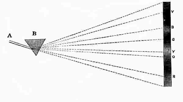
Whether this theory of the spectrum formation is absolutely
correct or not, the fact is established that the colors found in
a prismatic solar spectrum are always the same under the same
conditions and the order of their arrangement is never changed.
By means of the quality of spectrum colors called the wave
length, a given color can always be located in the spectrum,
and hence if a spectrum color is selected as a standard it can
always be determined by its recorded wave length.
Therefore it seems possible to establish certain standards of
color by a series of definitely located portions of the solar spectrum
and in the system here presented six have been chosen,
namely red, orange, yellow, green, blue and violet. These
six are more distinctly recognized than the others, and from
them by combination in pairs of colors adjacent in the spectrum
all the other colors can be very closely imitated, and hence
these six are selected as the spectrum standards. In these
standards the most intense expression of each color is chosen
i.e. the reddest red, greenest green, etc. which by the closest
scientific investigation have been located by their wave lengths
so that if they are in doubt in future they can be re-determined
by individuals or if disputed, may be corrected by any authoritatively
established congress, selected for the purpose. The
wave lengths of our six standards are represented by the following
numbers in ten millionths of a millimeter. Red, 6571;
Orange, 6085; Yellow, 5793; Green, 5164; Blue, 4695; violet,
4210. Having thus scientifically established these unchangeable
standards the attempt is made to secure the best possible pigmentary
imitation of each.
To any one who has ever compared a piece of colored material
with a good presentation of a spectrum color, it is unnecessary
to say that the result in an attempt to match the
spectrum color with the material or pigmentary color is a very
weak approximation, but the one thing aimed at is to secure
nearly as possible the same kind of color. For example in the
red, it is the aim to obtain the same kind of red, by which we
mean the same location in the spectrum, i.e. a red neither
more orange nor more violet than the reddest spot in the spectrum.
This selection must be based on a purely æsthetic perception
or impression of color. The same is true of each of the
six standard colors, as for example, for orange we select the
location which has seemed to a large number of good judges to
best represent the feeling of orange as between the quite well
defined red on one hand and the equally definite narrow band of
yellow on the other, and it is quite wonderful what unanimity
of opinion there is on this particular color which would naturally
seem to be the one most doubtful in its location. On the other
side of the yellow the green seems to offer little difficulty and
the pure Paris or emerald green is very nearly the standard.
The violet being at the other end of the spectrum is as easily
decided as the red, but the blue between the green and violet
is not so easily determined, because, from the best blue the
hue runs so imperceptibly into the violet on one side and the
green on the other. Pure ultramarine blue is the nearest approach
to the spectrum standard of blue of any of the permanent
pigments, but even this is a trifle too violet.
For educational purposes papers coated with pigments afford
at once the purest colors and the most economical and useful
material, and on this plan a line of colored papers has been
prepared for color instruction in the kindergartens and primary
schools in imitation of the above described spectrum standards.
From the pure spectrum standards it is possible by reflected
light to combine the two standards to produce a color between
them, for example if two small mirrors are held in a spectrum
one at the "red" and the other at the "orange" and the two
reflected on to the same spot on a white surface, the result is a
color between the red and the orange. So also if we mix red
and orange pigments together we may produce colors between
the two which may be termed orange-red or red-orange; but unfortunately
there is no means known by which we can measure
the proportion of the red and orange color-effect which is produced
by any given mixture of these two pigments, because
color-effect cannot be measured by the pint of mixed paint or
the ounce of dry pigment.
We, however, have another means for measuring color effect
which just in this emergency seems providential. It is a fact
well known to every boy that if he rapidly whirls a lighted stick
the fire at the end produces the effect of a circle of light, which
phenomenon is explained by a quality of the eye called retention
of vision, by which the impression made by the point of
light remains on the retina of the eye during an entire rotation.
It is a fact, based on the same quality of vision, that if one
color is presented to the eye, and instantly replaced by another
the effect is a combination of the two colors. Therefore if one-quarter
of the surface of a disk of cardboard is covered with
orange paper and three-quarters with red paper, and then the
disk placed on a rapidly rotating spindle, the color effect is a
mixture of red and orange, and the effect is exactly in proportion
to the angular measurements of the two sectors, so that if
the circumference is divided into 100 equal parts the resultant
color will be definitely represented by the formula "Red, 75;
Orange, 25."
Less than forty years ago an English scientist named J.
Clerk Maxwell while making experiments with such painted
disks happily conceived the idea of cutting a radial slit in each
of two disks from the circumference to the center so that by
joining the disks they could be made to show any desired proportion
of each and hence they are called Maxwell disks. With
such disks made in the six pigmentary standards red, orange,
yellow, green, blue and violet, the intermediate pigmentary spectrum
colors may be very accurately determined by combination
and rotation. If we give to each of these standards a symbol
as R. for red, O. for orange, Y. for yellow, G. for green, B. for
blue, V. for violet, we then have the basis for a definite nomenclature
of colors in imitation of the pure spectrum colors.
As all pigmentary or material colors are modified by light and
shade thus producing in high light tints and in shadow shades of
the colors, we must seek for some means of imitating these effects,
and fortunately find them in white and black disks. If
with a standard color disk we combine a white disk we may
have a line of tints of that color, and with a black disk, shades.
Giving this white disk a symbol of W. and the black disk N.
we complete our nomenclature. We cannot use B for black because
B has already been used for blue, and therefore we use
N. for niger, the Latin word for black.
Briefly stated then this system of color instruction is comprised
under the six general heads: Spectrum Standards; Pigmentary
Standards based on the spectrum standards; Maxwell
Rotating Disks in the pigmentary standards and Black and
White; a Color Nomenclature based on the accepted standards
and their disk combinations; and Colored Papers and
Water Colors made in accordance with these standards.
For spectrum standards, six definite locations expressing the
natural æsthetic or psychological impressions of red, orange,
yellow, green, blue and violet are selected. Six standards are
chosen instead of a larger number as for example twelve, because
for the purpose of a nomenclature the smaller number
is more convenient than a greater number. The six are selected
rather than three, four or five, because while in the consideration
of colored light alone the smaller number would possibly
suffice to form by combinations imitations of all other colors,
any number smaller than six is entirely inadequate to form by
pigmentary or disk combinations fairly good expressions of the
corresponding spectrum color combinations.
In selecting the spectrum standards special prominence has
been given to the psychological color perceptions of experts in
determining those locations in the spectrum best expressing the
color feeling of red, orange, yellow, green, blue and violet,
while the purely scientific consideration of these several questions
has not been ignored or lightly treated.
For pigmentary standards the best possible pigmentary imitations
of the six spectrum standards are secured and to these
are added the nearest approach to white and black that can be
produced in pigments.
Pigmentary standards on which to base a nomenclature are
valueless without some means by which measurements of standards
embraced in a given compound color can be expressed.
The Maxwell color disks are the only known means by which
we may measure the relative proportions of color effect embodied
in a given color, and therefore the eight color disks are the
foundation of the original color nomenclature herein advocated.
Colored papers are chosen for primary color instruction because
paper is a valuable medium for simple schoolroom manual
training and because no other pigmentary medium is at once
so economical and affords such pure colors as may be secured
in specially prepared colored papers, without a glazed surface.
Before leaving this part of the subject we do well to remember
that in the present conditions of chemistry as applied to
the preparation of pigments it is not possible to establish any
absolutely definite science of such color combinations. Nor is
it possible to establish permanent pigmentary standards without
great expense, but if the locations of the standard colors in the
spectrum are established by wave lengths the pigmentary standards
may be re-determined at any time and produced, in the
purest pigments available at the time. In art or harmony effects,
the purity of the pigmentary standard is not so important
as its hue, i.e. its location in the spectrum, which may always
be determined by the established wave length. This last statement
may be illustrated by the investigations regarding complementary
harmonies. Scientifically one color is not considered
complementary to another unless when combined in equal quantities
they produce white light, or in other words when combined
by the rotation of disks each color must occupy a half circle
and the result must be a neutral gray. But this is not essential
in considering a complementary harmony, as harmonies in different
tones and in various proportions are pleasing and as yet
the proportions and tones which produce the best combinations
have not been determined.
The entire question of harmonies or pleasing color effects is
dependent on individual color perception, and the establishment
of rules and laws on these points can result only from a
comparison of the opinions of many experts in various localities
and at different times. This cannot occur without some
means for recording these opinions in generally accepted terms.
It is too late for any individual opinion to be accepted as authority
regarding the relative values of two different harmonies
in color and this will be still less possible as we become better
educated in color and able to sense finer distinctions in color
combinations.
MONG other advantages to be gained by a logical study
of the psychology of color is the establishment of more
accurate color terms and definitions. If experiments and discussions
based on accepted standards and methods of comparisons
can be carried on we may hope in time to have as definite
expressions of color terms as we now have in music and
literature.
All color terms used by artists, naturalists, manufacturers,
tradesmen, milliners and the members of our households are as
indefinite as one might naturally expect from the utter lack of
a logical basis for the whole subject.
Without definitions or means for intelligently naming any
color, it is not strange that the terms used in speaking of colors
and color effects are so contradictory as to lose much of their
force, if perchance they retain anything of their original meaning.
For example, probably most people apply the term SHADE
to any modification of a color, either a hue, tint or shade.
It is true that a concise and reasonably full dictionary of
color terms must be the outcome of long experience in the logical
study of the science of color and its use in our every-day
lives, and at the best only suggestions can be made at present.
But as there must be a beginning and some terms seem to be
fairly well established, the following incomplete list of definitions
is offered, always subject to amendment by the majority
vote, for whenever such changes indicate advance they should
be welcomed.
Ray of Light.—The finest supposable element of light impression in the eye.
Beam of Light.—A number of rays.
Standard Colors.—As used in this system of color nomenclature,
the best pigmentary imitation of each of the six spectrum
colors red, orange, yellow, green, blue and violet and
black and white. These are more specifically called Pigmentary
Standards in distinction from spectrum standards.
Spectrum Standards.—The six colors found in the solar spectrum
and definitely located by their wave lengths, as follows in
the ten millionths of a millimeter. Red, 6571; Orange, 6085;
Yellow, 5793; Green, 5164; Blue, 4695; Violet, 4210.
Pigmentary Colors.—All colors used and produced in the
arts and sciences. This is in distinction from colors seen in
nature, as in flowers and the solar spectrum. The term refers
not only to pigments in the strictest sense but to all surfaces
coated, painted or dyed artificially.
Pure Colors.—A pure or full color, also called a saturated
color, is the most intense expression of that color without the
admixture of white or black or gray. All spectrum colors are
pure, while no pigmentary color is absolutely pure, but the pigmentary
color which approaches most nearly to the corresponding
color in the spectrum must be selected as the pigmentary
type of purity of that color. For example, the standard for
green must be the best possible pigmentary imitation of the
spot in the spectrum which by general consent is called green,
and so not only for the six standards but for all their combinations
which produce the other colors in nature.
In pigmentary colors the term pure is entirely one of relative
degree. As processes of manufacture are improved and new
chemical discoveries made, there is good reason to believe that
we shall have much more intense colors and hence much better
imitations of spectrum colors than are at present possible.
Therefore as our pigments become purer those now accepted as
full colors will in time become tints or broken colors and new
standards will be adopted.
Hue.—The hue of a given color is that color with the admixture
of a smaller quantity of another color. An orange hue of
red is the standard red mixed with a smaller quantity of orange.
With the disks, pure hues are secured only by mixing two standards
adjacent in the spectrum circuit.
For convenience in speaking and writing about colors in this
system of color instruction, all the spectrum colors other than
the six standard spectrum colors are designated as intermediate
spectrum hues, and often for convenience in speaking of them
they are called simply spectrum hues. To these are also added
the colors between red and violet which are not in the spectrum.
When so used the term must be considered as purely technical
in this particular relation, because a color between the standard
blue and the standard green is in the abstract no more a hue
than either of these colors. If two standards not adjacent in
the spectrum circuit are combined the result is not a pure spectrum
hue but always some broken spectrum color.
Local Color.—A term applied to the natural color of an object
when seen in ordinarily good daylight and at a convenient distance,
as a sheet of paper at arms length, a tree at twice its
height, etc.
Tint.—Any pure or full color mixed with white, or reduced
by strong sunlight. In the disk combinations a spectrum color
combined with white.
Shade.—A full color in shadow, i.e., with a low degree of
illumination. In disk combinations a spectrum color combined
with a black disk produces by rotation a shade of that color.
In pigments the admixture of black does not usually produce
as satisfactory shades of a color as may be secured with some
other pigments, and each artist has his own preferences in
making shades of the various colors on his palette.
Scale.—A scale of color is a series of colors consisting of a
pure or full color at the center and graduated by a succession of
steps to a light tint on one side and a deep shade on the other.
Tone.—Each step in a color scale is a tone of that color,
and the full color may be called the normal tone in that scale.
In art this word has had such a variety of meaning as to render
it very convenient for Amateur Art Critics, together with
such terms as breadth, atmosphere, quality, values, etc., but
in the consideration of color it should have this one definite
meaning.
Warm Colors.—Red, orange and yellow, and combinations
in which they predominate.
Cool Colors.—Usually considered to be green, blue and violet,
and the combinations in which they predominate. But it is,
perhaps, questionable whether green and violet may properly be
termed either warm or cool. The term cool as applied to colors
is quite indefinite, except in a general way, but red, orange and
yellow are universally considered as warm, and blue and green-blue
as cool.
Neutral Gray.—White in shade or shadow. Pure black and
white mixed by disk rotation. Black and white pigments mixed
do not usually produce a neutral gray, but rather a blue gray.
Warm Gray.—A neutral gray with the admixture of a small
quantity of red, orange or yellow.
Cool Gray.—A neutral gray with a small quantity of blue or
green-blue.
Green Gray.—A neutral gray having combined with it a
small quantity of green. As this color could hardly be classed
with either warm or cool grays this fourth class of grays is
suggested as helpful in giving definiteness to the more general
color expressions.
Broken Colors.—Gray colors, often improperly called broken
tints. For simplicity, a tint of a color is described as the pure
color mixed with white and a shade as the color mixed with
black, and the corresponding broken color is the same color
mixed with both white and black or with neutral gray. A tint
of a color thrown into a shadow or a shade of a color in bright
sunlight gives a broken color. For various reasons a very large
proportion of the colors in nature are broken. Broken colors
are much easier to combine harmoniously than full colors, or
even tints and shades.
In disk combinations when a pure color is combined with
both a white and black disk the result will be a broken color.
When a color is mixed with both black and white, i.e., with
gray, and becomes thereby a broken color, it then belongs to a
broken scale and educationally has no place in any pure scale,
i.e., a scale in which the key tone is a pure color. Neither has
a broken scale of a color any place in a chart of pure scales or
spectrum scales.
Neutral Colors.—A term often improperly applied to grays,
white, black, silver and gold. See passive colors.
Passive Colors.—A term suggested as covering black, white,
silver, gold and very gray colors. The term "neutral colors"
is often used in this sense but this is evidently improper if we
are to confine the term "neutral gray" to the representation of
white in shadow because as soon as a gray has any color in it,
it is no longer neutral.
Active Colors.—Those colors neither passive or neutral.
Necessarily both the terms "active" and "passive" used in
relation to colors must be quite indefinite.
Complementary Colors.—As white light is the sum of all
color if we take from white light a given color the remaining
color is the complement of the given color. When the eye has
been fatigued by looking intently for a few seconds at a red
spot on a white wall and is then slightly turned to the wall, a
faint tint of a bluish green is seen, and this is called the accidental
color of the red, and is supposed to be identical with
its complementary color. If with the disks we determine a
color which with a given color will produce by rotation a neutral
gray, we have the complementary color more accurately
than by any other means at present known in the use of pigmentary
colors.
Harmony.—Two colors are said to be in harmony or to combine
harmoniously if the effect is pleasing when they are in
juxtaposition or are used in a composition.
Spectrum Circuit.—If a pigmentary imitation of the solar
spectrum with the addition of violet red at the red end and red
violet at the violet end be made, and the two ends joined, we
shall have a spectrum circuit. This may be in the form of a
circle, an ellipse or an oval.
Primary Colors.—In the Brewster theory red, yellow and blue.
In the Young-Helmholtz theory red, green and violet are termed
primary colors because it is supposed that from these three sensations
all color perceptions are experienced. In purely scientific
investigations of color perceptions these last three or others
which are supposed to serve the same purpose are also called
fundamental colors. Practically every spectrum color is a primary,
because each has its own wave length.
Secondary Colors.—In the Brewster theory orange, green and
purple have been called secondary because it is claimed that they
are produced by the combination of primary colors in pairs.
Tertiary Colors.—A term used in the Brewster theory to denote
three classes of colors called russet, citrine and olive,
made by mixing the secondaries in pairs. These are all broken
spectrum colors. The orange and purple produce russet; the
orange and green form citrine; the green and purple, olive.
There seems to be no good reason for perpetuating the indefinite
terms secondaries and tertiaries as applied to color.
Values.—This word is very freely used in discussing effects
in works of art, both in color and in black and white. At
present it seems to be a very difficult term to define, and yet
each artist is quite sure that he can "feel" it, although few will
attempt to put into words a definition satisfactory even to
themselves. When an engraver, who is also an artist, attempts
to interpret nature in black and white on the metal plate or
wooden block, he endeavors to reproduce the "values" of the
various parts of the subject before him. In doing this he,
for one thing, attempts to produce a variety of neutral grays
which will express to the eye by means of black and white lines
the same tones of color effect as are seen in the several parts
of the subject under investigation. If this were the whole problem
the matter would be easily expressed by the disk nomenclature.
For instance, if we are to consider a certain red object
which may be represented by the standard red disk, we
place a medium sized disk of that color on the spindle, and in
front of it, smaller disks of white and black united. By rotation
the white and black disks become a neutral gray at the
center of the red disk. If this gray is made nearly white all
observers will agree that the gray is lighter than the red, and
if it is nearly black the opinion will be equally unanimous that
it is darker than the red. Consequently there evidently must be
a gray somewhere between these two extremes which a large majority
of experts may agree to be equal in depth or tone to the
red, i.e., neither lighter nor darker. But the artist-engraver
will insist that to him the term "value" expresses much more
than this and that he must use different lines in the sky or distance
from those which he uses in the foreground; and some
engravers will also insist that two different colors in the foreground
must receive different treatment with the graver in
order to express their true values. We know that true values
of colors are not expressed in a photograph, as the warm colors
are too dark and the blue far too light. If the term "value of
a color" is to be used as expressing something more than a
neutral gray of such a tone as to seem equal to it, then possibly
this latter quality must be expressed by the word tone, and yet
this use of that word will seem to enlarge its scope beyond its
present limits as it now is used to express the relations between
the different localities in one scale of color, while this new use
will extend to the comparison of tones in various color scales,
including neutral grays.
Luminosity.—The luminosity of a color is determined by
comparing it with a neutral gray. When a color seems to be
of the same brightness as a given neutral gray, i.e., not lighter
nor darker, then that gray is its measure of luminosity.
A noted authority says: "No colored object can have the
luminosity of a white object reflecting practically the whole of
the light impinging upon it. Therefore if we take absolute reflection
as 100 a fraction of 100 will give the relative luminosity
of any body." Luminosity is another expression of the
quality above described as forming a prominent feature in the
term values.
Potentiality.—The ability or strength of a color to affect other
colors by combinations with them. For example, white has a
greater potentiality than black, yellow greater than red, and
violet the least of all the spectrum colors.
It is a pertinent question whether any quality is involved in
this term which is not found in value, tone and luminosity, but
it expresses a somewhat different phase of a line of color effects.
Quality.—This term seems to be used rather indefinitely when
applied to color, but perhaps it is not far removed from the
term hue or kind of color.
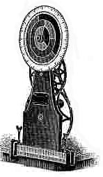 Fig. 2.
In the foregoing pages an attempt is made to explain
clearly and as briefly as possible the principles on which
the Bradley system of color instruction is based, and also to suggest
a few definitions necessary to an intelligent discussion of
the general subject of Color. Owing to the peculiar nature of
the questions involved, demonstration by actual experiment
is more convincing than the mere statement of theories can
possibly be, and therefore a few of the following pages will be
devoted to the explanation of some valuable
experiments, all of which may be tried by the
teacher in private, while many of them can be
shown the pupils with great advantage.
In this system the Maxwell color disks are
the means for color combinations and the
basis for measurements, and therefore for a
color nomenclature. For this reason the present
chapter treats largely of the proper use
of the wheel and incidentally the theory
of red, yellow and blue primaries with
combinations to produce secondaries
and tertiaries. No teacher using the
material connected with this color scheme can hope to meet
with success without a knowledge of the principles on which it
is based, and in this subject as in all others, it is essential that
the teacher shall know much more of it than he or she is ever
required to teach.
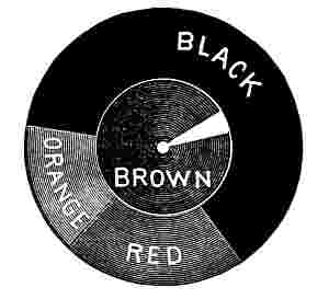
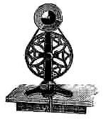 Fig. 3.
For most convenient use the machine should be clamped to
the front of a table and near one end, so that the speaker using
it can stand at the end of the table and operate it with the
right hand. Fig. 2 represents the Normal School Color Wheel
showing the face of the disks as seen by the audience. Facility
in the operation of the Color Wheel
is rapidly acquired by practice and
the exact position is easily determined
by the operator after a few
trials.
Fig. 3 shows the Primary School
Color Wheel, which has only two
sizes of disks, while the largest machine
has four sizes and is much finer
in construction. The smaller machine
does not require clamping to a table, but may be steadied
by the left hand while being operated by the right hand.
Fig. 4.
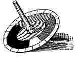
Many of the experiments of the color wheel can be produced
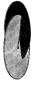
with a small toy called a Color Top, which is shown in Fig. 4.
It is composed of a thick cardboard disk forming the body of
in the operation of the Color Wheel
the top and a central wooden spindle
on which the disk closely fits.
A number of colored paper disks are
provided with this top so that very
many of the experiments performed
before a class can be repeated individually
by the pupils and in this
way the facts which may have been
demonstrated to the class with the color wheel can be fixed in
the minds of the pupils by their own experiments with the top.
Also as a home toy in the hands of the pupils it can be of value,
not only to the children, but to the parents as well.
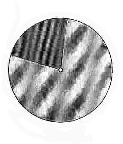
Fig. 5 shows the method of joining two Maxwell disks and
Fig. 6 their appearance when properly joined to be placed on
the rotating spindle of the color wheel. In joining two or more
disks for use on a color wheel or top, care should be taken to
place them in such relation to each other that when rotated the
radial edges exposed on the face toward the audience will not
"catch the wind." With small disks on the color wheel this
is not important, and if there is no whole graduated disk on the
arbor behind the slitted disks there is no advantage, but in using
the larger disks it is well to put the graduated disk behind the
others for this purpose, as at best it is quite laborious to keep
up speed when using several of the large disks, even with the
best possible conditions. With the thin paper disks of the color
in the operation of the Color Wheel
top this is an important matter. It will be noticed that the
method of joining the disks for use on the Color Top is the reverse
of that to be observed with the disks of the Color Wheel
as shown in Fig. 5.
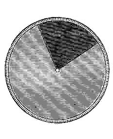
Fig. 7 shows the same two color disks placed in front of a
large white disk having its edge graduated to one hundred parts,
so that the relative proportions of two or more colors to be
combined can be determined accurately.
As the smaller disks offer so much less resistance in rotation
than the larger ones they are most desirable in private experiments
or before a small class, and the largest disks of the Normal
School Wheel are necessary only when more than three expressions
of color are required to be shown at the same time. In
making experiments before an audience those persons in front
should if possible be at least ten feet from the color wheel.
From ten to forty feet there seems to be but little difference
in the color perception, but for best tests fifteen to twenty
feet is the most desirable position.
For private practice with the color wheel a small mirror may
be placed five or six feet in front of the wheel in such position
as to furnish an image of the disks to the person operating the
machine. Owing to a slight loss of light by reflection the closest
criticism may not be possible when working with a mirror in
this way, but if a plate mirror is used the results are very good
and a bevel plate mirror about 7 x 9 inches without frame, can
usually be procured at small cost; this method is much more
satisfactory for personal experimenting than an assistant to
turn the wheel.
These disks have heretofore been used as a curious piece of
philosophical apparatus rather than because they have been supposed
to have any practical value in color training, but in establishing
a color nomenclature based on six spectrum colors the
disks at once assume a great value and are indispensable in a
system of color instruction founded on the science of color and
on the psychological perception of colors.
Let us suppose that the two disks shown in Fig. 7 are yellow
and green, 80 parts yellow and 20 parts green; then by rotation
we shall have a green yellow indicated by the symbol Y. 80,
G. 20. No argument is necessary to prove that when an exact
expression of color effect is required this is better than the
simple statement that it is a greenish yellow.
For practice it is profitable to commence with the red and
orange disks combined on the spindle, with a smaller red disk
in front of them, the smallest being preferable. Begin by introducing
say five per cent of orange and notice that a change
from the standard red at the center is visible. Gradually increase
the orange until it seems difficult to say whether the resulting
color is more like red or orange, and then exchange the
small red disk for an orange disk of the same size, and continue
adding orange in the larger disks until the difference cannot
be detected between the small disk and the larger combined
disks.
The standards may be combined in pairs, as has been indicated
with the red and orange, to produce all the intermediate
hues throughout the spectrum, but it must be remembered that
these combinations are to be made by joining in pairs, colors
adjacent in the spectrum, red and orange, orange and yellow,
yellow and green, green and blue, blue and violet. We then
shall have representations of all the spectrum colors, but there
are still the colors between violet and red, known in nature and
art as purples, which must be produced by uniting the red and
violet disks, thus completing a circuit of colors containing all
the pure colors in nature.
In nature all colors are modified by light and shade, strong
light producing tints and shadows more or less deep forming
shades.
These effects are imitated on the color wheel by the use of
a white disk combined with a disk of a standard color for tints
and a black disk for shades, and can be tested in the same
order as indicated for the hues, by combining each standard
disk with a white or a black disk in varying proportions. It
will be noticed early in disk experiments that a very small
amount of white produces a decided effect in the tone of a color
while a comparatively large amount of black is necessary to produce
a marked change. As this is exactly the reverse of the effects
of white and black pigments it is always a subject of remark.
In pigments these effects are imitated by the mixture of white
with a color to produce tints, and black for shades, or more
generally instead of black some dark natural pigment approaching
the hue of the color, may be preferred because a black pigment
will too often impart an unexpected and undesirable hue
to the color. As for example, in making shades of red some
natural brown pigment is better than black, and so various dark
browns and grays are used for different colors.
Even with the disks it is impossible to imitate purest tints
of all the standard colors, because in some of the colors, as
peculiarly in red and blue, the rotation of the white disk seems
to develop a slightly violet gray, for which effect there has as
yet been no scientific explanation. This gray dulls the purity
of the tint as compared with that which is found in the color
under a bright illumination, but on the whole both tints and
shades as well as the hues can be better illustrated with the
disks than in any other way, and in addition, the advantage is
secured of being able to measure and record the tone by the
graduated disk in the same way as the hues are measured and
recorded. A further advantage is secured in the use of disks
in color instruction because with pigments, the only other
method by which colors can be combined, much time must be
lost not only in the mixing and applying of the colors but in
the delay necessary to allow them to dry before the true results
can be seen.
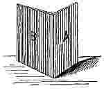 Fig. 8.
The shades of yellow as shown on the wheel will not be generally
accepted without criticism, but careful comparison with
yellow paper in shadow will prove the substantial truth of the
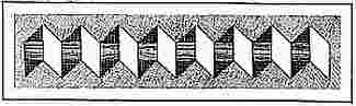
disk results. This experiment may be tried as follows: Join
two cards with a hinge of paper or
cloth to form a folding screen like
the covers of a book as in Fig. 8. On
the surface A, paste a piece of standard
yellow paper and on B, a piece of
yellow shade No. 1. Hold these two
surfaces toward the class in such
a position that the strong light will
fall on B, which is the yellow shade, and thus bring the face A,
which is a standard yellow, in a position to be shaded from the
light. By varying the angle of the covers with each other and
turning them as a whole from side to side, a position will be
secured in which the two faces will seem so nearly alike as to
convince the class that this color which they may have
thought to be green, is not green, but a color peculiar to itself,
a shade of yellow; because the darker paper when in full light
appears substantially the same as the standard yellow in the
shade or shadow.
In our experiments thus far with the wheel we have combined
the standards in pairs to produce the colors of the spectrum
between the standards, which for convenience may be called
intermediate spectrum hues, and also have combined a white
disk with each of the standards to produce tints of the standards
and a black disk to make shades.
By combining a white disk with an orange and a yellow disk,
for example, forming a trio of disks, a variety of tints of orange
yellow and yellow orange may be made. Also by the use of
the black disk instead of the white a series of shades of the intermediate
hues may be produced, and thus a great variety of
tints and shades of many spectrum colors shown.
Now if the white and black disks are combined with each
other the result will be a shade of white, i.e., a white in shadow,
which is an absolutely neutral gray. As the experiments progress
it will be seen that this neutral gray is a very important
feature in the study of color, and therefore it may be well at
this point to make sure that the disk combinations give the
true gray of a white in shadow by a test similar to the one used
for the shade of yellow, thus disarming criticism. Such a test
may conveniently be made by covering the reverse sides of the
folding covers with white on one cover and "neutral gray paper
No. 1" on the other. As the neutral gray papers are made
in imitation of combinations of black and white disks this experiment
is as convincing as the one regarding the yellow
shade. This is but one of many examples of the value of disk
combinations in the classification and analysis of colors.
In an elaborate chart of colors highly recommended for primary
color instruction a dozen years ago no correct understanding
of the classification of colors is shown, the tints and shades
being indicated by a very decided change of hue rather than a
consistent modification of tone. For example, in the red scale
the standard or normal red is vermilion, i.e., an orange red;
shade No. 1 is simply a red less orange in hue than the standard,
and shade No. 2 a shade of the standard red advocated in this
system; while tint No. 1 is a broken yellow orange and tint
No. 2 is much more yellow and more broken than No. 1.
Similar inconsistencies occur in all the other scales, showing
that the author had no correct knowledge of the analysis of
colors, and yet this was the best and practically the only aid
offered for instruction in color at that time.
Neither were there any true standards for neutral grays and
the term "neutral" was used in such an indefinite way as to rob
it of all actual value, until by the aid of disk combinations it
came to be confined to white in shadow as closely imitated by
the combinations of white and black disks.
Fig. 9.
With colored papers made in imitation of the six standards
and two tints and two shades of each, six scales of colors may
be produced by arranging the five different tones of each color
in a row, as in Fig. 9, which represents the orange scale with
tints at the left and shades at the right. If, in addition to these
six scales, we have two scales between each two of the standards,
we may have between the orange scale and the yellow scale
a yellow orange scale and an orange yellow scale, and if we
thus introduce the intermediate scales between each of the other
two standards, and include the red violet and violet red, we
shall have eighteen scales of five tones each.
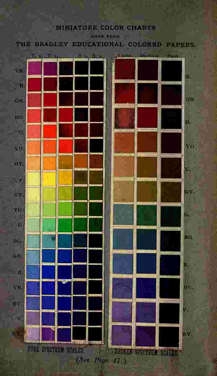
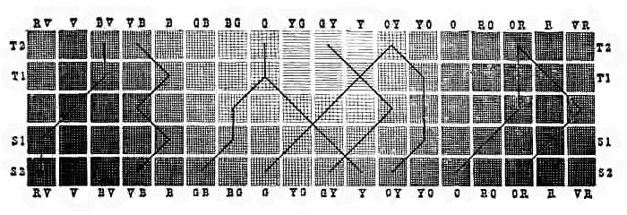
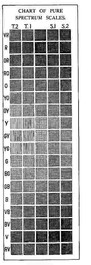
The eighteen scales as above named may be arranged as
shown in Fig. 10 to form a chart of pure spectrum scales
which is very valuable for study and comparison and especially
so in the study of the theory of harmonies. All these
tones are called pure tones and this chart is therefore called
a chart of Pure Spectrum Scales.
The idea that soft, dull, broken colors produce best harmonies
when used in combination may or may not be a universally
accepted truth, but there is a general belief that it is much
easier to make acceptable combinations with broken colors than
with pure spectrum colors and their tints and shades, and therefore
the temptation has been strong to select a general assortment
of colors which easily harmonize because of the pleasing
effect, instead of having regard solely to the educational value
of colors.
Truth in education requires that when colors are classified
as spectrum colors they shall all be the nearest approach possible
to the true spectrum colors, and in the spectrum there are
no broken or impure colors. Therefore, whenever the spectrum
is set up as nature's standard or chart of colors and an imitation
is made in pigments or papers, great care should be
used to secure the most accurate imitation possible, but in
the past this has not been the case, because of the prevailing
idea that the colors must all be possible combinations of three
primaries, and hence the orange, green and violet have often
been very broken colors. While pure colors and their tints and
shades may be advantageously combined with various tones of
broken colors in one composition for artistic effect, they should
be definitely divided when classified for educational purposes,
and their differences clearly explained to students.
In a scale of tones in any color the several papers will harmonize
more easily if the tints and shades are not too far removed
from the standard, but it is thought by many good
judges that the educational advantage in learning to see the
relationship of color in the more extreme tones is of greater
importance in the elementary grades than the facility for making
most pleasing combinations. Consequently in the Bradley
colored papers the tints are very light and the shades quite dark.
If, instead of adding either a white disk or a black disk to a
spectrum color, by which we make pure tints and shades, we
add both white and black, a line of gray colors or so-called
broken colors is formed. This is most beautifully shown with
the disks, and in this way a line of true broken colors is secured,
because in each case a true neutral gray has been added to the
color, which cannot be insured in the mixture of gray pigments.
As an example, this may be shown with the three smaller sizes
of the orange disks. With the medium size of these three make
the combination Orange, 35; White, 10; Black 55. With the
larger size disks make the proportions Orange, 16; White, 5;
Black, 79, and with the smallest size Orange, 43; White, 33;
Black, 24. Place these three sets of disks on the spindle at one
time and you have the three tones of a broken orange scale.
With similar combinations applied to the six standards and
one intermediate hue between each two, there will be material
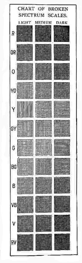
for a chart of Broken Spectrum Scales, as shown in Fig. 11,
including twelve scales of three tones each. These are the most
beautiful colors in art or nature when combined harmoniously.
Because of the loss of color in broken colors it is not advisable
to attempt so many different hues or so many tones of each hue
as in pure colors, for slight differences in either hues or tones
are not as readily perceived.
In these two charts of color scales two distinct classes of
colors are represented, namely, pure colors and broken colors.
The pure colors consist of the purest possible pigmentary imitations
of spectrum colors, with their tints and shades, and the
broken colors are these pure colors dulled by the admixture of
neutral grays in various tones. This distinction is readily
recognized under proper training, so that if a broken color is
introduced into a combination of colors from a pure scale it
will be readily detected, which always occurs when the attempt
is made to produce a series of spectrum scales by the combination
of the three primary colors red, yellow and blue. By this
method, if logically carried out, the orange, green and violet are
dark broken colors, and hence to a less extent the intermediate
colors also, because each of these is a mixture of a pure color
with a broken color. The usual result, however, is that the
orange made from the red and yellow seem so out of place in
the warm end of the spectrum that it is modified and made
much nearer the pure color, usually, however, too yellow, while
the greens and violets, which are deep and rich broken colors,
may seem more harmonious, but are so dark as to be out of
place among spectrum colors.
 |
 |
| Fig. 10. |
Fig. 11. |
If light broken colors are properly combined a beautiful imitation
rainbow is produced, which is more harmonious than the
spectrum made from full colors. A series of such colors combined
in spectrum order produce a more pleasing effect when
separated by a small space of white, black, gray, silver or gold.
The reason for this may be found in the discussion of simultaneous
contrasts.
In nature nearly all colors are broken. First, there is always
more or less vapor together with other impurities in the air, so
that even in a clear day objects a few hundred feet from us are
seen through a gray veil, as it were, and in a misty or hazy
day this is very evident. In the case of somewhat distant
foliage the general color effect is produced by the light reflected
from the aggregation of leaves, some of which may be in bright
sunlight and others in shadow, with a mixture of brown twigs.
All these tints and shades of green and brown are mingled in
one general effect in the eye. Also, owing to the rounded forms
and irregular illumination of objects, we see very little full or
local color in nature.
Therefore the study of broken colors becomes the most fascinating
branch of this whole subject, and it also has an added interest
because nearly all the colors found in tapestries, hangings,
carpets, ladies' dress goods, etc., come under this head.
In fact it would be hazardous for an artisan or an artist to
use any full spectrum color in his work, except in threads, lines
or dots. A considerable quantity of pure standard green, for
instance, would mar the effect of any landscape.
It is a very interesting diversion to analyze samples of the
dress goods sold each season under the most wonderful names.
For example:—
"Ecru," a color sold a few seasons ago, is a broken orange
yellow with a nomenclature O. 12, Y. 15, W. 17, N. 56,
while this year "Leghorn" and "Furet" are two of the "new"
colors, the former having a nomenclature of O. 16, Y. 54,
W. 19, N. 11, and the latter O. 18, Y. 18, W. 8, N. 56,
all of which are very beautiful broken orange yellows.
"Ashes of Roses" of past years is a broken violet red which
can be analyzed as follows: R. 8-1/2, V. 2-1/4, W. 15-1/4, N. 74.
"Anemon" of this season is R. 28, V. 7, W. 5, N. 60,
which is another broken violet red.
"Old Rose" is a broken red: R. 65-1/2, W. 24-1/2, N. 10.
"Empire" of past seasons is G. 18-1/2, B. 11, W. 16-1/2, N. 54,
while "Neptune" of this season is G. 13-1/2, B. 2-1/2, W. 11,
N. 73, both being broken blue greens.
"Topia," a beautiful brown, is O. 10, N. 90, a pure shade of
orange, while "Bolide" is a lighter yellow orange with a nomenclature
of O. 18-1/2, Y. 2-1/2, W. 1-1/2, N. 77-1/2.
We might analyze "Elephant's Breath," "Baby Blue," "Nile
Green," "Crushed Strawberry" and others common in the
market, but while the names will no doubt occur each season
the colors will change with the fickle demands of the goddess
of fashion and the interests of the manufacturers and dealers.
In writing any color nomenclature the letters should be used in
the following order: R.-O.-Y.-G.-B.-V.-W.-N., thus always
listing the standard colors before the white or black. For example,
never place Y. before O. or R., and never use N. before
W. If this order is strictly adhered to the habit is soon acquired
and a valuable point gained.
It has been shown that combined white and black disks form
neutral gray, which is a white in shadow or under a low degree
of illumination. If to such a gray a very small amount of color
is added, as orange for example, by the introduction of an
orange disk, this neutral gray becomes an orange gray, but
unless the amount is considerable it can not be detected as an
orange, but the gray may be termed a warm gray, denoting that
it is affected by some one of the colors near the red end of the
spectrum. If blue instead of orange is added to the neutral
gray, a cool gray is produced. When green is added to a gray
the result can not fairly be called either warm or cool, and hence
we have termed it a green gray. According to this plan we
have four classes of grays, Neutral, Warm, Cool and Green
grays. As there may be many tones of each, and many intermediate
combinations from red to green, or green to blue, the
number of grays in nature is infinite, but these four classes
with two tones of each in the papers form what may be called
standards or stations from which to think of the grays, the
same as the six standards in the spectrum constitute points
from which to think of pure colors.
A careful consideration of the foregoing pages, accompanied
with a color wheel or even a color top, can hardly fail to give
a student who will make the experiments a clear idea of the
use of the disks in the system of color education in which they
form such an important feature, and therefore the old theory of
three primaries, red, yellow and blue, and all that it leads to
can be very intelligently considered and tested by them in the
experiments which follow.
This old theory briefly restated is as follows: It is said
"there are in nature three primary colors, red, yellow and blue;
and by the mixture of these primary colors in pairs, orange,
green and violet may be made." In fact leading educators have
said that "in the solar spectrum, which is nature's chart of
colors, the principal colors are red, orange, yellow, green, blue
and violet; of these red, yellow and blue are primaries from
which may be made the secondaries, orange, green and violet."
All such statements as heretofore made in any popular treatment
of the subject are understood to mean that in a pigmentary
imitation of a spectrum the secondaries as enumerated
may be produced by the mixtures of the primary pigments, because
pigmentary mixtures are the only combinations generally
recognized.
This theory has also included the statement that the primaries
are complementary to the secondaries in pairs, and that the
combination of the secondaries in pairs may produce a distinct
class of colors called tertiaries.
It will be the aim of the following pages to demonstrate that
in all this there is neither scientific or æsthetic truth nor educational
value.
Experiments in mixing the three pigments, red, yellow and
blue, to produce the secondaries, orange, green and violet, have
been very carefully made with interesting and instructive results.
All such experiments are valueless unless made with one accepted
set of primaries for the three combinations, because it is
self-evident that if we select a vermilion red which is very decidedly
an orange red, and choose for our yellow one of the
orange yellows, the mixture will more nearly approach a true
orange than if a standard red and standard yellow are used.
Also in making a violet, if we mix a carmine, which is a violet
red, with a decidedly violet blue, of which there are many, the
result will be a better violet than the combination of the standard
red and blue. So also in the mixing of blue and yellow to
make green, a greenish yellow and a greenish blue will necessarily
produce better results than the standards. Therefore, to
test the matter fairly, the same pigments which are used to coat
the standard red, yellow and blue papers have been combined
so as to produce the best possible orange, green and violet,
and these results when analyzed on the color wheel are as
follows:—
The orange made by mixing standard red and yellow pigments
in the best proportions is equal to O. 46, W. 2, N. 52.
The violet is equal to V. 20, W. 1, N. 79, and the nearest approach
to a standard green is shown by disk analysis to be
G. 37, W. 7, N. 56, which is better than the violet and nearly
as good as the orange.
These experiments show that heretofore when a line of standards
of six colors has been prepared from three primaries, red,
yellow and blue, even though the purest possible colors may
have been selected for the primaries, the secondaries have not
been in the same class of colors, and that all of them are very
dark broken colors. Therefore, in using educational colored
papers based on such a scheme, the pupil has received no correct
impressions of the relative values of the several colors involved
in pure spectrum scales, but has been shown at the outset
a mixture of pure and broken colors as standards.
This is not a matter of opinion regarding best harmonies,
because it is easy to demonstrate that less skill is required
to combine broken colors harmoniously than pure colors, but it
is a choice between truth and error in the early education of
color perception.
While it may be impossible for the reader to secure pigments
exactly like the standards, red, yellow and blue, used in the
above experiments, and therefore the statement here made can
not be accurately verified, any one having a color wheel or
even a color top may test the same combinations by use of
disks. If it is true, as claimed, that a good standard orange
can be made by mixing red and yellow, then it should follow
that when a red and yellow disk are combined and a smaller
orange disk placed in front of them, that it ought to be possible
to so adjust the proportion of red to yellow that by rotation
the outer ring of color will match the central orange disk.
A trial of this experiment will show that while the color resulting
from the best possible combination of red and yellow is
a kind of orange, it is not even an approximation to the standard
orange, but is a shade of orange which may be matched by
combining the smaller orange disk with a black disk in the proportion
of O. 45, N. 55, the larger disks being R. 89, Y. 11.
In combining red and blue disks to make a violet the result
is more satisfactory, while if we attempt to produce a green by
combining the yellow and blue disks the result will be surprising,
but probably not convincing, because the statement that
yellow and blue make green has been so persistently reiterated
as a fundamental axiom that people who have given the subject
but little attention will feel that to doubt it is rank heresy. In
a text book treating of color is found the following passage:
"Green substances reflect the green, i.e., the blue and yellow
rays of the sunlight and absorb all the others." It is a fact,
however, that in the mixture of blue and yellow light there is
little or no trace of green, as a single experiment with a color
top or color wheel will readily demonstrate.
In response to this convincing experiment a colorist of the
"old school," (and there are few others) will doubtless say,
"Such an assertion seems to be true when applied to these rotating
disks, but we see no practical value in experiments of this
kind, because in the use of color we must depend on pigmentary
combinations, and in pigments yellow and blue do make
green." The author of a statement of this kind is always
honest in making it, and yet it is absolutely untrue, because as
has already been shown, the green resulting from the mixture
of yellow and blue can not be placed even approximately in
the same class as the yellow and blue of which it is composed.
In accepting the disk combinations of standard pigmentary
colors we are assuming a system of color investigation based
on the combination of colored light rather than the mixture of
pigments, and to an artist who has given the subject little
thought this seems quite radical, not to say startling. But, logically,
why is it not the most natural as well as the correct basis
for this work?
Art in color must be based on the imitation of natural color
effects. We must first learn to see color correctly and to know
what we see, and after that it is a very simple matter to learn
which pigments to combine for producing any desired result
which is already clearly defined in the mind. In fact the best
selection of pigments must often be based on their chemical
and mechanical qualities as much as on their peculiar hues.
All color impressions of material substances are produced
by colored light reflected from a material surface to the retina
of the eye, through which by some unknown means it is conveyed
to the brain. When the white sunlight falls on a material
substance a portion of the rays are absorbed and others are reflected
to the eye, thereby conveying impressions of color. If
on a surface of yellow material we throw a strong orange light
through a colored glass, some of the orange rays from the glass
will mingle with the yellow rays and the two are reflected to the
eye, thereby producing an orange yellow or yellow orange effect
where before it was yellow. So in a summer evening landscape
when there is a so-called red sunset, everything is illuminated
by an orange light and each color in the landscape is affected
by the orange rays which mingle with the rays of the
local color and are reflected to the eyes of the observer, producing
the effect of local colors mixed with orange.
In a room where the windows open on to a green lawn with
many trees in close proximity to the house, nearly all the light
is reflected from green surfaces, and hence is green light. In
such a case a correct painting of objects in that room would
have a general green effect.
The afternoon light in a room on the west side of a city
street may be nearly all red light, reflected from an opposite
red brick wall, and such a room would be ill-adapted to showing
fine dress goods, because the hues of the more delicate colors
would be entirely changed, and hence would give a false impression
as to the relations of the several colors in combination
as seen in white or clear daylight. If a piece of light blue
silk is illuminated by sunlight passing through a bit of yellow
glass, no trace of green effect will be produced, but a gray
either slightly yellow or blue, according to the relative strength
of the colors in the glass and the silk. This same effect would
be secured if the yellow light of the setting sun illuminated the
same material, but under such conditions everything else would
be similarly affected so that the effect would not be so apparent.
The idea that all color is derived from the three primaries,
red, yellow and blue, is so generally believed that our best
writers among artists, colorists and educators have repeated
it for many years. George Barnard, an English artist, in a
very valuable book on water color painting, speaking of the
colors of the spectrum which may be re-combined to form
white light, says that if the yellow and blue rays are combined
they produce green.
Chevreul also states in his invaluable book on color contrasts
that yellow and blue threads woven into a texture, side by side,
produce green. This statement is the more remarkable because
the writer was a very careful investigator and is but another
evidence of the strong hold which the Newton and Brewster
theory has had on the public mind for so many years.
The story is told of an artist who wished to introduce into a
composition of still life a blue vase with a bit of yellow lace
thrown over a portion of it, and having been educated to believe
that yellow and blue made green, gave a green effect to
the portion of the vase covered by the lace. Had he known
that blue and yellow light combined make gray instead of green
he would have avoided the error.
The fact that gray is the product of blue and yellow light is
sometimes taken advantage of in forming backgrounds in lithographic
printing, in which a stippling of alternate dots of yellow
and blue, very close together but not overlapping, is used to
produce a beautifully transparent gray much more pleasing
than any one tint of gray. This result is due to the blending
of the two colors in the eye with the same effect as the colors
of two rotating disks are mingled. The fact that there is a difference
between the color effects produced by mixing two pigments
and the mixing of the light reflected from similar colored
surfaces is a very strong argument for a system of color instruction
based on disk combinations, rather than on pigmentary mixtures.
In order to obtain the most truthful effects of color in nature
the artist should have sufficient knowledge of the principles
which govern the combination of colors by reflected light, so
that his reason may aid his eyes.
A little experimenting with the rotating disks and with pigments
will convince any one that the disk combinations form
the only possible basis at present known for logical color
instruction.
Having shown that the three colors, red, yellow and blue,
can not be combined to make an orange, a green or a violet of
a corresponding degree of purity, we will consider the other
claim which is set up by the advocates of the Brewster theory,
namely, that the secondaries are complementary to the primaries
in pairs, the green to the red, the violet to the yellow and
the orange to the blue.
As all color is contained in white light, if we take from white
light any given color, the color remaining is the complementary.
If a small disk of standard red paper is placed on a
white wall and the eyes fixed intently on it for a few seconds,
and then the eyes slightly moved back and forth, a ring of a
bluish green tint will be seen surrounding the red paper, or if
the eyes are fixed intently on the disk for a short time and the
paper suddenly removed, a disk of the same blue green tint
will be seen in place of the red disk. This is called the accidental
color and is supposed to be identical with the complementary
color, although the image is too faint to give any very
exact effect, but it is sufficient to furnish a clue to the complementary,
and we may infer that a color between green and blue
is that which is required.
Now if we can determine in what proportions red, blue and
green must be united to produce white light we may solve the
problem. This is not possible in the use of any pigmentary
colors, because of the impurity of all pigments as compared
with spectrum colors. Although the mixture of colored light
reflected from the disks, which are made of pigmentary colors,
gives much purer color than the actual mechanical mixture of
the two pigments, still, because it is a reflection of pigmentary
colors, it is far lower in tone than the corresponding mixture of
spectrum colors. Therefore it can not be a pure white, but may
be white in shade or a neutral gray, which, as already shown, can
be produced by the combination of a white and a black disk.
 |
 |
| Fig. 12. |
Fig. 13. |
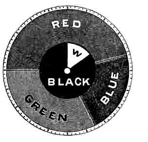
Therefore if red, blue and green disks of medium size are
joined on the wheel and in front of them small white and black
disks are combined, we have a means for solving this problem.
If these various disks can be so adjusted that when rotated the
effect of the three colored disks is a neutral gray, (or white under
a low degree of illumination) exactly matching a gray that
may be obtained by adjusting the small black and white disks,
then one step in the solution is taken, as shown in Fig. 12.
With such an arrangement a very close match is produced,
when the combined disks show the proportions to be R. 41-1/2,
B. 22-1/2, G. 36 for the larger disks, and for the small disks
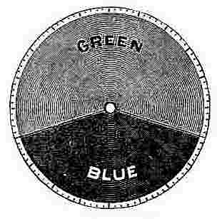
W. 15, and N. 85. Now if blue and green are combined in the
same proportions, as indicated above and in quantities sufficient
when added together to fill the entire circle of 100 parts, blue
will contain 38.3 parts and green, 61.7 parts, as shown in
Fig. 13, and the disks when rotated will give the color which is
the complementary of red: namely, a blue green.
In the same way the complementary of each of the other
standard colors, and in fact of any color, may be obtained.
The complementary of orange is another color between the
green and blue, but more largely blue. The complementary of
green is a violet red, and of violet a color between yellow and
green, while yellow and blue are very nearly complementary to
each other.
These figures furnish the results in a very well-lighted room,
with a perfectly white interior. It is a well-established fact
that this experiment is somewhat affected by the degrees of
illumination, and also that colored light from the walls and ceiling
of a room must of necessity have its effect, but all these
matters are so insignificant as to be of no material consequence
in the æsthetic study of the subject, and they can be very nearly
eliminated when necessary by a careful selection of conditions.
Whenever accurate experiments in pigmentary color comparisons
are to be made, either by the use of rotating disks or otherwise,
it is desirable to have a very well-lighted room, with a
northern exposure and to select a morning or noonday light
from a slightly overcast sky. These conditions obviate the unpleasant
effect of direct sunlight in the room and also the very
slightly blue effect of the clear sky. These precautions are unnecessary
in experiments relating to the ordinary æsthetic consideration
of color combinations, but even in such work it is
important to exclude all light reflected from neighboring trees
or colored buildings. Also the interior of the room should be as
free from color as possible; a clean white surface is especially
desirable.
A Chart of Complementary Colors, shown in Fig. 14, has
been found very valuable in fixing in the minds of teacher and
pupils the complementaries of the six standards. In this chart,
which is about eighteen inches in diameter, the circles at the
ends of the six diameters are colored papers selected from the
Bradley coated papers, as approximating the true complementaries.
In the majority of cases they are not far from correct,
but are least satisfactory in the blue and yellow. Theoretically
the complementary of the ideal standard blue is a slightly orange
yellow, and of the standard yellow a slightly violet blue. But
there is as yet no blue pigment in the market suitable for commercial
use which is free from a slightly violet effect. Therefore
the standard blue paper is practically as good a complementary
for the standard yellow as the violet blue paper. But notwithstanding
these slight imperfections which are at present unavoidable,
the chart is a valuable aid in fixing in the mind the
positions of the complementary pairs in the spectrum circuit.
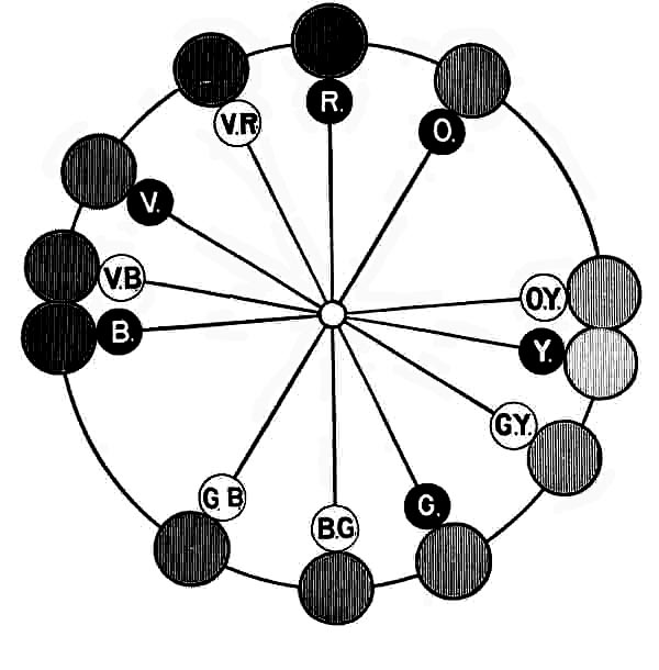
Fig. 14.
Each of the foregoing experiments furnishes an interesting
class exercise, and may be very closely repeated by the pupils
with their tops. Also the computation of the proportion of
green and blue when raised to the full circle may form a practical
problem in proportion for pupils of the higher grades.
Taken together, these experiments prove that the complementaries
of the old primaries are not found in the secondaries.
The last claim of the Brewster theory is that the secondaries
by combination form three lines of colors peculiar to themselves,
called citrines, russets and olives. It is asserted that
the mixture of orange and green makes citrine; orange and
violet russet; green and violet olive. Although these names
may be very convenient terms to express three general classes
of colors, they must of necessity be too general and indefinite
to be of value for accurate expression of color effects, and are
in fact so vague that hardly two persons can be found in a
large company who will agree as to the best expression of
either of them. The following are formulas for a number of
colors in each class, as made from analyses of colors coming
under these names. It is an interesting exercise to produce
some of these colors by means of the rotating color disks and
test the opinions of the different members of a company as to
which best represents to each one of them a tertiary color, as
citrine, for example. For this purpose three different formulas
may be shown at the same time, with three sizes of disks.
| O. 7. |
Y .13. |
W. 3½. |
N. 76½. |
|
| |
Y. 15. |
W. 4. |
N. 81. |
|
| |
Y. 13. |
W. 5. |
N. 76. |
G. 6. |
| O. 6. |
Y. 20. |
W. 4. |
N. 70. |
|
| O. 3. |
Y. 6. |
W. 8. |
N. 83. |
|
| R. 37. |
O. 8. |
W. 8. |
N. 47 |
| R. 79. |
|
W. 10½. |
N. 10½. |
| R. 33. |
O. 20. |
W. 6. |
N. 41. |
| R. 36. |
O. 4. |
W. 9. |
N. 51. |
| R. 47. |
O. 7. |
W. 8. |
N. 38. |
| G. 19. |
B. 11½. |
W. 10½. |
N. 59. |
| G. 13. |
B. 6. |
W. 12. |
N. 69. |
| G. 14. |
B. 12. |
W. 8. |
N. 66. |
| D. 10½. |
B. 15. |
W. 8. |
N. 66½. |
| G. 12½. |
B. 5½. |
W. 4. |
N. 78. |
The term citrine theoretically covers all possible combinations
of orange and green, but as generally understood those colors
which are so near the orange or the green as to very decidedly
approach either the one or the other are not included, and, as
shown in the above analyses, a citrine is a very broken color
ranging from an orange yellow through yellow to a green
yellow.
Although the russets would theoretically range from violet to
orange, yet the general conception of russet will hardly accept
a violet red, but will cover only the red and orange reds as
above indicated, while olives are confined to blue greens and
green blues.
These tests are based on combinations of the Bradley standard
orange, green and violet pigments, and therefore are far
stronger in color than those colors usually termed citrine, russet
and olive, made by mixing the pigmentary secondaries. For
example, if a yellow and blue pigment are mixed to form a
green, and red and yellow pigments to make an orange, and
then this green and orange are mixed to produce a citrine, the
result will be very much darker and more broken than the mixture
of the purer orange and green colors used as standards.
Restricted to these limits these names may become very useful
terms for general color expressions, as covering three different
classes of broken colors. If any one believes that these
color formulas do not correctly represent the three classes of
colors indicated, a series of experiments with even the small
color top will prove very convincing.
When the subject of standards as a means for identifying
colors is mentioned artists frequently express the feeling that
the names of pigments are good enough for them, such as Ultramarine
Blue, Prussian Blue, Vermilions, the Siennas, Indian
Red, etc. The following are the analyses of several samples
of Vermilion, Burnt Sienna, Raw Sienna, and Indian Red of
the best tube oil colors in the market:—
| |
R. 80. |
O. 14. |
W. 6. |
| |
R. 87. |
O. 8. |
W. 5. |
| |
R. 50. |
O. 24. |
W. 26. |
| R. 1¼. |
O. 6. |
W. 3. |
N. 89½. |
| R. 22½. |
O. 11½. |
W. 2. |
N. 64. |
| R. 25. |
O. 12½. |
W. 5½. |
N. 57. |
| O. 18½. |
Y. 6½. |
|
N. 75. |
| O. 17. |
Y. 14. |
W. 1. |
N. 68. |
| R. 8½. |
Y. 3½. |
W. 2. |
N. 86. |
| R. 11½. |
O. 7. |
W. 4. |
N. 77½. |
| R. 13½. |
O. 13½. |
W. 2½. |
N. 70½. |
A careful examination of these formulas and a reproduction
and comparison of the colors on the color top will convince any
one that in no case does the commercial name determine the
color with a degree of accuracy sufficient for any valuable
nomenclature.
The theory of the harmonies of colors is a subject which
awaits very careful investigation and a general discussion by
artists and expert colorists. Such investigations must include
many experiments based on common standards and uniform
methods of measurements and records.
Harmonies naturally seem to fall into a few general classes
which are convenient for comparison and discussion as well as
for elementary instruction, but no one person can set himself or
herself up to decide which are the best harmonies.
The practices and recommendations of noted artists who have
appeared to be gifted with intuitive perceptions regarding color
combinations have frequently included those for which there
seemed to be no recognized authority, and yet their beauty
could not be questioned. As the rules of grammar are but the
correlation of the practices of the best scholars, so the rules
governing color combinations must be the summary of the practices
and recommendations of the best artists, if they are to be
generally accepted as final, and hence we must patiently await
the growth of similarly established laws by the comparison of
the opinions of critics of acknowledged ability in various departments
of the world of art. This has not been possible in
the past and can never occur until there is a language of color
through which color facts can be somewhat accurately expressed
in verbal and written language, and this language cannot
exist until there is an accepted alphabet of color on which
it can be based. This alphabet is now in part furnished by the
spectrum standards and completed by the pigmentary standards
and the rotating disks made like them. Together they
form the basis for a nomenclature by the use of which the questions
involved in harmonies can be discussed and the results
expressed in written language.
In the investigation of any subject with a view to elementary
instruction, classification is an important factor, but one which
heretofore has been almost ignored as regards color education.
Consequently at present the more definite division of harmonies
into classes is very much a matter of personal opinion, but Mr.
Henry T. Bailey, State Supervisor of Drawing in Massachusetts,
has suggested a very useful classification in which he
arranges all harmonies under these five heads: Contrasted,
Dominant, Complementary, Analogous and Perfected.
Contrasted.—The contrasted harmonies are those in which
color is contrasted with non-color, or more accurately in which
an active color, that is a tone from the spectrum circuit, is
contrasted with a passive color, white, black, gray or silver and
gold; for example, a blue green tint with white, or green blue
with warm gray No. 1.
Dominant.—By dominant harmonies we mean those in which
are combined different tones from one color scale. For example,
red tint No. 1, and red shade No. 1, or a green blue tint, green
blue, and a green blue shade. A dominant harmony composed
of grays, or white, gray and black, is sometimes called a neutral
harmony.
Complementary.—This term refers to those harmonies in
which are combined opposite or complementary colors in the
spectrum circuit. The best of them show not only opposition
in color but also opposition in tone. Thus, tints of one color
with shades of its complementary produce a more pleasing effect
than do complementaries of equal value. The best complementary
harmonies contain one or more passive colors.
Analogous.—This name is applied to those harmonies in
which are combined tones from scales of neighboring colors in
the spectrum circuit.
For example, in a composition of colors from that part of
the spectrum containing yellow, green yellow and yellow green
the following simple combination may be made: Yellow tint
No. 1, green yellow and yellow green shade No. 2.
Perfected.—By perfected harmonies we mean those in which
the general effect of one analogous harmony is complementary
to that of another.
The above classification of harmonies is very valuable for
fixing in the mind the various effects of color combinations, and
yet they may seem to somewhat merge into each other in their
application, until the underlying principles which govern them
are understood. It is unwise to suppose that because the above
classification of harmonies is based on the science of color we can
infer that it furnishes definite rules for producing best effects.
The good or bad effect of two or more colors in combination
in decorative designs or fine art depends very largely upon
phenomena which are elaborately explained in a book entitled
"The principles of Harmony and Contrasts of Colours" by M.
Chevreul.
[A]
The first edition of this book was prepared in 1835
and published in 1838. The author had at that time been employed
for a number of years as superintendent of the manufactory
of Gobelin Tapestries in Paris under the control of the
French government.
In this book are described in detail the results of a great
number of experiments which were instigated by complaints
regarding certain colors produced in the dyeing department of
the manufactory, and which afford the most elaborate exposition
of the subject ever published.
One of the first things which led Chevreul to make his investigation
was the complaint that certain black yarns used as
shades in blue draperies were not a full black but more or
less gray.
The author says in his preface, "The work I now publish is the
result of my researches on Simultaneous Contrasts of Colours;
researches which have been greatly extended since the lectures I
gave on this subject at the institute on the 7th April, 1828. In
reflecting on the relations these facts have together, in seeking
the principle of which they are the consequence, I have been
led to the discovery of the one which I have named the Law of
Simultaneous Contrast of Colours."
The closing sentence of the preface to the first edition and
dated 1835 is as follows:—
"I beg the reader never to forget when it is asserted of the
phenomena of simultaneous contrast, that one colour placed beside
another receives such a modification from it, that this manner
of speaking does not mean that two colours, or rather the
two material objects that present them to us, have a mutual
action, either physical or chemical; it is really only applied to
the modification that takes place before us when we perceive
the simultaneous impression of these two colours."
It was not till three years later that a publisher could be
found for this book, which is still a standard.
The English translation comprises over five hundred closely
printed pages with many engraved and colored plates, and yet,
it has been of comparatively little value in popular instruction
because of the lack of a generally accepted color nomenclature
or list of well defined color terms, by which the readers might
have understood and repeated for themselves the experiments
described.
Unfortunately Chevreul was fully impressed with the Newton-Brewster
idea of three primaries, red, yellow and blue, and
therefore some of his deductions from his experiments seem to
have been more or less influenced by the attempt to make them
harmonize with this theory, and yet the subject which he has
treated so exhaustively and intelligently is one of the most important
in the æsthetic study and use of colors. In all expressions
of colors in combination with each other, whether in nature,
fine arts or the decorative and industrial arts, every color is affected
by its surrounding colors, a fact which is exhaustively
treated in this book.
While with our present knowledge of the subject it does not
seem that the material use of color can be reduced to an exact
science, this should not prevent us from accepting all the natural
and scientific aids which have been or may be discovered
toward this desirable result. Because of this lack of scientific
knowledge in Chevreul's time much of the worth of his experiments
is lost to us, yet there is very much of value in his work,
suggesting as it does experiments which may be tried with
present standards and modern methods.
If the use of Maxwell disks had been known to Chevreul his
deductions from his experiments would have been quite different
in their details. For example, in accepting the proposition
that there are three primaries, red, yellow and blue, which
may be combined in pairs to make the secondaries, orange,
green and violet, he states that owing to the impurities of the
pigments the secondaries are not as pure as the primaries.
Consequently he believes that this may account for many of the
shortcomings which he was too observing to overlook; but notwithstanding
such an error in theory this wonderful investigator
made many practical experiments and established very
valuable facts regarding color contrasts.
The term Simultaneous Contrast seems rather restricted for
a title covering such a range of effects, and the author subdivides
the subject into simultaneous contrasts, successive contrasts
and mixed contrasts, which he defines as follows:—
"In the Simultaneous Contrast of Colors is included all the
phenomena of modification which differently colored objects appear
to undergo in their physical composition and in the height
of tone of their respective colors, when seen simultaneously."
"The Successive Contrast of Colors includes all the phenomena
which are observed when the eyes, having looked at one
or more colored objects for a certain length of time, perceive,
upon turning them away, images of these objects having a
color complementary to that which belongs to each of them."
"The distinction of Simultaneous and Successive Contrast
renders it easy to comprehend a phenomenon which we may
call the mixed contrast; because it results from the fact that the
eye, having seen for a time a certain color, acquires an aptitude
to see for another period the complementary of that color,
and also a new color, presented to it by an exterior object;
the sensation then perceived is that which results from this
new color and the complementary of the first." These last
two effects may be shown very clearly in simple experiments.
There are various phenomena which may be classed as successive
contrasts sometimes called "after images." The phenomena
which Chevreul groups under the term "Simultaneous
Contrast of Colors" belong to a class of physio-psychological
effects termed after images, and more definitely to the subdivision
called negative images. The positive after images are
not important in the consideration of the theories of color and
therefore are not described here. The specific effect most directly
involved in the subject of harmonies may be observed if
the eyes are fixed upon a small disk of red paper on a white
wall for a few seconds and then the paper is suddenly removed,
as there will appear on the wall in place of the full red disk
a faint tint of a blue green. This is called an after image,
and is nearly or exactly a tint of the color complementary
to red.
For making this experiment mount a circle of red paper, say
three inches in diameter on a square white card, four or five
inches across, and grasping the card by one corner hold it in
front of a white wall or a sheet of white paper pinned on any
support. Tell the observer to look intently at the red disk for
a half minute, and then without giving any notice suddenly remove
it and ask what color is seen in place of it. At the first
trial the result may not be entirely successful, because the eyes
of the observer may naturally follow the red spot when it is
removed instead of remaining fixed in the original position, but
a second trial will bring the expected result. To illustrate
mixed contrast, fasten on the wall a piece of red tint No. 2
paper four or five inches square. This may be very conveniently
done by using a bit of beeswax on each corner of the paper,
which will not soil the wall. Then having the three-inch circle
of standard red paper mounted on a white card somewhat
larger than five inches square hold the card in front of the red
tint on the wall and repeat the experiment as before. The effect
now should be a three-inch disk of very light gray in the center
of the pink square, which is a "mixed contrast" according to
Chevreul. The reason is simple. The after-image or successive
contrast of light blue-green is projected on the red tint and
being complementary the resulting effect is a gray. If the red
tint could be exactly graded to the complementary effect in the
eye the resulting gray circle would be a true neutral gray.
Another illustration of the same physical effect by which the
complementary is induced may be shown by substituting for
the tint of red a light tint of the blue-green paper retaining the
full red disk as before. The same blue-green after image is
now projected on to the light blue-green paper and hence a circle
of more intense blue-green is produced. Thus it is seen
that Chevreul's successive and mixed contrasts are both due to
the same physiological effect, the only difference being in the
ground on to which the after image is projected.
It probably is unnecessary to state that these experiments
may be made with any color and its complementary and that
red and blue-green are used here merely as an example.
Another phase of the same physical effect is seen under
other conditions which may at first seem to be quite different
from those described, but which on examination appear somewhat
similar.
It is a well established fact that when two surfaces approximating
each other in color, as red and orange for example,
are placed side by side, both are rendered less brilliant, an effect
which might be reasonably expected because in order to see
both the eye is naturally directed first to one and then to the
other, and in each case the after image induced is a green-blue
or blue-green, which being approximately complementary to
both, dulls both. Or in other words, it is as though one examines
for a long time a line of goods of similar colors so that
the eye becomes fatigued and the color dulled. It is said that
a good salesman of colored materials will endeavor to occasionally
attract a customer's attention for a few moments to
some other colors approximating a complementary, so that
when the attention is again directed to the goods under consideration
the full effect of the color may be secured.
If it is true that the phenomenon of the after image is the
cause of the peculiar effects expressed by the terms simultaneous,
successive and mixed contrasts, and that by these effects
all harmonies in color are governed, it is certainly profitable to
understand them while using color material with the children,
for their good as well as our own pleasure.
Returning to our classification of harmonies, already stated,
we find the first to be Contrasted Harmony, which covers those
combinations in which a positive color, as a spectrum color for
example, is combined with white, black or gray, leaving out
for the present silver and gold, which may be confusing, and
can at best be used only as outlines.
The simplest combinations of colors are found in this class,
all of which are not equally harmonious, and some may not
perhaps be entitled to be classed as harmonies, although not
positively inharmonious. In this class, as in all others, there
is involved contrast of tone and contrast of color, which may
best be considered in several divisions.
According to the results of Chevreul's elaborate experiments
the effect of a combination of an active color with white is to
render the color more brilliant and to give to the white the effect
of the complementary of the active color. He admits that
the modification of white is very indefinite, but claims that,
knowing what to expect, a complementary effect may be seen
which otherwise would not be noticed. There is also a contrast
of tone which in all cases tends to strengthen a color when
used with white.
White and black are both intensified by combination with
each other, and this is the type of "contrast of tone." Contrast
of tone is very clearly shown when two or more grays of
different tones are placed contiguous to each other. This experiment
is easily tried by mounting side by side several strips
of gray papers of different tones. If more than two are used
they should be arranged in order from lightest to darkest. In
this case each band will appear to be graded in tone from one
edge to the other, each being lighter at the edge next to the
darker paper.
This effect is plainly shown on the color wheel by producing
several rings of grays with white and black disks of several
sizes graduated from light at the center to darker at the
circumference.
In consequence of this law of contrast of tone the contrast
of black with active colors generally tends to intensify the
black and lower the tone of the color, i.e., to weaken it as
though white or light gray was mixed with it, but this effect is
modified by contrast of color. Contrast of color is perceptible
in black when combined with color simply because the black is
not perfectly black but a very dark gray, and hence there is
the same complementary effect which shows in white and the
lighter grays, but in a smaller degree. This effect is most clearly
seen when the color used in combination is blue or blue-green,
which induces in the black, yellow or red complementaries and
gives the black a "rusty" appearance.
On the other hand, for example, red with black adds the
complementary green-blue to the black, which improves it. The
orange and yellow have a similar effect by their blue complementaries
to relieve the black from any rusty appearance and
a green yellow induces a violet effect in the black.
When a color is contrasted with white the light from the pure
white surface is so intense as to very largely obscure the complementary
effect on the white, while on the other hand the
feeble light from the black is not favorable for the exhibition
of a complementary. So it might naturally be inferred that
some tone between the white and black would be much more
favorable than either for the observance of this effect, which is
proved by experiment to be the case. This fact is illustrated
in the familiar experiment of placing a white tissue paper over
black letters on a colored ground, by which the black is practically
rendered a neutral gray and the color a light broken
color, and in appearance the gray letters receive a color complementary
to the color of the page on which they are printed.
Each color has its own tone of gray most susceptible to this
complementary effect. The truth of this proposition can be
perfectly shown on the color wheel by forming with three different
sizes of disks a gray ring on a colored surface. For
example, select small disks of orange and white of equal size,
then a black and a white disk of the second size and an orange
and a white disk of the third size. First place the large orange
and white disks on the spindle, then join the two medium-sized
white and black disks and put them in front of it, and lastly
add the small orange and white disks. By rotation the result
is the required neutral gray ring on a light orange surface. By
the joining of the white disk with each of the orange disks the
orange surface may be changed to a variety of tints for trial
with the different grays which may be made from the black
and white disks, so that the best tones of both orange and gray
may be secured. When the best proportions are obtained the
effect will be surprising, because when such disks are properly
adjusted the complementary effect is so strong in the gray that
it appears as a very definite color, a broken green-blue. It is
said that the tone of gray should have the same relation to the
tone of the color that its complementary would have in order
to get best results.
For the same reason if a circle of lightest neutral gray paper,
say four inches in diameter, is placed on a piece of yellow paper
about six inches square, and another circle just like it is
put on a piece of blue paper of similar size, it will be quite difficult
to convince any one who has not previously seen the experiment
that both gray circles are from the same sheet of paper.
The results observed in this experiment are produced by
a contrast of tone which causes one to look lighter than the
other, and a contrast of hue which gives one a blue and to
the other a yellow hue, in contrast to the color on which it is
mounted.
If two colors contiguous in the spectrum circuit are placed in
juxtaposition the effect of the contrast of hue is to throw them
away from each other. For example, if orange red and the red
orange papers are put side by side the former will seem more
red and the latter more orange. Therefore, when colored papers
are pasted up or laid in order to form a spectrum, for example,
the colors not only fail to blend together but each line
of contact is very disagreeably prominent.
If two colors are separated by a narrow strip of light gray,
gold, black or white, the effect is greatly improved. For this
reason a design in analogous colors is often improved by separating
certain colors by a fine line of black, gold or gray.
If two colors not closely related to each other in the spectrum
circuit are placed in juxtaposition, each is modified by an
effect which is the complementary of the other. For example,
if red and yellow are placed side by side, in contact, the red is
rendered more violet by the added effect of blue, which is the
complementary of yellow, and the yellow is modified by the
blue-green complementary of the red, which tends to dull the
yellow and change it slightly toward green.
If blue and yellow are joined both are improved, as the two
are so nearly complementary to each other that each is intensified
by simultaneous contrast, blue being added to blue and
yellow to yellow.
In the use of colored papers those combinations classified as
dominant harmonies are the most simple to make because they
are all in one family, as the little children like to consider the
relationship. The red family consists of the standard red and
its tints and shades, or in other words the red scale. With the
several papers ready made this harmony becomes very simple,
but in the use of pigments the production of a true color scale
is not a thing to be confidently undertaken by a novice.
In a very elaborate color chart for Primary education prepared
with great care by Dr. Hugo Magnus and Prof. B. Joy
Jeffries, and published at large expense about ten years ago
with hand-painted samples in oil colors, this lack of classification
of hues is very noticeable, although at that time it was by
far the best publication of the kind and was not criticised on
this point.
For example in a scale of five tones of red the following are
the analyses, beginning at the lightest tint:—
| Tint No. 2, |
O.45, |
Y.20, |
W.18, |
N.17. |
| Tint No. 1, |
O.69, |
Y.3, |
W.7, |
N.21. |
| Standard, |
R.75, |
O.25. |
|
|
| Shade No. 1, |
R.85, |
O.15. |
|
|
| Shade No. 2, |
R.75, |
N.25. |
|
|
In this scale according to the Bradley nomenclature the
standard or full color is a very fine vermilion expressed by
R.75, O.25, i.e. an orange red, and therefore in order to form
a perfect scale both tints and shades should be in the orange
reds, but in fact the tints are both broken colors, the lightest
a very broken yellow-orange and the deeper tint very nearly a
light broken orange. The lightest shade is a pure orange-red
but with a larger proportion of red to the orange than the
standard, while the darkest tone is a pure shade of red. Thus
in the five tones we have the following arrangement, beginning
at the lightest tint:—
Broken yellow-orange, broken orange, orange-red; another
pure orange-red but more red, and lastly red shade, thus embracing
in one orange-red scale parts of four scales from yellow-orange
to red. In these defects in the best chart of its kind
in the market only ten years ago is seen the best possible evidence
of the advance made since that time in color perception,
largely due to the use of the color disks in determining scales.
While in the use of colored papers the dominant harmony
may be the simplest and the one in which there is least danger
of really bad work, some of the combinations are much better
than others, and superiority is perhaps secured as much by the
relative quantities of each tone used in a composition as in the
selecting of the tones. In the entire range of the spectrum even
this class of harmonies involves problems too complex to be
solved by a few rules, but it is a very interesting field in which
the children may safely be allowed to roam and experiment.
Complementary Harmonies may perhaps be classified next to
dominant because they are more easily described and more definitely
limited than those effects termed Analogous Harmonies.
A pure Complementary Harmony consists of the combination of
tones from two scales which are complementary to each other.
For example, the red scale is complementary to the blue-green
scale, as also the green to the violet-red, and so on throughout
the entire range of the spectrum scales.
As explained on Page 50, the complementary of any color can
be determined by means of the color wheel, or nearly enough
for æsthetic purposes with the color top. But even though the
colors complementary to each other may be determined scientifically
there will always remain ample opportunity for the exhibition
of color sense and artistic feeling in the choice of colors
because the difference between a very beautiful composition in
complementary harmony and an indifferently good one may
be found in the choice of tones, or in the proportions of each
and their arrangement with relation to each other. This harmony
certainly contains great possibilities with comparatively
few limitations.
While it is perhaps approximately true that complementaries
are harmonious in combination, yet best authorities do not seem
to fully sustain this opinion and it is quite evident that pure tones
of some complementary pairs when combined are very hard in
their effects, if not positively unpleasant. This can be relieved
very decidedly and oftentimes very pleasing results secured by
modifying the colors to tints and shades or various broken tones.
But as has before been stated, and must be constantly reiterated,
all fine questions of harmonies can only be determined
by a general agreement of experts in color based on accepted
standards.
Analogous Harmonies may seem to be more closely related
to the dominant than the complementary and hence, logically,
should perhaps be considered before the complementary, but
there may be greater difficulties involved in the analogous than
in the complementary because they are not so definitely limited.
In an Analogous Harmony we may use tones from a number
of scales more or less closely related in the spectrum circuit.
In some parts of the spectrum it is possible to include a much
wider range than in others. It is comparatively easy to produce
safe compositions through that part bounded by the
orange-yellow and the green scales, while from the green to
the violet experiments are much less safe.
In almost any section of the spectrum a range of three scales
is safe if the tones are properly selected and proportioned, and
in some sections as many as five or six may possibly be included,
by an artist, with striking and pleasing effect.
The compositions which have been classified as Perfected
Harmonies may be defined as the combination of two Analogous
Harmonies which as a whole are approximately complementary
to each other, or in which the key tones of the Analogous
Harmonies are complementary to each other. Such compositions
may be entirely composed of analogous colors with
the addition of but one complementary color, and this is in fact
a very safe harmony, especially if that one color is used as a
border line or an outline here and there in the design, in which
case it may sometimes be strong in color and tone.
The chart of spectrum scales as made from colored papers
cut in squares is of great value in explaining the classification
of harmonies. Fig. 15 is a reduced copy of the chart of pure
spectrum scales shown on page 41, and which is here placed
horizontally for convenience.
Fig. 15.
The black zig-zag lines are designed as graphic illustrations
of the various classes of harmonies.
Contrasted Harmonies as defined are limited to designs in
one active color mounted on a background of one of the passive
colors and thus need no further explanation, although experience
will prove that some combinations are very much more
pleasing than others.
The Dominant Harmonies which are defined as combinations
of tones from one scale cannot be made more clear by a diagram,
which would be simply a straight vertical line through
any one of the eighteen scales, indicating that the five tones in
that scale or any selection from them may be used in a Dominant
Harmony.
The Analogous Harmony has given students the most trouble
and the diagram is principally prepared to illustrate the great
variety in harmonies of this class.
Commencing at the left, the first line indicates a harmony in
three scales beginning with red-violet shade No. 2 and passing
to shade No. 1, then to standard violet and thence to blue-violet
tints No. 1 and No. 2.
The next is in two scales, beginning at violet-blue shade
No. 2, thence to blue shade No. 1; back to normal violet-blue;
again into the blue scale at tint No. 1 and back to violet-blue
tint No. 2.
The next begins at green-blue shade No. 2 and ends in green
tint No. 2. Theoretically the line beginning in G. B. S. 2. and
leading to G. T. 1. and thence to Y. S. 2. may represent an
Analogous Harmony, but it may be doubtful whether a range
of such an extent in that part of the spectrum could be made
very harmonious. This may be divided into two harmonies at
G. T. 1. and each part may be extended to G. T. 2.
The straight line from G. S. 2. to O. Y. T. 2., embracing five
scales, might be extended to include the joining broken line
running into the Y. O. scale and finishing at O. Y. S. 2.
The remaining lines at the red end of the chart may be considered
as indicating one harmony in six tones, or two harmonies
in three tones each.
If the two ends of the Chart of Spectrum Scales are joined so
as to form an endless band or a cylinder, bringing the violet-red
scale adjoining the red-violet, as in the spectrum circuit,
the same graphic illustration could be given of harmonies extending
from violet to red.
The complementary harmonies require no diagrams, because
they are limited to the combination of two scales complementary
to each other and would be represented by two parallel
vertical lines through any two complementary colors, as for
example vertical lines through the red and green-blue scales.
The compositions termed Perfected Harmonies may be fairly
well illustrated in the diagram by the combination of the line
in V. B. and B. with the broken line commencing in G. Y. S. 2.
and ending in G. Y. T. 2.; or again by the line in R. V. to
B. V. combined with the straight line from G. T. 1. to Y. S. 2.;
or the broken line G. to Y. S. 2. Or again, the entire range of
the double combination O. S. 2., O. R. T. 2., V. R. and O. R. S. 2.
with the broken line from G. B. S. 2. to G. T. 2. Another
sample of Perfected Harmony is found in the union of line
O. R. S. 2., V. R., O. R. T. 2., with line G. B. S. 2. to G. T. 2.
These diagrams are designed to show the range or extent
which a single composition may cover under its special definition
and do not imply a necessity for using at one time all the
colors through which the line passes, or that they are specially
good harmonies.
A striking illustration in nature of a Perfected Harmony was
seen one bright autumn morning in a species of woodbine covering
the side of a red brick building, in which could be discovered
an infinite variety of colors in greens and violet-reds whose tones
were increased in number and intensified in effect by the reflections
of the sunlight and the corresponding shadows, producing
very light tints and very dark shades of various hues of the
complementary colors, and forming a complicated and wonderfully
beautiful effect very definitely classified as a Perfected
Harmony.
So much has been said and written about Field's Equivalents
that there is a very general impression among artists and others
that they constitute an important element in harmonious compositions
of color. This proposition as given in Owen Jones'
Grammar of Ornament is as follows:—
"The primaries of equal intensities will harmonize or neutralize
each other, in the proportions of 3 yellow, 5 red and
8 blue—integrally as 16.
The secondaries in the proportions of 8 orange, 13 purple,
11 green—integrally as 32.
The tertiaries, citrine (compound of orange and green), 19;
russet (orange and purple), 21; olive (green and purple), 24—integrally
as 64."
In commenting on this in "The Theory of Color" Dr. Von
Bezold says: "It is often maintained that the individual colors
in a colored ornament should be so chosen, both as regards
hues and the areas assigned to them, that the resulting mixture,
as well as the total impression produced when such ornaments
are looked at from a considerable distance, should be a neutral
gray. Starting from this idea, the attempt has been made to
fix the proportional size of the areas, which would have to be
assigned to the various colors usually employed in the arts, for
the purpose of arriving at the result indicated. This idea was
especially elaborated by Field, an Englishman, who gave the
name of 'chromatic equivalents' to the numbers of the proportions
obtained, a designation which has since been very
generally adopted. In reality, however, these 'chromatic equivalents'
have no value whatever."
The same writer also says: "It will always remain incomprehensible
that even a man like Owen Jones in the text accompanying
his beautiful "Grammar of Ornament" should have
adopted this proposition in the form given to it by Field, since
among all the ornaments reproduced in the work just mentioned
there are scarcely any which will really show the distribution
of colors demanded by the proposition in question."
[B]
In accordance with this eminent authority any one familiar
with disk combinations will know by experiment that no combinations
of red, yellow and blue approaching the proportion
named by Field can produce a neutral gray effect in the eye.
For practical study of color some economic material is absolutely
necessary and nothing so well combines manual work
with æsthetic cultivation as colored papers, if specially prepared
in standard colors and with a dead plated surface.
In the manufacture of the colored papers adopted in the
Bradley scheme of color instruction, the effort has constantly
been to produce the closest possible imitations of natural colors
consistent with the material.
With this aim in view we have secured the brightest possible
red, orange, yellow, green and blue and have chosen a violet
which has the same relation to the other pigmentary colors that
the soft beauty of the spectrum violet bears to the other parts
of the spectrum.
It however happens that in the pure aniline colors discovered
in recent years a line of purples and violets has been found so
much purer than the other pigments that we cannot with our
red and violet make a perfect imitation of the brightest aniline
purples used in some of the goods now in the market. Purple
is a general name for the several modifications of violet, red-violet
and violet-red as Peacock Blue is a name given to the
beautiful hues of blue-green and green-blue. These aniline
purples are but another indication that we may expect such
advance in the science of pigment manufacture in the comparatively
near future that a much purer line of standards may be
secured than is now possible in papers. But it does not materially
affect the value of the present standards as long as they
are accepted as indicating the kind of color, i.e., its location
in the spectrum, and the artists certainly should not object to
this lack of purity, because their only present criticism is that
the standards are too "raw," which is but another term for pure.
In the glazed colored papers in the market we may find some
of these purples, especially in the tints or "pinks" which when
placed beside the unglazed surfaces of the standard papers render
the latter quite subdued. But in primary color education
there is no place for these purest purple papers, until chemistry
discovers other colors correspondingly brilliant to complete
a purer chart of spectrum colors than is now possible.
In the preceding sections of this book the author has
aimed to so guide the teacher who is looking for aids in
elementary color teaching that she can by actual experiment determine
for herself the truths regarding color, and hence be able
to choose such facts as are suited to the needs of her pupils
from time to time, and to present them in such a logical order
as to render them of the greatest value in practical results.
It should be possible to interest the children in color more
easily than in any other subject. Examples are always around
them at home, in the street, in the garden and the field, if perchance
they are fortunate enough to see the field, and those
who see no attractive colors elsewhere certainly should find
them in the schoolroom. To a teacher who is in love with the
subject the world will be full of examples, every day. The
beautiful yellows and greens of the spring leaves, the flowers,
birds and butterflies of the summer, the autumn foliage, the
sunsets and blue and purple mountains of winter, are but hints
of the multitude of object lessons in color all around us; and
if none of these are available the more commonplace subjects
found in the latest seasonable colors of dress goods and house
furnishings will be almost equally valuable. When the children
are once interested they will discover, through their own observation,
examples of such value as to surprise one who has had
experience with only the old methods of trying to teach color,
or rather the utter lack of all methods heretofore in vogue.
The value of kindergarten training has been so thoroughly
demonstrated as to be beyond controversy, and all progressive
school boards must soon recognize the necessity of adopting
kindergarten methods in the lower primary grades, until such
time as it may be possible to introduce the complete kindergarten
for all the children, to precede the school proper. The
conditions prevailing in the kindergarten are peculiarly favorable
to the study of color, because of the opportunities afforded
for introducing it in connection with the manual exercises of
the gifts and occupations.
The first gift of the kindergarten, as originally introduced
by Frœbel, consists of six soft worsted balls in six colors,
which he seems to have selected as standards without care or
knowledge regarding the theory of "three primaries and three
secondaries," although no doubt he may have indifferently accepted
it, because it was the only one in his day suggesting any
logical scheme of color combinations.
The use of colored papers educationally in a systematic way
originated in the kindergarten, and comprised folding, cutting,
pasting and weaving, from which some color instruction was
incidentally derived by the children. But with the papers
formerly in the market little special training in the selecting,
matching and naming of colors, such as is of so great value at
the present time, was possible. The call for better colors in
papers came first from the kindergartners, and the diversity of
ideas expressed by them caused the writer to institute a series
of investigations which have resulted in the system to which
this book is devoted. The occupations of paper folding, cutting
and pasting have been adopted into the primary school
from the kindergarten, and there is no question but the occupation
of paper mat weaving as practiced in the kindergarten
should also be introduced in the lowest primary grades for
those who have not had kindergarten training, because of its
value in simple manual work and in designing symmetrical patterns
and harmonious color combinations.
By general consent colored papers have been chosen as the
most available material for this work, because while relatively
cheap, the purest colors possible in pigments are secured, and
the material is adapted to the most elementary manual training
and education in form as well as color.
It is not the author's aim to here provide a definite course of
lessons to be given in a perfunctory way or in a fixed order,
but rather to furnish suggestions based on practical work in
the schoolroom that may be of value to those who have carefully
examined the preceding pages of this book and become
familiar with the experiments described. The suggestions are
based on the experience of teachers who have been using the
system here advocated for several years and testing it in various
ways, and therefore it is hoped that they may be of value to
any earnest worker who is not fully satisfied with her efforts in
teaching color up to date. Consequently a brief outline of
work is suggested for the earliest years, according to a definite
order, and then further suggestions and experiments are introduced,
somewhat in the order in which they may naturally
present themselves.
The time has passed when it is necessary to offer any argument
for the study of color in the schoolroom. Every child
begins his school life with many color impressions which he
has been acquiring since the day when his baby fingers first
stretched toward some bit of color, and his development demands
a clear presentation to him during the earliest school
years of the fundamental facts concerning color upon which all
later work must be based.
A glass prism is one of the first requisites in the appliances
for teaching color, and a prism which may be bought for a few
cents will work wonders in the hands of an interested teacher,
although a more perfect instrument, such as is sold with physical
apparatus, will give colors which are better defined.
Experience in many schoolrooms has proved that a spectrum
can be shown somewhere in the average room at some hour in
every sunny day, especially in the longer days of spring and
summer, and it is well to have the prism when not in use so
fixed as to project the spectrum into the room much of the
time, so that it may become familiar to the younger children.
Observation of the spectrum enthuses the children with a
feeling for color which can be developed in no other way, and
they never tire with watching the wonderful vibrating effects of
the liquid colors; and by studying it the mental image of each
of the six colors becomes as distinct as that of the cube after
it has been handled and modeled. If the schoolroom is provided
with shutters or dark curtains a much better spectrum
can be produced by closing them, as even a slight change from
a bright sunny daylight has a very perceptible effect in bringing
out the colors. A person who has never seen a carefully
prepared spectrum in a room almost perfectly dark can have no
realizing sense of the purest possible expressions of color.
Accident once disclosed a simple means by which one teacher
secured a very good spectrum. There was a deep, dark closet
opening from the schoolroom and one bright day when the
prism was being used the spectrum was accidentally thrown
into this closet, and the sudden and enthusiastic expression of
approval by those pupils who were in position to discover it
was certainly interesting to the teacher of that country school,
with a dark coal closet.
In a spectrum such as can be produced in a dark room with
the most perfect form of prism, all the various colors can be
separated and carefully examined and by special appliances
compared with pigmentary colors. Experiments of this kind
are exceedingly interesting and instructive, and demonstrate
the wonderful intensity and purity of the spectrum colors as
compared with the purest pigmentary colors that can be produced.
Such experiments were carried to a great degree of
perfection when the six standard colors for the Bradley Colored
Papers were selected.
After many months of labor in securing samples of material
colors, and many days spent with the spectrum, a committee
of artists, scientists, teachers, and artizans unanimously decided
that æsthetically and psychologically the colors adopted
were the best possible material expression of the six localities
in the spectrum corresponding to the feeling or psychological
perception of red, orange, yellow, green, blue and violet.
Many subsequent experiments have apparently proved that
practically the same six colors best serve the purpose of primaries
from which to make all others by combination.
In accordance with these selections the educational colored
papers have been made, and since that time an expert scientist
has accurately located each of these colors in the spectrum
by its wave length. Consequently after the children have come
to know the six colors in the sun spectrum the six standard
colors of the papers may be shown as the best imitations possible.
In studying the six colors from the spectrum in a
schoolroom it frequently happens that one color may be best
seen on the floor, another on the wall or even the blackboard,
and another on the ceiling, and after the order of the colors in
the whole spectrum has been observed, it is well to get each
color where it can be best secured.
When the spectrum has been studied so that the children
have some idea of the six colors and their location relative to
each other, give each of the children a package of the colored
paper tablets, one inch by two inches, containing the eighteen
normal spectrum colors, i.e., those in the central vertical
column in the Chart of Pure Spectrum Scales, Page 41, and
tell them to select from the eighteen the six which they have
seen in the spectrum and which may be named to them as red,
orange, yellow, green, blue and violet.
[C]
If a sheet of neutral gray cardboard can be secured for use
on each desk all early color work will be more valuable, because
of the undesirable effect of the usual yellow or orange
color of the wood of the desk.
If some of the pupils do not make the correct selection of
the papers it may be well to let the error pass for that time
and have another exhibition of the spectrum before the next
trial. Get as many of them as possible to make the selection
of the six colors from the eighteen solely by comparison with
the spectrum. Later if some are still unable to succeed, a paper
spectrum may be shown to them, or what is better, six bits of
paper like their own, pasted on a card, with an interval as
wide as two papers between each two. When every child can
readily select the six standard colors from the eighteen then
all of them may with advantage be told to lay the six in a row
on the gray cardboard or desk, in their proper order, and sufficiently
separated to allow room for two other papers between
each two. When all have made the attempt and some have
failed to arrange the papers correctly the card having them
properly mounted may again be shown and each one in error
may make the necessary corrections by comparison.
In a solar spectrum such as is possible in the ordinary schoolroom
the intermediate colors between the standards cannot be
very distinctly seen but the child can be shown that between
the red and orange, with which he is familiar, there are colors
different from both and possibly he may be led to see that
these colors seem to be a mixture of the two. With this impression
in the minds of the children the following experiment
may be a very interesting psychological test of the natural color
perception of each child, or in other words his "color feeling."
Ask the children to arrange the remaining twelve papers between
the six standards in pairs and one outside of the red and
violet at the ends. This exercise will serve to bring each of
the other colors to the critical attention of the children so that
they may not be entirely strangers to them in the succeeding
exercises. At this stage the color wheel or color top or both
will be most valuable.
If the wheel is available let the teacher place on it combined
red and orange disks of medium size and in front a small red
disk. Before beginning the six papers should be laid on the
desk in order, separated by two spaces. Call attention to the
fact that the red disks are like the red sample of paper. Explain
how the disks are joined and that the two larger ones can
be made to show more or less of the orange and the red.
Then introduce a small amount of orange, perhaps not enough
to cause the effect to be perceived by the children when the
wheel is in motion, and rotate. Ask if they see any difference
between the small disk at the center and the larger surface.
Add more orange till they see a difference, and continue to add
orange to the red until nearly one-half the disk is orange or
till it may be questionable whether the color made by rotation
is more nearly orange or red. This point will be reached before
the orange nearly equals the red, because the orange is
more luminous. Explain that all these colors which the children
have been seeing are orange-reds and ask the pupils to
select that color from their papers which is orange-red, or most
like the orange and red. In the meantime set the orange and
red disks to the proportion of R. 85, O. 15, which nearly or
exactly matches the orange-red paper. When the children have
selected the paper which they think is orange-red, put the wheel
in motion and ask them if their selection is like the color on the
wheel. If not, see that all understand and have selected the
orange-red paper to place next the red sample. When this has
been done remove the disks from the wheel and readjust the
larger ones so as to show a combination that is nearly all orange;
then replace them and substitute in front a small orange disk
instead of the red one and proceed to show a series of red-orange
colors from the orange toward the red, as previously
shown from the red toward the orange.
With experiments before adults this break in the order of
proceeding and the change of disks would be unnecessary, but
with children it is desirable to mark a distinction between the
orange-red and the red-orange colors, a fact which is emphasized
by the mechanical manipulation. When the children have
been asked to place their red-orange paper in its proper position
the disks may be set to R. 50, O. 50, and an imitation of
their red-orange paper shown.
If the school is provided with color tops their use may be
begun at this point by allowing the children to attempt to repeat
the wheel experiments with the tops and thus produce for
themselves an imitation of the two intermediate spectrum hues
in the papers. In all combinations of colors by disks as well as
pigments there is some loss of purity and hence the colors of
papers in the intermediate hues may be a little brighter in
some cases than the results of two disks in combination.
This suggestion for the presentation of one pair of the intermediate
spectrum hues may serve to illustrate all the others, and
the time which can be devoted to the whole subject must determine
the detail with which each pair is treated.
If the tops are provided in a school but no color wheel then
the teacher must begin with a top as a substitute for the wheel
and let the children follow her with their tops by dictation.
At first this will be much more difficult than if the wheel could
be used, but after the children have become somewhat familiar
with the handling of the top by dictation the result will be quite
surprising. There will be in every school some children who
are exceedingly awkward in the manipulation of the top, until
the happy day arrives when all school children are graduates
of kindergartens. At present the average kindergarten pupil
will handle the top better than the children in the lowest primary
grades who have not had the advantages of kindergarten
instruction.
When all the hues except the red-violet and violet-red have
been located, the teacher should be prepared with a chart made
by pasting the eighteen paper samples, including standards
and intermediate hues, in their order on a strip of paper, so
that by bringing the ends together the children may see that
when they place the violet-red at one end of their row and the
red-violet at the other they are really completing a spectrum
circuit and forming a chart of natural colors. Ever since Newton's
day it has been fashionable to speak of the spectrum as
nature's chart of colors. This expression is but partially true
and is entirely false if we mean that it contains examples of
all the colors in nature. The spectrum is valuable in color
study only from the fact that it enables us to establish permanent
standard colors from which all colors in nature and the
arts may be named and by the combinations of which such
colors may be imitated.
Unless the standard colors in a system of color instruction
are the closest possible imitations of corresponding spectrum
colors there is no logical relation between such a system and a
chart of colors based on the spectrum, because the spectrum
does not furnish a complete circuit of colors and its only value
is, as before stated, in furnishing a permanent standard on
which to found a nomenclature of colors.
Up to this time we have not suggested the practice of introducing
any natural objects or calling the attention of the children
to various colors found in their surroundings. Each teacher
must use her judgment regarding this matter, but as soon as
miscellaneous colors are to be considered the two questions
of hues and tones are necessarily involved, and experienced
teachers have been divided in their opinions as to which should
be first considered, tone or hue. When it was thought necessary
to occupy a long time in presenting all the spectrum colors
this question assumed greater importance than at present, but
very many teachers have become convinced that we have not
been giving the children credit for nearly as much ability in the
recognition of colors as they deserve, and that with the methods
at present in use the six standard colors and twelve hues can
be learned in a few weeks, during which time it may not be
necessary to discuss the complicated combinations of colors in
nature and our domestic surroundings. This is not intended
to mean that the child will in this time be able to name the
various hues when seen separately, but that having the eighteen
paper tablets he may feel their relations to each other to such
an extent as to be able to lay them in their spectrum order.
Those pupils who seem to have no natural perception of the
proper relationship of colors will require more experience than
the rest of the class before they can be sure of their colors and
the teacher must exercise her judgment in deciding how long
to hold the class to this subject of spectrum hues on their
account.
As in other class work it is not necessary that the dull children
perfectly comprehend all that is told them at each step,
because there will always be some in a class who will comprehend
and thus the others may learn by observation, and in this
subject particularly every step in advance must necessarily include
a continual review of all that has preceded.
Consequently when a teacher has given as much time to the
study of hues in the arrangement of the papers as she deems
profitable, considering the entire time that can be devoted to
the subject during the year, she may well proceed to tones.
It is unnecessary at the beginning to use the word tones with
the children, as "light and dark" colors will be understood
more clearly. The first lesson in light and shade may be
given with some book bound in a bright color, as red for example,
which is common in cloth bindings. For this experiment
partially open the book and hold it vertically, with back
toward the class, in such position that a strong light from one
side of the room will fall directly on one cover while the other
is in the shade. If properly manipulated this simple experiment
may be made effective to an entire class by moving the
book in various directions to accommodate the several members,
so that at different times all the pupils may get very clearly the
idea of light and dark colors in the same scale.
This idea can be more clearly shown by means of a simple
model very easily made for the purpose. Take, for example,
three pieces of standard red paper, 4×4 inches, and mount
them on a piece of cardboard side by side, in a row. Trim the
card parallel to the edges of the papers, leaving a margin of
uniform width, and with the point of a knife "score" a line
partially through the card from the front, at the joining of the
papers, so that it can be neatly bent to the form shown in
Fig. 16 which represents the model as seen by the class. By
holding one of the rear edges with each hand the faces can be
folded to different angles with each other and the model turned
to different positions with relation to the children. Possibly the
windows at the rear of the room may be partially darkened to
advantage; they certainly can be if they have a sunny exposure
at the time. The object is to give a fair daylight on the
central surface for the standard, a strong light on one side to
form a tint of the standard and a shadow on the other for a
shade of the same color.
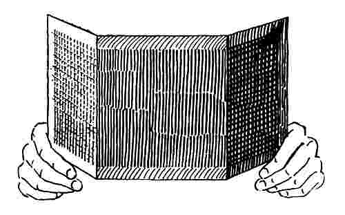
Fig. 16.
By a trial before school, in company with some other teacher
perhaps, the best positions for different parts of the room as
well as best lighting of the room may be determined in advance
and thus such a success achieved with the first experiment that
the whole idea of tint and shade may be impressed on each
child for all time and definitions firmly fixed in his mind for
these two most abused words in our every day vocabulary.
Added interest may be excited by showing similar models in
several other colors during the same lesson, thus avoiding the
possible impression on any mind that the term tint and shade
apply to any special color.
Tints and shades may also be shown very beautifully by
some kinds of colored materials. Colored satin ribbons, folded
or crumpled, and velvets and plushes give good object lessons.
One of the most effective exhibitions of tints and shades may be
found in a material used for upholstering furniture and technically
called "crushed plush," which is a worsted plush embossed
in figures and very changeable in its effects as its relation to the
light is changed, giving at the same time very light tints and
very dark shades in different portions.
Having thus shown how real tints and shades in nature are
produced, the color wheel may be introduced with advantage.
If it were practicable to use opaque colors in the school they
could be employed to show that the effect of a tint is produced
in pigments by mixing white with the standard color and a
shade by mixing black with it, but while the mixture of white
may produce the best imitations of some tints in nature, the
same result does not hold good in the use of black to form
shades, and black pigments are rarely used for this purpose,
because they impart various untruthful hues, according to the
colors with which they are mixed.
For this reason, and others which will appear later, the white
and black disks of the color wheel are found to be better than
any other single method for representing tones. In shades the
black disk produces by far the best imitation of nature, and so
does the white disk for more than half of the colors. But, as
previously stated, there is an effect which has never been satisfactorily
explained by which the tints of red and blue especially
receive an unexpected violet gray tinge by rotation.
Therefore in showing tints on the wheel it is well not to show
very light tints of red or blue until the class has received some
impressions of tones in other colors. In the orange and violet
the tints seem to be practically perfect, and in the yellow and
green not far from correct, but in the green they run a trifle
toward the blue and in the yellow become a little gray or
broken. But in the shades the black disk has done wonders
for color instruction, particularly in making standard neutral
grays which cannot be imitated by white and black pigments,
and in determining the shades of yellow, as has been explained.
See Page 36.
Therefore, after having shown actual tints and shades with
the folded models, and perhaps the other materials suggested,
place a colored disk combined with a white disk on the wheel,
and in front of them a smaller colored disk of the same color
as the larger one for comparison, and by changing the relative
proportions show various tints. Then substitute a black disk
for the white and show shades. If, for example, orange is
taken, all proportions of both tints and shades may be shown
very truthfully, the deeper shades being very rich browns.
Having in this way impressed on the children the terms tints
and shades, give them the paper tablets, Selection No. 2, in
the deepest tints and the lightest shades, reserving the lightest
tints and deepest shades found in Selection No. 4 for later use.
Let each member of the class lay the spectrum in the normal
colors and then select the six tints corresponding to the six
standards. When all of them think they have done this, tell
them to choose the corresponding shades. If a number fail in
the attempt it may be well to set up three sizes of disks on the
color wheel in shade, standard and tint of red. In showing a
tint of red with the disks it is not a good plan to make a tint
lighter than R. 95, W. 5, which is about R. T. 1. If the wheel
is not available samples of papers may be held up in the three
tones so that the class can get the correct idea. There is no
best method of reaching all pupils in any class, but in some
way at this point in color education every pupil ought to acquire
such knowledge of the subject as to be able to select at
least the six standard scales in three tones, and this should be
practically accomplished before much time is devoted to the
consideration of such materials as flowers, fabrics and miscellaneous
papers, because until the child understands both hues
and tones he can do nothing in either analyzing or naming
colors.
As soon as these six scales are familiar to the pupil the selecting
of various objects and placing them in general families
may be very valuable work, but until that time the classification
of colors cannot be carried out very accurately, or at best
the families will be very likely to include some uncles, and
cousins and aunts, and yet, on the other hand, if even the distant
relatives are recognized in preference to strangers the
choice will give evidence of a sympathetic feeling for color relations,
favorable to future progress and indicating something
of the natural color sense of the child.
If such occupations as paper cutting and pasting, or weaving
of mats have a place in the school, combinations in two or
three tones of the six standards can now be made. At this
stage names are of little importance, but they will come in play
early, as it is natural to give names to everything, and as soon
as the child knows the definite names which belong to colors
they will be used.
Immediately following the first idea of tints and shades or
tones, the grays should have attention, because in the occupations
with papers they will play an important part. For this
purpose white, black and the neutral gray papers are included
in Selection No. 2 of the paper tablets and should be made
familiar to the children while the tints and shades are being
studied. The suggestion that a neutral gray is a tint of black
or a shade of white may or may not aid a child to better understand
the relation of the neutral grays to the color chart,
but it is a thought worthy of the attention of the teacher, as expressing
a fact important in the consideration of color impressions.
This gray may also be illustrated on the wheel by the
union of white and black disks, and should be early presented
in this way, because this is the only means by which we can
secure standards for pigmentary neutral grays, and the fact
that this special and peculiar gray is so important in all color
investigation furnishes sufficient argument for making it prominent
before the other grays.
Even at this early period in his color education a child may
be shown that white in shadow is a gray, and the fact that it is
a neutral gray is not essential to him, as he has no knowledge
of any other gray and probably it may not be desirable to call
attention to the various classes of grays until after the broken
colors have been studied. A sheet of white card or heavy
paper may serve to show that white in shade or shadow is a
gray.
For this experiment fold the card or paper very sharply and
hold it with the folded edge vertical and projecting toward the
class, and in such a position relative to the windows that half
of the paper is in very full light and the other in shadow.
A comparison of neutral gray paper No. 1 with a true shade
of white or white in shadow, as explained on Page 36, will
serve to connect the gray papers with the shades of white.
After the idea of tones is made clear to the children, so that
they can readily form the six standard scales in three tones,
the completing of the Chart of Spectrum Scales in three tones
will be merely a matter of drill, as no new principles are
involved.
When the pupils can lay the Chart of Pure Spectrum Scales
in three tones correctly, the thoughtful teacher will naturally
ask herself what is the next logical step, and it may at first
seem as though the completion of the chart in five tones ought
to immediately follow. But it is very desirable that the pupils
begin as early as possible to make a practical application of
their knowledge of colors to the familiar objects around them;
and it is evident that before any very accurate comparison of
miscellaneous colors can be intelligently undertaken the child
should be able to recognize the effect of mixing gray with a
color, in distinction from the pure tints and shades of that
color.
Very few of the common colors seen in fabrics and house
furnishings are either full pure colors or their tints and shades,
but nearly all are broken colors. Therefore it seems desirable to
introduce the study of broken colors, before considering the extreme
tones of the pure colors as represented in tints and shades
No. 2 in the Chart of Pure Spectrum Scales in five tones.
This order of presentation seems specially advisable, because
the distinguishing of the extreme tones where the color is lost
to so great a degree is more difficult than anything connected
with the subject of broken colors. Therefore at this point
paper tablets, Selection No. 3 are introduced. From this collection
of tablets when properly arranged a Chart of Broken
Spectrum Scales of twelve colors in three tones may be made,
and in addition there are tablets illustrating the several classes
of grays other than neutral grays.
The first result desired is a definite distinction in the mind
of each pupil between a broken color and any tint or shade of
the same color. In order that the explanation of this distinction
shall be intelligently comprehended each child must have
such a clear idea of the meaning of the terms "tints" and
"shades" that he shall not fail to readily understand any statement
regarding them because of confusion as to the definite
meaning of these terms. The child should know clearly that
a "tint" is a color in a strong light or mixed with white either
in pigments or disks, while a "shade" is a color in shade or
shadow, i.e. with less than the normal illumination, or mixed
with black. When this has been fixed in the mind of a pupil,
and he has also been shown that neutral gray, the only gray
he has learned anything of, is the result of the combination of
white and black, it will not be difficult for him to see that a
broken color is produced by the mixture of both white and
black with the pure color. Much later it will be possible for
him to think of a broken color as a tint thrown into a shade or
shadow, as may be observed by casting a strong shade or
shadow on to a piece of colored paper in some one of the tints
of the spectrum scales.
The color wheel and tops furnish the simplest and most effective
means for the presentation of broken colors, because
they automatically analyze every color shown, so that the pupil
sees for himself just what has been done.
After having refreshed the minds of the class as to tints
and shades and grays by a brief restatement of the conditions
involved in these terms, the idea of broken colors may be shown
with disks on the color wheel or top. For this experiment
place on the spindle, for example, a combination of orange,
white and black disks, and in front of these disks put combined
orange and black disks of smaller size. Make the proportions
of the larger disks, O. 15, W. 4, N. 81, and the smaller,
O. 26, N. 74. In rotation the larger ring will show a dark
broken orange and the inner one a dark shade of orange, and
the difference in quality will be readily seen and felt. The effect
is more valuable as a lesson if the tones of the two are
nearly equal, although this is not necessary.
A very much lighter pair of colors is secured by using the
following formulas, O. 43, W. 26, N. 31, and O. 77, W. 23.
Both these experiments may be made with the primary color
wheel or color top. If the High School Color Wheel is in use
so that the four rings of color can be shown at one time, the
two larger rings may show two tones of broken color and the
smaller rings a tint and shade of pure color.
In the use of tops two may be spun at once as near together
as possible, the two broken tones on one top and the tint and
shade on another.
In green similar experiments may be tried, with the following
formulas:—
| G. 20, |
W. 6, |
N. 74. |
| G. 36, |
W. 13, |
N. 51. |
| G. 34, |
N. 66. |
|
| G. 82, |
W. 18. |
|
Practically the same methods may be adopted in the study
of broken colors as were employed with the pure colors.
The paper tablets contained in Selection No. 3, comprising
broken colors and grays, will now come into use to accompany
experiments with disks in broken colors. The tablets in the
broken spectrum colors number thirty-six, comprising twelve
scales of three tones each, thus producing but one intermediate
hue between each two standards, instead of two, as in the
chart of pure colors.
Exercises in selection and arrangement of these tablets to
form a chart may be employed to familiarize the pupils with
the new kind of colors. The colors are not so pronounced as
in the pure scales, and for this reason the arranging may be
more difficult, but the smaller number of hues simplifies it
somewhat, so that, with the better-trained color perception
which the child will have acquired at this stage, no greater effort
will be required than in the earlier lessons.
When the Chart of Broken Scales can be laid with reasonable
accuracy by the majority of the class the two charts as far
as studied, each in three tones, may be laid on the desk at the
same time for comparison and thus the difference in quality or
character emphasized.
All kinds of materials may now be considered and classified,
and great interest inspired in the subject generally. Flowers,
autumn leaves, dress goods and anything with color can be
studied and the colors analyzed. Before the study of broken
colors was taken up some few flowers could be quite accurately
matched with the disks and analyzed, but now very many more
of the flowers and plants as well as other material can be accurately
analyzed and a definite nomenclature given to each sample.
Selection No. 3 of tablets contains, in addition to the twelve
scales of broken colors, six colored grays, which must at some
stage be considered in connection with gray colors or broken
colors, to which they are closely related. As has already been
stated, there is a point where by the continued addition of gray
to a color, the color is so far obscured that its identity is practically
lost and the result becomes a colored gray.
Although the line between gray colors and colored grays cannot
be definitely drawn there are so many grades visible beyond
the point where the exact color used with the gray can
be determined, that the term "colored gray," which covers the
three classes, warm, cool and green grays, is convenient for
common use.
It is very desirable that a distinction be observed between
the terms "colored grays" and "gray colors," and therefore
broken colors may be a better term to apply to the gray colors
because a distinction is thus more strongly emphasized between
these two classes of colors.
The following table furnishes formulas from which the colors
of the Chart of Broken Spectrum Scales may be very nearly
imitated on the High School Color Wheel. Each scale should
be shown by the three smaller sets of disks, namely, the smallest
for light tone, next size for standard or medium, and the third
size for darkest tone.
This list of disk combinations is furnished here for the convenience
of teachers who may have occasion to illustrate the
compositions of the various classes of colors comprised in the
Chart of Broken Spectrum Scales, which covers the entire
range of the æsthetic colors and from which by modifications
every subdued color in material substances can be analyzed and
definitely named.
Owing to the color usually found on the interior of a school-room
and the lack of pure white light from outside it is not
probable that these proportions will exactly match the papers,
but the formulas will enable the teacher to approximate the
color, and then the more accurate match in conformity to the
conditions in each case may be secured by making changes in
accordance with suggestions from a majority of the class, an
exercise which will afford valuable practice for the pupils.
| LIGHT. |
MEDIUM. |
DARK |
| | | | |
| | | |
| | | |
| |
| RED |
| R. 68, | W. 18, | N. 14. |
| |
R. 59, | W. 5, | N. 35. |
| |
R. 22½, | W. 5, | N. 72½. |
|
| ORANGE RED |
| R. 51, | O. 17½, | W. 23, | N. 8½. |
|
R. 47, | O. 16, |
W. 8½, | N. 28½. |
|
R. 15, | O. 7½, | W. 7½, | N. 70. |
| ORANGE |
| O. 43, | W. 22½, | N. 24½. |
| |
O. 34½, | W. 10, | N. 55. |
| |
O. 15, | W. 5, | N. 79½. |
|
| YELLOW ORANGE |
| O. 23, | Y. 15, | W. 27, | N. 35. |
|
O. 24½, | Y. 17½, | W. 15, | N. 43. |
|
O. 10, | Y. 4½, | W. 6, | N. 79½. |
| YELLOW |
| Y. 34, | W. 30½, | N. 35½. |
| |
Y. 24, | W. 12½, | N. 63½. |
| |
Y. 12½, | W. 5, | N. 82½. |
|
| GREEN YELLOW |
| Y. 24, | G. 13, | W. 28, | N. 35. |
|
O. 24½, | G. 10, | W. 17, | N. 48. |
|
Y. 11, | G. 13, | W. 10, | N. 66. |
| GREEN |
| G. 16, | W. 9, | N. 75. | |
|
G. 34, | W. 19, | N. 49. | |
|
G. 23, | W. 41, | N. 36. | |
| BLUE GREEN |
| G. 8½, | B. 7½, | W. 7, | N. 77. |
|
G. 22, | B. 18, | W. 12, | N. 48. |
|
G. 24, | B. 25, | W. 23, | N. 28. |
| BLUE |
| B. 22½, | W. 6, | N. 71½. | |
|
B. 38, | W. 13, | N. 49. | |
|
B. 36, | W. 29, | N. 35. | |
| BLUE VIOLET |
| B .13, | V. 9½, | W. 6½, | N. 71. |
|
B. 13, | V. 25, | W. 15, | N. 47. |
|
B. 20, | V. 15, | W. 29, | N. 39. |
| VIOLET |
| V. 20, | W. 13, | N. 67. | |
|
V. 51, | W. 24, | N. 25. | |
|
V. 61 | W. 32, | N. 7. | |
| RED VIOLET |
| R. 17, | V. 10, | W. 5, | N. 68. |
|
R 16½, | V. 45, | W. 13, | N. 25½. |
|
R. 23, | V. 40, | W. 26, | N. 11. |
In preparing the papers for the Chart of Broken Spectrum
Colors the selection of the tones of the several colors has been
made in accordance with the æsthetic color feeling of those to
whom the matter was intrusted, but the hues of the colors are
based on the standards of the pure spectrum colors.
If these colors are considered independently of their relation
to a general system of color education, it may seem that a
stronger and purer line of colors would be more beautiful; but
the more broken or subdued colors have been chosen after very
careful consideration, because they are intended for elementary
instruction and therefore should be so far removed from the
pure color scales as to impress themselves on the minds of the
children as a distinct and representative class of colors. When
the color sense of the pupils has been sufficiently cultivated to
observe smaller distinctions, a variety of color scales much less
broken may be shown with the disks.
Different selections for a score of charts could be made, all
beautiful and representing broken colors, but after much consideration
these thirty-six were selected from a very large number
of hand-painted samples made for the purpose, as furnishing
a sufficient number of typical broken colors for elementary
color instruction, and in such hues and tones as to form a
harmonious chart for comparison with the Chart of Pure Spectrum
Scales.
When the children have advanced far enough to understand
the analysis of a color, i.e., to correctly name a color, exercises
which may be called color puzzles can be introduced from time
to time with great interest and profit.
The idea is simply to suddenly show to the class a series of
disks in rapid rotation and ask them to guess what colors it is
composed of, i.e., what the definite name of the color is.
The following is a suggestion for this exercise, supposing
that a broken green yellow is to be shown:—
Select a green, a yellow, a white and a black disk of medium
size and combine them as follows: Y.20, G.10, W.10, N.60.
Then, having previously removed the nut from the spindle of
the wheel and laid it in a convenient place, take the combined
disks and lay on the top of them any other disk of a larger
size, with the center holes of all corresponding with each other
and place all these disks on the spindle of the wheel with the
larger disk still covering the face of the others. Having previously
furnished an assistant with a sheet of cardboard of sufficient
size to conceal the disks from the class have it held in
front of the wheel while the disk which conceals the combination
is removed, the nut screwed to place and the disks put into
rapid rotation; then order the card taken away and ask the
class what color they see, still continuing the rotation.
The correct answer should be broken green-yellow, and not
a shade of green-yellow, a broken yellow-green, a tint of yellow
or a yellow shade; for there is but one true name and that
should be stated. Definite expressions of color are as possible
as the terms used regarding other scientific subjects, and should
be encouraged.
Much interest can be inspired and valuable instruction imparted
to the children by experiments with the color wheel, but
whenever color analysis is the object in view, if disks of more
than one of the standard colors are used in the same combination
they must be of colors adjacent to each other in the spectrum.
For example, if a blue and a yellow disk are united and
placed in rotation the result may be a blue gray, a yellow gray,
or perhaps very nearly a neutral gray, because blue and yellow
are so nearly complementary to each other. But a nomenclature
of the resulting color effect expressed in terms of blue and
yellow is not of practical value, because it is evident that in the
analysis of a gray-blue, yellow has no logical place. If in an
attempt to match a color which seems to be a broken blue, something
else besides the blue, white and black is required, it must
be either green or violet, i.e., one of the two standard colors adjacent
to the blue in the spectrum. In other words, every color
in nature is a spectrum color, i.e., either a pure spectrum color,
a tint or a shade of a spectrum color, or a broken spectrum
color. Hence every color can be matched, and therefore analyzed
by the combination of one disk of a standard color with
a white disk, a black disk or both, or else by two adjacent
spectrum standards with white and black or both.
There are many combinations of disks outside the limitations
above named which are valuable and interesting in color investigation
when not used for simple analysis, but if they are presented
as pleasing experiments before the pupils can understand
their logical relation to the subject of color education,
the result may be entirely misleading rather than instructive.
In making experiments in broken colors with the wheel the
most satisfactory results are secured in orange, violet, green
and yellow, while the red is fairly good and the blue less satisfactory
than the others because of the slight effect of gray or
violet which comes into the lighter tones by rotation, to which
reference has already been made.
As explained on Page 54, the so-called tertiary colors, russets,
citrines and olives were formerly supposed to be classes
of peculiar colors to which these names were given. The fact
that these are all broken spectrum colors was first demonstrated
by the use of the color wheel and they are now quite generally
accepted as such by those who have given heed to modern
methods of color instruction.
As already shown the disks have also seemed to correctly
define the several scales of colors, so that in contrast to the
color charts of a dozen years ago a distinction is clearly drawn
between the colors in the yellow and the orange scales, or even
between the yellow-orange and the orange-yellow scales, so accurately
do the disks determine the hue of a color.
When the pupils have progressed so far that they can arrange
the paper tablets to form the Chart of Pure Spectrum Scales in
three tones and also the Chart of Broken Scales, they will be
prepared to intelligently begin the use of papers in cutting and
pasting designs in the several classes of harmonies, but before
most effective results can be produced the lightest tints and
deepest shades of the full chart of pure scales in five tones
must be considered.
The entire mastery of these extreme tones will be quite difficult
because they are so far removed from the standards, and
the children can hardly be expected to recognize and name them
when seen separately. If a pupil is able to correctly arrange
them in connection with the other tones of the chart, his accomplishment
will show a high grade of color perception. But
these extreme tones are introduced because their use in the more
advanced work of paper cutting and pasting produces stronger
and more beautiful harmonies and a higher degree of color
training than would result were the tints and shades nearer the
standards in tone.
No detailed rehearsal of the lessons for this work is necessary
to enable a teacher who has pursued the course of instruction
thus far to complete it in a logical way, and relatively
little time will be required by the pupils to become sufficiently
familiar with these tones for practical purposes, because of their
more acute color perception which will be developed at this
period.
In the study of color the work of cutting and pasting designs
in educational colored papers affords the earliest and best practical
expression of the color feeling which has been acquired
and stimulates the further development of color perception.
The order in which the use of these papers can be most profitably
taken up in the occupations of cutting and pasting may
be determined by a careful consideration of the subject of harmonies
as explained quite fully in the foregoing section entitled
"Practical Experiments," Pages 67 to 73.
The first in order is Contrasted Harmony, in which cut papers
in one color may be mounted on a ground of some passive
color as white or gray. In selecting the gray, analogy is usually
preferable to contrast, while neutral gray is fairly safe
for all colors. According to this suggestion the warm grays
may be used with the warm colors and the cool grays with the
cool colors, and in a majority of the cases the lightest tone of
gray is preferable.
Without question Dominant Harmonies or the arrangement
in families are the most profitable and safe for early practice.
In this class a light tint may be used for the background on
which to mount any of the other tones of the same scale. Beyond
these two classes of harmonies the order of presentation
must be determined by the teacher. If the complementary is
attempted with simple geometrical forms a light tint may most
safely be selected for a background in the least aggressive of
the two colors and the design or pasted forms in some of the
complementary tones other than the normal color. Do not attempt
to combine full complementary colors in elementary work.
The Analogous Harmony may be used in simple designs with
beautiful effects when judicious selections are made, but owing
to the latitude necessarily involved in the definition of this class
of combinations the children cannot very early be trusted to
make their own selections.
It is evident that nothing can be attempted in the Perfected
Harmonies in any of the ready-cut forms, but beautiful results
can be produced in this class with well-drawn and accurately
cut ornamental designs in colored papers, which may even surpass
in strength and beauty any effects which can be produced
in water colors such as can be used by the children.
For earliest practice in making designs in colored papers the
ready cut forms of the kindergarten, technically called "parquetry
papers" are very convenient and may be procured either
with or without gum on the back. These are prepared in various
geometrical forms based on the one-inch standard, among
which the most useful for pasting decorative designs are the
circle, half-circle, square, half-square and equilateral triangle.
Where models and tablets are used in form study the tablets
may serve as patterns from which the children can mark out
the papers which they can then cut for themselves, and thus the
oval and ellipse may be added to the forms, and also practice
in accurate cutting secured.
In the use of tablets as patterns the outlines should be made
on the backside of the paper, by holding the tablet in place
with one finger and working carefully around it with a well-pointed
pencil. The marking to the pattern and cutting to the
line provides valuable elementary practice in manual training.
As it is the prime object of these papers to treat of color no
attempt is here made to give directions for designing units of
ornament or for folding and cutting designs. All such exercises
furnish the best possible practice in both designing and manual
work, but they belong more directly to the department of drawing
and are fully treated in the hand books explaining modern
systems of drawing. We offer here a number of simple arrangements
of such forms as may be found in ready-cut papers or may
be marked from the form study tablets as before mentioned,
with the addition of a few other figures which involve some very
simple designs for free-hand cutting.
The accompanying illustrations show a number of simple arrangements
of such forms as are found in ready-cut papers or
may be marked from the form study tablets already mentioned,
with the addition of a few other figures which include some
very simple forms requiring free-hand cutting. Suggestions
for more elaborate designs and specific directions for paper
cutting can be found in elementary books treating of decorative
drawing and those devoted solely to paper cutting.
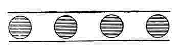 |
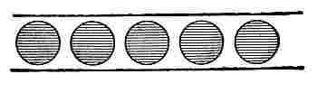 |
| Fig. 17. |
Fig. 18. |
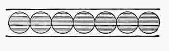 |
 |
| Fig. 19. |
Fig. 20. |
Figs. 17 to 25 show arrangements of one-inch kindergarten
parquetry papers in one color, used as units to form border
designs in contrasted harmony on a white or a gray ground, in
all of which there is repetition of form as well as color. A narrow
strip of paper in the same color as the units may be used
at top and bottom to finish the design.
 |
 |
| Fig. 21. |
Fig. 22. |
 |
 |
| Fig. 23. |
Fig. 24. |
 |
 |
| Fig. 25. |
Fig. 26. |
Figs. 26 to 37 show border designs, each of which is made
with one form in two colors or tones in alternation.
 |
 |
| Fig. 27. |
Fig. 28. |
 |
 |
| Fig. 29. |
Fig. 30. |
 |
 |
| Fig. 31. |
Fig. 32. |
 |
 |
| Fig. 33. |
Fig. 34. |
 |
 |
| Fig. 35. |
Fig. 36. |
Fig. 37.
Figs. 38 and 39 show border designs in one color, with forms
marked from the elliptical and oval tablets and cut by hand.
In Fig. 39 borders are made by combining half-squares which
may be used with or without narrow strips of the same color.
Fig. 38.
Fig. 39.
Figs. 40 and 41 are made by using one form with alternation
of tone and of position. Fig. 41 is derived from Fig. 40 by
laying the dark squares with the corners in contact and placing
the light squares over them.
Fig. 42 shows alternation of form and color or tone, which
is also the scheme employed in Fig. 43 in a design less simple
with the addition of the half-circles.
Figs. 44 and 45 show two other simple and pleasing designs
with alternation of both form and tone or color.
Figs. 46, 47, 48, and 49 comprise designs in two forms and
two tones or colors, in which some hand cutting is necessary
on the part of the pupils.
 |
 |
| Fig. 40. |
Fig. 41. |
 |
 |
| Fig. 42. |
Fig. 43. |
 |
 |
| Fig. 44. |
Fig. 45. |
Fig. 46.
Fig. 47.
Fig. 48.
Figs. 50 to 54 are rosettes made from parquetry papers
with the addition of a small circle or square at the center cut by hand.
Fig. 49.
Figs. 55 to 60 are principally hand-cut forms, and 61, 62 and 63 show surface
patterns made from parquetry squares and half-squares.
 |
 |
 |
 |
| Fig. 50. |
Fig. 51. |
Fig. 52. |
Fig. 53. |
 |
 |
 |
| Fig. 54. |
Fig. 55. |
Fig. 56. |
 |
 |
| Fig. 57. |
Fig. 58. |
 |
 |
| Fig. 59. |
Fig. 60. |
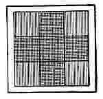 |
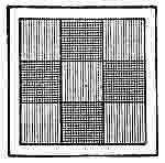 |
 |
| Fig. 61. |
Fig. 62. |
Fig. 63. |
Colored papers can be used more advantageously in decorative
designs than in imitations of natural objects, for which
water colors are much better suited, but some copies of natural
flowers and autumn leaves have been made in colored papers
which were exceedingly close imitations of water color paintings
when seen at a little distance, rivaling in the case of the
autumn leaves the best water color effects in brilliancy and
depth of color.
There need be no definite rules governing the continuation
of color study from this point by a teacher who is interested in
the subject and has tried the experiments suggested in the preceding
pages. The work will become very interesting at this
stage, because now all sorts of material may be introduced for
analysis and classification and from this point forward, to the
highest achievements of the artist, nature will furnish abundant
stimulus to color thought and investigation, if the foundation
has been laid according to the true theory of color perception
which it is the object of this system to explain.
A valuable and interesting phase of color investigation and
color training may be found in the analysis and naming of the
natural colors found in flowers, minerals and the plumage of
birds. The necessity for a definite and adequate nomenclature
which naturalists experience in this department of education
has been emphasized by the publication within a few years of
a book entitled "A Nomenclature of Colors for Naturalists,
and a Compendium of useful knowledge for Ornithologists."
This book has been prepared with great care by Robert
Ridgway of the United States National Museum, and contains
a large number of hand-painted plates showing nearly two
hundred colors which represent selections from three hundred
and fifty names of colors which are given in English, Latin,
German, French, Spanish, Italian and Norwegian or Danish.
[D]
The fact that a book involving so much technical knowledge
and the expenditure of so much time and money was deemed
justifiable is an evidence of the great need for some definite
nomenclature.
In the introduction the author says: "Undoubtedly one of
the chief desiderata of naturalists, both professional and amateur,
is a means of identifying the various shades of colors
named in descriptions, and of being able to determine exactly
what name to apply to a particular tint which it is desired to
designate in an original description. No modern work of this
character it appears, is extant,—the latest publication of its
kind which the author has been able to consult being Syme's
edition of 'Werner's Nomenclature of Colors,' published in
Edinburgh in 1821. It is found, however, that in Syme's 'nomenclature'
that the colors have become so modified by time,
that in very few cases do they correspond with the tints they
were intended to represent."
The following are the opening sentences of the preface:
"The want of a nomenclature of colors adapted particularly to
the use of naturalists has ever been more or less an obstacle to
the study of Nature; and although there have been many works
published on the subject of color, they either pertain exclusively
to the purely scientific or technical aspects of the case
or to the manufacturing industries, or are otherwise unsuited to
the special purposes of the zoologist, the botanist and the
mineralogist."
In the same book the Chapter on Principles of Color opens
with the following sentences: "The popular nomenclature of
colors has of late years, especially since the introduction of
aniline dyes and pigments, become involved in almost chaotic
confusion through the coinage of a multitude of new names,
many of them synonymous, and still more of them vague or
variable in their meaning. These new names are far too numerous
to be of any practical utility, even were each one identifiable
with a particular fixed tint. Many of them are invented
at the caprice of the dyer or manufacturer of fabrics, and are
as capricious in their meaning as in their origin; among them
being such fanciful names as 'Zulu,' 'Crushed Strawberry,'
'Baby Blue,' 'Woodbine-berry,' 'Night Green,' etc., besides
such nonsensical names as 'Ashes of Roses' and 'Elephant's
Breath.'"
These extracts from this valuable and interesting book by
an author of large experience are quoted here to emphasize the
practical necessity for more definite color education based on
analysis and nomenclature.
With the color wheel or color top, the colors of flowers and
leaves as well as all other objects in nature and art may be
analyzed and named, and the names definitely recorded in the
terms of a nomenclature based on permanent standards.
The following list of flowers and leaves of plants and trees
with their analyses in terms of our nomenclature is taken from
a recently published paper entitled "On the Color Description
of Flowers," by Prof. J. H. Pillsbury, to whom the writer is indebted
for some of the earliest suggestions regarding the practical
application of the scientific facts of color to color teaching,
and also for valuable scientific work which he has done including
the exact location of the six color standards in the
solar spectrum by their wave lengths:—
"With these standards to work from, I undertook to determine
the color analysis of certain of our common flowers. The
following results, will, I think, be interesting to botanists. The
numbers given indicate per cent. of color required to produce
the hue of the flower:—
| Common forsythia, |
F. viridissima: |
|
Pure spectrum yellow. |
| Fringed polygala, |
P. paucifolia: |
|
R. 48, |
V. 52. |
|
| Wistaria, |
W. frutescens, wings: |
|
R. 11, |
V. 89. |
|
| Wistaria, |
W. frutescens, standard: |
|
R. 9, |
V. 79, |
W. 12. |
| Flowering quince, |
Cydonia japonica: |
|
R. 95, |
V. 2, |
W. 3. |
| Wild cranesbill, |
Geranium maculatum: |
|
R. 28, |
V. 66, |
W. 6. |
The variations of color in the early summer foliage is also
interesting. The following analyses are for the upper side of
fresh and well developed healthy leaves. It is not impossible
that a little attention to these variations in the color of foliage
on the part of artists would save us the annoyance of some of
the abominable green which we so often see in the pictures of
artists of good reputation:—
| White oak: |
|
Y. 7. 5, |
G. 11 .5, |
N. 81. |
|
| Apple: |
|
Y. 5, |
G. 13, |
W. 2, |
N. 80. |
| Copper beech: |
|
R. 17, |
V. 2, |
N. 81. |
|
| Hemlock: |
|
Y. 2, |
G. 9, |
N. 89. |
|
| White pine: |
|
Y. 2. 5, |
G. 11, |
N. 86. 5. |
|
| White birch: |
|
Y. 5. 5, |
G. 11. 5, |
W. 1, |
N. 82. |
| Hornbeam: |
|
Y. 5. 5, |
G. 12. 5, |
N. 82. |
|
| Shagbark hickory: |
|
Y.4.5, |
G.9.5, |
N.86. |
|
These analyses were made in a moderately strong diffused
light with Maxwell disks of the standard hues referred to
above."
These are but a few of the numerous flowers the colors of
which may be perfectly imitated and consequently analyzed
and named with the color wheel or the top. In fact for individual
work in natural history the top is more convenient than
the wheel and sufficiently accurate for all practical purposes,
while it is a very fascinating occupation for child or adult.
In the use of disks for analyzing colors it must be remembered
that every material color is some quality of some color
in the spectrum circuit, and therefore may be matched with not
more than two standard disks, either alone or with white or
black or both. If more than two color disks, besides white and
black, are used they will neutralize each other more or less,
and a neutral gray or a gray and some spectrum color will be
the result. For example, if yellow and blue in nearly equal
parts are introduced in connection with red and orange, the
yellow and blue being nearly complimentary to each other will
produce practically a neutral gray, and the result will be the
same as if only red, orange, white and black were used.
Fig. 64.
Owing to the recent advances in the art of dyeing there are
some textile goods which are too intense in color to be exactly
imitated by the disk standards, but this fact need not prevent
a practical analysis of such colors, because by very slightly reducing
with white the color to be examined the same color is retained,
the modification making it, of course, somewhat lighter.
Fig. 64, showing a small circle representing a disk of the material
mounted on thick paper, illustrates this statement. Suppose
we have a piece of rich brown cloth, so intense in color that
when red, orange and black are combined in the proportions
of R. 22, O. 16, N. 62, the material is still a little richer in color
than can be made with the disks of the color wheel. If we introduce
a small amount of white into the brown of the material
we may hope to match it with the disks and this may be done by
cutting a bit of fairly heavy white paper in the form shown in
the diagram and loosening the nut of the color wheel slightly,
after which we insert the point of the triangle under the nut so
that when tightened the white paper may be held in front of
the brown disk, as in the illustration. Trim the outer end even
with the disk and then rotate. If the effect of the white is too
great trim off a little from the side of the white paper to make
it narrower, until a perfect match is secured.
The small disk in rotation is then of the same color but not
quite so intense as before, or in other words, is a very deep
tint of the color. In this way the Nomenclature can be recorded
as follows: Brown 95, W. 5, = R. 22, O. 16, N. 62.
This result does not often occur, but the subject is noticed
here in detail that no one may be in doubt when such cases do
come to light, as they will sooner or later.
The aniline colors give some purples which are much more
brilliant than either the violet or red which otherwise should by
combination produce them, so that with these standards they
cannot be made, but must be reduced with white, or possibly
with white and black.
If a color wheel is not available many of these experiments
may be tried on the color top, but not as satisfactorily, because
of the accuracy necessary in cutting so small a disk in a woven
material. In using the top for analysis of all ordinary colors,
the best plan is lay the material on a table or other level surface
and spin the top on it. If quite an accurate test is desired
the cardboard disk of the top may be trimmed down to the size
of the largest paper disk, so that there will be no intervening
ring of light color to separate the color of the rotating disks
from the material on which it is spun.
Practical applications of the color top are already being
made, as for example, in the selection of house furnishings. For
this purpose disks of the top are combined at home to produce
the desired colors to match the wood finishings and papers or
draperies in a partially completed room, the top being used as
a guide in preliminary selections of additional materials from
the stores.
If a number of colors are required it is convenient to use
several combinations of disks, each set being slightly gummed
together. In this way standards for various colors with a top
spindle for rotation in the salesroom may be carried in a very
small space.
As every competent artisan must understand the use for
which each implement is designed, in order to secure the best
results with it, possibly a brief explanation of the principles
on which the colors in the Bradley Educational Colored Papers
are selected and classified may be of value. In the sample
books of these colored papers there are four sections. The first
section of the book, following the title leaf called "Pure Spectrum
Scales" consists in part of the six standard colors, red,
orange, yellow, green, blue and violet, with two intermediate
hues between each two standards, which eighteen colors form
the central vertical column in the Chart of Pure Spectrum Scales
shown on Page 41.
In addition to these eighteen normal spectrum colors, there are
two tints and two shades of each, thus producing eighteen spectrum
scales of five tones, in which the normal colors as indicated
in the central column aim to be the purest possible pigmentary
expressions of the spectrum colors represented.
In determining the number of colors to adopt in the preparation
of the papers enough have been selected to furnish types
of all the colors in the spectrum, and also the hues between
red and violet, but at the same time the number has been so
restricted as to secure a reasonably simple nomenclature of the
intermediate hues. A hue of a color is defined as the result of
the admixture of that color with a smaller quantity of another
color; thus a hue of red approaching the orange is an orange
hue of red, or an orange-red. If a small amount of red is added
to orange the result is a red hue of orange, or a red-orange.
Therefore in selecting two hues between each two standards,
rather than a larger number, the simplest nomenclature possible
is secured, and one in which no mental effort is necessary to
recall the color indicated by each symbol. For example, we
have four colors indicated as R, OR, RO, O; red, orange-red,
red-orange, orange; or more extended, red, orange hue of
red, red hue of orange, orange. Thus by using as symbols familiar
terms, no effort of the memory is required to recall the
color indicated by each symbol, as would necessarily be the
case if there were a greater number of hues and therefore more
arbitrary symbols.
The use of rotating color disks on the wheel and the top by
which an infinite variety of intermediate hues can be made and
accurately named by the pupils reduces the required number
of papers to those types necessary for first primary work, and
thus prepares the child for the use of pigments at an earlier
age than would be possible without such color instruction.
The second section of the sample book contains white, black
and grays as indicated on the separating fly leaf. In these the
best pigmentary expression of black and white are furnished.
In material colors as found in industrial products, there are
various so-called blacks and whites. For black there are blue-black,
green-black, and brown-black; and in white, cream-white
and pearl-white. Cream-white is a yellow-white and
pearl-white a blue-white. In fine white papers either blue, red
or yellow is generally added to the pulp to counteract or cover
up the gray tone of the natural material. The standard black
here presented is the best possible pigmentary imitation of a
very deep black hole, as for example, the projecting end of a
large iron water or sewer pipe of considerable length buried in
the ground, which is the blackest thing known.
The white is an imitation of new-fallen snow. Neither of
these standards can be very nearly approached although we
often hear of things as "white as snow" and as "black as night."
In the same group and following the black and white are two
examples each of the four kinds of grays: Green gray, warm
gray, cool gray and neutral gray. A pure white in shadow is
the true neutral gray and a perfect imitation of this is made by
the rotation of combined black and white disks on the color
wheel. If to the black and white disks we add a blue disk we
have cool grays. With red, orange or yellow the warm grays
are produced, while the use of a green disk gives green grays.
In the papers two tones of each gray are furnished.
The papers found in the first two sections comprise all the
colors necessary for earliest primary color instruction, and
should become familiar to the children before explanation is
made of the colors in the succeeding collections.
In the third section, designated "Broken Spectrum Scales"
will be found a collection of gray colors or broken colors. As
has before been stated, a broken color is a pure color mixed
with a neutral gray. In the combination of pigmentary colors
a tint of a color is the pure color mixed with white, a shade is
the color mixed with black, and a broken color is a pure color
mixed with both black and white, which is a neutral gray.
Therefore if with red, for example, we mix a certain amount
of a given neutral gray and call that the normal tone of a broken
scale of red, for the tint in that scale we must mix with the
standard red a lighter gray and for the shade a darker gray.
When a comparatively small quantity of neutral gray is combined
with a pure color the result is a "gray color," as above
described, because the color is quite definitely retained, but
more or less modified by the gray. On the other hand, if a
relatively small quantity of color is added to a neutral gray,
the resulting color is properly called a "colored gray," because
it is still a gray modified by color, and in this class we have
warm grays, cool grays, etc., according to the color combined
with the gray. The gray colors are quite generally termed
"broken colors" and this seems a very useful practice, because
it avoids the confusion of the somewhat similar terms "gray
color" and "colored gray."
By reference to the Chart of Broken Spectrum Scales on
Page 41 it will be seen that we have only twelve scales and but
three tones in each scale, instead of eighteen scales and five
tones, as in the pure scales, for which there is a good reason.
For educational purposes in the elementary grades, which is
the only place where there is a legitimate use for colored papers,
the steps in gradation of hue or tone must not be too short,
and if the saturation or intensity of the normal colors in the
several scales is reduced by adding gray, as in the broken colors,
there is not the possibility for as many steps in either hues or
tones without leaving those colors adjacent to each other too
nearly alike. Therefore in the broken colors there are but
thirty-six, instead of ninety, as in the pure scales.
The distinction between pure colors with tints and shades,
and broken colors in various tones, should be made very plain
to the children whenever the subject is brought to their notice,
because it is a vital point in the classification of colors. Educationally
this is one of the most objectionable features in the
old red, yellow and blue theory of color composition, because
no distinction is observed between pure and broken colors in
classification. In the Bradley colored papers the distinction is
made very decided for educational purposes, so that no one
would for a moment tolerate the mixture of the normal colors
from the pure scales with the normal colors from the broken
scales in the formation of a spectrum.
This may be illustrated by a selection as follows: First lay
in order the normal spectrum colors with the pure colors found
in the first section of the sample book, thereby forming the
central vertical column of Fig. 10. Then substitute for the
orange, green and violet, those colors selected from the collection
of broken colors, and the result will seem to render the
operation absurd, but it is the same in principle as the results
produced in the attempt to form a spectrum by the combination
of three primary pigments, red, yellow and blue, because so
produced the orange, green and violet, show by disk analysis
from 54 to 80 per cent of black and white and are therefore as
much broken as the corresponding colors in the papers of the
broken scales, but not exactly the same in tone.
Those papers which are termed "Engine Colored Papers" are
so named from the process of manufacture as distinguished
from "coated papers" which comprise the first three sections
of the book. In coated papers a white paper is covered with a
coating of colored pigment "fixed" with a small amount of white
gum, gelatine or glue, and in this way the pure color of the pigment
is obtained. In the engine colored papers the color is
mixed with the paper pulp in the process of making the paper.
In a paper mill the tub or vat in which the pulp is kept stirred
up and perfectly mixed is called the engine, and hence this
technical term has been applied to such papers as are colored
in the pulp. In this class of papers both sides are alike, and
for this reason in some of the folding exercises these papers
are preferred, also because they are thinner and tougher.
Heretofore, it has been impossible to obtain engine colored papers
in "families" or scales, but in this assortment the numbers
from one to six, furnish six scales of three tones each, comprising
the normal tones with tints and shades. Following these
from seven to sixteen are a collection of unclassified colors including
grays which are much used. All these can be analyzed
and classified by the color wheel. Black and white complete
this class. It is impossible to make any close approximation
to a black in this class of papers, as when they are compared
with the coated blacks the result is a very gray black, or very
dark gray. All the colors in these papers from No. 1 A to No.
13 are quite light broken spectrum colors, but less broken than
the coated papers designated as broken spectrum colors.
While great care has been bestowed on the original selection
of the colors of all these above-described papers and every effort
is constantly exercised to keep them the same from year to
year, the subject is materially complicated by the guarantee required
of the manufacturers that no arsenic colors shall be used
in the preparation of any of the papers. This guarantee is
strictly insisted on, because, while the writer has never been
able to learn of any authentic case where a child has been injured
by the use of plated or glazed papers, he believes that the
opinions of parents and teachers should be respected in the
matter, although the arsenic colors are often the most permanent
and the aniline substitutes which are necessarily used belong
to a class which is the most fugitive of all colors.
The line of colored papers now in use is the result of many
experiments on the part of the writer and careful tests by experienced
teachers for several years, and in its present condition
affords but small indication of the time and care which has
been expended on it. This has been inevitable, because the
peculiar system on which the colors are based has been one of
growth and the papers have been designed to afford the necessary
material colors for this special scheme of instruction.
In preparing the tints and shades in the papers many experiments
have been made to determine the true effect of light and
shadow on each normal color, and then to imitate these effects
in the papers.
All this is independent of the professional tricks which artists
use to heighten their effects, some of which are legitimate, while
others may be questionable on sound principles.
It is a common habit with artists to introduce very warm effects
into all sunlight by the use of orange or yellow in the
warm colors. This extreme tendency has been intentionally
avoided in the preparation of these papers, however desirable
or allowable it may be considered in heightening effects. So
also in the shades as in the tints, the aim has been to keep all
the tones of one color in the same scale, even though artists
often run the various tones of the same piece of color into two
or three analogous scales.
It is the object of color education to train the eye to see
color wherever or however it may be produced, either by actual
color reflection or contrasted effects, and in order that these effects
may be understood as explained under Simultaneous Contrasts
it is necessary that the prepared material be truthful to
nature, the more so because these effects are sometimes greatly
exaggerated by artists.
When the subject of color was introduced into the curriculum
of the common schools of this country, the use of paints
was a novelty. So little was known regarding the possibilities
of water colors as a means of education, that the teachers may
be excused for having had grave doubts about the practicability
of the scheme. Very few teachers in the lower grades of
schools had received at that time any definite instruction in the
harmonies of colors or the manipulation of pigments; and what
little thought had been given to the subject was based on the
three-color theory of Brewster, which was the only one available
at that time.
During the intervening years much has been done to make
entirely feasible the introduction into school and kindergarten
of this pleasing and educating occupation.
Color standards have been adopted, which are nothing less
than selections from the solar spectrum itself, and the manufacture
of pigments has improved so much that it may almost
be said to be a new industry. In the training of teachers,
also, color instruction is now given an important place, so that
the kindergartner and primary teacher can give the attention
that it deserves to a subject which is so interwoven with all
that is beautiful in the material world around us.
Passing from one form of color work to another, it is exceedingly
important that children of any grade should find the
same principles obtaining in each step of the way, and also
that the knowledge gained in the earliest stages of the work
should be available in the higher forms. This is particularly
true of color instruction as it is now found in the best schools,
and the principal reason why water colors are so much better
adapted to use in the schools to-day than in former years, is
because paints are now made to correspond in color with the
standards with which the children have become familiar in the
colored papers and other material of the kindergarten.
At present it is generally conceded that these six colors, Red,
Orange, Yellow, Green, Blue and Violet, which stand out so
prominently in the solar spectrum, are pre-eminently adapted
to serve as standards and as the basis of an alphabet of color.
There should, therefore, be no question as to the adoption of
these same colors as the palette of paints for the earliest color
work, even with the babes in the kindergarten, when anything
beyond the colored papers and the usual kindergarten occupations
is wanted.
Not very long ago it was the practice to give the child a box
of colors and let him paint at random without any definite
instruction as to the relation which each color should bear to
the others. In fact, with the usual cheap box of paints then
in the market there was no decided correlation of the colors
nor any educational selection, both of which we have to-day.
Water colors are now furnished which so closely approach
the standards of the colored papers that they are of the greatest
assistance in developing the æsthetic taste and judgment
of the pupils, and it is remarkable how early in the training of
children paints can be used with advantage.
In some of the previous pages of this book we have treated of
the false theory of Sir David Brewster, who supposed that
there were three primary colors in the solar spectrum and that
all the other colors were produced by the overlapping or mixing
of these in pairs.
This error, being applied to pigments, has worked much
harm and has greatly retarded the progress of color study.
Even now some teachers recommend the use of the red, yellow
and blue palette on the ground of simplicity and economy.
All the recent scientific writers on color treat this three-color
scheme as already exploded, because the simplest as well as
the most complex experiments with colored light prove its
falsity. Nevertheless, the fact that yellow and blue, which
with light make very nearly white, do in the mixture of pigments
produce a green, has deceived many persons. But the best
green that can be so procured is a very broken color and not
to be successfully compared with the beautiful and brilliant
green of the spectrum. Why then, should we not have in our
paints imitations of the solar green, orange and violet as well
as the red, yellow and blue? It is not well to sacrifice so much
for alleged simplicity, and as for economy, it will take but a
moment's reflection to see that it would take no more paint to
cover a given surface with six colors than with three.
Oil colors, of course, are out of the question and pastels
almost equally so, for although full colors may be produced in
both these mediums, they are not suited to the use of young
children, and at best are neither neat nor convenient, while
colored pencils are not sufficiently satisfactory in results.
Therefore water colors seem to be better adapted to primary
work than any other pigmentary material.
Of necessity the pupil must later be able to recognize any
pigment he may meet and to classify it according to its color
value and also to give it a definite name, other than the one by
which it is sold.
More than one professional artist has already worked successfully
from nature in oil colors with a palette consisting of
only close approximations to the six standard colors with white
and a few grays. A person whose color perception has been
trained by the use of the color disk in six standard colors with
colored papers to correspond, will undoubtedly be able to more
truthfully reproduce the colors which he sees in nature, on the
canvas or paper by means of such a pallette than if he had been
taught by any other system and used the ordinary pigments.
The subject of color blindness has received much attention
because of its practical importance in the affairs of our daily
lives. The use of colored lights as signals on ships and railroads
has necessitated very strict regulations regarding the employment
of persons whose color vision is defective, and therefore
in some states specialists have been employed by the state
authorities to examine from time to time the school children
regarding their perception of colors.
Possibly this condition of things may not at present be considered
a serious reflection on the methods of color instruction,
or lack of such instruction in our schools because it has become
so common as to attract little attention. But if it were necessary
for the same course to be pursued in any other department
of our public education that fact would not fail to occasion very
uncomplimentary remarks regarding the methods employed.
For example, if a state official were necessary to determine
whether pupils are deaf or not after they have been through our
grammar schools, and preliminary to accepting positions of responsibility,
it would seem that something was wrong, and yet
after a child has had instruction in color according to a logical
system there should be no more necessity for an examination
regarding his ability to properly distinguish colors than there
should regarding his ability to hear.
Color blindness has quite generally been divided into three
classes, red, green, and violet blindness, those afflicted with red
blindness being most numerous, and the cases of violet blindness
being very rare, if indeed there are any which may properly
be so called.
This classification, known as the Holmgren system, seems to
have been based on the Young-Helmholtz theory that all color
perceptions are the result of three primary effects in the eye,
namely, red, green and violet, rather than on any analytical
classification of actual experiments concerning color blindness.
Color tests should be so arranged as to detect either a defect
in the brain which renders it difficult for the pupil to remember
the names of the several colors, or in the eye, by which he cannot
see a difference between two dissimilar colors.
A person totally color blind would see in the solar spectrum
a band of gray in various tones, and hence if a red and a green
should seem to be of the same tone of gray he would call both
either red or green, and after much experience would come to
give color names to various tones of gray.
Such cases, however, are exceedingly rare, if in fact they
exist. Other scientists and physiologists have doubted the truth
of the claims made by both Holmgren and Helmholtz, and some
have made extended experiments regarding color blindness
which seem to oppose the Holmgren theory. In view of these
conditions it does not seem necessary for a teacher in the elementary
grades to attempt to grasp the situation very fully, and
much less to aid in the solution of the problem. Very fortunately
this is unnecessary, because in all the scientific tests
proposed for adults nothing is accomplished which any primary
school teacher will not be easily able to determine during the
first two or three years of ordinary school work, if the modern
system of color instruction is pursued.
There is no better material than colored papers for testing
the color perceptions, and the exercises of selecting, matching
and arranging the spectrum colors by means of the small color
tablets generally in use in the first years of school are the very
best that can be devised without regard to any of the abstract
theories concerning either the cause or the possible classification
of color blindness.
For some reason the most common form of color blindness
occasions a confusion between red and green, as for example,
we are told, by some people, that in picking wild strawberries in
a field the fruit can be distinguished from the leaves and grass
only by the shape, and the green fruit from the ripe by the
touch or taste.
If a teacher discovers that a child is unable to readily give
the name of a color it may not indicate want of color vision,
but merely inability to remember names, and therefore various
tests which will naturally suggest themselves can be made to
aid in reaching a decision on this point. Should the results
of the tests seem to indicate some defect in color vision, the
nature of the trouble should be sought and memoranda made
from time to time for future reference, and if the final result
shows a radical lack of color perception the parents should be
informed of the fact and a physician consulted.
It is probable that the number of color blind women is very
much less than that of men, and much time has been spent in
debating the matter, but some doubt remains as to whether this
opinion does not obtain because the girls are brought so much
more intimately into relation with colored materials in selecting
their articles of dress, and consequently come to know the names
of colors much better, and in fact enjoy a much better color
education than the men. A more correct decision regarding
this question can better be reached when both the boys and
girls receive a systematic color education and their color sense
is more equally cultivated.
HE course of color instruction suggested in the preceding
pages is not arbitrarily divided into lessons or
even years, because the conditions in the city and rural schools
in the various states of this country are so varied that no uniform
allotment or division of time can be suggested which will
be satisfactory to all.
The number of hours that can be devoted to any subject must
be determined by those who prepare the school programme and
the progress must be more or less rapid, with instruction correspondingly
superficial or complete at each stage, according to
the time allowed, the preparation of the teacher and the natural
ability of the pupils.
The teaching of color is usually classed with drawing because
both relate directly to art, but inasmuch as color enters into our
every day experiences so much more largely than the graphic
arts there seems to be good reason for teaching it very fully
where little attention is given to drawing.
Every competent teacher can and will become expert and
even enthusiastic in teaching color, if she fully understands the
system which it is the object of the foregoing pages to explain.
The following brief outline suggests the order in which the
facts concerning color may be presented and the material which
can be used in an elementary course, beginning with the first
primary grade pupils, who for the most part have not had kindergarten
training.
As a part of the material the Bradley Educational Colored
Papers, cut to tablets each 1 x 2 inches, are prepared and put
up in four small envelopes which are enclosed in one larger
envelope. On the larger envelope these words are printed:
"The Bradley Paper Tablets for Primary Color Education,
Selections 1, 2, 3, 4 for Complete Course." The four small envelopes
are labeled in this way: "Selection No. 1, eighteen
pieces from Chart of Pure Spectrum Scales, the Normal Spectrum
Colors." "Selection No. 2, forty pieces from Chart of
Pure Spectrum Scales, Tint No. 1 and Shades No. 1, with White,
Black and Neutral Grays." "Selection No. 3, forty-two pieces
comprising complete Chart of Broken Spectrum Scales and
Warm, Cool and Green Grays." "Selection No. 4, thirty-six
pieces from Chart of Pure Spectrum Scales, Tints No. 2 and
Shades No. 2."
MATERIAL.
A Glass Prism, the cost of which need not exceed a few
cents, as almost any lamp or gas pendent in the form of a
prism will serve the purpose. By the use of such a prism a
small spectrum can be shown on the wall of any schoolroom
having a sunny exposure during any part of the day. This
spectrum will make plain the fact that sunlight is composed of
many colors.
METHOD.
Show to the pupils the best solar spectrum that can be produced
under the controlling conditions.
Call attention to the six colors, red, orange, yellow, green,
blue and violet, and the order of their arrangement in the
spectrum.
Present the colors separately as far as possible, selecting the
best conditions available for each one.
MATERIAL.
Neutral gray or white card to cover desk top for a background.
Chart of Pure Spectrum Scales.
Colored Paper Tablets, Selection No. 1, embracing the six
standards and the intermediate spectrum hues, eighteen pieces.
Color Wheel or Tops.
METHOD.
Ask the pupils to separate the six standards from the twelve
spectrum hues. Standards to be arranged in spectrum order.
Teach the names of the standards.
Test natural color perceptions by the attempts of the pupils
to lay the spectrum in the eighteen papers.
Explain the intermediate hues by the color disks, and drill
with the tablets. Continue the practice of having the pupils
lay the entire spectrum with the papers until it is familiar to
them.
PRACTICAL OCCUPATIONS.
Pasting simple designs in either of the six standard colors,
on white or gray background, with ready-cut papers. Marking
forms from tablets and cutting and pasting them on backgrounds.
MATERIAL.
Folding models to show light and shade. Crumpled satins
and plushes.
Standard color disks with white and black, on wheel or tops.
Paper tablets, Selection No. 2, Tints No. 1, Shades No. 1,
White, Black and Neutral Grays.
METHOD.
Ask each pupil to lay spectrum in eighteen normal colors.
Lay tints and shades of the six standards.
Have the children complete tints and shades No. 1 of entire
spectrum circuit.
Illustrate neutral grays by white in shadow with folding
model, also with white and black disks combined.
Begin to classify into families the miscellaneous color material
brought by the pupils.
PRACTICAL OCCUPATIONS.
Pasting of ready-cut papers in standard and shade on a
background of the tint of same scale.
Paste designs in three tones of one scale on white or neutral
gray background.
Mat weaving in tones of one scale.
Mat weaving in neutral gray and one or two tones of one
color.
MATERIAL.
Disks on wheel or top. Paper tablets, Selection No. 3.
Chart of Broken Spectrum Scales.
METHOD.
Illustrate broken colors by disk combinations.
Let the pupils lay paper tablets to form Chart of Broken
Scales.
Compare this chart with the Chart of Pure Scales laid with
the papers.
Classifying of miscellaneous materials with reference to pure
and broken colors. Analysis of samples of pure and broken
colors in cloths and flowers.
PRACTICAL OCCUPATIONS.
Paper cutting and pasting to be continued.
Following the broken colors in three tones which form the
Chart of Broken Spectrum Colors, the three kinds of colored
grays, warm, cool and green, may be considered preparatory
to their use in contrasted effects.
MATERIAL.
Paper tablets, Selection No. 4. Chart of Spectrum Scales
in five tones may be introduced for observation when the children
are able to lay it with their papers.
METHOD.
Continue the study of tones with pure spectrum scales in
five tones, as was done in the first three tones.
From the Chart of Spectrum Scales the study and classification
of harmonies can begin in a simple way.
From this time on free-hand paper cutting and pasting may
be introduced at pleasure, employing the colored papers in five
tones when required.
By taking advantage of the instruction imparted in a course
of color study such as has been outlined in the preceding pages
the pupil will be able to advance in his ability to perceive colors
and to make definite analyses of colors in natural and manufactured
material. In this way the advanced study of harmonies
can be greatly facilitated so that it will be possible for the
student to apprehend and appreciate many delicate and subtle
color effects in art and nature never before imagined. In fact
the foundation of color study will have been laid in such a
logical and fascinating manner that its further advance will be
but a pleasure to the pupil and teacher, so that no arbitrary
plan will be necessary, because so many lines of work will suggest
themselves to all who are interested in the subject.
This outline would not be complete without a reference to
water colors, but this is not the place to give definite instructions
as to their use. Kindergartners and primary teachers
are now generally competent to direct the children in this work,
if they will avail themselves of such aid as is furnished by
recently published books on the subject.
Non-poisonous paints, cheap and still of fair quality, can
now be obtained in standard colors and put up in various forms.
The moist paints in collapsible tubes are the most convenient
as well as the most economical for school use. This form
should be accompanied by a small mixing palette containing
several compartments, which can be bought at so small a price
that each pupil can have one. The paint in the tubes can then
be dealt out only as required for each day's use.
Where the price is preceded by a star the article is too large to
be sent by mail. In other cases where no postage is given the goods
are sent postpaid on receipt of price.
WATER COLORS.
In ordering it will be necessary to give only the number of the box.
| No. |
Price. |
Postage. |
1. An enameled box containing eight pans of semi-moist
colors, six Standards and two Grays, one brush, per box |
$ .35 |
|
2. An enameled box containing ten pans semi-moist
colors, six Standards, Black, White, Cool Gray
and Warm Gray, one brush, per box |
.50 |
|
3. Same box as above, containing five pans semi-moist
colors. Red, two Yellows, Blue and Gray, one brush, per box |
.30 |
|
4. Enameled box containing four pans semi-moist
colors, Red, Yellow, Blue and Gray, one brush, per box |
.20 |
|
| 5. Same as above, Red, two Yellows and Blue, per box |
.20 |
|
6. A decorated box containing eight cakes of dry
colors, six Standards and two Grays, one brush, per box |
.25 |
|
7. A decorated box containing four large cakes of
dry colors. Red, Yellow, Blue and Gray, one brush, per box |
.20 |
|
8. Same box as above. Red, two Yellows and Blue, two brushes,
per box |
.20 |
|
9. Nine tubes moist colors in strong paper box.
Six Standards, Warm Gray, Cool Gray and Black, per set |
.90 |
|
10. Photograph Colors. A box of eight colors, the
six Standards and a Chinese White and a Brown,
with one brush. These colors are expressly prepared
for coloring photographs, half tone prints, maps, etc. |
.25 |
|
| Bradley's School Colors, moist in Tubes. The most
economical form for school use. These colors are
so prepared that they remain moist out of the
tube. The set comprises the following colors:
Carmine, Crimson Lake, Vermilion, Gamboge,
Chinese Yellow, Hooker's Green, No. I, Hooker's
Green, No. II, Ultramarine, Prussian Blue, Sepia,
Warm Sepia, Burnt Sienna, Payne's Gray, Ivory
Black, Chinese White and the six Standards,
with Warm, Cool and Neutral Gray, Black and
White, per tube |
.10 |
|
| Little Artist's Complete Outfit, comprising a Mixing
Palette with its seven compartments filled with
semi-moist colors and a brush, the whole enclosed
in a strong cardboard case |
.15 |
.03 |
|
| Standard Mixing Palette, with seven compartments
for paints and two for mixing. Almost indispensable
in using tube colors. Extra deep,
per doz. |
.60 |
.25 |
| Water Cups. An enameled metal cup, practically indestructible, per doz. |
.60 |
.13 |
| Camel's Hair Brushes, Quill, per doz. |
.30 |
.02 |
| Camel's Hair Brushes, Long Handles, per doz. |
.60 |
.03 |
| Japanese School Brushes, per doz. |
.60 |
.05 |
| Artists' Camel Hair Brushes, No. 6, Wooden Handles, per doz. |
.75 |
.03 |
| Milton Bradley Co.'s Water Color Pads—Made of
extra quality paper for water color work. |
|
|
| No. 1, Pad of 50 sheets, 6x9, each |
.10 |
.09 |
| No. 2, Pad of 25 sheets, 9x12, each |
.10 |
.10 |
|
| High School Color Wheel, with Disks in box |
*10.00 |
|
| One set of Disks for above, in box |
*2.00 |
|
| Primary School Color Wheel, with Disks |
*3.00 |
|
| One set of Disks for above in portfolio |
.75 |
.06 |
| Color Top, by mail, each |
.06 |
|
| Color Top, by mail, per doz. |
.50 |
|
| No. 1 Prism, at buyer's risk |
.10 |
|
| No. 2 Prism, at buyer's risk |
.15 |
|
| No. 3 Prism, at buyer's risk |
.30 |
|
| Rainy Day Spectrum, made from colored papers,
mounted on cardboard, 1" x 13", each |
.10 |
.04 |
| Large Spectrum, 5" x 30", mounted on cloth, each |
.25 |
.04 |
| Chart of Pure Spectrum Scales, No. 1 X, on cardboard,
9" x 24", hinged and folded. Ninety
papers one inch square, each |
.50 |
.10 |
| Chart of Pure Spectrum Scales, No. 2 X. Size,
12"x48", folded and hinged. Ninety papers two inches square, each |
.75 |
.15 |
| Chart of Broken Spectrum Scales, No. 1. Size, 9"x12",
with paper 1-1/2 inches square, comprising twelve scales of three tones each |
.50 |
.10 |
| Chart of Broken Spectrum Scales, No. 2. Size,
12"x48", with the same papers as No. 1, three inches square, each |
.75 |
.15 |
| Chart of Complementary Colors. On cardboard 18 inches square, each |
*.50 |
|
| Standard Color Chart. On two cards 11x28 inches,
hinged and eyeleted for hanging. This is a combination
chart comprising "Spectrum Standards,"
"Pure Spectrum Scales," "Complementary
Contrasts," "Broken Spectrum Scales," and
"Grays." Printed suggestions for using the
charts on the back, each |
1.25 |
.15 |
|
| Water Colors in the Schoolroom, by Milton Bradley, boards |
.25 |
|
A new book of practical suggestions, valuable to every one
who would undertake to teach the use of water colors. |
|
|
| Elementary color, by Milton Bradley, cloth |
.75 |
|
Gives the principles on which the Bradley System is based
and an explanation of the use of the Glass Prism, Color Wheel,
Maxwell Disks, Color Top, Colored Papers, Color Charts and Water Colors. |
|
|
| The Little Artist by Marion Mackenzie, cloth |
.75 |
.15 |
A practical book of water color work for children,
with 12 beautiful, colored plates. Size of book, 12x14 inches. |
|
|
| Color in the Kindergarten, by Milton Bradley, paper covers |
.25 |
|
A manual of the theory of color and the use of
color material in the Kindergarten. |
|
|
A Class Book of Color, by Prof. Mark M. Maycock.
Teachers' Edition, cloth |
1.00 |
|
| Pupils' Edition, boards |
.50 |
|
| A very complete teachers' handbook in color. |
|
|
| Practical Color Work, by Helena P. Chace, paper |
.25 |
|
A handbook for the educational use of colored
papers in teaching color in primary and ungraded schools. |
|
|
The Color Primer, by Milton Bradley, paper.
Teachers' Edition, 80 pages
|
.10 |
|
| Pupils' Edition, 24 pages |
.05 |
|
| Simple and direct teachings. |
|
|
|
| Paper Tablets, Set No. 1, 1x2 in. |
.02 |
|
| Paper Tablets, Set No. 2, 1x2 in. |
.02 |
|
| Paper Tablets, Set No. 3, 1x2 in. |
.03 |
|
| Paper Tablets, Set No. 4, 1x2 in. |
.04 |
|
| Sample Book, one by four inches, containing the full assortment |
.05 |
.01 |
| Package, 4x4 papers, 100 pieces |
.20 |
.04 |
| Package, 5x5 papers, 100 pieces |
.30 |
.05 |
Fun, Physics and Psychology in Color.
A box of material for simple experiment, each |
.25 |
.07 |
Complementary Color Contrasts. A box of
large material for popular experiments in color vision, each |
.75 |
.20 |
The Dunn and Curtis Illustrative Sewing Cards, in color.
Two sets: A. Literature Illustration.
B. Cards for Special Occasions. |
|
|
| Set of eight cards |
.25 |
|
| Dozen of any Design |
.40 |
|
|
|