By E. Gordon Duff
The art of the wood-engraver may almost be said
to have had no existence in England before the
introduction of printing, for there are not probably
more than half a dozen cuts now known, if indeed
so many, that are of an earlier date. The few that
exist are devotional prints of the type known as
the 'Image of Pity,' in which a half-length figure
of Christ on the cross stands surrounded with the
emblems of the Passion.
It may be taken, I think, for granted that at the
time Caxton set up his press at Westminster, that
is, in the year 1476, there was no wood-engraver
competent to undertake the work of illustrating his
books. We see, for instance, that in the first
edition of the Canterbury Tales there are no woodcuts,
while they appear in the second edition; and
it is not likely that Caxton would have left a book
so eminently suited for illustration without some
such adornment had the necessary craftsmen been
available. As it was, it was not till 1480 that
woodcuts first appeared in an English printed book,
the Mirror of the World. In this there are two
series of cuts. One, consisting of diagrams, is
found in most of the MSS. of the book; the other,
which represents masters teaching their scholars
or at work alone, was a new departure of Caxton's.
It is quite probable that they were intended for
general use in books, indeed we find some used in
the Cato, but they do not appear to have been
employed elsewhere. The diagrams are meagre
and difficult to understand, so much so that the
printer has printed several in their wrong places.
The necessary letterpress occurring within them is
not printed (Caxton had not then a small enough
type), but is written in by hand, and it is worth
noticing that this is done in all copies in the same
hand, and so must have been done in Caxton's office,
some are fond enough to suppose by Caxton himself.
In the next year appeared the second edition of
the Game of Chesse, with a number of woodcuts.
The first edition, printed at Bruges by Caxton and
Mansion, had no illustrations. The cuts are coarsely
designed and roughly cut, but serve their purpose;
indeed, they are evidently intended as illustrations
rather than ornaments. Some controversy has at
different times arisen as to whether these cuts were
executed in England or abroad, but Mr. Linton
has very justly decided in favour of England. The
work, he says, is so poor that any one who could
hold a knife could cut them, therefore there was no
necessity to send abroad.
About 1484 we have two important illustrated
books, the Canterbury Tales and the Æsop; the
former with 28 illustrations, the latter with 186.
The cuts of the Canterbury Tales depict for the
most part the various individuals of the Pilgrimage,
and there is also a bird's-eye view of all the pilgrims
seated at an immense round table at supper, which
was used afterwards by Wynkyn de Worde for the
'Assembly of Gods.' The copies of German cuts in
the Æsop, with the exception of the full-page frontispiece
(known only in the copy in the Windsor Library),
are smaller, and are the work of two, if not three,
engravers. One cut seems to have been hurriedly
executed in a different manner to the rest, perhaps
to take the place of one injured at the last moment.
It is not worked in the usual manner with the outlines
in black—i.e. raised lines on the wood-block,
but a certain amount of the effect has been produced
by a white line on a black ground—i.e. by
the cut-away lines of the wood-block.
The Golden Legend, which was the next illustrated
book to appear, contains the most ambitious woodcuts
which Caxton used. Those in the earlier part
are the full width of a large folio page, and show,
especially in their backgrounds, a certain amount of
technical skill. The later part of the book contains
a number of small cuts of saints very coarsely executed,
and the same cut is used over and over again
for different saints.
In 1487 Caxton first used his large woodcut device,
which is probably, though the contrary is often
asserted, of English workmanship. It is entirely un-French
in style and execution, and was probably
cut to print on the Missal printed by Maynyal for
Caxton in order that the publisher might be brought
prominently into notice.
About this time (1487-88) two more illustrated
books were issued,—the Royal Book and the Speculum
Vite Christi. The series cut for the Speculum
are of very good workmanship, though the designs
are poor, but all of them were not used in the book.
One or two appear later in books printed by W.
de Worde, manifestly from the same series. The
Royal Book contains only seven cuts, six of which
are from the Speculum. Some of the cuts occur
also in the Doctrinal of Sapience and the Book of
Divers Ghostly Matters.
It is impossible not to think when examining
Caxton's books that the use of woodcuts was rather
forced upon him by the necessities of his business,
than deliberately preferred by himself. He seems to
have wished to popularise the more generally known
books, and only to have used woodcuts when the
book absolutely needed them. He did not, as some
later printers did, simply use woodcuts to attract
the unwary purchaser.
What cuts Caxton possessed at the end of his
career it is hard to determine. The set of large
Horae cuts which W. de Worde used must have been
Caxton's, for we find one of them, the Crucifixion,
used in the Fifteen O'es, which was itself intended as
a supplement to a Horae, now unknown. In the
same way there must have been a number of cuts
for use in the 8vo Horae, but as that is known only
from a small fragment, we cannot identify them.
From similarity of style and identity of measurement
we can pick out a few from Wynkyn de
Worde's later editions, but many must be passed
over.
On turning to examine the presses at work at
the same time as Caxton's one cannot but be struck
by the scarcity of illustrations. Lettou and Machlinia,
though they produced over thirty books, had
no ornaments that we know of beyond a border
which was used in their edition of the Horae ad
usum Sarum, and passed into the hands of Pynson.
They seem to have been without everything except
type, not having even initial letters.
The St. Alban's press was a step in advance. A
few cuts were used in the Chronicles, and the Book
of St. Alban's contains coats of arms, produced by a
combination of wood-cutting and printing in colour.
The Oxford press was the most ambitious, and
was in possession of two sets of cuts, in neither
case intended for the books in which they were
used. One set was prepared for a Golden Legend,
but no such book is known to have been issued at
the Oxford press. One of these cuts appears as
a frontispiece to Lyndewode's Constitutions. It represents
Jacobus de Voragine writing the Golden
Legend, so that it did equally well for Lyndewode
writing his law-book. Others of the series are
used in the Liber Festialis of 1486, but as that was
a small folio and the cuts were large, the ends were
cut off, and they are all printed in a mutilated
condition. The other cuts used in the Festial
are small, and form part of a set for a Horae, but
no Horae is known to have been printed at the
Oxford press. It would be natural to suppose in
this case that these cuts had been procured from
some other printer who had used them in the production
of the books for which they were intended;
but the most careful search has failed to find them
in any other book. Besides these cuts the Oxford
press owned a very beautiful border, which was
used in the commentary on the De Anima of Aristotle
by Alexander de Hales and the commentary
on the Lamentations of Jeremiah by John Lattebury,
printed in 1481 and 1482. The printers
owned nothing else for the adornment of their
books but a rudely cut capital G, which we find
used many times in the Festial.
The poverty of ornamental letters and borders is
very noticeable in all the English presses of the
fifteenth century. Caxton possessed one ambitious
letter, a capital A, which was used first in the Order
of Chivalry, and a series of eight borders, each made
up of four pieces, and found for the first time in the
Fifteen O'es. They are of little merit, and compare
very unfavourably with French work of the period.
The best set of borders used in England belonged
to Notary and his partners when they started in
London about 1496. They are in the usual style,
with dotted backgrounds, and may very likely
have been brought from France. Pynson's borders,
which he used in a Horae about 1495, are much
more English in style, but are not good enough to
make the page really attractive; in fact almost
the only fine specimens of English printing with
borders are to be found in the Morton Missal,
which he printed in 1500. In this book also there
are fine initial letters, often printed in red. It is
hard to understand why, as a rule, English initial
letters were so very bad; it certainly was not
from the want of excellent models, for those in
the Sarum missals, printed at Venice by Hertzog
in 1494, and sold in England by Frederic
Egmont, contain most beautifully designed initials,
as good as can be found in any early printed
book.
Wynkyn de Worde, when he succeeded in 1491
to Caxton's business, found himself in possession
of a large number of cuts, a considerably larger
number than ever appeared in the books of Caxton's
that now remain to us. The first illustrated book
he issued was a new edition of the Golden Legend, in
which the old cuts were utilised. This was printed
in 1493. In 1494 a new edition of the Speculum
Vite Christi was issued, of which only one complete
copy is known, that in the library at Holkham. It
probably contains only the series of cuts used by
Caxton in his edition, for the few leaves to be found
in other libraries have no new illustrations. About
the same time (1494) De Worde issued several editions
of the Horae ad usum Sarum, one in octavo
(known from a few leaves discovered in the binding
of a book in the library of Corpus Christi College,
Oxford) and the rest in quarto. In the quarto
editions we find the large series of pictures, among
which are the three rioters and three skeletons,
the tree of Jesse, and the Crucifixion, which occur
in Caxton's Fifteen O'es. It is extremely probable
that all the cuts in these editions had belonged
to Caxton. The two cuts in the fragment of
the octavo edition, however, are of quite a different
class, evidently newly cut, and much superior in
style and simplicity to Caxton's. It is much to be
regretted that no complete copy of the book exists,
for the neat small cuts and bold red and black
printing form a very tasteful page.
A curious specimen of engraving is to be found
in the Scala Perfectionis, by Walter Hylton, also
printed in 1494. It represents the Virgin and
Child seated under an architectural canopy, and
below this are the words of the antiphon beginning,
'Sit dulce nomen d[=n]i.' These words are not
printed from type, but cut on the block, and the
engraver seems to have treated them simply as
part of the decoration, for many of the words
are by themselves quite unreadable and bear only
a superficial resemblance to the inscription from
which they were copied.
An edition of Bartholomaeus' De proprietatibus
rerum issued about this time has a number of cuts,
not of very great interest; and the Book of St. Albans
of 1496 has an extra chapter on fishing, illustrated
with a picture of an angler at work, with a tub, in
the German fashion, to put his fish into. It has also
a curiously modern diagram of the sizes of hooks.
In 1498 De Worde issued an illustrated edition of
Malory's Morte d'Arthur. The cuts are very ambitious,
but badly executed, and the hand of the
engraver who cut them may be traced in several
books. In 1499 an edition of Mandeville was
issued, ornamented with a number of small cuts,
and about this time several small books were issued
having cuts on the title-page.
Richard Pynson's first illustrated book was an
edition of the Canterbury Tales, printed some time
before 1492. At the head of each tale is a rudely
executed cut of the pilgrim who narrates it. These
cuts were made for this edition, and were in some
cases altered while the book was going through the
press to serve for different characters: the Squire
and the Manciple, the Sergeant and Doctor of
Physic, are from the same blocks with slight alterations.
In 1494 came an edition of Lydgate's
Falle of Princis, a translation from the De Casibus
virorum et feminarum illustrium of Boccaccio,
illustrated with the cuts used by Jean Dupré
in his Paris edition of a French version of the
same work in 1483. One of the neatest of these,
depicting Marcus Manlius thrown into the Tiber,
is here shown. About 1497 an edition of the
Speculum Vite Christi was issued, with a number of
neatly executed small cuts, and in 1500 Pynson
printed the beautiful Sarum Missal, known as the
Morton Missal. Special borders and ornaments,
introducing a rebus on the name of Morton, were
engraved for this, and a full-page cut of the prelate's
coat of arms appears at the commencement
of the book.
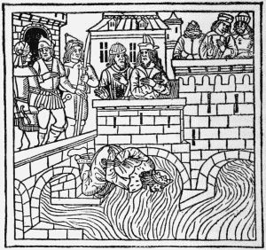 The Death of Marcus Manlius. From Lydgate's The Falle of
Princis, Pynson, 1494. (Reduced.)
The Death of Marcus Manlius. From Lydgate's The Falle of
Princis, Pynson, 1494. (Reduced.)
After the year 1500 almost every book issued by
W. de Worde, who was pre-eminently the popular
publisher, had an illustration on the title-page.
This was not always cut for the book, nor indeed
always very applicable to the letterpress, and the
cuts can almost all be arranged into series made
for more important books. There were, however,
a few stock cuts: a schoolmaster with a gigantic
birch for grammars, a learned man seated at a
desk for works of more advanced scholarship, and
lively pictures of hell for theological treatises. The
title-page was formed on a fixed plan. At the
top, printed inside a wood-cut ribbon, was placed
the title, below this the cut.
Pynson, who was the Royal printer, and a publisher
of learned works, disdained such attempts
to catch the more vulgar buyers. His title-pages
rarely have cuts, and these are only used on such
few popular books as he issued. Both he and De
Worde had a set of narrow upright cuts of men and
women with blank labels over their heads, which
could be used for any purpose, and have the names
printed in type in the label above.
Foreign competition was also at this time making
its influence felt on English book-illustration. W.
de Worde had led the way by purchasing from
Godfried van Os, about 1492, some type initial
letters, and at least one woodcut. Pynson, early
in the sixteenth century, obtained some cuts from
Vérard, which he used in his edition of the Kalendar
of Shepherdes, 1506, and Julian Notary, who began
printing about 1496, seems to have made use of
a miscellaneous collection of cuts obtained from
various quarters. He had, amongst other curious
things, part of a set of metal cuts executed in the
manière criblée, which have not been traced to any
other book, but appear to have passed at a considerably
later date into the hands of Wyer, who
commenced to print before 1524. When W. de
Worde left Westminster in 1500 to settle in Fleet
Street, he parted with some of his old woodcuts
to Notary,—woodcuts which had been used in the
Horae of 1494, and had originally belonged to
Caxton. All these miscellaneous cuts appear in
his Golden Legend of 1503, and the large cut of the
'Assembly of Saints' on the title-page seems also
to have been borrowed. It was used by Hopyl
at Paris in 1505 for his edition of the Golden Legend
in Dutch, and passed afterwards with Hopyl's
business to his son-in-law Prevost, who used it in
a theological work of John Major's. The engraved
metal ornamental initials were obtained from André
Bocard.
Some time before 1510 an extremely curious
book, entitled the Passion of our Lorde Jesu, was
printed abroad, probably in Paris. The uncouthness
of the language seems to have brought about
its destruction; for, though many fragments have
been found in bindings, only one perfect copy,
now in the Bodleian, is known. It contains a
number of large cuts of a very German appearance
and quite unlike any others of the period. Some
are used also in the York Manual printed for De
Worde in 1509.
About this time too a number of popular books
in English, some adorned with rude woodcuts, were
issued by John of Doesborch, a printer in Antwerp.
Among them may be mentioned The wonderful
shape and nature of man, beasts, serpents, &c., the
Fifteen Tokens, the Story of the Parson of Kalenbrowe,
and the Life of Virgilius. A still earlier
Antwerp cut, which had been used by Gerard Leeu
for the title-page of his English Solomon and Marcolphus,
found its way to England and was used
by Copland.
In the last years of Henry VII.'s reign, from 1501
to 1509, a few books may be mentioned as particularly
interesting from their illustrations. In
1502 De Worde printed the Ordinary of Chrysten
Men, a large book with a block-printed title. It
was reprinted in 1506. In 1503 appeared the
Recuyles of ye Hystoryes of Troye, a typical example
of an illustrated book of the period. There are
about seventy cuts of all kinds, of which twelve
were specially cut for the book: many others were
used in the Morte d'Arthur, and the rest are miscellaneous.
In 1505 we have the 'Craft to live and
die well,' of which there is another edition in the
following year. In 1506 appears the Castle of
Labour, one of the few books entirely illustrated
with cuts specially made for it; in 1508 the
Kalendar of Shepherdes. The cuts in these last
three books were all ultimately derived from French
originals. An edition of the Seven Wise Masters of
Rome, of which the only known copy is imperfect,
appeared about 1506, though the cuts which illustrate
it were made before 1500. The fragment
contains seven cuts, but the set must have consisted
of eleven. They are very careful copies of those
used by Gerard Leeu in his edition of 1490, and
have lost none of the feeling of the originals.
Three books only of Pynson's production during
this period call for special notice. About 1505 he
issued an edition of the Castle of Labour, with very
well-cut illustrations closely copied from the French
edition. In 1506 appeared his edition of the
Kalendar of Shepherdes, which is illustrated for the
most part with cuts obtained from Vérard, and
in 1507 an edition of the Golden Legend. Of each
of these books but one copy is known.
For some unknown reason, the accession of
Henry VII. acted in the most extraordinary way
upon the English presses, which in that year issued
a very large number of books. Perhaps the influx
of visitors to London on that occasion made an
unusual demand; but at any rate a number of
popular books were then issued. Amongst them
are Rychard Cuer de Lyon, the Fiftene Joyes of
Maryage, the Convercyon of Swerers, the Parliament
of Devils, and many others. Besides these there
were, of course, a number of funeral sermons on
Henry VII., many of which have curious frontispieces.
One of these was used again a little later,
for the funeral sermon of the King's mother, the
Lady Margaret, the royal pall and effigy on it
being cut out and replaced by an ordinary pall.
This method of inserting new pieces into old blocks,
technically termed plugging, was not much used at
this period when wood-engraving was so cheap.
An excellent example, however, will be found in
the books printed for William Bretton, which contain
a large coat of arms. A mistake was made
in the cutting of the arms, and a new shield was
inserted, the mantling and supporters being untouched.
Another notable book of that period is
Barclay's Ship of Fools, issued by Pynson in 1509.
It contains one hundred and eighteen cuts, the
first being a full-page illustration of the printer's
coat of arms. The rest are copies, roughly executed,
of those in the original edition. Another
version of this book, translated by Henry Watson,
was issued the same year by Wynkyn de Worde.
It is illustrated with a special series of cuts, which
are used again in the later editions. Of the original
edition of 1509 only one copy is known, printed on
vellum and preserved in the Bibliothèque Nationale.
Stray cuts from this series are found in several of
De Worde's other books, but may be at once
recognised from the occurrence of the 'fool' in his
typical cap and bells.
About this time and a little earlier the title was
very often cut entire on a block. The De Proprietatibus
of c. 1496 contains the first and the most
elaborate specimen, in which the words 'Bartholomeus
de proprietatibus rerum' are cut in enormous
letters on a wooden board; indeed the whole block
was so large that hardly any copy contains the
whole. Faques, Pynson, and others used similar
blocks, in which the letters were white and the
background black (one of Pynson's printed in red
is to be found in the Ortus Vocabulorum of 1509),
but their uncouthness soon led to their disuse.
Numbers of service books were issued by Pynson
and Wynkyn de Worde, profusely illustrated with
small cuts, most of which appear to have been of
home manufacture, though unoriginal in design.
It is worth noticing one difference in the cuts of
the two printers. Pynson's small cuts have generally
an open or white background, De Worde's
are, as a rule, dotted in the French style. Since in
some of their service books these two printers used
exactly similar founts of type the identification of
their cuts is of particular value. But these service
books almost from the first began to deteriorate.
The use of borders was abandoned, and little care
was given to keeping sets of cuts together, or using
those of similar styles in one book. We find the
archaic cuts of Caxton, the delicate pictures copied
from French models, and roughly designed and
executed English blocks all used together, sometimes
even on the same page. The same thing is
noticeable in all the illustrated books of the period.
De Worde used Caxton's cuts up to the very end of
his career, though in many cases the blocks were
worm-eaten or broken. The peculiar mixture of
cuts is very striking in some books. Take as an
example the edition of Robert the Devil, published
about 1514. No cut used in it is original: one is
from a book on good living and dying, another
from the Ship of Fools,[22] a third is from a devotional
book of the previous century, and so on. In the
Oliver of Castile of 1518, though there are over
sixty illustrations, not more than three or four
are specially cut for it, but come from the Morte
d'Arthur, the Gesta Romanorum, Helias Knight of
the Swan, the Body of Policy, Richard Cuer de Lion,
the Book of Carving, and so on, and perhaps many
are used in several. Indeed, W. de Worde minded
as little about using the same illustrations over and
over again as some of our modern publishers.
For all books issued in the early years of the sixteenth
century it was thought necessary to have at
least an illustration on the title-page, so that practically
an examination of the illustrated books of
the period means almost an examination of the
entire produce of the printing press. In time,
when the subject has been thoroughly studied, it
will be possible to separate all the cuts into series
cut for some special purpose.
A rather important influence was introduced
into the history of English book illustration about
1518, when Pynson obtained a series of borders
and other material, closely imitated from the
designs made by Holbein for Froben.[23] They
are the first important examples of 'renaissance'
design used in English books, and their effect was
rapid and marked. Wynkyn de Worde, who in his
devices had hitherto been content to use Caxton's
trade-mark with some few extra ornaments, introduced
a hideous parody of one of Froben's devices,
poor in design, and wretched in execution. The
series of borders used by Pynson were good in execution,
and their style harmonised with the Roman
type used by him at that time, but with other books
it was different. The heavy English black letter
required something bolder, and unless these borders
were heavily cut, they looked particularly meagre.
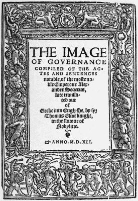
A very beautiful title-page of this type (here somewhat
reduced) is that in Sir Thomas Elyot's Image
of Governance, printed by Thomas Berthelet at
London in 1540-41.
The illustrated books of this period offer a curious
mixture of styles, for nothing could be more opposed
in feeling than the early school of English cuts and
the newly introduced Renaissance designs. The
outsides of the books underwent exactly the same
change, for in place of the old pictorial blocks with
which the stationers had heretofore stamped their
bindings, they used hideous combinations of medallions
and pillars.
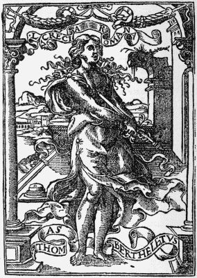 Device of Thomas Berthelet.
The device of Berthelet is an excellent specimen
of the new style. Despising good old English names
and signs, he carried on business at the sign of
Lucretia Romana in Fleet Street, and his device depicts
that person in the act of thrusting a sword into
her bosom. In the background is a classical landscape,
and on either side pillars. Above are festoons,
and on ribbons at the head and feet of the
figure the name of the printer and of his sign.
Though the cut is uninteresting it is a beautiful
piece of work.
Another result of the new movement was the
banishment of woodcuts from the title-page. Those
to Pynson's books have already been noticed, but
lesser printers like Scot, Godfrey, Rastell, and
Treveris also made use of borders of classical
design, and gave up the use of woodcuts. It is
extremely curious to notice what excellent effects
on a title-page the printers at this time produced
from the poorest materials. They seem to have
understood much better than those of a later date
how to use different sized type with effect, and to
make the whole page pleasing, without attracting
too much attention to one particular part.
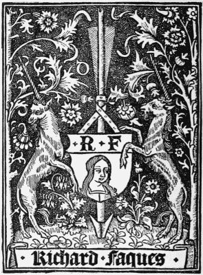 Device of Richard Faques.
Before leaving this early period it will be as
well to return a little, and briefly notice some of
the more marked illustrated books produced by
printers other than Pynson and De Worde. The
two printers of the name of Faques, Guillam and
Richard, produced a few most interesting books,
and the device of the last named, founded on that
of the Paris printer, Thielman Kerver, is a fine
piece of engraving. The name was originally cut
upon the block as Faques, and was so used in his
two first books; but in order to make the name
appear more English in form, the 'ques' was cut
out and 'kes' inserted in type. The last dated
book which he printed, the Mirrour of Our Lady
of 1530, contains several fine illustrations; that
on the reverse of the title-page depicting a woman
of some religious order writing a book, has at the
bottom the letters E. G. joined by a knot, which
may be the initials of the engraver.
The Cambridge press of 1521-1522, from the
scholastic nature of its books, required no illustrations,
but it used for the title-page of the Galen
a woodcut border, rather in the manner of Holbein,
but evidently of native production. In 1536 this
border reappears in a Dutch Prognostication printed
at Antwerp. The Oxford press of the early sixteenth
century borrowed some of its cuts from De
Worde, but a few, such as the ambitious frontispiece
and the four diagrams in the Compotus of
1519, were original.
John Rastell in his Pastyme of People used a
number of full-page illustrations of the kings of
England, coarse in design and execution, and very
remarkable in appearance. Peter Treveris issued a
number of books with illustrations, some of which
are well worthy of notice. The Grete Herbal, first
published in 1516, contained a large number of
cuts. Jerome of Bruynswyke's Worke of Surgeri
has some curious plates of surgical operations, and
though the subjects are rather repulsive, they are
excellent specimens of the wood-cutting of the
period. Treveris' best known book is the Policronicon
of 1527, printed for John Reynes, whose
mark in red generally occurs on the title-page.
This title-page is a fine piece of work, and has
been facsimiled by Dibdin in his Typographical
Antiquities. Some of the cuts and ornaments
used by Treveris passed after his death into
the hands of the Edinburgh printer, Thomas
Davidson.
Lawrence Andrewe of Calais, who printed shortly
before 1530, also issued some curious illustrated
books. Before coming to England he had translated
the extraordinary book, The wonderful shape and
nature of man, beasts, serpentes, &c., printed by John
of Doesborch, whom we have spoken of above.
On his own account he issued the Boke of distyllacyon
of waters by Jerome of Brunswick, illustrated
with pictures of apparatus, and The Mirror of the
World. This is founded on Caxton's edition, but
is much more fully illustrated, the cuts to the
Natural History portion being particularly curious.
It is worth noticing that Andrewe, like some other
printers at this time, introduced his device into
many of the initial letters and borders which were
cut for him, so that they can be readily identified
when they occur, after his death, in books by
other printers.
After the death of Wynkyn de Worde in 1535,
ideas as regards book-illustration underwent a great
change. Theology had become popular, and theological
books were not adapted for illustration. The
ordinary book, with pictures put in haphazard,
absolutely died out; and cuts were only used in
chap books, or in large illustrated volumes,—descriptions
of horrible creatures, and the likenesses
of comets or portents on the one hand, chronicles,
books of travel, and scientific works on the other.
The difference which we noticed between W. de
Worde and Pynson, the one being a popular printer
and the other a printer of standard works, is distinctly
marked in the succeeding generation. While
Wyer, Byddell, and Copland published the popular
books, Grafton and Whytchurch, Wolfe and Day,
issued more solid literature. The old woodcuts
passed into the hands of the poorer printers, and
were used till they were worn out, and it is curious
to notice how long in many cases this took. On
the other hand, the illustrations made for new books
are, as a rule, of excellent design and execution,
owing a good deal, in all probability, to the influence
of Holbein, who, for the latter portion of his life,
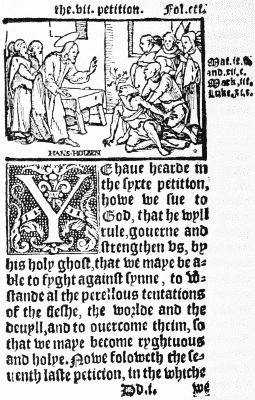
was living in England. As examples of his work,
we may take two books published in 1548, Cranmer's
Catechism, published by Walter Lynne, and Halle's
Chronicles, published by Grafton. The first contains
a number of small cuts, one of which is signed
in full Hans Holbein, and two others are signed
with his initials H. H. Some writers insist that
these three cuts alone are to be ascribed to him,
and that the rest are from an unknown hand. Besides
these small cuts, there is one full-page cut on
the back of the title of very fine work. It represents
Edward VI. seated on his throne with the
bishops kneeling on his right, the peers on his left.
From the hands of the king the bishops are receiving
a Bible. The cut at the end of Halle's Chronicles,
very similarly executed and also ascribed to Holbein,
represents Henry VIII. sitting in Parliament. Almost
all the volumes of chronicles, of which a number
were issued in the sixteenth century, contain woodcuts,
and two are especially well illustrated,—Grafton's
Chronicles, published in 1569, and Holinshed's
Chronicles in 1577. The illustrations in the
latter book, which Mr. Linton considers to have
been cut on metal, do not appear in the later
edition of 1586. Among the illustrations in the
first edition, so Dibdin says, is to be found a picture
of a guillotine.
 From Cranmer's Catechism, London, 1548.
Of all the English printers of the latter half of
the sixteenth century, none produced finer books
than John Day, who, it has been suggested,
engraved some of the woodcuts which he used.
The best known, perhaps, of his books is the
Book of Christian Prayers, commonly called Queen
Elizabeth's Prayer Book, which he published in
1569. In a way, this book is undoubtedly a fine
specimen of book-ornamentation, but as it was
executed in a style then out of date, having borders
like the earlier service books, it suffers by comparison
with the 'Books of Hours' of fifty years earlier.
Another book of Day's which obtained great popularity
was the History of Martyrs, compiled by
John Fox. We read on Day's epitaph in the
church of Bradley-Parva—
"He set a Fox to wright how martyrs runne,
By death to lyfe. Fox ventured paynes and health,
To give them light; Day spent in print his wealth."
Considering the popularity of the book, and the
number of editions that were issued, we can hardly
imagine that Day lost money upon it. The illustrations
are of varied excellence, but the book
contains also some very fine initial letters. One,
the C at the commencement of the dedication,
contains a portrait of Queen Elizabeth on her
throne, with three men standing beside her, two
of whom are supposed to be Day and Fox. Below
the throne, forming part of the letter, is the Pope
holding two broken keys.
Initial letters about this time arrived at their
best. They were often very large, and contained
scenes, mythological subjects, or coats-of-arms. A
fine specimen of this last class is to be found in
the Cosmographical Glasse, by William Cuningham,
1559. It is a large D containing the arms of Robert,
Lord Dudley, to whom the book is dedicated. Very
soon after this some ingenious printer invented the
system of printing an ornamental border for the
letter with a blank space for the insertion of an
ordinary capital letter,—a system which soon succeeded
in destroying any beauty or originality
which letters had up to this time possessed.
In conclusion, it will be well to notice the growth
of engraving on metal in England. The earliest
specimen that I know of is the device first used by
Pynson about 1496. It is certainly metal, and has
every appearance of having been cut in this country.
Some writers have put forward the theory that the
majority of early illustrations, though to all appearance
woodcuts, were really cut on metal. But
wherever it is possible to trace an individual cut for
any length of time, we can see from the breakages,
and in some cases from small holes bored by insects,
that the material used was certainly wood. Julian
Notary had some curious metal cuts, but they were
certainly of foreign design and workmanship, and the
same may be said of the metal cuts found amongst
the early English service books. The border on the
title-page of the Cambridge Galen, usually described
as engraved on metal, is really an ordinary woodcut.
It is not till 1540 that we find a book illustrated
with engravings produced in this country.
This was Thomas Raynald's Byrth of Mankynde,
which contains four plates of surgical diagrams. In
some of the later editions these plates have been
re-engraved on wood. In 1545 another medical
book appeared, Compendiosa totius delineatio aere
exarata per Thomam Geminum. It has a frontispiece
with the arms of Henry VIII., and forty plates
of anatomical subjects. Other editions appeared in
1553 and 1559, and the title-page of the last is
altered by the insertion of a portrait of Elizabeth
in place of the royal arms. The Stirpium Adversaria
nova authoribus Petro Pena et Mathia de
Lobel of 1570 has a beautifully engraved title-page,
and the 1572 edition of Parker's Bible contains a
map of the Holy Land with the following inscription
in an ornamental tablet: 'Graven bi Humfray
Cole, goldsmith, an English man born in ye
north, and pertayning to ye mint in the Tower,
1572.' Humfray Cole is supposed by some authorities
to have engraved the beautiful portraits of
Elizabeth, the Earl of Leicester, and Lord Burleigh,
which appear in the earlier edition of 1568. Saxton's
maps, which appeared in 1579, are partly the work
of native engravers, for at least eight were engraved
by Augustine Ryther and Nicholas Reynolds.
In 1591 there are two books,—Broughton's Concent
of Scripture, and Sir John Harington's
Ariosto. The latter contains almost fifty plates,
closely copied from a Venetian edition, and
was the most ambitious book illustrated with
metal plates published in the century. There are
a few other books published before 1600 which
contain specimens of engraving, but none worthy
of particular mention.