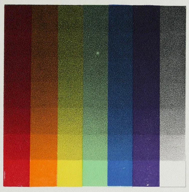
New original cover art included with this eBook is granted to the public domain.
A PRACTICAL MANUAL FOR THE LAY STUDENT OF COLOR
By
EMILY NOYES VANDERPOEL
WITH ONE HUNDRED AND SEVENTEEN COLORED PLATES
LONGMANS, GREEN, AND CO.
91 and 93 Fifth Avenue, New York
LONDON AND BOMBAY
1902
Copyright, 1901, by
Emily Noyes Vanderpoel.
All rights reserved.
Rockwell and Churchill Press
BOSTON, U.S.A.
To
My Father
WILLIAM CURTIS NOYES
PREFACE
vii
From a scientific standpoint admirable works
on color have been written, but they demand
more time and study than many can give to them,
and are too theoretical to be easily understood;
while those written from an artistic standpoint
may be useful to those who paint pictures but
are not of much benefit to larger classes of people
who are artists in other occupations. Painters of
pictures must study color as well as lines and
composition; but a better understanding of color
would also be of great value to decorators, designers,
lithographers, florists, dressmakers, and
milliners; women in their dress and home decoration,
and many others. For such, to combine
the essential results of the scientific and artistic
study of color in a concise, practical manual, and
to classify the study of color in individual eyes,
in light, in history and in nature, has been the
aim of the author of this book. Also, as color
viiicannot be fully appreciated by any written description,
the text has been made as brief as possible,
the plates full and elaborate.
It has been asked by artists who have given
years of study to form, perspective and composition,
why it should be necessary to study color if
one has a good eye for it, to which another question
may serve as answer. Suppose a person intending
to make art his life work has a good eye
for form, will he, therefore, begin to paint pictures
before learning to draw, or without going through
a thorough drill in perspective? Later, having
some subject in his mind which he wishes to put
on canvas, he does not stop to review all the rules
he studied of form and perspective; the knowledge
and facility he gained in that study will
enable him unconsciously to crystallize his thought
into better shape on his canvas. Does the possessor
of a naturally fine voice think he can dispense
with the time and trouble of cultivating it?
The same reasoning may well be applied to color
and its study.
E. N. V.
INTRODUCTION
ix
For some years I have known of the study and
research the author of this book has devoted
to problems in Color, and its uses in the arts of
Design and Decoration, and it is gratifying to me
that the result of much of this work is to be given
to the public for the use of those who are interested
in the subject.
A great deal will be found in these pages that
will be of practical service, particularly to those
who have not been able to read the works of
Chevreul, Von Bezold, Rood, Church, and others.
Indeed, even in these, careful study would be necessary
to select passages describing combinations
that could be applied to special work.
Much attention is here given to contrasts of
modified or subdued colors, such colors as would be
required constantly in decorative designs covering
large spaces, against which points of more positive
color would be placed. One of the greatest difficulties
xin arranging a color design is in determining
the qualities and quantities of color in an
effective and agreeable way, and very few works
give the useful hints on this subject contained in
this book. Under the heading of “Historic Color”
are some very interesting and original diagrams,
presented in a way easily to be understood and
made use of in actual practice.
The study of color from the scientific side has
very little attraction for the layman, and it is even
difficult for a painter to get out of such study
much that will help him in his work; but the
presentation of some of the salient points of the
scientific side, by one who has also borne in mind
the artistic side, cannot fail to make this book
attractive and useful to a great number who wish
to know something of the laws that underlie
agreeable arrangements of color.
The relation of color to light is much the same
as that of music to sound. Color has its
many hues, its long scales of tints and shades, its
true and its false chords. Mere sound gives us but
little pleasure; when developed, however, into its
highest form, music, we are thrilled, as by the song
of a bird, a favorite ballad, or a Beethoven Symphony.
So in light, our enjoyment culminates at
the glories of color in a flower or a sunset, at the
shadows that play over the hills, or at the varied
hues of a salt marsh. Hence we may aptly term
color the music of light; and when we think of the
wonderful ways in which it has been used and
combined by painters and designers for hundreds
of years, it must seem strange to us that its harmonies
have not been as thoroughly studied and
classified as those of sound.
Furthermore, color has come to be so closely
4connected with all the occupations and enjoyments
of mankind that it is hard for us to realize that
many persons are wholly or partially blind to its
beauties. It is well known that there are some
individuals with such perfect organs of hearing
that they are able to distinguish the slightest
sounds, who yet are so utterly unable to distinguish
between two tones or between the harmonies and
discords of music that they are said to have “no
ear.” So there are those whose eyes are as well
formed for seeing all and distant objects, but who
are unable to see color as it is seen by people with
normal eyes. Such individuals may be said to
have “no eye” for color, and are scientifically
termed “color-blind.”
This fact is not so well known; and, in view of
it, any one interested in color will understand the
wisdom of beginning a study of color with some
knowledge of color-blindness, and, if possible, with
having his eyes examined by an expert. Such an
examination is a short and simple matter. Dr.
William Thomson of Philadelphia has devised what
he calls a “color stick,” on which colored wools are
so hung and numbered that it is not even necessary
to be an expert to use it, and with the help of
which color-blindness can easily be detected. It
has been used with great success over some fifty
thousand miles of railroad. From the same hand
5has lately come a newer and simpler form of the
same invention.
Color-blindness is seldom a total want of the
power to see colors, but is rather a want of the
true normal perception of colors, and it is more
common than is generally supposed. The most
common form of the defect, which has been called
by some “red-blindness,” is that of not seeing
red, but of confusing it with green, as, for instance,
being unable to see any difference between the red
flower of a geranium and the green of its foliage;
between green grass and red autumn leaves. A
color-blind person will sort variously colored wools
in the strangest way, putting the reds among
the greens, and mixing the blues and the violets
together.
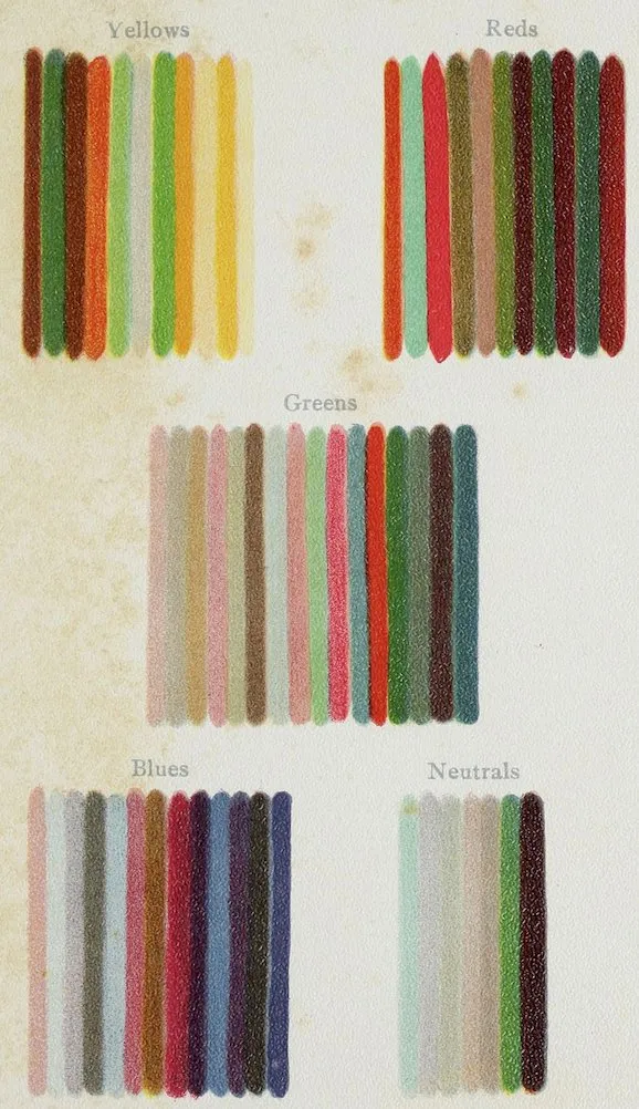
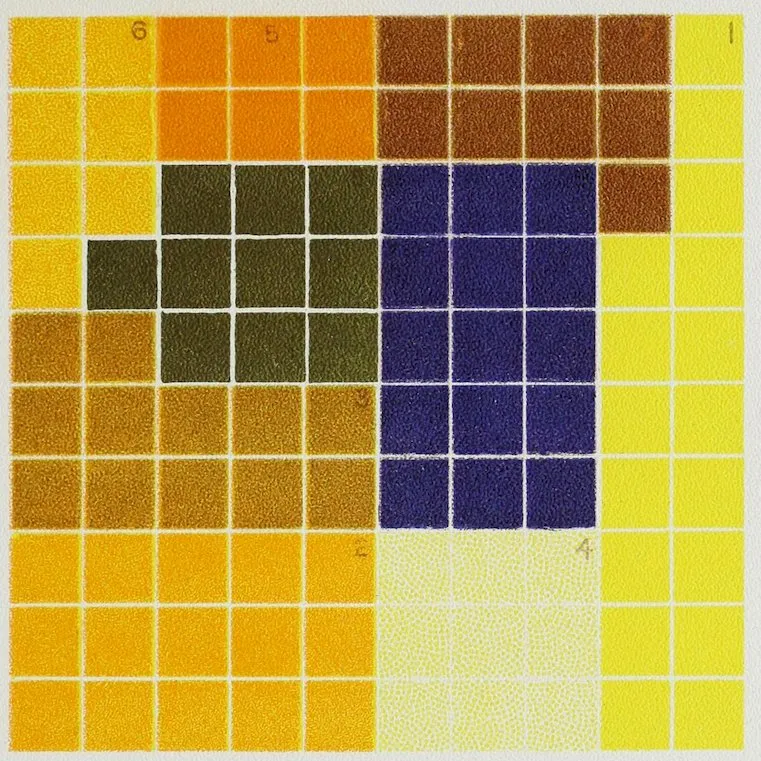
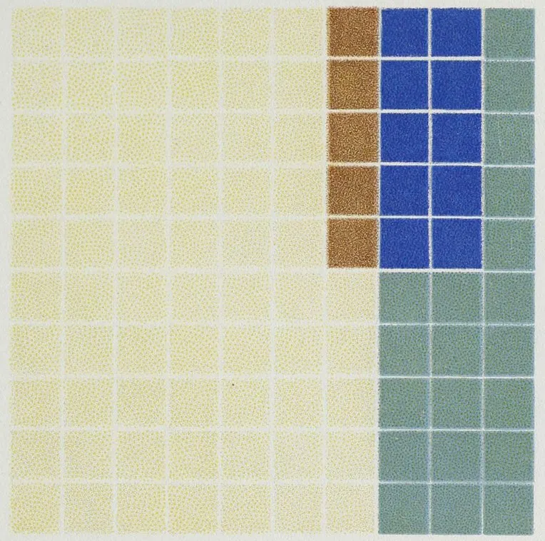
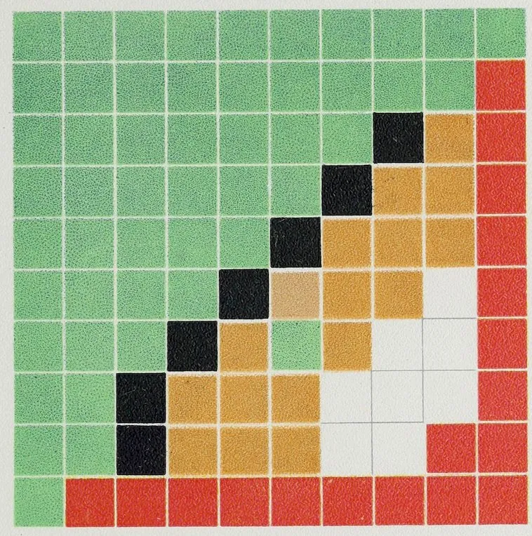
Plate I shows part of the result of an examination
of a color-blind man by Doctor Thomson. The
patient was given one hundred and fifty different-colored
wools to sort in little heaps according as
he saw them to be red, blue, green, etc.; he seemed
to hesitate over but few of them. These he put by
themselves in a heap called neutral. To a normal
eye the result is almost incomprehensible, as he
mixed green with all the other colors and made
other as strange combinations. Di-chromatic vision
has been suggested as a fitting term for such defective
color-perception, as colors to red-blind
6persons amount to but two, viz., yellow and blue,
with a long range of neutral grays between.
There are other forms of color-blindness which
are less common. Some persons seem to see but
red and blue, classing yellow and green with red.
A less common defect is that of not seeing violet,
while there are a few cases on record where all
sensation of color is wanting, everything appearing
in differing degrees of gray. One such
instance coming under the notice of the writer
occurred temporarily from over-strained nerves in
a person gifted with an abnormally fine color-sense.
No doubt some people are born color-blind,
but the defect is also brought on by disease, by the
excessive use of tobacco, alcohol, and other stimulants,
and may, or may not, prove permanent.
According to Abney, the disease begins in the
centre of the eye, so that those suffering from its
early stages can match colored wools correctly, but
when given instead small colored pellets to match
make many mistakes, because a pellet may happen
to be directly before the small blind spot that is
insensible to its color, while the larger mass of
wool extends before the whole retina. Doctor
Charcot and his school in Paris have made many
examinations into visual disturbances, and through
these examinations much of the peculiar coloring
and mannerism of some of the modern painters of
7the so-called impressionist, tachist, mosaist, gray-in-gray,
violet colorist, archaic, vibraist, and color
orgiast schools has been explained. The artists
tell the truth when they say that nature looks to
them as they paint it, but they are suffering from
hysteria or from other nervous derangements by
which their sight is affected.
For a long time railroad engineers would not
believe that examinations for color-blindness were
necessary, but when shown the results of such
an examination the surprise of those with normal
eyes was intense. They realized what it would be to
travel on a train in charge of an engineer who did
not know when the red danger signal had been put
in place of the usual green one. In other spheres
of life correct knowledge of color is not so vitally
necessary, yet to artisans of many kinds—decorators,
florists, manufacturers, dressmakers, milliners,
etc.—it is both useful and important.
As to the extent of color-blindness, it has been
estimated that in England about one person in
eighteen is more or less afflicted with it. In 1873
and 1875 Dr. Farre examined in France one
thousand and fifty officials of various grades, and
found among them ninety-eight color-blind, or nine
and thirty-five hundredths per cent. In 1876
Professor Holmgren examined in Sweden two
hundred and sixty-five persons on the Upsala
8Gefle line, with the result that thirteen were found
to be color-blind. Seebach found five young persons
out of forty-one in a gymnasium who were
color-blind. None of them had been at all conscious
of the defect.
Among the visitors to the International Health
Association in London, in 1884, Mr. F. Galton
found a large number of men and a small number
of women with more or less defective color-perception.
In this country, examinations in the
army and navy and among railroad engineers
reveal that color-blindness, if not as general as in
England, is quite common. Dr. Thomson states
that as far as has been gathered from statistics
generally, the percentage of color-blind men in
the civilized world is four per cent., or one in
twenty-five,—among women one in four thousand.
While he has seen a great number of color-blind
men he has never met a woman with the defect.
Singularly enough this color-blindness—the
confounding of one color with another, or the
want of perception of certain colors—does not
prevent great enjoyment of both nature and art.
A person so color-blind as to see no difference
between the scarlet of a geranium blossom and
the green of its leaves, or who buys a pair of
bright green gloves supposing them to be brown,
is still an enthusiastic and seemingly an intelligent
9admirer of landscape and art. One cannot say
from what the enjoyment arises, but it is certainly
there.
There is a noted instance of a man who learned
in later life that he was color-blind, and then
first understood why he had never been able to
pick as many strawberries as his boy companions,
because with his defect he saw no difference between
the colors of the berry and that of its
leaf.
There is, however, a very simple way in which
it is possible for some color-blind persons to correct
in a measure their erroneous impressions. If they
have something green to match and fear they may
mistake red for the green, by looking at their
samples through a green or red glass they can
prove whether or not they are correct. Through
a green glass the green will keep its color, while
the red will look nearly black. Through a red
glass the red will remain unchanged and the green
will seem nearly black.
Color-blind people can have colored glasses
mounted as spectacles at small cost, which will
almost entirely relieve their defect and be of great
help in their work.
How far the eye of a color-blind person is susceptible
of education is still uncertain. Sufficient
experiment has not been made in that direction,
10but the fact that women notice color more than do
men and are, as a general rule, more correct in
their judgment of color, points to the fact that
the eye is unconsciously educated by its surroundings.
The constant discrimination in choice of
dress and home decoration which enters early into
a girl’s life gives an education which men, in
Europe and America at least, are deprived of,
from generally wearing black or quiet colors.
That an eye normal in its perceptions of colors
is capable of cultivation cannot be doubted. “It
does not admit of doubt that individual sensibility
to color admits of large variations, and that it is
susceptible of immense improvement. This cultivation
of the sense of color is, however, rather psychological
than physiological, rather mental than
physical. It is not that the organ of vision is improved,
but our power of interpreting and coördinating
the senses which it transmits to the brain.
And here it is that the effects of association come
most prominently, though often unconsciously, into
play. We try to trace out the causes of the vast
numbers of color sensations which we are continually
receiving, but we constantly find that the cold
methods of analysis fail to explain the mental appreciation
with which we regard the astounding
fertility of nature in its gifts of color.”[1]
11Artists often find that when the eyes are over-stimulated
by false lights or colors, or want of balance
in the colors looked at, the nerves are so irritated
that a confusion of color and complementary
tones takes place. If continued to any length of
time the nerves become so fatigued that the color-sense
is lost, and the eye responds only to gradations
of black and white.
That there are also subtle shades of difference
in the sensibility to color even of good, normal eyes,
no one who has paid any attention to art can fail
to know. These shades of difference it is impossible
to gauge, and they can only be known by the
differing qualities of work produced. In a studio
where perhaps a dozen pupils may be painting
from one piece of still life, a vase, or bit of drapery,
such differences can be clearly seen. One pair of
eyes may have a tendency to see more violet than
the others, another pair sees everything more brilliantly
or in a higher key than the others. One student
may have more difficulty in harmonizing on
his canvas the different colors of the model than
the rest, while another with perhaps less skill in
using the paint may have such a fine eye for harmony
as by the mere charm of his color to delight
every one in the room.
There comes with advancing years a subtle
change in the condition of the eye which it is well
12to understand. With age the lens of the eye loses
its purity or whiteness and becomes tinged with
yellow. This is not generally known, and the
change is not always strongly marked, but it produces
a decided effect upon the perception of blue
and bluish colors. The case of the English painter
Mulready may be cited as a good instance. His
pictures in his later years were different in color
from his earlier ones, being much colder in tone,
that is bluer or less yellow. If, however, they
were looked at through a piece of slightly yellow
glass they appeared of the same coloring as his
earlier work, painted when his eyes were normal.
CHAPTER II COLOR THEORIES
13
A full review of the theories held about
color is not necessary in a work of this
nature, and those who have more time for and
further interest in the subject will find mentioned
in Appendix B to this volume the titles of a number
of admirable works and treatises.
The sensation of color is first and preëminently
produced by light. But an electric discharge, internal
causes, or even pressure on the eyeball
may also cause it; just how, we do not know.
In fact, the whole subject of color, its causes,
and its mechanism, is still in the region of
speculation, although of speculation that may be
useful.
Leaving aside the theory of color production by
other causes, we will give our attention to that
color sensation caused by the light of the sun, and
briefly to that produced by artificial light.
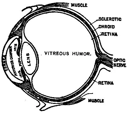
The cut on page 14 shows the construction of the
eye viewed from the side. We see that light enters
the front of the eye through the cornea and lens
and strikes the interior coating, which is the retina.
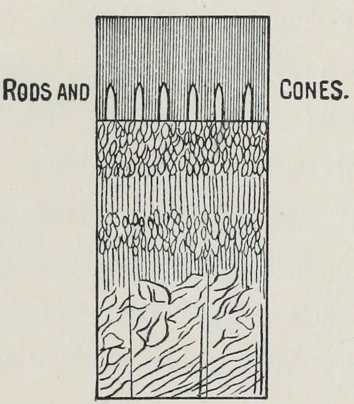
14This is a wonderful membrane, very thin, but composed,
as we see in the next illustration, magnified
many times (page 15), of a marvellous network
made of minute nerves and blood vessels ending
on the innermost surface in tiny rods and cones.
These rods and cones in some mysterious way are
acted upon by light, and, like the outposts of an
army, send messages of form and color to the brain.
Color is therefore spoken of as “an internal sensation,”
and is fine or poor as are the eyes and
brain of the person who sees it.
THE CONSTRUCTION OF THE HUMAN EYE AS VIEWED FROM THE SIDE.
(Nearly life size.)
What is light, we ask? Scientists answer that
it is something which comes to us from a luminous
or light-giving body. Sir Isaac Newton pronounced
it to consist of fine atoms moving toward us rapidly.
A later theory is called the wave theory—that
15there exists throughout space a fine impalpable
medium, “the light-bearing ether,”—that this
ether moves in waves, which, beating upon the retinas
of our eyes as ocean waves beat upon the
shore, produce what we call light.
CROSS-SECTION OF THE RETINA, SHOWING THE RODS AND CONES.
(Very much magnified.)
Sunlight compared to candle or gas light appears
to be white; this white was proved by Sir Isaac
Newton in 1672 to consist of many colors combined
in one ray. He was the first to divide such
a ray of sunlight, which he did by letting it fall
through a slit in the window of a darkened room,
then through a prism, or three-sided piece of glass,
on white paper. If this experiment be repeated
there will be seen “a long streak of pure and beautiful
colors which blend into each other by gentle
gradations.” Anyone who has seen a rainbow has
16seen the same separation of colors, as the raindrops
act in the same way as the prism and divide the
rays of sunlight into their component colors.
The “spectrum” is the name given to the streak
of colors when produced by the help of the prism,
and it and the rainbow contain the same colors in
the same order. The experiment has also been
made of passing this streak of colors through a
second prism, when they again unite and the ray
of simple white light reappears.
An instrument called a “spectroscope” has been
invented, and is constantly used by scientific
students of color, which analyzes a ray of light
still better than the simple prism. With its aid,
early in this century, Wollaston and Fraunhofer
discovered that the spectrum of sunlight, in addition
to its colors, was crossed by many fine, dark,
fixed lines. These have been named Fraunhofer
lines, and are most useful in dividing and mapping
out the limits of the different colors. Still
a later invention called a “diffraction grating,”
made either of speculum metal or of glass silvered
on the back and ruled with fine parallel
lines, sometimes as many as eighteen thousand to
the English inch, is used in place of a prism.
With the use of improved methods Professor
Rowland of Johns Hopkins University has made
one ruled with some fifty or sixty thousand lines.
17A ray of sunlight can be divided by this without
the disadvantage of crowding the colors in the
middle, as is unavoidable by the wedge-shaped
glass of the prism.
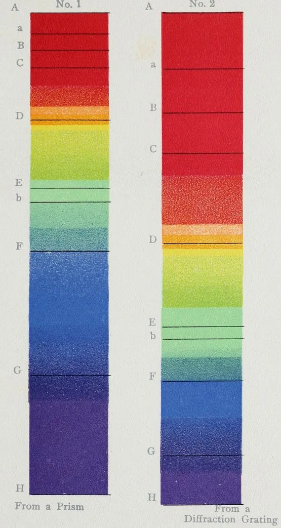
Plate II shows a solar spectrum as produced by
a prism and also one as shown by a diffraction
grating. They both give the colors and the main
Fraunhofer lines, the latter being numbered.
Although not essential to the practical use of
this manual, we will now return to the theories
of the primary colors, so called, upon which differing
views have been held. Sir David Brewster’s
theory of three primaries—red, yellow, and blue—has
been the most popular, because of the ease
with which the three so-called secondary colors
may be made by mixing paint of the three primaries,
as follows: red and blue, violet; blue and
yellow, green; yellow and red, orange. Artists
have generally adopted it; Chevreul, the great
director of the Gobelin tapestries, based his whole
color system on the theory of three primary colors—red,
yellow, and blue; three secondary colors
made by combinations of the first three—orange,
green, and violet; and three tertiary colors made
from combinations of the second three—olive,
russet, and citrine. We must, however, discriminate
carefully between pigments, paints, and light.
By experiment we prove that yellow and blue light
18do not make green, but white; that red and green
light make yellow; and so on, so that the theory
of Thomas Young is now more generally followed
by scientists. As Rood gives it in his Modern
Chromatics, “there can be in an objective sense no
such thing as three fundamental colors, or three
primary kinds of colored light. In a totally different
sense, however, something of this kind is not
only possible, but, as the recent advances of science
show, highly probable. We have already seen in a
previous chapter that in the solar spectrum the eye
can distinguish no less than a thousand different
hues. Every small, minute, almost invisible portion
of the retina possesses this power, which leads
us to ask whether each atom of the retina is supplied
with an immense number of nerve fibrils for
the reception and conveyance of this vast number
of sensations.
19
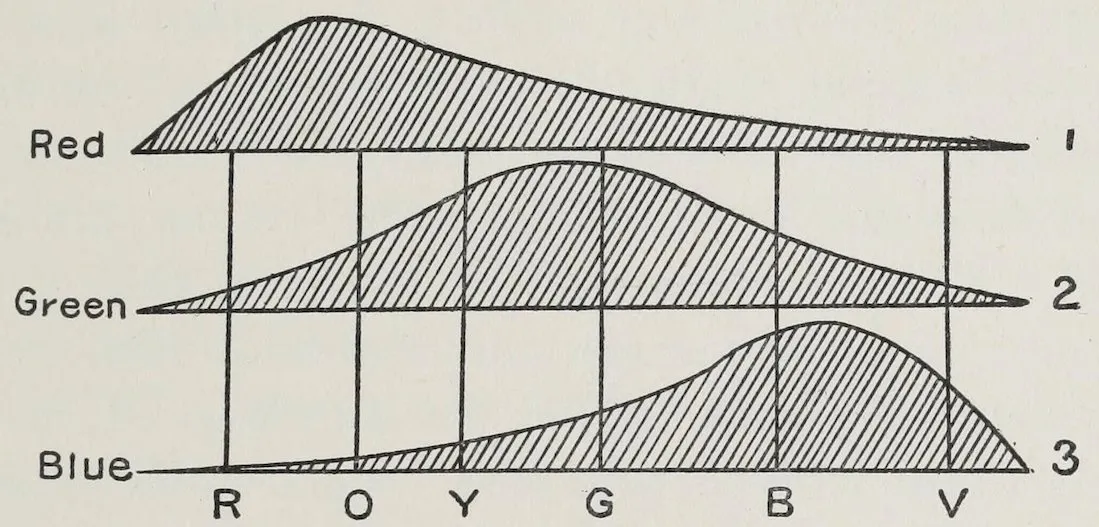
DIAGRAM ILLUSTRATING THE YOUNG-HELMHOLTZ THEORY OF COLOR SENSATION.
“According to the theory of the celebrated
Thomas Young, each minute elementary portion of
the retina is capable of receiving and transmitting
three different sensations; or we may say that each
elementary portion of its surface is supplied with
three nerve fibrils, adapted for the reception of
three sensations. One set of these nerves is
strongly acted on by long waves of light and produces
the sensation we call red; another set responds
most powerfully to waves of medium
length, producing the sensation we call green;
finally, the third set is strongly stimulated by
short waves, and generates the sensation known
as violet.” (This might perhaps rather be called
violet blue, as scientists differ as to the exact
shade.) “The red of the spectrum, then, acts
powerfully on the first set of these nerves; but
according to Young’s theory, it also acts on the
two other sets, but with less energy. The same is
true of the green and violet rays of the spectrum;
they each act on all three sets of nerves, but most
powerfully on those specially designed for their
reception.” All this will be better understood by
the aid of the accompanying diagram, which is
taken from Helmholtz’s great work, Physiological
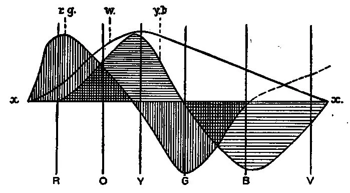
Optics. In this figure, along the horizontal
20lines 1, 2, 3 are placed the colors of the spectrum
properly arranged, and the curves above them
indicate the degree to which the three kinds
of nerves are acted on by these colors. Thus we
see that nerves of the first kind are powerfully
stimulated by red light, are much less affected
by yellow, still less by green, and very little by
violet light. Nerves of the second kind are much
affected by green light, less by yellow and blue,
still less by red and violet. The third kind of
nerves answer readily to violet light, and are successively
less affected by other kinds of light in
the following order: blue, green, yellow, orange,
red. The next point in the theory is that if all
three sets of nerves are simultaneously stimulated
to about the same degree the sensation which we
call white will be produced. This result would
almost lead us into calling white a color—and the
most brilliant one of all. These are the main
points of Young’s theory, which was published as
long ago as 1802, and more fully in 1807. Attention
has been called to it within the last few years
by Helmholtz, and it is mainly owing to his labors
and those of Maxwell that it now commands such
respectful attention. Thus far the study of color-blindness
has furnished evidence in favor of the
theory of Young, and its phenomena are more
easily explained by this than by any other theory.
21A recent invention by Frederick E. Ives of
Philadelphia has also been cited in its support.
Through the use of what he calls a photo-chromoscopic
camera he takes through three color
screens—a red, a green, and a blue one—three
negatives. These negatives, placed in an instrument
called by him a stereo-photo-chromo-scope
(which resembles a stereoscope, and which also holds
three screens of the same colors), produce to the
eyes an image so perfect in color and relief that
“people have been seen to place their hand in
front of it before they were convinced that they
did not see a direct reflection.” Various sets of
three hues, or modified hues, might be used to produce
the same effect.
In 1878, having re-investigated the subject thoroughly,
Hering published in Vienna a paper advocating
another theory. According to this “the
retina is provided with three visual substances, and
the fundamental sensations are not three, but six,—
Black and white,
Red and green,
Blue and yellow.
Each of these three pairs corresponds to an assimilation
or diassimilation process in one of the
visual substances; thus red light acts on the red-green
substance in exactly the opposite way from
green light, and when both kinds of light are
22present in suitable proportions a balance is effected,
and both sensations, red and green, vanish.”[2]
One of the latest accounts of these theories (of
Young-Helmholtz and Hering), written in English,
is to be found in Dr. Foster’s Text-book of Physiology.
It contains a full and clear discussion of the
merits and demerits of both theories from a scientific
standpoint. From it we give the accompanying
diagram illustrating Hering’s theory of color
vision.
DIAGRAM ILLUSTRATING HERING’S THEORY OF COLOR SENSATION.
Edridge Green also discusses both theories fully
in connection with color-blindness.
On one point all these theories agree, which is
that perfect or normal color vision is made up of
three factors, or as Foster says, it is “tri-chromic,
23based on three or the equivalent of three primary
sensations.” The first, the Brewster theory, states
that they are red, yellow, and blue colors; the second,
the Young-Helmholtz theory, that there are
three kinds of nerve fibrils in the retina, affected
respectively by red, blue, and green, and their combinations
of the spectrum; while that of Hering
is that in the eye there are three changeable visual
substances which are increased or diminished accordingly
as the rays of black and white, yellow
and blue, or red and green, fall upon them.
Le Conte, in his work Sight, says of the latter
part of this theory, “according to Hering, complementary
colors are the result of opposite affections
of the retina, so that there are only two
essentially distinct color affections of the retina,
which, with their opposites, produce two pairs of
complementary colors; the one with its opposite
produces red and green; the other with its opposite,
yellow and blue. This, though more doubtful, seems
a probable cause of complementariness.” Also,
“Stanley Hall ... believes that color is perceived
by the cones (in the retina) alone; further,
that different parts of the same cone vibrate with
different degrees of rapidity, and therefore respond
to different colors, and the conical form is adapted
for this purpose. In order to gain a clearer conception
we may imagine each cone to be made up
24of a number of buttons of graduated sizes joined
together. These buttons, on account of their different
sizes, would vibrate with different degrees
of rapidity, and therefore co-vibrate with different
colors. White light, he supposes, vibrates the
whole series; red light the thicker, and violet the
thinner portion of the series; or, taking Hering’s
view of the primary colors, we may imagine that
red and green rays affect one portion and yellow
and blue rays another portion of the same cone.”
From the fact that in 1876 F. Boll discovered
that the retina contained a red or purple substance
that quickly disappeared on exposure to light,
Kuhne elaborated, after further experiments with
light upon that substance, a still later theory of
color vision which supposes that the light waves
produce in the retina different compounds that give
rise to the sensation of the different colors.
Mrs. Franklin of Baltimore has lately given us
a theory of “light sensation,” as she prefers to call
it, which has been favorably received.[3] The question
of the specific uses of the rods and cones in
the retina has been a puzzling one, and she suggests
that they may be of the same nature, but in
different stages of development,—in other words,
that the rods are undeveloped cones. As there
are more cones than rods in the middle of the
25retina, and as color is seen more vividly there, the
inference is that the cones are susceptible to both
light and color, while the rods are only sensitive
to light. Such a theory seems to explain the results
of many experiments heretofore made by
scientists. Some discussion of the subtile and
beautiful colors produced by interference, refraction,
absorption, and polarization, as well as by
opalescence, fluorescence, and phosphorescence,
might aptly follow here, but that such discussion
hardly comes within the scope of this mainly
practical book. Readers who wish to understand
and experiment with them are referred to the
works of Rood, Church, and Dove.
CHAPTER III COLOR QUALITIES HUE, PURITY, LUMINOSITY—COLD AND WARM COLORS—TINTS, SHADES, BROKEN TINTS
26
Colors have three principal qualities, called
scientifically “constants of color,” which
should be studied as a preparation for the study of
the harmony of colors. These qualities are hue,
purity, and luminosity. To make these as clear as
possible, we will for the present, at least, ignore
the delicate divisions of the spectrum made by
both scientists and artists of which about one
thousand have been counted, and divide it arbitrarily
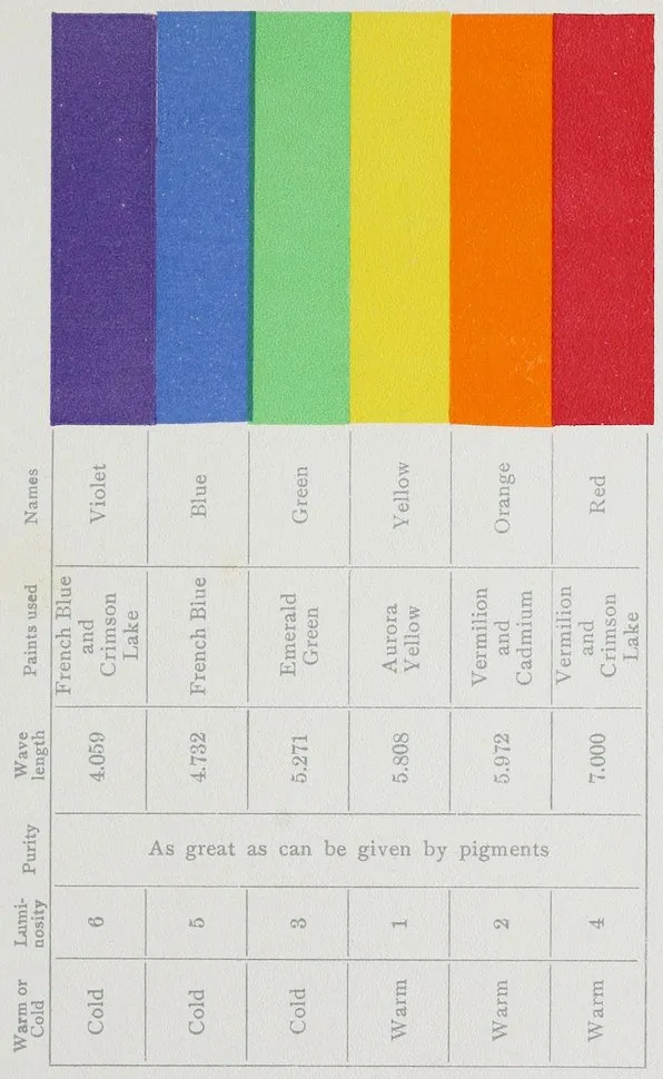
into six pure spectral colors differing from
each other by their hues as by their wave
lengths; the wave lengths we give according to
Rood, expressed in ten-millionths of a millimetre
(¹⁄₁₀₀₀₀₀₀₀). (See Plate III.) These six divisions
can be placed beside and compared with flowers
and colored materials, and are printed to imitate
colored light as nearly as pigments and paper
can give them. At best, any such imitation
falls far short of nature.
The first quality or constant of colors is hue,
27this term being generally agreed upon by scientists
to mean color pure and simple, according to its
wave length in the spectrum. Plate III gives us
six hues—violet, blue, green, yellow, orange, and
red. Each of these is quite different from the next
one, as the violet hue is from the blue hue, the blue
hue from the green hue.
The second quality or constant of colors is purity,
that is, its lack of any mixture of white, black,
or any other color. These not only weaken the
color but change its character, as will be found
by mixing white paint with vermilion paint, which
will be seen to grow more pink, as well as lighter,
as the white is added.
The third quality or constant of colors is their
luminosity or brightness, also sometimes called
clearness. It is measured by the total amount of
light reflected to the eye, and is therefore independent
of hue and purity. The amount of luminosity
of a color can be determined correctly by
means of an invention called Maxwell’s Disks.
These disks date back to the time of Ptolemy, but
were brought into use early in this century by
Maxwell. A disk, or round piece of cardboard,
painted with the color to be tested, is put behind
two smaller disks, one of white and one of black,
which can be so adjusted that on turning them all
rapidly the gray formed by the mingling of black
28and white matches in luminosity the one back
of it.
From such experiments we see that a room
papered or painted in yellow will give you the
lightest room, because it will reflect more light to
the eye than any of the other colors; one done in
orange will come next, and so on through the list.
A practical knowledge of these different luminosities
is most useful in decoration, both on account
of the contrast between colors for this reason as
well as for their hues. Also for the ability to
lighten a dark part of a room by placing there a
piece of luminous coloring, and vice versa to darken
what is too bright. We must here add that these
terms, purity of color and luminosity, are used by
artists in quite a different sense, as they call paintings
noticeable for purity of color, meaning only
that the tints in them have no tendency to look dull
or dirty, but not at all implying the absence of
white or gray light. They call color in a painting
luminous simply because it actually recalls to the
mind the impression of light, not because it actually
reflects much light to the eye. Plate No. IV
gives the six spectral colors in their order of
luminosity.
We will now take up in turn each of the six
hues by itself and study it in its variations towards
its neighboring hues.
29That we do not appreciate the influence of color
upon man as well as upon the lower animals, is
true; but color has not been studied by us as it
probably will be in the near future. The powers
of attraction of different colors for ants and bees
have occupied the time and close observation of
Sir John Lubbock and of many other scientists,
and now the effect of different colors is being
tried on the children in some schools and on the
patients in certain insane asylums. A few facts
are enough to show that there is still much to
learn in that direction, and that these questions
can be investigated with profit. One of these
facts is that a certain shade of purple always produced
the condition of the skin commonly known
as “goose-flesh” upon a girl in a normal condition
of health.
Goethe in his Theory of Colour, as translated
by Sir Charles Eastlake, records observations and
experiments of the most minute character with
regard to light and colors—of a character hardly
touched upon by others. His suggestion of using
colored glass for study in colors is very valuable.
He says, “People experience a great delight in
color generally. The eye requires it as much as it
requires light. We have only to remember the
refreshing sensation we experience, if on a cloudy
day the sun illumines a single portion of the
30scene before us and displays its colors. That
healing powers were ascribed to colored gems
may have arisen from the experience of this indefinable
pleasure.
“From some of our earlier observations we can
conclude that general impressions produced by
single colors cannot be changed, that they act
specifically and must produce definite specific
states in the living organ.
“They likewise produce a corresponding influence
on the mind. Experience teaches us that particular
colors excite particular states of feeling. It is
related of a witty Frenchman, “Il pretendoit que
son ton de conversation avec Madame étoit changé
depuis qu’elle avait changé en cramoisi le meuble
de son cabinet, qui étoit bleu.” (He imagined that
the tone of his conversation with Madame was
changed since she had changed the coloring of her
sitting-room from blue to crimson.)
“In order to experience these influences completely,
the eye should be entirely surrounded with
one color; we should be in a room of one color, or
look through a colored glass. We are then identified
with the hue, it attunes the eye and mind in
mere unison with itself.[4]
“The colors on the plus side are yellow, red-yellow
31and yellow-red. The feelings they excite are
quick, lively, and aspiring.
“The colors on the minus side are blue, red-blue
and blue-red. They produce a restless, susceptible,
anxious impression.”
Each of these six hues can be divided roughly
into three, as they are pure or tend toward their
neighboring hues. So violet, of which we have
pure normal or spectral violet, with red-violet on
one hand, blue-violet on the other; or yellow, of
which we have pure normal or spectral yellow, with
orange-yellow on one side, green-yellow on the other.
Violet is a cold color, red-violet warmer than
blue-violet. It is grave, dignified, as compared
with the other colors. Being a retiring color, it
will serve well as a background, as it will throw
forward any more luminous color put upon it. In
flowers we have examples of this color in its variety
in violets, lilacs, asters, sweet peas, and morning-glories.
In the latter it is exquisitely shaded
from one extreme to the other. The wild Eupatorium
furnishes a fine example of red-violet, the
cultivated variety an equally good one of the blue-violet,
almost cold enough for a blue. There is no
sound pigment which can be used alone to paint
this color. The violet in the originals for these
plates was made with French blue and crimson
lake, and crimson lake is not considered a permanent
32color. Violet of all kinds suffers from artificial
light, losing much of its blue, and becoming
more red and dull.
Blue is a cold color, and a retiring one, especially
suited for backgrounds, as one will notice in
studying a blue sky, against which the landscape
stands out with great beauty. In flowers, examples
of this color are more rare than of others.
The blue gentian is not a true blue, it is so close
on blue-violet. Forget-me-nots, chicory, centaureas,
and larkspur give us blue in differing varieties.
The sky from the deep violet blue of a winter’s
night to the pale, greenish tones near the horizon
on a summer’s day shows us an unsurpassed scale
of this hue.
Goethe says of it, “It may be said that blue
brings a principle of darkness with it.
“This color has a peculiar and almost indescribable
effect on the eye. As a hue it is powerful,
but it is on the negative side, and in its highest
purity is, as it were, a stimulating negation.
Its appearance, then, is a kind of contradiction between
excitement and repose.
“As the upper sky and distant mountains appear
blue, so a blue surface seems to retire from us.
“But as we readily follow an agreeable object
that flies from us, so we love to contemplate blue,
not because it advances to us, but because it draws
us after it.
33“Blue gives us an impression of cold, and thus
again reminds us of shade. We have before
spoken of its affinity with black.
“Rooms which are hung with pure blue appear
in some degree larger, but at the same time empty
and cold.
“The appearance of objects seen through a blue
glass is gloomy and melancholy.
“When blue partakes in some measure of the
plus side the effect is not disagreeable; sea-green
is rather a pleasing color.”
Genuine ultramarine is an expensive but very
pure blue paint made from lapis-lazuli. Artificial
ultramarine generally inclines towards violet. A
good deal of green and violet light is reflected from
cobalt blue. There is some green in Prussian blue,
in indigo, and in cerulean blue. Prussian blue, if
used quite thickly, reflects some red. The blue for
the original of Plate X was made of French
blue (artificial ultramarine), tinged on the violet
end with crimson lake, and on the greenish end
with emerald green, which latter is not a permanent
color, but which approaches nearest of any
pigment to the green hue in the spectrum. Blue
is one of the colors most used in decoration.
Green may be cold or warm, retiring or advancing
according as it approaches blue or yellow,
although pure spectral green is of a cold nature.
34When one studies the great scale of greens as seen
in a landscape lit up with full sunshine, and
notices the intense yellow-green where the sun
shines through the leaves, the pale gray greens
produced by the sun’s glancing over the polished
surfaces of others, and the rich dark green in the
shadows, it seems as if no other color would admit
of so varied a scale or be more restful to the eye.
Goethe says: “The eye experiences a distinctly
grateful impression from this color. The beholder
has neither a wish nor the power to imagine a
state beyond it. Hence for rooms to live in constantly,
the green color is most generally selected.”
This assertion may be doubted, many persons
objecting to green, the truth probably being that
it has been found difficult to use, and not having
been understood or well treated has not been appreciated.
Its healthfulness cannot be doubted if one
considers how refreshing the surroundings of trees
and grass are to an invalid who has been surrounded
by city bricks and stones. Can we not derive a like
benefit from this color by decorating our city rooms
with varying tones of soft gray greens, like nature,
relieved here and there with a touch of brightness,
as flowers, birds, and butterflies gleam amid the foliage
in their native haunts? The rules for heightening
these contrasts with certain varieties of green
will be given in the chapter on contrasts. The
35extremes of green blend better than those of other
colors. Emerald green has been used as being
the best paint with which to imitate the normal
green of the spectrum, but it must be remembered
that it is a trifle bluer than it should be to be exact.
Of yellow Goethe writes, “This is the color
nearest the light.
“In its highest purity it always carries with it
the nature of brightness, and has a serene, gay,
softly exciting character.
“In this state applied to dress, hangings, carpets,
etc., it is agreeable. Gold in its perfectly unmixed
state, especially when the effect of polish is
superadded, gives us a new and high idea of this
color; in like manner, a strong yellow, as it appears
on satin, has a magnificent and noble effect.
“We find from experience again that yellow excites
a warm and agreeable impression. Hence in
painting it belongs to the illumined and emphatic
side.
“This impression of warmth may be experienced
in a very lively manner if we look at a landscape
through a yellow glass, particularly on a gray winter’s
day. The eye is gladdened, the heart expanded
and cheered, a glow seems at once to breathe
towards us.”
Yellow is both a warm and an advancing color,
especially useful to apply as ornament on other
36colors, as gold embroidery is beautiful on any
color. With the exception of white there are
more yellow flowers than of any other color. In
Moorish decorations, which are some of the finest
in the world, gold is used as ornament on blue and
red grounds; in fact, throughout the history of
ornament, yellow is more often used in that way
than as a groundwork.
A thin wash of Aurora yellow gave the color for
the original of Plate XII. This paint, when put
on thickly, tends too much toward orange to imitate
well the very narrow band of yellow in the
spectrum. It is made from cadmium, and, according
to Church,[5] the deep or orange cadmiums are all
more lasting than the pale or lemon-colored kinds.
Orange is still a warmer color than yellow, and
is also an advancing color. Goethe says, “All that
we have said of yellow is applicable here in a
higher degree. The red-yellow (orange) gives an
impression of warmth and gladness, since it represents
the hue of the intenser glow of fire, and of
the milder radiance of the setting sun.” Orange is
perhaps the most intense color and should be used
sparingly in decoration, as it needs great care as to
the quality and quantity of other colors to balance
it. Orange cadmium was used for the original of
Plate XI.
37Red is a warm color and an advancing one.
Goethe says, “The agreeable, cheerful sensation
which red-yellow excites increases to an intolerably
powerful impression in bright yellow-red.
“The active side is here in its highest energy, and
it is not to be wondered at that impetuous, robust,
uneducated men should be especially pleased with
this color. Among savage nations the inclination
for it has been universally remarked, and when
children left to themselves begin to use tints
(paints), they never spare vermilion and minium.
“In looking steadfastly at a perfectly yellow-red
surface, the color seems actually to penetrate the
organ. It produces an extreme excitement, and
still acts thus when somewhat darkened. A yellow-red
(scarlet) cloth disturbs and enrages animals.
I have known men of education to whom its effect
was intolerable if they chanced to see a person
dressed in a scarlet cloak on a gray, cloudy day.”
In nature we have red only in small portions, a
few red birds or those with throats or spots of red;
almost no butterflies, but many flowers. The rose,
which leads in beauty the long procession of flowers,
contains an immense scale of this color on the violet
side, from the palest blush to the deepest crimson,
almost purple. There being less of red in nature
than of any other color, it becomes by contrast the
decorative color. It has also the quality of changing
38less with lessening light than any other color,
and is particularly fine in combination with blue.
Vermilion and carmine were used to make the
spectral red of Plate XIV, though they are far from
reproducing the vivid quality of the original. Vermilion
used with oil is much more permanent
than with water. Of the lakes, Church says in his
Chemistry of Paints and Painting: “No artist
who cares for his work, and hopes for its permanency,
should ever employ them.”
There is another quality shown in Plate III by
which colors may be divided into the warm and
cold classes. The six spectral colors we have so far
been studying in this chapter may be roughly
divided as follows:
COLD.
WARM.
Violet
Yellow
Blue
Orange
Green
Red
although some varieties of green may be classed
among the cold colors because of the large amount
of blue they seem to contain, and others may be
classed among the warm ones from their seeming
to contain so large an amount of yellow.
It is well to remember that cold colors seem to
retire or go back from the eye, while the warm
ones seem to come forward, and that the right use
39of these qualities greatly affects architecture and
decoration. (See Plates V and VI.)
To recapitulate, we have first, three qualities or
constants of colors: hue, purity, luminosity; then
the qualities of being warm or cold. Following
upon these are divisions of the tones into three
other groups or scales of tints, shades, and gray
or broken tints.
These scales have been confined to six for the
sake of simplicity, but the reader may multiply
them infinitely to correspond with the infinite gradations
in nature.
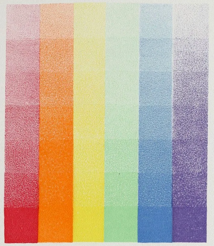
1. Tints.—“The reduced scale—that is, the
normal hue mixed with progressive increments (additions)
of white, thus forming tints.” The spectral
hue of the color weakened by white. Plate VII.
2. Shades.—“The darkened scale—that is,
the normal hue mixed with progressive increments
(additions) of black, thus forming shades.” The
spectral hue of the color darkened with black.
Plate VIII.
3. “The dulled scale—that is, the normal hue
mixed with progressive increments of gray, thus
forming broken tints commonly called grays.”
The spectral hue of the color changed by black and
white. Besides these regular scales which can be
approximately rendered in paint or colored inks
there is an infinite variety of what we might call
40irregular scales which can never be given save in
nature. They are those in which a color is changed
or neutralized by one or more of the other colors.
These cannot even be named, for their multitude.
With the aid of a color wheel on which he used
disks of black, white, and the six prismatic colors,
Professor Rood has drawn up and formulated the
proportions of 488 of these compound or neutralized
colors. With the formulæ a number of them
have been printed in color quite successfully. It
is probably the first attempt to establish standard
colors, and a most valuable one, which it is hoped
may bear fruit. If those and the arbitrary terms
for colors and their different states could come
into general use it would greatly help all descriptions
of color-harmonies.
Having become familiar with the six colors, we
now arrive at the object for which we have gone
through the previous study; namely, the first
kind of color harmony, one-color combinations, also
called combinations of self-tones, the simplest
and the preliminary harmony to that of combined
colors. The first rule to be observed in making
one-color combinations is to avoid putting together
what we may call, borrowing the term from the
language of music, the large intervals, or extremes,
of a color in their pure spectral hues. For example,
in arranging a basket of flowers, never put
41those of a crimson or violet-red, such as an American
Beauty rose, next to a scarlet or orange-red
flower, such as a scarlet geranium. These are too
unlike each other, being at the large intervals of
the hue. They injure each other and are therefore
disagreeable.
As a second rule, all colors, even those above-named,
may be combined in one harmony, but
this harmony must be produced from the fact that
tints, or shades, or both combined, are used, rather
than the simple spectral hues. In fact, nature
uses pure colors most sparingly; they appear, if
you will remember, in small bright spots in jewels,
in somewhat larger quantities in flowers and fruit,
in the wings of butterflies and the plumage of
birds, to relieve and ornament the more subdued
great masses of neutral greens and grays that
make up the ordinary garb of nature.
But to return to the combinations of larger intervals
of color we were considering. For instance,
while scarlet (orange-red) and crimson (violet-red)
do not combine well, at a French sea-shore
resort was seen the combination of a pink (that
is, a tint of violet-red) dress, shaded by a brilliant
scarlet (orange-red) parasol carried by its wearer.
It was as daring a combination as could be made;
its success was complete owing to the pale tint of
the dress and the correspondingly correct hue of
42the scarlet of the parasol. The effect was helped
and complemented by the large mass of the sea as
background. No rule can prescribe these tints or
shades exactly, a gifted eye only can combine them
with success; but the fact might serve as a hint
to those who find by examination and experiment
that they have such an eye.
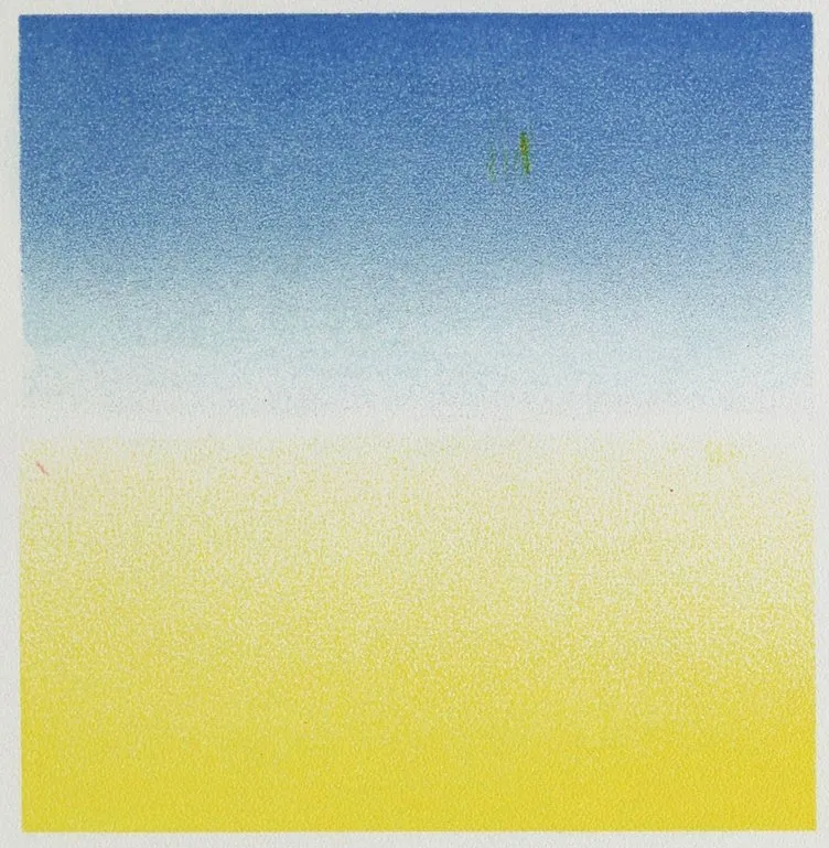
Besides the use of tints and shades to help us in
combining what would otherwise be inharmonious
color, gradation is another means we can employ
to serve our purpose. For instance, considering
different blues, which are not agreeable together,
we will look at a cloudless sky; we find that
above us it may be of a deep blue verging on
violet blue, while, as we let the eye follow it
down through the infinite and exquisite gradations
it contains, near the horizon we come gently
upon our other blue, the greenish one, and feel no
discord. The rainbow, which is, in fact, a kind of
spectrum, is the best possible example of the great
use of gradation; there we have all the pure colors,
one differing immensely from the other, but the
gradations between them are so fine and complete
as to prevent the least discord. In opals and pearl
shells, in peacock’s feathers and soap bubbles,
such coloring is also seen enhanced by being
broken by soft grays and greens. It is caused by
what is scientifically called interference; that is,
43the thin layers of the material interfere or break
up the waves of light and so produce the color.
Reflection in colored materials can be used to
help greatly in harmonizing them. Look at a
piece of red sealing-wax. Hold it up by a window
and the high gloss on it will reflect so much light
as to make the side toward the light appear almost
white. On another side the true or local color, the
brilliant red, will be seen, and the side in shadow
will be of another color still, darker and more
crimson or violet-red. Red satin will have the
same varieties in its high lights, middle, and shaded
parts, and these whiter lights and shaded parts
really gray and subdue the color of the material. A
woollen cloth of the same color which has less power
of reflection will therefore have less of the gray
about it. With practice, fine and beautiful one-color
combinations, greatly varied, can be made
by using materials of different textures but of the
same color.
What has been said so far of colors applies to
them as seen in ordinary daylight, but we must
also know how they are affected by lessened, increased,
and artificial light. Rood made many
elaborate experiments in this direction, too numerous
to be given here. With these in view, Church
gives the following table of the main changes that
occur in colored objects from the changing of the
light in which they are commonly seen:
44
If Light
Increase,—
Diminish.
Red
becomes
Scarlet
Purplish.
Scarlet
„
Orange
Red.
Orange
„
Yellow
Brown.
Yellow
„
Paler
Olive-Green.
Yellow-green
„
Yellower
Greener.
Blue-green
„
More blue
Greener.
Art’f. ultramarine
becomes
Blue
More violet.
Violet
„
More blue
Purple.
Purple
„
Redder
More violet.
We must also note the effect produced by double
light; as, for instance, at sunset when we find in
one direction the cool light from the blue of the
sky, in another the warm light from the setting sun.
This is more complicated and difficult to understand.
Reflections from near objects produce similar
effects; as, for instance, in the city, the light
reflected from a red brick wall and that from a
blue sky. An artist painted a portrait in which
the likeness was spoiled by the unnatural amount
of red in the complexion. On examination it was
found to have been put there rightly, inasmuch as
the artist certainly saw it; the error lay in choosing
a place for the subject where the red reflection
from a brick wall was thrown on his face. In a
room, a yellow wall paper and a curtain of some
other color may throw combined and confusing
though perhaps at the same time most interesting
reflections on some object. The combined effects
of daylight and gas or lamp light are similar.
45We will next consider the effect upon colored
objects of a light, itself colored,—of what is called
a dominant light. (See Plate VI, with instructions.)
Chevreul made many experiments with these.
Church gives them to us, with modifications, in the
following concise form:
Red
rays falling
on
white
make it
appear
red.
„
„
„
red
„
„
deeper red.
„
„
„
orange
„
„
redder.
„
„
„
yellow
„
„
orange.
„
„
„
green
„
„
yellowish-gray.
„
„
„
blue
„
„
violet.
„
„
„
violet
„
„
purple.
„
„
„
black
„
„
rusty black.
Orange
„
„
white
„
„
orange.
„
„
„
red
„
„
reddish-orange.
„
„
„
orange
„
„
deeper orange.
„
„
„
yellow
„
„
orange-yellow.
„
„
„
green
„
„
dark yellow-green.
„
„
„
blue
„
„
dark reddish-gray.
„
„
„
violet
„
„
dark purplish-gray.
„
„
„
black
„
„
brownish-black.
Yellow
„
„
white
„
„
yellow.
„
„
„
red
„
„
orange-brown.
„
„
„
orange
„
„
orange-yellow.
„
„
„
yellow
„
„
deeper yellow.
„
„
„
green
„
„
yellowish-green.
„
„
„
blue
„
„
slaty-gray.
„
„
„
violet
„
„
purplish-gray.
„
„
„
black
„
„
olive-black.
Green
„
„
white
„
„
green.
46Green
„
„
red
„
„
yellowish-brown.
„
„
„
orange
„
„
grayish-leaf-green.
„
„
„
yellow
„
„
yellowish-green.
„
„
„
green
„
„
deeper green.
„
„
„
blue
„
„
bluish-green.
„
„
„
violet
„
„
bluish-gray.
„
„
„
black
„
„
dark greenish-gray.
Blue
„
„
white
„
„
blue.
„
„
„
red
„
„
purple.
„
„
„
orange
„
„
plum-brown.
„
„
„
yellow
„
„
yellowish-gray.
„
„
„
green
„
„
bluish-green.
„
„
„
blue
„
„
deeper blue.
„
„
„
violet
„
„
bluer.
„
„
„
black
„
„
bluish-black.
Violet
„
„
white
„
„
violet.
„
„
„
red
„
„
purple.
„
„
„
orange
„
„
reddish-gray.
„
„
„
yellow
„
„
purplish-gray.
„
„
„
green
„
„
bluish-gray.
„
„
„
blue
„
„
bluish-violet.
„
„
„
violet
„
„
deeper violet.
„
„
„
black
„
„
violet-black.
In this table the effect of yellow light gives us
the effect of gas or lamp light on colors, as they
are yellow in character. To make his experiments
with artificial light as sure as possible, Rood, or
Chevreul, in daylight, threw the light from a gas
burner on colors set in a camera so as to judge at
the same time of the effects of the two kinds of
light, for we must remember that commonly when
we see colors by gas or lamp light we are so surrounded
47ourselves by the same yellow light that
everything is tinged by it, and our judgment
is affected; all we see being yellower, yellow
objects will look less yellow for want of the contrast
seen in daylight. This effect is now understood
and provided for by dry goods merchants,
who have for some time shown materials for
evening dresses in rooms lighted by gas. A fairly
good idea of the appearance which pictures, colored
materials, articles of dress and decoration will
make by gas or lamp light can be had by looking
at them through a piece of pale orange-yellow
glass.
Electric and calcium lights, being much whiter
than that of gas or oil, make less difference in
colors, but their intensity being different from
that of ordinary diffused daylight, it produces different
and more intense effects.
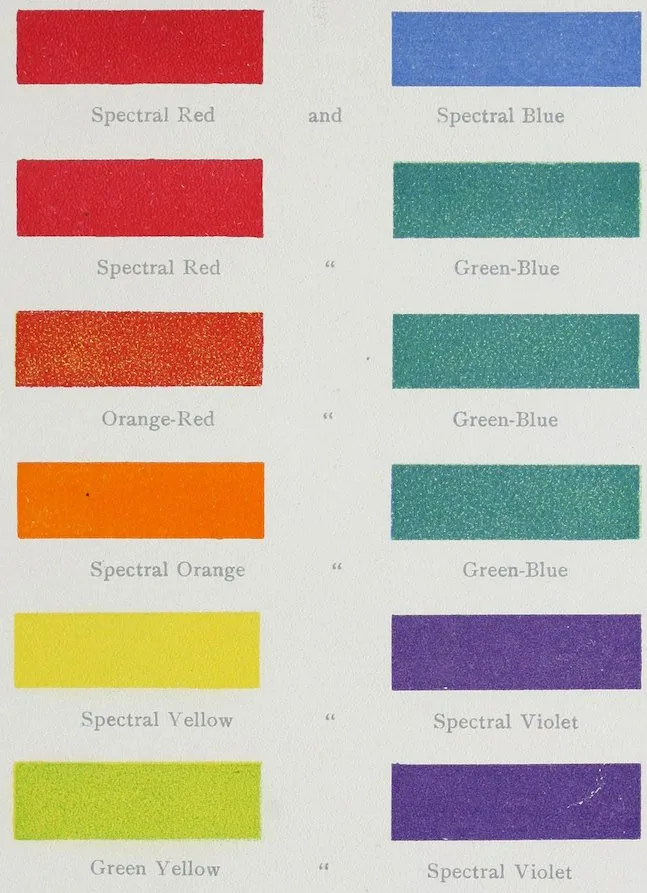
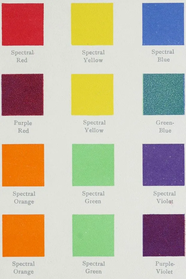
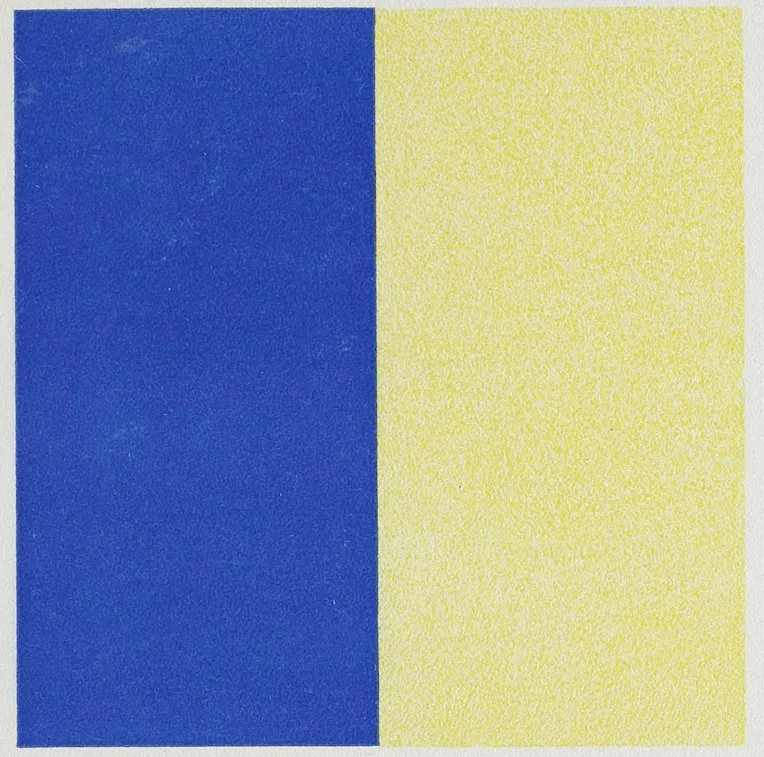
CHAPTER IV CONTRASTS AND COMPLEMENTS
48
Given a certain amount of any color, say
normal or spectral red, and wishing to make
it look as bright as it can, what color shall we
put with it, and how much of that color, to attain
our purpose? To answer that question correctly,
having in the last chapter studied the harmony
possible in what have been called self-tones, or
one-color combinations, we will take up contrasts,
of which we have several kinds, as follows:
Simultaneous contrasts of tone, neutral.
Simultaneous contrasts of color on neutral grounds.
Successive contrasts.
Mixed contrasts.
Contrasts of complements.
Contrasts of other hues or lesser contrasts.
Contrasts of brightness.
Contrasts of purity.
Contrasts of cold and warm colors.
The first point to understand clearly is the law
of simultaneous contrast of tone as studied and
49written about by Chevreul in his elaborate work
on color. Church explains this law: “Contrast
caused by difference in brightness is commonly
called contrast of tone. This kind of contrast
may occur alone or it may be associated with contrast
of hue and contrast of purity. It will be
well to consider first the simplest cases, in which
contrast of tone is not accompanied by other contrasts.
It is impossible, however, to reduce
experiments on tone-contrast to their simplest
expressions, because a third element always comes
in, namely, the background on which the pair of
tones is placed for examination. Whether this
background be black, white, gray, or colored, it
must necessarily differ in some one direction from
one or both the trial pieces, and will therefore itself
produce a contrast. To minimize the complication
thus introduced we may try an experiment for
producing the phenomena of tone-contrast in three
ways, using three backgrounds with identical trial
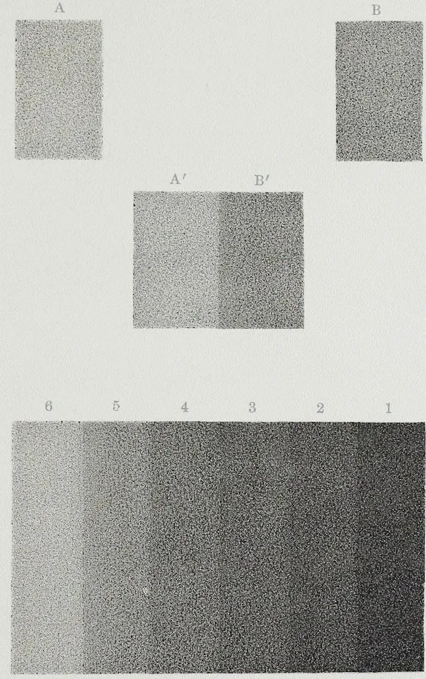
pieces on each. We first take two strips of light
gray paper, A and A′, in Plate XV, and place them
a few inches apart on a large sheet of (white)
paper in a good light. We then prepare two
similar strips of a considerably darker shade of
gray, B and B′, and place them, as shown in the
diagram, B′ alongside of A′ and the other the
same distance from B′ as A is from A′. On
50close observation it will be seen that A′ close
to B′ appears lighter than A, which lies at
some distance, while B appears correspondingly
darker than B′. The effect of contrast in enhancing
differences of tone may be studied
thus: Make such openings, five in number, in a
piece of card, as will serve to divide each of the
strips A and B into three portions. When viewed
through this card, held between the trial pieces and
the eye, it will be found that the two adjoining
parts of the strip are most contrasted in tone,
and the others less so in proportion to their distance
from the line of contact. The experiment
should now be repeated with a background of
black velvet, and again with a background of gray
paper lighter in tone than either of the strips.
The effect of contrast of tone is still better
seen in a series of toned strips placed next each
other. In such a case the effect on all the strips
save the end ones is that of double contrast. For
the second strip or second tone has one side of it
made apparently darker by reason of the contiguity
of the lighter tone of strip, while the other
side seems lighter, owing to the contiguity of the
darker tone of strip 3. The general result of
these double contrasts is that the whole series or
scale of tones gives the appearance of a number
of hollows, although, in fact, the apparent hollows
51are perfectly flat areas of uniform shade. The
effect of this experiment is approximately represented
in Plate XV, where the real flatness of each
tone of the six may be verified by covering up all
the others by a card. Tones of any one color instead
of gray may be thus employed to illustrate this
kind of simultaneous contrast, but its characteristic
effect is not seen unless the contrasting tones differ
considerably in intensity, increase by regular gradations,
and are near each other, or in absolute
contact. However, if tones of a color, whether
in tints or shades, be used, there is generally a
complication introduced, owing to the difficulty of
getting a series of such tones which shall be the
same in hue.
“This phenomenon of simultaneous contrast of
tone of course largely affects ... all drawings
in black and white and in monochrome.”
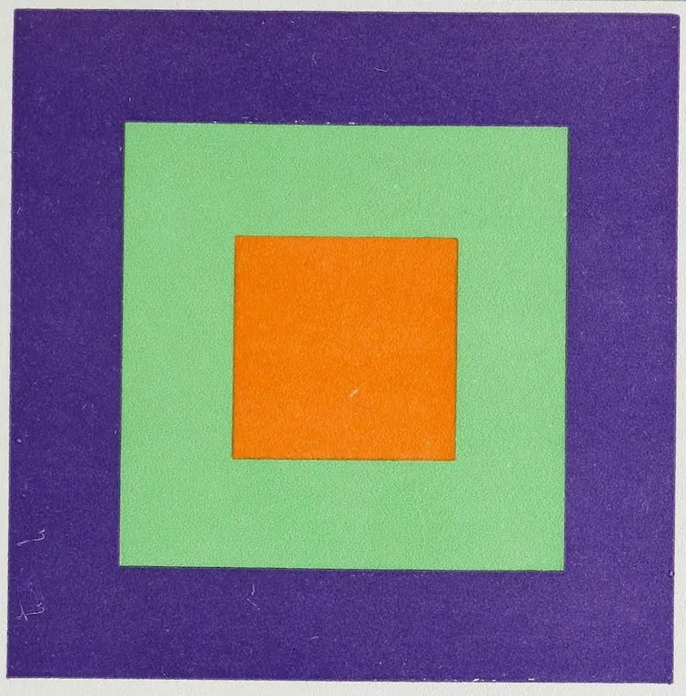
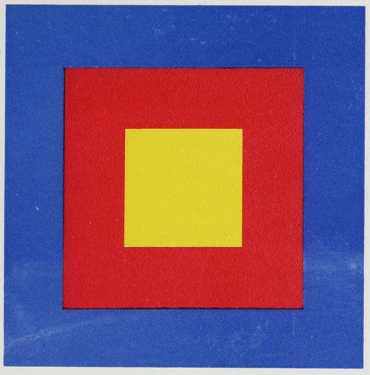
Following upon the law of simultaneous contrast
of tone is the law of simultaneous contrast of
color formulated by Chevreul, as follows: “In
the case where the eye sees at the same time two
contiguous (or adjoining) colors, they will appear
as dissimilar as possible, both in their optical composition
and the height of their tone. We have,
then, at the same time simultaneous contrast of
color, properly so called, and contrast of tone.”
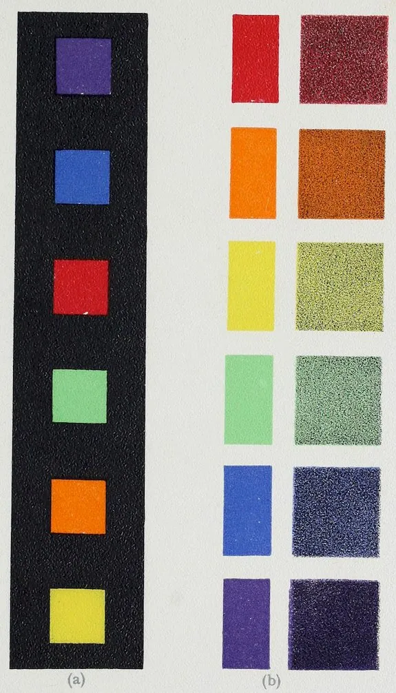
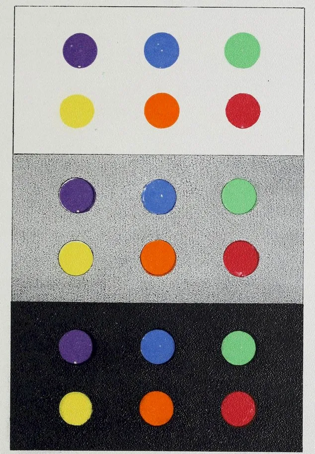
Plate XVI gives the simplest examples of this simultaneous
52contrast of color, the six spectral colors
we have been studying on grounds of white, black,
and gray. The colors seem brighter on the black
ground and darker on the white, while with the
gray the yellow alone is much affected, it seeming
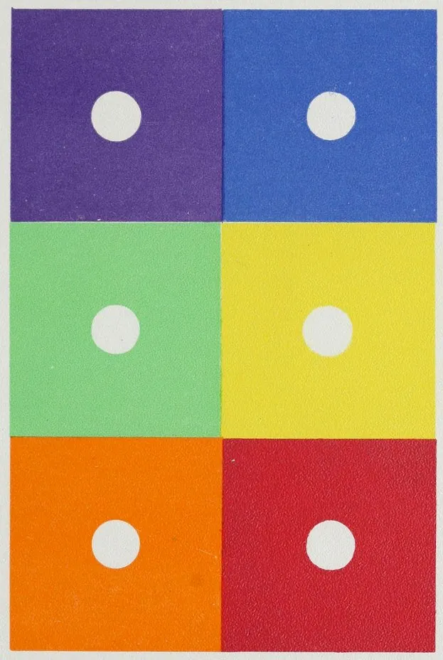
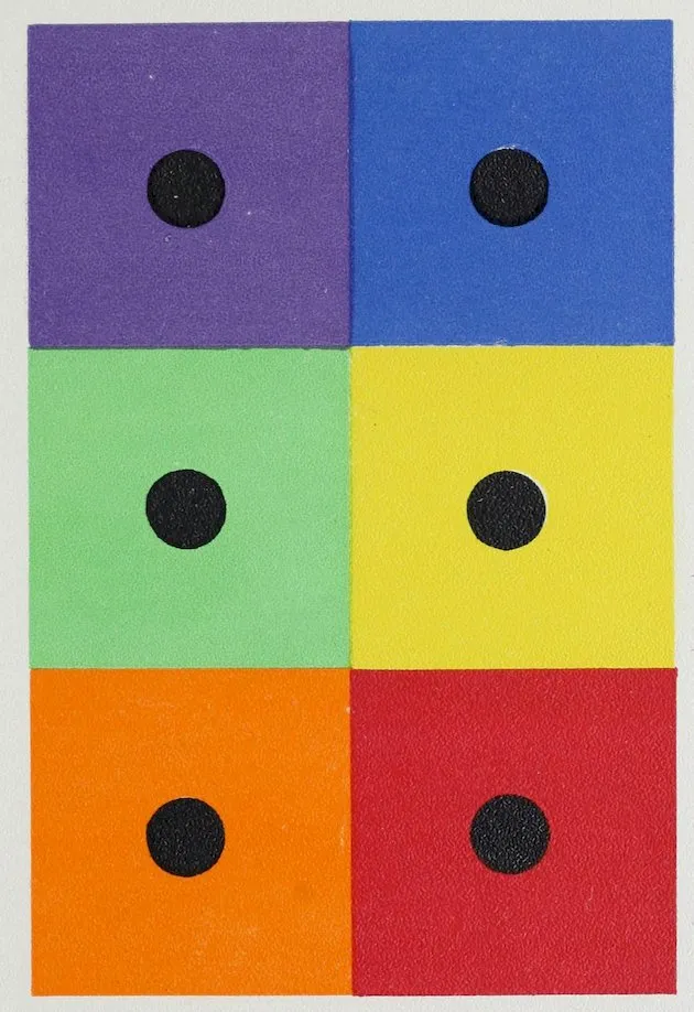
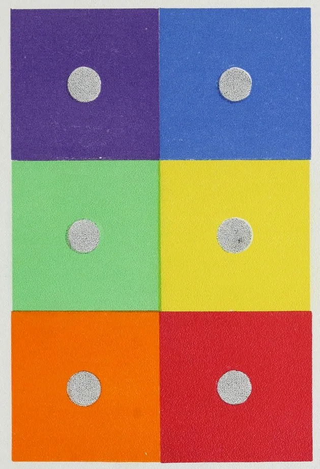
to grow brighter. The following plates (Nos.
XVII, XVIII, and XIX) give the same coloring,
but reversed, the white, black, and gray being in
spots or disks on the six colored grounds. By
covering the squares on Plate XIX. with the prepared
sheet of paper having a square opening just
large enough to allow but one of its six divisions
to be seen at a time, we shall find that each one
of the disks or spots looks, not pure gray, but
tinged with another color. This result gives us
our first hint of what is called a complementary
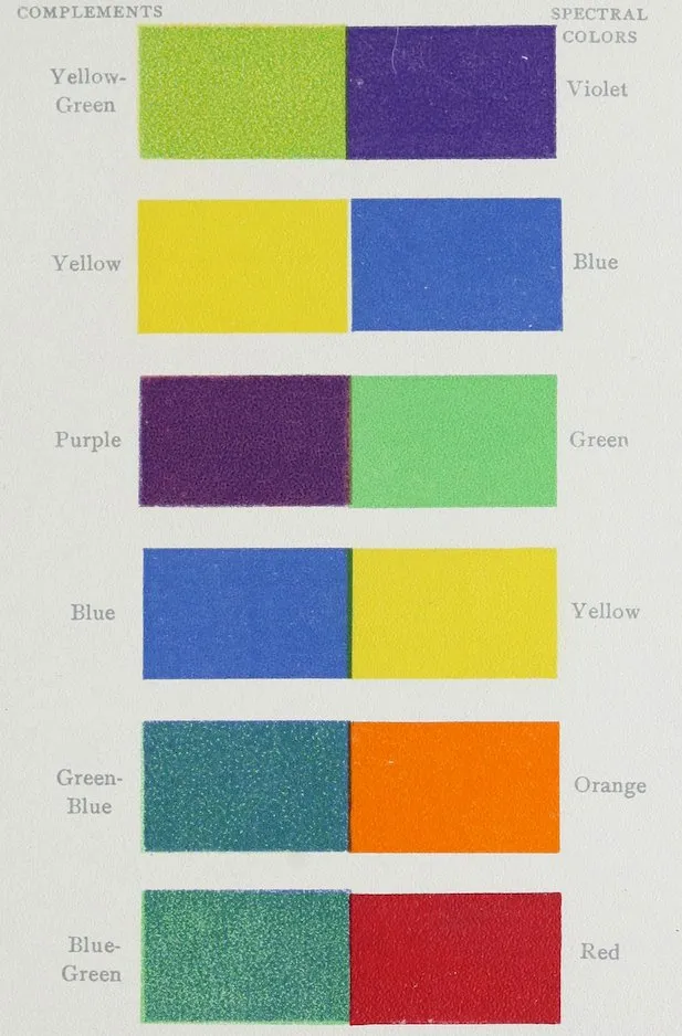
color. In the case of the gray on blue the gray
will appear rusty or yellowish, yellow being the
complement of blue; the gray on yellow will
appear bluer, blue being the complement of yellow;
on the green the gray will look purplish-red, on
the orange greenish-blue, on red bluish-green, and
on the violet yellowish-green.
Black lace over colors is always affected by them
in a similar way. Over yellow, its complement
being blue, the lace will look at its best, that is,
blackest; over blue, the lace will tend to yellow,
and will lose something of its strength and the
53fulness of its black; over greens, it will partake
of their complement, red, and tend to look rusty.
In connection with this tinging of black with
the color complementary to that of the color of the
ground on which it is placed, Chevreul tells an
interesting anecdote. A manufacturer was given
black and colored wools with which to make some
goods, the pattern to be black on colored grounds.
When they were delivered the man who had ordered
the goods complained that he had not been
given the same black wool, that the blacks were
not pure and clear. The manufacturer declared
he had used the same wools. A lawsuit followed,
in the course of which Chevreul was called upon
to give his testimony as to color, when he proved
that, according to the law of simultaneous contrast
of color, the black wool was the same, but when
woven in figures, as for instance, black on blue, the
complementary color to blue, namely, yellow, being
called up by the eye, made the black look a rusty-brownish
black instead of pure clear black. He
added that the only way to make the black on blue
look pure would be to color it with a little of the
blue so as to overcome its yellowish complement.
This delicate impression of the color complementary
to the one we are looking at, is called
up involuntarily by the eye, of which the nerve
fibrils become fatigued by the strong color, and
54incline to see the extreme opposite or complementary
color. The complement of a color may also
be called up or produced by looking fixedly at a
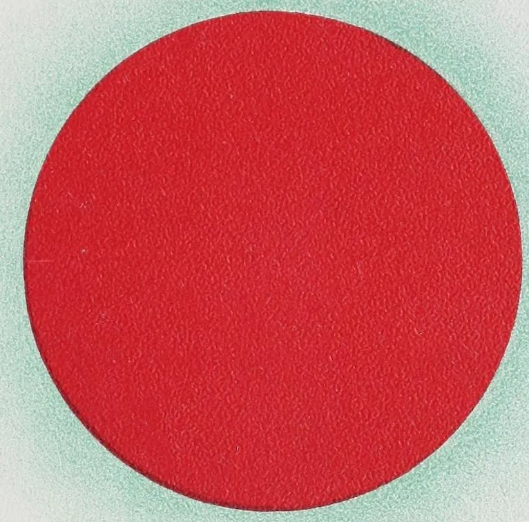
round spot like that on Plate XX for some time.
After a while there may be seen a faint image
of its complement on the white paper around it.
A still better way of seeing the complement of a
color is by looking fixedly for some time at a
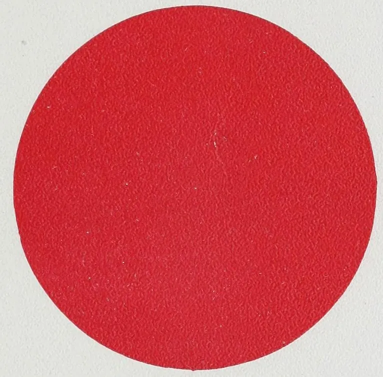
disk of the selected color placed on white paper
(Use Plate XXI); then suddenly slip a sheet of
white paper over it, and, continuing to look at the
place where it was, the same-sized image of its complement
will be seen. Here we have the answer
to the question at the beginning of the chapter:
bluish-green is the color complementary to spectral
red. The eye becomes tired with looking at the
red, and the nerve fibrils excited by it incline
to see its complement, bluish-green. We can,
however, prove this conclusion most correctly by
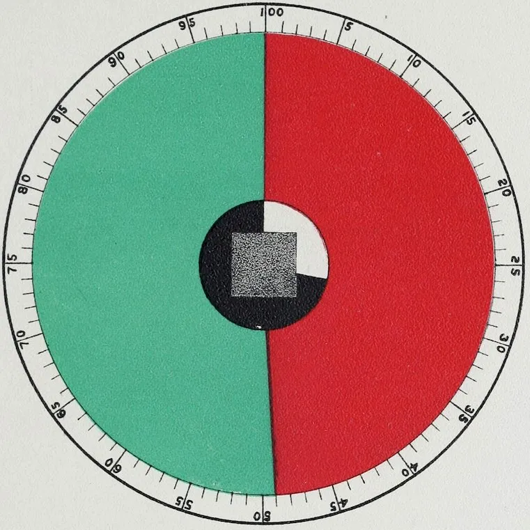
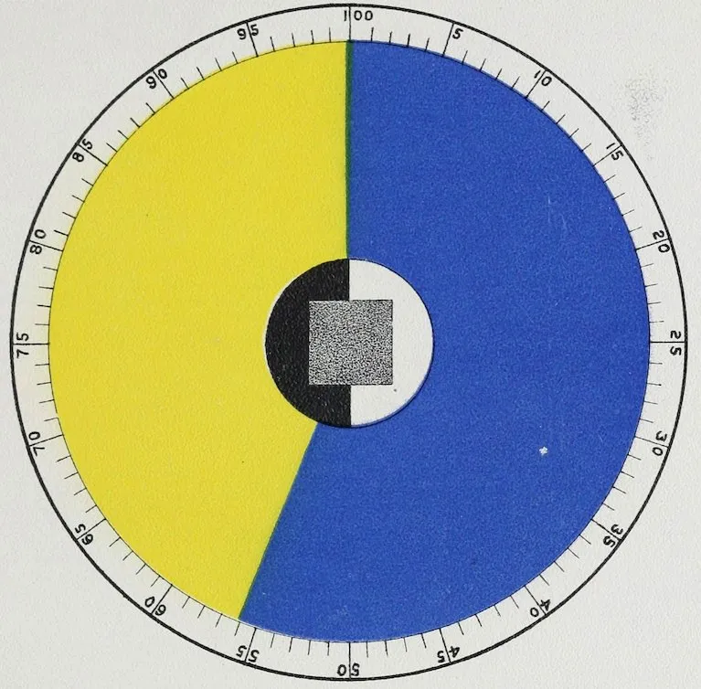
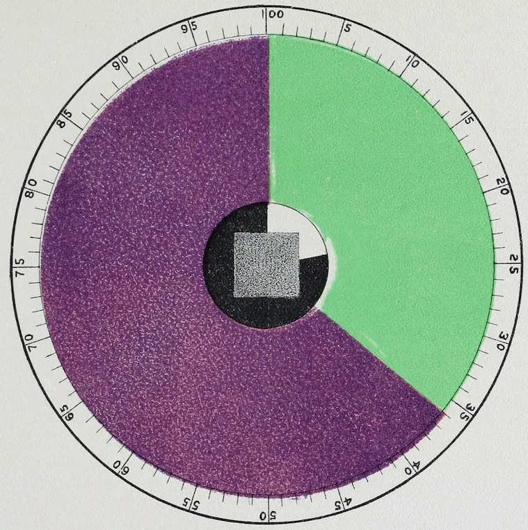
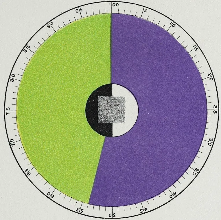
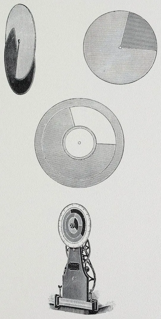
means of what are called Maxwell’s disks. If
we cut out a disk or circular piece of cardboard
and paint it spectral red, then cut a second one
just like it but paint it bluish-green, cutting a slit
in both from the edge to the middle so we can
slip one into the other as shown in Plate XXII,
and then turn them rapidly, the color in both will
seem to fade away until, when turning fast enough,
we shall see no color at all,—simply a complete
55disk of light gray. That result proves that spectral
red and bluish-green are true complements of each
other, because a certain number of parts of red neutralize
a certain number of parts of bluish-green.
If, instead of using paints and paper we were able
to use colored light, the result would be even
better; we should have white light as the result
of mixing the red and the bluish-green in the
right quantities. Pigments are so dull or non-luminous
compared with light that with them we
can only produce gray, or as it has been called,
dark white, or white in shadow. To be quite sure
that we have gray, let us add in front of our disks
two smaller ones of black and white, and we will
find the gray produced by the mixture of the
black and white to match perfectly the gray made
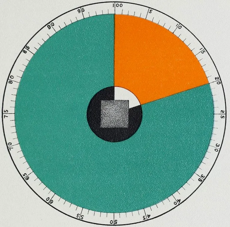
of spectral red and bluish-green. To measure the
quantity of each color necessary, we can put behind
the two disks a white disk that is not slit,
the circumference of which is divided, as in Plates
XXII, XXIII, XXIV, XXV, and XXVI, into
one hundred parts. These are plates of the six
specified spectral colors with their complements.
The numbers give the quantity in one-hundredths
of each color. The “number of luminosity”
means the quantity of white in proportion to
black, in one-hundredths necessary to make the
gray of that particular degree.
56The Milton-Bradley Company, of Springfield,
Massachusetts, make an excellent little machine,
including several sets of disks of different sizes and
good colors, and a stout frame on which to put the
disks, with a crank by which to turn them. It can
be set up and screwed on a table, so that any one
can make for himself these delightful experiments.
Plate XXVII is an illustration of this machine.
There is hardly a limit to the number of the other
complementary colors that can be made with this
set of disks. Study of this set of complementary
colors is most important as a foundation for all
contrasts. Experiment has also proved that colors
have more than one complement.
“Complementary colors of full brightness and
purity afford the most striking examples of the
effect called contrast. When each of a pair of such
colors differs as much as possible from its fellow
in hue, but is of the same degree of brightness, it
is found, while the brightness of both is enhanced,
that the hue of both is unchanged by the close
neighborhood or contiguity of the two colors. But
if the pair be not truly complementary, or if in
brightness or purity one color differ from the
other, then such difference will not be seen exactly
as it is, but such dissimilarity as exists, whether it
be of one hue, of purity, or of brightness, will be
increased or enhanced by juxtaposition. This is
57the primary law of contrast, which embraces three
varieties dependent respectively upon differences
as to the three constants of color, namely, hue,
purity, and brightness (or luminosity). If two
adjacent colors differ in brightness, that which is
the brighter, or, in other words, the more luminous,
will increase in brightness, while the less luminous
will have its brightness diminished. If two adjacent
colors differ in hue, such difference will be
increased, each hue tending to change as if it had
been mixed with the complementary of the other.
In the case of complementaries no increase of
difference in hue is, however, possible.”[6]
Plate XXVIII shows us the six spectral colors
with their complements, not in quantity, but as a
table. After thorough study of this table of first
and simplest contrasts, the practical advantage of
Plates XXII to XXVI will be apparent. To make
it easier we give Plate XXIX, which shows the same
set of complements. Here they are arranged in a
circle in which each color is opposite its own complement.
This circle leads us from the strongest
contrasts of complements to lesser contrasts. This
should also be studied till it can be remembered for
future reference. Being in simple spectral colors,
it is easier than the more numerous tints of shades
of neutralized colors, and is also a key for understanding
58and classifying them. It is well here to
note how many complements are green or greenish
in hue.
Concerning the law of simultaneous contrast,
with regard more especially to lesser contrasts,
Rood says: “When any two colors of the chromatic
circle are brought into competition or contrasted,
the effect produced is apparently to move
them both farther apart. In the case, for example,
of orange and yellow, the orange is moved
toward the red, and assumes the appearance of
reddish-orange; the yellow moves toward the
green, and appears for the time to be greenish-yellow.
Colors which are complementary are
already as far apart in the chromatic circle as possible;
hence they are not changed in hue, but
merely appear more brilliant and saturated.”
Plate XXX will be found of great assistance in
comparing pairs of colors with each other. Here
we have a diagram of a chromatic circle. By
placing over it the transparent color screen found
at the end of the book, and moving it slowly in
the same direction, it will be seen that red when
contrasted with greenish-blue causes this last color
to move away from the centre of the circle in
a straight line; hence, as the new point is on
the same diameter, but farther from the centre,
we know that the greenish-blue is not made more
59or less blue or green, but is simply caused to appear
more saturated or brilliant. The new point
for the red lies also on the same diameter, but is
nearer the centre of the circle; that is, the color
remains red, but appears duller or less saturated.
Experience confirms this. If a considerable number
of pieces of red cloth, for example, are examined
in succession, the last one will appear
duller and inferior in brilliancy to the others, but
it will still appear red. Proceeding with the
examination of the effects produced on the other
colors, we find that the orange has been moved
toward yellow and also toward the centre of the
circle; hence our diagram tells us that red, when
put into competition with orange, causes the latter
to appear more yellowish and at the same time
less intense. So we can go on comparing one
color with another and find out the effect of each
by moving the one circle over the other in different
directions, always finding that the complements
as moved away from each other only grow
more brilliant but more changing in color. Church
gives us a list of the changes due to the principal
pairs of lesser contrasts from the observations of
Chevreul, Rood, etc., as follows:
(It may be remarked that this table of changes
as here given is more easily understood than in its
original form as given by Church.)
60
Pairs of Colors.
Change due to Simultaneous Contrast.
Red with orange
inclines to
purple.
Orange with red
„
yellow.
Red with yellow
„
purple.
Yellow with red
„
green.
Red with blue-green
becomes more
brilliant.
Blue-green with red
„
„
Red with blue
inclines to
orange.
Blue with red
„
green.
Red with violet
„
orange.
Violet with red
„
blue.
Red with purple
„
orange.
Purple with red
„
blue.
Orange with yellow
„
red.
Yellow with orange
„
green.
Orange with green
„
red.
Green with orange
„
blue-green.
Orange-yellow with turquoise
becomes more
brilliant.
Turquoise with orange-yellow
„
„
Orange with violet
inclines to
yellow.
Violet with orange
„
blue.
Orange with purple
„
yellow.
Purple with orange
„
blue.
Yellow with green
„
orange.
Green with yellow
„
blue-green.
Yellow with turquoise
„
orange.
Turquoise with yellow
„
blue.
Yellow with blue
becomes more
brilliant.
Blue with yellow
„
„
Green with blue
inclines to
yellow-green.
Blue with green
„
violet.
Green with violet
„
yellow-green.
Violet with green
„
purple.
61Green with purple
becomes more
brilliant.
Purple with green
„
„
Blue with violet
inclines to
green.
Violet with blue
„
purple.
Violet with purple
„
blue.
Purple with violet
„
red.
“It must not be imagined that the changes
enumerated in the above table are at all equal to
one another in amount. We have, indeed, always
some change, but it varies much in the case of
different pairs. When the chromatic interval (on
the color-circle) is small, then the change of hue,
in virtue of simultaneous contrast, is large; when
the interval is large the change of hue is slight,
but it is accompanied by change of brightness;
when the interval is as large as possible there is
no change of hue, but the brightness of both hues
is increased.”
After simultaneous contrasts Chevreul gives us
successive contrasts, which latter “may be observed
when we tire one set of retinal fibrils by gazing
for some time on a surface of a very decided color
and brightness. Afterward, on looking at a colorless
surface of white, gray, or black, it will be
found to be tinctured with the complementary of
the first color.” If we stare at a piece of bright
red paper and then look at white paper we will
62see blue-green, the complement of the red. So, if
we look at a series of pieces of red cloth the first
will appear the brightest, the second less so, the
third still less, but if the eye is rested by looking
at a piece of bluish-green cloth the red will then
be seen of its original brightness. When a black
spot laid on red cloth is looked at steadily for
some time, then is taken suddenly away, the
place where the black spot was will appear to
be of a brighter red than that around it on account
of the less fatigue there has been to that part
of the retina. A salesman who understood complementary
colors could use this law of successive
contrasts with great effect in showing
goods.
Still another form of contrast is called mixed
contrast. “The distinction of simultaneous and
successive contrast renders it easy to comprehend
a phenomenon which we may call mixed contrast;
because it results from the fact that the
eye, having seen for a time a certain color, acquires
an aptitude to see for another period the complementary
of that color and also a new color,
presented to it by an exterior object; the sensation
then perceived is that which results from this new
color and the complementary of the first. The
following is a very simple method of observing this
mixed contrast: One eye being closed, the right
63for instance, let the left eye regard fixedly a piece
of paper of the color A; when this color appears
dimmed, immediately direct the eye upon a sheet
of paper colored B; then we have the impression
which results from the mixture of this color B with
the complementary color, C, of the color A. To be
satisfied of this mixed impression it is sufficient
to close the left eye, and to look at the color B
with the right: not only is the impression that
produced by the color B, but it may appear modified
in a direction contrary to the mixed impression
C + B, or, what comes to the same thing, it appears
to be more A + B.”[7]
That the complementary of a color exists in its
shadow may be seen by watching a stretch of snow
when the sun is hidden by a cloud: the snow is
white, the shadow gray. When the cloud passes
away, the light on the snow makes it look yellow;
the shadow will also be seen to be more or less
blue as the atmosphere is more or less clear and
free from the moisture which veils the sunlight.
The same result in a greater or less degree exists
in all shadows, which shows how useful study of
the complementary colors is for painters.
The purple or violet shadows of the “impressionists”
are in many cases exaggerations. On
snow, dust, or sand, violet shadows are to be found
64in certain conditions of the atmosphere, but “impressionists”
often do not seem to take into sufficient
account the color called by artists “local
color” of the substance or material on which the
shadow is thrown, or the color of the sky reflected
in the shadow. A true colorist detects these
subtle varieties. An artist who has not a fine eye
for color uses the pure colors given by scientists,
thus making the crude, harsh pictures so much
criticised. They are true to a great extent scientifically,
but are cold and glaring, and without the
true spirit of nature.
In studying the complements of these six spectral
hues we come across the theory that because
a color and its complement together make white,
therefore they must prove to be an agreeable
harmony. Now, is that true? At first sight we
answer, No. We do know that if we wish to make
a color as brilliant as possible, we must add to it
its complement. Under certain circumstances
that may give us a good result, but artistic taste
declares that a pure spectral color and its complement
make a combination so strong and vivid
as almost to amount to crudeness, and to jar on
a sensitive eye. Still, the theory that complementary
colors make a true and perfect harmony
is well considered in the following extract from
Eastlake:
65“Every treatise on the harmonious combination
of colors contains the diagram of the chromatic
circle more or less elaborately constructed. These
diagrams, if intended to exhibit the contrasts produced
by the action and reaction of the retina,
have one common defect. The opposite colors are
made equal in intensity; whereas the complemental
color pictured on the retina is always less
vivid, and always darker or lighter than the
original color. This variety undoubtedly accords
more with harmonious effects in painting.
“The opposition of two pure hues of equal intensity,
differing only in the abstract quality of
color, would immediately be pronounced crude and
inharmonious. It would not, however, be strictly
correct to say that such a contrast is too violent;
on the contrary, it appears the contrast is not
carried far enough, for though differing in color,
the two hues may be exactly similar in purity and
intensity. Complete contrast, on the other hand,
supposes dissimilarity in all respects. In addition
to the mere difference of hue, the eye, it seems,
requires difference in the lightness or darkness of
the hue. The spectrum of a color relieved as a
dark on a light ground is a light color on a dark
ground, and vice versa. Thus, if we look at a
bright red wafer on the whitish surface, the complemental
image will be still lighter than the
66white surface; if the same wafer is placed on a
black surface the complemental image will be
still darker. The color of both these spectra may
be called greenish (bluish-green), but it is evident
that a color must be scarcely appreciable as such,
if it is lighter than white and darker than black.
It is, however, to be remarked, that the white
surface round the light greenish image seems
tinged with a reddish hue, and the black surface
round the dark image becomes slightly illuminated
with the same color, thus in both cases assisting
to render the image apparent.
“The difficulty or impossibility of describing
degrees of color in words has also had a tendency
to mislead, by conveying the idea of more positive
hues than the physiological contrast warrants.
Thus, supposing scarlet to be relieved as a dark,
the complemental color is so light in degree and
so faint in color that it should be called a pearly
gray; whereas the theorists, looking at the quality
of color abstractedly, would call it a green-blue,
and the diagram would falsely present such a hue
equal in intensity to scarlet, or as nearly equal as
possible.
“Even the difference of mass which good taste
requires may be suggested by the physiological
phenomena, for unless the complemental image is
suffered to fall on a surface precisely as near to
67the eye as that on which the original color was
displayed, it appears larger or smaller than the
original object, and this in a rapidly increasing
proportion. Lastly, the shape itself soon becomes
changed. That vivid color demands the comparative
absence of color, either on a lighter or darker
scale, as its contrast, may be inferred again from
the fact that bright colorless objects produce
strongly colored spectra. In darkness the spectrum,
which is first white, or nearly white, is
followed by red; in light, the spectrum, which is
first black, is followed by green. All color, as the
author observes, is to be considered as half light,
inasmuch as it is in every case lighter than black
and darker than white. Hence no contrast of
color with color, or even of color with black
or white, can be so great (as regards lightness or
darkness) as the contrast of black and white, or
dark and light abstractedly. This distinction
between the differences of degree and the differences
of kind is important, since a just application
of contrast in color may be counteracted by an
undue difference in lightness or darkness. The
mere contrast of color is happily employed in some
of Guido’s lighter pictures, but if intense dark had
been opposed to his delicate carnations, their comparative
whiteness would have been unpleasantly
apparent. On the other hand, the flesh-color in
68Giorgione, Sebastian del Piombo (his best imitator),
and Titian, was sometimes so extremely glowing
that the deepest colors and black were indispensable
accompaniments. The manner of Titian, as
distinguished from his imitation of Giorgione, is
golden rather than fiery, and his biographers are
quite correct in saying that he was fond of opposing
red (lake) and blue to his flesh. The correspondence
of these contrasts with the physiological
phenomena will be immediately apparent, while
the occasional practice of Rubens in opposing
bright red to a still cooler flesh-color will be seen
to be equally consistent....
“It was before observed that the description of
colors in words may often convey ideas of too
positive a nature, and it may be remarked generally
that the colors employed by the great masters
are, in their ultimate effect, more or less subdued
or broken. The physiological contrasts are, however,
still applicable in the most comparatively
neutral scale.”
Chevreul gives us in his book, Colour (a
work published in 1835, which has gone through
many editions and translations, having finally
been edited and republished in 1889 by his son), an
elaborate system of color contrasts based upon the
older theory of three primary colors, red, yellow,
and blue. There followed upon this in 1890 one
69by Charles La Couture, Répertoire Chromatique,
containing an ingenious and beautiful system of
color scales also founded upon the Brewster theory
of red, yellow, and blue as primary colors. Of
these color charts it has been well said that they
are only able to display the effects, not of mixing
colored light, but colored pigments.
The following are rules to be used in regard to
contrasting colors:
Rule I.—A pair of complementary colors in
their pure spectral tones in the proportions in
which they neutralize or complement each other,
as in Plates XXII to XXVI, should only be used
if you wish to produce a bold, striking, perhaps
harsh effect; or if you wish to create a focus in
your picture, your room, or your decoration. In
the latter case it will be well to soften the effect
(especially in the case of a picture) by repeating
the same colors in tints or shades in some other
part of the work.
Rule II.—Harmony of contrast exists only in
proportion to the changes in quality or quantity
in equal portions of pure spectral tones.
Rule III.—The more neutral you make the
tint or shade of one of the pair of complements,
so much the more may you add to its quantity.
For instance, a small quantity of bright spectral
red will balance a large quantity of pale blue-green.
70Rule IV.—By using two or more tints, or
shades and tints, of one of the pair of complements,
so much the finer becomes the harmony.
The artist Turner sent to an exhibition of the
Royal Academy in England a marine which was
accepted and hung, but which, being a quiet picture
consisting mainly of pale, grayish sea-greens,
attracted little attention. On varnishing day,
however, he went to the Academy and painted in
the foreground of his picture a scarlet buoy, when
to the surprise of every one, owing to the correct
balance of the quality and quantity of his complementary
contrast, the scarlet and blue-green so
intensified each other that the picture became a
striking one, dulling the others around it and
drawing constant admiration.
From a dinner table set out at a flower show in
the Madison Square Garden, which took a first
prize, Plate XXXI is taken. It was a harmony
of yellow and blue.
1.
Yellow chrysanthemums.
2.
Yellow lamp-shades.
3.
Yellow satin centrepiece.
4.
Yellow candies.
5.
Yellow candies.
6.
Yellow candies.
71
7.
Yellow-brown almonds.
8.
Gold ornament on glass, china, and candies.
9.
Dark purple-blue grapes.
In this case some of the yellow was in pure
spectral tones, the blue very strong, dark, and
neutralized.
Rule VI.—The finest harmony of contrast will
be found where tints and shades of both the pair
of complements can be combined. Then a small
amount of both in spectral tones may be introduced
to give accent to the rest. Plate XXXII gives a
blue and yellow harmony taken from an English
china cup composed of two blues and two yellows,
both neutral. The ground, being of a pale tint of
yellow, is greater in quantity according to Rule
III. The dainty pattern painted on it is in the
two blues; the delicate stems holding and uniting
the conventional leaves and flowers are of brown
(or dark yellow). The brown, being the darkest
color, is the smallest in quantity, as the harmony
is intended to be light and cheerful.
Harmonies in blue and yellow have been used
with great success in old decoration, when blended,
modified, and interchanged with each other, and
are one of the most useful combinations of colors
that can be made. They are largely used in
Italian and Spanish tiles and other porcelains.
They are complementary colors strongly opposed
72to each other, but the reason for their being more
agreeable than other pairs of complements seems
to arise from the fact that one, the yellow, is
so much more luminous (or lighter) than the other
that it affords a greater contrast than appears in
the other pairs of complements.
Rule VII.—Even pure spectral colors may be
used with good effect by blending them in small
portions, as in what are technically called diaper
patterns.
We have still a further power of adding to our
harmony of contrasts by the use of different materials,
such as paper, paint, plaster, silk, satin,
velvet, plush, and metals, in which the variety of
surfaces gives an infinite number of tones, absorbing
and reflecting, etc. These will be considered
in the chapter on color-harmonies, and seem
really inexhaustible. In that chapter is given
a list of pairs of the lesser contrasting colors,
such as have been found by observation of historic
color to be the most agreeable to the eye.
CHAPTER V COLOR-HARMONIES HARMONIES OF COMPLEX OR VARIOUS COLORS
73
It is said that the use of agreeable and harmonious
colors tends to the sanity of the whole
body by strengthening the nerves; so much so,
that part of the treatment of insane patients in a
European asylum consists in surrounding them
with certain colors, and, probably, of changing
these according to certain rules. From these facts
we surely learn that there is reason beyond that
of our mere enjoyment of colors to lead us to
study color-harmonies.
The most widely accepted division of these harmonies
is that of Chevreul, who in his life of over
one hundred years had time to formulate, revise,
and amplify his laws of color, and, from his position
as director of the manufacture of the Gobelin
tapestries, great opportunities for experiment.
The two chief groups, based respectively on analogy
and on contrast, are resolved into three sub-divisions
each. These are quoted as follows from
Church, who has added some explanations to them
as given in The Law of Simultaneous Contrast:
74“I.—HARMONIES OF ANALOGY.
“II.—HARMONIES OF CONTRAST.
“1. The Harmony of Analogy of Scale.—This
harmony is essentially that of a series, the harmony
of gradation. It includes those cases in
which is presented a simultaneous view of three
or more tones of the same scale, whether these
tones be tints, or shades, or broken tones. It is
obtained in various degrees of perfection, according
to the number of tones present, and the value
of the intervals between them. When the tones
are not easily separable by the eye, and pass into
one another, then the effect called ‘shading’ is
produced.
“2. The Harmony of Analogy of Tones.—When
two or more tones of the same depth, or of
very nearly the same depth, but belonging to different
but related or neighboring scales, are viewed
together, the harmony of tone is produced. Many
such assortments are, however, displeasing to the
educated eye, unless the tones be so selected as to
fall into a series with a gradually increasing quantity
of some one of their color elements, when they
may be arranged in the third kind of harmonies
of analogy.
“3. The Harmony of a Dominant Hue.—An
example of this harmony is afforded by viewing a
contrasted color assortment, a bouquet of flowers,
75or even a landscape, through a piece of glass so
slightly tinctured with a color as not to obliterate,
but merely to modify, the various colors belonging
to the arrangement or composition.
“1. The Harmony of Contrast of Scale is produced
by the simultaneous view of two or more
distant tones of the same scale.
“2. The Harmony of Contrast of Tones is produced
by the simultaneous view of two or more
tones of different depths belonging to neighboring
or related scales.
“3. The Harmony of Contrast of Hue is produced
by the simultaneous view of colors belonging
to distant scales, and assorted in accordance with
the laws of contrast. This kind of contrast includes
also those cases in which the effect is still
further enhanced by difference of tone as well as
of color.
“The distinction between these two classes or
groups of harmonies is somewhat arbitrary, for
the collocation of any two tones or any two colors,
whether its results be agreeable or otherwise, inevitably
involves the element of contrast. Color-harmonies,
so far as contrast is concerned, differ
in degree and complexity, but Chevreul’s harmonies
of analogy pass by steps more or less marked
into distinct and undoubted harmonies of contrast.
In every harmony there is contrast of tone or of
76color, and therefore contrast cannot be employed
as a criterion of classification. The two fundamental
ideas underlying complex color-harmonies
may perhaps be expressed as those of gradual
change and of abrupt change. Instead of separating
color-harmonies into two distinct groups, it
would be better to arrange them in order upon
the arc of a circle, placing at one extremity those
harmonies on which the succession of contiguous
tones or hues is marked by the smallest differences,
and at the other extremity, those harmonies
in which the elements of contrast are most strongly
developed. About the middle of the arc will be
arranged those transitional harmonies in which
contrasts of tone, contrasts of color, and contrasts
of tone and color combined, begin to make themselves
felt as modifying the effect of the regular
sequence of tones and related hues. According to
this scheme, we may commence with harmonies in
which the succession of tones is so gentle as to
be barely perceptible, and we may end with those
harmonies in which the change of hue and of tone
is most abrupt. A list of illustrative examples
will help to elucidate the scheme:
“1. The passage, by insensible differences, of the
tints, shades, or broken tones of a single hue from
light to dark.
“2. The passage, by small but regular, definite,
77and perceptible steps, of the tints, shades, or
broken tones of a single hue from light to dark.
“3. The passage, as in the preceding example
(2), of the tones of one hue, from light to dark,
when each step is separated by a neutral element,
such as white, gray, or black.
“4. The passage, by insensible differences, of one
hue, or of the tones of one hue into another related
hue, or its tones.
“5. The passage, by definite steps, of one hue,
or of the tones of one hue, into another related hue
or its tones.
“6. The passage, as above (5), of related hues
into each other, each step separated by a neutral
element.
“7. The passage, by insensible differences, of one
hue into another chromatically remote hue.
“8. The passage, by definite steps, of one hue
into another chromatically remote hue.
“9. The passage, as above (8), of one hue into
another, when each step is separated by a neutral
element.
“10. The collocation of distant tones.
“11. The collocation of chromatically distant
hues with or without the interposition of neutral
elements.
“It will be noticed how the idea of seriation
or gradation becomes more and more involved
78with that of change as we follow the sequence of
the above examples. Gradually the notion of
orderly succession, of a regular series with the presence
of a pervading and dominant constituent, is
lost by the abruptness of change caused by the
introduction of foreign elements, or by the contiguity
of distant tones and distant hues.”
As both of these sets of rules for harmonies of
colors are so elaborate as to amount almost to color
charts, and would be difficult and complicated to
print in colors, for our practical purpose we will
roughly divide harmonies of colors under three
heads; as follows (See Plate XXXIII):
Harmonies of one color.
Harmonies of contrast (of color).
Harmonies of complex or various colors.
This division is not strictly correct, because even in
a harmony of one color the element of contrast
will appear; as, for instance, when we combine a
pale tint of yellow, say straw color, with brown,
which is a dark shade of yellow. As, however, in
this case it is contrast of tone, not contrast of
color, we will not let that interfere with the order
of our arbitrary classification. The first class,
harmonies of one color, have been considered in
Chapter III. When simple, refined color is wanted
in either dress or decoration, or where from inexperience
79one is afraid to combine colors, it is best
and safest to use this simplest kind of color
harmony. With this class, as black and white are
not colors, we will also include harmonies of one
color combined with black, or white, or gray, or
two or all three of these. From a book advertisement
most successful in its clear, simple, and
agreeable character we give Plate XXXIV. It
was on white paper, the proportions as follows:
Most white, less black, least yellow, this latter
always outlined with black. The white also
showed through the yellow in some places and
served to lighten the design.
In decoration, when two tones of one color are
used they are often separated with a fine line of
white or black or gray. In Plate XXXV the
useful effect of such a line of separation is shown.
A light tint on a dark shade does not so much
need an outline, but a dark shade on a light tint
is much improved by white outlines. The white
line increases the apparent strength of both tint
and shade, while black will increase their brightness
but diminish their purity.
“In the consideration of the specific effects of
the association of white, gray, or black with a
single color, we follow the order in which the
colors succeed each other in the spectrum, adding
purple at the end.
80“1. Red.—Red with white becomes deeper,
more saturated or purer, and less bright. The
combination, as to intensity of contrast, is similar
to that of green with white, being less than that
of blue, violet, or purple with white, but more
marked than that of orange or yellow with white.
“Red with gray, when the latter is moderately
pale, becomes brighter and less saturated, sometimes
acquiring an orange tinge.
“2. Orange.—Orange with white is rendered
deeper, and perhaps a trifle more reddish. The
contrast of tone between orange and white is much
greater than that between yellow and white; the
combination is consequently more effective.
“Orange with gray, when the latter is pale, is
deepened and reddened. With dark tones of gray
orange becomes lighter.
“Orange with black becomes brighter and slightly
yellower.
“3. Yellow.—Yellow with white is rendered
deeper, less bright, and less advancing, acquiring
a slight greenish hue. The lighter the tone of the
yellow the less pleasing is the combination.
“Yellow with gray is rendered brighter and perhaps
slightly orange. The combination is satisfactory
when the gray is rather dark.
“Yellow with black is rendered paler, brighter,
and more advancing. The combination affords
81the most intense contrast of tone next to that of
white with black. The blackness of the black is
modified by acquiring a slight bluish hue which
enriches it.
“4. Green.—Green with white becomes deeper
and purer; the combination is capable of yielding
very beautiful effects.
“Green with gray becomes deeper only when the
gray is pale; if the gray be at all dark it acquires
a purplish tinge.
“Green with black is rendered brighter and paler,
while the black suffers, being tinged with a reddish
or purplish hue.
“5. Blue.—Blue with white constitutes a
generally pleasing combination. The contrast of
tone is very decided when the blue is at once pure
and bright. The effect of strongly illuminated
white clouds in deepening the tone of the blue of
the sky bordering them is a good example of one
of the chief characteristics of this combination;
under such conditions the white often assumes a
slightly yellowish tint.
“Blue with gray. Gray, if pale, deepens and
purifies blue; the combination, though necessarily
cold, is often most serviceable in pictorial as well
as in ornamental art.
“Blue with black. This combination is less
agreeable than that of blue with gray, or of violet
82with black, especially when the tone of the blue
is deep. Light tones of blue are made still paler,
but broken tones more saturated, by contiguity
with black.
“6. Violet.—Violet with white affords a strong
contrast of tone; the combination is an agreeable
one, resembling that of blue with white.
“Violet with gray. The distinctive hue of violet
makes itself felt strongly in this combination,
which is a quiet and agreeable one.
“Violet with black gives but a slight contrast of
tone when the violet is pure. The black acquires
a rusty brown hue, which reduces its depth.
“7. Purple.—Purple with white affords a good
contrast of tone. Pale purples and rosy tints
form agreeable combinations with white.
“Purple with gray resembles in effect the combination
of violet with gray; the gray, if of
moderate area, becomes decidedly greenish.
“Purple with black is rarely a satisfactory combination;
the black acquires a greenish hue.”[8]
The second class, harmonies of contrast, have
been studied in Chapter IV. Where bold, striking,
emphatic color is needed the complementary colors
may be used. The most prominent part of a picture,
a room, or a decoration will be, as far as
color is concerned, where some color and its complement
83in nearly, or quite, spectral hues are
given. This striking effect of contrast will
lessen accordingly as the colors darken into
shades, or lighten into tints, or become more
and more neutral from the mixture with some
other color. An eye untrained or inexperienced
will find these complementary contrasts difficult
to use, there being danger of producing a
crude or harsh effect. Rules for their use are
given in Chapter IV. Classifying the complementary
pairs according to the pleasure we take
in them we may put yellow and blue first, then
orange and green-blue, red and blue-green, finally
violet and green. Chevreul, Rood, Von Bezold,
and Bruecke, having made many experiments and
observations in their attempts to lay down rules for
harmonious combinations, state that here we come
upon problems that cannot be solved by purely
scientific reasoning. By comparing the art of one
country or of one period of one country with that
of another, we find that throughout them all, certain
pairs of colors have been preferred to certain others
and we feel that æsthetic taste, which cannot be
explained, influences us greatly in our liking for
certain combinations. Beside taste, inheritance,
training, environment, and contrast all have their
unconscious effect upon these preferences. Church
divides pairs of colors into three classes: Pairs of
84the small intervals, pairs of decided differences,
and the extremes or complements. The latter we
have considered in Chapter IV. Pairs of the
small intervals are such as
Orange-red and yellowish-orange,
Reddish-orange and orange-yellow,
Orange and yellow,
which, being so close to each other in the color
scale in decoration, are apt to injure each other
unless separated by outlines of black, white, gray,
or gold. Rood gives the following table of small
intervals:
“Darker.
Lighter.
Red
Orange-red.
Orange-red
Orange.
Orange
Orange-yellow.
Orange-yellow
Yellow.
Yellowish-green
Greenish-yellow.
Green
Yellowish-green.
Cyan-blue
Green.
Blue
Cyan-blue.
Ultramarine-blue
Blue.
Violet
Purple.
Purple
Red.”
Church gives us the following list of pairs as,
from his and others’ observations, they have been
found to have been more or less agreeable:
“An asterisk attached to the name of a color
85indicates that the mixture of gray or black with
it improves the effect of its association. It may
be further remarked that in many cases where
two colors of full depth yield a bad or unsatisfactory
assortment the reduction of the tone of one
of them by a considerable addition of white often
makes the combination agreeable.
“Normal red
with
violet
bad.
„ „
„
blue
excellent.
„ „
„
blue-green
good, but strong.
„ „
„
green
good, but hard.
„ „
„
green-yellow
fair.
„ „
„
yellow*
unpleasing.
Scarlet
„
violet
bad.
„
„
turquoise
good.
„
„
blue
good.
„
„
yellow
unpleasing.
„
„
green
fair.
Orange-red
„
violet
good.
„ „
„
purple
fair.
„ „
„
blue
excellent.
„ „
„
turquoise
good.
„ „
„
blue-green
unpleasing.
„ „
„
yellow-green
fair.
Orange
„
purple
bad.
„
„
violet
good.
„
„
blue
good, but strong.
„
„
turquoise
good.
„
„
blue-green
good.
„
„
green
fair.
Orange-yellow
„
purple
good.
„ „
„
violet
excellent.
86„ „
„
blue
good.
„ „
„
turquoise
fair.
„ „
„
blue-green
moderate.
„ „
„
green
bad.
Yellow
„
violet
excellent.
„
„
purple
good.
„
„
normal red
poor.
„
„
turquoise
moderate.
„
„
blue-green*
bad.
„
„
green*
bad.
Greenish-yellow
„
purple
good.
„ „
„
violet
excellent.
„ „
„
scarlet
strong, and hard.
„ „
„
orange-red
fair.
„ „
„
turquoise
bad.
„ „
„
normal blue
good.
Yellowish-green
„
normal red
good, but hard.
„ „
„
purple
difficult.
„ „
„
blue-green
bad.
„ „
„
blue
good.
Normal green
„
purple
strong, but hard.
„ „
„
scarlet
difficult.
„ „
„
orange-red
hard.
„ „
„
turquoise
bad.
Blue-green
„
purple
fair.
„ „
„
violet
good.
„ „
„
blue
bad.
„ „
„
green
bad.
„ „
„
yellowish-green
bad.
„ „
„
turquoise
bad.
“The above list comprises fifty-five only of the
very numerous combinations, in pairs, of some of
the decided hues.... It is assumed that in
87our experiments on their chromatic effects, pleasing
or otherwise, we have been using colored
materials, which neither by any peculiarity of
texture, nor quality, nor design, are capable of
improving the results. Cloth and paper are suitable;
silk, velvet, glass, and enamel, for various
reasons, give results which are complicated by the
introduction of new elements. Pairs in these
latter materials, in consequence of the presence
of lustre, translucency, or ‘throbbing’ hues, in
varying degrees, will often become quite acceptable,
while in prosaic cloth, or paper, they are just
the reverse.”
The third class, harmonies of complex or various
colors, follows, and includes groups of three or
more colors. The difficulties of combination increase
as the number of colors increases. It is
well to remember, if one is bewildered with these
difficulties, that, however fine the harmony of
many colors may be, it can hardly surpass the
beauty of one made of but two or three, provided
that these are well proportioned to each other in
quantity and quality, suited to and combined in
some good design, or made up of various materials
with differing surfaces. As to triads, or three-color
combinations, Rood gives us the following groups as
having been most extensively used, and if we draw
on our memory we may probably recall both paintings
88and decorations consisting of any one of
these combinations. (See Plates XXXVI and
XXXVII.)
Spectral red, yellow, and blue.
Purple-red, yellow, cyan-blue (greenish-blue like a turquoise).
Orange, green, violet.
Orange, green, purple-violet.
With regard to these he calls our attention to the
fact that in them the colors are nearly, or quite,
120° apart on the chromatic circle, also that artists
in their choice of these colors have been evidently
guided by their wish to have two out of three
warm colors. According to Bruecke:
Carmine, yellow, and green, a favorite combination
during the middle ages, to us seems “somewhat
hard and unrefined.”
Orange-yellow, violet, and bluish-green are not
so agreeable because two of the colors are cold.
In the triad vermilion, green, and violet-blue, used
greatly by the Italian schools, there seem at first
to be two cold colors, but as the green was olive
it might be called vermilion, dark greenish-yellow,
and violet-blue.
Attempts have been made to give formulas of
certain colors as they are supposed properly to
89balance one another, or to make “chromatic
equivalents.” Field elaborated this theory in his
Chromatography, and it was adopted by Owen
Jones in his Grammar of Ornament. Later
writers on color, however, show that Field’s experiments
were not such as to justify his conclusions.
The leading idea he tried to prove
was, that to make a perfect harmony, each color
in a given picture or design should bear such a
mathematical relation to the whole that the combination
of all should make, when seen at a distance,
“a neutralized bloom, or a whitish-gray.”
He speaks, for instance, of red, yellow, and blue.
This has a plausible sound, but cannot be correct,
for with a color wheel we find that red, yellow, and
blue will not in any proportions make a “whitish-gray,”
also because almost all of the best works of
good colorists have throughout them some dominant
hue, more generally on the warm side, such as
yellow, orange, or red. At the same time careful
study of texture will be very useful, as different
weaves reflect and absorb the colors so as to produce
a sort of “neutralized bloom,” such as Field
speaks of.
That chromatic equivalents can be made is
shown by Maxwell’s disks; as, for instance, Church
gives us the proportions of three colors which on
90being turned on the wheel rapidly produce a
neutral gray, as follows:
“Red 36½ + green 33¾ + blue 29¾ = 100.”
We have also already seen in the chapter on
Contrasts that certain parts of one color require
certain parts of another color to neutralize it and
so make gray.
As there is no end to the possible combinations
of colors we can only give certain rules for making
them, leaving it to the student to follow up
his previous practice with two colors and by experience
to enlarge his knowledge and ability to
use all colors with skill.
A full harmony, in fact a symphony, of colors
can hardly be better explained than by describing
one used in the trial scene in the “Merchant of
Venice,” as given by Mr. Mansfield. The tribune
or desk behind which Portia delivered her speech
was white, draped with a full-hued scarlet cloth.
The black of her gown, the strongest contrast to
white, and the brilliant red, were admirably used
to focus the eye upon this part of the scene just
as the ear was focused on the speech “The quality
of mercy is not strained.” The other principal
actors, Shylock, Antonio, and Bassanio, wore red,
yellow, blue; bright colors, but less bright and
less contrasting than the white, black, and scarlet.
The attendants and spectators were in more neutral
91and subdued colors, while away behind them all
stretched a grayish blue sky seen between the
pillars of a wide porch which formed a background
well calculated to throw into relief the colors of
the costumes.
From what we have learned we find the following
ways of harmonizing colors:
First.By Gradation, that is, the gradual blending
of one color into another, or one variety of one
color into another variety of the same color, as in
the morning-glory blossom, in which the different
hues grade softly into one another from edge to
heart; or as in a clear sunset sky, where the blue
above changes into green, the green into yellow,
and the yellow into red near the horizon, and where
still we cannot find the exact boundary of any
one of the colors. (See Plate XXXVIII.)
“These ever-present gentle changes of color in
all natural objects give to the mind a sense of the
richness and vastness of the resources of Nature;
there is always something more to see, some new
evanescent series of delicate tints to trace; and,
even where there is no conscious study of color, it
still produces its effect on the mind of the beholder,
giving him the sense of the fulness of Nature, and
a dim perception of the infinite series of gentle
changes by which she constantly varies the aspects
of the commonest objects. This orderly succession
92of tints, gently blending into one another,
is one of the greatest sources of beauty that we are
acquainted with, and the best artists constantly
strive to introduce more and more of this element
into their works, relying for their triumphs far
more on gradation than on contrast. The greatest
effects in oratory are also produced by corresponding
means; it is the modulation of the tone and
thought, far more than sharp contrasts, that is
effective in deeply moving audiences. We are
very sensitive to the matter of modulation even in
ordinary speech, and instantly form a general
judgment with regard to the degree of cultivation
and refinement of a stranger from the mode in
which a few words are pronounced. All this has
its parallel in the use of color, not only in painting,
but also in decoration. Ruskin, speaking of gradation
of color, says: ‘You will find in practice
that brilliancy of hue and vigor of light,
and even the aspect of transparency in shade,
are essentially dependent on this character alone;
hardness, coldness, and opacity resulting far
more from equality of color than from nature
of color.’ In another place the same author,
in giving advice to a beginner, says: ‘And it
does not matter how small the touch of color
may be, though not larger than the smallest
pin’s head, if one part of it is not darker than
93the rest, it is a bad touch; for it is not merely
because the natural fact is so that your color
should be gradated; the preciousness and pleasantness
of color depends more on this than on any
other of its qualities, for gradation is to colors just
what curvature is to lines, both being felt to be
beautiful by the pure instinct of every human
mind, and both, considered as types, expressing the
law of gradual change and progress in the human
soul itself. What the difference is in mere beauty
between a gradated and ungradated color may be
seen easily by laying an even tint of rose-color on
paper, and putting a rose-leaf beside it. The victorious
beauty of the rose as compared with other
flowers depends wholly on the delicacy and quantity
of its color-gradations, all other flowers being either
less rich in gradation, not having so many folds of
leaf, or less tender, being patched and veined instead
of flashed.’”[9]
In connection with gradation, Church says:
“There is one quality of good color which lies at
the very root of all successful employment of vivid
hues. It consists in minute variations of hue and
tone within the same surface. A color must not
be absolutely uniform, flat, and monotonous unless
it be very pale, very dull, or very dark, when
the absence of this ‘throbbing’ or ‘palpitating’
quality, though undesirable, is less observed. We
94have before us, as we write, a fine old Chinese
vase of turquoise crackle. Apart from the mosaic
texture, resulting from the innumerable fissures in
the glaze, what a number of variations in appearance
does this turquoise color offer! Where the
color is thinnest it is paler, and verges more upon
green; where it is thickest, it is at once deeper,
and more blue, and there are innumerable hues
and tones. In painting, similar effects may be
produced by unequal glazings and scumblings of
one hue upon another, or by apposition of minute
dots and patches of closely related colors.”[10]
The following is a practical way of using this
beauty of gradation: “For instance, in the morning
glory and the sweet pea we may observe a
perfectly beautiful combination of crimson, purple,
and violet. Notice the charming gradation of
color in the morning glory; one tone runs into
the other with a subtlety which is quite wonderful,
and all the colors merge into the luminous green-white
centre from absolute positivism to perfect
delicacy with an ease which is surprising. Now
let us try to mass a large group of crimson, purple,
violet, and greenish-white asters together with the
same result. Alas! what a task it is and how
confused we become with the distracting color
tones; but we must feel our way carefully and
systematically. First, our most powerful color—crimson
95or violet—must be grouped gracefully
and placed in a prominent position; next, we
must run our color tone either toward blue or
crimson, as the case may be. If we have any gaslight
near we must make use of it to accent our
prominent group, and last, mingled slightly with
the palest tones of dull pink and purplish-blue,
we may group our greenish-white asters in some
position where they will contrast well with the
strong color group, and where they will be sure to
have the intermediate blue and crimson tones act
like a bridge to connect the color scheme. Nothing
distracts the eye so much as violent transitions of
color.”[11]
A similar element of beauty in Oriental rugs,
not always understood, and one in which they
differ from those made by machinery, arises from
the fact that being made by hand there are slight
variations throughout, even in the dyeing of the
wools. In an unusually fine specimen the rich
green ground varied slightly in tone three or four
times. To an uncultivated eye this might seem
a defect; to an artistic one, the play of color, the
variety in unity, is far finer than the even monotony
of a perfectly matched surface.
Second.By Change of Quality; as from
pure spectral colors to their tints or shades. The
96greater we make this change either way, the more
sure we may be of harmony, as a color scheme of
very pale tints or very dark shades is almost sure
to be good even if quite varied. In fact, contrast
of tone, which is change of quality, will harmonize
any two colors, as pale blue and dark green, or
pale green and dark blue. Of pairs of contrasts
which in pure spectral colors we have seen
to be crude and harsh, Rood says, “Complementary
colors are very valuable when the artist is
obliged to use dark, dull, or pale colors, and still
is desirous of obtaining a strong or brilliant effect.”
Another kind of change of quality helps us to
make very beautiful combinations. It lies in the
use of colors that are neither spectral, nor pure
tints, nor shades, but of such as are neutralized by
mixtures of other colors; as, for instance, if instead
of using pure yellow, pure red, and pure blue, we
use a yellow toned down by an admixture of a
little red and blue, a red toned in the same way
with blue and yellow, and a blue that has in it
something of red and yellow; the colors will still
be yellow, red, and blue, but in approaching each
other will become more related and so far more
harmonious. Still another change of quality
allows us to put in the place of one or more of the
colors the same amount of a tint or a shade of the
same color which will improve the harmony by
97varying its luminosity and by bringing all nearer
together. (See Plate XXXIX.)
Third.By Change of Quantity; as of a
large amount of one of the colors to a small
amount of the other, so as to introduce another
element of contrast. For want of the better balance
as given by the fourth rule it is inferior to it.
(See Plate XL.)
Fourth.By Change of Quality and Quantity;
or by making a small amount of a dark
shade of one color balance a much larger amount
of a light tint of another color, or, vice versa, a
small amount of a light tint to balance a much
larger amount of a dark shade, or a small amount
of a pure color to balance a large amount of a
more neutral color. In this case the rule is that
accordingly as you lower or raise the quality of
your color so in proportion may you increase its
quantity. (See Plate XLI.)
Fifth.By the Addition of another Color,
however unobtrusive, which breaks the even balance
between two colors, just as in form, where
we may find two trees of the same size and shape
make an unpleasant composition. There the effect
can be much improved by the addition of a third
tree of a different size and shape. For instance,
with yellow and yellowish-green, the addition of
violet would improve and harmonize them. This
98third color can be added in different ways, by outlines,
small masses, etc. (See Plate XLII.)
Sixth.By the Addition of Black, White,
Gray, Gold, or Silver.—When two colors are
not quite harmonious a small quantity of black
will much improve the combination. The strong
contrast in depth between the black and the colors
seems to bring them together and so make them
more related. In Chinese coloring the happy
effect of black should be noted, also in old Japanese
prints where the black hair of the figures
acts in the same way. This black, white, gray,
gold, or silver may be added in outlines, as the
brass in Japanese cloisonné, or in such lines as
these | | | | | | | | drawn over the whole
design, as seen in a wall paper, softening the colors
and blending them with each other. It may be as
in cement around and between the little bits of
stone in mosaic, which produces much the same
effect in throwing a sort of bloom over the colors.
It may be in separating some part of the design
from the other, as seen in a wall decoration where
there was a rectangle of greenish-blue on a ground
of dark violet-blue separated by white and gold, of
which the result was excellent; or it may be by
little dots over all the colors. (See Plate XLIII.)
Seventh.By a Dominant Hue, which may run
through all the design in outlines, although
99colored outlines are not so good as those of black,
white, gray, gold, or silver, or those which may be
added in small spots over all the colors; or those
which may be added in small quantities to all the
colors, changing their quality, and so bringing them
to a harmony of a dominant hue. To make this
clear, look at Plate VI. In it we have pure spectral
yellow, pure spectral blue, and pure spectral red.
Put over it the blue screen found in the end of
the book; the blue will be seen to be bluer, the
yellow will become a greenish-yellow, the red will
have a violet tinge to it. It will have become a
harmony of the dominant hue of blue, but as blue
is a cold color the harmony will not have become
much more agreeable for the change. Try what
making the same colors a harmony of the dominant
hue of yellow will do by putting over it the yellow
screen. The colors will be seen to be quite different.
The yellow will be changed very little, only growing
slightly darker, the red from the pure spectral hue
will be moved toward the orange, and the blue
will be moved toward the green. This gives us a
fine harmony, and a favorite one with artists.
Harmonies of the dominant hues of red, orange,
or yellow—warm colors—are much more generally
liked than those of blue, green, or violet, the
cold colors. Age has done much for old pictures
by darkening and mellowing the paints and varnish
100so as to give them harmony of the dominant
hue. Jean François Millet’s have such harmony
already, owing to his fine eye for color; it will be
noticed that though he may have put many fairly
bright colors, blue, red, green, and yellow on
one canvas, they all blend wonderfully together.
“Harmony” (we quote from Burnet on Colour,
who speaks of Mengs) “he considers to consist in
the true equilibrium of the different colors regulated
by the general tone of light by which they
are illuminated; thus, if the light is yellow, all
the colors will appear tinged with the same hue,
as the air interposed between them and the eye of
the spectator is already tinged with that color.”
The harmony resulting from a dominant hue in
nature may also be seen in a spray of young
leaves in spring when many hues of green and
yellow will be found connected and harmonized by
the red of the stem, which color runs through it
all, carrying the red into the greens and yellows.
(See Plate XLIV.)
Eighth.By Interchange.—If two unbroken
masses of the same quantity of strong color are
put side by side the result may be unbearable. By
interchanging them, however, in this way, in what
are called in design diaper patterns, they may
blend so as to be quite agreeable. Or they may
be blended in weaving by interchange, as if one
101thread be of green, the next of purple, then again
green. (See Plate XLV.)
Ninth.By Counterchange.—Examples of
fine decorative art may be found of two colors
where the design and the ground change places at
certain intervals. It is an ingenious and beautiful
way of obtaining variety of coloring. To make
it successful the amount of ground color should
balance that of the design. Plate XLVI gives
us a good example.
Tenth.By Form and Texture, as by the
curves in a vase or any object which deepens the
color as it goes away from the light and lightens
it as it turns toward the light; as in a curtain of
which the folds modify the color; as in rough and
shaggy stuffs like plush, etc., which produce constant
variation and vibration of color, and just so
much added charm. The sparkle in jewels and
colored glass, the sheen on satins, silks, and
metals, and the down on fruit also come under
this rule, as so many modifications of color
tending to break up its flat surface and produce
harmony.
Eleventh.By Outlining a mass of flat color in
a design with black or a dark color, then adding a
second outline inside the first, but of either a light
tint of the same color as the dark mass or of
another color which harmonizes with it; then
102there will be found an agreeable result. In fact,
this will give a velvety appearance to the color.
In making a complex color arrangement it is
well to begin by planning first its leading parts;
the additions will be much easier. Harmony of
color must come not alone from the object we
are planning for, but also from the place in which
it is to be used, or the person who is to wear
it. The color of an object may be beautiful
in itself, but much of that beauty may be lost or
neutralized by its surroundings. On the other
hand, an object giving but one good, simple color
note may be so appropriate to its position, may so
exactly suit its surroundings, as to complete a
perfect harmony.
Colors should also be adapted to the form of the
object or designs on which they are to be used.
Thus, when wishing to emphasize a part that retires
from the eye, retiring colors should be used,
and vice versa.
In addition to the above rules a few suggestions
for making color-harmonies may be useful:
First, texture can be used to help the harmony.
Second, harmonies with warm colors predominating
are preferred.
Third, if certain colors are to be used in any
decoration it is wise to put them together first in
paint, paper, or plain materials, for the reason that
103any unpleasant effect they may have on one another
will show more quickly in such materials; for the
better the material, the more readily the colors
blend on account of the richer surfaces. In
colored, not painted, glass, this can be appreciated.
It will be noticed that the quality of the glass and
the brilliancy of the light through it help to
harmonize the colors.
Fourth, a simple pattern, if pattern at all,
should be tried first, as the beauty of a good
design may blind one to the quality of the coloring.
Fifth, remember that combinations in which
warm colors prevail are more agreeable than those
made mainly of cold colors, while it is also true
that the finest harmony of complex or various
colors is that in which there is a proper balance
of both warm and cold colors, so used that they
enhance each other.
Sixth, it is safe to affirm that any colors may
be used together with success, provided that they
are harmonized by the use of some of the rules
here given.
Any one unused to working with colored materials
would do wisely to begin cautiously, experimenting
at first with simple combinations of one
color according to the first rule on page 75 for
such combinations. In some flowers we do see the
two extremes of a color combined, as in a jonquil
104the centre is of orange-yellow, the outer petals of
greenish-yellow, but they are rather the exception.
Attention here should also be had to the suggestion
as to the use of differing materials of one
color. When some skill has been gained in the
simplest kind of color harmony, a single note of the
complementary color may be added. For example,
see the dinner table harmony, page 69, of yellows
with a strong note of dark blue. When the eye
has become somewhat trained by practice of this
kind, harmonies in triads or three colors may be
tried. Constant practice in pairs and triads cannot
be too fully recommended. Finally, trials may be
made in complex combinations. One other way
to begin working in color is by the use of neutral
or grayed colors. Turner, the English artist, one
of the greatest, if not the greatest, of modern
landscape painters, began in this way, in the use
of what are called “broken tints,” using finally in
his pictures the fullest palette of glowing colors.
Let us suppose three ways of being called upon
to make a color harmony. The first, that a
designer has an order for a bouquet, a dress, a
curtain, or for the decoration of a room, but is
limited by the terms of the order to the use of
certain colors. Then let him begin by studying
the qualities of those colors, and ask himself if
they are cool or warm, tints or shades, bright or
105dull, whether they are tones of one color, contrasts
or complex.
Again, suppose the order to be less limited in
color, but that the bouquet is to be put in a room
of certain coloring, or the dress to be worn by a
person of such and such complexion and hair, or
that the curtain is to be hung in a north room
where warm color is needed, or perhaps in a light
room where the southern sun needs to be toned
down as it enters, to prevent a glare. The general
coloring of the room must also be taken into account,
but is it not seen that the answer must be
different in each case? One colored flower would
give quite a different effect from another, the dress
that would suit a fair face with yellow hair would
be quite unlike one becoming to a dark skin with
black hair, while a curtain of soft yellow would
tinge the northern light with some of the sunshine
color that never enters the dull room, and
in the sunny room a curtain of cool, non-luminous
color would soften the glare and add to its
comfort and harmony. The light and shade in
the room should also be taken into account. The
warm and cold tones can be arranged in such
balance that color will glow from the shadows.
In a third supposable case the designer is given
unlimited choice of colors. Then every resource
can be called in, and the work resulting should be
106beautiful in proportion to the freedom of the order.
Furthermore, colors should be appropriate; for
a quiet room, a quiet, commonplace person, for
anything where quiet effect is desired, the designer
should adhere to quiet, neutral combinations, or to
combinations of one color. When a woman has a
brilliant complexion, black eyes and dark hair,
gay colors may be worn and seem all in harmony
with the wearer, but these same gay colors would
only emphasize the more commonplace character
and coloring of others.
Plates XLVII and XLVIII have been added here
to show the true character of whites so-called; as
blue-white, which is really a very pale tint of
blue; and how by gradation, one color changes into
another in nature.
CHAPTER VI HISTORIC COLOR
107
To continue our color study we must next ask
what has been done with it in the past and
how it has been used and combined. Our knowledge
would be incomplete without the experience of
the past. The simplest and easiest way will be
to consult the Grammar of Ornament, by Owen
Jones, and L’Ornement Polychrome, by Racinet,
the two best books of the kind, remembering, however,
that there are several editions of each, varying
in the quality of the coloring of the plates, and that
even the best of these do not succeed in thoroughly
reproducing the rare harmonies of color attained
in the pictures, rugs, pottery, silks, metal, and
jewel work that served as models. For these we
must turn to the museums, and there is where the
real lover of, and worker in, color must go for
examples of the most skilful use of color by man
up to this time. To many of them age has helped
to give the great charm they possess, by fading
and refining the colors so that they blend more
perfectly with each other.
108Unfortunately, no mention is made in the
Grammar of Ornament of Japanese color, and
Racinet gives but small space to it. Since the
publication of these books we have become familiar
with it even in the shop windows. We must bear
in mind, however, that intercourse with western
nations and the increasing demand for Japanese
goods is already lowering their artistic standard,
especially as they are making many goods entirely
for western markets, so that for their best work
we must look for old specimens made when Japan
was a shut-in nation. As a whole, nothing finer
can be found. For pure coloring, for the most
complex and happiest combinations, they have no
equals. Thorough study of these is one of the
best schools for designers. The Japanese themselves
are taught by being made to copy the best
old works.
The Japanese love of color and their sense of
fitness went so far that they even changed the
ornaments of their rooms with the changing
seasons. Nay, more, their women wore garments
of which the embroidery harmonized with the
different months: cherry, apple, pear blossoms
when the fruit trees bloomed, colored leaves in the
autumn, and so on, keeping in tune with the year,
and getting great enjoyment out of things too
little thought of by us.
109At this point in his course the student will be
wise to bear four things in mind: First, that as
this is the study of color, not form, he should confine
his attention to the colors as far as possible,
as a fine design may tend to warp the judgment
of them. Secondly, that different lights may
vary what is really the same color. Thirdly, that
if he isolates one color from another by means of
such a card with a small opening in it as is to be
found with the color screens at the end of this
book, he will be greatly helped to understand it.
Fourthly, that he should pay special attention to
the proportions of the colors.
The following plates have been taken from specimens
of color of different nations, and are given in
simple proportions of quality and quantity, the
latter in one-hundredths, as nearly as it is possible
to measure, when the design may be much complicated
and broken up. In studying these with reference
to making the plates, it has seemed probable
that those who made them took their color in
many instances directly from nature; as, for instance,
Plate LIV reminds one of the qualities
and quantities of color of a gayly feathered parrot.
It is hoped that these plates may help to create
a taste for hard study of whatever originals may
be at hand in books, shops, private houses, or
museums.
110Plate LXXXIV is a drawing of the antique rug
from which Plate LXXXV is reduced. By comparison
the student will see how these and the
other plates have been made.
CHAPTER VII NATURE COLOR
111
“And you, painter, who are desirous of great
practice, understand that if you do not
rest it on the good foundation of Nature, you will
labor with little honor and less profit; and if you
do it on a good ground, your works will be many
and good, to your great honor and advantage.
“A painter ought to study universal Nature, and
reason much within himself on all he sees, making
use of the most excellent parts that compose the
species of every object before him. His mind will
by this method be like a mirror, reflecting truly
every object placed before it, and become, as it
were, a second nature.”
From the Treatise on Painting, by Leonardo da
Vinci, we copy the above passages. May they
serve as an introduction to the next branch of our
color study, and prove a stimulus of the highest
kind not only to painters, but to other artists.
This final step in our study leads us to Nature, a
step easy to make, but once made, it places us in
a school as vast as it is great, and in one which we
should never leave. Until our attention is called
112to it, we are unconscious what apparently unpromising
material may yield new and beautiful motives
for color-harmonies.
“We do not sufficiently study from nature; we
ought to draw and study vegetable forms, shells,
fishes, birds, beasts. A continual use of your notebook
should enable you to lay up an inexhaustible
store of artistic materials and suggestions....
Then, again, the study of the arrangement of color
of natural objects is almost entirely ignored; yet
how pregnant would it be with the most valuable
and original suggestions. There is hardly anything
in nature that is not perfect in color. A
dead sparrow would enable you to arrange the
marquetrie of a cabinet with faultless harmony.
Then, again, the varied tints of any color in light,
shade, and half tint are always harmonious. The
gradations of color in a flower, if properly studied,
would teach a lady to dress with a taste that
would be the envy of her sex. That dress is not,
more than it is, the study and recognized province
of an artist, is a matter of wonder.”[12]
Following closely upon this advice of Mr.
Moody, an artist tells us that in Algiers he has
seen the Arab girls working the beautiful embroideries
so much admired with boxes of butterflies
beside them, that from their harmonious
blending of colors they may gain fresh enthusiasm
113and inspiration for their work. Those who are
not privileged to go to foreign lands in search of
color motives can find them in our own country,
and those who can leave the city’s walls for but a
day’s holiday may find in the suburbs much that
is new and helpful. Why not make excursions
for the purpose? A color hunt would surely be as
cheap and harmless as it would be enjoyable and
helpful. In New York City itself, the Museum of
Natural History holds case upon case of birds,
butterflies, shells, and minerals that can give an
infinite number of novel motives, the florists’
shops contain many more, and, if one keeps his
eyes about him, even in the street he may meet
with good and unexpected combinations, as, for
instance, Plate C, which is from the flange of a
propeller, of which the discoloration of the metal
gave a fine color motive.
The Japanese have always been distinguished
for their intense sympathy with nature, and we
find that a large part of the enjoyment of their
lives the year round comes from their constant
study and observation of nature, the result, of
course, showing itself in their art.
Condor says, in The Flowers of Japan,
“Flower-viewing excursions, together with such
pastimes as shell-gathering, mushroom-picking,
and moon-viewing, form the favorite occupations
of the holiday seeker throughout the year,” and
114“Snow-viewing is included as one of the flower
festivals of the year.”
One caution must be given to those looking to
nature for color motives, which is this: to make
allowance for the modifications of form, contrast,
composition, gradation, and atmosphere which
may deceive us as to the true color of our object.
It can be more truly judged by being looked at
through a card with an opening in it, which thus
isolates it from the adjoining colors. “We should
be cautious in basing our conclusions even on
observations made directly from nature itself;
for here our judgment is liable to be warped by
the presence of beautiful form, good composition,
exquisite gradation, and high luminosity.”[13] A
few plates made directly from nature are given, not
for the sake of the imitation, but to suggest some
of the many directions in which to look for fresh
inspiration in color-designing.
Students in art and science are constantly
bidden to go to nature for the abundant secrets
she is ready to reveal to those who seek and prize
them, and why should not workers in simpler, if
not lower, occupations, be sent to the same source,
which is so bountiful as to contain something for
every one, and so, profiting by her fulness, learn
at the same time to find contentment and joy in
their work?
CHAPTER VIII SPECIAL SUGGESTIONS
115
After having carried the study of color as
far as the limits of our plan allow, a few
simple, practical suggestions may not come amiss.
Students of painting and design will find Rood’s
many experiments with colors in his Modern
Chromatics minute and valuable, especially those
on the effects of mixing paints and their consequent
loss of luminosity. If their time for the
scientific study of color be limited, Colour, by
Church, is well adapted for their purpose, being
small, clear, and admirably illustrated. It gives
briefly the gist of what has been written heretofore
on the subject.
Burnet, in Colour in Painting, is helpful on the
artistic side. He says, “Harmony arising from
the reflection of one color upon the adjoining, so
as to produce a blending and union of the several
hues, has been practised with the greatest success
by many of the Dutch school, producing a chain
of connections between the two extremes of hot
and cold.”
As to materials for painting, Church’s Chemistry
116of Paints and Painting gives much useful
information as to their substance, permanence,
adulteration, and effect upon one another. Recollecting,
as we do from experiments with Maxwell’s
disks, that neutral colors are simply any one of the
six colors diluted or changed by black or white, or
black and white, or other colors, it is interesting
to know that an ingeniously illustrated book, published
in Paris by E. Guichard, La Grammaire
de la Couleur, gives abundant examples of neutral
colors, and printed beside them samples of the
colors of which they are made. The author suggests
that in embroidery any of these combinations can
be made by twisting together threads of each of
the colors required to make the neutral color, as
by Plates CXVI and CXVII.
In the matter of the choice of draperies and any
kind of still life to be used to paint from, one of
our leading artists advised his pupils generally to
select old things as being usually finer than new
ones, because age mellows and refines colors; and
also that objects of one country harmonize better
with each other than those of different countries,
and those of one period of one country still better.
Florists, gardeners, and fruit-dealers will find a
large part of Chevreul’s book devoted to color as
applied to horticulture, with notes of his experiments
in the arrangement of plants and flowers.
117While other nations love flowers and use and
cultivate them, the Japanese, along with their
great skill in growing them, have elaborated an
art of arranging them, of which art a full and clear
account, admirably illustrated, is given in The
Flowers of Japan, and the Art of Floral Arrangement,
a recent work published in Tokio. Many
features of this art are very attractive, and much
can be learned from them even if we do not wish to
carry it to the same extent of form and ceremony.
They make much of common flowers, and while
our admiration is mainly given to the blossoms,
they value every part of the plant, using stem,
leaf, and bud in their arrangements so as to display
each to advantage, with the flower as the crowning
beauty of the whole. The author writes, “The
arrangement of flowers has always been regarded
in Japan as an occupation befitting learned men
and literati. Ladies of the aristocracy have practised
it, as they have other arts, but it is by no
means considered as an effeminate accomplishment.
Priests, philosophers, and men of rank who have
retired from public life have been its most enthusiastic
followers. Various virtues are attributed to
professors of the art, who are considered to belong
to a sort of aristocracy of talent, enjoying privileges
of rank and precedence in society to which they
are not by birth entitled. A religious spirit, selfdenial,
118gentleness, and forgetfulness of cares are
some of the virtues said to follow from a habitual
practice of the art of arrangement of flowers.”[14]
The fact that flowers usually make a focus
wherever they may be placed,—on a table, in a
room, or in a landscape,—on account of their comparative
purity and luminosity of color, increases
their beauty and shows the skill of the person who
arranges them, but there is also a corresponding
disadvantage that if discord there be, the arrangement
is all the more prominent, the eye being
called to it immediately.
While we speak of the “comparative purity and
luminosity” of colors we may at the same time
quote from one of a series of interesting articles by
F. Schuyler Matthews:[15]
“Even our anxiety to obtain definite names
for definite colors is completely overshadowed by
the stronger wish to understand the secret of their
harmonious relationship.
“Now let us try to discover if we can some small
portion of this secret. Why is it that nature
nearly always puts yellow stamens in her white
flowers? Why is it that nearly all of her white
flowers are not a colorless pure white? Why is it
difficult for us to find a positively blue or positively
yellow flower? What is the reason that
119there is such a multitude, such an infinity of color
tones in the flowers, on the earth, over the sea,
in the sky, everywhere? What a perplexing,
changeable, evasive thing the whole world of color
is! What is the reason of it all? Simply this:
Nature abhors the commonplace—she despises
crude red, yellow, and blue. Variety she will have;
harmony she insists upon; positivism she only
employs to emphasize her love of the infinite.
Thus we have one rather questionably perfect
yellow marigold and a dozen others which have
more orange in them than yellow; one scarlet-lake
colored gladiolus and an infinity of red roses,
which cannot be called anything which is an approach
to the pure red color which scarlet-lake
nearest resembles. We have the forget-me-not,
which is nearly a true blue, but we have a host
of so-called blue flowers, every one of which
has barely fifty per cent. of the true sky blue in its
composition.”
It seems as though in the face of these facts it
would be hardly possible to designate any special
flowers which possess the prismatic colors in an
absolutely pure form.
The rules for making harmonies can be made to
apply to the arrangements of gardens, shop windows,
bouquets and other decorations, as well as
to the catalogues of florists, etc. A recently issued
120catalogue strikes a true color chord in its cover.
It shows a bunch of sweet peas and leaves of
agreeable colors well balanced by the background
of pale neutralized green, thus making a true and
tempting harmony to lovers of flowers and color.
Salesmen and women would be helped in their
line of work by studying particularly the qualities
of colors, and the effect on them of different kinds
of artificial light. Knowledge of the contrasts of
color will help greatly in showing goods to advantage,
as one color may be made to heighten the
color of another, and counters and shop windows
may be well arranged according to the rules given
for different classes of harmonies.
Women in their dress, embroidery, and house
decorations have immense opportunities; no art is
finer or higher for a woman however placed than
that of being a harmonious whole herself, and of
making or adding to a harmonious home, in which
the unconscious influence of good color holds a
large share. To do this it must not be thought
that much money is necessary; it adds, of course,
to the ability of choice among fine goods, but
cheap materials of good colors wisely combined
may produce a far happier, we may even say
healthier, result, than an unlimited purse without
knowledge and taste. This is difficult to overestimate.
No woman has a right to say she has
121no influence, conscious or unconscious, on the world
around her. Does not much of the influence for
good or ill come from a woman’s dress? It may
be cheap, it may be plain, but it should be, and
can be, in good taste and in harmony with the
character and position of the person who wears it,
and knowledge of one’s own coloring and of that
suited to it is one of the most important details.
Women in their dress, milliners and dressmakers,
would do well to realize that a dress or
bonnet may be good in color in itself, when it is a
whole, but when worn it becomes only part of a
whole and will be harmonious and becoming, or
inharmonious and unbecoming, as it does, or does
not, suit the coloring of the wearer. To wear
anything simply because it is beautiful is unwise;
it should first of all be suitable. Study of the law
of contrast of color will here help immensely.
For instance, according to that law, red and
yellow next to each other make the yellow seem
more yellow, the red more red, so if a woman with
a sallow, colorless complexion wears pink roses or
pink ribbons, the yellow in her skin is intensified
and the small amount of pink in her cheeks is
lost. As blue is the complement of yellow, a
bright blue will have a still worse effect, but let
her try a shade of not too intense yellow; the skin
will seem to lose its yellow, and whatever pink
122there may be will be brought out by the contrast.
So other peculiarities may be softened or increased
by contrast or harmony of color. White hair is
made to seem whiter by the contrast of black or a
very dark color; black hair and rosy cheeks are
made more brilliant by a white surrounding; delicate
blonde coloring will be made insipid and colorless
by too strong colors, and a plain face may be
made attractive by surrounding it with harmonizing
coloring.
APPENDICES — APPENDIX A DEFINITIONS — APPENDIX B
123
125
ABSOLUTE COLORS: see Local Colors.
ADVANCING COLORS: those of the longer wave
lengths; those that seem to come forward; but each
color only advances or recedes according to its relation
to some other color. See Luminosity.
ANALOGOUS HARMONY: see Harmony.
BEAM OF LIGHT: a linear portion[16] of light made of
a number of rays.
BRIGHTNESS: see Luminosity.
BROKEN COLOR: a color changed by the addition of
black and white or gray.
COLD COLORS: those of the shorter wave lengths, such
as green, blue, and violet.
COLOR: an internal sensation, produced by various
causes, chiefly by waves of incomplete light acting
on the eye; as used by artists, the rich, harmonious
effect, or full appearance produced by certain combinations
of colors.
COLOR CHART: a systematic arrangement of colors in
a geometrical design such that every variation and
126combination of hue, tint, and shade is in its proper
place and in correct relation to all other hues, tints,
and shades.
Advancing
Colors,
see
under
Advancing;
Bright
„
„
„
Brightness;
Broken
„
„
„
Broken;
Cold
„
„
„
Cold;
Complementary
„
„
„
Complement;
Complements of
„
„
„
„
Constants of
„
„
„
Constants;
Contrast of
„
„
„
Contrast;
Harmony of
„
„
„
Harmony;
Hue of
„
„
„
Hue;
Intense
„
„
„
Saturated;
Local
„
„
„
Local;
Luminosity of
„
„
„
Brightness;
Luminous
„
„
„
Luminous;
Neutral
„
„
„
Neutral;
Normal
„
„
„
Normal;
Opaque
„
„
„
Opaque;
Pigment
„
„
„
Pigment;
Primary
„
„
„
Primary;
Prismatic
„
„
„
Prismatic;
Pure
„
„
„
Pure;
Quality of
„
„
„
Constants;
Saturated
„
„
„
Saturated;
Secondary
„
„
„
Secondary;
Spectral
„
„
„
Normal;
127Tertiary
„
„
„
see under Tertiary;
Transparent
„
„
„
Transparent;
Value of
„
„
„
Values;
Warm
„
„
„
Warm.
COMPLEMENTS or
COMPLEMENTARY COLORS: any color and the color
of its after-image; any two colors which when mixed
make white.
COMPOUND or MIXED COLOR: a color changed or
neutralized by the addition of another color or colors.
CONSTANTS or QUALITIES OF COLORS: Hue, Purity,
and Luminosity.
DIFFRACTION GRATING: a polished metal or brass
surface ruled with fine lines and used instead of a
prism to divide a ray of light and produce a spectrum.
DOMINANT HARMONY: see Harmony.
DOMINANT HUE: see Hue.
HARMONY: the pleasing effect due to the action upon
each other of colors improved and made more beautiful
by being put together; such an agreement between
the different hues, tints, or shades of a design
as will produce unity of effect.
Analogous Harmony: an agreeable combination of
colors that are related to a fundamental color.
Complex Harmony: an agreeable combination of three
128or more colors, or with the addition of black or
white, or gray, or gold, or silver, or any or all of
them.
Contrasted or Complementary Harmony: an agreeable
combination of any pair of complementary colors, or
of their tints or shades, or tints and shades.
Dominant Harmony: an agreeable combination of colors
in which one color predominates by modifying all
the other colors, by serving as a ground, or by being
added in small portions all over the design.
One-color Harmony, also called a Harmony of Self-tones:
an agreeable combination of one color used in tints
or shades, or tints and shades, or hue and tints, or
hue and shades, or hue, tints, and shades.
HUE: color, by wave length, much the same as color;
the chief quality by which one color differs from another
color, as red differs from blue or green.
Dominant Hue: the hue which predominates through
the larger part of a design or composition.
INTENSE: see Saturated.
LIGHT: the chief agent that produces vision.
LOCAL COLOR: the actual color of an object unaffected
by shadows or reflected lights.
LUMINOSITY: the strength of the light sent to the eye
by any color; a luminous color sends more than a
non-luminous one.
LUMINOUS COLORS: those which reflect light in large
quantities; the colors of the long wave lengths are
more luminous than those of the short ones.
129NEUTRAL COLORS: a term often incorrectly applied
to black, white, gray, gold, and silver.
NORMAL, SPECTRAL, PRIMITIVE, or PRISMATIC
COLORS: those seen in the rainbow and the solar
spectrum are generally accepted as such and are used
as the standard for the study of colors. Pigment
colors can only imitate these colors imperfectly.
OIL COLORS: pigments ground in oil.
OPAQUE COLORS: pigment colors which are so thick
that paper or canvas cannot be seen through them.
PIGMENTS: materials from which paints, inks, dyes,
and stains are made.
PIGMENT COLORS: paints, inks, dyes, and stains used
in the fine and industrial arts.
PRIMARY COLORS: red, blue, and yellow; so called
because it was supposed that all other colors could
be made from them.
PRIMITIVE COLORS: see Normal Colors.
PRISM: a triangular or three-sided bar of clear glass.
PRISMATIC COLORS: those that appear when a ray
of white light shines through a prism. See Normal
Colors.
PURE COLORS: those unmixed with white light or any
other color; those of the spectrum.
PURITY OF COLORS: the absence of an admixture of
any other color or colors, or white or black.
QUALITIES OF COLORS: see Constants of Colors.
RAY OF LIGHT: a small linear portion or streak of
light which may be white or any color.
130RECEDING COLORS: those which seem to retire or
recede from the eye; those of the short wave lengths.
RETINA: a thin inner lining of the eye. See page 20.
SATURATED or INTENSE COLORS: colors that are
pure and luminous to their greatest extent; without
any mixture of white light.
SECONDARY COLORS: orange, green, and violet; so
called because it has been thought they were made
from combinations of the primary colors.
SELF-TONES: see Tone.
SHADE: a tone of a color darkened by the addition of
black pigments to paints, inks, dyes, and stains, or by
the action of diminished light on immaterial colors.
SHADOW: about the same as shade, as generally used,
but for the sake of clearness it is best to designate by
shadow those parts of an object which do not receive
any direct rays of light, while those surfaces which receive
but little direct light, and are thus intermediate
in value between the light and the shadow, are called
shade surfaces. Then the term cast-shadow denotes the
shadow projected by one body on another body or
surface.
SOLAR SPECTRUM: see Spectrum.
SPECTRAL COLORS: see Normal Colors.
SPECTRUM: the result of the decomposition of a ray of
sunlight into all the colors which form it; the streak
of colors formed by a ray of light that has passed
through a prism or over a Diffraction Grating.
STANDARD COLORS: those of the spectrum.
131TERTIARY COLORS: citrine, olive, and russet, so called
because it has been thought that they were made from
combinations of the secondary colors.
TINT: a tone of a color produced by the addition of white to
oil, water to water, and white light to immaterial colors.
TONE: the given state of a color as it may be pure, luminous,
broken, compound, a tint, or a shade.
Self-tones: tones of the same color.
TRANSPARENT COLORS: those in which the color
tints the paper or canvas, which shows through the
color, thus helping to produce the effect.
VALUES: the relative amount of light contained in the
different colors of a picture, design, or composition;
the lightest or most luminous being called the highest
in value.
WARM COLORS: those of the longer wave lengths, as
yellow, orange, and red.
WATER COLORS: pigments prepared to be used with
water.
WAVE LENGTHS OF COLORS: objects having no color
in themselves possess the power of reflecting waves of
light; waves of light of varying lengths give us the
effect of color. Either the amount of motion of the
ether, or height of the wave, produces the intensity
or brightness of the light, and the length of the
wave produces the color; red has a wave length of
about 7000/250,000,000 of an inch, orange 5979/250,000,000, yellow
5802/250,000,000, green 5272/250,000,000, blue 4732/250,000,000, and violet
4059/250,000,000.
133
As whatever may be of value in this little
work on a theme so large and complex as
color must of necessity be drawn largely from
what has been written before, the following list of
books and authors is given, partly as having been
referred to during its preparation, and partly as a
suggestion for further reading to any student of
color who can afford the time and labor necessary
to the acquisition of a larger and wider comprehension
of a subject which can be treated only
scantily enough within the scope of a single small
volume.
Although no pretence is here made to completeness
as bibliography, yet it is believed that the
fifty works enumerated below fairly cover the
history of color and of its ever-growing relation
to Art and Manufacture. For the sake of convenience
the list is chronologically arranged.
134A Treatise on Painting. By Leonardo da Vinci. (London,
1835: Nichols & Sons.) (Translation.)
Colour. By M. E. Chevreul. (London, 1839: Geo. Bell
& Sons.) (Translation.)
Theory of Colour. By J. W. von Goethe. (London,
1840: J. Murray.) (Translation, with notes, by Sir
Chas. Eastlake.)
Rudiments of the Painter’s Art; or a Grammar of
Colouring. By George Field. (London, 1850: Weale.)
Darstellung der Farbenlehre und optische Studien.
By W. H. Dove. (Berlin, 1853.)
Researches on Colour-blindness. By G. Wilson.
(Edinb., 1855: Sutherland & Knox.)
Grammar of Ornament. By Owen Jones. (London, 1856.)
On Colour (ETC.). By Sir J. S. Wilkinson. (London,
1858: J. Murray.)
Die Farbenharmonie in ihrer Anwendung auf die
Damentoilette. By R. Adams. (Leipzig, 1862: J.
J. Weber.)
Practical Hints on Colour in Painting. By John
Burnet. (London, 1865: J. & J. Leighton.)
Des Couleurs au Point de Vue Physique, Physiologique
Artistique et Industriel. By Ernst Bruecke.
(Paris, 1866: J. B. Baillière & fils.)
The Principles of the Science of Colour. By William
Benson. (London, 1868: Chapman & Hall.)
Color. By M. É. Cavé. (New York, 1869.) (Translation.)
Manual of the Science of Colour. By W. Benson.
(London, 1871: Chapman & Hall.)
135The Theory of Colouring. By J. Bacon. (London,
1872: G. Rowney & Company.)
L’Ornement Polychrome. By A. Racinet. 2 vols. Fo.
(Paris, 1873–86: Firmin Didot.)
A Grammar of Colouring applied to Decorative
Painting and the Arts. By George Field. (London,
1875: Lockwood & Company.)
Theory of Color. By Dr. Wilhelm von Bezold. (Boston,
1876: L. Prang & Company.) (Translation.)
Die geschichtliche Entwickelung des Farbensinnes.
By Hugo Magnus. (Leipzig, 1877: Veit.)
The Principles of Light and Color. By E. D. Babbitt.
(New York, 1878: Babbitt & Company.)
Complément des Études sur la Vision des Couleurs
par E. Chevreul. By M. E. Chevreul. (In Institut
de France. Académie des Sciences—Memoires. T. 41,
partie 2.) (Paris, 1879.) (English translations exist.)
Modern Chromatics, with Application to Art and
Industry. By O. N. Rood. (New York, 1879: D.
Appleton.)
The Colour Sense: its Origin and Development. By
Grant Allen. (London, 1879: Trübner & Company.)
Color-Blindness. By B. Joy Jeffries. (London, 1879.)
A Handbook for Painters and Art Students on the
Character and Use of Colours. By W. J. Muckley.
(London, 1880: T. & C. Baillière.)
Sight; an Exposition of Monocular and Binocular
Vision. By Joseph Le Conte. (New York, 1881: D.
Appleton & Company.)
136Untersuchungen über den Farbencontrast vermittelst
rotirender Scheiben. By G. B. T. Schmerler.
(Leipzig, 1882: W. Engelmann.)
La Grammaire de la Couleur. By E. Guichard. 3 vols.
(Paris, 1882: H. Cagnon.)
Die Farbenwelt. By Max Schasler. (Berlin, 1883: C.
Habel.)
The Laws of Contrast of Colour and Their Application
to the Arts and Manufactures. By M. E.
Chevreul. (London, 1883: Routledge.) (Translation.)
Colour. By A. H. Church. (London, 1887: Cassell & Company.)
Il Libro dei Colori. Segreti del Secolo XV. Da O.
Guerrini & C. Ricci. (Bologna, 1887: Romagnoli Dall’
Acqua.)
Colour, An Elementary Treatise. By C. T. Whitmell.
(Cardiff, 1888: W. Lewis.)
F. C. Schroeder’s “Systematic Index.” By F. C.
Schroeder. (Boston, 1888: F. C. Schroeder.)
Iris: Studies in Colour and Talks about Flowers.
By A. F. Dielitzsch. (Edinburgh, 1889: T. & T. Clark.)
(Translation.)
Répertoire Chromatique. By Charles La Couture.
(Paris, 1890: Gauthier, Villars & Fils.)
The Chemistry of Paints and Painting. By A. H.
Church. (London, 1890: Seeley & Company.)
Colour in Woven Design. By R. Beaumont. (London,
1890: Whittaker & Company.)
137Colour-Blindness and Colour-Perception. By F. W.
Edridge Green. (London, 1891: Kegan Paul, Trench,
Trübner & Company.)
A Text-Book of Physiology. By M. Foster. (London,
1891: Macmillan & Company.)
Flowers of Japan and the Art of Floral Arrangement.
By Condor. (Yokohama, 1891: Kelly &
Walsh.)
Colour Measurement and Mixture. By W. de W.
Abney. (London, 1891.)
Harmonious Colouring. 3 vols. Fo. By C. H. Wilkinson.
(Manchester, 1891: Harmonious Colouring Company.)
Colour Vision. By E. Hunt. (Glasgow, 1892: Smith.)
On a Color System. By O. N. Rood. (New Haven,
1892.)
Students’ Text-Book of Color; or, Modern Chromatics.
By O. N. Rood. (New York, 1892: D.
Appleton & Company.)
Colour Vision. By W. de W. Abney. (London, 1895;
Low.)
Color-Vision and Color-Blindness. By J. E. Jennings.
(Phila., 1896: Davis Company.)
Colour in Nature. A Study in Biology. By M. I.
Newbegin. (London, 1898: J. Murray.)
I
Plate I
WOOLS AS SORTED BY A COLOR-BLIND MAN
II
Plate II
SOLAR SPECTRA
III
Plate III
TABLE OF SPECTRAL COLORS
Names
Paints used
Wave length
Purity
Luminosity
Warm or Cold
Violet
French Blue and Crimson Lake
4.059
As great as can be given by pigments
6
Cold
Blue
French Blue
4.732
5
Cold
Green
Emerald Green
5.271
3
Cold
Yellow
Aurora Yellow
5.808
1
Warm
Orange
Vermilion and Cadmium
5.972
2
Warm
Red
Vermilion and Crimson Lake
7.000
4
Warm
IV
Plate IV
THE SPECTRAL COLORS
(a) In their order of Luminosity
(b) Pure and Grayed
V
Plate V
ADVANCING AND RETIRING COLORS
VI
Plate VI
ADVANCING AND RETIRING COLORS
See page 99. The color screens at end of volume are for use with this plate.
VII
Plate VII
TINTS
VIII
Plate VIII
SHADES
IX
Plate IX
VIOLET
with its extremes
X
Plate X
BLUE
with its extremes
XI
Plate XI
GREEN
with its extremes
XII
Plate XII
YELLOW
with its extremes
XIII
Plate XIII
ORANGE
with its extremes
XIV
Plate XIV
RED
with its extremes
XV
Plate XV
SHADES BY CONTRAST
XVI
Plate XVI
SPECTRAL COLORS ON BLACK, WHITE AND GRAY
XVII
Plate XVII
WHITE ON SPECTRAL COLORS
XVIII
Plate XVIII
BLACK ON SPECTRAL COLORS
XIX
Plate XIX
GRAY ON SPECTRAL COLORS
XX
Plate XX
SPECTRAL RED WITH ITS COMPLEMENT
N. B. The blue-green complementary is here imitated as closely as possible, but when spontaneously called up by the eye it is really brighter than the white paper.
XXI
Plate XXI
SPECTRAL RED DISK FOR EXPERIMENT IN COMPLEMENTS
Gaze steadily at the red disk for three minutes, cover it quickly with the preceding blank page without removing the eyes and you will see its complementary image.
XXII
Plate XXII
SPECTRAL RED AND ITS COMPLEMENT, BLUE-GREEN, IN THEIR RELATIVE PROPORTIONS
The gray in the centre of this Plate is the gray produced by the above two complements when mixed on a color wheel, and corresponds exactly to the gray produced by the given amounts of black and white.
(N. B. The above proportions were obtained in an average light. They will vary with all variations in the quality and quantity of the illumination. This applies as well to the following four Plates.)
XXIII
Plate XXIII
SPECTRAL ORANGE AND ITS COMPLEMENT, GREEN-BLUE, IN THEIR RELATIVE PROPORTIONS
The gray in the centre of this Plate is the gray produced by the above two complements when mixed on a color wheel, and corresponds exactly to the gray produced by the given amounts of black and white.
(N. B. The above proportions were obtained in an average light. They will vary with all variations in the quality and quantity of the illumination.)
XXIV
Plate XXIV
SPECTRAL YELLOW AND ITS COMPLEMENT, SPECTRAL BLUE,
OR
SPECTRAL BLUE AND ITS COMPLEMENT, SPECTRAL YELLOW, IN THEIR RELATIVE PROPORTIONS
The gray in the centre of this Plate is the gray produced by the above two complements when mixed on a color wheel, and corresponds exactly to the gray produced by the given amounts of black and white.
(N. B. The above proportions were obtained in an average light. They will vary with all variations in the quality and quantity of the illumination.)
XXV
Plate XXV
SPECTRAL GREEN AND ITS COMPLEMENT, PURPLE, IN THEIR RELATIVE PROPORTIONS.
The gray in the centre of this plate is the gray produced by the above two complements when mixed on a color wheel, and corresponds exactly to the gray produced by the given amounts of black and white.
(N. B. The above proportions were obtained in an average light. They will vary with all variations in the quality and quantity of the illumination.)
XXVI
Plate XXVI
SPECTRAL VIOLET AND ITS COMPLEMENT, YELLOW-GREEN, IN THEIR RELATIVE PROPORTIONS
The gray in the centre of this plate is the gray produced by the above two complements when mixed on a color wheel, and corresponds exactly to the gray produced by the given amounts of black and white.
(N. B. The above proportions were obtained in an average light. They will vary with all variations in the quality and quantity of the illumination.)
XXVII
Plate XXVII
MILTON-BRADLEY COLOR MACHINE
XXVIII
Plate XXVIII
TABLE OF COMPLEMENTS ARRANGED IN PAIRS
XXIX
Plate XXIX
TABLE OF COMPLEMENTS ARRANGED IN A CIRCLE
XXX
Plate XXX
CONTRAST DIAGRAM
See page 58. Transparency accompanying the volume is for use with this plate.
4. The use of this suggestion as to colored glass is strongly urged by the
author, as it is a capital way of seeing how the world would look were everything
in it blue, or any other color.