Part I.
In a work of a merely practical character
anything like a critical or historical dissertation on the art of
illumination would of course be out of place. The growing or rather
reviving taste in this and neighbouring countries which has during the
last twenty or thirty years brought to light such vast treasures of
mediæval art, which had lain for three centuries buried under a heap
of pseudo-classical rubbish, has elicited amongst its most pleasing
features a host of works on illumination which, without exhausting a
subject which is inexhaustible, have at least contributed largely to
place this beautiful art on its proper pedestal, and investigate and
develope the rules by which it is governed. These works are of course
of different pretensions and varying beauty, though of the majority
it may fairly be alleged that they are magnificent and brilliant
specimens of typography, and that the research and ability displayed in
their contents are fully equal to the beauty of their illustrations.
From such works the history of the rise and progress, the culmination
and decadence of the art may be easily traced, and a catena of
characteristics constructed. The principal defect exhibited by almost
all these works is that their (necessarily) large price places them out
of the reach of all but the wealthy, and it may be added that even when
access can be obtained to them they are found to contain no practical
directions for cultivating and practising the art of which they treat.
It is the object of this little work to supply this deficiency, to
place within every one’s reach just the sort of information and
instruction which a master might be supposed to give his pupil, and to
enable persons with a taste for illuminating to answer for themselves
the universally-asked question, “How am I to set about it?”
What illumination really is, or rather what is and what is not
illumination, in the strict sense of the word, it is not so easy to
define as might be supposed. Define it as ornamental letter writing;
but every ornamental letter is not necessarily an illuminated
one—witness our shop fronts for instance. Illumination is extending,
it is true, to them, and has been employed in some instances with
marked success: but a mere tyro can select two specimens, and say
without a moment’s hesitation which is and which is not illumination,
and yet it would puzzle an experienced illuminator to define logically
the difference. It is not however so material to hunt for definitions,
as by acquaintance and experience to acquire such a general knowledge
of its leading characteristics as will enable the mind to arrive at
that by instinct, which it is difficult to do by definition. For most
purposes it may perhaps suffice to define it as a peculiar system of
ornamenting manuscript or letterpress, which leaves the body of the
matter intact, or only fills up the hiatus at the ends of paragraphs,
bestows on the initial letter or letters an ornamentation more or
less elaborate and profuse, extends that ornamentation along the top
and down the left side of the matter, or still further extending,
envelopes the whole in a sort of framework of colour, gilding, &c.
This description will do for addresses, charters, scroll work and the
like, as well as for what have ever afforded the greatest scope for
illumination—books.[1]
It has been announced already that there is no intention of introducing
into this work a dissertation on the history of illumination. It is
however essential to the successful study of the art, even in its most
moderate form, to obtain some general notion of its rise and progress,
and of the sort of works, and of what dates to look into, for the best
and most characteristic specimens. In furnishing a key to this portion
of the study, we propose to avail ourselves, by way of illustration, of
specimens, accessible to all without charge, namely, those displayed in
the glass cases of the king’s library, and adjoining manuscript saloon
at the British Museum.
Where, when, and how the idea of ornamenting writings first sprung into
existence, is as immaterial as it is difficult to discover. It is the
fashion to ascribe its origin, in common with that of many other arts
and sciences, to the East; and indeed, the presence at the Museum of
several beautiful specimens of oriental illuminated MSS. would appear
to denote a very high condition of the art in Persia and Hindostan
at an early date; but in reality it is not improbable that the art
was springing into existence simultaneously, or nearly so, in several
parts of the world at once. The styles of the oriental illumination
already alluded to, of the ancient Byzantine, of the early Roman,
and the Hibernian, are fundamentally dissimilar, and probably came
into existence independently of each other. It is from the last-named
country—Ireland—then far in advance of all neighbouring lands in
civilization and learning, that it seems most probable England first
received the art. History informs us of what was done for the then
inhabitants of this country by missionary monks from the island of
St. Patrick, and there can be no doubt they would bring their service
books, or at least the art of writing them, along with them, and so
spread the knowledge of their art side by side with that of their
religion; and it is remarkable that one of the earliest, if not the
earliest specimens of the art of illumination extant in this country,
is a copy of the Gospels made for Macbrid Mac Dernan, in (as is
supposed) the year 885, and now to be found in the library at Lambeth
Palace. The style of this very early age of the art is quaint but
highly characteristic. It shares with the Byzantine a severity and
simplicity of outline, and an intricacy of interlacing in the details,
which are very striking—one specimen in our first page of examples, it
may be added, is taken from this curious work.
Once in England the Hibernian element would naturally meet, mingle
with, and finally be absorbed in the ever-progressing and improving
tide of taste setting in from the Continent, or spontaneously springing
out of the varying developments of art and science in England
itself. We are not therefore surprised to find—and this must ever
be borne in mind—that the science of architecture and the sister
arts of illuminating, metal working, wood carving, embroidery, and
perhaps we may add fresco painting, passed on hand in hand through a
nearly parallel course of development through the middle ages, all
culminating together, as far as chasteness of design and elegance of
execution were concerned, in the 13th and 14th centuries, and as far
as profuseness and richness of ornamentation were concerned, in the
15th; and all together sinking out of sight during the Reformation. And
the reason why, in obtaining a general view of the progress of one—as
illumination—it is wise to keep the others in mind, is, that each
serves, and especially architecture as a sort of memoria technica
to the rest. Thus whilst the severe straight lines and semicircles
of the Norman school prevail, a corresponding simplicity of outline
characterizes the illuminations of the period; the same grotesque
lizard-shaped monsters, which twine themselves round the capitals of
the columns form the components or terminals of the initials in the
service books; and even a resemblance may be traced between, at least,
one kind of beading and the exterior ornamentation of the writing. When
the graceful and luxuriant curves of foliage begin to steal into the
pages of the MS. they are to be found also forming the capital of the
column, though here it must be confessed the former somewhat outruns
the latter—a style of illumination generally known as the opus
Anglicum, and claimed as the peculiar invention of this country,
having been in use more than a century before the foliage, which is
one of its characteristics, appears in the capital. Further on, when
flowers are added to foliage in the one, they appear in the other; when
the angular principle is introduced into architecture, it shews itself
in illumination; and when outline is in the one almost buried under
prodigal elaboration of detail, the other seems to have all the riches,
animal as well as vegetable, of the park and the flower garden, poured
over its pages to smother the text.
The leading characteristics of
the different principles of illumination, as developed during an
investigation into specimens, of the changes successively introduced as
above, will be found to be—
1st.—The component parts of the initial itself
are made the subject of ornamentation; sometimes by the contortion
of a dragon or some other pliable animal into a grotesque parody of
the shape of the letter; sometimes by forming it of a combination
of geometric figures, resulting from an endless crossing of lines,
the whole terminating in heads or other parts of the same sort of
creatures; sometimes by the introduction of foliage in a more or less
integral manner.
2nd.—The ornamentation oozing over as it were
beyond the limits of the letter itself, extends in a straggling manner
upwards and downwards, or downwards and along, forming a partial fringe
to the corner or margin of the page.
3rd.—The initial regains its simplicity of
outline, but is laid upon a cartouche of ornamental work or of diaper
work, the species of ornamentation mentioned in No. 2 being nearly
detached from the letter, and forming a kind of canopy—or, as it is
customary to call it ‘bracket’—over it.
4th.—The bracket is extended all round the page,
and becomes an illuminated border. Illustrations, such as scenes,
portraits, &c. are introduced within. The initial dwindles, as does
the space for the text, which frequently occupies but a tiny islet, in
the midst of a sea of rich decoration.
The whole of these resolve themselves into two leading principles: the
one where the initial itself is the illumination, and its outline and
component parts are the subject of treatment. The other, where the
initial remains in its simplicity of outline, and the ornamentation is
bestowed on what surrounds it, or on that on which it is imposed.
Our list of examples from the British Museum will be found to contain
specimens of nearly all the different styles we have alluded to, and to
display most of the leading characteristics. It is hardly necessary to
add, that there are vast treasures of this art lying at the same place,
and to be got at with a little trouble, and from these it would have
been easy enough to have selected some more favourable specimens of
some of the styles; and it is to be hoped that a larger proportion of
these treasures, than the somewhat meagre allowance at present placed
within the reach of the general public may some day be made generally
accessible. In this work, for the reason already stated, nothing has
been included which is not open to all the world to inspect. It should
further be prefaced that the Italian specimens have been placed by
themselves, partly because the majority of them belong to a different
school, in which the classical element naturally introduces itself to a
greater or less extent, and partly because they well deserve a distinct
examination, being in general far more richly executed than the others,
(and they belong besides all to one period, the latter half of the 15th
and the very beginning of the 16th century.)
No distinction has been made between MS. and printed works in the
selection, because the large majority of the illuminations in the
latter—amounting in our selection to all but one—are done by hand,
and are therefore quite as useful by way of study as if they appeared
on the most undoubted vellum MS. that had ever borne the scrutiny of
all the archæologists. Separate mention also is made of the Oriental
illuminations.
It is perhaps hardly necessary to add that nearly all the specimens
will be found to have been taken from books, for the simple reason that
by far the larger proportion of all mediæval illumination was bestowed
upon them: of these it is not surprising to find Ecclesiastical works
coming in for the largest share of attention. The service books in use
in mediæval days,[2]
in churches and cathedrals, were numerous; and being, as to a large
part of their contents, accompanied by the old musical notation,
executed in a large bold type, were necessarily of considerable size;
indeed, as a general rule, about that of our modern music paper,
that is, rather larger than the prayer books generally in use in our
cathedrals in these days. Of these service books some of the principal
were—the Missal or Mass book, the Lectionary, which contained the
lessons for each day, the Psalter, the Hymnarium or book of hymns,
the Antiphonarium or anthem book: these were in constant daily use,
and there were besides a number of other books containing offices,
benedictions, &c. for special occasions. The book of private
devotion, in use among the laity, was called the book of Hours, as it
contained prayers, psalms, &c. for all the canonical hours during
the day; and for the clergy and religious, there was the Breviary as
well. The above list will convey but a meagre notion of the number and
variety of the books in use in the middle ages, in connexion with the
service of the church. It may be added, by the way, that the libraries
of cathedrals, monasteries, and religious houses were well furnished
with copies of the Gospels, and of the other books composing the sacred
volume; of which, occasionally, also copies found their way into the
comparatively small collections of great men. From the above sketch,
however, it may be gathered, what a field was afforded, by this variety
of books, for the exercise of the art under consideration. The large
vellum sheets on which the various offices were to be inscribed must
have been a source of almost revelry to the imaginations of such
members of the monastic institution, always in those days attached to a
cathedral, as were the fortunate possessors of artistic taste; and it
is probable that, to the monastic body, the work of illumination was
always generally, and through all the earlier centuries exclusively,
confided. It was not until it began to assume a place as a recognized
art, in all probability, that regular professors and practisers of it
sprung up outside the walls of the monastery;[3]
but however and by whomsoever practised, there was always plenty to
be done—besides the regular business of replacing, perpetuating, and
increasing the contents of the cathedral or monastic library—there were
always great and wealthy men, desirous of possessing for themselves, or
of presenting to their friends or patrons, such books as a copy of the
Gospels, or, more generally, a book of Hours; and the richness and
magnificence of the work executed, would bear a sort of exact
proportion to the liberality of the customer, or the greatness of
the destined owner. It was in this way that such splendid works came
into existence, as the Gospels made for Macbrid Mac Dernan, already
mentioned; the Lectionary presented by Lord Lovell to the church
of Salisbury; the celebrated Hours of Anne of Brittany, generally
understood to have been presented to her by Louis XII; those of S.
Louis, of Henry VII., of the Duke of Anjou, of Queen Mary; the great
Hours of the Duke of Berri; the golden Gospels; the Bibles written for
Charlemagne, for Charles the Bald; and a host of other magnificent
works which, at this day, supply those specimens of the art which
modern illuminators take for their models, and occupy, in relation to
it, the same place as the old masters’ pictures to painting, and the
temples of Greece and Rome, and the cathedrals of England and France,
to architecture.
But the art of illumination, though principally employed on works
connected with the services of the church, or with private devotion,
was far from being exclusively so occupied. Chronicles and histories,
and descriptions and travels, as well as poems and other compositions,
and the classics, all received more or less ornamentation, according
to the same rule of proportion already laid down for service books,
and books of hours. Dedications were common; and what we should now
call a presentation copy, was frequently adorned with magnificent
illustration, in honour of the great man under whose auspices the work
issued, and of whom it was not unusual to introduce a portrait into the
title or first page, representing him ‘as he appeared’ receiving the
presentation copy from the author. Of this kind are the Recollation of
the Chronicles of England written for Edward the IV., 1460; Capgrave’s
Commentary on Genesis, dedicated to Humphrey Duke of Gloucester, 1438;
Old Mandeville’s Wonders of the World, 14th century; Lydgate’s poem, or
rather translation of the Pelerinage de l’Homme, dedicated to the great
Earl of Warwick, 1430; and many others. Of the classics many beautiful
editions have come down to us, both in MS. and printed, illuminated
with exquisite taste—the classic element being very naturally
introduced more liberally here than into the books of religion, or even
of local interest. The 15th century is rich in such works; and Italy,
as might be supposed, produces the best. The King’s Library, at the
British Museum, displays more, in proportion, of these specimens of the
art than of any other; and many of them will repay careful study for
the sake of their extreme chasteness, the excellence of their taste,
and the comprehensiveness of their general arrangement.
It may be readily conjectured that books thus produced were exceedingly
valuable; indeed, every one is aware what a serious and palpable effect
the price of books, before the introduction and development of the
art of printing, exercised on the spread of literature; and though it
was not every copy of every work that was made the subject of those
brilliant appliances of red, and blue, and gold, which glitter on the
leaves open beneath the glass cases at the Museum, yet even ordinary
and less pretentious works received some sort of simple ornamentation,
principally in the shape of giving the initial letters of chapters
or paragraphs in colour, filling up the vacant spaces at the end of
either with a simple outline flourish, somewhat resembling the earlier
Greek borders, introducing red lines between the written ones, and in
general—to use a very familiar phrase—‘smartening up’ the appearance
of the work. When, however, the artist and the skilled workman were
called in to exert their energies, and exercise their ingenuity on the
more magnificent, both of course had to be remunerated, in proportion
to the prominence of their part in the production of the work, and the
value of their labour naturally entered largely as an almost principal
item into the heavy prices paid for such books: it may be added,
however, that the cost of binding formed generally an almost equally
extravagant item in the calculation, to understand which, it will
merely be necessary to look into one or two of the cases, in the rooms
we have referred to, specially devoted to specimens of magnificent
binding. Under these circumstances the value of illuminated books
need be no longer a wonder. We select, however, one instance by way
of closing this digression. The same Duke Humphrey, of whom mention
has already been made, presented in the year 1440, to the University
of Oxford, a collection of some 600 volumes, among which there were
120 which were valued alone at 1,000l., between 1,800l. and
1,900l. of our present money.[4]
They were the most splendid and costly copies that could be procured,
finely written on vellum, and elegantly embellished with miniatures
and illuminations. The narrator feelingly deplores, by the way, the
utter destruction or removal of all this magnificent donation, with
the single exception of a copy of a Valerius Maximus, by the pious
visitors of the University, in the reign of Edward VI., whose zeal
was only equalled by their ignorance, or perhaps by their avarice;
because these books, being highly ornamented, looked like missals. It
will be scarcely necessary to remind the reader that the treasures of
the art of illumination in this country suffered—besides the weeding
out of the Reformation—a second grand onslaught in the succeeding
century, when the troopers of the Commonwealth tore up and scattered
to the winds the beautiful contents of many a nobleman’s and private
gentleman’s library, from the precisely similar reason that they were
full of popish pictures. The first raid was on the ecclesiastical, the
second on the lay libraries; and that so many treasures of art escaped,
is probably owing to the circumstance, that the more intelligent and
provident, both of churchmen and laymen—and let it be added those
amongst both who appreciated their books as highly, or more so, than
their plate—concealed them in cellars and out of the way places, before
the storm fell on them. On the whole, it would seem as though England
has suffered in this matter more than any other country, from the
indiscriminating fury of bigotted fanatics.
Another class of subjects of the art to which allusion has already
been made, consists of official documents, such as charters, grants,
diplomas, &c., the dignity of which it appears to have been not unusual
to enhance by the aid of ornamentation. As far as can be gathered,
however, the custom seems to have obtained more in Italy than in
this country; and it is only mentioned here, partly as exhibiting a
distinct department of the art, and partly because one of the most
striking specimens, to which reference will be made, is a grant by a
Duke of Milan to his wife, of lands in the territories of Novara Pavia
and Milan, (1494,) and which for beauty of conception, excellence of
execution, and above all chasteness of tone, has not its equal among
all the specimens adduced. Such a grant is a sort of counterpart
to our marriage settlement; but this may be the best place to warn
beginners not to confound law engrossing with illumination. The former
is—or was, and might again become—a beautiful art of itself; some
magnificent specimens of it exist—the charter of the law society for
one—but the arts are distinct and the characters different. The only
work in which the two frequently meet in these days, and present in
that combination a very fair reproduction, by the way, of these very
charters and diplomas of which we are now treating, is the engrossment
of those singularly worded documents in which a public body is wont to
inform an exalted personage, that they “beg to approach her with the
profoundest, &c., &c., &c.,” in short, of an address.
There yet remains to mention another department of the art, which
during the last few years has become a very favourite and somewhat
popular vehicle for its revival and development. This is what is
generally known as “scroll work,” under which head, though the title
is strictly applicable to but one sort, it is proposed to include, for
convenience’ sake, all sorts of writing on, or attached to walls. The
growth of this department of the art may be easily traced in connexion
with the growth of intelligence and learning generally. In days when
few besides ecclesiastics could read, it was a very obvious mode of
instruction—akin to what goes on now in the nursery and the infant
school—to cover interior walls, and especially those of churches,
with pictures, illustrating, either by actual historical events or in
allegory, those moral and religious lessons which it was desired to
inculcate; and many such fresco paintings, as they are curiously enough
called, have recently come to light from under the coats of whitewash
with which modern economy had carefully covered them up—and though
this method of instruction, through the medium of wall painting, never
quite died out, and has been the subject of a noble resuscitation in
these days, yet it was again obviously natural that, as people more
generally acquired the power of reading, and as, simultaneously, a
feeling against any sort of figures inside churches—always except the
lion and unicorn of the Caroline days—sprung up, those lessons which
had hitherto been pictorially should now be directly inculcated; in
short, that the picture book should be laid aside for the grammar.
There came to help a canon, ordering the setting up of the Lord’s
Prayer, Creed, and Ten Commandments, and thus by degrees texts of
scripture came to appear along the string courses, following the spring
of the arches, or adorning the side walls, &c. Modern architects have
availed themselves largely of this custom; and in many modern churches,
not only are texts introduced as features in the architecture, but also
in quaintly-devised scrolls along the walls, whilst the Creed, &c. have
been made the vehicle of elaborate ornamentation at the east end.
That most of these instructive adornments of the walls of churches,
schools, &c. are painted on the wall itself, and so in a manner are
taken out of the category of the art which is the peculiar subject of
this work, by no means deprives them of a place in it altogether, for
they are all as truly specimens and products of the art as what is
executed on vellum or cardboard, only bearing to the latter about the
same relation as fresco painting does to the canvas picture.
At Christmas time particularly, as well as on some other festive
occasions, it is not unusual to see an almost indefinite multiplication
of this scroll work executed on paper or cardboard, and sometimes
in embroidery, affixed temporarily to the walls. Of these temporary
decorations, which generally exhibit strong internal evidence of their
being the work of beginners, it would be illnatured to say more than
that they are specimens rather of hearty zeal than of good taste, and
that a rudimentary acquaintance, even, with mediæval examples, might
have saved them from inflicting pain on critical eyes, whilst they
would have been equally the admiration of the uninitiated.
A remarkable instance of this department of the art, and one not
unworthy of imitation, is to be found mentioned in the ‘Expenses of
Louis XI,’ in which a sum is entered as paid to one ‘Bourdichon,
painter and illuminator,’ for having executed in ‘Azure fifty large
scrolls,’ which the king had caused to be set up in several places
in Plessis du Parc, and on which was written, Misericordias Domini
in æternum Cantabo, (I will sing the mercies of the Lord for ever;)
and ‘for having painted and pourtrayed in gold and Azure,—and other
colours, three angels, three feet high or thereabouts, each of which
holds one of these scrolls in his hand, and appears to be writing the
aforesaid Misericordia.’
This part of the subject must not be entirely abandoned without a
passing mention of what may, at first sight, appear hardly to form a
legitimate department of the art, but which even a cursory examination
of mediæval illuminated work will shew to have formed an integral and
prominent feature in it, and to be therefore fairly reckoned as a
distinct section of it. This is the Monogram[5]
—the most ancient of all ornamentation used in Christendom. For on the
walls of those catacombs, into which the persecuted Christians of
the earlier centuries of the Church’s history at Rome descended to
celebrate their devotions and bury their dead, and the long unknown
treasures of which are still being brought to light, the same or nearly
the same sacred monogram is frequently to be met with, as appears
curiously twisted into the brilliant initiatory pages of the earlier
illuminated books, and a poor imitation of which is still to be seen
adorning the front of many a red velvet altar cloth in our English
churches at this day. The use of the monogram, however, was far more
extended than this. In mediæval times, almost every prince and great
man had the initial letters of his name woven into a monogram or
device, which appeared in his books, on his housings, on the badges of
his domestics, in the architecture of his palace—everywhere, in short,
where it could form a feature of ornament. Later on, the early printers
each adopted one, and the practice has been thus gradually handed
down to our days, when the use of them is becoming almost universal.
It is a pretty and ingenious department of the art, but requires some
study of good models in order to arrive at its principles, and prevent
quaintness from degenerating into clumsiness or absurdity.
In furnishing the beginner with some clue to the best styles for
study, there is considerable difficulty, arising from l’embarras des
richesses. One of the best modern authorities on the art enumerates
no less than nine successive styles, exclusive of the Italian, all of
which, with a single exception, present distinct features of beauty;
and the larger work, by the same author, presents three times that
number of specimens. From such a mass of materials as this, elimination
is not easy. Nevertheless, for all the purposes of this elementary
work, it need only be necessary to enumerate four leading styles for
study, leaving for any future and more advanced work the filling up of the
interstices between these four, and the more expanded description of all.
The First may be referred to the earliest centuries of the introduction
of the art into this country, perhaps from the 6th to the 9th; its
leading characteristics, which are rather distinguished by quaintness
than beauty, have been well described as ‘an artistic and ingenious
disposition of interwoven threads, bands, or ribbons, of various
colours, upon black or coloured grounds, varied by the introduction of
extremely attenuated lizard-like reptiles, birds, and other animals,
similarly treated.[6]
The initials are frequently of enormous size, and extreme intricacy.’
A frequent peculiarity is the practice of surrounding all external
outlines with rows of minute red dots.
The Second belongs to the 10th and 11th centuries, and has been already
alluded to as the opus Anglicum. The general characteristics are, a
border to the whole text, constructed of parallel stripes, or bars of
gold, between and around which a style of foliage, in perfect harmony
with the solidity of the framework, intertwines itself in a graceful
and quite peculiar manner.[7]
The Third may be referred generally to the 14th century, when, as has
been before remarked, the art reached its culminating point, as far
as chasteness of design and elegance of execution were concerned.
The period has been well denominated ‘a great artistic era, when
the architecture, the painting, the goldsmith’s work, the elaborate
productions in enamel, and the illuminator’s art, were all in
beautiful harmony, being each founded on similar principles of design
and composition.’ It is not easy to lay down any but a few leading
characteristics, as the specimens are as varied in construction as
they are in the style of their beauty. One leading feature however
is, the profuse use of what are technically called ‘ivy leaves,’ as
an accessory to borders and initials, and which, tastefully handled,
produce very much the effect of filagree work;[8]
miniatures and miniature scenes, coats of arms, &c., are introduced
at the corners of the page, and at proper intervals along the frame
border; tiny birds of gay plumage are perched here and there among the
foliage; and the conventional acanthus begins to be associated with
natural flowers, &c., leading the way to—
The Fourth style, or that in which richness and profuseness of
decoration reached their culminating point. The end of the 15th and
beginning of the 16th centuries may claim this style of which—though
as of the last, it may be truly said the varieties are countless—the
leading characteristic is the solid border; by which is meant that
the foliage, flowers, birds, animals, &c., which hitherto formed an
open border with no background, are now as it were strewed about upon
a carpet of gold, or of some good background colour, the effect being
heightened by the introduction of shading to ‘throw up’ the objects
pourtrayed.[9]
The Italian style of the 15th century to which alone reference will be
here made, is characterised more or less by all the peculiar beauties
of the third and fourth styles just described, but, as might have been
expected, with a strong admixture of the classical element both in
outline, foliage and general treatment; in fact, it may be described as
consisting of these two styles cast in a classical mould.
There is one species of illumination chiefly applicable to initials,
quite unique in its exquisite chasteness, for which we are indebted to
Italy. It consists of interlacing branches, quite white, laid upon a
parti-coloured floor, the effect being that a different colour appears
through every adjoining interstice of the branches. The background is
frequently lightened by being strewed over with white dots.
The Oriental style of illumination is principally characterised by
a profuse use of filagree work and gold, and by the introduction of
numerous exquisitely-finished miniatures and miniature pictures, in
which it is not uncommon to find the faces drawn on tiny disks of
ivory, and attached to the page in situ.
Of the character employed in executing the text of an illuminated piece
of work, it may suffice to point out—first, that it should agree
chronologically with the style of illumination adopted; next, that it
should harmonize with it in an artistic point of view; and thirdly,
that simple styles of character are preferable.[10]
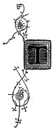
The object of this introductory sketch being rather to lay down general
principles, leaving the student to work them out than to follow him
through the whole study, for which, indeed, there is no space, it
may be as well, in the first instance, to point out the two leading
errors into which modern illuminators are apt to fall. The one is a
slavish imitation of mediæval models; the other, the unrestrained
indulgence of the illuminator’s own fancy. Both are vicious, though
the latter far more so than the former—for the mediæval illuminators
had real taste and artistic feeling; and the modern copyist, by his
slavish reproduction, unconsciously appropriates to himself what
they possessed; while the other, wandering about in the uncultivated
wilderness of his own ideas, picks up and piles together a mass of
incongruous materials—of which, when he has completed the
extraordinary jumble, he cannot in the least comprehend why the result
is so unsatisfactory. But the fact is, illumination (like every other
art) has its grammar, and that grammar lies in the mediæval books;
but when the grammar is mastered, there is no reason why modern
intelligence should not be emancipated from the trammels of everything
but its fundamental principles.
The principle of the construction of a border, in the style of the
celebrated Hours of Anne of Brittany, may be strictly adhered to, for
instance; but the details and their treatment may be quite new. Nor
because the figures introduced into an Anglo-Saxon illuminated bible
are generally dislocated about the hips, and display a tendency to
postures of the feet, impossible even to the most flexible dancer, is
it necessary to reproduce in a modern illumination of the same style
the same unnatural distortions.
And these remarks lead naturally to another, namely, that some study of
the principles of the harmonies of outline, of form, and above all of
colour, is essential to the successful study of the art of illumination.
Nor will anything more materially promote this study than a careful
consideration of the harmonies enumerated, as they are exhibited in
nature, both animal and vegetable, but particularly the latter, as
something of a bower seems the fundamental idea of all the better
styles of the art. All sorts of creeping plants, whether in the
garden or the hedgerow; all sorts of flowers, exotic, native, or
wild—nay, fruits and many vegetables—as parsley, notably—may
be pressed with advantage into the service of the art: whilst the
graceful forms and beautiful plumage of the bird tribe, especially
of the inhabitants of the Tropics; the equally brilliant though more
delicate plumage of butterflies and moths; the symmetrical contour
and tasteful combinations of colour in many quadrupeds; and even the
homelier insects which crawl about our fruit trees, may be all studied
with advantage. The old illuminators were frequently happy to avail
themselves of a caterpillar, or a lady bird, to break the monotony of a
broad, flat space, or heighten the effect of a leaf, or balance a too
obtrusive colour in an opposite corner. Reptiles, too, may contribute
much that is exceedingly beautiful, both in outline and colour; and in
this respect again the Tropics furnish the most brilliant specimens.
Besides the book of nature itself, then, all sorts of works (with
coloured illustrations) on Botany and Zoology, may with advantage
be consulted; nor need Conchology be disregarded: some of the
more beautiful shells forming admirable subjects of study for the
illuminator. And where books are inaccessible, there is at any rate the
department of Natural History, at the British Museum, open to every one.
Lastly, it will be useful to take every opportunity of marking how
other arts have treated the same subjects—Architecture and Metal
working particularly. Such observations will tend to shew above all
how the principle and idea of the natural may be translated into the
conventional, without loss of grace. The carvings in the capitals of
some of the early English columns supply the best instances.
For these last purposes the mediæval courts of the Crystal Palace may
be made excellent schools—as the Alhambra court, for the study of
colour in its richest combinations. The Kensington Museum might form a
general school for both.
We proceed next to furnish a catalogue of those specimens at the British
Museum which are best calculated to assist the beginner in his studies.
Part II. — 1º Paper .— — 2º Colours .— — Pencils, Pens, Drawing Instruments, &c.
Several obvious reasons combined in mediæval days to make vellum the
almost exclusive vehicle for illuminated writing. It was the substance
on which most manuscript books were written: it was durable, and it
took both ink and colour well. It is still largely in use for the
purposes of illumination, and may be had properly prepared at almost
any stationer’s, as well as at all artists’ colour shops. Any drawing
paper with a smooth surface may also be used; but the best substance of
all is the ordinary Bristol board, not too thick, for there should be
some little elasticity—three sheets thick is about the most useful.
So much in illumination depends on (1º) the
brilliancy and (2º) the durability of the colours employed, that too
much care can hardly be displayed in their selection. Instances are
numerous in which work on which hours and hours of care and pains
were bestowed, a few years ago, is now so faded as to be almost
unintelligible; the reds have flown, the whites turned brown, and a few
hazy, blue marks are all that are left. It is clear that they of old
surpassed us in the preparation of their colours. Some of the paintings
in the ancient temples of Egypt, which have been proved to be only
water colour, are as brilliant and fresh to-day as they were when laid
on three thousand years ago. The exquisite miniatures and elaborate
ornamentation of numbers of Oriental manuscripts, five, six, seven, and
more centuries old, retain all their original beauty and gorgeousness;
and the mediæval office books, and other MSS. of England, France, and
Italy, especially those of the 14th century, are at this day as much
marvels of brilliant colouring as the stained glass windows of the
same periods. To the beginner, of course, the character of the colours
employed is not so important, as to more forward artists. Still it is
wise to exercise judgment in selection, even from the first, especially
as in nine cases out of ten a cake of colour will last for years.
The best course is to make the purchases at one of the best artists’
colour shops, to eschew all ‘made up’ colours, and to rely on the eye
for producing at home the several gradations of hue, by mixing the
primal colours on the slab. Comparatively few are really required; and
as illuminating is a very different art from ordinary water-colour
drawing, and requires a peculiar texture of matter, the colours most
fitted for it are not always the same as those in ordinary use. The
following will be found the most serviceable:—
| |
| REDS. |
YELLOWS & BROWNS. |
SILVERS. |
| Scarlet vermillion |
Indian yellow |
The most durable mode |
| Crimson vermillion |
Gamboge |
of producing this most |
| Crimson lake |
Sepia |
delicate and sensitive |
| Carmine |
The latter, mixed with |
of all colours, is to |
| The two last for |
lake, makes a good |
use platina, or |
| the deeper hues, |
shadow colour, and |
aluminum, and burnish |
| and for shading. |
shows well on reds, |
afterwards. |
|
or on gold. |
See ‘Tricks.’ |
| BLUES. |
BLACKS. |
WHITES. |
| Ultramarine |
Indian ink |
Chinese white is the |
| Permanent blue |
This will be found the |
most brilliant and |
| The latter for the |
most generally useful. |
stands best. |
| deeper hues, and |
Ivory black and lamp |
|
| for shading. |
black are both good |
|
| |
blacks; but genuine |
|
| |
Indian ink is as good, |
|
| |
or better, and has the |
|
| |
advantage of working |
|
| |
well in the pen, which |
|
| |
the others will not do. |
|
NEUTRAL TINTS,
PURPLES, &c. |
GREENS. |
GOLDS. |
| Permanent blue, |
Emerald green— |
The ordinary shell |
| mixed with lake, |
Use permanent blue |
gold; but it will |
| will be found |
for the shading. |
be found most |
| best suited for |
|
economical to |
| illumination. |
|
purchase it in the |
| The neutral tint |
|
larger quantities, |
| sold in the shops |
|
as sold in Porcelain |
| is too heavy, |
|
pans and saucers. |
| so is that |
|
There is also a gold |
| ordinarily made |
|
medium, the use of |
| up of indigo and |
|
which as well as of |
| light red. |
|
the agate burnisher, |
| |
|
will be explained |
| |
|
under the head of |
| |
|
‘Tricks.’ |
| |
The pencil being only used for sketching the subjects, those marked
F, H, and HH, will be found sufficient. A few ordinary fine-pointed
steel pens will do very well for outlining. For the benefit of any
learner not conversant with the use of the pen with colour, it may be
added that the method is, to mix the colour, very liquid, in a saucer;
and then filling a camel’s hair brush with some, to draw the brush
across the shoulder of the pen, which is to be held with the open part
upwards. It will be found that enough colour is thus scraped off, as
it were, to charge the pen: by a similar method the drawing pen is
charged.
It will be well to have a drawing pen, a pair of compasses with pen
and pencil legs, a few drawing pins; a drawing board, 2 feet by 18
inches, or smaller; a T square; three set squares
(one 45°, the other two 70° and 20°) and respectively 3 inches,
6 inches, and 9 inches in length. The latter will be found more
practically useful than all sorts of parallel rulers; but as their use
is not generally familiar to any but architectural and engineering
draftsmen, it may be useful to add an explanation of it.
Having adjusted the cardboard by means of the T
square on the drawing board, secure it by pins. To draw any
number of parallel lines it is now merely necessary to lay the
T square across the cardboard, in a direction
perpendicular to that of the desired lines, taking care, of course,
that the cross piece of the T is well against the
edge of the drawing board, and kept firm by a weight; and then keeping
one side of the set square against the side of the T,
to slide it up and down as occasion shall require.
It will be found very useful both for keeping the
T square steady, and for tracing and other purposes,
to have a couple of small weights—lead is the best material—about the
size of a child’s large toy brick, or—say—3 inches long, 2 inches wide,
and ½ an inch deep. Any plumber can cast them. Cover each of them with
a piece of foolscap, or other paper not too smooth, folding it up like
a parcel, and sealing the ends down on the upper side. The advantage of
this plan is, that the envelope can be removed and renewed as it gets
dirty. Handles to weights, or thick weights, are a mistake; they catch
the hand.
As greater neatness and accuracy in curves are sometimes necessary
than can be attained by any but the most practised hand, it will be
found useful to have a few French curves; these can be procured at any
artists’ colour shop, or drawing instrument maker’s.
Three brushes will be enough. Washing, as in water-colour drawing,
being never used in illuminating, no large brushes are needed; the
largest need not be more than half the size of a lead pencil, the
second of course smaller, and the third a very fine one. They should be
of sable; and carefully selected for firmness, compactness, even point,
and absence of straggling hair.
A slab or palette for the colours, and a separate saucer or slab for
Indian ink should be provided.
It will be necessary also to have an ivory point for tracing off, and a
small agate for burnishing and other purposes; both are to be procured
at the artists’ colour shop.
Of course tracing paper will be required—the French is the best—as
well as a sheet of red paper for tracing off. Red paper, though readily
procurable in the artists’ colour shops, and perhaps most conveniently
so, is nevertheless simply and easily constructed. Any one who is
desirous of making his own, has merely to take a sheet of foreign post
paper, scrape a piece of red chalk over it, and then rub in with a
piece of soft chamois leather or wadding, until the paper is evenly
covered, not making it too thick, or it will trace off clumsy lines.
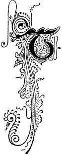
The beginner being now furnished with all necessary materials, the
shortest and most comprehensible way of instructing him in the use of
them, will be to take two or three of our own examples, and ask him to
follow us through the process of executing them. To take a very simple
one first, we will select any one of the letters in No. 3. The piece of
cardboard is supposed to be laid on the drawing board, and kept steady
by a single pin in the centre of its upper side, there being no need
for perfect rigidity as there are no squaring or parallel lines in this
illumination. Proceed to trace the initial from the example by laying
a piece of tracing paper over it, with weights to steady it, the same
weights may be easily so arranged as to keep the book open as well.
Run over every line with your softest pencil with a fine point, and a
light hand. Remove the tracing paper, and adjust it over the cardboard,
so as to bring the tracing over the desired spot. Adjust the weights,
slip the red paper underneath, take your ivory point and begin tracing
off; and of this, let it be remarked, that nothing but practice can
give the beginner the requisite skill to make a good tracing. A heavy
hand, or a broad point will produce a coarse tracing; too light a
hand, too faint a tracing, and too fine a point will cut through the
tracing paper. It will be well to make a few trials first, and even
during the progress of a tracing, especially if it be an elaborate one,
to lift the lower corner of the tracing paper carefully now and then,
so as not to disturb the weights, and to see that all is going on as
it should. The tracing being complete, proceed next to outline it in
Indian ink, with a pen. For this purpose prepare some ink in the manner
already described, on its separate slab. The ink outline should be
complete—strong and weak where needed, as in the outline illustration
of our specimen, and should be clean and firm—all this while keep a
clean piece of paper under the working hand.
The outline being completed, the next thing will be to prepare the
colours. For either of the initial letters in Example 3, red, green,
and gold are the only colours needed; and this may be the most
suitable place for introducing a few words about what is technically
called ‘body colour.’ Body colour is very largely used in all ancient
illumination, whether English, French, Italian, or Oriental; but is
most prominently observable in the Italian. It is obtained by simply
mixing a small quantity of some opaque substance with the colour. Zinc,
or Chinese white, are most commonly employed for the purpose; and the
best mode of construction is to have the white in one of the metal
tubes, squeeze a drop about the size of a pea on to the slab, and then
rub the colour over it. Of course it will be necessary to introduce
some colour a little darker than the hue desired, as the white will
lighten it: thus for instance, in order to obtain an ordinary blue,
it will be necessary to add a touch or two of permanent blue, or the
ultramarine will turn out too pale. The advantages of body colour are
twofold—first, any body colour will lie flat; next, being opaque, it
can when needful be worked over other colour.
For the purposes of the illumination now under consideration then,
it will merely be necessary to rub in scarlet vermillion and emerald
green. Be careful to rub plenty, for it is a rule in illuminating that
the colours should be laid on thick and powerful; there are no faint
transparent tints, as in water-colour drawing, but even in miniature
scenes, light colours are obtained not by diluting the colour with
water, but by adding white to it. Another rule is, to lay on the
largest body of colour first: thus in the instance before us—first put
in the reds, taking care to lay on plenty of colour, to keep within the
ink outline carefully, close to it but not encroaching on it, and to
see that your colour lies evenly or ‘flat.’ Next, put in the greens,
observing the same rules, and finally the gold, for it is another rule
to leave the gold to the last to avoid rubbing as much as possible.
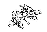
Our next example will be No. 7. Trace and outline as before. Proceed
next to put in the ultramarine blues in the acanthus and flowers;
next the permanent blue in the darker hues of both as well as in the
initial, taking care, both in acanthus and flowers, to keep the curves
clean and bold. Now colour the green leaves with emerald green, the
darker lines as directed with permanent blue. The reds in the flowers
follow next—all, except that in the right hand lower corner—with
crimson lake, the darker hues being touched in with permanent blue,
which, combining with the lake, will produce the neutral tint
before referred to. The excepted corner flower will require crimson
vermillion, shaded with sepia and lake. Crimson vermillion will also
furnish the colour for the red flowers in the initial. Lastly, put in
the golds, shading with sepia and lake.
The last Example we select is No. 9. Here, as in No. 3, proceed to
trace, &c. as directed, only in this case the T square and set
squares will come into play for the outlines of the border, both in
tracing, tracing off, and in outlining—use the drawing pen for the
last. The fruit, flowers, &c. must next be carefully executed with the
requisite colours, according to the table given above; the gold then
laid on, and afterwards the shade worked over the gold with a neutral
tint, made of sepia and lake, as directed.
There are a few ‘Tricks’ which will be found generally useful to bear
in mind. The agate is a useful auxiliary; with the side of it you can
burnish your golds and silvers (platina) by gently rubbing them until
they acquire the requisite brilliancy; and with the point of it several
very pretty methods of breaking and enriching a flat gold or silver
surface may be put in force, either by covering it with dots, or with
dots in combination with straight or curved lines, or with a sort of
Arabesque work, or—indeed, with any sort of pattern according to the
designer’s fancy.
Sparks of white may be with advantage introduced to throw up the edge
of a leaf, or the most prominent portion of a stalk, or even to bring
out the lighter edge of a letter from the background. In the latter
case be careful not to obliterate the outline. The white should come
just outside it, and between it and the background.
A large initial or surface of heavy colour may be very easily lightened
by the introduction of a powdering of minute gold dots. These may be
produced by laying on the dots, first of all, with either Chinese
white, or with an article sold in the artists’ colour shops, called the
gold medium; and in either case touching the dots, when dry, with shell
gold. The effect will be that they will stand out in strong relief from
the ground on which they are laid, and will produce a very rich effect.
Finally, whilst observing the general rule to keep your work as flat as
possible, be careful that it do not degenerate into tameness—rather
than this—and especially with foliage, fruit, flowers, &c. do not be
afraid to introduce into the deepest corners of the heaviest shades
good, strong, telling touches, of almost black colour.
But above all, when in a difficulty, study the specimens enumerated
above; rather err on the side of imitation than of invention.
The second point is the parallel of the first, in connexion with what
may be called the manipulatory part of the treatise. Here again we
must warn our readers that the book is but a Primer. The work already
referred to contains no less than seven and twenty imperial octavo
pages, about colours and gilding, and brushes, and other practical
matters. This will furnish some idea of the magnitude of this part of
the subject. But our little volume merely pretends to put beginners
in the way of acquiring the power of learning more. And let us here
remark, that in some particulars the colours selected, and the
directions given differ, we observe, from the recommendations of other
writers; and without therefore pretending for one moment to sit in
judgment on those who differ with us, we will take the liberty of
informing readers that our directions are based on the experience and
observations of many years’ extensive practice of the art in question.
We may also add that, though the Primer is intended to enable beginners
to teach themselves, (and if its directions are carefully attended to,
will have that effect,) still it is advisable, when practicable, to
carry out those directions under the eye of a master at first, even if
such supervision only amount to submitting to him the results of the
earlier efforts, that he may point out the secrets of any failures.
Above all, the golden rule for the student of illumination is, not
to attempt too much at first. Far more real progress is made by
carefully, patiently, and accurately completing a single copy of one
simple letter, such for example as the N in Example No. 3, than in
hurrying over half a dozen more ambitious studies, in a way which may
produce a certain effect at a distance, but will not bear looking
into. Like Burke, rather aim to be ‘slow and elaborate,’ than dashing
and effective; but be industrious, and let your motto be,—“Festina lente.”
In conclusion, it maybe as well to impress
upon the reader two points: the first is, in great part, a mere
repetition of the introductory sentences of our little volume, but
cannot be too repeatedly urged on his attention. There is no pretension
whatever in this slight practical essay, to give anything approaching
to a complete dissertation on the art of illumination; such a task
would occupy a score of such volumes as ours, and be then capable of
almost illimitable further expansion. We have indeed already remarked
that the subject is inexhaustible; and the last notable work published
on the art well observes, that ‘men of the profoundest learning have
devoted, some whole lives, and many of them long years, to the study of
those precious pages, on the decoration of which the highest efforts
of the illuminists of old were lavished; and have yet one and all
confessed the partial and incomplete mastery of the subject which they,
with all their labour, have been able to acquire.’ It is not to be
expected, therefore, that within the comparatively tiny dimensions of a
Primer anything more than the merest outline was practicable, all that
has been attempted then has been to furnish just such a description and
dissertation as is absolutely essential to the due comprehension of
what the art is, and of what it is applicable to, leaving the student
to search for further information among such of the larger and more
abstruse works on the subject, as may be accessible to him at the
reading room of the British Museum,[13]
or elsewhere. Even at the risk of being accused of repetition, it has been
thought wise to impress this point strongly on the reader’s attention.
His motto should be an amalgamation of two well known ones—